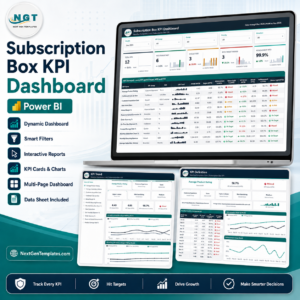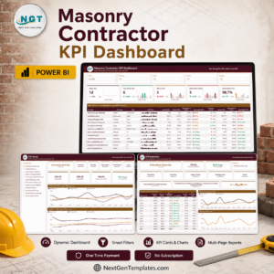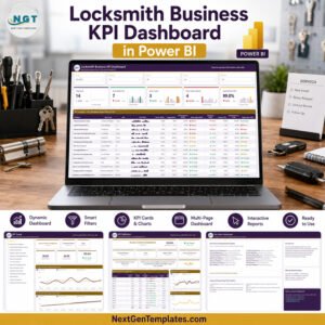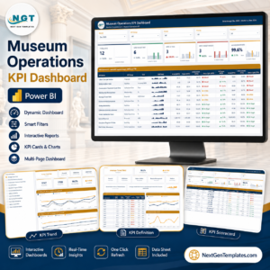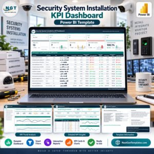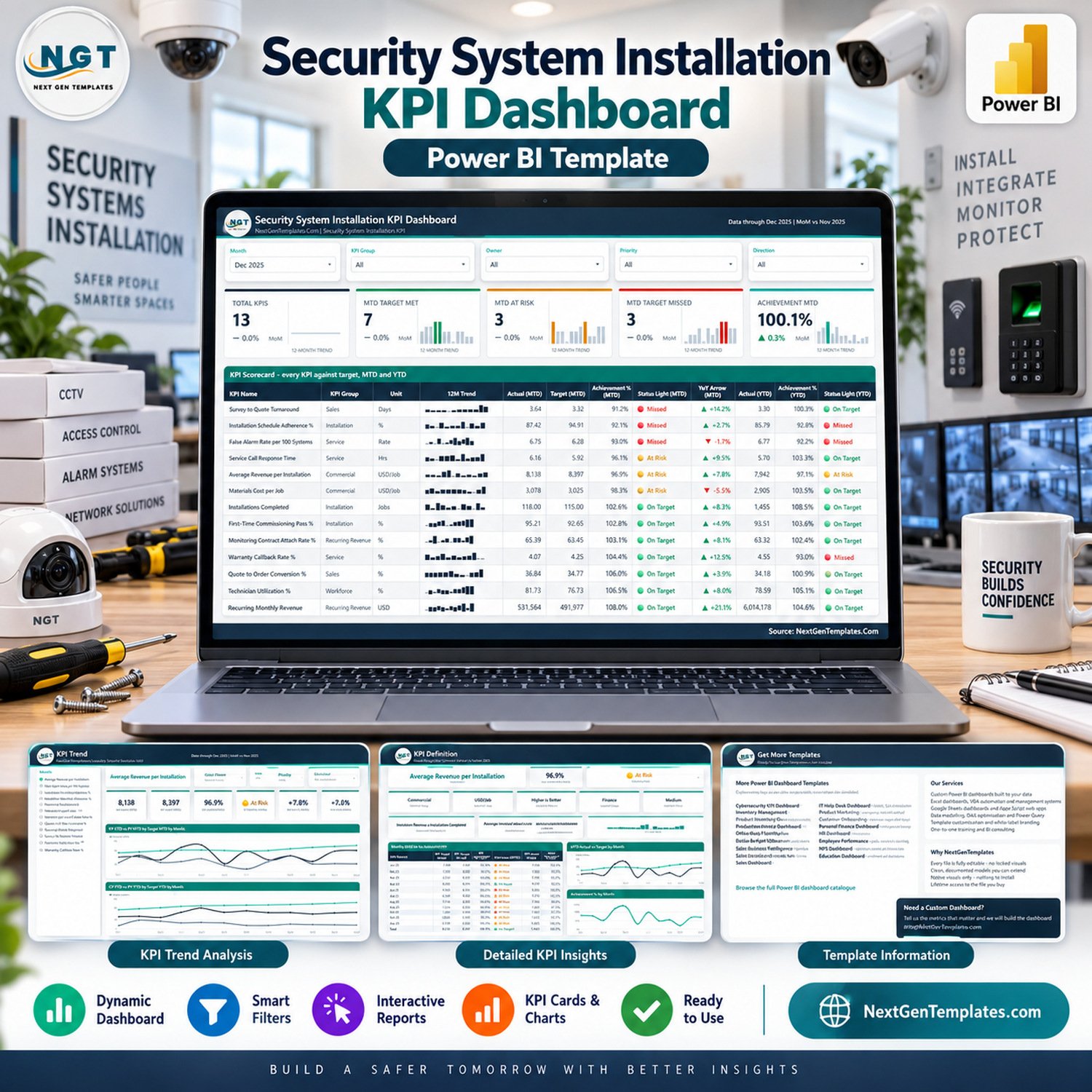
The Security System Installation KPI Dashboard in Power BI scores 13 named KPIs against a monthly target and a prior-year comparison across 3 analytical report pages, driven by 156 target rows and 312 actual rows in one Excel data pack. Setup takes under 10 minutes: open the .pbix, point it at your own copy of Data.xlsx, and press Refresh.
🌍 Join 8,400+ teams in 40+ countries using NextGenTemplates to replace paid SaaS tools with one-time-purchase Excel, Google Sheets, Power BI and HTML templates.
✅ Instant download · One-time payment · No subscription · No per-user fees · Lifetime access
⚠️ Please read this first. This is an internal management-reporting template over data you supply. It does not monitor, test, certify or assure any alarm, CCTV, access-control or life-safety system. It does not establish compliance with UL 681, UL 827, NFPA 72, EN 50131, SIA standards, local alarm permitting, electrical codes or fire codes, and it does not satisfy any licensing requirement for security installers. It is not a security risk assessment, a system design, a commissioning record or an inspection certificate, and it does not replace a licensed installer’s statutory duties. Every installation, compliance, response-time and inspection figure you see in the screenshots is a buyer-entered demo number, not a measurement the template performs.
🔑 Key Features of the Security System Installation KPI Dashboard in Power BI
🎯 13 KPIs in 6 groups, defined in the workbook rather than hard-coded. The shipped sample set covers Sales (Survey to Quote Turnaround, Quote to Order Conversion %), Installation (Installations Completed, First-Time Commissioning Pass %, Installation Schedule Adherence %), Service (False Alarm Rate per 100 Systems, Service Call Response Time, Warranty Callback Rate %), Workforce (Technician Utilization %), Recurring Revenue (Monitoring Contract Attach Rate %, Recurring Monthly Revenue) and Commercial (Average Revenue per Installation, Materials Cost per Job).
🚦 Direction-aware scoring, so cost and cycle-time KPIs are not punished for being low. Each KPI is flagged UTB (higher is better) or LTB (lower is better) in the workbook. Higher-is-better KPIs score Actual ÷ Target; lower-is-better KPIs score Target ÷ Actual, so beating a cost or response-time target scores above 100%. Status lights read On Target at 100% or more, At Risk from 95% to 100%, and Missed below 95%.
🔎 Five synced slicers on the scorecard page. Month (single-select), KPI Group, Owner, Priority and Direction filter the cards and the table together, and the Group, Owner, Priority and Direction slicers are sync-grouped so a selection carries across pages.
📅 Both MTD and YTD, plus a prior year. The data pack holds 12 months of targets for the reporting year and 24 months of actuals — the reporting year and the one before it — which is what every prior-year and year-over-year figure reads from.
🧮 Nothing about the KPI list is fixed. Rename, add or delete a KPI in the three input sheets, hit Home > Refresh, and the card counts, the scorecard rows, the KPI picker and every chart follow. The KPI name is the join key across all three sheets.
🖱️ Two hidden tooltip pages. The report ships 6 pages in total: 4 you navigate to and 2 hidden 280×360 tooltip pages (“KPI Detail” and “Trend Detail”) that appear on hover with Achievement %, Variance % and a small breakdown bar chart.
🛠️ Native visuals only. Across its visuals the report references 38 distinct measure names (we are quoting the names the visuals bind to, not a count of measures in the model — the compressed data model cannot be read from outside Power BI). There are no custom visuals to install and nothing is locked.
📦 What’s Inside the Security System Installation KPI Dashboard in Power BI
The download is a single ZIP containing three files: the .pbix report, Data.xlsx (the data pack it refreshes from), and Power BI Dashboard – User Manual.pdf. The workbook has four sheets: a Read Me, Input_ Target (156 rows — 13 KPIs x 12 months), Input_ Actual (312 rows — 13 KPIs x 24 months) and KPI Definition (13 rows, with Unit, Formula, Definition, Type, Owner and Priority per KPI).
Page 1: KPI Scorecard
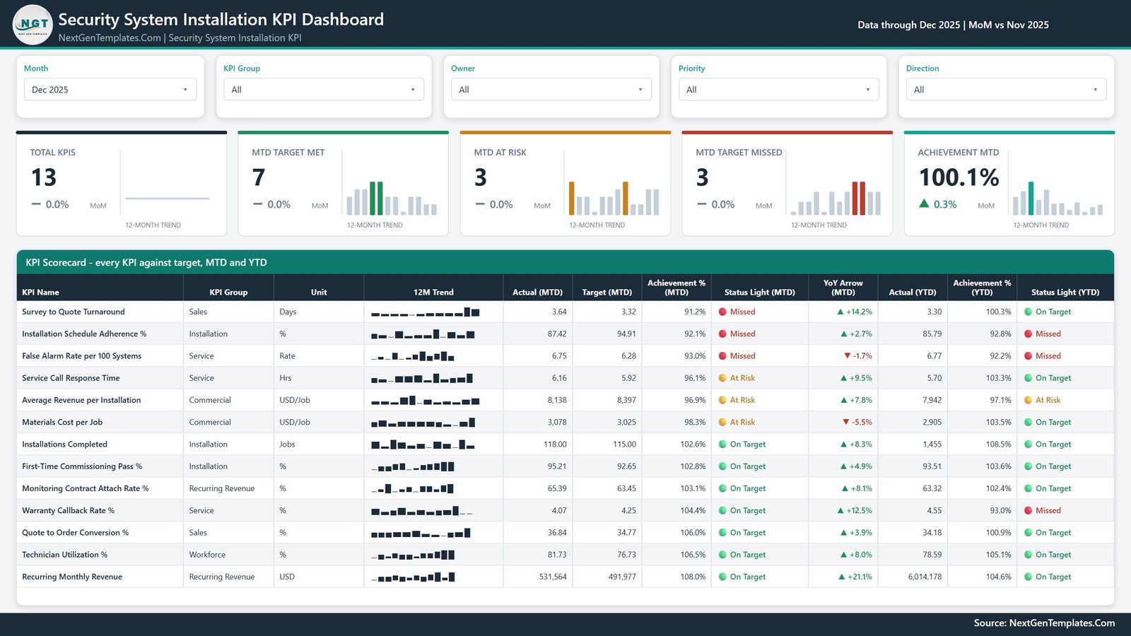
The landing page. Five slicers across the top (Month, KPI Group, Owner, Priority, Direction) sit above five summary cards — Total KPIs, MTD Target Met, MTD At Risk, MTD Target Missed and Achievement MTD — each with a month-over-month delta and a 12-month sparkline. Below them the twelve-column table “KPI Scorecard – every KPI against target, MTD and YTD” lists every KPI with its group, unit, 12-month trend, MTD actual, MTD target, MTD achievement %, MTD status light, YoY arrow, YTD actual, YTD achievement % and YTD status light.
Page 2: KPI Trend
A single-KPI view. The left rail lists all 13 KPI names as a radio list; picking one repoints the whole page. Six context cards echo the selected KPI’s group, unit, direction, owner and priority, and five value cards show KPI Actual (MTD), KPI Target (MTD), KPI Achievement % (MTD), KPI Status (MTD) and KPI YoY % (MTD). Two line charts follow: CY MTD vs PY MTD vs Target MTD by Month and CY YTD vs PY YTD vs Target YTD by Month, each plotting current year, prior year and target across twelve months.

Page 3: KPI Definition
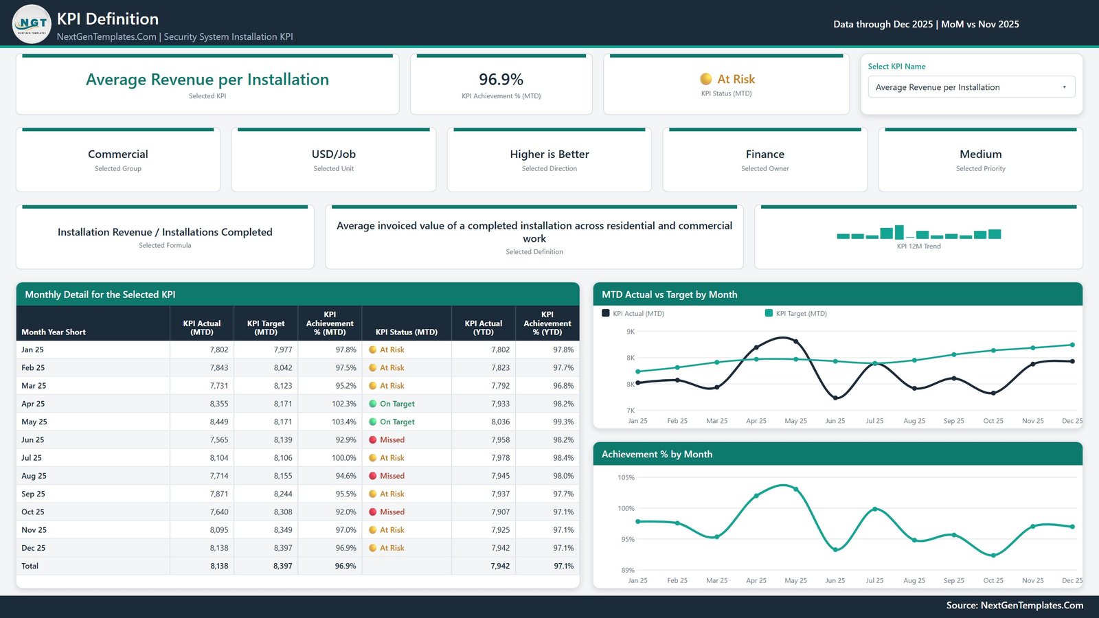
The documentation and month-by-month page for one KPI, driven by the same synced picker. Cards show the selected KPI’s achievement %, status, group, unit, direction, owner, priority, its written formula, its plain-English definition and a 12-month trend. The table “Monthly Detail for the Selected KPI” gives twelve monthly rows plus a total, each with MTD actual, MTD target, MTD achievement %, status, YTD actual and YTD achievement %. Two charts sit beside it: MTD Actual vs Target by Month and Achievement % by Month.
Page 4: Get More Templates
The fourth page is a reference and catalogue page, not an analytical one — it lists other NextGenTemplates Power BI titles and a short “Using and Customising This Template” crib sheet. We have deliberately left it out of the image gallery above because it shows no data from your report, but it is in the file you download.
Honest note on the shipped file
Three things we found while checking this build, none of which affect the numbers: (1) on the scorecard table the YoY Arrow column tracks raw movement, not whether the movement is good — a rise is green and a fall is red even on a lower-is-better KPI, so Materials Cost per Job falling 5.5% shows red while Survey to Quote Turnaround lengthening 14.2% shows green; read the Achievement % and status light for the direction-aware verdict. (2) The line charts abbreviate the value axis to whole thousands, so on a currency KPI two adjacent gridlines can both read “8K”. (3) A month whose achievement is 99.98% displays as “100.0%” while still being flagged At Risk — the display rounds, the status does not.
📊 Security System Installation KPI Dashboard in Power BI vs. Tableau / Qlik vs. a Paid Field-Service SaaS
| Feature | This Power BI template | Tableau / Qlik build | ServiceTitan / Simpro / Jobber |
|---|---|---|---|
| Cost | $12.99 one-time ✅ | $70-115 / user / month (Creator) | $100-300+ / user / month |
| Platform | Power BI Desktop (free) ✅ | Tableau Desktop or Qlik Sense licence | Vendor cloud only |
| Setup time | Under 10 minutes ✅ | Days of modelling and design | Weeks of onboarding and data migration |
| Add or rename a KPI | Edit a spreadsheet row, then Refresh ✅ | Edit the workbook and republish | Limited to the vendor’s metric catalogue |
| Direction-aware scoring (UTB / LTB) | Built in per KPI ✅ | Hand-written calculations | Usually fixed by the vendor |
| Prior-year comparison | Included (24 months of actuals) ✅ | Build it yourself | Often a higher tier |
| Real-time team collaboration | Via Power BI Service (separate licence) | ✅ Via Tableau / Qlik Cloud | ✅ Native |
| Mobile access | Via the Power BI mobile app | ✅ Native apps | ✅ Native apps |
| Year-1 cost at 5 users | $12.99 total ✅ | $4,200-6,900 | $6,000-18,000+ |
For a security installation business that wants a reviewed, target-scored KPI pack without a per-seat analytics bill, the Security System Installation KPI Dashboard in Power BI sits in the sweet spot.
👥 Who This Template Is For — and Who It’s Not For
✅ Built for:
- Owners and operations managers at alarm, CCTV and access-control installation firms with roughly 5 to 200 staff, who already keep their numbers in a spreadsheet
- Branch and regional managers who need one monthly page to take into a management meeting
- Service and monitoring-centre leads tracking response time, false-alarm rate and warranty callbacks against an internal target
- Power BI users who would rather start from a finished model than from a blank canvas
❌ Not for:
- Anyone who needs compliance evidence, certification, inspection records or permit documentation — this template produces none of those, and no reporting template can
- Teams wanting a live feed from an alarm receiver, a monitoring platform or a field-service system; this refreshes from a spreadsheet you maintain
- Businesses needing job scheduling, dispatch, quoting or invoicing — that is field-service software, not a dashboard
- People without Power BI Desktop, or who cannot install it (there is a Google Sheets edition for that case)
⚙️ How to Use the Security System Installation KPI Dashboard in Power BI
- Unzip the download and keep the .pbix and Data.xlsx in the same folder. Open the .pbix in Power BI Desktop (free from Microsoft).
- Open Data.xlsx and read the Read Me sheet. It explains the three input sheets and the MTD/YTD rules in about a page.
- On the KPI Definition sheet, replace the 13 sample rows with your own KPIs. Set Type to UTB where higher is better and LTB where lower is better.
- Fill Input_ Target with one row per KPI per month for the reporting year, and Input_ Actual with the same for the reporting year and the year before it.
- For rates, ratios and percentages, make YTD the average of the months so far, never a sum. Only money, volumes and counts should accumulate.
- Back in Power BI, press Home > Refresh. If you moved the workbook, use Home > Transform data > Data source settings > Change Source first.
- Pick your month on the scorecard, then use the KPI Trend and KPI Definition pages to drill into any single KPI.
💼 Real-World Use Cases
Ray runs a 40-technician alarm and CCTV installation company. He keeps his monthly numbers in a spreadsheet already, so each month he pastes them into Input_ Actual, refreshes, and walks into the Monday management meeting with the KPI Scorecard page on screen — installations completed, first-time commissioning pass rate and schedule adherence against target, all on one page, instead of rebuilding the same deck every month.
Priya manages a monitoring centre for a regional security firm. She filters the Owner slicer to her own team and watches two KPIs closely: False Alarm Rate per 100 Systems and Service Call Response Time. Because both are flagged lower-is-better, beating target scores above 100% and shows green, which means she no longer has to explain to the board why a “low” number is a good number.
Daniel is a fractional CFO for three trade businesses, one of them a security installer. He uses the KPI Definition page to show each owner exactly how a metric is calculated — the written formula and definition sit right there next to the month-by-month table — which has ended most of the arguments about whose number is right.
❓ Frequently Asked Questions
Does this certify our installations or make us compliant?
No. The Security System Installation KPI Dashboard in Power BI is an internal reporting template over data you enter yourself. It does not test, certify or assure any alarm, CCTV or access-control system, and it establishes nothing under UL 681, UL 827, NFPA 72, EN 50131, SIA standards or any local permitting, electrical or fire code.
Are the numbers in the screenshots real installation data?
No. Every figure in the images and in the shipped Data.xlsx is realistic sample data created to demonstrate the layout. Replace all of it with your own numbers before you use the dashboard for anything. The template performs no measurement of its own.
What exactly is in the download?
One ZIP with three files: the Power BI report (.pbix), Data.xlsx holding the KPI definitions plus 156 target rows and 312 actual rows, and a PDF titled “Power BI Dashboard – User Manual”. No installer, no macros and no custom visuals.
How long does setup take?
Under 10 minutes if your monthly numbers already exist in a spreadsheet. Paste your KPI list into the KPI Definition sheet, paste targets and actuals into the two input sheets, then press Refresh in Power BI Desktop. Every card, table and chart re-reads the workbook.
Can I change the 13 KPIs to my own?
Yes — that is the design. Nothing in this Power BI template hard-codes a KPI name. Add, rename or delete rows in all three sheets (the KPI name is the join key), refresh, and the counts, the scorecard and the KPI picker all follow automatically.
How does this compare to ServiceTitan or Simpro?
Those are field-service platforms that run your jobs, dispatch and invoicing at roughly $100-300 per user per month. This is a $12.99 one-time reporting layer that reads a spreadsheet you already maintain. It reports; it does not operate your business, and it does not replace field-service software.
Do I need a paid Power BI licence?
No, not to use it. Power BI Desktop is free from Microsoft and opens, refreshes and edits the file. A Power BI Pro or Premium licence is only needed if you want to publish the report to the Power BI Service and share it with colleagues online.
👤 About the Author
Built by PK — Microsoft Certified Professional with 15+ years of Excel, Google Sheets and Power BI experience. Founder of NextGenTemplates, reaching 300K+ subscribers across YouTube channels (@PKAnExcelExpert, @NextGenTemplates, @NeoTechNavigators). Every template is hand-built and tested before release.
🔗 Explore Related Templates
Browse the full range of Power BI Dashboards, or start with these:
- Fire Safety Services KPI Dashboard in Power BI — the same month-picker scorecard built for fire protection and life-safety service work.
- Garage Door Service KPI Dashboard in Power BI — the same KPI engine for an install-and-service trade.
- CCTV Installation KPI Dashboard in Google Sheets — narrower scope, camera work only.
- Alarm Monitoring Service Management System Web App — for running the monitoring operation itself, not reporting on it.
Also available as: Security System Installation KPI Dashboard in Google Sheets (the same dashboard, no Power BI needed) and Security System Installation KPI Scorecard in Google Sheets (the simpler scorecard-only sibling). For the field side, there is also the Security System Maintenance Checklist in Google Sheets.
📖 Click here to read the Detailed Blog Post
🎥 Visit our YouTube channel for step-by-step video tutorials
👉 YouTube.com/@NextGenTemplates
📅 Last updated: September 2026