

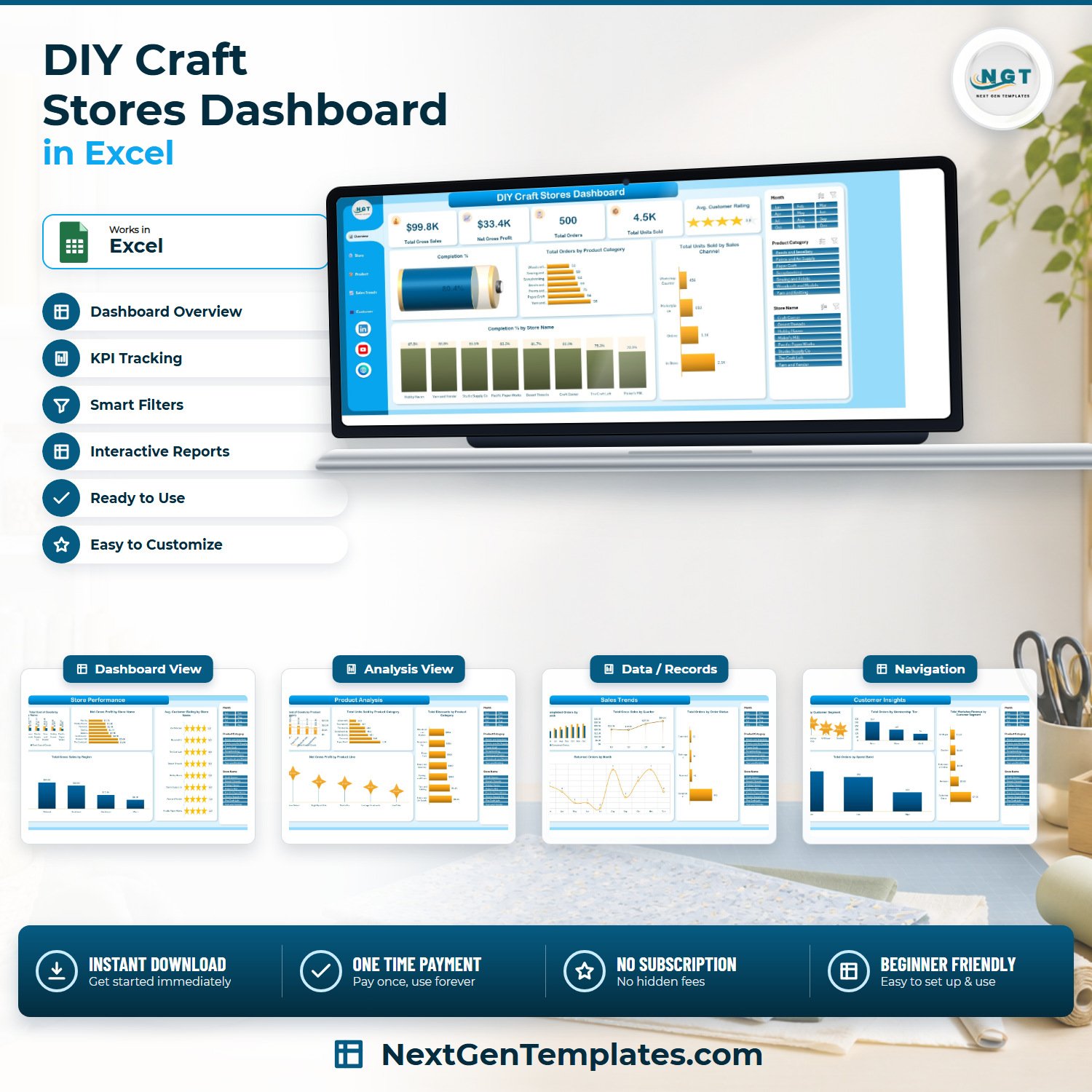

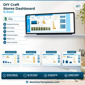
The DIY Craft Stores Dashboard in Excel tracks 5 headline KPIs and 21 charts across 5 interactive pages, driven by 25 pivot tables and a 500-row sample sales table with 28 columns. Three slicers — Month, Product Category and Store Name — are synced across every page, so one click re-filters the whole workbook. Setup takes under 10 minutes: paste your own sales rows into the Data sheet, refresh, and every card and chart updates.
🌎 Join 8,400+ teams in 40+ countries using NextGenTemplates to replace paid SaaS tools with one-time-purchase Excel, Google Sheets, Power BI and HTML templates.
✅ Instant download · One-time payment · No subscription · No per-user fees · Lifetime access
This is the analytical DIY Craft Stores Dashboard — a multi-page sales, product and customer analysis workbook. It is not a single-page KPI scorecard and not a monthly traffic-light tracker. If you run one craft shop or a chain of eight, this is the file that answers “which store, which category, which customer segment is actually making the money.”
🔑 Key Features of the DIY Craft Stores Dashboard in Excel
📊 Five KPI tiles on the Overview page. Total Gross Sales, Net Gross Profit, Total Orders, Total Units Sold and an Average Customer Rating tile rendered as stars. In the shipped sample they read $99.8K, $33.4K, 500 orders, 4.5K units and 3.9 stars — every one recalculated from the Data sheet, never typed in.
🔢 Three page-synced slicers. Month (Jan–Dec), Product Category (7 categories) and Store Name (8 stores) sit in a fixed right-hand panel on all five pages. Click “Yarn and Knitting” and the whole workbook — every chart, every card, every page — narrows to that category.
💰 Profit is calculated, not assumed. The workbook carries three calculated pivot fields: Gross Profit (Gross Sales − Discount Amount − Cost of Goods), Profit Margin, and Completion Rate. That is why the Overview gauge can show an 80.4% order completion rate straight out of the box.
🏪 Store-level and region-level comparison. Page 2 ranks all 8 stores by gross sales against cost of goods, by net gross profit, and by average customer rating, then breaks total gross sales across 5 regions — Northeast, Midwest, Southeast, Southwest and West.
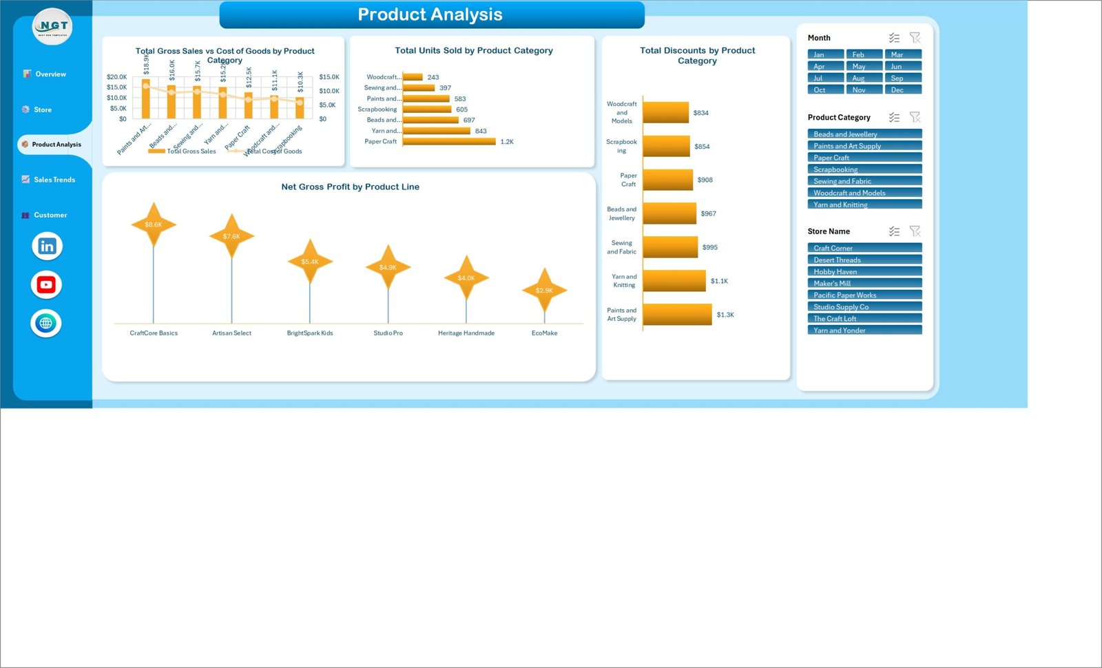
🎨 Category and product-line profitability. Page 3 compares gross sales against cost of goods for all 7 craft categories, ranks units sold, ranks net gross profit across 6 product lines (CraftCore Basics, Artisan Select, BrightSpark Kids, Studio Pro, Heritage Handmade, EcoMake), and shows exactly how much discount each category is giving away.
👥 Customer segmentation built in. Page 5 splits revenue across 5 buyer types — Professional Crafter, Hobbyist, Workshop Group, Gift Buyer and Student — and adds membership tier, spend band and workshop revenue views, which is where craft retail actually differs from general retail.
📁 No add-ins, no macros required. Native Excel pivot tables, pivot charts and slicers only. Opens in Excel 2016, 2019, 2021 and Microsoft 365 on Windows and Mac.
📦 What’s Inside the DIY Craft Stores Dashboard in Excel
Seven worksheets: five navigable dashboard pages, one Data sheet holding the 500 sample sales records across 28 columns, and one Support sheet holding all 25 pivot tables that feed the visuals. A left sidebar with hyperlinked buttons moves you between pages in one click.
Page 1: Overview
The command centre. Five KPI tiles — Total Gross Sales, Net Gross Profit, Total Orders, Total Units Sold and Average Customer Rating — sit above a Completion % gauge, plus Total Orders by Product Category, Total Units Sold by Sales Channel (In-Store, Online, Marketplace, Workshop Counter) and Completion % by Store Name.

Page 2: Store Performance
Compares your locations head to head with Total Gross Sales vs Total Cost of Goods by Store Name, Net Gross Profit by Store Name, Avg. Customer Rating by Store Name shown as star tiles, and Total Gross Sales by Region.

Page 3: Product Analysis
Where margin lives. Total Gross Sales vs Cost of Goods by Product Category, Total Units Sold by Product Category, Net Gross Profit by Product Line and Total Discounts by Product Category, so you can see which craft ranges are quietly being discounted into loss.
Page 4: Sales Trends
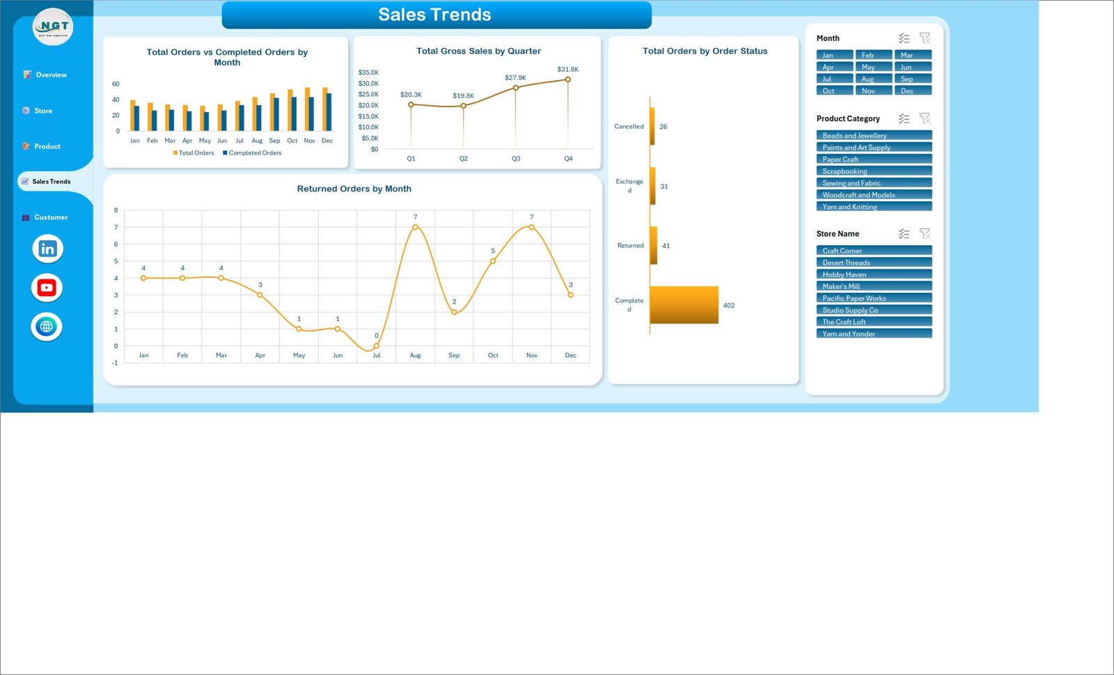
The time view. Total Orders vs Completed Orders by Month, Total Gross Sales by Quarter, Total Orders by Order Status (Completed, Returned, Exchanged, Cancelled) and Returned Orders by Month — the chart that exposes a seasonal returns spike before it becomes a habit.
Page 5: Customer Insights
Total Gross Sales by Customer Segment, Total Orders by Membership Tier (Basic, Silver, Gold), Total Workshop Revenue by Customer Segment and Total Orders by Spend Band. In the sample, Workshop Groups generate $7.6K of workshop revenue against $1.6K from gift buyers — the kind of split that decides your class schedule.

Data sheet and Support sheet
The Data sheet is a formatted Excel Table (TblData) with 500 sample craft-retail orders across 28 columns including Sale Date, Store Name, City, Region, Product Category, Product Line, Sales Channel, Customer Segment, Membership Tier, Order Status, Units Sold, Unit Price, Gross Sales, Discount Amount, Cost of Goods, Shipping Cost, Workshop Revenue, Stock On Hand, Reorder Point and Customer Rating. The Support sheet holds all 25 pivot tables; you never need to touch it.
📈 DIY Craft Stores Dashboard in Excel vs. a Google Sheets Build vs. Paid Retail Analytics SaaS — Where This Fits
| Feature | DIY Craft Stores Dashboard in Excel | Google Sheets equivalent | Lightspeed Analytics / Zoho Analytics |
|---|---|---|---|
| Cost | $17.99 one-time | Free, but you build it yourself | $30–$149 / user / month |
| Platform | Microsoft Excel 2016+ / 365, Windows & Mac | Browser only | Browser, vendor-hosted |
| Setup time | ✅ Under 10 minutes — paste data, refresh | Hours of formula and chart work | Days, plus POS integration |
| Works offline | ✅ Yes | No | No |
| Real-time team collaboration | Via OneDrive / SharePoint co-authoring | ✅ Native | ✅ Native |
| Mobile access | Excel mobile app (view) | ✅ Full | ✅ Full |
| Customisable fields & charts | ✅ Full — it is your workbook | ✅ Full | Limited to vendor schema |
| Workshop & class revenue tracking | ✅ Built in (Workshop Revenue by segment) | Build it yourself | Rarely modelled |
| Year-1 cost at 5 users | $17.99 total | $0 + your build time | $1,800–$8,940 |
For craft retailers who want store, category and customer analysis without paying per seat every month, the DIY Craft Stores Dashboard in Excel sits in the sweet spot.
👥 Who This Template Is For — and Who It’s Not For
✅ This template is built for:
- Independent craft, yarn, scrapbooking and art-supply shop owners running 1–20 locations
- Multi-store craft retail managers who need to rank stores by profit, not just by turnover
- Etsy and marketplace sellers who also sell in-store and want both channels in one view
- Craft studios running paid workshops who need class revenue separated from product revenue
- Bookkeepers and analysts who already live in Excel and want a finished pivot model, not a blank sheet
❌ This template is NOT for:
- Teams wanting a live POS integration — this reads a data sheet you export or paste, it does not connect to Square or Shopify by itself
- Anyone needing per-user permissions, audit logs or SOC 2 — use a hosted BI platform instead
- Datasets beyond roughly 500,000 rows, where Power BI or a database will perform better
- Users who want a single-page monthly traffic-light scorecard rather than five analysis pages
⚙ How to Use the DIY Craft Stores Dashboard in Excel
- Download the ZIP, extract it, and open DIY Craft Stores Dashboard in Excel.xlsx. The included user manual PDF explains every sheet.
- Open the Data sheet and browse the 500 sample rows so you can see the exact shape each column expects.
- Delete the sample rows and paste your own sales export in their place, keeping the 28 column headers unchanged.
- Press Ctrl + Alt + F5 (Data > Refresh All). All 25 pivot tables and every chart rebuild against your data.
- Use the Month, Product Category and Store Name slicers on the right of any page — they filter all five pages at once.
- Click the sidebar buttons to move between Overview, Store Performance, Product Analysis, Sales Trends and Customer Insights.
- Rename categories, stores or product lines directly in the Data sheet; the charts pick up new names on the next refresh.
💼 Real-World Use Cases
Maria owns three yarn and needlecraft shops. She exports her POS sales each Monday, pastes them into the Data sheet, and uses the Store Performance page to see that her smallest store has the highest average customer rating but the thinnest net gross profit — a staffing decision she was making on gut feel a month earlier.
Dev runs a scrapbooking and paper-craft store with a workshop room. The Customer Insights page told him workshop groups drive several times the class revenue of any other segment, so he doubled weekend sessions and moved the beginner classes to the slot his Sales Trends page showed as the quietest.
Priya is the buyer for an eight-branch craft chain. She uses Product Analysis to compare gross sales against cost of goods per category and spotted that one range was absorbing the largest discount pool while contributing the fewest units — she cut the range and rebuilt the order sheet around the two highest-margin product lines.
❓ Frequently Asked Questions
What KPIs does the DIY Craft Stores Dashboard in Excel track?
The DIY Craft Stores Dashboard in Excel tracks 5 headline KPIs — Total Gross Sales, Net Gross Profit, Total Orders, Total Units Sold and Average Customer Rating — plus order completion rate, profit margin, discounts, returns and workshop revenue across 21 charts. All of them recalculate when you refresh with your own data.
How long does setup take?
Under 10 minutes. Open the workbook, replace the 500 sample rows in the Data sheet with your own sales export using the same 28 column headers, then press Ctrl + Alt + F5 to refresh. Every pivot table, chart and KPI tile in the DIY Craft Stores Dashboard in Excel updates automatically.
How does this compare to Lightspeed Analytics or Zoho Analytics?
Those platforms charge $30–$149 per user per month and need integration work. The DIY Craft Stores Dashboard in Excel is a one-time $17.99 purchase, works offline, and gives you the same store, category and customer views — without per-seat fees or a vendor-defined schema you cannot change.
Do I need macros, add-ins or Power Query?
No. The DIY Craft Stores Dashboard in Excel uses only native Excel pivot tables, pivot charts and slicers. There are no macros to enable and no add-ins to install, so it opens cleanly in locked-down corporate Excel environments.
Which Excel versions does it work in?
The DIY Craft Stores Dashboard in Excel works in Excel 2016, 2019, 2021 and Microsoft 365 on both Windows and Mac. Slicers and pivot charts are standard features in all of those versions. Excel for the web can view the file but cannot drive slicers reliably.
Can I add my own stores, categories and product lines?
Yes. The sample carries 8 stores, 7 product categories and 6 product lines, but those are just values in the Data sheet. Type your own names, refresh, and every chart, slicer and ranking in the DIY Craft Stores Dashboard in Excel rebuilds around them.
Is this the same as a craft store KPI scorecard?
No. This is the analytical dashboard — five pages of trend, store, product and customer analysis. A KPI scorecard is a single-page monthly grid with targets and traffic lights. If you want the month-by-month target view instead, look at our KPI Dashboard range.
👤 About the Author
Built by PK — Microsoft Certified Professional with 15+ years of Excel, Google Sheets and Power BI experience. Founder of NextGenTemplates, reaching 300K+ subscribers across YouTube channels (@PKAnExcelExpert, @NextGenTemplates, @NeoTechNavigators). Every template is hand-built and tested before release.
🔗 Explore Related Templates
- DIY Craft Marketplaces Dashboard in Excel — the online-marketplace sibling, if you sell through Etsy and similar platforms rather than a shop floor.
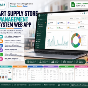
- Art Supply Store Management System Web App — a full multi-user system with billing and inventory when a workbook is no longer enough.
- DIY Home Improvement Stores KPI Dashboard in Excel — the monthly traffic-light scorecard format, for target tracking rather than analysis.
- Craft Winery and Vineyard Dashboard in Excel and Garden Centers KPI Dashboard in Excel for neighbouring specialty-retail niches.
Also available as: a Power BI build — see the DIY Craft Marketplaces Dashboard in Power BI. Browse the whole Excel Dashboard Templates range, or the wider KPI Dashboard Templates collection if you want targets and traffic lights instead.
📖 Click here to read the Detailed Blog Post
🎥 Visit our YouTube channel for step-by-step video tutorials
👉 YouTube.com/@NextGenTemplates
Watch the step-by-step video Demo:
📅 Last updated: September 2026
Compatibility and Requirements
- Works in Microsoft Excel desktop (Excel 2016 or later, or Microsoft 365) on Windows and Mac. Excel for the web can view the file but cannot drive the slicers reliably.
- The Month, Product Category and Store Name slicers filter all five pages at once. Microsoft explains them in Use slicers to filter data.







Reviews
There are no reviews yet.