

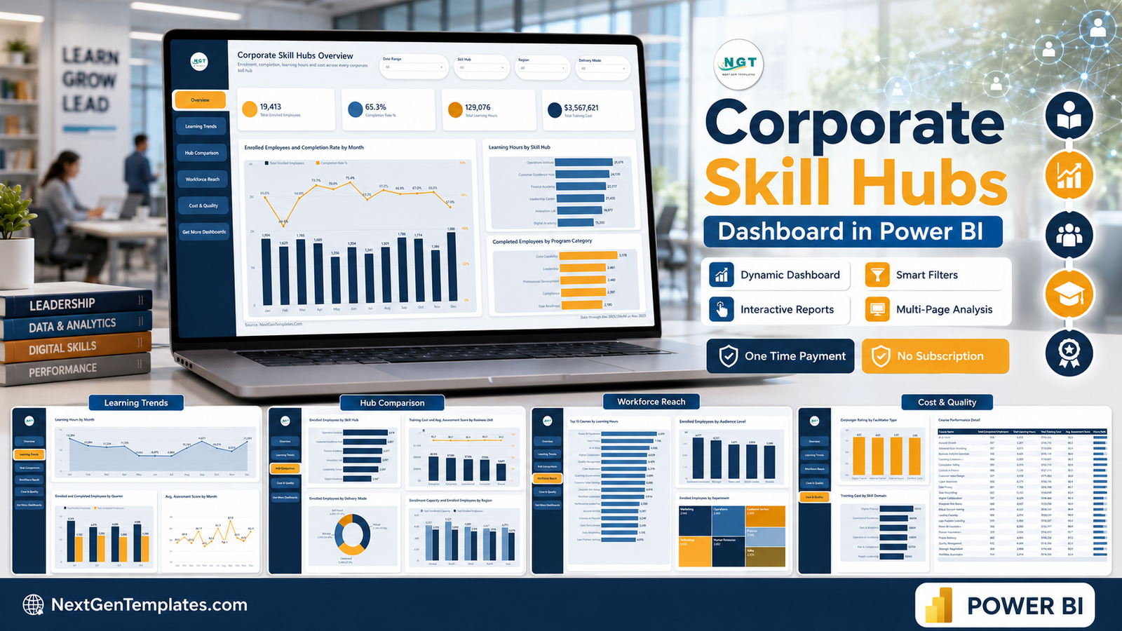

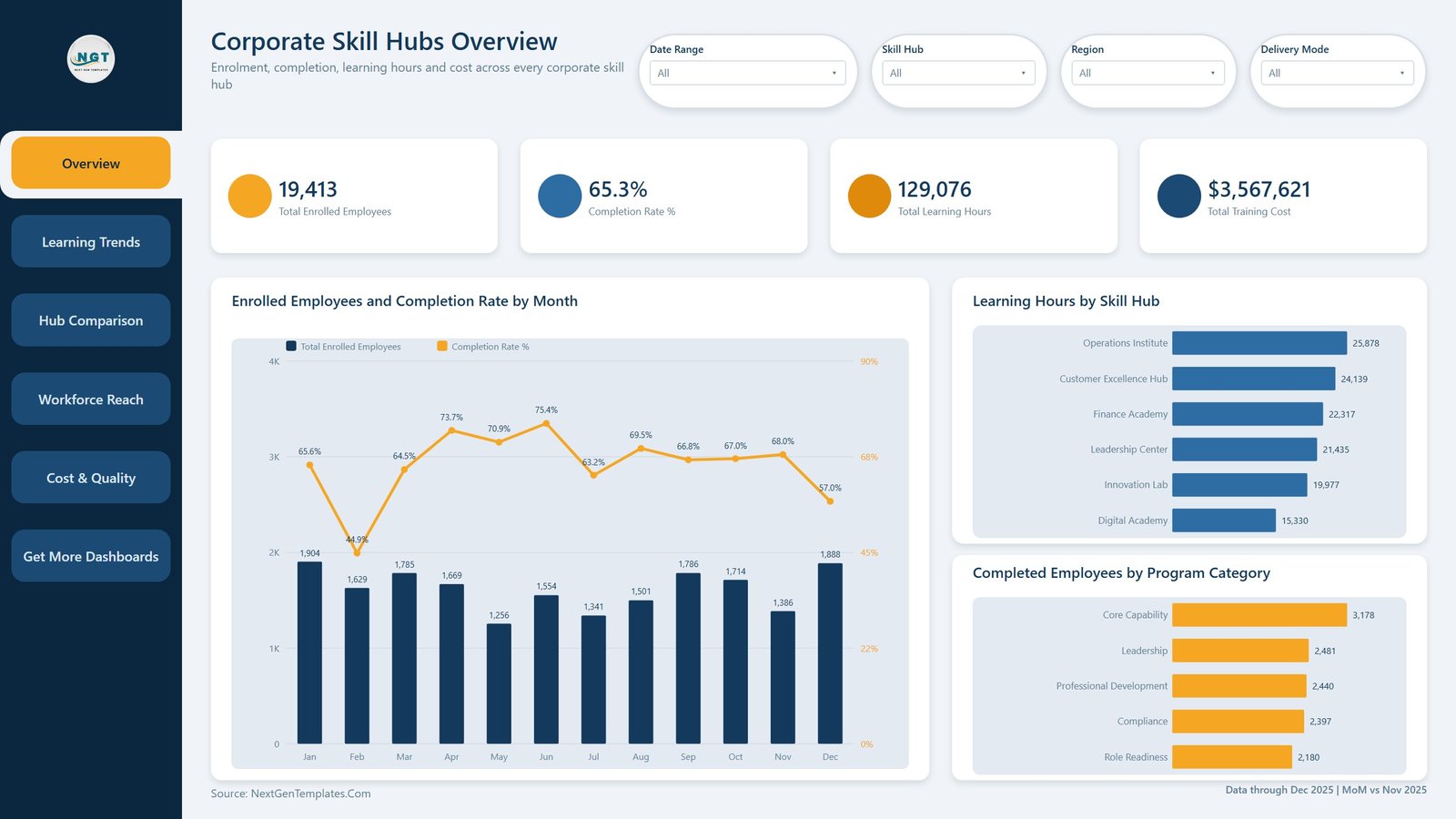
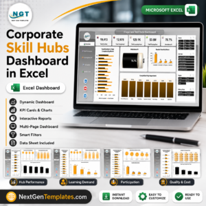
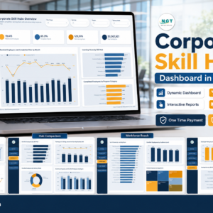
The Corporate Skill Hubs Dashboard in Power BI is a ready-to-open .pbix report that turns a flat register of training sessions into a six-page learning-and-development report. The sample file carries 500 sessions across 21 columns covering January to December 2025, and opens on four headline figures: 19,413 enrolled employees, a 65.3% completion rate, 129,076 learning hours and $3,567,621 of training cost. Six skill hubs, seven departments, five regions, 24 courses and four delivery modes are already modelled. Download it, open it in the free Power BI Desktop, point the query at your own export and every page redraws. One payment, no subscription, and support if anything does not work as described.
Key Features of the Corporate Skill Hubs Dashboard in Power BI
- Six report pages – Overview, Learning Trends, Hub Comparison, Workforce Reach, Cost & Quality and a Get More Dashboards page, all laid out at 1280 x 720 and fitted to the window.
- A left navigation rail on every page – buttons jump straight between the five analysis pages, so nobody has to hunt for the page tabs.
- Four slicers per page, tuned to that page – Date Range, Skill Hub and Region are constant; the fourth changes to Delivery Mode, Program Category, Business Unit, Department or Skill Domain depending on the question the page answers.
- A hidden Details drillthrough page bound on 11 fields – Skill Hub, Business Unit, Department, Region, Delivery Mode, Program Category, Skill Domain, Course Name, Audience Level, Facilitator Type and Status. Right-click any bar and you land on the session records behind it.
- Two hidden 280 x 360 tooltip pages – hovering a category or a quarter shows three cards plus a small chart instead of a bare number.
- Eleven measures drive the visuals – Total Enrolled Employees, Total Completed Employees, Total Enrollment Capacity, Total Learning Hours, Total Training Cost, Completion Rate %, Avg. Assessment Score, Avg. Manager Rating, Sessions, Hours Rank and a Report Context card.
- 500 rows of realistic sample data in the bundled
Data.xlsx, so the report is populated the second it opens. - A user manual PDF inside the ZIP that walks through swapping the data source and re-publishing.
What’s Inside the Corporate Skill Hubs Dashboard in Power BI
Overview. Four KPI cards, then Enrolled Employees and Completion Rate by Month as a column-and-line combo, Learning Hours by Skill Hub and Completed Employees by Program Category as bar charts. In the sample the Operations Institute leads on 25,878 learning hours and Core Capability is the biggest completing category at 3,178 employees.
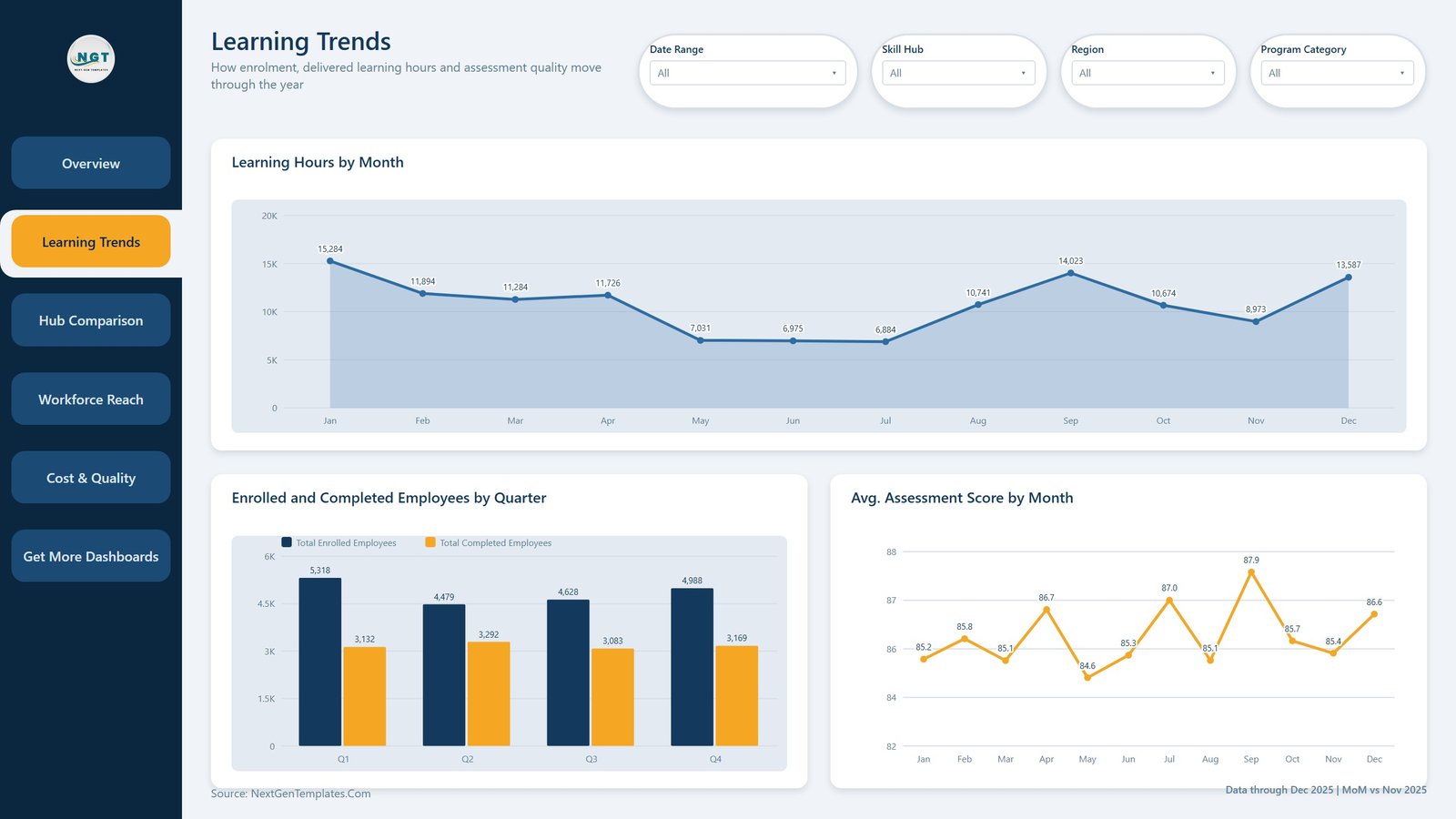
Learning Trends. Learning Hours by Month as an area chart, Enrolled and Completed Employees by Quarter as a clustered column, and Avg. Assessment Score by Month as a line that holds between 84.6 and 87.9 across the year.
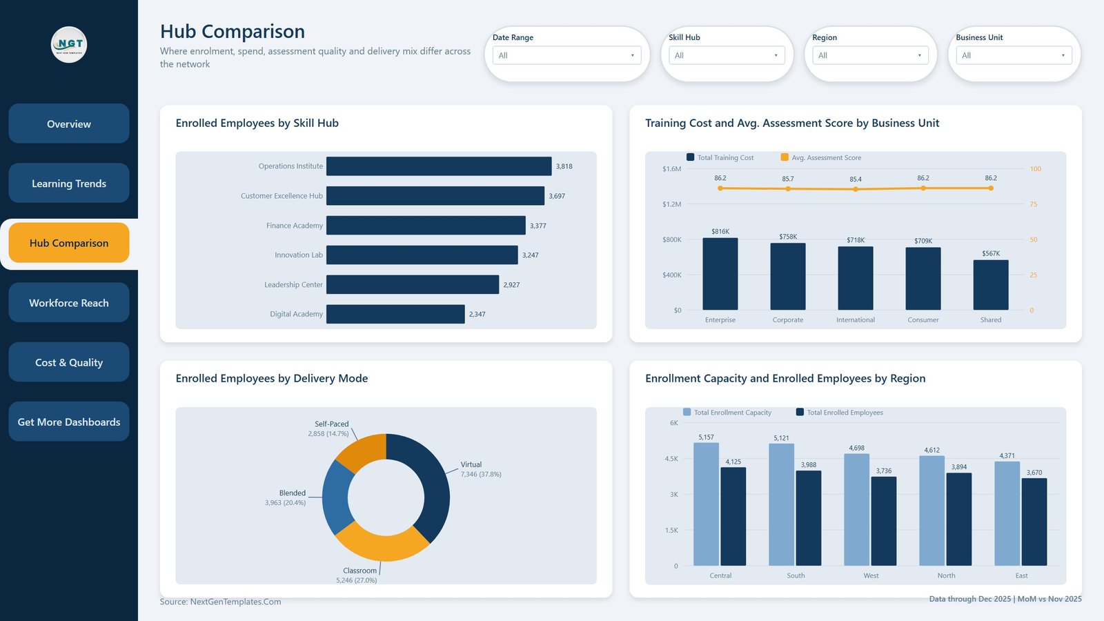
Hub Comparison. Enrolled Employees by Skill Hub, Training Cost and Avg. Assessment Score by Business Unit (cost as columns, score as a line on a second axis), Enrolled Employees by Delivery Mode as a donut – Virtual 37.8%, Classroom 27.0%, Blended 20.4%, Self-Paced 14.7% – and Enrollment Capacity and Enrolled Employees by Region so you can see unfilled seats.
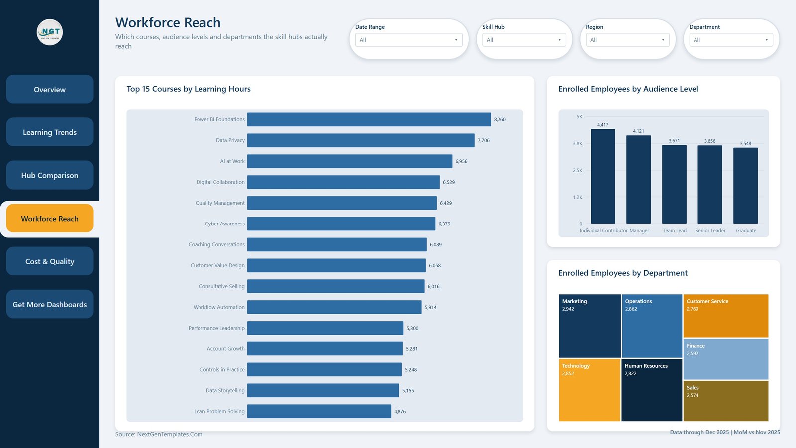
Workforce Reach. Top 15 Courses by Learning Hours, Enrolled Employees by Audience Level across five levels, and Enrolled Employees by Department as a treemap over all seven departments.
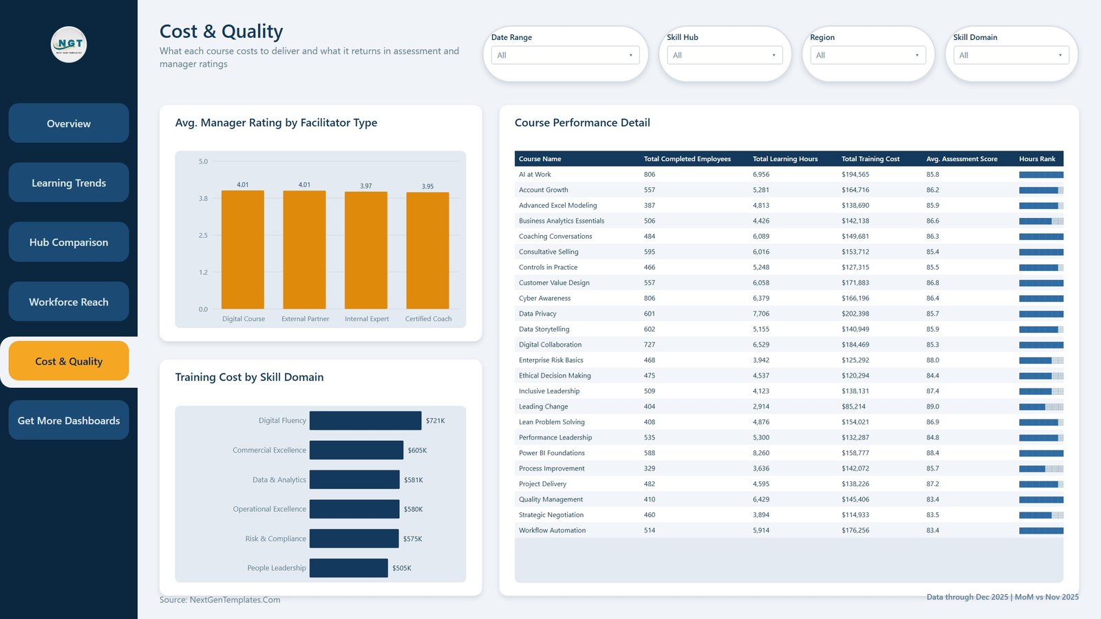
Cost & Quality. Avg. Manager Rating by Facilitator Type, Training Cost by Skill Domain, and a Course Performance Detail table listing every course with completed employees, learning hours, training cost, average assessment score and a data-bar Hours Rank column.
Get More Dashboards. A closing page of NextGenTemplates links and contact details. It ships as part of the file; hide it in seconds if you would rather it did not.
Corporate Skill Hubs Dashboard in Power BI vs. Tableau vs. a Paid LMS Analytics Add-On – Where This Fits
| This Power BI template | Tableau / Qlik build | LMS analytics add-on (Docebo, Cornerstone tier) | |
|---|---|---|---|
| Cost | One payment of $17.99 | Tableau Creator from $75/user/month | Typically $3,000+/year on top of the LMS |
| Platform | Power BI Desktop (free) or Power BI Service | Tableau Desktop or Qlik Sense | Vendor portal only |
| Setup time | Under an hour – swap the Excel source and refresh | Days to design the model and the sheets | Weeks, plus vendor onboarding |
| Real-time team collaboration | Via Power BI Service once you publish | Via Tableau Server / Cloud | Built in |
| Mobile access | Power BI mobile app | Tableau mobile app | Vendor app |
| Customizable fields | Full – it is your model, your DAX, your layout | Full | Limited to what the vendor exposes |
| Share with link | Yes, after publishing to the Service | Yes, on Server/Cloud | Yes |
| Year-1 cost at 5 users | $17.99 once | Around $4,500 | $3,000 and up |
| Drillthrough to session records | Yes – Details page bound on 11 fields | Build it yourself | Varies by plan |
| Connects to your LMS or HRIS | No – it reads an Excel or CSV export | Only if you build the connector | Yes, it is the LMS |
Who This Template Is For – and Who It’s Not For
A good fit if you run a corporate academy, a group of internal skill hubs or a training function, you can export session-level data to Excel or CSV, and you want a report that shows enrolment, completion, hours, cost and quality side by side without paying for another analytics seat. It also suits Power BI learners who want a finished, well-structured model to take apart.
Not a good fit if you need a live connection into your LMS or HRIS – this template reads a file you export, and refreshing means refreshing that file. It is not a learning management system: it does not enrol anyone, host content or issue certificates. It does not store employee-level personal data – the grain is a training session, not a person – so if you need per-employee learning records you will have to extend the model yourself. And if your organisation runs fewer than a handful of courses a year, a spreadsheet will serve you better than a Power BI model.
How to Use the Corporate Skill Hubs Dashboard in Power BI
- Unzip the download. You get the
.pbix, the sampleData.xlsxand a user manual PDF. - Open the
.pbixin Power BI Desktop, which Microsoft gives away free. - Click through the five analysis pages with the sample data still loaded so you can see what each visual is meant to show.
- Open
Data.xlsxand replace the 500 sample rows with your own, keeping the 21 column headers exactly as they are. - In Power BI, use Transform data to point the query at your file, then Refresh. Every page, slicer and card redraws.
- Right-click a bar or a treemap tile and choose Drillthrough > Details to see the sessions behind the number.
- Publish to the Power BI Service if you want to share a link with the L&D team or the wider business.
Real-World Use Cases
Priya, L&D manager at a 4,000-person manufacturer. Her six academies each report enrolment in their own format. She standardises the export, drops it into the model, and the Hub Comparison page settles the quarterly “who is actually delivering” argument in one screen.
Daniel, finance business partner for HR. He needs training spend by business unit before budget season. Cost & Quality gives him spend by skill domain and the Course Performance Detail table gives him cost per course, both exportable.
Anika, capability lead in a shared-services centre. She uses Workforce Reach to check that graduates and individual contributors are not being crowded out of the popular courses by managers, then drills through to the sessions to see which ones filled first.
Frequently Asked Questions
Does this connect to my LMS, HRIS or Workday?
No. The template reads an Excel or CSV export. There is no LMS, HRIS or Workday connector in the file, and none is implied. If you want a live connection, you would add that query yourself in Power BI.
Do I need a paid Power BI licence?
Not to use it. Power BI Desktop is free from Microsoft and opens the file. A Power BI Pro licence is only needed if you want to publish and share it through the Power BI Service.
How is Completion Rate % calculated in the sample?
Completed employees divided by enrolled employees across every session in scope. In the sample that is 65.3%, because the 500 rows include 65 scheduled and 37 cancelled sessions that cannot have completions yet. Filter Status to Completed and the same measure reads 86.2%. Both are correct – they answer different questions – and you can change the measure to suit your definition.
Does it store employee names or personal data?
No. The sample data is fictional and the grain is a training session, not a person. There is no employee name, ID, email or any other personal identifier in the model.
Can I change the colours and add my logo?
Yes. The report uses a standard Power BI theme JSON and image resources, both of which you can swap. The NextGenTemplates logo on each page is an ordinary image visual you can replace with your own.
Are the assessment scores and manager ratings benchmarks?
No. They are sample values in the demonstration file and become whatever your own data says once you swap the source. Nothing in this template is a published industry benchmark or a recommendation about what a good score is.
What is the difference between this and your Corporate Skill Hubs KPI Dashboard?
This is the analytical dashboard – five pages of charts you slice and drill through. The Corporate Skill Hubs KPI Dashboard in Excel is a scorecard: a month picker, targets and traffic lights. Different products, and many teams use both.
About the Author
Built by PK – Microsoft Certified Professional with 15+ years of Excel, Google Sheets, and Power BI experience. Founder of NextGenTemplates, reaching 300K+ subscribers across YouTube channels. Every template is hand-built and tested before release.
Explore Related Templates
- Corporate Skill Hubs Dashboard in Excel – the same topic built with pivot tables and slicers, for teams that live in Excel.
- Learning & Development Dashboard in Power BI – a wider L&D view across the whole function.
- Corporate Universities Dashboard in Power BI – for organisations running a single internal university rather than several hubs.
- HR Analytics Dashboard in Power BI – headcount, attrition and hiring alongside your learning numbers.
- Browse the whole Power BI Dashboard category or the wider Power BI collection.
Get the Corporate Skill Hubs Dashboard in Power BI for $17.99 (regular $29.99). Instant download, lifetime access, free bug fixes, and help within 72 hours if anything does not work. A full walkthrough is on the blog: Corporate Skill Hubs Dashboard in Power BI.
Last updated: 26 August 2026.




Reviews
There are no reviews yet.