

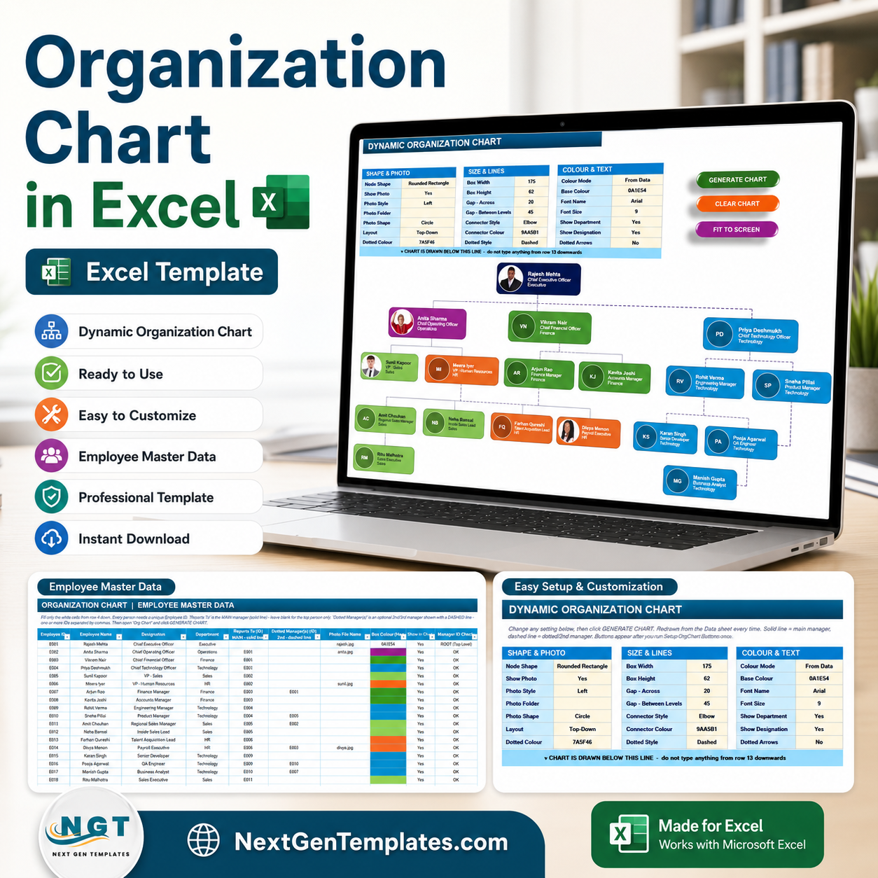
Organization Chart in Excel turns an 18-row employee master table into a dynamic org chart with photos, color-coded departments, solid reporting lines, and dashed dotted-manager links. It gives HR teams 13 chart styling controls, 3 VBA action buttons, and a Manager ID Check column so broken reporting chains are visible before the chart is generated. Join 8,400+ teams in 40+ countries using NextGenTemplates. One-time payment, no subscription, no per-user fees, and lifetime access.
Key Features of Organization Chart in Excel
- Employee master table – Store Employee ID, name, designation, department, reporting manager, dotted manager, photo file name, box color, show/hide status, and manager checks in one structured sheet.
- One-click VBA chart generation – Use Generate Chart, Clear Chart, and Fit to Screen buttons to rebuild the chart after every data change.
- Solid and dotted manager lines – Show the main manager with solid connectors and optional second-line or matrix managers with dashed connectors.
- Photo and initials support – Display employee photos when available, or use initials inside circular placeholders when a photo file is not provided.
- Editable design controls – Set node shape, box width, height, horizontal gap, level gap, connector type, connector color, dotted color, font, and visibility options from the control panel.
- Built-in error check – The Manager ID Check column flags ROOT and OK states so the top person and reporting relationships stay clean.
What’s Inside the Organization Chart in Excel
Employee Master Data Sheet
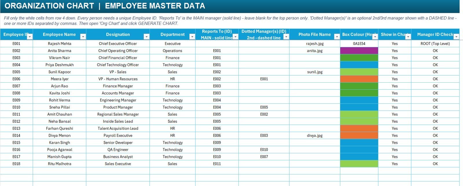
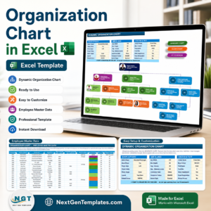
The data sheet is where the organization structure is maintained. Each person needs a unique Employee ID. The Reports To column creates the main reporting hierarchy, while Dotted Manager(s) creates optional matrix relationships shown with dashed lines. You can also control whether a person appears in the chart, assign a department color, and add a photo file name.
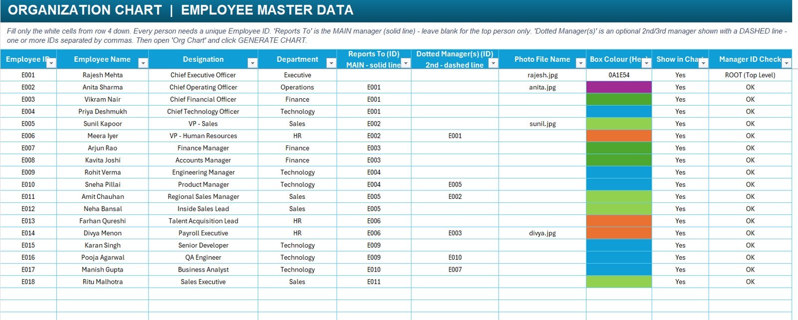
Employee Master Data sheet
Dynamic Organization Chart Sheet
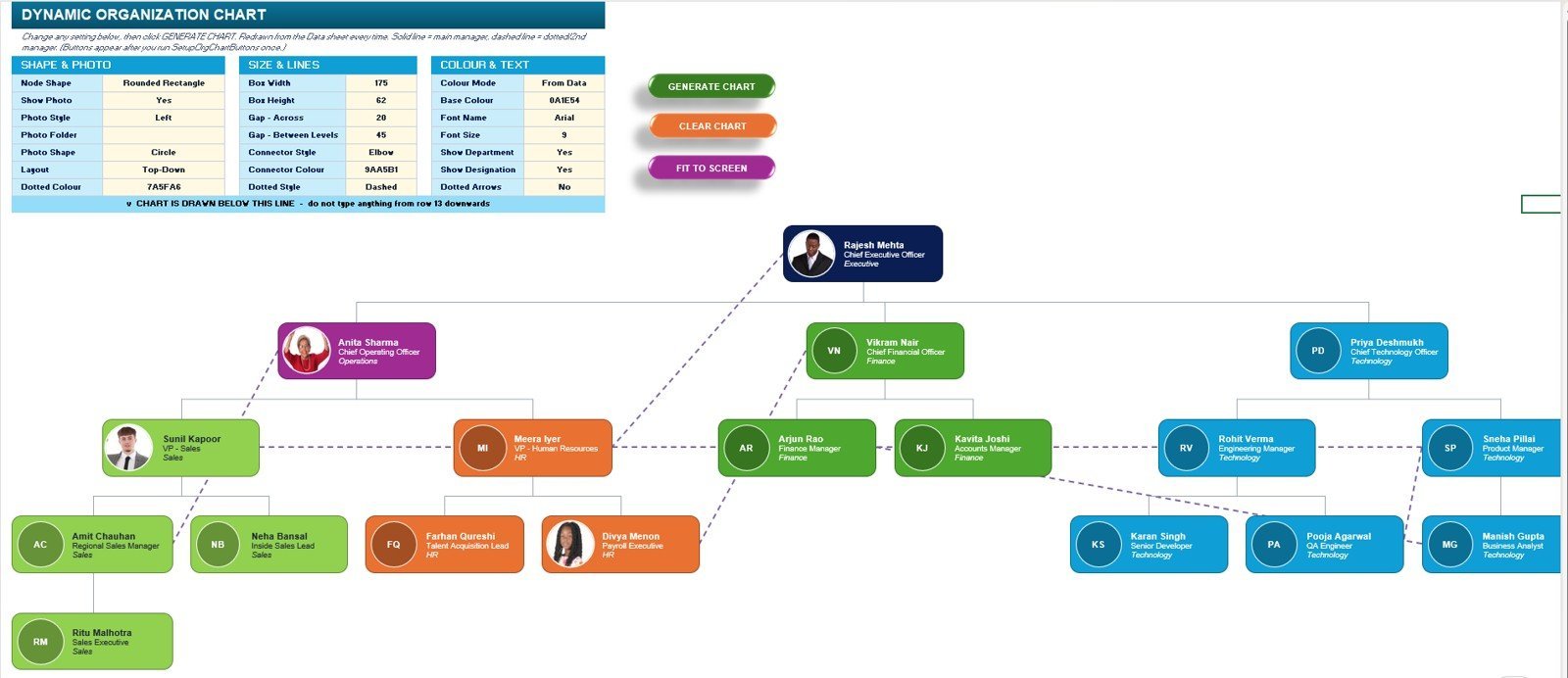
The chart sheet includes the styling control panel and the generated hierarchy. It supports top-down layout, rounded rectangle nodes, optional photos, department colors, solid manager lines, dashed dotted-manager lines, and a Fit to Screen command for large charts.
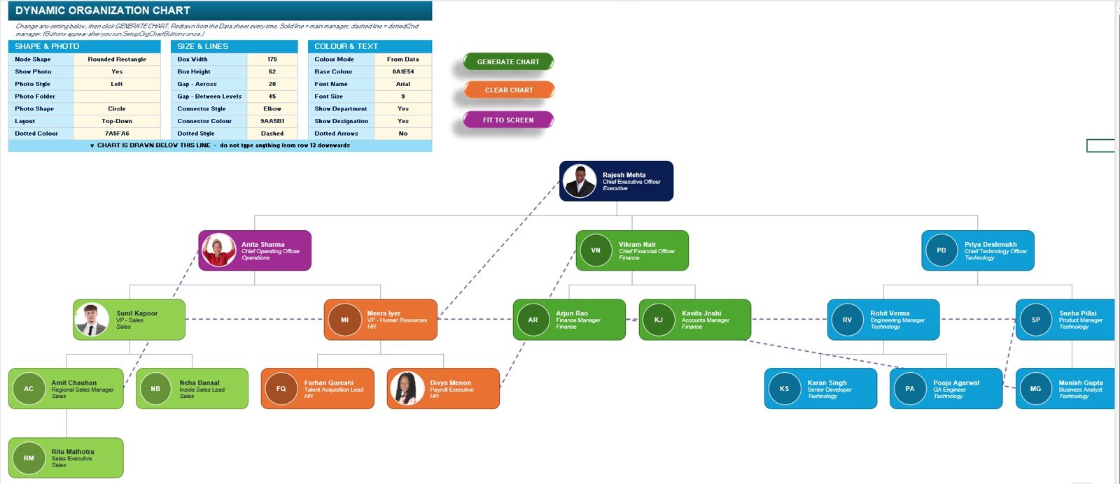
Dynamic Organization Chart sheet
Organization Chart in Excel vs. Google Sheets vs. Paid HR SaaS – Where This Fits
| Feature | Organization Chart in Excel | Google Sheets alternative | Paid HR SaaS or org chart tool |
|---|---|---|---|
| Cost | $7.99 one-time | Low software cost, manual build | Recurring subscription |
| Platform | Microsoft Excel desktop | Browser spreadsheet | Vendor-hosted web app |
| Setup time | Enter employee data and click Generate Chart | Build formulas, drawings, or scripts manually | Import, configure roles, and train users |
| Real-time team collaboration | Best with one owner editing the file | Native collaboration | Usually included |
| Mobile access | View only; VBA needs desktop Excel | Good browser and mobile access | Usually included |
| Customizable fields | Editable employee table and formatting controls | Editable but manual | Plan and permission dependent |
| Share with link | Possible through OneDrive or SharePoint | Native sharing | Role-based sharing |
| Year-1 cost at 5 users | $7.99 plus existing Excel license | Software cost plus build time | Often hundreds or thousands per year |
| Dotted-line manager support | Built into the data model | Requires manual connector logic | Depends on vendor |
| Offline use | Yes, with desktop Excel | Limited | Usually no |
Who This Template Is For – and Who It’s Not For
Best fit: HR managers, founders, office administrators, department heads, consultants, and Excel power users who need a clear org chart without paying for a full HR system. It is especially useful for small and mid-sized teams with matrix reporting, dotted-line managers, or frequent reporting changes.
Not a fit: teams that need live employee self-service, role-based HR permissions, automatic sync from HRIS systems, browser-only editing, or several users editing the chart at the same time. For that workflow, a dedicated HR SaaS or web app will be a better fit.
How to Use the Organization Chart in Excel
- Open the workbook in Microsoft Excel desktop.
- Go to the Employee Master Data sheet and replace the sample employees with your own employee IDs, names, designations, departments, reporting IDs, and optional dotted manager IDs.
- Add photo file names if you want photos to appear in nodes, or leave them blank to use initials.
- Review the Manager ID Check column and fix any missing or invalid manager IDs.
- Open the Org Chart sheet and set the layout, node size, gaps, colors, font, photo options, and connector style.
- Click Generate Chart. Use Clear Chart before rebuilding, and Fit to Screen when the hierarchy becomes wide.
Real-World Use Cases
Nisha, HR manager at a 90-person services company: updates new hires and resignations in the master table, clicks Generate Chart, and shares a fresh reporting structure before every monthly leadership review.
Arjun, operations head in a matrix team: uses the dotted manager column to show project reporting lines that do not fit into the main hierarchy, making cross-functional accountability easier to explain.
Meera, Excel consultant: customizes node colors, photo shape, connector style, and layout spacing for client-ready org charts without redrawing shapes by hand.
Frequently Asked Questions
Does this Organization Chart in Excel require macros?
Yes. The Generate Chart, Clear Chart, and Fit to Screen buttons use VBA, so the workbook should be opened in desktop Excel with macros enabled.
Can I add more employees?
Yes. Add new rows in the Employee Master Data sheet, give each person a unique Employee ID, and assign the correct Reports To ID. The chart can be regenerated after changes.
Can I show dotted-line managers?
Yes. Use the Dotted Manager(s) column for second-line, project, or matrix managers. Multiple dotted manager IDs can be entered with comma separation.
Can I use employee photos?
Yes. The template supports photo file names and photo shape settings. If no photo is available, the chart can display employee initials instead.
Can I change the colors and sizes?
Yes. The control panel includes box size, gap, connector color, dotted connector color, base color, font settings, and department/designation visibility options.
Is this a replacement for HR software?
No. It is an Excel-based visualization and reporting-structure tool. It does not handle payroll, permissions, employee self-service, or HRIS synchronization.
About the Author
Built by PK – Microsoft Certified Professional with 15+ years of Excel, Google Sheets, and Power BI experience. Founder of NextGenTemplates, reaching 300K+ subscribers across YouTube channels. Every template is hand-built and tested before release.
Explore Related Templates
Pair this template with the Employee Master and Record Data Entry System in Excel for structured employee records, the Payroll Data Entry System in Excel for salary logs, and the Leave Management System for HR leave tracking. For wider HR reporting, explore the HR Director Toolkit. You can also browse Excel Charts and Visualization templates and Excel VBA Tools.
Ready to create a clean reporting structure in Excel? Use the Organization Chart in Excel template to turn employee data into a visual hierarchy in minutes.
Watch the step-by-step video Demo:
Last updated: August 2026





Reviews
There are no reviews yet.