

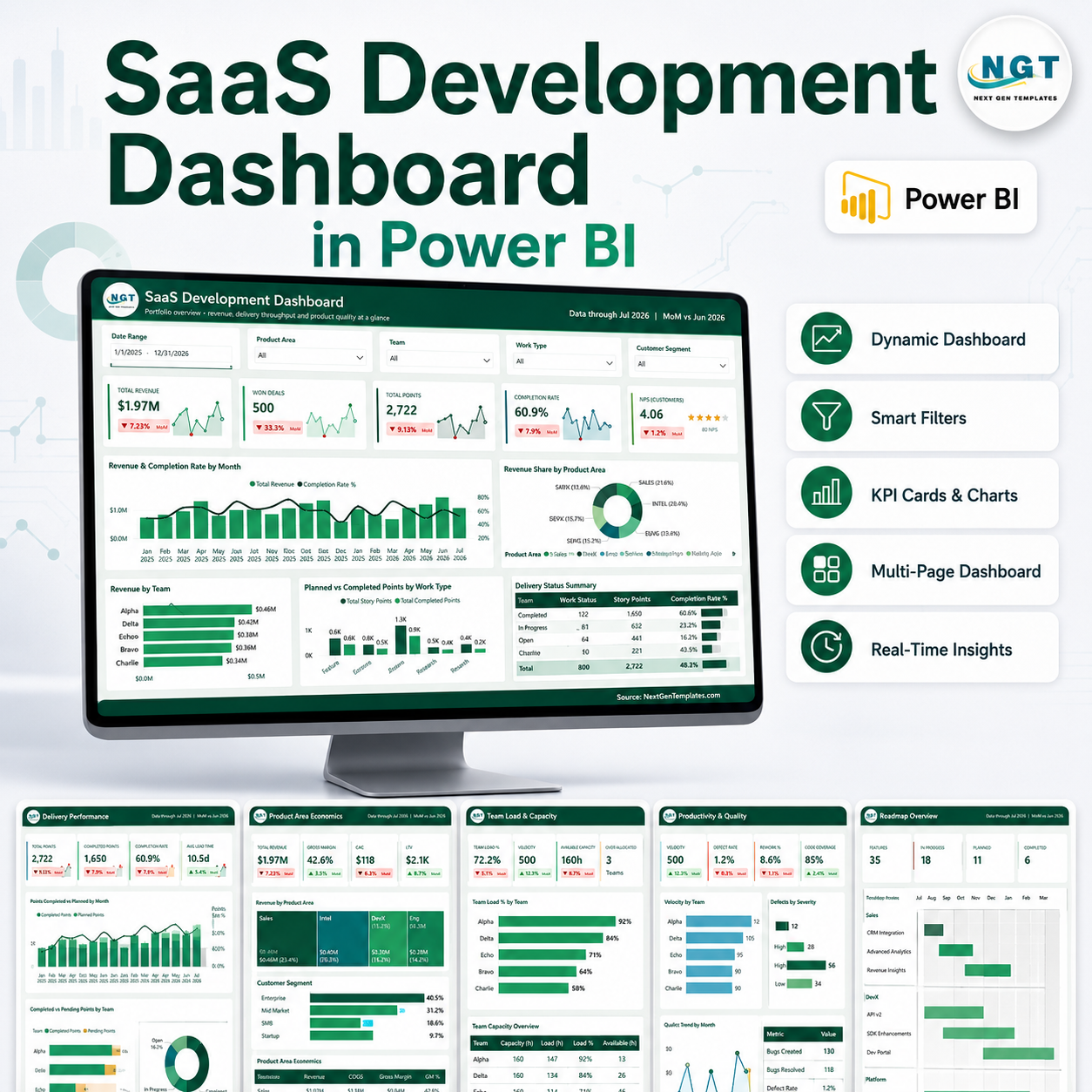
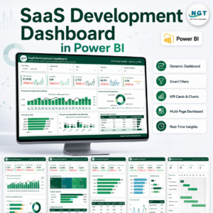
SaaS Development Dashboard in Power BI gives software leaders a ready-to-use PBIX report with 5 Power BI pages, 5 executive cards, 20 chart views, and slicers for fast filtering. Track Total Revenue, Work Items, Story Points, Completion Rate, Avg Satisfaction, sprint delivery, product economics, reliability, developer hours, and team capacity in one editable file. Built by PK for a 300K+ subscriber learning audience, this is a one-time $17.99 download with no recurring SaaS analytics subscription. Open it in Power BI Desktop, replace the sample source, refresh, and review product development performance with confidence.

Key Features of SaaS Development Dashboard in Power BI
- 5 Power BI report pages: Overview, Delivery Performance, Product Area Economics, Quality and Reliability, and Team Load and Capacity.
- 5 executive cards: Total Revenue, Work Items, Story Points, Completion Rate, and Avg Satisfaction.
- 20 chart views: Analyze revenue, completion, product areas, teams, sprints, work types, bugs, defects, hours, and delivery cost.
- Multiple slicers: Filter the dashboard quickly by available development and business dimensions.
- Editable PBIX file: Customize fields, measures, visuals, slicers, colors, and data connections in Power BI Desktop.
What’s Inside the SaaS Development Dashboard in Power BI
1. Overview Page
The Overview page gives product, engineering, and SaaS leadership a high-level view of revenue and delivery health. Cards show Total Revenue, Work Items, Story Points, Completion Rate, and Avg Satisfaction.
Revenue and Completion Rate by Month: This chart connects monthly commercial performance with delivery execution. It helps leaders see whether revenue growth is moving with reliable completion performance.
Revenue Share by Product Area: This visual shows how each product area contributes to total revenue. It helps teams identify the modules or product lines carrying the strongest commercial weight.
Revenue by Team: This chart compares revenue contribution across teams. It supports discussions about ownership, roadmap focus, and team-level business impact.
Planned and Completed Points by Work Type: This chart compares planned scope with completed delivery across feature, bug, enhancement, and other work categories. It helps spot work types where execution differs from plan.
Delivery Status Summary by Status: This view summarizes work items by status. It makes it easier to review completed, backlog, in-progress, blocked, or delayed work during operating reviews.
2. Delivery Performance
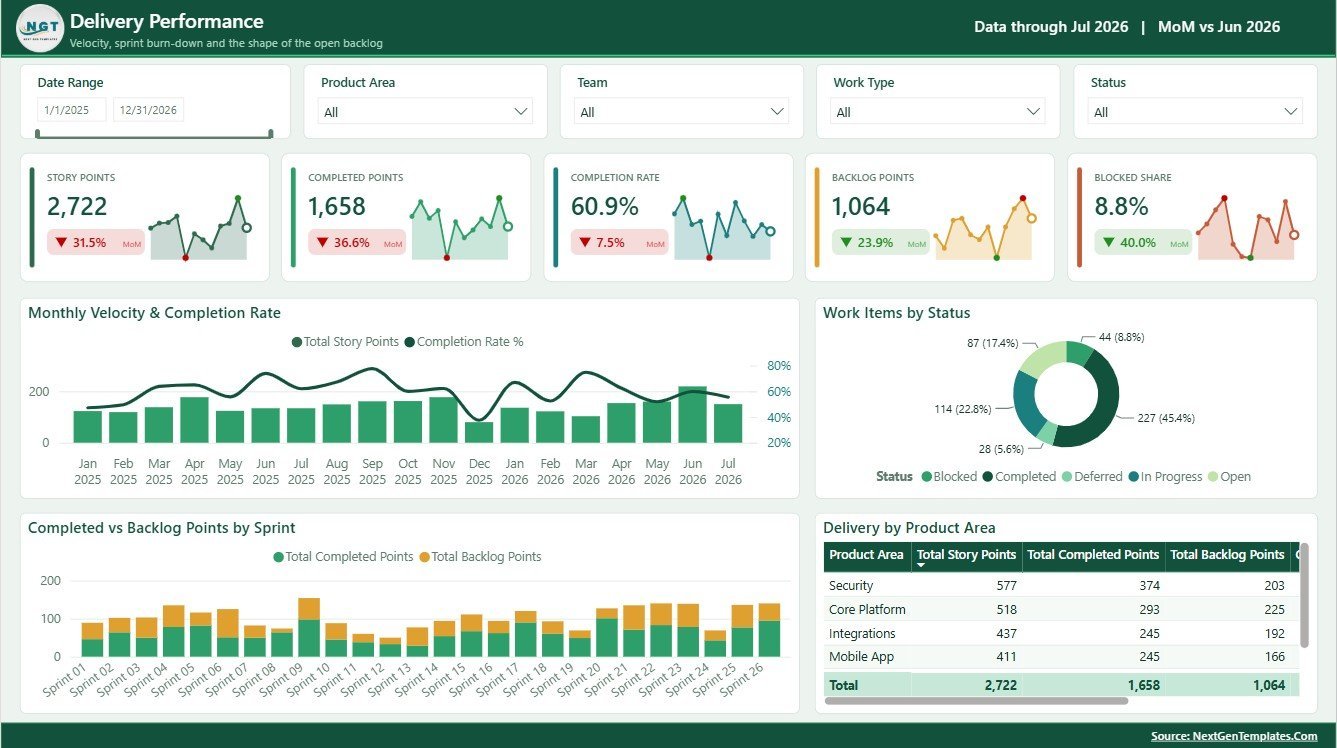
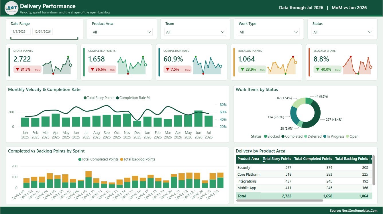
The Delivery Performance page focuses on velocity, status, sprint output, backlog, and product-area execution.
Monthly Velocity and Completion Rate by Month: This chart shows story point movement and completion performance over time. It helps engineering managers separate true throughput from unfinished carryover.
Work Items by Status: This visual counts work items across delivery states. It quickly shows whether work is concentrated in backlog, active execution, review, or completed status.
Completed and Backlog Points by Sprint: This chart compares completed effort with remaining or planned backlog by sprint. It helps sprint reviews focus on delivery balance and scope pressure.
Delivery Metrics by Product Area: This view compares delivery performance across product areas. It helps product leaders identify where execution is healthy and where deeper planning is needed.
3. Product Area Economics
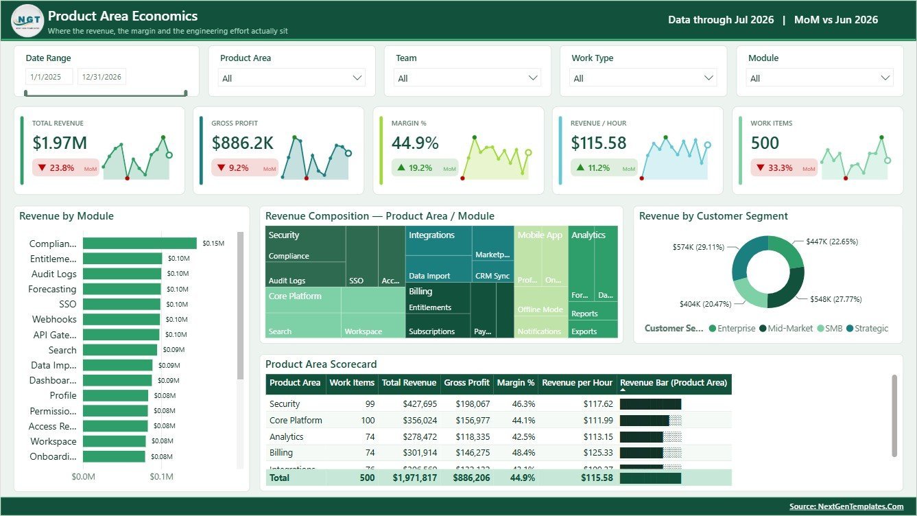
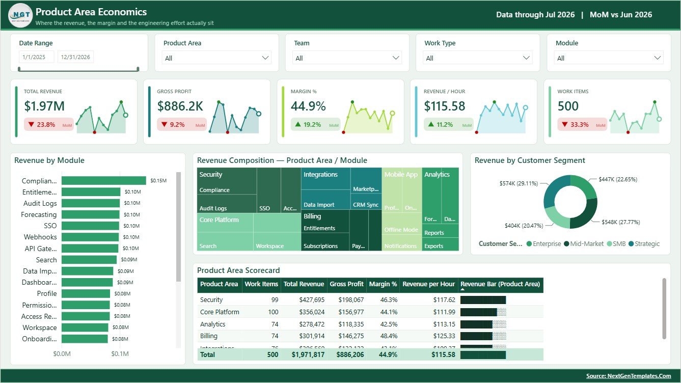
The Product Area Economics page connects revenue, modules, customer segments, and product-area metrics.
Revenue by Module: This chart ranks modules by generated revenue. It helps identify which functional areas deserve more investment or commercial attention.
Revenue Composition by Product Area and Module: This visual breaks revenue into product-area and module combinations. It is useful for portfolio reviews and roadmap prioritization.
Revenue by Customer Segment: This chart shows revenue contribution by customer segment. It helps SaaS teams compare enterprise, SMB, mid-market, or other segments in one view.
Product Area Metrics by Product Area: This table-style view summarizes key measures by product area. It helps connect financial results with delivery and product ownership.
4. Quality and Reliability
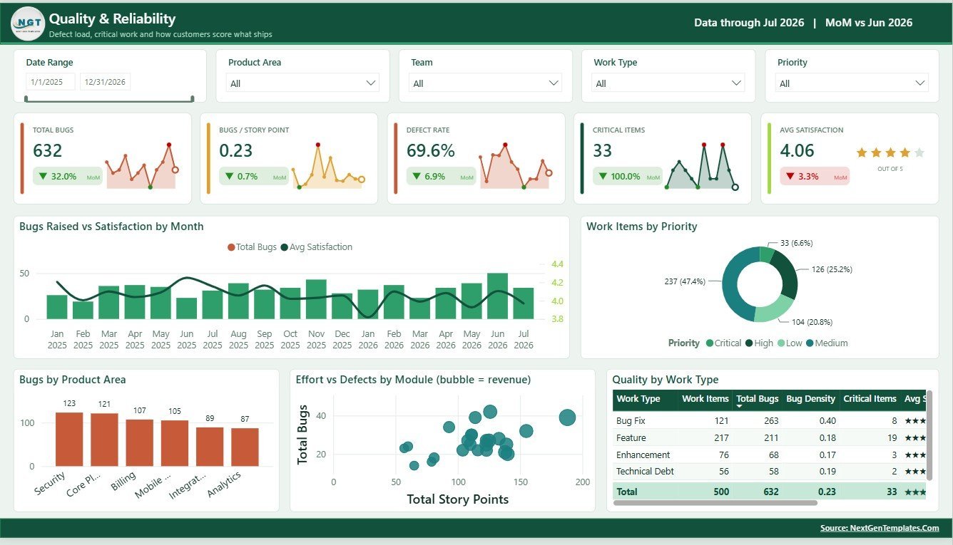
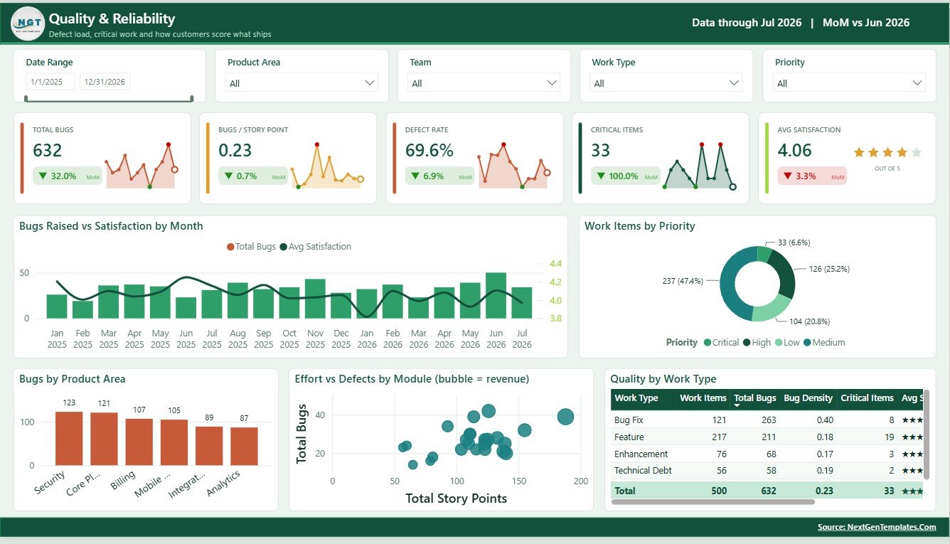
The Quality and Reliability page helps teams connect bugs, satisfaction, priorities, effort, defects, and modules.
Bugs Raised and Satisfaction by Month: This chart compares defect volume with satisfaction trends. It helps show whether quality issues are affecting customer sentiment.
Work Items by Priority: This visual shows how work is distributed across priority levels. It supports sprint planning, escalation review, and risk management.
Bugs by Product Area: This chart identifies product areas with the highest bug counts. It helps prioritize technical debt, testing, and stabilization work.
Effort and Defects by Module: This chart compares delivery effort with defect volume at the module level. It helps identify modules that consume high effort or create reliability concerns.
Quality Metrics by Work Type: This view summarizes quality performance by work category. It helps teams compare features, bugs, enhancements, and maintenance items.
5. Team Load and Capacity
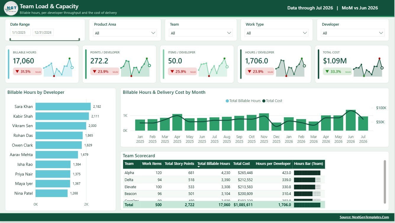
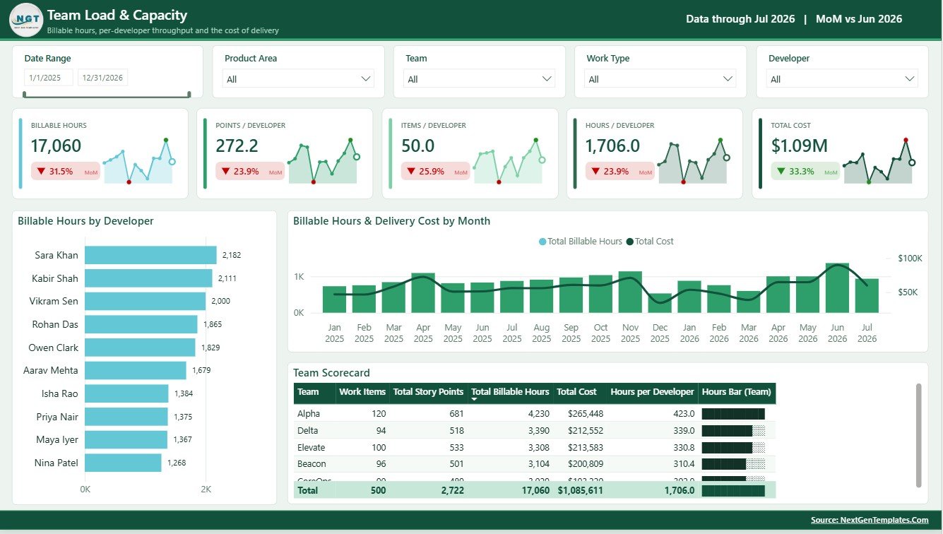
The Team Load and Capacity page focuses on developer effort, billable work, delivery cost, and team-level metrics.
Billable Hours by Developer: This chart compares billable hours across developers. It helps managers review workload balance, utilization, and capacity pressure.
Billable Hours and Delivery Cost by Month: This chart connects monthly hours with delivery cost. It helps leadership understand whether cost growth matches delivery output.
Team Metrics by Team: This view summarizes workload and performance by team. It supports capacity planning, sprint planning, and team-level operating reviews.
SaaS Development Dashboard in Power BI vs. Tableau vs. Paid CRM/SaaS – Where This Fits
| Feature | This Power BI dashboard | Tableau alternative | Paid SaaS alternative |
|---|---|---|---|
| Cost | $17.99 one-time sale price | Requires Tableau access and dashboard build time | Recurring subscription or implementation fee |
| Platform | Power BI Desktop and Power BI Service | Tableau Desktop or Tableau Cloud | Vendor cloud system |
| Setup time | Download, connect data, refresh, and customize | Build model, calculations, and visuals manually | Onboarding, integration, and user setup |
| Custom fields | Edit model, measures, visuals, and slicers | Editable with Tableau skills | Limited by vendor configuration |
| SaaS delivery fit | Best for reusable product, sprint, quality, and revenue reporting | Best for Tableau-standardized analytics teams | Best for live ticketing, CRM, or engineering workflow operations |
Who This Template Is For – and Who It’s Not For
This template is for SaaS founders, product managers, engineering managers, delivery leads, revenue operations analysts, and BI developers who need a repeatable report for development performance, product economics, quality, and team capacity.
It is not a Jira replacement, CRM system, billing platform, ticketing system, customer success tool, or live product analytics SDK. Use it when your development and revenue data can be prepared for Power BI reporting.
How to Use the SaaS Development Dashboard in Power BI
- Download and unzip the product package.
- Open the PBIX file in Power BI Desktop.
- Review the sample pages, cards, charts, slicers, and data model.
- Replace or connect your own SaaS development data source.
- Refresh the report and validate cards, charts, and filters.
- Customize measures, visuals, labels, colors, and slicers as needed.
- Publish to Power BI Service if you want to share the report with your team.
Real-World Use Cases
Aarav, SaaS founder: reviews revenue, completion rate, satisfaction, and delivery status before the monthly investor update.
Nina, product operations lead: uses product area economics to compare modules, segments, and revenue contribution while planning roadmap priorities.
Daniel, engineering manager: reviews velocity, backlog points, bugs, defects, billable hours, and delivery cost during sprint retrospectives.
Frequently Asked Questions
What is included in the SaaS Development Dashboard in Power BI?
The PBIX report includes Overview, Delivery Performance, Product Area Economics, Quality and Reliability, and Team Load and Capacity pages with cards, charts, and slicers.
Can I connect my own SaaS development data?
Yes. You can replace the sample source or connect your own data in Power BI Desktop and refresh the report.
Do I need Power BI Desktop?
Yes. Open the PBIX file in Power BI Desktop, which is available from Microsoft.
Can I customize the dashboard?
Yes. You can edit visuals, data model fields, DAX measures, slicers, colors, and source connections.
Is this a live project management tool?
No. It is a reporting dashboard, not a workflow system. It can report on exported or connected project data.
Can I publish it online?
Yes, if you have the required Power BI account and sharing permissions, you can publish it to Power BI Service.
About the Author
Built by PK – Microsoft Certified Professional with 15+ years of Excel, Google Sheets, and Power BI experience. Founder of NextGenTemplates, reaching 300K+ subscribers across YouTube channels. Every template is hand-built and tested before release.
Explore Related Templates
- Rural Development Dashboard in Power BI
- Rural Development Dashboard in Excel
- Power BI templates
- Power BI dashboard templates
Download the SaaS Development Dashboard in Power BI to turn revenue, roadmap, sprint, quality, and capacity data into a clear Power BI reporting experience.
Last updated: August 8, 2026.












Reviews
There are no reviews yet.