

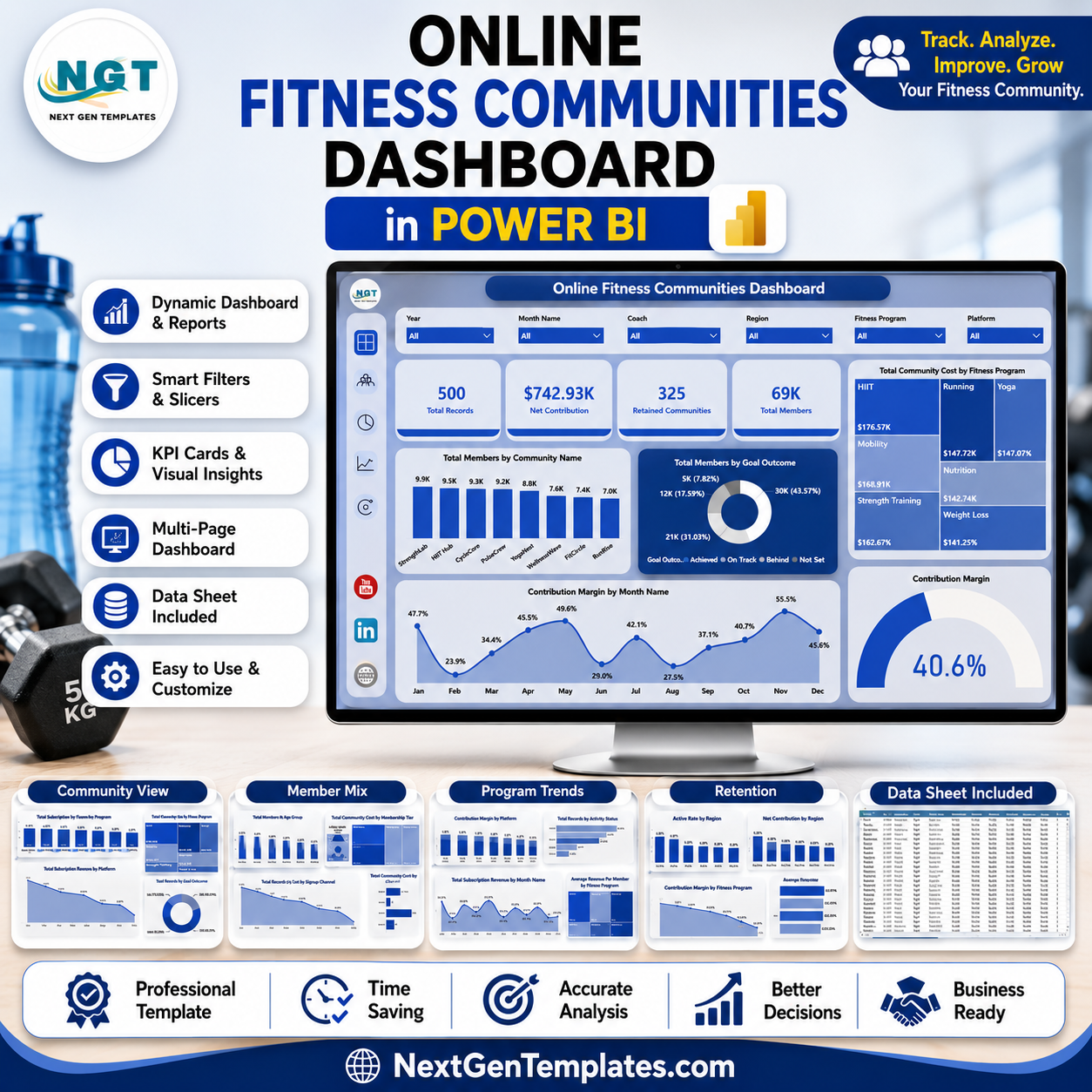

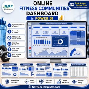
Online Fitness Communities Dashboard in Power BI helps fitness founders, online coaching teams, community managers, and subscription analysts review community growth, member mix, revenue, costs, contribution margin, and retention from one editable .pbix report. The template includes 5 Power BI pages, 4 high-level KPI cards, multiple slicers, and 18 ready analysis visuals. For a one-time price of $17.99, you can turn exported community data into a clean Power BI dashboard without building every page from scratch.
Instant download. One-time payment. No subscription. No per-user template fee. Lifetime access to the downloaded file.
Key Features of Online Fitness Communities Dashboard in Power BI
- 5 Power BI report pages for Overview, Community View, Member Mix, Program Trends, and Retention.
- 4 executive KPI cards showing Total Records, Net Contribution, Retained Communities, and Total Members.
- Multiple slicers to filter the report quickly by available community, program, member, platform, region, and status fields.
- Community performance analysis by community name, goal outcome, fitness program, and selected filters.
- Revenue reporting by community name, region, platform, and month.
- Member mix views by age group, membership tier, retention status, and signup channel.
- Program trend reporting for contribution margin, activity status, active communities, and subscription revenue.
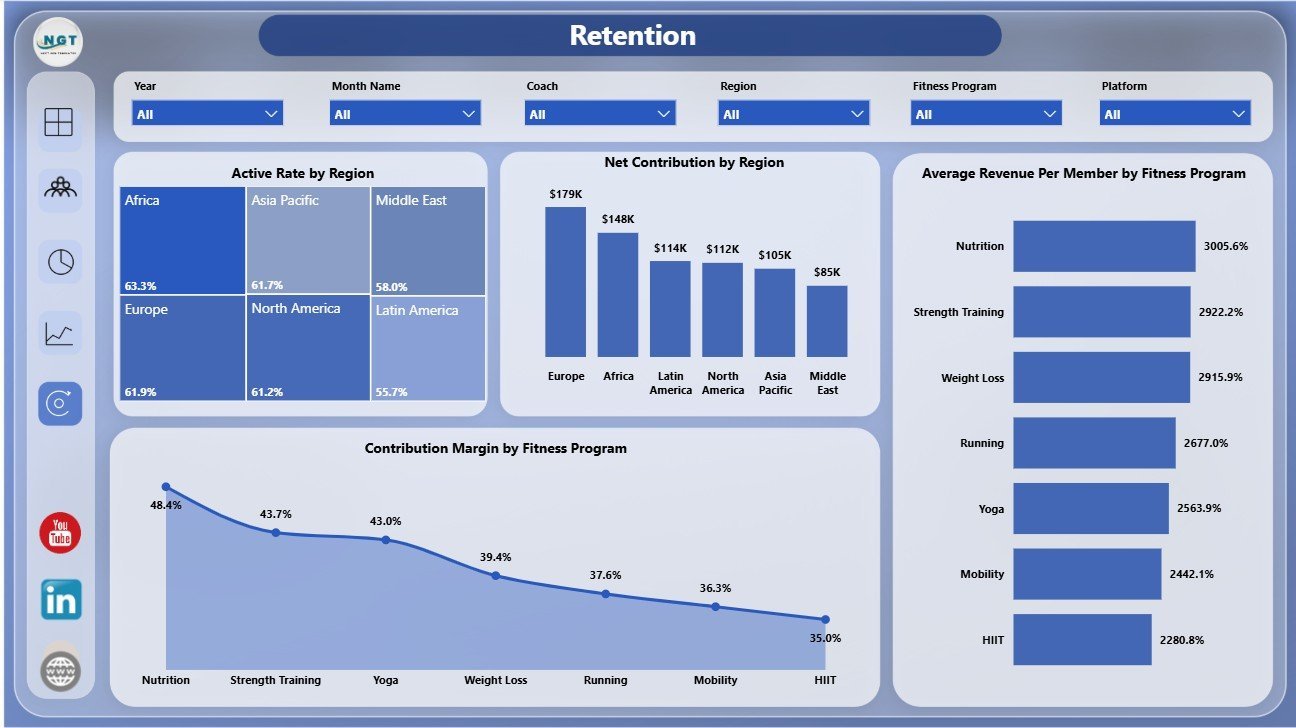
- Retention analysis by region and fitness program, including active rate, net contribution, average revenue per member, and contribution margin.
What’s Inside the Online Fitness Communities Dashboard in Power BI
1. Overview Page
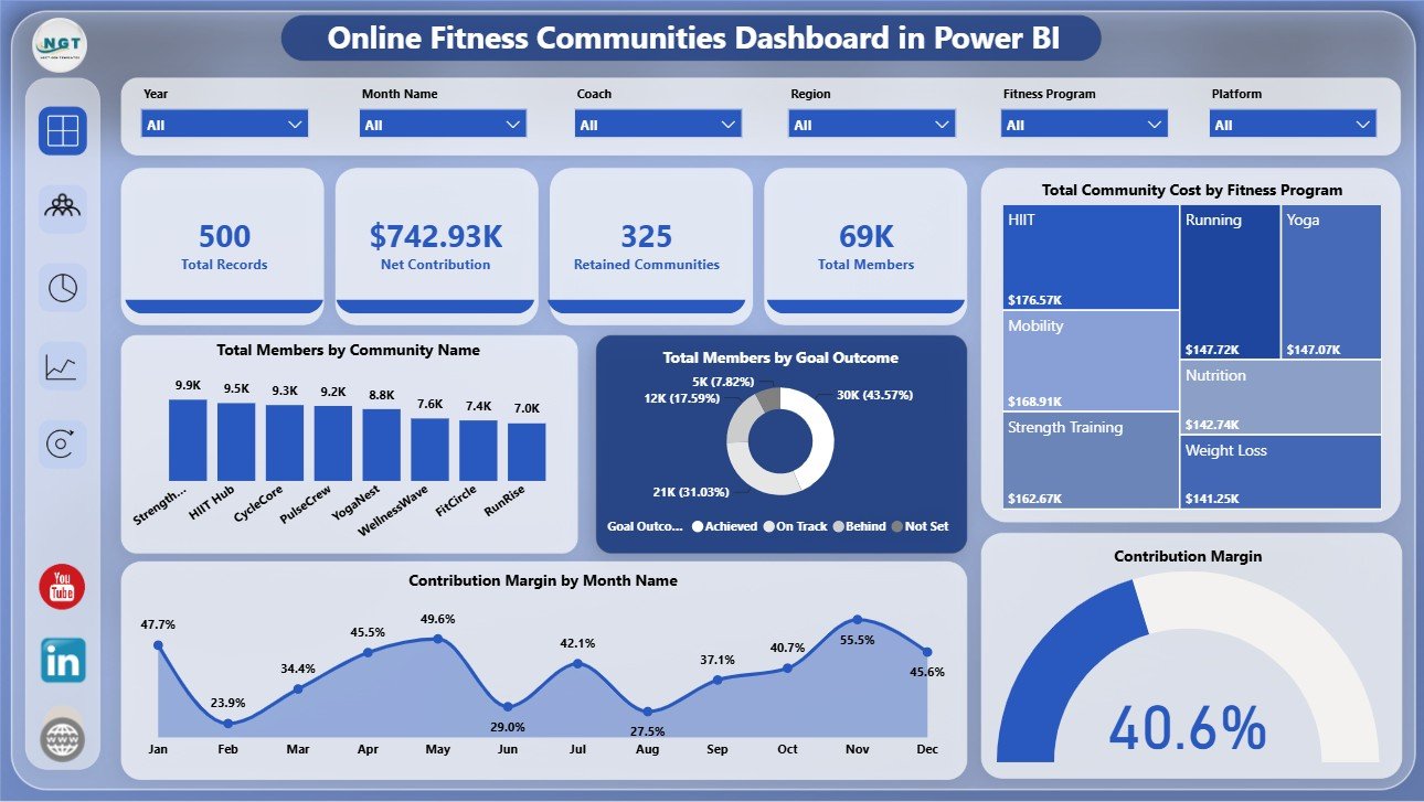
The Overview Page gives a top-level snapshot of online fitness community performance. KPI cards show Total Records, Net Contribution, Retained Communities, and Total Members, while slicers help users filter the report quickly during reviews.
Total Members by Community Name: This chart compares member volume across each online community. It helps managers identify the largest communities and spot smaller groups that may need growth attention.
Total Members by Goal Outcome: This chart groups members by their goal outcome. It helps teams understand whether programs are producing visible member progress.
Total Community Cost by Fitness Program: This visual highlights which fitness programs carry the highest community cost. It supports budget review and program profitability checks.
Contribution Margin by Month Name: This trend shows how contribution margin changes month by month. It helps managers detect seasonal changes, growth periods, and weaker months.
Contribution Margin by Selected Filters: This visual updates with slicer selections so users can review profitability for a chosen segment, program, platform, or region.
2. Community View
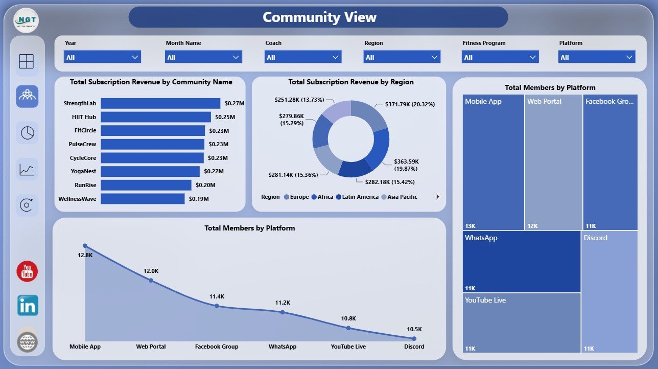
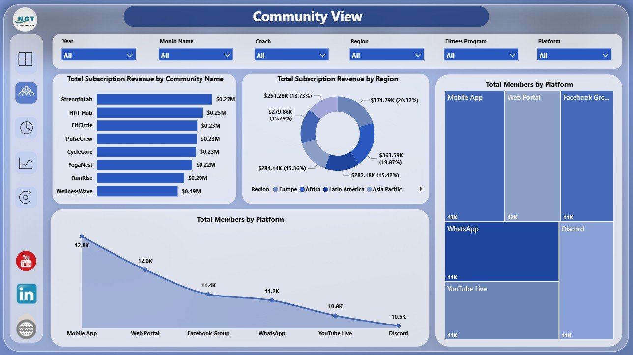
The Community View page focuses on community-level revenue and platform performance.
Total Subscription Revenue by Community Name: This chart compares subscription revenue across communities. It helps users identify which communities are generating the strongest income.
Total Subscription Revenue by Region: This visual shows revenue by geographic region. It is useful for identifying strong markets and underperforming regions.
Total Members by Platform: This chart compares member count by platform. It helps teams decide where engagement, content, and support resources should be focused.
3. Member Mix
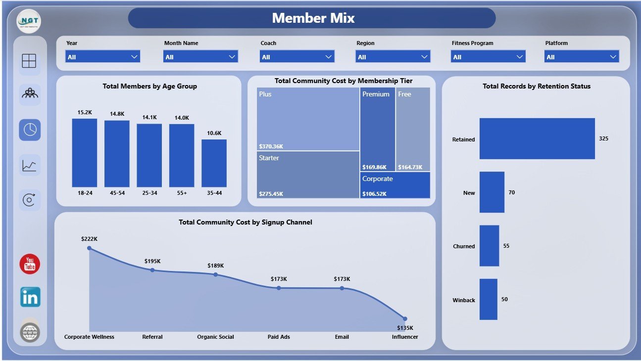
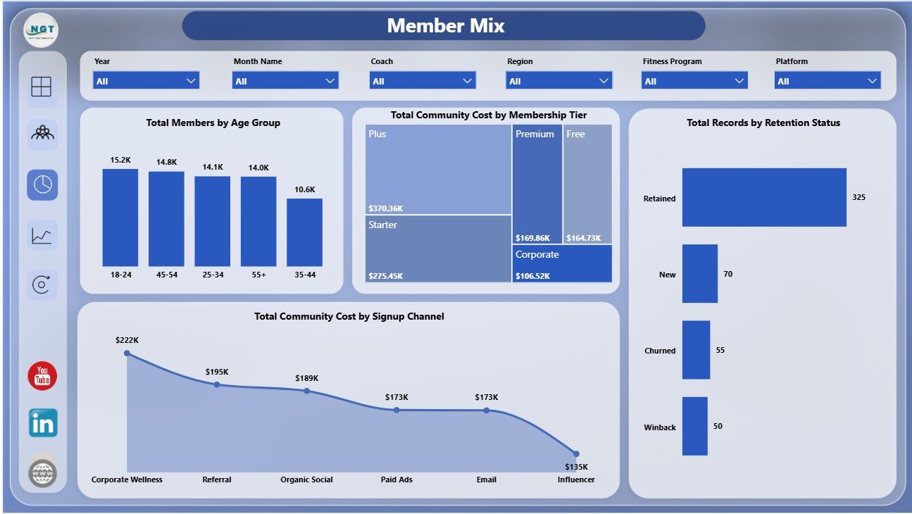
The Member Mix page explains who is inside the community and how member segments affect cost and retention.
Total Members by Age Group: This chart shows member distribution across age bands. It helps program teams understand the audience profile they are serving.
Total Community Cost by Membership Tier: This visual compares cost by membership tier. It supports tier-level pricing and cost review.
Total Records by Retention Status: This chart separates retained, churned, or other retention statuses. It helps teams monitor community health and retention patterns.
Total Community Cost by Signup Channel: This visual shows cost connected to each signup channel. It helps growth teams evaluate channel efficiency.
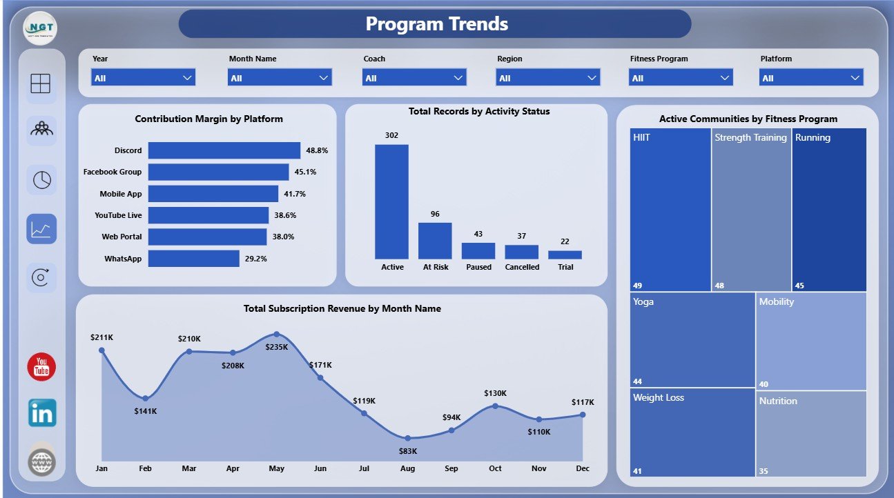
4. Program Trends
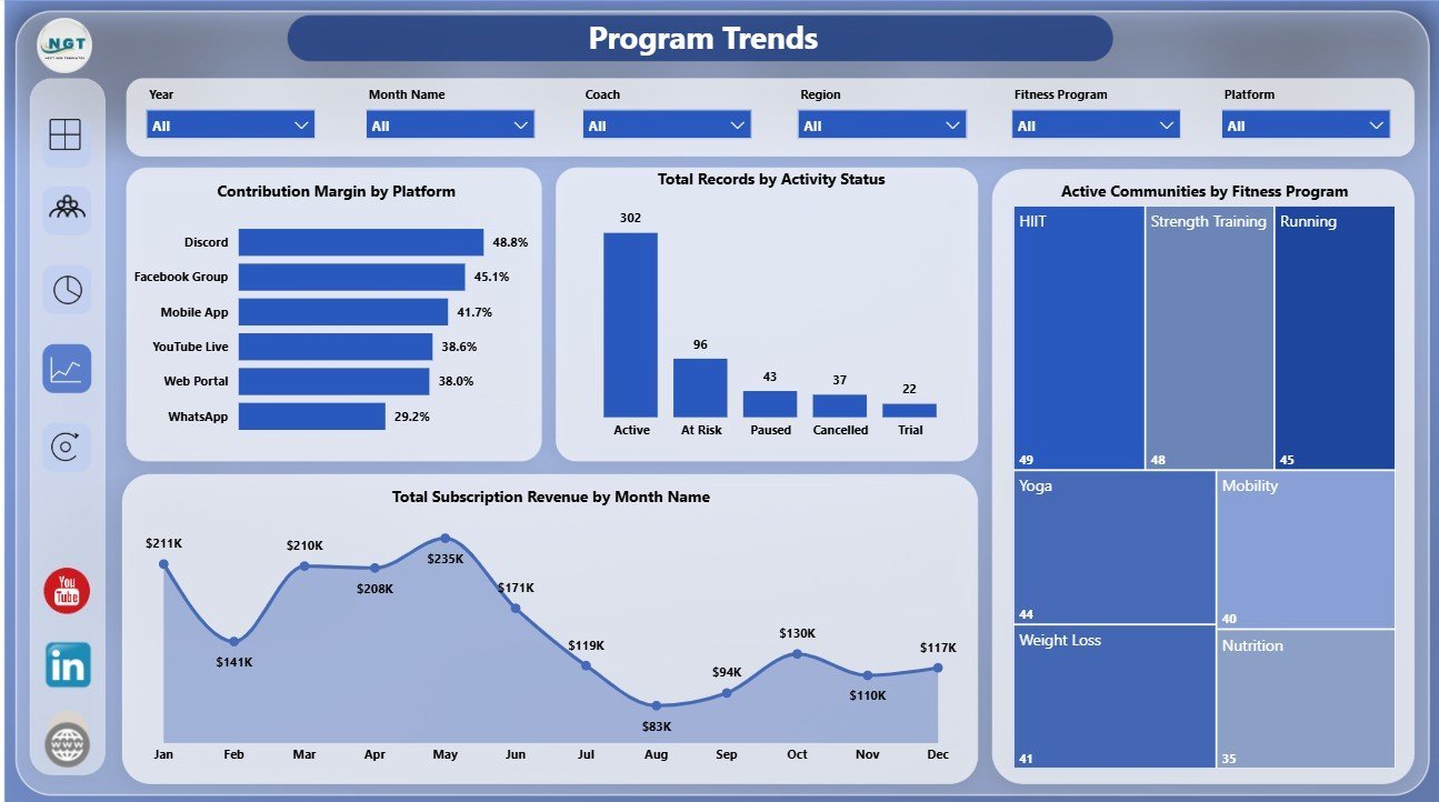
The Program Trends page tracks program, platform, activity, and monthly revenue movement.
Contribution Margin by Platform: This chart compares contribution margin across platforms. It helps leaders see which delivery channels are most profitable.
Total Records by Activity Status: This visual breaks records into activity statuses. It helps community managers quickly see active and inactive participation patterns.
Active Communities by Fitness Program: This chart shows which programs have the most active communities. It helps teams identify the programs with stronger ongoing participation.
Total Subscription Revenue by Month Name: This trend displays subscription revenue by month. It helps review growth, seasonality, and monthly performance changes.
5. Retention
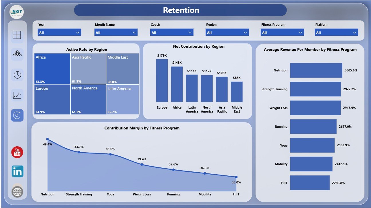
The Retention page is built for understanding where active rate, net contribution, revenue per member, and margin are strongest.
Active Rate by Region: This chart compares active participation by region. It helps operators find regions with stronger engagement.
Net Contribution by Region: This visual shows contribution after cost by region. It helps finance and operations teams compare regional profitability.
Average Revenue Per Member by Fitness Program: This chart compares revenue per member across programs. It helps teams evaluate program pricing and monetization.
Contribution Margin by Fitness Program: This chart compares profitability by fitness program. It helps managers identify programs that are financially stronger or weaker.
Online Fitness Communities Dashboard in Power BI vs. Tableau vs. Paid Community SaaS – Where This Fits
| Feature | This Power BI Dashboard | Tableau Alternative | Paid Community SaaS |
|---|---|---|---|
| Cost | $17.99 one-time | License plus dashboard build time | Monthly or annual subscription |
| Platform | Power BI Desktop | Tableau Desktop or Cloud | Vendor cloud platform |
| Setup time | Open .pbix, replace source, refresh | Build or customize workbook | Requires onboarding and configuration |
| Real-time team collaboration | Available after publishing to Power BI Service | Available through Tableau Cloud | Usually included by plan |
| Mobile access | Available after Power BI publishing | Available after publishing | Usually included |
| Customizable fields | Editable model, visuals, pages, and measures | Editable if you own the workbook | Often limited by vendor settings |
| Year-1 cost at 5 users | $17.99 plus any Microsoft licensing | Usually much higher | Often hundreds or thousands |
| Fitness community analytics | 5 ready report pages | Requires custom dashboard design | Depends on export access and plan |
Who This Template Is For – and Who It’s Not For
This template is for online fitness community operators, virtual coaching businesses, subscription fitness groups, community managers, fitness program leads, growth analysts, and finance teams that already have member, revenue, cost, program, and retention data available for reporting.
It is not a live community platform, payment processor, workout app, chat system, CRM, or automated data connector. If you need real-time member messaging, billing automation, class scheduling, or mobile app event tracking, use dedicated software and use this Power BI dashboard as your reporting layer.
How to Use the Online Fitness Communities Dashboard in Power BI
- Download and unzip the dashboard package.
- Open the .pbix file in Power BI Desktop.
- Replace or connect your own online fitness community data source.
- Refresh the report and validate the cards, slicers, and charts.
- Use slicers to filter by community, program, region, platform, membership tier, retention status, activity status, and signup channel.
- Publish to Power BI Service if you want controlled sharing or scheduled refresh.
Real-World Use Cases
Aditi, Community Manager: Aditi reviews total members, retained communities, activity status, and goal outcomes before her weekly community meeting.
Ryan, Fitness Founder: Ryan compares contribution margin, subscription revenue, and community cost to decide which programs deserve more promotion.
Maria, Subscription Analyst: Maria filters by platform, region, age group, and membership tier to understand which segments drive stronger revenue per member.
Frequently Asked Questions
What does this dashboard track?
It tracks records, net contribution, retained communities, total members, subscription revenue, community cost, contribution margin, active rate, average revenue per member, retention status, activity status, signup channel, platform, region, and fitness program.
How many Power BI pages are included?
The report includes 5 pages: Overview, Community View, Member Mix, Program Trends, and Retention.
Do I need Power BI Desktop?
Yes. Power BI Desktop is used to open, refresh, edit, and customize the .pbix file.
Can I customize the report?
Yes. You can edit visuals, slicers, fields, measures, colors, labels, and pages in Power BI Desktop.
Can I publish this to Power BI Service?
Yes. You can publish the file to Power BI Service if your Microsoft account and workspace permissions support it.
Does this replace community management software?
No. It is a reporting dashboard for prepared data, not a member portal, chat tool, payment system, or workout delivery platform.
About the Author
Built by PK – Microsoft Certified Professional with 15+ years of Excel, Google Sheets, and Power BI experience. Founder of NextGenTemplates, reaching 300K+ subscribers across YouTube channels. Every template is hand-built and tested before release.
Explore Related Templates
Also see Online Fitness Communities Dashboard in Excel, Fitness Apps Dashboard in Power BI, Gym Retention Dashboard in Power BI, and Fan Communities Platforms Dashboard in Power BI. Browse more Power BI templates and Power BI Dashboard templates.
Download the Online Fitness Communities Dashboard in Power BI and turn community data into a clear Power BI view of members, programs, revenue, contribution, and retention.
Last updated: July 16, 2026.















Reviews
There are no reviews yet.