

The best utilities dashboard for most water and utility companies in 2026 is the Water Utilities Dashboard in Excel ($17.99): five pages report water produced, distributed and demanded, pipeline breaks, contamination cases and risk rating by source, consumer type, treatment plant, region and zone. The Water Supply KPI Dashboard in Google Sheets is the best value at $9.99, and six more picks cover Power BI, electricity distribution and billing.
Last updated: October 2026
Key takeaways
- Best overall utilities dashboard: the Water Utilities Dashboard in Excel at $17.99, the only pick that joins supply, demand, risk and pipeline breaks by source, plant and zone in one file.
- Best value: the Water Supply KPI Dashboard in Google Sheets at $9.99, with 15 ready water KPIs shared in a browser.
- Best for boards and regulators: the Water Utilities Dashboard in Power BI at $17.99, with region, consumer and zone slicers on screen.
- Electric distribution teams get SAIDI, loss percentage and customer satisfaction in the Electricity Distribution KPI Dashboard from $9.99.
- All eight picks are one-time purchases from $9.99 to $17.99; none replaces SCADA, GIS or your billing system, which stay your systems of record.
Utilities dashboard templates compared
| Template | Format | Best For | Price |
|---|---|---|---|
| Water Utilities Dashboard | Excel | Best overall: supply, demand, risk and breaks by source, plant and zone | $17.99 |
| Water Supply KPI Dashboard | Google Sheets | Best value: 15 water KPIs vs target and previous year | $9.99 |
| Water Utilities Dashboard | Power BI | Board and regulator reporting on screen | $17.99 |
| Water Utilities KPI Dashboard | Excel | Monthly scorecard incl. non-revenue water and billing efficiency | $12.99 |
| Water Utilities KPI Dashboard | Power BI | KPI review meetings with targets met and missed | $11.99 |
| Electricity Distribution KPI Dashboard | Excel | Electric distribution reliability (SAIDI) and losses | $14.99 |
| Electricity Distribution KPI Dashboard | Google Sheets | Shared reliability tracking across depots | $9.99 |
| Billing Accuracy KPI Dashboard | Excel | Customer billing teams: error rate and rebills | $14.99 |
How we picked these utilities dashboard templates
We searched the full NextGenTemplates catalogue of Excel, Google Sheets and Power BI products for water, utility, electricity, energy and billing tools, then kept the eight that an operations manager, plant engineer, network planner, finance controller or billing lead would open every month. Each pick had to run from a real data or input sheet, show genuine utility measures such as water distributed, non-revenue water, pipeline breaks, SAIDI or billing error rate, and be editable without a consultant.
We covered water and electricity on purpose, because many municipal utility companies run both, and we included all three formats because the monthly pack is often built in Excel and then shared across plants or presented on screen. Close variants of the same design are left out of the ranking and listed in the decision section. Prices are the current one-time list prices on each product page. For regulatory context, the U.S. EPA Safe Drinking Water Act pages set out the water-quality obligations a dashboard should help you monitor, and the EIA-861 electric utility data publishes the reliability figures (SAIDI and SAIFI) US distributors report each year.
Why utility companies need a dashboard
Utilities run on thin operating margins and public scrutiny. A water utility can produce more water every month and still lose money if non-revenue water creeps from 17% to 20%, and a distributor can meet demand while a single district drives most of the complaints. The numbers exist, but they sit in SCADA exports, lab results, a maintenance log, the billing system and an engineer’s own workbook.
So the monthly review starts with someone stitching files together, and the questions that matter take days: which source or plant carries the most risk, which zone loses the most water, whether pipeline breaks are rising after a cold month, and whether billing errors are generating rebills and complaints. Regulators and councils ask the same questions, usually at short notice.
Enterprise utility analytics platforms answer them at a cost, typically with implementation projects and per-seat licences that a municipal department, rural co-operative or private water company cannot justify for reporting alone. A utilities dashboard template sits on top of your exports. It does not replace the system of record; it turns the numbers into a one-page view for a one-time $9.99 to $17.99. If your organisation also runs power generation, our guide to energy and utility dashboards in Google Sheets and Power BI covers output, emissions and downtime.
The 8 best utilities dashboard templates for 2026
1. Water Utilities Dashboard in Excel: best overall
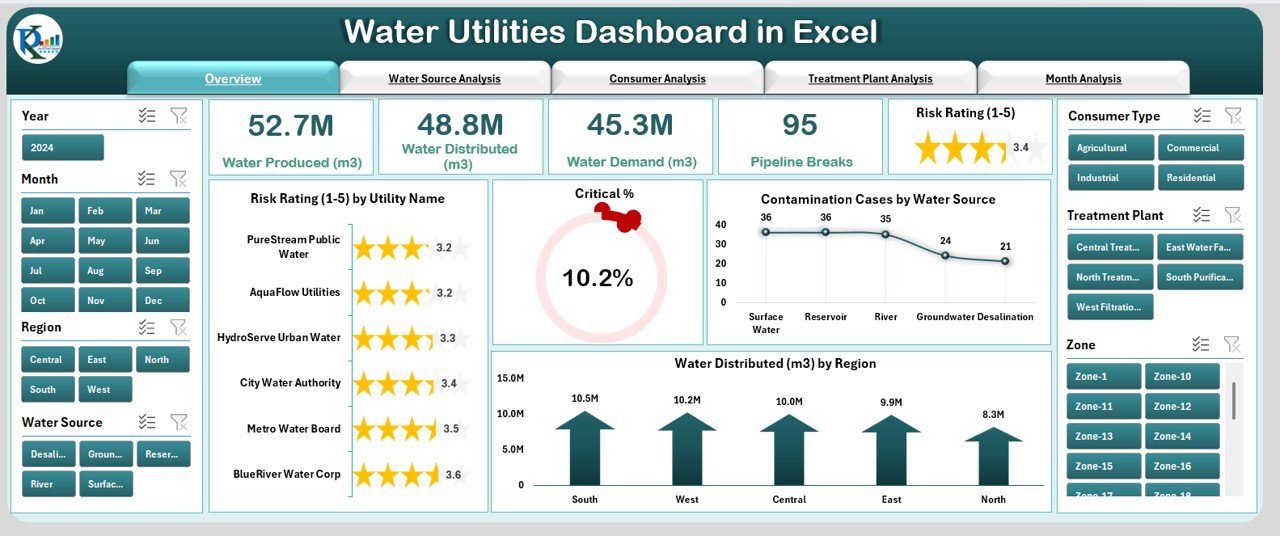
This is the most complete utilities dashboard in the roundup, and it ranks first because it is the only pick that joins supply, demand, risk and network failures in one workbook and lets you cut every view by source, plant and zone. Five KPI cards (Water Produced, Water Distributed, Water Demand, Pipeline Breaks and a 1 to 5 Risk Rating) sit on the Overview page, with a left-hand page navigator to the detail pages.
Who it is for: water authorities, municipal water departments, treatment plant managers and utility analysts who report in Microsoft Excel.
- Five pages: Overview, Water Source Analysis, Consumer Analysis, Treatment Plant Analysis and Month Analysis.
- Slicers for year, month, region, water source, consumer type, treatment plant and zone.
- Risk rating by utility name, critical % gauge, contamination cases by water source and water distributed by region.
- Source pages for lakes, rivers, reservoirs, groundwater and desalination; consumer pages for residential, commercial, industrial and agricultural users.
Concrete uses: the sample overview shows 52.7M m³ produced against 48.8M m³ distributed, a gap of about 7% that is exactly where a loss investigation starts; 95 pipeline breaks and a 10.2% critical share sit next to each other so maintenance and risk are reviewed together; and the zone slicer narrows the whole file to one district for a council meeting. Price: $17.99. Get the Water Utilities Dashboard in Excel →
Best for: the utility that wants supply, risk and network performance in one Excel file.
2. Water Supply KPI Dashboard in Google Sheets: best value

At $9.99 this is the best value in the list. It is a KPI scorecard rather than a transaction dashboard: choose a month and 15 water supply KPIs show month-to-date and year-to-date actuals against target and previous year, with green and red arrows, in a Google Sheet that plants and head office can share.
Who it is for: small and mid-sized water utilities, municipal planners and operations teams that work in Google Workspace.
- 15 sample KPIs across water quality, supply, customer service, distribution, operational efficiency, environmental impact and maintenance.
- Quality KPIs such as turbidity (NTU), pH and chlorine residual (mg/L).
- Network KPIs such as water loss rate, leakage rate, network pressure (PSI) and daily supply volume.
- Cost and service KPIs: energy per m³, cost per m³ supplied, complaint resolution rate, preventive maintenance adherence and average repair time.
Concrete uses: give each plant edit access to its own monthly actuals; watch turbidity and chlorine residual against target before a regulator asks; and track whether preventive maintenance adherence improves after a new schedule. Price: $9.99. Get the Water Supply KPI Dashboard in Google Sheets →
Best for: a first shared water KPI scorecard at the lowest price.
3. Water Utilities Dashboard in Power BI: best for boards and regulators
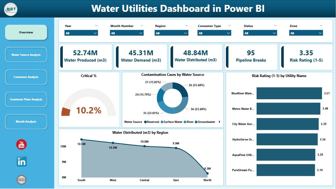
The Power BI build of pick 1, designed for presenting. A left-hand navigation runs to Overview, Water Source Analysis, Consumer Analysis, Treatment Plant Analysis and Month Analysis pages, with dropdown slicers for year, month number, region, consumer type, status and zone.
Who it is for: utility executives, risk and compliance officers, ESG teams and regulators reviewing several regions.
- KPI cards for water produced, water demand, water distributed, pipeline breaks and risk rating.
- Contamination cases by water source as a donut with counts and shares.
- Risk rating by utility name and water distributed by region.
- Monthly trend page for demand, records and water distributed.
Concrete uses: in the sample, reservoir and surface water each account for about 24% of contamination cases, which tells a board where treatment spend should go first; the status slicer separates active from flagged records; and the region trend shows the North distributing 8.3M m³ against 10.5M m³ in the South. Price: $17.99. See the Water Utilities Dashboard in Power BI →
Best for: organisations that present on screen to boards, councils or regulators.
Not sure where to start? Most water utilities start with the Water Utilities Dashboard in Excel ($17.99). If your team works in Google Workspace and wants a monthly scorecard first, the Water Supply KPI Dashboard in Google Sheets ($9.99) is the cheapest way to put targets in front of every plant.
4. Water Utilities KPI Dashboard in Excel
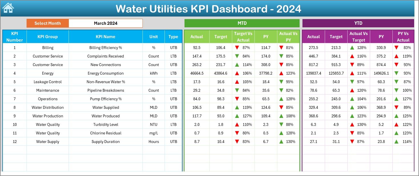
A monthly scorecard for the whole utility, including the commercial side. The sample tracks 12 KPIs across billing, customer service, energy, leakage control, maintenance, operations, distribution, production, quality and supply, each with its unit and whether higher or lower is better.
Who it is for: water boards and utility departments that report a fixed KPI set to management every month.
- Seven sheets: Home navigation, Dashboard, KPI Trend, Actual, Target and Previous Year input sheets, and KPI Definition.
- Month selector in cell D3 that refreshes MTD and YTD actual vs target and vs previous year.
- KPIs include billing efficiency %, non-revenue water %, pipeline breakdowns, pump efficiency % and supply duration in hours.
- KPI Definition sheet with formula, unit and type, so every plant measures the same way.
Concrete uses: the sample March view shows non-revenue water at 17.5% against a 16.6% target, the kind of miss that should trigger a zone-by-zone leak survey; compare pipeline breakdowns with the previous year after a mains renewal programme; and report billing efficiency next to production so finance and operations share one page. Price: $12.99. Get the Water Utilities KPI Dashboard in Excel →
Best for: utilities that manage by monthly targets, including non-revenue water.
5. Water Utilities KPI Dashboard in Power BI
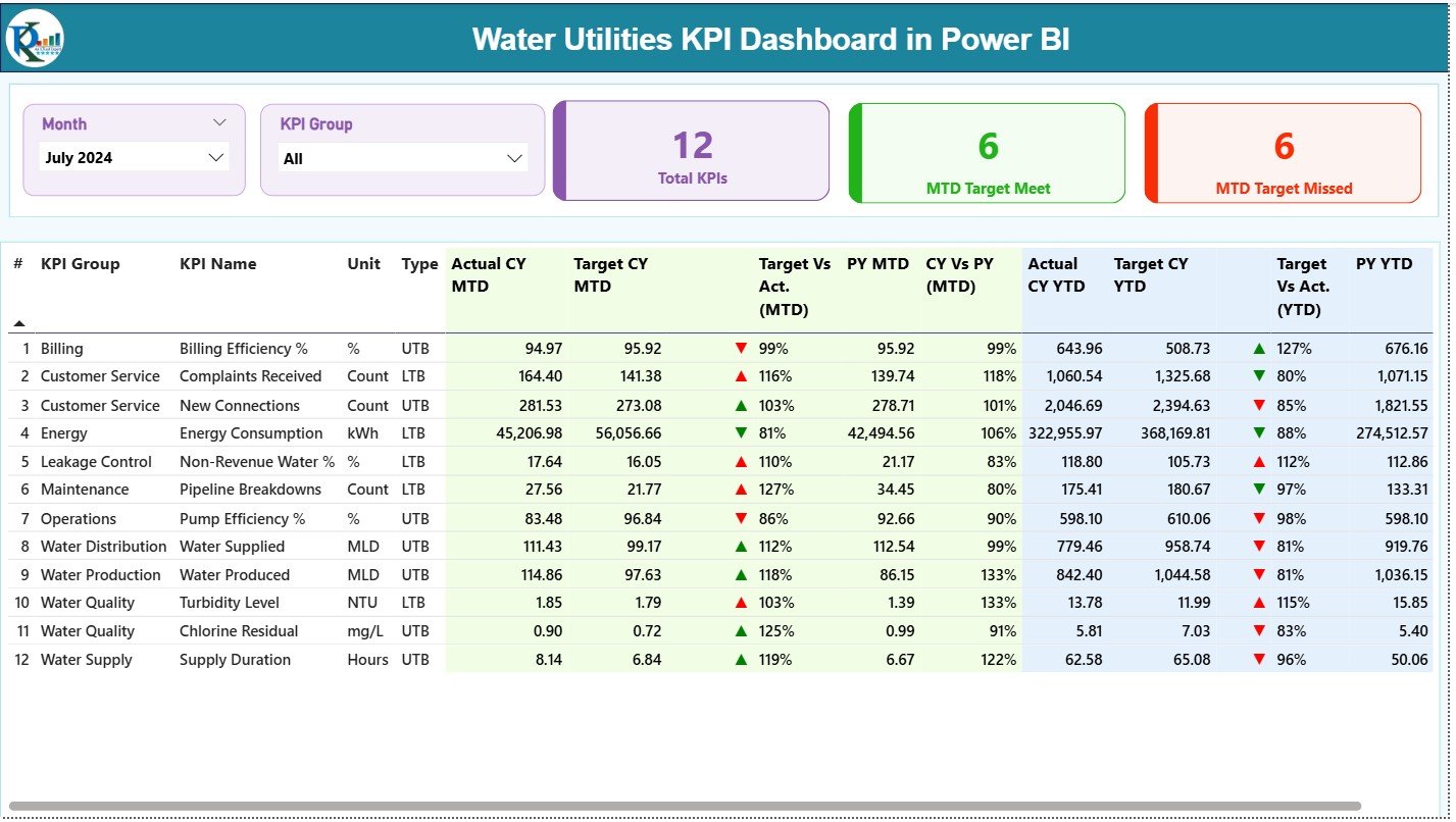
The same 12-KPI framework as a Power BI report. The summary cards count total KPIs, MTD targets met and MTD targets missed, and month and KPI group slicers filter the table, with a drill-through page for each KPI’s formula, definition and unit.
Who it is for: leadership teams that run the monthly performance review from a live screen.
- Cards for total KPIs, targets met and targets missed (6 and 6 in the July sample).
- MTD and YTD actual vs target and vs previous year with green and red icons.
- Trend page with combo charts for current year vs previous year.
- Data maintained in a simple Excel input file, then refreshed in Power BI.
Concrete uses: filter to the Water Quality group before a compliance meeting; check whether energy consumption in kWh is tracking below target after pump upgrades; and drill through when a councillor asks how a KPI is calculated. Price: $11.99. See the Water Utilities KPI Dashboard in Power BI →
Best for: utilities that already use Power BI for management reporting.
6. Electricity Distribution KPI Dashboard in Excel
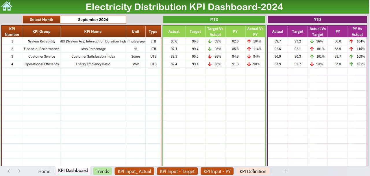
The pick for electric distribution companies and multi-utilities. It uses the same scorecard structure, with a Home sheet, KPI Dashboard, Trends, three input sheets and KPI Definition, and ships with reliability, financial, customer and efficiency KPIs.
Who it is for: distribution network operators, rural electric co-operatives, municipal electric departments and energy managers.
- Sample KPIs: SAIDI (system average interruption duration index), loss percentage, customer satisfaction index and energy efficiency ratio.
- MTD and YTD actual vs target and vs previous year with arrows.
- Editable KPI list, so you can add SAIFI, CAIDI, outage response time or operating cost per customer.
- KPI Definition sheet for consistent formulas across depots.
Concrete uses: track SAIDI against target every month rather than once a year when reliability is reported; watch technical and commercial loss percentage after a meter replacement programme; and compare customer satisfaction with the previous year after storm season. Price: $14.99. Get the Electricity Distribution KPI Dashboard in Excel →
Best for: electric utilities that report reliability and losses in Excel.
7. Electricity Distribution KPI Dashboard in Google Sheets
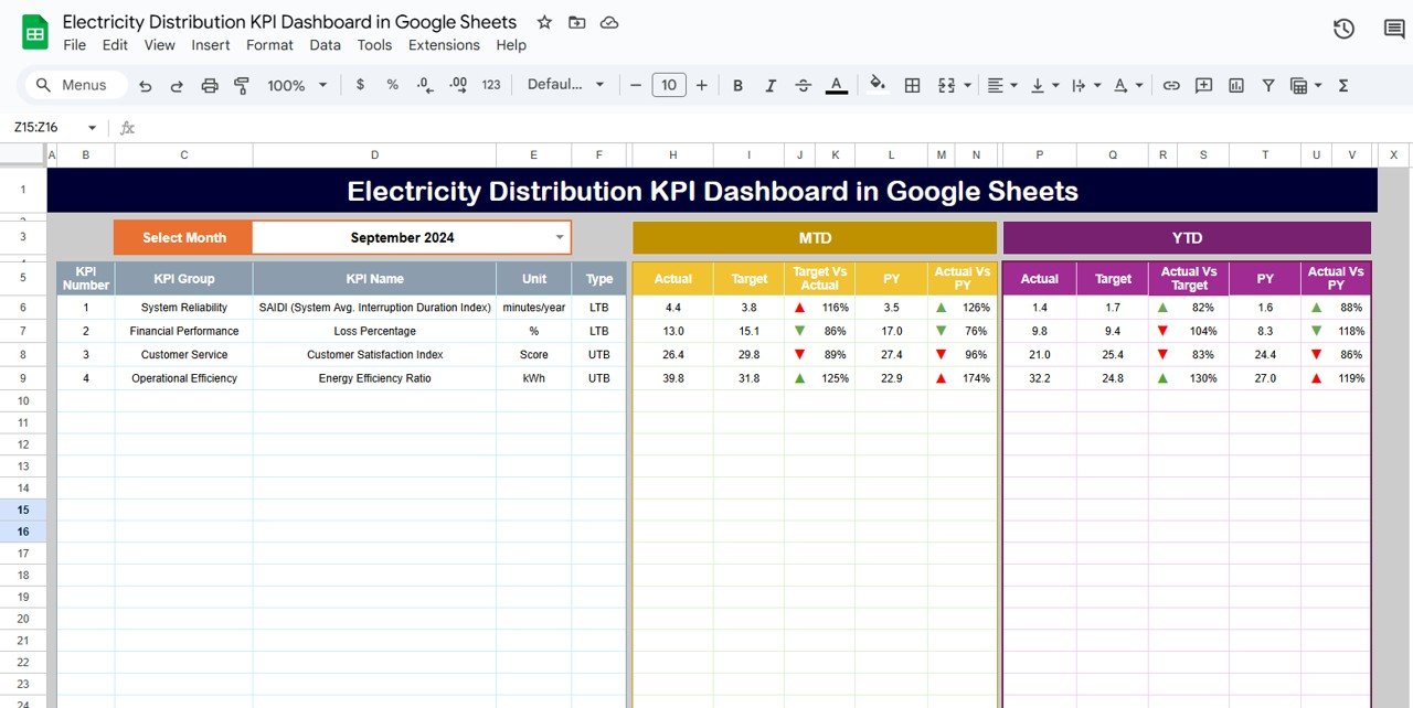
The Google Sheets edition of pick 6, at $9.99. A month selector refreshes the same four starter KPIs, SAIDI, loss percentage, customer satisfaction index and energy efficiency ratio, against target and previous year, and the KPI Trend tab shows group, unit, formula, type and definition for any KPI you choose.
Who it is for: distributors whose depots and head office need one shared file without Excel licences.
- Dashboard, KPI Trend, Actual, Target, Previous Year and KPI Definition tabs.
- Green and red arrows for MTD and YTD performance.
- Browser-based sharing with edit rights per contributor.
- Add rows for any extra reliability or service KPI.
Concrete uses: let each depot enter its own monthly SAIDI minutes; keep loss percentage visible to the commercial team; and review the trend chart before setting next year’s targets. Price: $9.99. Get the Electricity Distribution KPI Dashboard in Google Sheets →
Best for: shared reliability tracking on a small budget.
8. Billing Accuracy KPI Dashboard in Excel
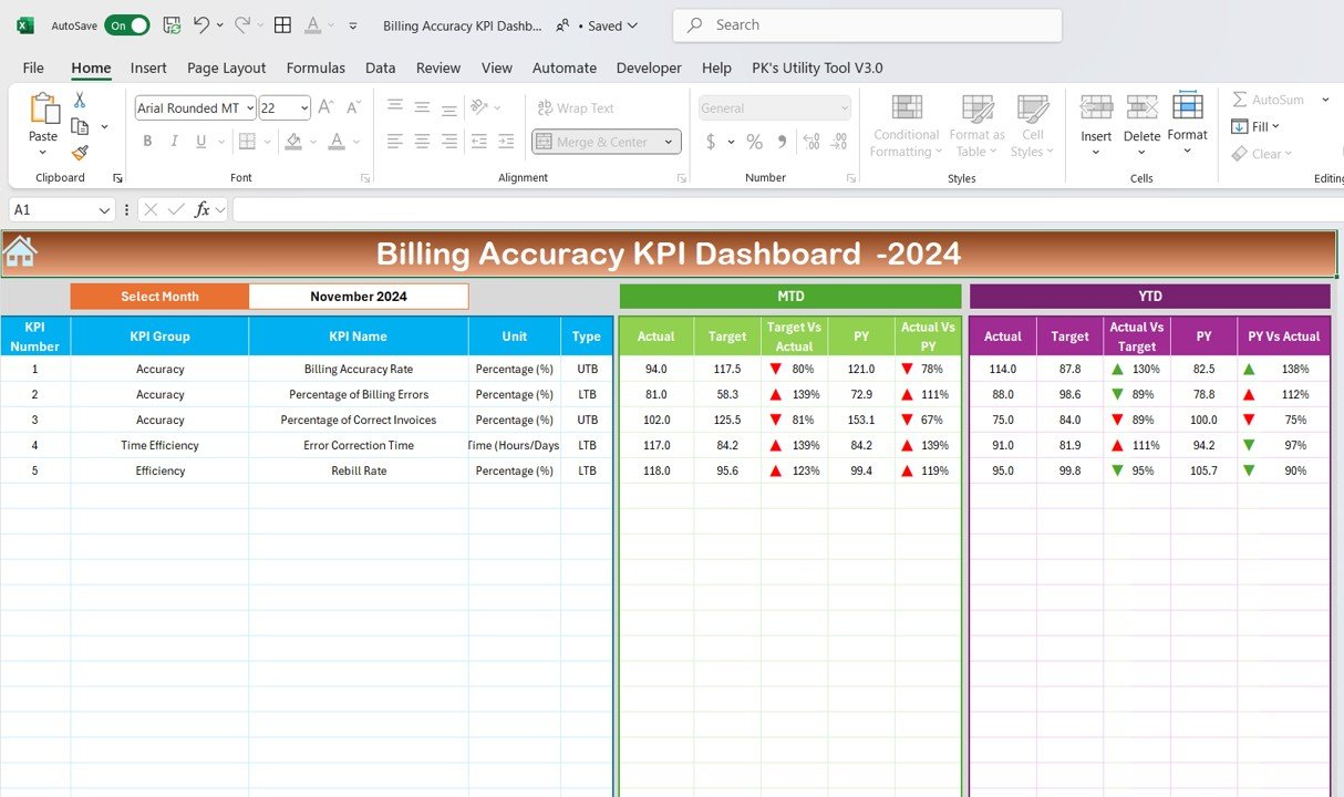
A specialist pick for the customer side. Billing errors are one of the biggest sources of utility complaints, and this workbook tracks five billing KPIs month to date and year to date against target and previous year.
Who it is for: utility billing, revenue protection and customer service teams.
- Sample KPIs: billing accuracy rate, percentage of billing errors, percentage of correct invoices, error correction time and rebill rate.
- Higher-is-better and lower-is-better types so arrows read correctly.
- Actual, Target and Previous Year input sheets with a month selector.
- Trend sheet and KPI Definition sheet.
Concrete uses: track rebill rate after an estimated-read backlog; show the board that error correction time is falling; and pair billing accuracy with the complaints KPI in pick 4 to see whether fewer errors mean fewer calls. Price: $14.99. Get the Billing Accuracy KPI Dashboard in Excel →
Best for: billing teams that need a scorecard rather than an operations view.
The utility KPIs every utilities dashboard should show
Whichever utilities dashboard you choose, make sure the monthly pack answers these questions. Each formula works in any spreadsheet once your data sits in one table.
| KPI | Formula | What to watch for |
|---|---|---|
| Non-revenue water % | (System input volume − billed authorised consumption) ÷ system input volume | Read by zone; a company average hides the leaking district |
| Distribution efficiency | Water distributed ÷ water produced | A widening gap points to treatment or transmission losses |
| Pipeline breaks per 100 km | Breaks in period × 100 ÷ network length in km | Spikes after cold or dry months; compare with the previous year |
| Energy per m³ | Pumping and treatment kWh ÷ cubic metres supplied | Rising energy on flat volume signals pump wear or pressure issues |
| Water quality compliance | Samples meeting standard ÷ total samples | Any fall below 100% needs a source and plant explanation |
| SAIDI (electric) | Total customer interruption minutes ÷ customers served | Separate major-event days before comparing years |
| Billing accuracy rate | Correct bills ÷ total bills issued | Rebills and complaints usually follow a drop within a month |
Keep formal compliance sampling and statutory reliability filings in their own systems; the dashboard is where you monitor the trend and spot the zone, plant or depot that needs attention. Teams that also run treatment and production lines can borrow ideas from our 12 manufacturing KPIs with ready-made dashboards, since plant throughput and downtime measures transfer directly.
How to choose the right utilities dashboard template
Match the template to two things: the question you answer every month and the software your team already uses.
- Water supply, risk and breaks by source, plant and zone: the Water Utilities Dashboard in Excel ($17.99), or the Power BI edition ($17.99) for on-screen reporting.
- A monthly water KPI scorecard: the Water Supply KPI Dashboard in Google Sheets ($9.99), also available as the Water Supply KPI Dashboard in Excel ($12.99) and Water Supply KPI Dashboard in Power BI ($11.99).
- Whole-utility targets including non-revenue water and billing: the Water Utilities KPI Dashboard in Excel ($12.99) or the Power BI edition ($11.99).
- Treatment, desalination and water resources: the Water Treatment Services KPI Dashboard in Excel ($12.99), the Water Desalination KPI Dashboard in Excel ($14.99), the Water Resource Management Dashboard in Excel ($13.99) and the Water Resource Management Dashboard in Power BI ($17.99).
- Electric distribution reliability: the Electricity Distribution KPI Dashboard in Excel ($14.99) or the Google Sheets edition ($9.99); maintenance teams can add the Electric Utility Maintenance Dashboard in Excel ($17.99), the Electric Utility Maintenance Dashboard in Power BI ($17.99) or the Electric Utility Maintenance KPI Dashboard in Excel ($14.99).
- Generation, output and emissions: the Energy & Utility Dashboard in Excel, the Energy & Utility Dashboard in Power BI (both $17.99) or the Energy & Utility Dashboard in Google Sheets ($9.99).
- Customer billing: the Billing Accuracy KPI Dashboard ($14.99).
- Utility costs of your own buildings rather than a network: the Building Utility Cost Dashboard in Google Sheets ($9.99) or the Office Utility Cost Dashboard in Excel ($13.99).
Energy utilities with sustainability reporting duties can add the Energy & ESG Sustainability Bundle ($59.99 for eight Excel and Power BI templates). For neighbouring sectors, see our oil and gas dashboard buyer guide, the quality control templates for ISO 9001 teams for lab and sampling processes, and the project management dashboard templates for capital works and mains renewal. Before you buy anything, our guide to evaluating an Excel dashboard lists the checks worth doing.
When a utilities dashboard template is NOT the right answer
A dashboard is a reporting layer, not a system of record. Be honest about where a utilities dashboard template stops:
- You need real-time network or plant data. SCADA, telemetry and historians handle live pressures, flows and alarms. Export summaries into a dashboard; never run operations from a spreadsheet.
- You need meter-to-cash billing. Customer information and billing systems carry tariffs, meter reads, payments and the audit trail regulators expect. The billing dashboard here only measures their accuracy.
- You file statutory compliance or reliability reports. Water-quality sampling records and regulatory reliability filings belong in dedicated compliance tools.
- You manage assets at pipe-segment level. GIS and asset management systems hold the network model, work orders and condition scores.
- Your data runs to millions of rows a month, such as smart meter interval reads. Use the Power BI picks, or a data warehouse feeding Power BI, instead of a workbook.
If none of those apply, and for monthly management reporting they usually do not, a template is the faster, cheaper and more flexible choice, and it keeps working if you change the system underneath.
Frequently asked questions
What is a utilities dashboard?
A utilities dashboard is a ready-made Excel, Google Sheets or Power BI file that turns water production, distribution, demand, losses, outages, billing and service records into KPI cards and charts. You paste your own monthly exports into the data or input sheets, refresh, and see performance by region, source, plant, zone or month without building reports by hand.
Which KPIs should a water utility track?
Start with water produced and water distributed, demand, non-revenue water percentage, pipeline breaks per month, pump efficiency, energy use per cubic metre, turbidity and chlorine residual, complaints received and supply duration. Add billing efficiency and cost per cubic metre supplied once the operational numbers are stable. The KPI dashboards here let you edit the list.
Is a utilities dashboard template a replacement for SCADA or a billing system?
No. SCADA, GIS, asset management and customer information or billing systems stay your systems of record. A utilities dashboard template is a reporting layer that reads monthly exports from those systems, and it costs a one-time $9.99 to $17.99 instead of a per-user analytics subscription or an implementation project.
Excel, Google Sheets or Power BI: which suits a utility company best?
Choose Excel when one analyst or engineer prepares the monthly pack, Google Sheets when plants, depots and head office need one live file in a browser, and Power BI when data covers many zones, plants or years and you present on screen to a board or regulator. Every pick here is a one-time purchase.
How do I calculate non-revenue water?
Non-revenue water is system input volume minus billed authorised consumption, divided by system input volume and shown as a percentage. Calculate it by zone and month, because one district with a burst main or meter problem can hide inside a healthy company-wide figure. The Water Utilities KPI Dashboard tracks it as a lower-is-better KPI.
Can these templates track electricity reliability such as SAIDI and SAIFI?
Yes. The Electricity Distribution KPI Dashboard in Excel and its Google Sheets edition include SAIDI as a lower-is-better KPI, alongside loss percentage, a customer satisfaction index and an energy efficiency ratio. You can add SAIFI or CAIDI as extra rows because the KPI list, units and targets are editable.
Do I need macros, coding or a Power BI Pro licence?
No. The Excel dashboards use formulas, pivot tables and slicers, the Google Sheets editions run in any browser, and the Power BI files open in the free Power BI Desktop app. A paid Power BI licence is only needed if you publish the report to the Power BI service and share it online.
Which template is best for a small municipal water department?
Start with the Water Supply KPI Dashboard in Google Sheets at $9.99. It already lists 15 water KPIs, from turbidity and chlorine residual to leakage rate and average repair time, and several staff can update it in a browser. Move to the Water Utilities Dashboard in Excel when you need source, plant and zone analysis.
Can I report in cubic metres, megalitres or gallons?
Yes. The data and input sheets accept whatever units your exports use. The sample files show cubic metres on the transaction dashboards and megalitres per day on the KPI dashboards; change the unit column and number formats once, and every card and chart follows the same data.
How long does setup take?
Most teams report within an afternoon. Export one row per record with date, region, zone, source, plant and the volumes, paste it into the data sheet under the same headings, refresh, then check the Water Produced card against a figure you trust from operations before sharing the file. KPI dashboards need only monthly actuals and targets.
Get more utilities dashboard templates
Ready to see supply, losses and risk on one page? Start with our best overall utilities dashboard, the Water Utilities Dashboard in Excel ($17.99), or the best-value Water Supply KPI Dashboard in Google Sheets ($9.99). Boards and regulators get more from the Water Utilities Dashboard in Power BI ($17.99), and electric distributors should start with the Electricity Distribution KPI Dashboard ($14.99). Every option is a one-time purchase with no subscription and no per-user fee.
Compare more industry roundups with our Power BI dashboard templates ranked by industry, the premium Power BI templates under $20, the shareable Google Sheets templates for teams, the K-12 school administration templates, the accounting and CPA firm templates and the 25 best-selling business templates. Subscribe to the NextGenTemplates YouTube channel for setup tutorials.