

Managing water resources is one of the most critical responsibilities for any city, region, or water authority. Every day, water utility teams must track water sources, treatment plants, distribution lines, consumer usage patterns, contamination risks, and operational efficiency. When this information is spread across multiple spreadsheets and departments, it becomes difficult to make fast and accurate decisions.
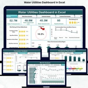
The Water Utilities Dashboard in Excel solves this challenge by bringing all essential water management KPIs into one clean, interactive, and ready-to-use dashboard. It helps water authorities, environmental teams, treatment plant operators, and senior managers track performance trends with complete clarity. With its visual insights, automated calculations, and simple navigation, the dashboard supports safe, reliable, and efficient water supply management.
📌 What Is a Water Utilities Dashboard in Excel?
A Water Utilities Dashboard in Excel is a pre-designed reporting system that tracks:
Water demand
Water distributed
Contamination cases
Risk rating
Warning & critical percentages
Plant production
Source-wise behavior
Consumer consumption patterns
Seasonal and monthly trends
The dashboard uses Excel formulas, PivotCharts, slicers, and automation to convert raw data into meaningful insights. Users only need to update the Data Sheet, and everything refreshes instantly. No advanced Excel knowledge or external software is required.
Whether you manage large municipal water systems or small regional utilities, this dashboard ensures smooth and reliable analysis.
🎯 Why Do Water Utilities Need a Dashboard?
Water utility operations involve constant monitoring. Missing even one critical indicator—such as rising contamination or sudden demand spikes—can impact public safety.
This dashboard helps you:
Identify high-risk sources
Detect operational issues early
Plan for peak demand months
Improve treatment plant efficiency
Compare regions and consumer types
Make faster decisions
Reduce data collection time
Improve public safety and service reliability
Instead of spending hours compiling data, your team can invest time in solving problems and improving service.
📊 Key Features of the Water Utilities Dashboard in Excel
The dashboard includes five analytical pages, each designed for a specific category of water management. A left-side Page Navigator allows users to move between pages instantly.
🟦 1. Overview Page – One Complete View of Utility Health
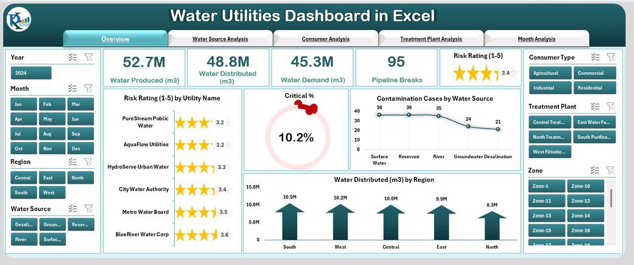
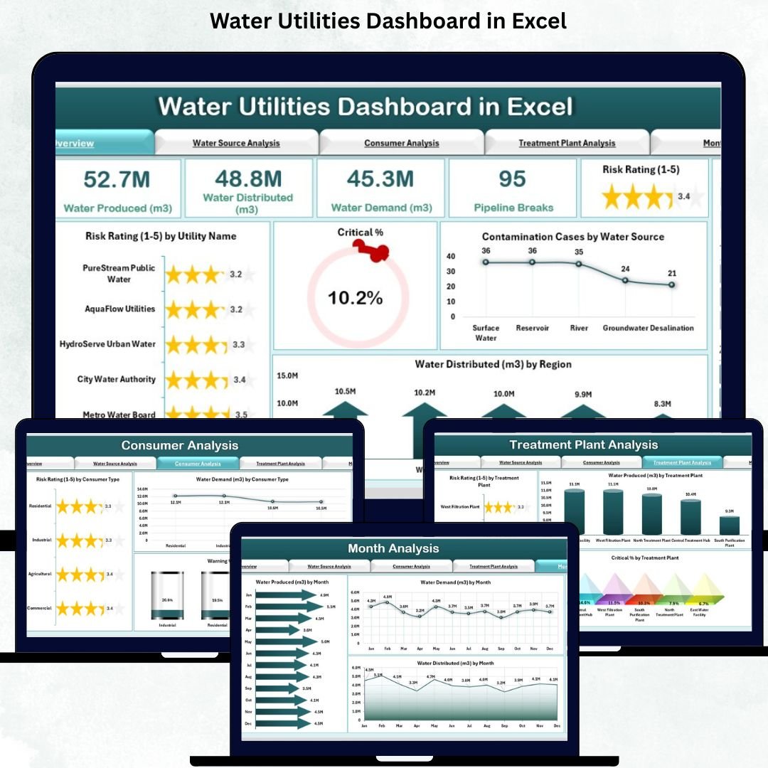
The Overview Page gives leadership and managers a quick snapshot of overall water performance.
⭐ KPI Cards Display:
Total Risk Rating
Critical %
Water Demand
Contamination Cases
Total Water Produced or Distributed
⭐ Four Powerful Charts:
Risk Rating by Utility Name
Critical %
Contamination Cases by Water Source
Water Distributed by Region
This page helps teams understand where risks are rising, where demand increases, and which regions require urgent attention.
🟧 2. Water Source Analysis – Source-Wise Performance Tracking
Water utilities depend on multiple water sources:
✔ Lakes
✔ Rivers
✔ Reservoirs
✔ Groundwater
✔ Storage tanks
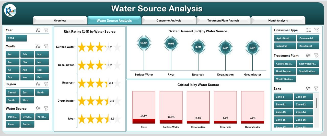
Each source has unique risks and demand levels. This page includes:
⭐ Charts:
Risk Rating by Water Source
Water Demand by Water Source
Critical % by Water Source
With these insights, teams can make better decisions about sourcing, allocation, treatment, and contingency planning.
🟩 3. Consumer Analysis – Understand Segment-Wise Consumption
Consumers come from different sectors such as:
Residential
Industrial
Commercial
Agricultural
Special users
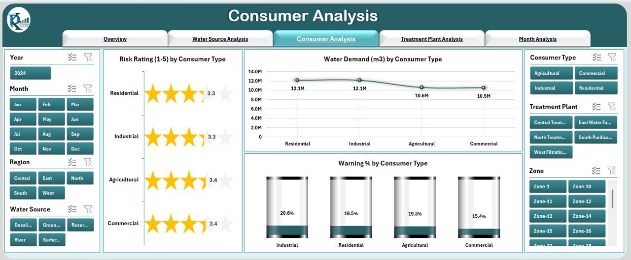
This page helps analyze consumption behavior and risk by category.
⭐ Charts:
Risk Rating by Consumer Type
Water Demand by Consumer Type
Warning % by Consumer Type
This helps in planning for peak seasons, understanding user segments, and improving supply distribution.
🟪 4. Treatment Plant Analysis – Improve Water Safety & Production Efficiency
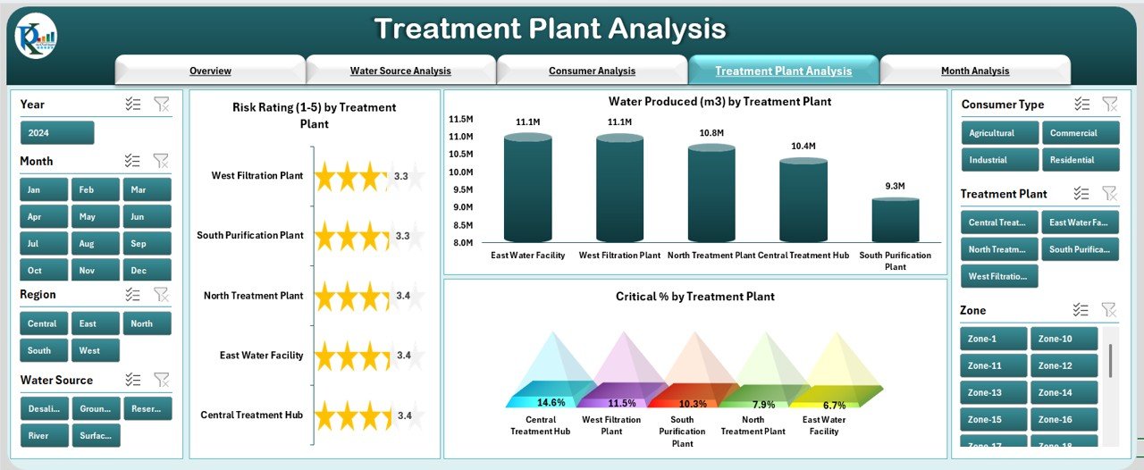
Treatment plants are the backbone of safe water supply. Their efficiency determines overall water quality and distribution effectiveness.
⭐ Charts:
Risk Rating by Treatment Plant
Water Produced by Treatment Plant
Critical % by Treatment Plant
With this information, plant teams can identify operational gaps, maintenance needs, and production shortfalls.
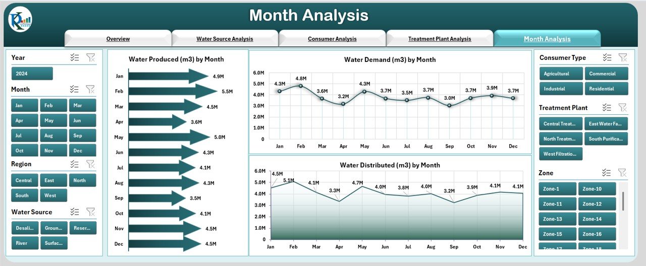
🟫 5. Monthly Analysis – Track Seasonal & Monthly Behavior
Water demand and supply vary across months due to climate, rainfall, and consumption patterns.
⭐ Monthly Trend Charts:
Water Produced by Month
Water Demand by Month
Water Distributed by Month
This helps teams plan resources, manage scarcity periods, and forecast long-term consumption.
🛠 Support Sheet & Data Sheet
✔ Support Sheet
Contains formulas, calculations, reference tables, and slicer data sources.
✔ Data Sheet
The main input sheet where all raw data is entered:
Utility names
Water sources
Treatment plants
Regions
Consumer types
Demand, production, contamination, risk indicators
Once updated, the dashboard refreshes automatically.
🌟 Advantages of the Water Utilities Dashboard in Excel
⭐ 1. Instant Decision-Making
All essential KPIs appear in one place.
⭐ 2. Complete Visibility
Eliminates confusion caused by multiple reports.
⭐ 3. Better Safety and Risk Management
Early warnings help prevent contamination or supply failures.
⭐ 4. Reduced Manual Errors
Automated charts reduce human calculation mistakes.
⭐ 5. Consumer Behavior Insights
Helps manage demand patterns across user categories.
⭐ 6. Plant-Level Performance Tracking
Improves operational efficiency and maintenance planning.
⭐ 7. Seasonal Demand Forecasting
Easy monthly trend analysis supports long-term planning.
⭐ 8. Senior Management Transparency
Clear visuals improve communication and reporting accuracy.
🧠 Best Practices for Using the Dashboard
Update the Data Sheet regularly
Validate numbers before uploading
Use slicers to compare multiple scenarios
Track warning and critical indicators closely
Review monthly trends for forecasting
Share dashboard insights across departments
Keep the dashboard file structured and clean
🏁 Conclusion
The Water Utilities Dashboard in Excel is a powerful monitoring tool that simplifies complex water management operations. It brings together performance metrics, contamination risks, demand and supply patterns, and monthly trends into a single dashboard. Whether you are managing a municipal water department, treatment plant, or regional utility, this dashboard provides clarity, speed, and confidence in decision-making.
Visit our YouTube channel to learn step-by-step video tutorials
🔗 Click here to read the Detailed blog post








Reviews
There are no reviews yet.