

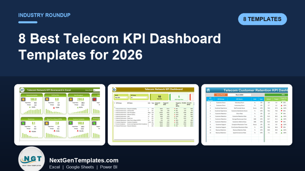
The best telecom KPI dashboard for most telecom operators in 2026 is the Telecommunications KPI Dashboard in Excel ($14.99): it tracks network, customer and financial KPIs, from availability and dropped call rate to churn, ARPU and EBITDA margin, month to date and year to date against target and last year. The Telecom Network KPI Dashboard in Google Sheets is the best value at $9.99, and six more picks cover Power BI, churn and scorecards.
Last updated: October 2026
Key takeaways
- Best overall telecom KPI dashboard: the Telecommunications KPI Dashboard in Excel at $14.99, the only pick that puts network, customer and financial KPIs for an operator in one Excel file.
- Best value: the Telecom Network KPI Dashboard in Google Sheets at $9.99, with ten network KPIs shared in a browser.
- Best for leadership reviews: the Telecommunications KPI Dashboard in Power BI at $11.99, with month and KPI group slicers and targets met and missed counted for you.
- Churn is its own problem: the Telecom Customer Retention KPI Dashboard in Excel splits voluntary and involuntary churn and tracks NPS, CLV and revenue retention.
- All eight picks are one-time purchases from $9.99 to $14.99; none replaces your network monitoring, OSS/BSS or billing system, which stay your systems of record.
Telecom KPI dashboard templates compared
| Template | Format | Best For | Price |
|---|---|---|---|
| Telecommunications KPI Dashboard | Excel | Best overall: network, customer and financial KPIs in one file | $14.99 |
| Telecom Network KPI Dashboard | Google Sheets | Best value: 10 shared network KPIs | $9.99 |
| Telecommunications KPI Dashboard | Power BI | Leadership KPI reviews on screen | $11.99 |
| Telecom Network KPI Dashboard | Excel | Network operations (NOC) monthly pack | $14.99 |
| Telecom Network KPI Dashboard | Power BI | Network KPI reviews with targets met and missed | $11.99 |
| Telecom Customer Retention KPI Dashboard | Excel | Churn, NPS and customer lifetime value | $14.99 |
| Telecommunications KPI Dashboard | Google Sheets | Shared operator-wide KPI tracking | $9.99 |
| Telecom Network KPI Scorecard | Excel | One-screen traffic-light scorecard for executives | $14.99 |
How we picked these telecom KPI dashboard templates
We searched the full NextGenTemplates catalogue of Excel, Google Sheets and Power BI products for telecom, telecommunications, network and subscriber retention tools, then kept the eight that a network operations manager, a customer experience lead, a revenue analyst or a chief operating officer at a telecom operator would open every month. Each pick had to run from real input sheets, carry genuine telecom measures such as network availability, call drop rate, latency, jitter, churn or ARPU, and be editable without a consultant.
We covered network, customer and financial KPIs on purpose, because an operator’s monthly review fails when one of the three is missing. We included all three formats because the pack is usually built in Excel, shared across regions in Google Sheets and presented on screen in Power BI. Close variants are left out of the ranking and listed in the decision section. Prices are the current one-time list prices on each product page. For market context and the standard definitions behind subscriber and coverage indicators, the ITU ICT statistics pages are the reference most regulators and operators use.
Why telecom operators need a KPI dashboard
A telecom operator makes money on thin margins spread across millions of small subscriptions. A one-point rise in monthly churn, a region where dropped calls creep above target, or a support queue where first contact resolution slips can cost more in a quarter than any new tariff earns. The data to spot those problems exists, but it is scattered: network monitoring exports, trouble ticket logs, the billing system, the CRM and a finance workbook.
So the monthly review starts with someone copying numbers between files, and the questions that matter take days to answer. Is network availability holding at target in every region? Is mean time to repair rising after a change in field staffing? Is churn voluntary, which points to price or service, or involuntary, which points to collections? Is ARPU rising faster than cost per user?
Enterprise telecom analytics and BI platforms answer those questions at a cost. Implementation projects run for months, and per-seat licences add up fast: Power BI Pro is $14 per user per month and Tableau Creator is $75 per user per month before any telecom-specific build. A telecom KPI dashboard template sits on top of your existing exports instead. It does not replace the system of record; it turns the monthly numbers into one page for a one-time $9.99 to $14.99. If your operations also include data centre or IT service teams, our 12 cybersecurity KPIs with ready-made dashboards covers the security side.
The 8 best telecom KPI dashboard templates for 2026
1. Telecommunications KPI Dashboard in Excel: best overall
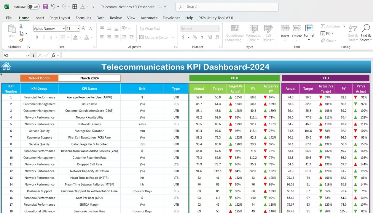
This is the most complete telecom KPI dashboard in the roundup, and it ranks first because it is the only Excel pick that covers all three sides of an operator in one file: network performance, customer management and financial performance. The KPI list runs from average revenue per user (ARPU), churn rate and customer satisfaction score (CSAT) to network availability, latency, dropped call rate, network capacity utilization, MTTR, MTBF, cost per user and EBITDA margin.
Who it is for: mobile, fixed-line and broadband operators, MVNOs and regional carriers that run a monthly management review in Microsoft Excel.
- KPI groups: Financial Performance, Customer Management, Network Performance, Service Quality, Customer Support and Operational Efficiency.
- A month selector that refreshes MTD and YTD actual, target and previous year, with green and red arrows.
- Service KPIs such as first call resolution rate, average call duration, data usage per subscriber, ticket resolution time and service activation time.
- Separate Target, Actual and Previous Year input sheets plus a KPI Definition sheet holding each formula, unit and type.
Concrete uses: put churn rate and revenue from value-added services (VAS) on the same page so marketing and finance discuss one set of numbers; compare MTTR with MTBF to see whether faults are being fixed faster or simply happening less; and watch EBITDA margin against cost per user before the board asks. Price: $14.99. Get the Telecommunications KPI Dashboard in Excel →
Best for: the operator that wants network, customer and financial KPIs in one Excel file.
2. Telecom Network KPI Dashboard in Google Sheets: best value
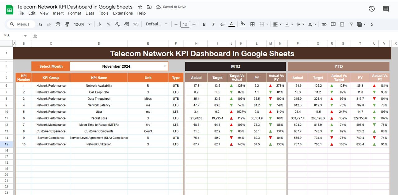
At $9.99 this is the best value in the list. It focuses on the network: choose a month from the dropdown and ten KPIs show month-to-date and year-to-date actuals against target and previous year, with triangle indicators, in a Google Sheet that regional teams can share.
Who it is for: small ISPs, regional carriers, fibre network operators and network operations teams that work in Google Workspace.
- Ten KPIs: network availability, call drop rate, data throughput (Mbps), network latency (ms), jitter, packet loss, MTTR, customer complaints, SLA compliance and network utilization.
- KPI groups for network performance, network maintenance, customer experience and service compliance.
- Each KPI tagged UTB (upper the better) or LTB (lower the better) so the arrows read correctly.
- Browser-based sharing with edit rights per contributor and no Excel licence needed.
Concrete uses: let each region enter its own monthly actuals; keep SLA compliance visible to the enterprise sales team; and check whether packet loss and jitter improve after a backbone upgrade. Price: $9.99. Get the Telecom Network KPI Dashboard in Google Sheets →
Best for: a first shared network scorecard at the lowest price.
3. Telecommunications KPI Dashboard in Power BI: best for leadership reviews
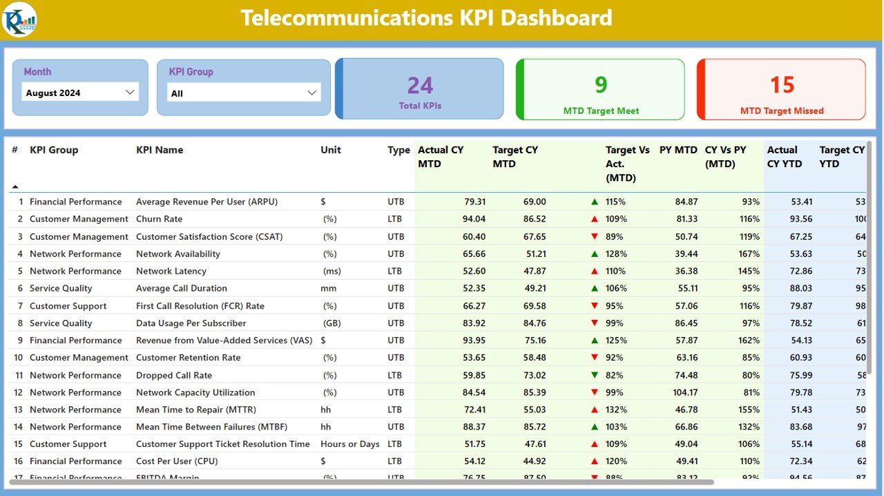
The Power BI build of pick 1, designed for presenting. Summary cards count total KPIs, MTD targets met and MTD targets missed, and month and KPI group slicers filter a full table of actual vs target and current year vs previous year, month to date and year to date.
Who it is for: executive teams, strategy and performance offices, and regulators’ liaison teams that review telecom KPIs on screen.
- 24 KPIs in the sample, with 9 met and 15 missed in the August view, so the meeting starts with the misses.
- The same network, customer, service and financial KPI list as the Excel edition.
- KPI group slicer to narrow the table to financial, network or customer KPIs.
- Data maintained in a simple Excel input file, then refreshed in the free Power BI Desktop app.
Concrete uses: filter to Customer Management before a churn review; sort by target vs actual to list the worst misses first; and open the trend view when a director asks whether ARPU is really rising. Price: $11.99. See the Telecommunications KPI Dashboard in Power BI →
Best for: operators that already run management reporting in Power BI.
Not sure where to start? Most telecom operators start with the Telecommunications KPI Dashboard in Excel ($14.99) because it covers the network, the customer and the money in one file. If your network team works in Google Workspace, the Telecom Network KPI Dashboard in Google Sheets ($9.99) is the cheapest way to put ten network targets in front of every region.
4. Telecom Network KPI Dashboard in Excel
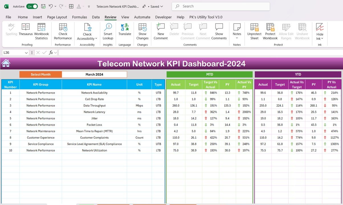
The Excel edition of the ten-KPI network framework, built for the monthly network operations pack. A Home sheet links to the dashboard, the trend sheet, the three input sheets and the KPI definitions, so engineers who are not spreadsheet specialists can still find their way around.
Who it is for: network operations centre (NOC) managers, transmission and core network teams, and field maintenance leads.
- Network availability, call drop rate, data throughput, network latency, jitter, packet loss and network utilization.
- Mean time to repair (MTTR) in hours for the maintenance team.
- Customer complaints and SLA compliance so service impact sits next to the technical numbers.
- MTD and YTD actual vs target and vs previous year with up and down arrows.
Concrete uses: track MTTR every month rather than only after a major outage; show enterprise customers SLA compliance with the trend behind it; and compare latency and jitter with the previous year after a vendor swap. Price: $14.99. Get the Telecom Network KPI Dashboard in Excel →
Best for: network teams that report in Excel.
5. Telecom Network KPI Dashboard in Power BI
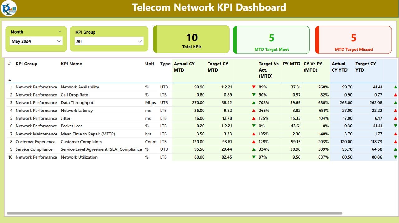
The same ten network KPIs as a Power BI report. Cards count total KPIs, targets met and targets missed (5 and 5 in the May sample), and month and KPI group slicers filter the MTD and YTD table.
Who it is for: CTO offices and network leadership teams that hold a monthly performance review in front of a screen.
- Actual vs target and current year vs previous year, MTD and YTD, with green and red icons.
- KPI group slicer for network performance, maintenance, customer experience and service compliance.
- Trend page comparing the current year with the previous year for any KPI.
- Monthly inputs kept in a plain Excel file, so no database is needed.
Concrete uses: open the review on the missed KPIs; filter to network maintenance when MTTR is the agenda item; and show the year-on-year trend for network availability in a vendor review. Price: $11.99. See the Telecom Network KPI Dashboard in Power BI →
Best for: network leadership that already uses Power BI.
6. Telecom Customer Retention KPI Dashboard in Excel
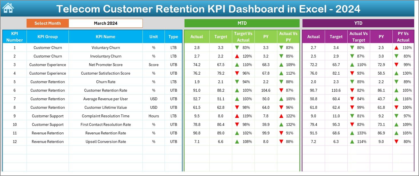
Churn is the KPI that decides whether a telecom operator grows, so it gets its own pick. This dashboard tracks 12 retention KPIs across customer churn, customer experience, customer retention, customer support and revenue retention, month to date and year to date.
Who it is for: retention, customer experience, CRM and marketing teams at mobile, broadband and pay-TV operators.
- Voluntary churn and involuntary churn as separate KPIs, plus overall churn rate and customer retention rate.
- Net Promoter Score and customer satisfaction score.
- Average revenue per user, customer lifetime value, revenue retention rate and upsell conversion rate.
- Complaint resolution time in hours and first contact resolution rate.
Concrete uses: in the March sample, voluntary churn is 2.8% against a 3.3% target while involuntary churn misses at 2.7% against 2.2%, which points the fix at collections, not at pricing; track upsell conversion after a bundle launch; and pair NPS with complaint resolution time to show service is driving loyalty. Price: $14.99. Get the Telecom Customer Retention KPI Dashboard in Excel →
Best for: teams whose main question is why subscribers leave.
7. Telecommunications KPI Dashboard in Google Sheets
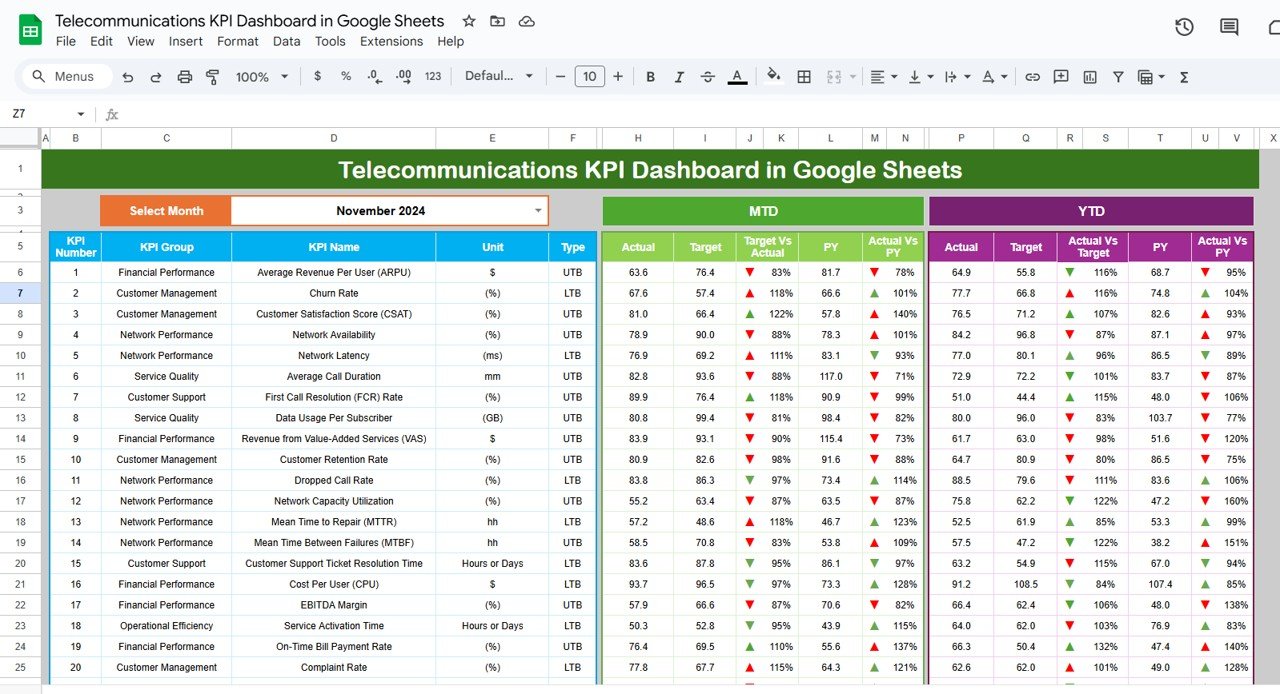
The Google Sheets edition of pick 1 at $9.99. A month dropdown refreshes the full operator KPI list, including ARPU, churn rate, CSAT, network availability, latency, first call resolution, VAS revenue, retention rate, dropped call rate, MTTR, MTBF, cost per user, EBITDA margin, service activation time, on-time bill payment rate and complaint rate.
Who it is for: operators whose regional managers, finance and customer teams all need to update one shared file.
- MTD and YTD actual vs target and vs previous year with arrows.
- Financial, customer, network, service and operational KPI groups.
- Actual, Target, Previous Year and KPI Definition tabs.
- Runs in any browser with Google Workspace sharing.
Concrete uses: let finance own ARPU and EBITDA margin while operations owns network availability, in the same file; watch on-time bill payment rate as an early signal of involuntary churn; and review service activation time after a provisioning change. Price: $9.99. Get the Telecommunications KPI Dashboard in Google Sheets →
Best for: operator-wide KPI tracking on a small budget.
8. Telecom Network KPI Scorecard in Excel
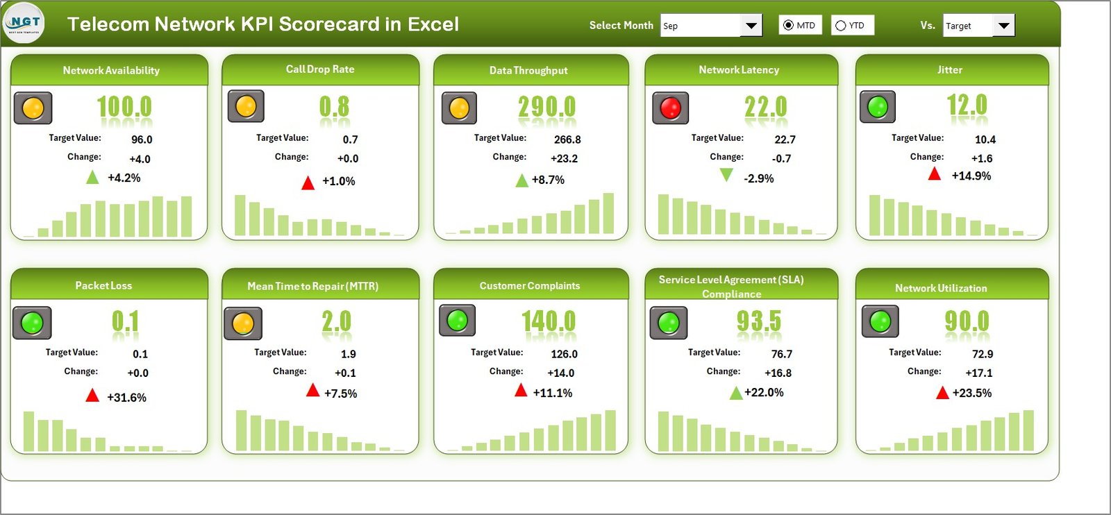
A scorecard rather than a table. Ten KPI cards each show the actual value, the target, the change and a traffic light, with a small bar chart of the monthly trend underneath. A month dropdown, an MTD or YTD switch and a “vs target or previous year” selector control the whole page.
Who it is for: executives and board members who want to read network health at a glance.
- The ten network KPIs: availability, call drop rate, throughput, latency, jitter, packet loss, MTTR, customer complaints, SLA compliance and utilization.
- Red, amber and green indicators per KPI.
- Twelve-month mini bar chart on every card.
- Switch between MTD and YTD and between target and previous year comparisons.
Concrete uses: in the September sample, network availability reads 100.0 against a 96.0 target and SLA compliance 93.5 against 76.7, while latency shows a red light; print the page for a board pack; and use the trend bars to show whether a red light is a blip or a pattern. Price: $14.99. Get the Telecom Network KPI Scorecard in Excel →
Best for: a one-screen network summary for executives.
The telecom KPIs every telecom KPI dashboard should show
Whichever telecom KPI dashboard you choose, make sure the monthly pack answers these questions. Each formula works in any spreadsheet once your data sits in one table. Benchmarks vary by market and technology, so set targets from your own history and contracts.
| KPI | Formula | What to watch for |
|---|---|---|
| Network availability % | (Total minutes − outage minutes) ÷ total minutes | Carrier-grade targets sit at 99.9% or higher; read it by region, not only network-wide |
| Dropped call rate % | Dropped calls ÷ total established calls | Usually expected to stay low single digits; spikes follow site outages or congestion |
| Latency (ms) | Average round-trip time on reference tests | Track jitter and packet loss alongside it; voice and gaming feel them first |
| Mean time to repair (MTTR) | Total repair time ÷ number of faults | Rising MTTR with flat fault counts points to field staffing or spares |
| Monthly churn rate % | Subscribers lost in month ÷ subscribers at start of month | Large US postpaid phone bases run under about 1% a month; prepaid runs far higher |
| ARPU | Service revenue ÷ average subscribers in the period | Compare with cost per user; ARPU growth that trails cost growth erodes margin |
| First contact resolution % | Issues solved on first contact ÷ total issues | A drop usually shows up in complaints and churn within one or two months |
| SLA compliance % | Services meeting SLA ÷ services under SLA | Enterprise contracts often carry credits; report it before the customer does |
Keep live alarms and real-time performance in your network monitoring tools; the dashboard is where you see the monthly trend and agree actions. For the customer side in more depth, our guide to 10 churn and retention metrics with ready-made dashboards explains how to segment churn, and the 12 customer service KPIs post covers contact-centre measures such as FCR and handle time.
How to choose the right telecom KPI dashboard template
Match the template to two things: the question you answer every month and the software your team already uses.
- Network, customer and financial KPIs together: the Telecommunications KPI Dashboard in Excel ($14.99), the Power BI edition ($11.99) or the Google Sheets edition ($9.99).
- Network performance only: the Telecom Network KPI Dashboard in Excel ($14.99), the Power BI edition ($11.99) or the Google Sheets edition ($9.99).
- A one-screen executive view: the Telecom Network KPI Scorecard in Excel ($14.99), the Telecommunications KPI Scorecard in Excel ($12.99) or the Telecommunications KPI Scorecard in Google Sheets ($9.99).
- Churn and retention: the Telecom Customer Retention KPI Dashboard in Excel ($14.99) or the Telecom Customer Retention KPI Dashboard in Power BI ($11.99).
- Towers, sites, fibre and capacity: the Telecommunications Infrastructure KPI Dashboard in Excel ($14.99), the Telecommunications Infrastructure KPI Dashboard in Power BI ($11.99) or the Telecommunications Infrastructure KPI Dashboard in Google Sheets ($9.99).
- Transaction-level analysis rather than monthly KPIs: the Telecommunications Dashboard in Excel ($17.99), the Telecommunications Dashboard in Power BI ($17.99), the Telecommunications Dashboard in Google Sheets ($6.99) or the Telecommunications Dashboard in HTML ($12.99).
For neighbouring industries, see our utilities dashboard templates, which share the same network reliability logic, the airline and airport operations templates, and the IT asset management dashboards for equipment and spares. Before you buy anything, our guide to evaluating an Excel dashboard lists the checks worth doing.
When a telecom KPI dashboard template is NOT the right answer
A dashboard is a reporting layer, not a system of record. Be honest about where a telecom KPI dashboard template stops:
- You need real-time network monitoring. Alarms, counters and live performance belong in your network management system, OSS and probes. Export monthly summaries into a dashboard; never run the network from a spreadsheet.
- You need billing, rating or charging. BSS and billing platforms handle tariffs, usage records, invoices and the audit trail. The templates here only report on the results.
- You file regulatory quality-of-service returns. Statutory reports have defined measurement methods and should come from the systems that capture the raw data.
- You analyse call detail records or per-subscriber usage. Millions of rows a day need a data warehouse, with Power BI on top, not a workbook.
- You need churn prediction. Scoring individual subscribers for churn risk needs a model built on customer-level data; these dashboards measure churn after it happens.
If none of those apply, and for monthly management reporting they usually do not, a template is the faster, cheaper and more flexible choice, and it keeps working if you change the systems underneath.
Frequently asked questions
What is a telecom KPI dashboard?
A telecom KPI dashboard is a ready-made Excel, Google Sheets or Power BI file that shows a telecom operator's key performance indicators, such as network availability, call drop rate, latency, churn, ARPU and MTTR, against target and the previous year. You enter monthly actuals and targets, pick a month, and the month-to-date and year-to-date views update automatically.
Which KPIs should a telecom operator track every month?
Track a balanced set: network availability, dropped call rate, latency, packet loss and MTTR on the network side; churn rate, retention rate, NPS and first contact resolution on the customer side; and ARPU, cost per user and EBITDA margin on the financial side. The Telecommunications KPI Dashboard covers all three groups in one file.
Is a telecom KPI dashboard template a replacement for an OSS/BSS or network monitoring tool?
No. Network monitoring, OSS, BSS, billing and CRM systems stay your systems of record and alarm tools. A telecom KPI dashboard template is the monthly management layer on top: it reads summary figures exported from those systems and turns them into a one-page scorecard for a one-time $9.99 to $14.99.
Excel, Google Sheets or Power BI: which is best for a telecom team?
Choose Excel when one analyst prepares the monthly pack offline, Google Sheets when regional teams or field offices need to update one shared file in a browser, and Power BI when leadership reviews KPIs on screen with slicers and drill-through. All eight picks are one-time purchases with no per-user fee.
How do I calculate churn rate for a telecom operator?
Churn rate is the number of subscribers who left during the period divided by the subscribers at the start of the period, shown as a percentage. Report monthly churn separately for prepaid and postpaid and split voluntary from involuntary churn, as the Telecom Customer Retention KPI Dashboard does, because the fixes are different.
What does LTB and UTB mean in these dashboards?
UTB means upper the better and LTB means lower the better. Every KPI is tagged with one of the two, so the green and red arrows read correctly: higher network availability is good, while a higher call drop rate, latency, jitter or MTTR is bad. You set the type once on the KPI definition sheet.
Do I need macros, coding or a Power BI Pro licence?
No. The Excel templates use formulas, dropdowns and conditional formatting, the Google Sheets editions run in any browser, and the Power BI files open in the free Power BI Desktop app. A paid Power BI Pro licence, currently $14 per user per month, is only needed if you publish and share the report online.
Can I add my own telecom KPIs, such as 5G coverage or NPS by region?
Yes. The KPI list, group, unit, type and formula all live on an editable definition sheet, and the input sheets take one row per KPI per month. Add a row for 5G population coverage, average download speed or site uptime, enter targets, and the dashboard picks it up.
Which template is best for a small ISP or regional carrier?
Start with the Telecom Network KPI Dashboard in Google Sheets at $9.99. It tracks ten network and service KPIs, including availability, call drop rate, throughput, latency, jitter, packet loss, MTTR and SLA compliance, and several staff can update it at once. Add the Customer Retention dashboard when churn becomes the main question.
How long does it take to set up a telecom KPI dashboard?
Most teams are reporting within an afternoon. Enter twelve months of targets on the target sheet, paste monthly actuals from your network monitoring and billing exports into the actual sheet, add last year's figures, then choose a month. Check one KPI against a number you trust before you share the file.
Get more telecom KPI dashboard templates
Ready to see the network, the customer and the money on one page? Start with our best overall telecom KPI dashboard, the Telecommunications KPI Dashboard in Excel ($14.99), or the best-value Telecom Network KPI Dashboard in Google Sheets ($9.99). Leadership teams get more from the Telecommunications KPI Dashboard in Power BI ($11.99), and retention teams should start with the Telecom Customer Retention KPI Dashboard ($14.99). Every option is a one-time purchase with no subscription and no per-user fee.
Compare more industry roundups with our Power BI dashboard templates ranked by industry, the premium Power BI templates under $20, the shareable Google Sheets templates for teams, the 15 sales KPIs to track and the 25 best-selling business templates. Subscribe to the NextGenTemplates YouTube channel for setup tutorials.