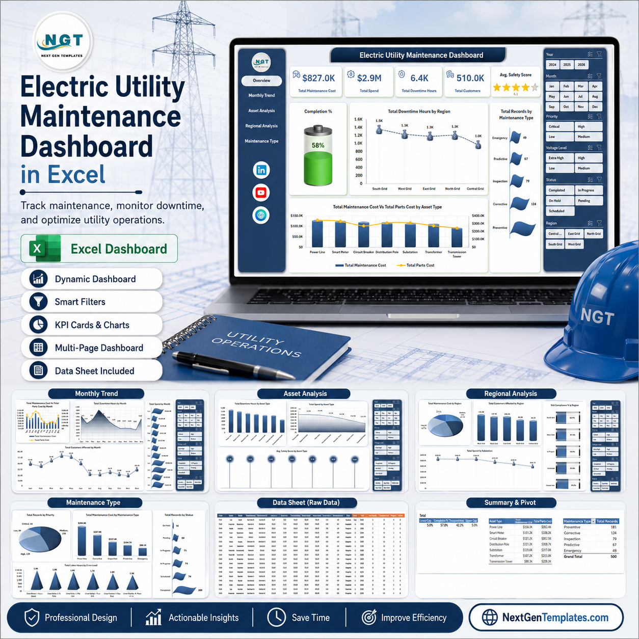


Electric Utility Maintenance Dashboard in Excel helps utility maintenance teams monitor maintenance cost, spend, downtime, customers affected, safety score, asset performance, regional service quality, and maintenance workload in one editable workbook. The file includes 7 worksheet tabs, 5 headline KPI cards, slicer-based filtering, pivot-driven charts, a structured Data Sheet, and a Support Sheet that can be hidden after setup. It is designed for teams that want practical Excel reporting without paying for a monthly maintenance analytics platform. One-time download. No subscription. Built by PK, a Microsoft Certified Professional with 15+ years of Excel dashboard experience.
Key Features of Electric Utility Maintenance Dashboard in Excel
- Interactive Excel dashboard with multiple slicers for quick filtering.
- Overview KPI cards for Total Maintenance Cost, Total Spend, Total Downtime Hours, Total Customers, and Avg. Safety Score.
- Monthly trend analysis for costs, downtime, spend, and customer impact.
- Asset, regional, and maintenance type pages for deeper operational review.
- Dedicated Data Sheet where users can replace sample rows with their own data.
- Support Sheet with pivot tables that refresh the entire dashboard after data updates.
- Editable workbook built for Microsoft Excel users in utility operations, maintenance, and asset management.
What’s Inside the Electric Utility Maintenance Dashboard in Excel
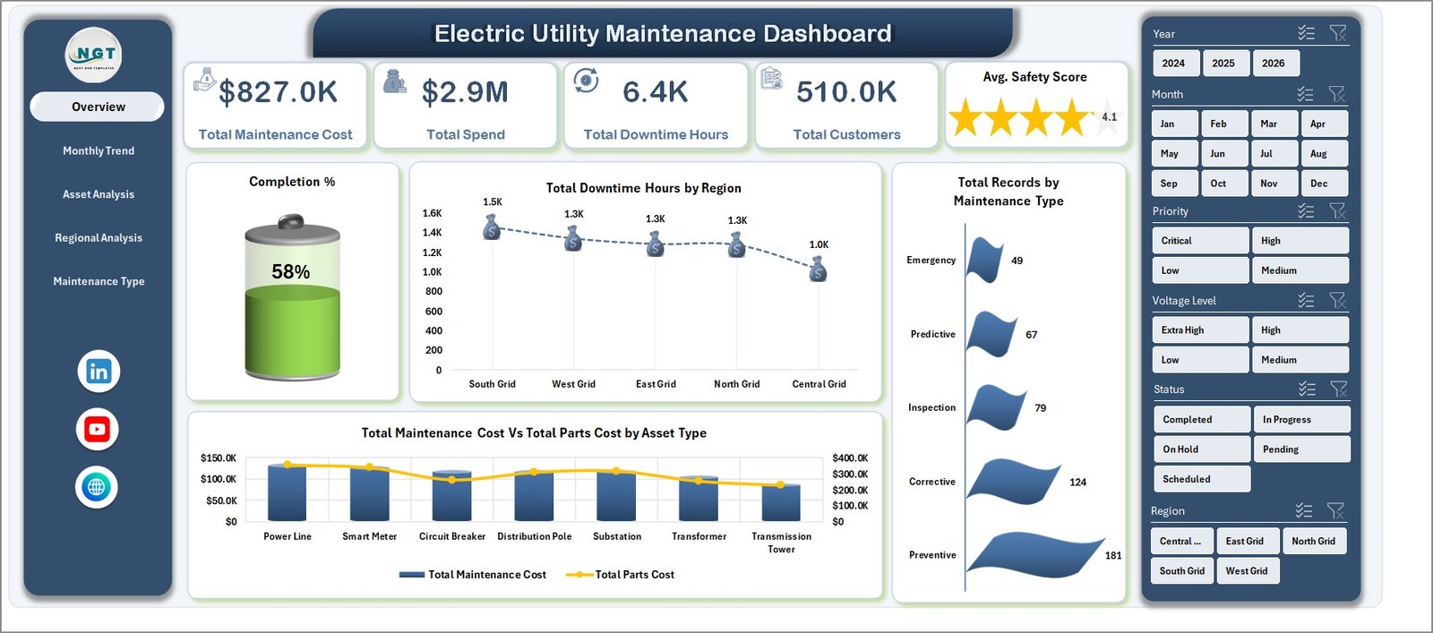
1. Overview Page
The Overview Page gives maintenance leaders a high-level snapshot of the complete utility maintenance operation. The top cards show Total Maintenance Cost, Total Spend, Total Downtime Hours, Total Customers, and Avg. Safety Score so managers can understand cost, reliability impact, and service quality before reviewing the detailed pages.
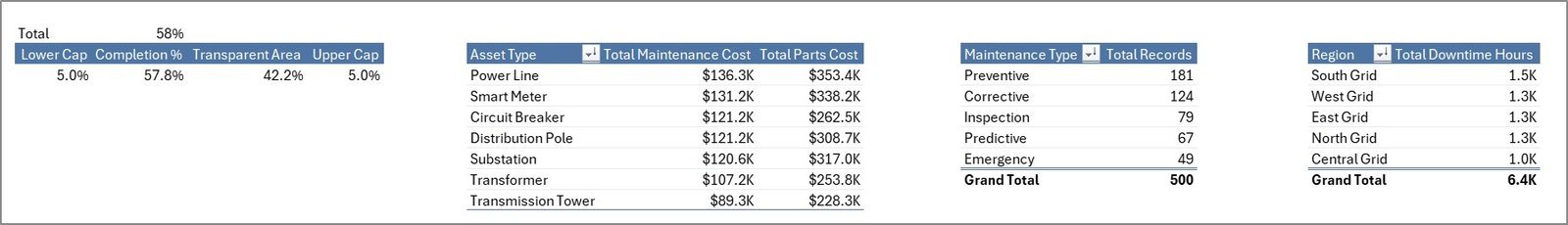
Completion % by Total Records: This chart shows how many maintenance records are completed compared with the total workload. It helps teams monitor backlog pressure and whether work is moving through the process on time.
Total Downtime Hours by Region: This chart compares downtime across service regions. It helps managers identify regions where outages, asset failures, or delayed response may need extra attention.
Total Records by Maintenance Type: This visual groups work by maintenance type. It helps teams understand whether preventive, corrective, emergency, or planned work is driving the largest share of activity.
Total Maintenance Cost Vs Total Parts Cost by Asset Type: This comparison shows how service cost and parts cost behave by asset category. It is useful for identifying assets that may need replacement planning, vendor review, or stronger preventive maintenance.
Electric Utility Maintenance Dashboard in Excel
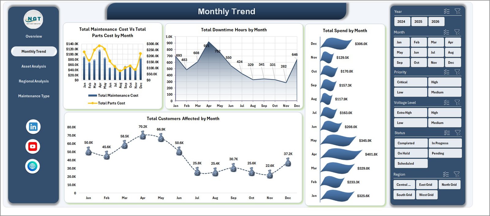
2. Monthly Trend
The Monthly Trend tab shows how maintenance cost, parts cost, downtime, total spend, and customers affected move over time. Utility teams can use this page to spot cost spikes, seasonal downtime patterns, and months with higher customer impact.
Monthly Trend
3. Asset Analysis
The Asset Analysis tab focuses on performance by asset type and voltage level. It includes Total Downtime Hours by Asset Type, Total Spend by Asset Type, Total Maintenance Cost by Voltage Level, and Avg. Safety Score by Asset Type.
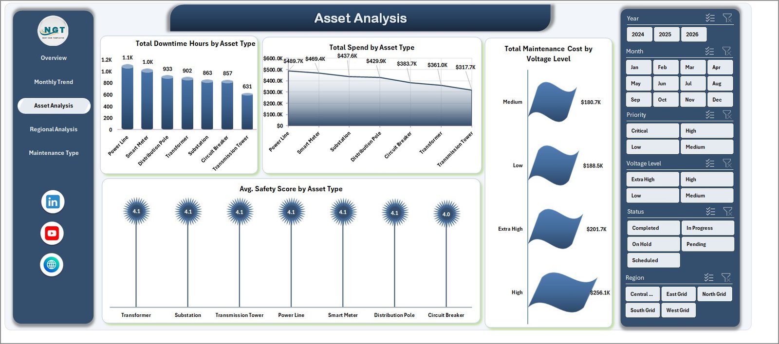
Asset Analysis
4. Regional Analysis
The Regional Analysis tab compares cost, customer impact, SLA compliance, and substation spend across regions. It helps operations teams see which areas carry the highest maintenance burden and where service performance needs review.
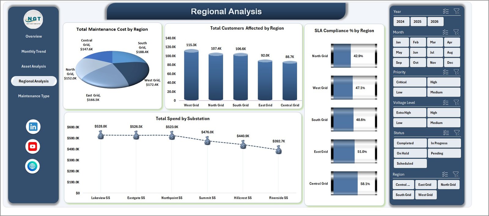
Regional Analysis
5. Maintenance Type
The Maintenance Type tab explains workload by priority, maintenance type, status, and crew lead. It is useful for coordinators who need to balance labor hours, review open work, and understand which maintenance categories consume the most cost.
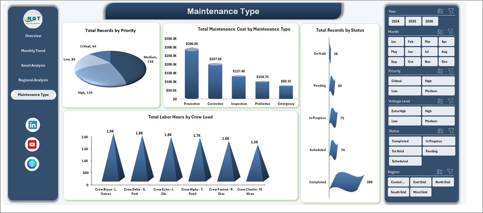
Maintenance Type
6. Data Sheet Tab
The Data Sheet stores the source records in the same format used by the dashboard. Replace the sample data with your own maintenance rows, keep the column structure consistent, and refresh the workbook to update cards, slicers, pivots, and charts.
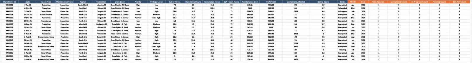
Data Sheet tab
7. Support Sheet
The Support Sheet contains pivot tables used to create the dynamic dashboard. After updating the Data tab, go to the Data tab in the Excel Ribbon and click Refresh All. The pivots and charts will refresh automatically, and this sheet can remain hidden for normal users.

Support sheet tab
Electric Utility Maintenance Dashboard in Excel vs. Google Sheets vs. Paid CRM/SaaS – Where This Fits
| Feature | This Excel Template | Google Sheets Alternative | Paid SaaS Alternative |
|---|---|---|---|
| Cost | $17.99 one-time | Low direct cost, manual build time | Monthly or annual subscription |
| Platform | Microsoft Excel | Google Sheets | Vendor cloud platform |
| Setup time | Replace data and refresh | Build pivots and charts manually | Requires configuration and onboarding |
| Real-time team collaboration | Available through OneDrive or SharePoint | Strong native collaboration | Usually included by user license |
| Customizable fields | Fully editable workbook | Editable if built manually | Limited by vendor settings |
| Share with link | Possible through Microsoft cloud storage | Built in | Account based |
| Year-1 cost at 5 users | $17.99 plus existing Excel access | Low tool cost, higher build time | Often hundreds or thousands |
| Pivot refresh workflow | Included | Must be built | Depends on reporting module |
Who This Template Is For – and Who It’s Not For
This dashboard is for electric utility maintenance managers, operations managers, reliability engineers, asset management teams, substation supervisors, and reporting analysts who need a clean Excel view of cost, downtime, customers affected, SLA compliance, safety score, priority, status, asset type, region, and crew lead activity.
It is not a real-time SCADA system, outage management system, work order platform, GIS tool, or enterprise asset management system. It works best as a reporting layer when maintenance records are already available in rows and columns.
How to Use the Electric Utility Maintenance Dashboard in Excel
- Download and unzip the product file.
- Open the workbook in Microsoft Excel.
- Go to the Data Sheet and replace the sample records with your own maintenance data.
- Keep the same column headers and data structure for clean pivot refresh.
- Use Data > Refresh All to update the Support Sheet pivots and all dashboard charts.
- Use slicers to filter by region, asset type, month, status, priority, maintenance type, and other available fields.
Real-World Use Cases
Meera, utility maintenance manager: Meera uses the Overview and Regional Analysis pages during weekly reviews to explain downtime, cost, safety score, and customer impact by service area.
Daniel, reliability engineer: Daniel uses Asset Analysis to identify asset types and voltage levels with repeated downtime or high maintenance spend before recommending preventive action.
Asha, operations analyst: Asha updates the Data Sheet each month, refreshes the workbook, and sends leadership filtered views for high-priority maintenance and SLA compliance.
Frequently Asked Questions
What is included in this Excel dashboard?
The workbook includes Overview, Monthly Trend, Asset Analysis, Regional Analysis, Maintenance Type, Data Sheet, and Support Sheet tabs.
Can I use my own utility maintenance data?
Yes. Replace the sample records in the Data Sheet while keeping the same structure, then use Refresh All.
Does this dashboard require macros?
No. The dashboard is designed around Excel tables, slicers, charts, and pivot tables.
Can I hide the Support Sheet?
Yes. The Support Sheet can stay hidden after setup because it mainly stores pivot tables used by the dashboard charts.
Can I customize the workbook?
Yes. You can edit labels, charts, slicers, colors, formulas, and worksheet structure based on your reporting needs.
Is this a replacement for enterprise maintenance software?
No. It is an Excel reporting template, not a full work order, asset registry, or real-time monitoring platform.
About the Author
Built by PK – Microsoft Certified Professional with 15+ years of Excel, Google Sheets, and Power BI experience. Founder of NextGenTemplates, reaching 300K+ subscribers across YouTube channels. Every template is hand-built and tested before release.
Explore Related Templates
- Energy and Utility Dashboard in HTML
- Power Distribution KPI Dashboard in Excel
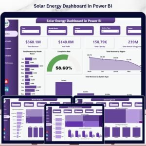
- Solar Energy Dashboard in Power BI
- Browse Excel Dashboard Templates
- Browse Operations Excel Templates
Download the Electric Utility Maintenance Dashboard in Excel and turn maintenance records into clear cost, downtime, asset, region, and service-quality reporting.
Last updated: June 7, 2026.


Reviews
There are no reviews yet.