

The 12 manufacturing KPIs to track in 2026 are OEE, Availability, Performance, Quality Rate, First Pass Yield, Throughput, Cycle Time, Unplanned Downtime, Scrap Rate, On-Time Delivery in Full, Capacity Utilization, and Manufacturing Cost per Unit. Together they measure whether your plant runs, runs fast, runs clean, and runs profitably.
Last updated: September 2026
Most factories drown in numbers but track the wrong ones. The manufacturing KPIs below are the compact set that plant managers, operations leaders and continuous-improvement teams actually use to run a shift. For each metric you get a one-sentence definition, the exact formula, a realistic benchmark range, and the single mistake that quietly ruins the number. Then we map every metric to a ready-made dashboard template so you can start measuring this week instead of building spreadsheets from scratch.
Key takeaways
- OEE is the master metric — it multiplies Availability × Performance × Quality, and world-class is 85%, while the typical plant sits at 40–60%.
- Every KPI here ships with a formula and a benchmark range, so you can score your line today, not “someday when the data is clean”.
- Eight NGT dashboard templates already calculate these manufacturing KPIs, priced from $9.99 to $79.99.
- The best-value option is the Plant Production Manager Toolkit — 9 Excel + Power BI templates for $79.99, roughly the cost of two single dashboards.
- Chasing 100% on the wrong KPI (Capacity Utilization, Availability) usually destroys On-Time Delivery and Quality — the balance matters more than any single peak.
Manufacturing KPI dashboard templates compared
| Template | Format | Best for | Price |
|---|---|---|---|
| Plant Production Manager Toolkit (Best value) | Excel + Power BI (9 templates) | Running a whole plant from one KPI stack | $79.99 |
| Manufacturing Production Management System V1.0 (Best overall) | Excel VBA | Live production entry + throughput, cost and schedule KPIs | $19.99 |
| Manufacturing Production Variance Analysis Dashboard (Excel) | Excel | Cost per unit, scrap cost and material/labour variance | $17.99 |
| Manufacturing Production Variance Analysis Dashboard (Power BI) | Power BI | The same variance KPIs with interactive drill-down | $17.99 |
| Manufacturing Risk Management KPI Dashboard (Excel) | Excel | Downtime, availability and reliability risk | $14.99 |
| Manufacturing Sustainability KPI Dashboard (Excel) | Excel | Scrap, waste and energy-per-unit tracking | $14.99 |
| Manufacturing Market Expansion KPI Dashboard (Excel) | Excel | Capacity utilization and throughput vs demand | $14.99 |
| Food Manufacturing KPI Dashboard (Google Sheets) | Google Sheets | Quality, yield and OEE on a free, shareable platform | $9.99 |
How we picked these manufacturing KPIs
We searched the NextGenTemplates catalogue of 500+ business templates and its manufacturing library specifically, then cross-checked the metric definitions against the standard OEE framework published by OEE.com and lean-manufacturing practice. A KPI earned a place only if it (1) drives an operational decision on the shop floor, (2) has an unambiguous formula, and (3) already appears on at least one shippable dashboard so you can act on it. We deliberately excluded vanity metrics — gross units produced, raw machine hours — that go up when the plant is doing the wrong things faster.
The 12 manufacturing KPIs to track in 2026
1. Overall Equipment Effectiveness (OEE)
Definition: the single percentage that tells you how much of your fully productive manufacturing time is actually productive.
Formula: OEE = Availability × Performance × Quality.
Benchmark: 85% is world-class, 60–85% is typical for a decent plant, and 40–60% is common for factories that have never measured it. Below 40% signals systemic loss.
Common mistake: celebrating a high OEE built on an easy ideal cycle time. If your “ideal” speed is set below what the machine can really do, Performance — and therefore OEE — is inflated across every shift.
2. Availability
Definition: the share of scheduled production time the equipment was actually running.
Formula: Availability = Run Time ÷ Planned Production Time (Run Time = Planned Production Time − Stop Time).
Benchmark: ~90% is world-class; 80–90% is healthy; below 80% means downtime is eating your schedule.
Common mistake: handling changeovers and planned maintenance inconsistently. If planned stops sometimes count against Availability and sometimes don’t, the trend line becomes meaningless.
3. Performance (speed efficiency)
Definition: how fast the line ran versus its ideal speed while it was running.
Formula: Performance = (Ideal Cycle Time × Total Count) ÷ Run Time.
Benchmark: ~95% is world-class; 85–95% is normal once small stops and speed losses are controlled.
Common mistake: ignoring “small stops” and micro-slowdowns because no one logs them. These minor speed losses are usually the biggest hidden drain on Performance.
4. Quality Rate
Definition: the proportion of units produced that meet spec the first time, within the OEE calculation.
Formula: Quality = Good Count ÷ Total Count.
Benchmark: ~99.9% is world-class; 97–99.9% is common; below 97% points to a process control problem.
Common mistake: counting only scrapped units as bad and treating reworked units as “good”. Rework is a quality loss — it consumed capacity twice.
5. First Pass Yield (FPY)
Definition: the percentage of units that pass every step of the process without any rework, scrap or deviation.
Formula: FPY = Units passing without rework ÷ Units entering the process × 100. Across a line, Rolled Throughput Yield = FPY₁ × FPY₂ × … × FPYₙ.
Benchmark: above 95% is strong; 90–95% is workable; below 90% exposes a “hidden factory” of rework.
Common mistake: measuring yield at the end of the line after rework has already fixed the defects, then calling it First Pass Yield. That hides where quality actually fails.
6. Throughput
Definition: the volume of good units the line produces in a given period.
Formula: Throughput = Good Units Produced ÷ Time Period (per hour, shift or day).
Benchmark: aim for 80–95% of the line’s rated design capacity; sustained output above 95% usually means the rated capacity is understated.
Common mistake: reporting gross throughput that includes defective units. Throughput should only count units you can actually ship.
7. Cycle Time
Definition: the average time it takes to produce one finished unit.
Formula: Cycle Time = Net Production Time ÷ Number of Units Produced.
Benchmark: a healthy line runs within 5–10% of its ideal cycle time and at or below customer Takt time (available time ÷ customer demand).
Common mistake: confusing Cycle Time with Lead Time or Takt Time. Cycle Time is the internal pace of one operation; Lead Time is the whole order-to-delivery clock.
8. Unplanned Downtime
Definition: the percentage of scheduled time lost to failures, jams and stoppages you did not plan for.
Formula: Unplanned Downtime % = Unplanned Stop Time ÷ Scheduled Production Time × 100.
Benchmark: world-class plants keep it under 2%; 5–10% is typical; above 10% is a maintenance and reliability red flag.
Common mistake: lumping planned maintenance and changeovers into the unplanned bucket, which makes the number look worse and hides the true breakdown rate.
9. Scrap Rate
Definition: the share of produced units that are rejected and cannot be sold or reworked.
Formula: Scrap Rate = Scrapped Units ÷ Total Units Produced × 100.
Benchmark: under 1% is excellent for most discrete manufacturing; 1–3% is common; above 3% deserves a root-cause project.
Common mistake: tracking scrap as a unit count only. Scrap should be costed — material plus labour plus overhead already spent — or its true impact stays invisible.
10. On-Time Delivery in Full (OTIF)
Definition: the percentage of customer orders delivered both on the promised date and complete in quantity.
Formula: OTIF = Orders delivered on time AND in full ÷ Total orders × 100.
Benchmark: above 95% is strong; 90–95% is typical; below 90% erodes customer trust fast.
Common mistake: measuring “on time” and “in full” separately and reporting whichever is higher. OTIF only counts an order that hits both — a partial shipment on time still fails.
11. Capacity Utilization
Definition: how much of your maximum possible output you are actually producing.
Formula: Capacity Utilization = Actual Output ÷ Maximum Possible Output × 100.
Benchmark: 70–90% is a healthy operating band; sustained figures above 90% leave no buffer for demand spikes or maintenance.
Common mistake: chasing 100% utilization. A plant run flat-out has no slack, so any hiccup immediately damages OTIF, Quality and Unplanned Downtime.
12. Manufacturing Cost per Unit
Definition: the fully loaded cost to produce one finished unit.
Formula: Cost per Unit = (Materials + Direct Labour + Manufacturing Overhead) ÷ Total Units Produced.
Benchmark: this is product- and industry-specific, so track the trend — a well-run line drives cost per unit down quarter over quarter as scrap and downtime fall.
Common mistake: leaving overhead, scrap and rework cost out of the numerator, which understates true unit cost and hides where margin actually leaks.
Manufacturing KPI formula and benchmark table
| Metric | Formula | Benchmark | Where to see it |
|---|---|---|---|
| OEE | Availability × Performance × Quality | 85% world-class; 40–60% typical | Plant Production Manager Toolkit |
| Availability | Run Time ÷ Planned Production Time | ~90% world-class | Risk Management KPI Dashboard |
| Performance | (Ideal Cycle Time × Total Count) ÷ Run Time | ~95% world-class | Plant Production Manager Toolkit |
| Quality Rate | Good Count ÷ Total Count | ~99.9% world-class | Food Manufacturing KPI Dashboard |
| First Pass Yield | Units passing without rework ÷ Units entering × 100 | >95% strong | Food Manufacturing KPI Dashboard |
| Throughput | Good Units ÷ Time Period | 80–95% of rated capacity | Production Management System |
| Cycle Time | Net Production Time ÷ Units Produced | Within 5–10% of ideal | Production Management System |
| Unplanned Downtime | Unplanned Stop Time ÷ Scheduled Time × 100 | <2% world-class; 5–10% typical | Risk Management KPI Dashboard |
| Scrap Rate | Scrapped Units ÷ Total Units × 100 | <1% excellent; 1–3% common | Sustainability KPI Dashboard |
| OTIF | On-time & in-full orders ÷ Total orders × 100 | >95% strong | Market Expansion KPI Dashboard |
| Capacity Utilization | Actual Output ÷ Max Possible Output × 100 | 70–90% healthy band | Market Expansion KPI Dashboard |
| Cost per Unit | (Materials + Labour + Overhead) ÷ Units | Product-specific; trend down | Production Variance Analysis Dashboard |
Ready to stop building formulas by hand? The Plant Production Manager Toolkit bundles 9 Excel and Power BI templates that already calculate OEE, downtime, throughput and cost per unit — $79.99 for the whole stack. Get the toolkit →
The 8 dashboards that already calculate these manufacturing KPIs
Every metric above needs a place to live. These eight ready-made templates map directly to the manufacturing KPIs in this guide, ranked by how much of the full KPI stack they cover.
1. Plant Production Manager Toolkit — best overall value
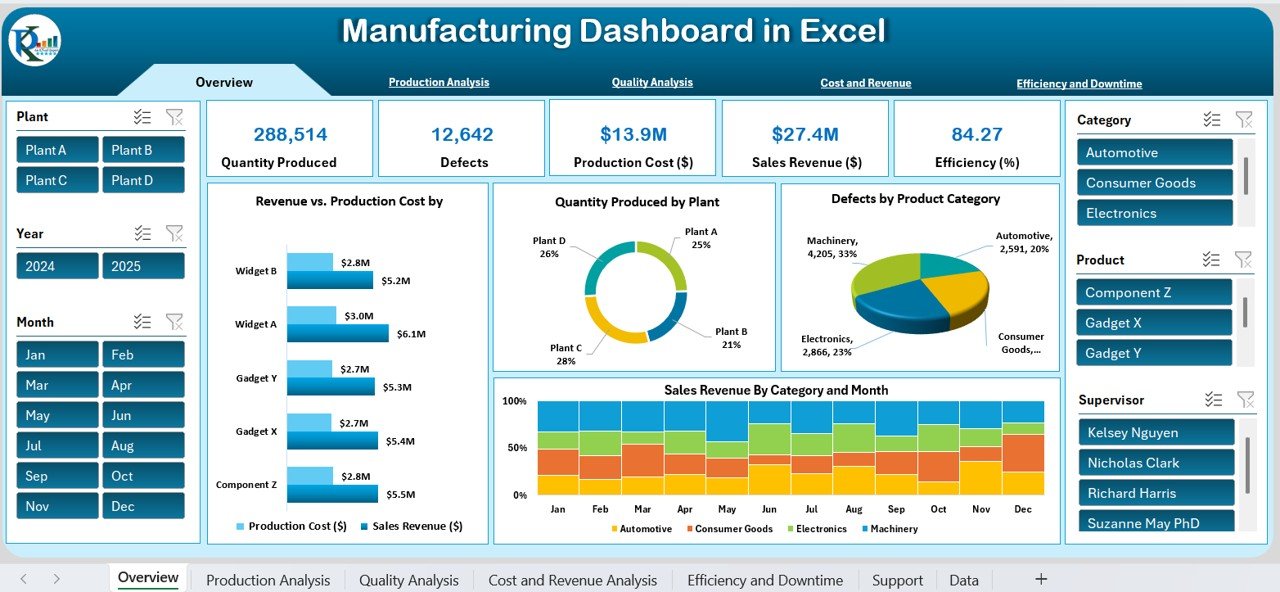
What it is: a 9-template bundle in both Excel and Power BI built to run an entire plant from one KPI stack.
Who it is for: plant managers and operations leaders who want OEE, downtime, throughput, cost and delivery KPIs without stitching together five separate files.
- Covers OEE and its Availability / Performance / Quality components
- Throughput, capacity and schedule attainment views
- Cost-per-unit and variance reporting
- Both Excel and Power BI formats in one purchase
At $79.99 for nine templates, it costs roughly what two single dashboards would — the reason it is the best-value pick for anyone tracking more than three or four manufacturing KPIs. Best for: running the full KPI stack from day one.
2. Manufacturing Production Management System V1.0 — best for live data entry
What it is: an Excel VBA system where operators log production and the KPIs update automatically.
Who it is for: teams that need Throughput, Cycle Time, schedule attainment and Cost per Unit driven by real shift entries, not a static template.
- Structured production entry with validation
- Automatic throughput and cost-per-unit calculation
- Schedule-attainment tracking against plan
At $19.99 it is the most capable single file here for turning daily logs into live manufacturing KPIs. Best for: operational, entry-driven tracking.
3. Manufacturing Production Variance Analysis Dashboard (Excel)
What it is: an Excel dashboard focused on cost, scrap cost and material/labour variance.
Who it is for: cost accountants and production controllers who own Manufacturing Cost per Unit and need to see where variance comes from.
- Standard vs actual cost variance
- Material, labour and overhead breakdown
- Scrap and rework cost visibility
At $17.99 it is the sharpest tool here for the Cost per Unit and Scrap KPIs. Best for: cost and variance control.
4. Manufacturing Production Variance Analysis Dashboard (Power BI)
What it is: the same variance analysis rebuilt in Power BI with interactive slicers and drill-down.
Who it is for: teams already on Power BI who want to filter variance by product, line or period.
- Interactive cost-variance drill-down
- Refreshable from your data source
- Shareable via Power BI service
At $17.99 it suits reporting that needs interactivity rather than a fixed Excel layout. Best for: Power BI-first finance and ops teams.
5. Manufacturing Risk Management KPI Dashboard (Excel)
What it is: an Excel KPI dashboard for downtime, availability and reliability risk.
Who it is for: maintenance and reliability leads who own Availability and Unplanned Downtime.
- Downtime and stoppage tracking
- Availability and reliability KPIs
- Risk scoring for critical assets
At $14.99 it is the natural home for the Availability and Downtime metrics. Best for: maintenance and reliability tracking.
6. Manufacturing Sustainability KPI Dashboard (Excel)
What it is: an Excel dashboard for scrap, waste and energy-per-unit metrics.
Who it is for: teams reporting on Scrap Rate alongside 2026 sustainability and ESG targets.
- Scrap and waste tracking
- Energy and resource use per unit
- Sustainability KPI trend views
At $14.99 it pairs the Scrap Rate KPI with the environmental metrics buyers increasingly ask for. Best for: scrap, waste and ESG reporting.
7. Manufacturing Market Expansion KPI Dashboard (Excel)
What it is: an Excel dashboard linking Capacity Utilization and Throughput to demand.
Who it is for: operations and commercial teams deciding whether current capacity can absorb new demand.
- Capacity utilization vs available capacity
- Throughput against demand forecast
- Delivery and OTIF views
At $14.99 it is the best fit for the Capacity Utilization and OTIF KPIs. Best for: capacity-vs-demand planning.
8. Food Manufacturing KPI Dashboard (Google Sheets) — best budget pick
What it is: a Google Sheets dashboard for Quality Rate, yield and OEE, tuned for food production.
Who it is for: smaller or multi-site teams who want a free, shareable platform for quality-first manufacturing KPIs.
- Quality Rate and First Pass Yield
- OEE and production tracking
- Cloud-based, no software licence needed
At $9.99 it is the lowest-cost way to start tracking the quality KPIs on a platform your whole team can open. Best for: quality-led tracking on a budget.
How to choose between them
- Want the whole KPI stack in one buy? Take the Plant Production Manager Toolkit ($79.99).
- Need operators to enter data and KPIs to update live? The Production Management System ($19.99).
- Focused on cost and variance? The Variance Analysis Dashboard in Excel or Power BI ($17.99).
- Owning downtime and reliability? The Risk Management KPI Dashboard ($14.99).
- On a tight budget or multi-site? The Food Manufacturing KPI Dashboard in Google Sheets ($9.99).
If you are still comparing formats, our guide to manufacturing dashboard templates for plant managers walks through Excel vs Power BI for the shop floor, and Power BI dashboard templates ranked by industry covers the interactive route.
When a template is NOT the right answer
A spreadsheet or dashboard template is the right tool when you are measuring, reporting and improving with data that arrives daily or per shift. It is the wrong tool in three situations. First, if you need real-time machine data streaming straight off PLCs and sensors, you need an MES or IIoT platform, not a workbook you update by hand. Second, if hundreds of operators must enter data simultaneously across sites, a proper database or web app scales better than a shared file. Third, if your KPIs feed automated control decisions — stopping a line when Quality drops — that logic belongs in the machine system, not a report.
For everything short of that — plant reviews, monthly ops meetings, continuous-improvement projects, and getting a baseline before you invest in software — a well-built template is faster, cheaper and easier to change. Many teams run these dashboards for years alongside their MES, using them for the analysis the MES does poorly.
Start tracking this week. The Food Manufacturing KPI Dashboard in Google Sheets gives you Quality, yield and OEE for just $9.99, or step up to the full Plant Production Manager Toolkit for $79.99. Prefer a walkthrough first? Watch our builds on the NextGenTemplates YouTube channel.
Frequently asked questions
What are the most important manufacturing KPIs to track?
OEE is the single most important manufacturing KPI because it combines Availability, Performance and Quality into one number. Around it, track Throughput, Unplanned Downtime, First Pass Yield, On-Time Delivery in Full and Manufacturing Cost per Unit. Together these six cover whether the plant runs, runs well, and runs profitably.
How do you calculate OEE?
OEE = Availability × Performance × Quality. Availability is Run Time ÷ Planned Production Time, Performance is (Ideal Cycle Time × Total Count) ÷ Run Time, and Quality is Good Count ÷ Total Count. Multiply the three percentages together. A line at 90% × 95% × 99% gives an OEE of about 85%, which is world-class.
What is a good OEE score in manufacturing?
85% is considered world-class OEE. A typical plant that has started measuring sits between 60% and 85%, and factories new to OEE often score 40–60%. Anything below 40% signals major, systemic losses. Focus on your trend rather than the absolute number, since ideal cycle times differ by line.
What is the difference between First Pass Yield and Quality Rate?
Quality Rate, used inside OEE, is good units ÷ total units at a single step. First Pass Yield is the percentage of units passing a whole process with no rework at any station. Rolled Throughput Yield multiplies each station’s FPY, revealing the “hidden factory” of rework that a final Quality Rate can mask.
How often should manufacturing KPIs be reviewed?
Review operational KPIs like OEE, Downtime and Throughput daily or per shift so problems are caught fast. Review cost, OTIF and Capacity Utilization weekly, and strategic trends monthly in the ops meeting. The dashboards in this guide are built to refresh at whichever cadence your data arrives.
Which manufacturing KPI dashboard is best for a small factory?
For a small factory, the Food Manufacturing KPI Dashboard in Google Sheets at $9.99 is the easiest start — it is cloud-based, free to open and covers Quality, yield and OEE. If you want cost and throughput too, the $19.99 Manufacturing Production Management System handles live entry without a database.
Can I track these KPIs in Excel, or do I need Power BI?
You can track all 12 manufacturing KPIs in Excel or Google Sheets. Power BI adds interactive slicing, automatic refresh and easy sharing, which helps once you have many lines or need drill-down. Most of the templates here ship in Excel, and the Plant Production Manager Toolkit includes both formats.
What is the difference between Cycle Time and Takt Time?
Cycle Time is how long your process actually takes to make one unit. Takt Time is the pace you must hit to meet customer demand — available production time ÷ customer demand. When Cycle Time is at or below Takt Time, you can meet demand; when it exceeds Takt Time, you fall behind and need capacity or speed improvements.
Why is chasing 100% capacity utilization a mistake?
Running at 100% capacity leaves no buffer, so any breakdown, changeover or demand spike immediately hurts On-Time Delivery, Quality and Unplanned Downtime. A healthy operating band is 70–90%. The slack lets you absorb variability and run preventive maintenance without missing shipments.
How much do manufacturing KPI dashboard templates cost?
The templates in this guide range from $9.99 for the Food Manufacturing KPI Dashboard in Google Sheets to $79.99 for the Plant Production Manager Toolkit, a 9-template Excel and Power BI bundle. Single-purpose dashboards sit at $14.99–$19.99, so the bundle is the best value once you track four or more KPIs.
Get more manufacturing KPI templates
Pick the metrics that matter for your plant, then grab the dashboard that already calculates them. The best-value option remains the Plant Production Manager Toolkit — 9 Excel + Power BI templates for $79.99. For a quality-first start, the Food Manufacturing KPI Dashboard is just $9.99. Browse more in our manufacturing dashboard templates roundup or the 25 best-selling business templates of 2026, and subscribe to the NextGenTemplates YouTube channel for build walkthroughs. Comparing platforms? See Excel vs Google Sheets vs Power BI for how the formats stack up.
Related: For the operations side of the business, see our guide to 15 supply chain KPIs to track in 2026 – each with its exact formula, a realistic benchmark range and the 8 ready-made dashboards that calculate them.
Measuring learning rather than the factory floor? See our companion guide to the 12 training KPIs to track in 2026.