

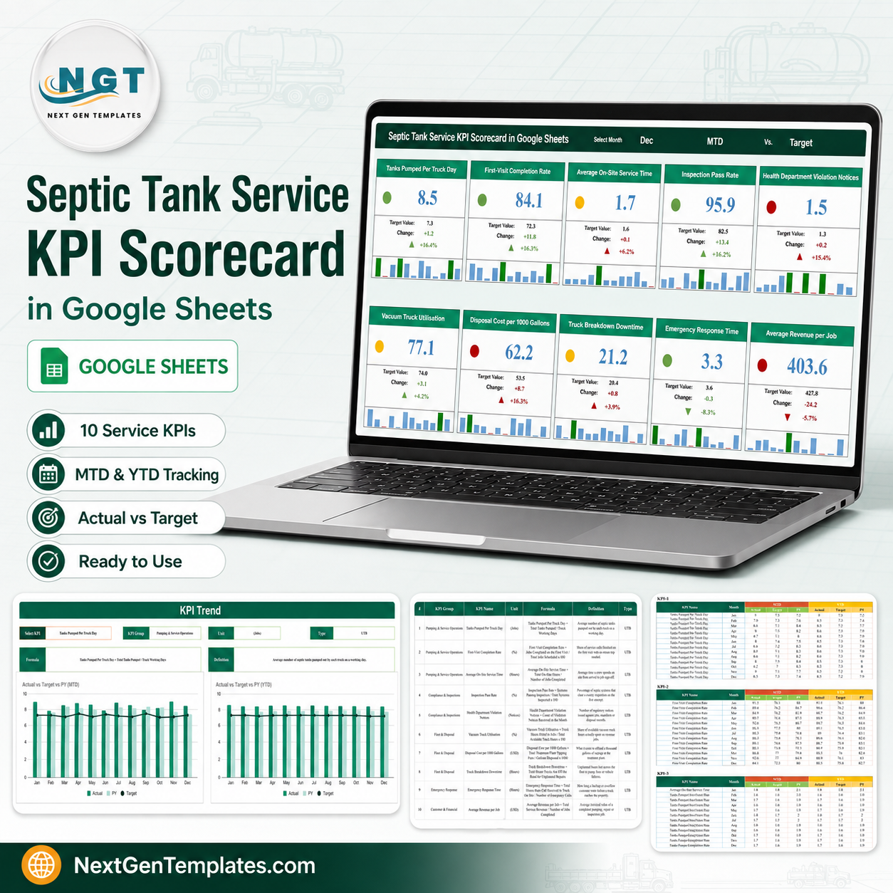


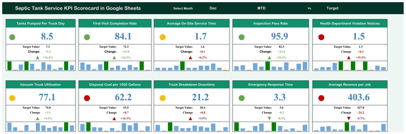
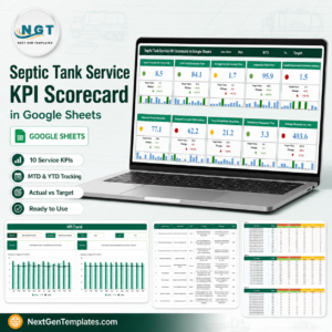
The Septic Tank Service KPI Scorecard in Google Sheets puts ten septic-service numbers on one screen. Pick a month at the top and every KPI shows its actual, its target, the gap in units and in percent, an up or down arrow, a red / amber / green traffic light and a twelve-month mini bar strip. In the December sample that ships in the file, four KPIs sit green, three amber and three red. It is built on a Scorecard page, a KPI Trend page, a KPI definitions page and a 120-row monthly data page, and everything except that data page is formula-driven, so replacing the sample figures is the only real setup step. This is the KPI Scorecard line – a month-picker board – not the analytical Dashboard family and not the KPI Dashboard family. One-time price, instant download, no subscription and nothing to install.Septic Tank Service KPI Scorecard in Google Sheets
Key Features of the Septic Tank Service KPI Scorecard in Google Sheets
- Ten septic-service KPIs in five groups – Pumping & Service Operations (3), Compliance & Inspections (2), Fleet & Disposal (3), Emergency Response (1) and Customer & Financial (1).Septic Tank Service KPI Scorecard in Google Sheets
- Three header cells drive the whole page – a month cell (Dec in the sample), an MTD / YTD basis cell and a Target / PY comparison cell. Change any one of them and all ten cards, lights, arrows and change figures recalculate.
- MTD and YTD in the same file – every KPI carries a month-to-date and a year-to-date actual, target and prior-year figure for all twelve months, and the header cell switches which pair the cards read.Septic Tank Service KPI Scorecard in Google Sheets
- Compare against target or against last year – the Vs. cell flips every card from “Target Value” to “PY Value” without touching a formula.Septic Tank Service KPI Scorecard in Google Sheets
- Red / amber / green traffic lights – a coloured dot on each card, scored from that KPI’s own variance against target. For an upper-is-better KPI: at or below target is red, up to 10 percent above target is amber, more than 10 percent above is green. For a lower-is-better KPI the bands are mirrored – at or below target is green, up to 10 percent over is amber, more than 10 percent over is red.
- Direction-aware scoring – five KPIs are tagged UTB (upper is better) and five LTB (lower is better), so Average On-Site Service Time, Health Department Violation Notices, Disposal Cost per 1000 Gallons, Truck Breakdown Downtime and Emergency Response Time score correctly when they fall rather than rise. Every UTB / LTB flag in the shipped file was checked against the metric it belongs to.
- Change in units and in percent – each card shows the raw gap to target (for example +1.2 tanks per truck day) and the same gap as a percentage (+16.4%), with a green or red arrow that follows the KPI’s direction rather than the sign of the number.
- Twelve-month bar strip on every card – one small bar per month across the year, so a card shows shape as well as level.
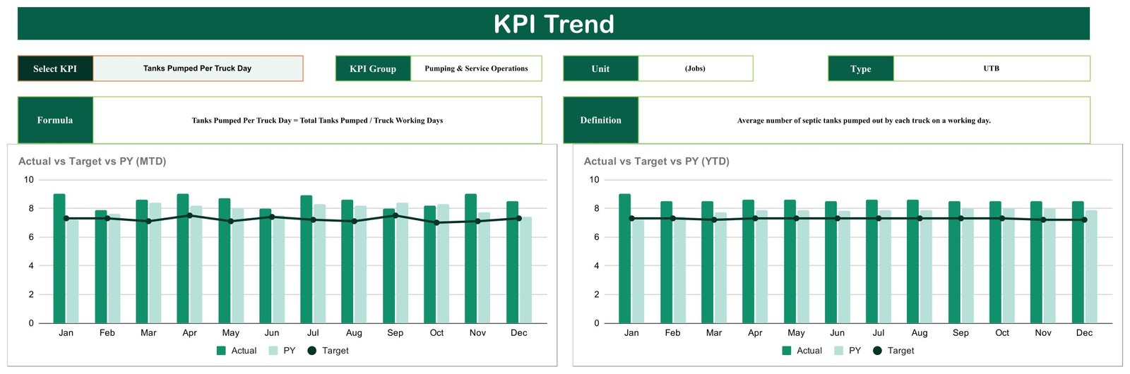
- A KPI Trend page with its own picker – choose any KPI from a dropdown and the page fills in its group, unit, UTB / LTB type, formula and definition, then draws two clustered column charts: Actual vs Target vs PY on an MTD basis and the same on a YTD basis, twelve months across.
- A written formula and definition for all ten KPIs – the KPI Definition page carries the group, unit, the arithmetic in words and a plain-English definition for each metric, so the whole team reads the number the same way.
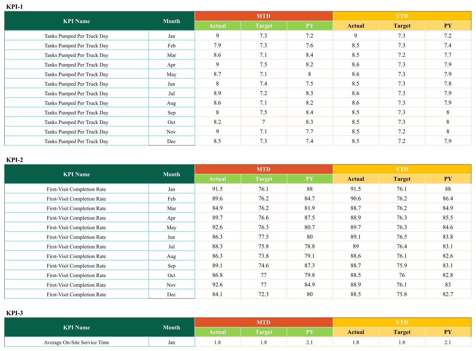
- 120 rows of editable monthly data – ten numbered KPI blocks of twelve months, each with MTD actual / target / prior year and YTD actual / target / prior year. Replace the sample figures and you are done.
- Everything is a formula, nothing is a macro – the cards read the data page through SUMIFS and named ranges. There is no script, no add-on and no permission prompt.
- One-time price, no subscription – works in any browser on a free Google account, and the copy is yours to keep.
What is Inside the Septic Tank Service KPI Scorecard in Google Sheets
Eight tabs, in the order you meet them:
- Read Me – intended as the orientation tab. In this build it ships empty; see the honest notes section below.
- Scorecard – the board. A title bar with the three pickers, then ten cards in two rows of five: KPI name, traffic-light dot, the big number, the target value, the change in units, the change in percent with an arrow, and the twelve-month bar strip.
- KPI Trend – one KPI at a time. A dropdown picks the metric; the page then shows its group, unit and type, its formula and its definition, and two twelve-month clustered column charts (MTD and YTD) with Actual, PY and a Target line.
- Input Data – where you work. Ten blocks labelled KPI-1 to KPI-10, each with the KPI name, twelve month rows (Jan to Dec) and six numeric columns: MTD Actual, MTD Target, MTD PY, YTD Actual, YTD Target and YTD PY.
- KPI Definition – the ten-row master table: number, KPI group, KPI name, unit, formula, definition and the UTB / LTB type. Rename a KPI here and the Scorecard and the Trend page follow.
- Color Settings – a printed copy of the RAG variance table, for reference. Read the notes section below before you try to edit it.
- Support – the calculation engine: it pulls each KPI’s month value with SUMIFS against the named ranges, works out the change, the arrow, the arrow colour and the traffic-light colour, and holds the twelve monthly values that feed each card’s bar strip.
- Trend_Support – the same idea for the KPI Trend page: twelve rows of MTD and YTD actual, target and prior-year values for whichever KPI the dropdown is on.
The ten KPIs, exactly as they ship: Tanks Pumped Per Truck Day (jobs, UTB), First-Visit Completion Rate (%, UTB), Average On-Site Service Time (hours, LTB), Inspection Pass Rate (%, UTB), Health Department Violation Notices (notices, LTB), Vacuum Truck Utilisation (%, UTB), Disposal Cost per 1000 Gallons (USD, LTB), Truck Breakdown Downtime (hours, LTB), Emergency Response Time (hours, LTB) and Average Revenue per Job (USD, UTB).
Honest Notes About This Build – Please Read Before You Buy
Four things in this file are worth knowing up front. None of them stop the scorecard working for the ten months that are unaffected, and all of them are fixable in a minute or two inside your own copy, but you should hear them from us rather than find them yourself.
- The month dropdown mis-spells two months, and those two months break the board. The Scorecard’s month picker offers “June” and “July” in full, while the Input Data page stores every month in three-letter form – Jan, Feb, Mar, Apr, May, Jun, Jul, Aug, Sep, Oct, Nov, Dec. The cards match the month by exact text, so choosing “June” or “July” matches nothing: all ten cards fall to zero, the change percentages disappear and the traffic-light cells error. The other ten months are unaffected. The fix takes about thirty seconds: in your own copy, click the month cell on the Scorecard, open Data > Data validation, and change “June” to “Jun” and “July” to “Jul” in the list. Alternatively, rename Jun to June and Jul to July in the Month column on the Input Data page. Either way the two months start working immediately.
- The Read Me tab is empty. The tab exists but no content was written to it in this build. Everything it would have said is on the KPI Definition page, in the How to Use steps below and in the blog walkthrough linked at the end.
- The Color Settings tab is documentation, not a control panel. It prints the RAG variance table so you can see the bands, but the thresholds the cards actually use are held on the Support tab, to the right of the calculation block, and that is the copy the traffic-light formula reads. Editing Color Settings changes nothing on the board. If you want different bands, edit the RAG table on the Support tab – or leave them, since the shipped bands (10 percent either side of target) suit most operators.
- The mini bar strip colours by size, not by direction. On each card the tallest months are picked out in dark green and the smallest are marked in red. That reads correctly for an upper-is-better KPI, but on a lower-is-better one – violation notices, downtime, response time, disposal cost – the darker bars are the worst months, not the best. The heights are right; only the highlight colour is direction-blind. Read the strip for shape and level, and take the direction from the arrow and the traffic light, which are both direction-aware.
Everything else in the file was checked line by line before this listing went up: the ten KPIs are consistent across the Scorecard, the KPI Definition page and the Input Data blocks; every change figure and percentage on the December board recomputes exactly from the underlying rows; and all ten UTB / LTB direction flags match their metric.
Septic Tank Service KPI Scorecard vs. Excel vs. Paid Field-Service Software – Where This Fits
| This Google Sheets scorecard | The Excel edition (in preparation) | Paid field-service software (Jobber, Housecall Pro, ServiceTitan) | |
|---|---|---|---|
| Cost | One-time 13.99 (8.99 on sale) | One-time purchase | A monthly subscription, usually priced per technician |
| Platform | Google Sheets in any browser, free Google account | Microsoft Excel desktop | Vendor-hosted web and mobile app |
| Setup time | Minutes – copy the sheet, replace 120 rows of sample data | Minutes, once Excel is installed | Days to weeks of customer, route and job import |
| Works offline | No – it lives in the browser | Yes | Usually partly, through the mobile app |
| Real-time team collaboration | Yes, native Google Sheets sharing | Only through OneDrive co-authoring | Yes |
| Share with a link | Yes, view-only or editable | No | Per-seat login required |
| KPI set | Its own ten septic KPIs, every name and formula editable | A different set of ten septic KPIs – see below | Whatever the vendor exposes |
| Comparison bases | Target or prior year, on MTD or YTD | Target, prior year or prior month | Vendor reporting |
| Dispatch, routing, invoicing | No | No | Yes – that is what you are paying for |
| Connects to your accounting or dispatch software | No – values are typed in | No – values are typed in | Yes |
The honest summary: if you need scheduling, dispatch, job costing and invoicing tied together, buy the software. If what you actually want is ten numbers reviewed once a month against target, this sheet does that for less than the cost of a single tank of fuel.
How This Differs From the Excel Edition
There is a companion Septic Tank Service KPI Scorecard in Excel. It is being prepared and is not on sale yet, so there is no link to it here – ask us and we will point you at it once it is live. It matters because it is not this file with a different extension: the two editions were built separately and ship different KPI sets and different pages.
- Both ship ten KPIs, a month picker, direction-aware traffic lights, MTD and YTD figures and a per-KPI trend view.
- The KPI sets barely overlap. This Google Sheets edition runs Tanks Pumped Per Truck Day, First-Visit Completion Rate, Average On-Site Service Time, Inspection Pass Rate, Health Department Violation Notices, Vacuum Truck Utilisation, Disposal Cost per 1000 Gallons, Truck Breakdown Downtime, Emergency Response Time and Average Revenue per Job. The Excel edition runs Tanks Pumped, Jobs Completed, Avg Job Duration, On-Time Arrival %, First-Time-Fix %, Callback Rate %, Inspection Pass %, Revenue per Job, Disposal Cost/Job and Customer Retention %. Even where a theme repeats, the definition differs – disposal cost per thousand gallons here, disposal cost per job there.
- Different groups. This edition groups by Pumping & Service Operations, Compliance & Inspections, Fleet & Disposal, Emergency Response and Customer & Financial. The Excel edition uses four groups of its own.
- Different emphasis. This edition carries fleet and emergency metrics the Excel one does not – vacuum truck utilisation, truck breakdown downtime, emergency response time and a violation-notice count. The Excel edition carries service-desk and retention metrics this one does not – on-time arrival, first-time-fix, callback rate and customer retention.
- Different shape. This edition is eight Google Sheets tabs with ten KPI slots and 120 data rows. The Excel edition is a nine-sheet workbook with twenty numbered KPI blocks, a third comparison basis (prior month) and an extra KPI Analysis page with a red / amber / green counter and top-and-bottom-five rankings, and it works offline.
- Different band handling. In the Excel edition the RAG thresholds on its Color Settings sheet are wired into the tiles. In this Google Sheets edition, as noted above, the live bands sit on the Support tab instead.
Buy the one that matches how you already talk about the business – or both, if you want the wider coverage.
Who This Template Is For – and Who It Is Not For
A good fit for: owner-operators and small-to-mid septic pumping, portable-sanitation and liquid-waste companies running one to ten vacuum trucks; office managers who rebuild the same monthly summary by hand every month; operations leads who want pumping throughput, fleet, emergency-response and money numbers on one page instead of four spreadsheets; and anyone who wants a simple board to run the first-Monday numbers meeting from.
Not a good fit if: you need live data pulled from your dispatch, routing or accounting software – this sheet does not connect to anything and does not import; you want alerts, reminders or emails when a KPI turns red – it has none; you need per-truck, per-driver or per-customer drilldown – it reports at company level by month; you track more than ten KPIs and are unwilling to edit the sheet; or you are looking for a regulatory record. On that last point, to be completely plain: the Inspection Pass Rate and the Health Department Violation Notices count in this file are management summary numbers you type in yourself. They are not an inspection record, not a permit or manifest register, not a disposal or effluent log and not evidence for any regulator, health department or certifying body. This template gives no environmental, permitting, disposal, wastewater or public-health guidance of any kind, and nothing in it should be treated as such. Keep whatever records your local rules require exactly as you keep them today.
How to Use the Septic Tank Service KPI Scorecard in Google Sheets
- Open the PDF in your download and click the template link inside it, then use File > Make a copy so Google Drive creates your own editable copy. A free Google account is enough, and the original stays view-only for everyone else.
- Fix the two month labels first. On the Scorecard, click the month cell, open Data > Data validation and change “June” to “Jun” and “July” to “Jul”. This takes half a minute and makes all twelve months work.
- Go to the Input Data page and replace the sample MTD and YTD figures with your own – one numbered block per KPI, twelve months each, actual / target / prior year on both bases.
- Set your targets in the Target columns. They drive both the change figures and the traffic lights, so a soft target produces a green board that means nothing.
- Rename any KPI you do not use on the KPI Definition page – change the name, group, unit, formula text, definition and, importantly, the UTB / LTB type so the scoring direction follows the metric. Keep the row structure and the Scorecard and Trend pages follow automatically.Septic Tank Service KPI Scorecard in Google Sheets
- Keep the month spelling consistent everywhere. The board matches a month by exact text against the Month column on the Input Data page, so the picker and the data must agree. If a card ever goes blank or drops to zero after switching months, that mismatch is the reason.Septic Tank Service KPI Scorecard in Google Sheets
- Set the three header cells on the Scorecard: the month you are reviewing, MTD or YTD, and whether you are comparing against Target or PY.Septic Tank Service KPI Scorecard in Google Sheets
- Use the KPI Trend page in the meeting – pick the one metric that turned red and show its twelve-month MTD and YTD charts against target and last year, so one bad month does not become a policy change.
- Share the sheet with your office manager and lead driver using Google Sheets’ own sharing – view-only if you only want them reading it.Septic Tank Service KPI Scorecard in Google Sheets
Real-World Use Cases
A three-truck pumping company reviewing December. The board reads four green, three amber and three red. Tanks Pumped Per Truck Day is 8.5 against a 7.3 target (+1.2, +16.4%) and First-Visit Completion Rate is 84.1 against 72.3 (+11.8, +16.3%) – the crews are producing. What is red is Average Revenue per Job at 403.6 against a 427.8 target, down 5.7 percent, which points at pricing and job mix rather than at the drivers.
The fleet conversation. Vacuum Truck Utilisation sits amber at 77.1 against a 74.0 target – above target, but only by 4.2 percent, so the light stops short of green – while Truck Breakdown Downtime is amber at 21.2 hours against 20.4 and Disposal Cost per 1000 Gallons is red at 62.2 against 53.5, up 16.3 percent. Because those three live together in the Fleet & Disposal group, the read is that the trucks are busy and the cost of running them is the problem, not idle capacity.
The service-quality read. Emergency Response Time is green at 3.3 hours against a 3.6 target, down 8.3 percent – the one KPI on this board improving by falling. Average On-Site Service Time is amber at 1.7 hours against 1.6, up 6.2 percent. Side by side, the two say crews are arriving faster and staying longer, which is a scheduling question rather than a training one, and the KPI Trend page shows whether it is a trend or a single month.
Frequently Asked Questions
Is this the KPI Scorecard, the KPI Dashboard or the analytical Dashboard?
This is the KPI Scorecard line. It is a month-picker board: ten KPI cards with traffic lights, a KPI Trend page, a KPI definitions page and a typed monthly data page. It is not the analytical Dashboard family, which is chart-and-slicer driven over a transaction table, and it is not the KPI Dashboard family, which is a different template with its own layout. The three lines carry near-identical names in the shop, so check the title before you buy – this one ends in KPI Scorecard in Google Sheets.
What exactly do I download?
A PDF. It carries the link to the live Google Sheets template – open the link and use File > Make a copy to put your own editable copy in your Google Drive. There is no ZIP and no spreadsheet file to install, because the product is the sheet itself.
Are the June and July months really broken?
In the file as shipped, yes – the picker spells them in full while the data page uses Jun and Jul, so those two months match nothing and the cards read zero. It is a labelling mismatch, not a broken formula, and you fix it in your own copy in about thirty seconds by editing the dropdown list (Data > Data validation on the month cell). We would rather tell you than have you discover it in a meeting.
Does it connect to my dispatch, routing or accounting software?
No. There are no integrations, no imports, no API and no sync. You type or paste the monthly values into the Input Data page. That is the deliberate trade-off that keeps it a 13.99 sheet rather than a monthly subscription.
Will it email or alert me when a KPI goes red?
No. There are no alerts, notifications or scheduled reminders of any kind. The traffic lights are visual only, on the sheet, while you are looking at it.
Is the Inspection Pass Rate a compliance record?
No, and please do not use it as one. It is a management summary percentage that you calculate and type in yourself, and the same is true of the Health Department Violation Notices count. Neither is an inspection record, a permit or manifest register, a disposal log or evidence for any regulator or health department, and this template offers no environmental, permitting or wastewater guidance whatsoever. Keep your statutory records exactly as you keep them now.
Can I change the ten KPIs to my own?
Yes. Every KPI name, group, unit, formula text, definition and UTB / LTB type is an editable cell on the KPI Definition page, and the Input Data page has a matching twelve-month block per KPI. The Scorecard page has ten card slots, so ten is the number it shows.
Can I change the red / amber / green thresholds?
Yes, but not on the tab you would expect. The Color Settings tab is a printed reference in this build; the bands the cards actually read are the RAG table on the Support tab. Edit them there and the whole board follows.
Does it handle both MTD and YTD?
Yes. The Input Data page stores both bases for every KPI and every month – actual, target and prior year for each – and the header cell on the Scorecard switches which pair the cards display. The KPI Trend page charts both bases at once.
Do I need a paid Google Workspace account?
No. A free Google account is enough. The copy link creates the sheet in your own Drive and it stays yours, with no expiry and no seat count.
Is there an Excel version?
An Excel edition is being prepared and is not on sale yet. Read the “How This Differs From the Excel Edition” section above first: the two editions ship different KPI names, different groups and a different page count, so they are companions rather than duplicates.
About the Author
Built by PK – Microsoft Certified Professional with 15+ years of Excel, Google Sheets, and Power BI experience. Founder of NextGenTemplates, reaching 300K+ subscribers across YouTube channels. Every template is hand-built and tested before release.
Explore Related Templates
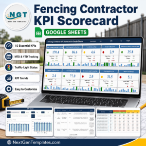
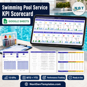
- Swimming Pool Service KPI Scorecard in Google Sheets – the closest neighbour on this line: same board, route-based service trade.
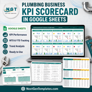
- Plumbing Business KPI Scorecard in Google Sheets – useful if septic work sits alongside a plumbing arm.
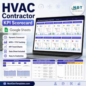
- HVAC Contractor KPI Scorecard in Google Sheets and Roofing Contractor KPI Scorecard in Google Sheets – for multi-trade operators running more than one service line.
- Fencing Contractor KPI Scorecard in Google Sheets, Paving Contractor KPI Scorecard in Google Sheets, Concrete Contractor KPI Scorecard in Google Sheets and Insulation Contractor KPI Scorecard in Google Sheets – the same board across the contracting trades.
- Browse the whole Google Sheets catalogue or the KPI Dashboard category for more scorecards.
Get the Septic Tank Service KPI Scorecard in Google Sheets today – one-time payment, instant download, no subscription. Open the PDF, make your copy, spend thirty seconds on the month labels, and you have ten septic-service KPIs on one screen in under five minutes. A full walkthrough is on the NeoTechNavigators blog.
Watch the step-by-step video Demo:
Last updated: 2 September 2026.
Compatibility and Requirements
- Works in Google Sheets. You need a free Google account and a web browser.
- You pick the month, the MTD or YTD basis and the Target or PY comparison from dropdowns on the Scorecard sheet, and the KPI Trend sheet has its own KPI dropdown. Google explains dropdowns in Create an in-cell dropdown list.













Reviews
There are no reviews yet.