

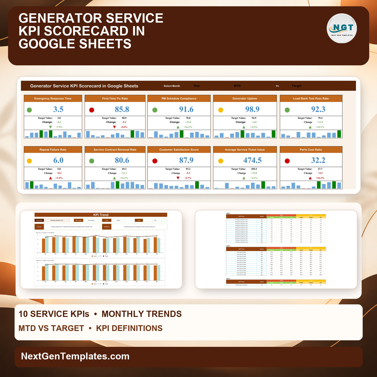
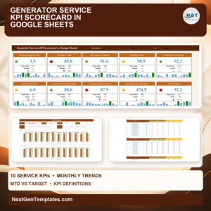
The Generator Service KPI Scorecard in Google Sheets tracks 10 generator service KPIs in four groups (Service Delivery, Equipment Reliability, Customer & Contracts and Financial Performance) on one page of traffic-light cards, each with a 12-month mini chart. A KPI Trend page charts any KPI against Target and prior year (PY), and the sample file ships with 120 monthly records (10 KPIs x 12 months).
This is the KPI scorecard edition, a generator maintenance scorecard built around a month picker plus a KPI Trend page, and a different product from our analytical Google Sheets dashboards and trackers. Every value is a monthly figure you type in; the file reports on your numbers and makes no compliance or code claims. You buy it once and own the file.
✅ Instant download · One-time payment · No subscription · No per-user fees · Lifetime access
🔑 Key Features of the Generator Service KPI Scorecard in Google Sheets
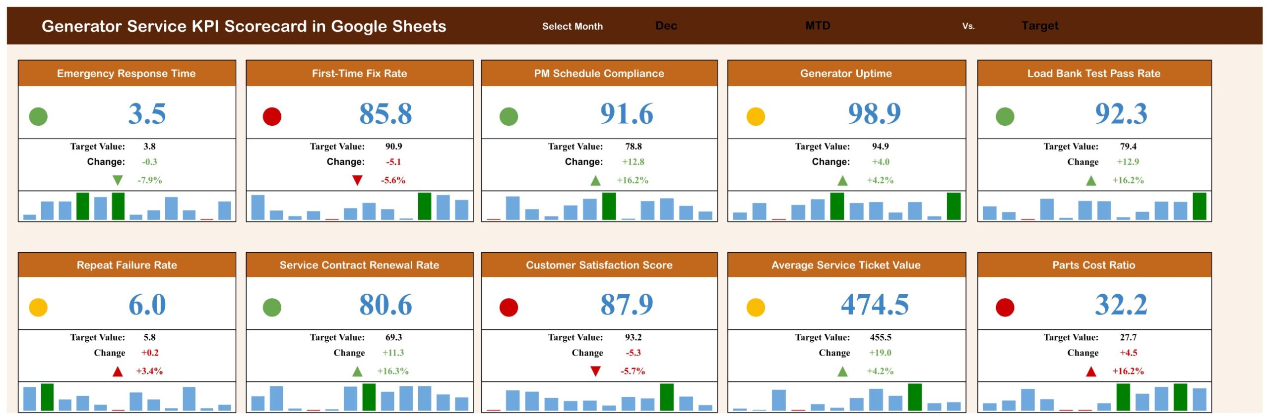
🎯 Three selectors on one page. Month (Jan to Dec), MTD or YTD, and Target or PY. Every card recalculates from the Input Data tab with ordinary formulas, no Apps Script or add-ons.
🚦 Direction-aware traffic lights. Seven KPIs are upper-the-better (UTB) and three are lower-the-better (LTB): Emergency Response Time, Repeat Failure Rate and Parts Cost Ratio. For UTB, a variance at or below 0% is red, up to 10% amber and above 10% green; LTB uses the mirror rule, so a slower response or a higher parts cost turns red. That makes this a strict kpi traffic light scorecard: a UTB KPI only goes green when it beats target by more than 10%.
📈 Full detail on every card. Actual value, Target or PY value, change, change %, an arrow and a 12-month mini column chart with the selected month in green.
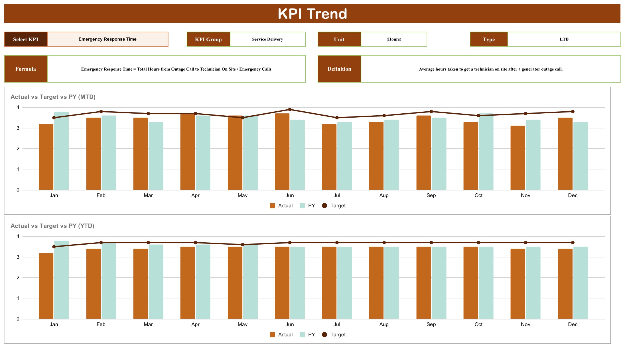
📊 KPI Trend page. Pick a KPI to see its group, unit, type, formula and definition above two charts: Actual vs Target vs PY (MTD) by Month and Actual vs Target vs PY (YTD) by Month.
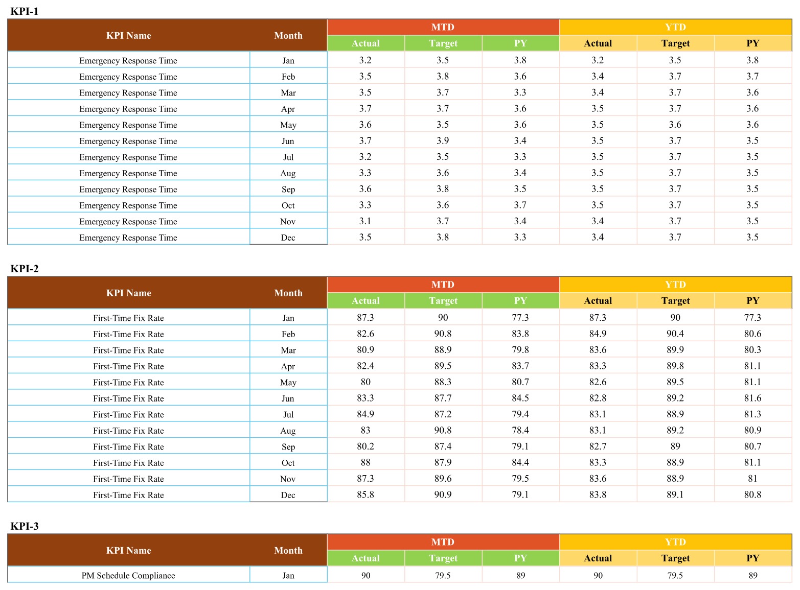
✏️ Simple monthly data entry. Input Data holds MTD and YTD Actual, Target and PY for each month. YTD is typed, not calculated, so you decide whether a YTD figure is a sum or an average.
📦 What’s Inside the Template
- 🚚 Service Delivery: Emergency Response Time (hours, LTB), First-Time Fix Rate (%), PM Schedule Compliance (%)
- ⚡ Equipment Reliability: Generator Uptime (%), Load Bank Test Pass Rate (%), Repeat Failure Rate (%, LTB)
- 🤝 Customer & Contracts: Service Contract Renewal Rate (%), Customer Satisfaction Score (%)
- 💰 Financial Performance: Average Service Ticket Value ($), Parts Cost Ratio (%, LTB)
Page 1: Scorecard
Ten cards in two rows of five. With December, MTD and Target selected, the sample shows 4 green, 3 amber and 3 red lights: PM Schedule Compliance reads 91.6% against 78.8% (green, up 16.2%), First-Time Fix Rate 85.8% against 90.9% (red, down 5.6%), and Emergency Response Time 3.5 hours against 3.8 (green, because a faster response is better). Generator Uptime reads 98.9% against 94.9%, which is amber: above target, but by less than the 10% green band.
Page 2: KPI Trend
Select KPI, KPI Group, Unit, Type, Formula and Definition boxes sit above the MTD and YTD charts. The sample shows Emergency Response Time, an LTB hours KPI in the Service Delivery group.
Page 3: KPI Definition
All 10 KPIs with KPI Group, Unit, Formula, Definition and Type, for example Load Bank Test Pass Rate = Units Passing Load Bank Test / Units Tested x 100, and Parts Cost Ratio = Parts and Consumables Cost / Service Revenue x 100.

Page 4: Input Data
Ten blocks, KPI-1 to KPI-10, each with 12 monthly rows of MTD and YTD Actual, Target and PY. This is the only sheet you type into.
The file also has Read Me, Color Settings, Support and Trend_Support tabs. The Read Me tab explains each sheet, the four setup steps and the traffic-light rule.
⚠️ Known issues in this build: the Month drop-down lists “June” and “July” while Input Data uses “Jun” and “Jul”, so those two months show blank cards until you edit the drop-down (step 2 below). Color Settings is not linked to the lights, even though the Read Me says the thresholds live there; the bands actually sit in the RAG table at the top right of the Support tab. The figures supplied are fictional sample data.
📊 Google Sheets Scorecard vs. the Excel Edition vs. Field Service Software
| Feature | This scorecard (Google Sheets) | Generator Service KPI Scorecard in Excel | Field service software |
|---|---|---|---|
| Cost | ✅ One-time payment | One-time, plus an Excel licence | Recurring subscription |
| Platform | ✅ Browser, any OS | Desktop Excel 2016 or later | Vendor apps |
| Team sharing | ✅ Native link sharing | File attachment | Per-user seats |
| KPI set | 10 KPIs incl. Load Bank Test Pass Rate, Repeat Failure Rate, Contract Renewal | 10 KPIs (room for 20) incl. Unplanned Failures, Technician Utilisation, Callback Rate | Vendor-defined |
| Editable RAG bands | In the Support tab | ✅ Color Settings sheet | Within vendor limits |
| Dispatch, work orders, invoicing | No, monthly totals only | No | ✅ Yes |
The Excel edition is a separate product with a partly different KPI set. Both cover response time, first-time fix rate, generator uptime, preventive maintenance, customer satisfaction and a parts-cost measure.
👥 Who This Template Is For, and Who It’s Not For
✅ Built for: owners and service managers of generator service companies, maintenance contractors and facilities teams who hold a monthly review and want response, fix rate, uptime, renewal and parts-cost figures on one shared page. If you have been looking for a google sheets kpi scorecard for power equipment service, this is it.
❌ Not for: teams that need dispatch, work orders, asset registers, parts stock control, compliance records or invoicing, or several years of history in one file.
⚙️ How to Use the Scorecard
- Open the PDF in your download, click the Google Sheets link and choose Make a copy.
- On the Scorecard tab select cell N1, open Data > Data validation and change “June” and “July” to “Jun” and “Jul”.
- Edit the KPI Definition sheet to match your business, keeping KPI names identical in the Input Data blocks.
- Replace the sample MTD and YTD Actual, Target and PY figures with your own.
- Pick a month, MTD or YTD and Target or PY, then open KPI Trend for any KPI’s history.
💼 Real-World Use Cases
Ravi runs a generator maintenance contractor with six field technicians. At month end he checks First-Time Fix Rate and PM Schedule Compliance against target, then shares a view-only link with his service lead.
Claire manages service contracts for a standby power dealer. When Service Contract Renewal Rate slips she opens KPI Trend to see which months the renewals fell, and compares it with Customer Satisfaction Score.
❓ Frequently Asked Questions
Is this a KPI Scorecard or a dashboard?
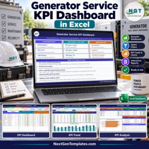
It is the Google Sheets KPI Scorecard: 10 traffic-light cards, a month picker and a KPI Trend page. Our Generator Service KPI Dashboard in Excel is a different product with 14 KPIs and a KPI Analysis page.
How long does setup take?
A minute to copy, a minute for the June/July fix, then as long as it takes to enter 12 months of figures for 10 generator service KPIs.
Can I change the traffic-light thresholds?
Yes, in the RAG table at the top right of the Support tab. The Color Settings tab is not linked in this build.
Does it check electrical code or emissions compliance?
No. It reports the monthly figures you enter and makes no regulatory or safety claims. The supplied figures are fictional sample data.
👤 About the Author
Built by PK, Microsoft Certified Professional with 15+ years of Excel, Google Sheets and Power BI experience. Founder of NextGenTemplates, reaching 300K+ subscribers across YouTube channels (@PKAnExcelExpert, @NextGenTemplates, @NeoTechNavigators).
🔗 Explore Related Templates
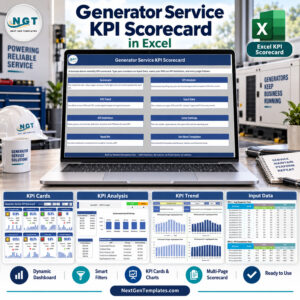
⚡ Prefer Excel? See the Generator Service KPI Scorecard in Excel, or step up to the Generator Service KPI Dashboard in Excel for a 14-KPI analysis layout.
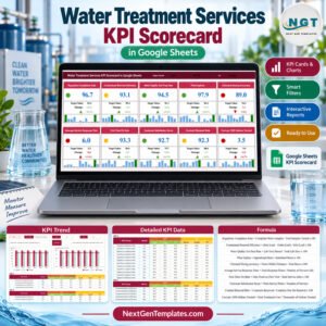
🛠️ Same scorecard layout for other service trades: Water Treatment Services KPI Scorecard in Google Sheets and Solar Panel Installation KPI Scorecard in Google Sheets. For scheduling and job records, try the Fleet Maintenance Calendar in Google Sheets and the Maintenance Work Order Data Entry System in Excel.
📂 Browse every Google Sheets KPI template.
📘 Google’s guide explains how to edit a drop-down list in Google Sheets.
📖 Click here to read the Detailed Blog Post
🎥 Visit our YouTube channel for step-by-step video tutorials: YouTube.com/@NextGenTemplates
Watch the step-by-step video Demo:
📅 Last updated: September 2026










Reviews
There are no reviews yet.