

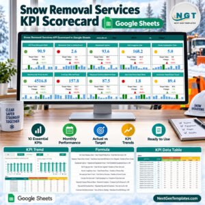
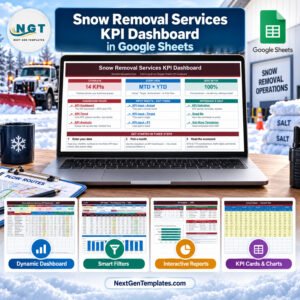
The Snow Removal Services KPI Dashboard in Google Sheets tracks 14 KPIs across 5 KPI groups, with Month-to-Date and Year-to-Date Actual, Target, Achievement % and Prior Year comparison for every metric. Pick a month from one dropdown and seven header cards, 28 traffic-light statuses, a 12-month trend view and a group roll-up all recalculate from worksheet formulas. There are no add-ons, macros or scripts to install.
This listing is the KPI Dashboard family: a month-picker scorecard with traffic lights plus KPI Trend and KPI Analysis pages. It is a different product from our analytical Google Sheets dashboards and from the Snow Removal Services KPI Scorecard in Google Sheets, a separate layout that is still in preparation, as are the Excel editions of both.
🌍 Join teams in 40+ countries using NextGenTemplates to replace paid reporting tools with one-time-purchase spreadsheet templates.
✅ Instant download · One-time payment · No subscription · No per-user fees · Lifetime access
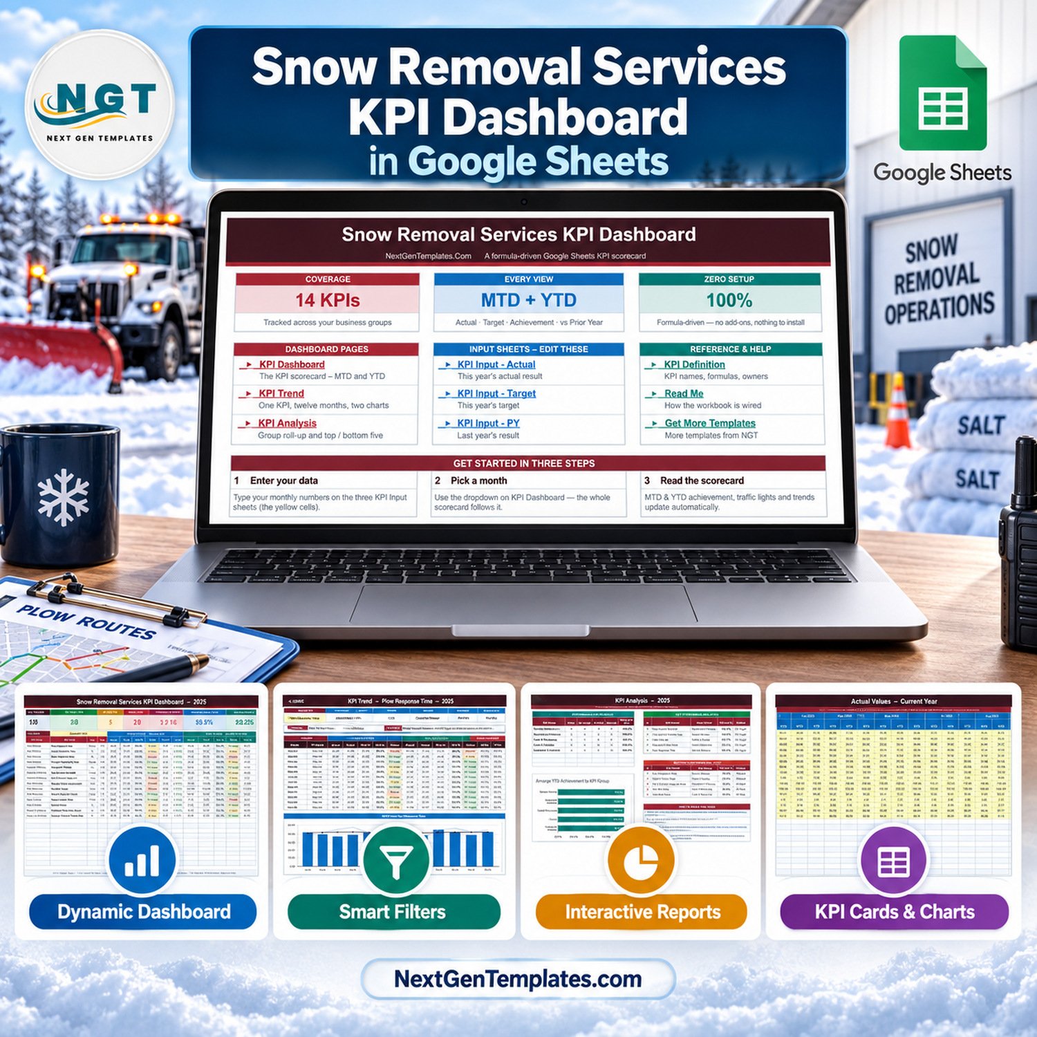
🔑 Key Features of the Snow Removal Services KPI Dashboard in Google Sheets
📅 One month picker drives everything. The Select Month dropdown on the KPI Dashboard sheet sets the reporting month. The MTD block, the YTD block, the header cards and the KPI Analysis page all follow it, so a monthly review of plowing, salting and contracts starts with a single click.
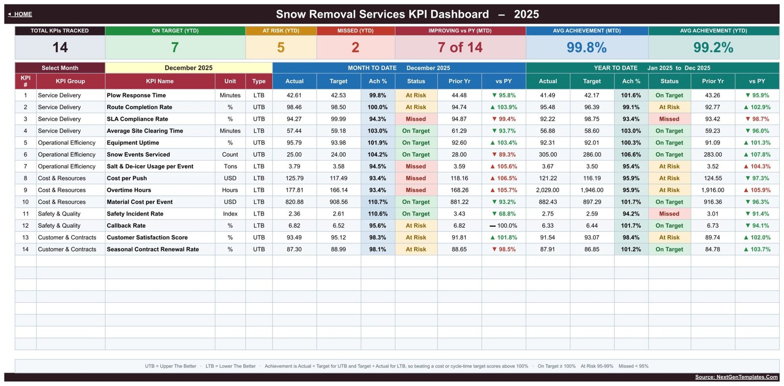
🚦 Traffic-light status on MTD and YTD. Each KPI shows On Target at 100% achievement or more, At Risk between 95% and 99%, and Missed below 95%. A vs PY arrow compares every KPI with the same month last year, coloured green or red by whether the move is good for that KPI.
🔄 Upper-the-better and lower-the-better logic. Six KPIs are UTB and eight are LTB: Plow Response Time, Average Site Clearing Time, Salt & De-icer Usage per Event, Cost per Push, Overtime Hours, Material Cost per Event, Safety Incident Rate and Callback Rate. For LTB metrics achievement is Target ÷ Actual, so arriving faster or spending less than planned scores above 100%.
📊 Seven header cards. Total KPIs Tracked, On Target (YTD), At Risk (YTD), Missed (YTD), Improving vs PY (MTD), Avg Achievement (MTD) and Avg Achievement (YTD). The December 2025 sample reads 14, 7, 5, 2, 7 of 14, 99.8% and 99.2%.
🧮 Sensible YTD rules. Snow Events Serviced and Overtime Hours add up through the year (305 events and 2,029 hours in the sample), while times, rates, costs per event and the satisfaction score use running averages.
🧩 KPI list you can edit. Add, rename or delete KPIs on the KPI Definition sheet and every other sheet follows. The sheets are wired for 22 KPI rows, so eight empty rows are ready for your own measures with no formula edits.
📦 What’s Inside the Template
The workbook has three dashboard pages (KPI Dashboard, KPI Trend, KPI Analysis), three input sheets (KPI Input – Actual, KPI Input – Target, KPI Input – PY) and reference sheets (KPI Definition, Read Me, Get More Templates), all reached from a Home page.
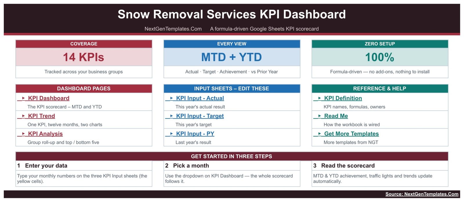
Home Page
The Home page links every sheet in three panels (Dashboard Pages, Input Sheets and Reference & Help), shows the 14 KPIs, MTD + YTD and zero-setup cards, and sets out three steps: enter your data, pick a month, read the scorecard.
KPI Dashboard
This is the main scorecard. It lists all 14 KPIs with group, unit and type, then MTD and YTD Actual, Target, Ach %, Status, Prior Yr and vs PY, under the seven header cards. In the December sample, Plow Response Time reads 42.61 minutes against a 42.53 target, and SLA Compliance Rate is Missed at 94.27% against 99.99%.
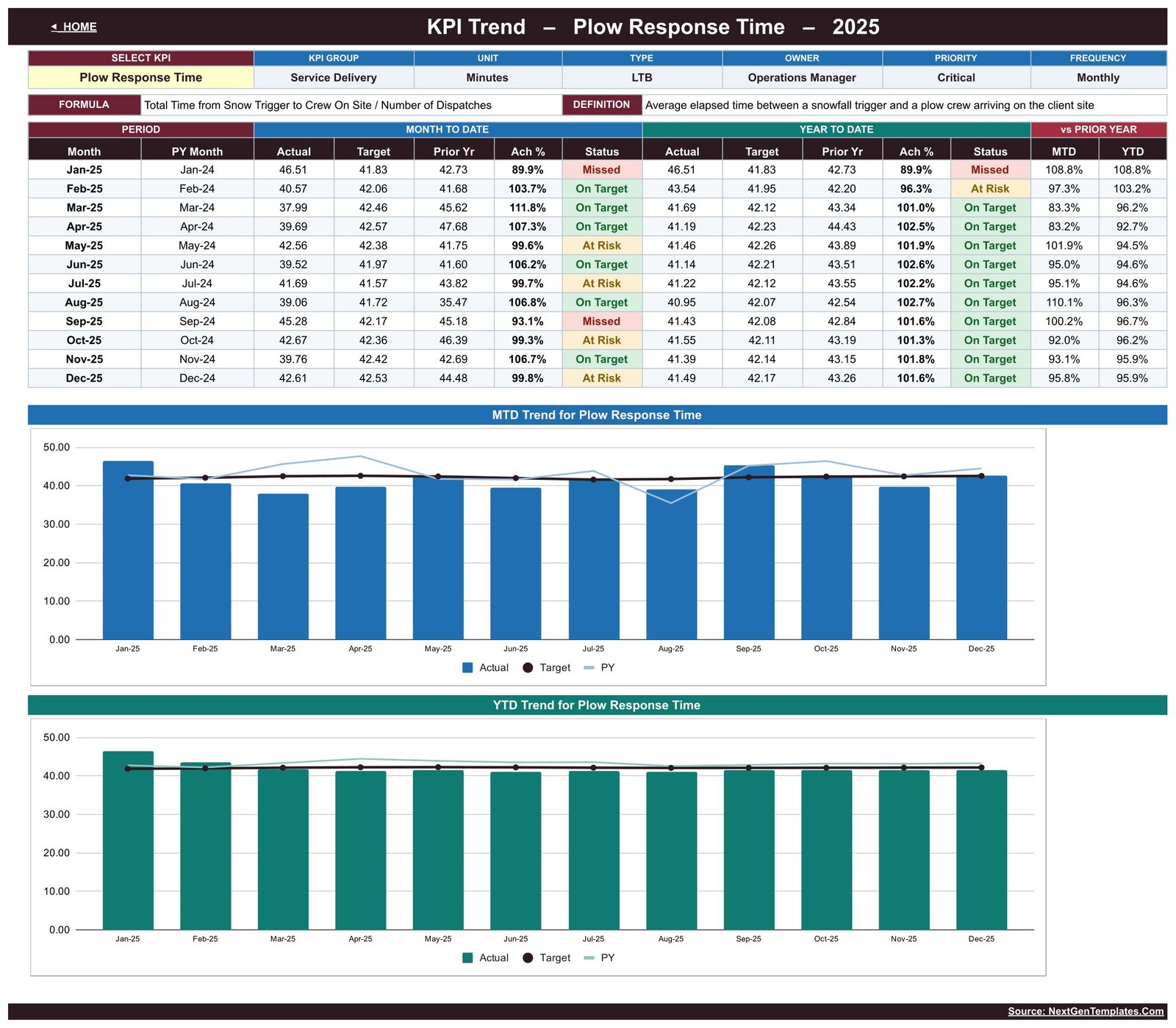
KPI Trend
Pick one KPI to see its group, unit, type, owner, priority, frequency, formula and definition. A 12-month MTD and YTD table with status and vs Prior Year sits above two charts, MTD Trend and YTD Trend, each showing Actual, Target and PY by Month.
KPI Analysis
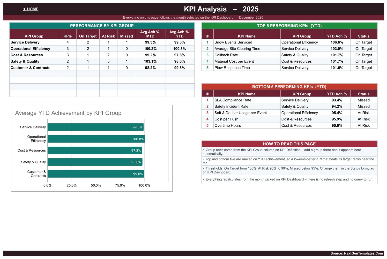
Performance by KPI Group counts On Target, At Risk and Missed per group with average MTD and YTD achievement. It ranks the Top 5 and Bottom 5 KPIs by YTD achievement and charts Average YTD Achievement by KPI Group. In the sample, Snow Events Serviced leads at 106.6% and SLA Compliance Rate trails at 93.4%.
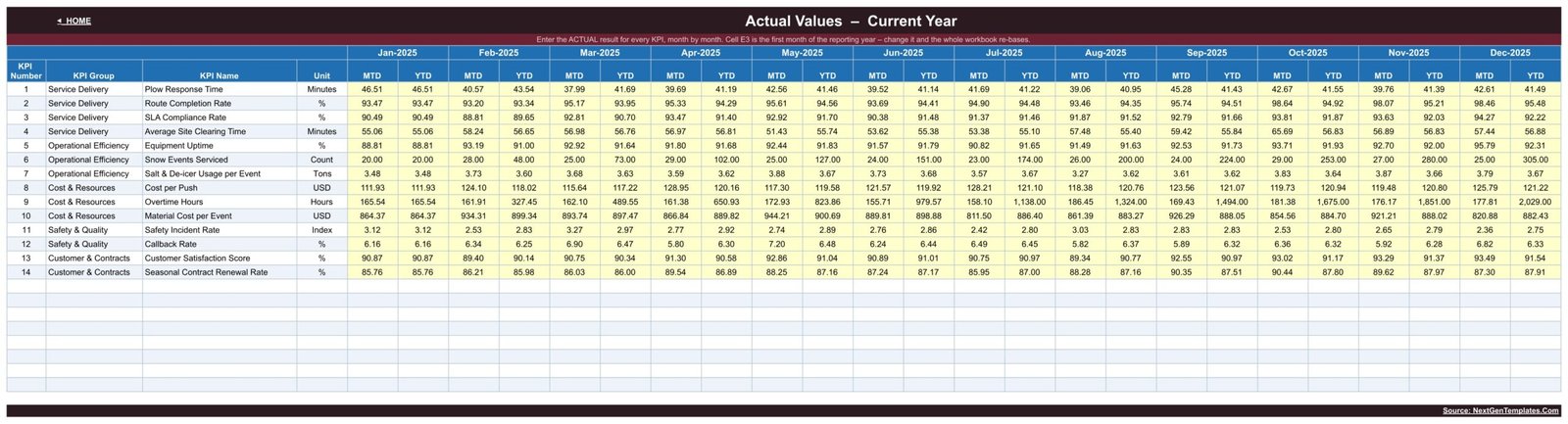
KPI Input – Actual
You type this year’s actual result for each KPI, month by month, in the yellow MTD and YTD cells. The Target and PY input sheets follow the same layout. Cell E3 holds the first month of the reporting year, and changing it re-bases the whole workbook, which suits a season that starts in the autumn.
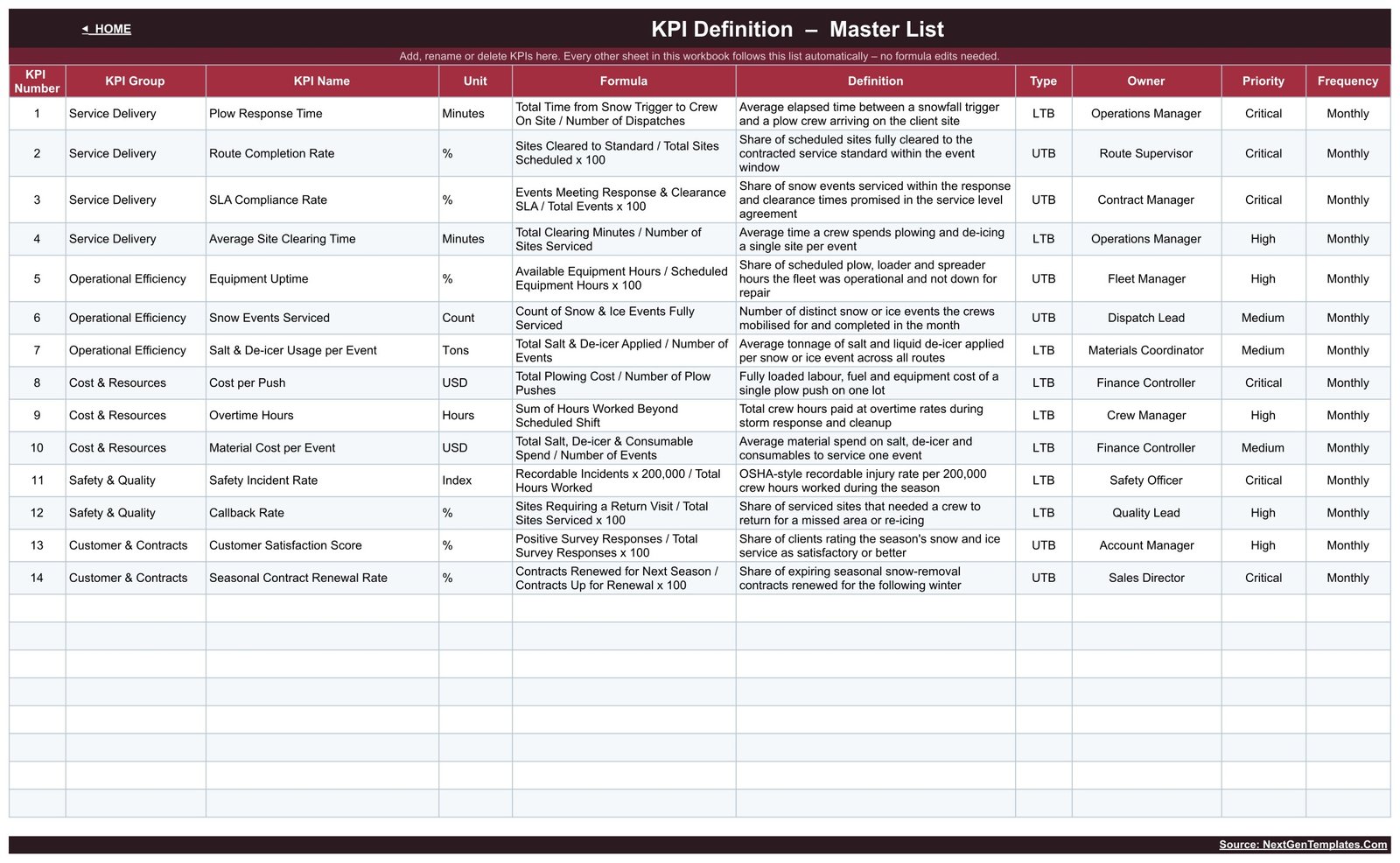
KPI Definition
The master list holds each KPI’s number, group, name, unit, formula, definition, type, owner, priority and frequency, for example Cost per Push = Total Plowing Cost / Number of Plow Pushes, owned by the Finance Controller.
The 14 sample KPIs:
- 🚚 Service Delivery (4): Plow Response Time, Route Completion Rate, SLA Compliance Rate, Average Site Clearing Time
- ⚙️ Operational Efficiency (3): Equipment Uptime, Snow Events Serviced, Salt & De-icer Usage per Event
- 💵 Cost & Resources (3): Cost per Push, Overtime Hours, Material Cost per Event
- 🦺 Safety & Quality (2): Safety Incident Rate, Callback Rate
- 🤝 Customer & Contracts (2): Customer Satisfaction Score, Seasonal Contract Renewal Rate
📊 Google Sheets KPI Dashboard vs. Excel Dashboard vs. Field Service Software: Where This Fits
| Feature | Snow Removal Services KPI Dashboard (Google Sheets) | Microsoft Excel KPI Dashboard | Snow and field service software |
|---|---|---|---|
| Cost | ✅ $8.99 one-time | One-time template plus an Excel licence | Recurring monthly subscription |
| Platform | ✅ Any browser with a Google account | Excel desktop | Vendor web and mobile apps |
| Setup time | ✅ Minutes: make a copy, type monthly numbers | Minutes to hours | Account setup and onboarding |
| Real-time team collaboration | ✅ Native Google Sheets sharing | Through OneDrive or SharePoint | ✅ Yes |
| Mobile access | Google Sheets app (best viewed on a tablet) | Excel mobile app | ✅ Dedicated crew apps |
| Customizable KPIs | ✅ Edit the KPI Definition sheet | Depends on the template | Within built-in reports |
| MTD, YTD and prior-year comparison | ✅ Built in for every KPI | Depends on the template | Depends on the plan |
| Dispatch, GPS tracking, site photos, invoicing | ❌ Not included | ❌ Not included | ✅ Core feature |
| Year-1 cost at 5 users | ✅ $8.99 total | Template plus 5 Microsoft 365 seats | Subscription pricing |
For snow and ice management contractors who want a monthly management scorecard without paying for another software seat, this template sits in the sweet spot.
👥 Who This Template Is For, and Who It’s Not For
✅ This template is built for:
- Owners of commercial and residential snow plowing, salting and ice management companies who run a monthly performance review
- Operations managers and route supervisors reporting response time, route completion, equipment uptime and overtime against target
- Account and sales managers who need customer satisfaction and seasonal contract renewal next to the operating numbers
❌ This template is NOT for:
- Teams that need live dispatch, GPS tracking, storm alerts, site photos or invoicing. This is a KPI scorecard, not snow management software
- Anyone looking for safety, insurance, liability or legal records. Safety Incident Rate and SLA Compliance Rate are management measures only
- Businesses wanting storm-by-storm or site-by-site data. The workbook works at monthly company level
⚙️ How to Use the Template
- Open the PDF in your download and click its link to make your own copy in Google Drive.
- Review the KPI Definition sheet and rename, add or delete KPIs to match your company, including each definition.
- Set the first month of your reporting year or season in cell E3 of KPI Input – Actual.
- Type monthly Actual, Target and Prior Year values in the yellow cells.
- Pick a month on the KPI Dashboard sheet and read the traffic lights.
- Use KPI Trend for one metric and KPI Analysis for the group view and Top/Bottom 5.
💼 Real-World Use Cases
The owner of a six-truck commercial plowing company opens the KPI Dashboard after each month, selects it and starts with the Missed rows. In the December sample that puts SLA Compliance Rate, Salt & De-icer Usage per Event, Cost per Push and Overtime Hours on the agenda.
A route supervisor uses KPI Trend on Plow Response Time to show twelve months of MTD and YTD values against target and last year, which frames a conversation about pre-staging crews before a storm.
An account manager checks KPI Analysis to see that Cost & Resources sits at 97.8% average YTD achievement while Operational Efficiency reaches 100.8%, then builds the renewal pitch around the service numbers.
❓ Frequently Asked Questions
What KPIs does the Snow Removal Services KPI Dashboard track?
It ships with 14 sample KPIs in five groups: Service Delivery, Operational Efficiency, Cost & Resources, Safety & Quality and Customer & Contracts. Examples include Plow Response Time, Route Completion Rate, Equipment Uptime, Cost per Push, Callback Rate and Seasonal Contract Renewal Rate. You can rename or replace them on the KPI Definition sheet.
How long does setup take?
Making a copy takes seconds. Most of the setup is typing your monthly Actual, Target and Prior Year values into the yellow input cells. Once they are entered, every card, status, trend chart and group table updates from formulas. There is no refresh step and no script to authorise.
Is this the same as the Snow Removal Services KPI Scorecard?
No. This is the KPI Dashboard family, with a month picker, MTD and YTD traffic lights, a KPI Trend page and a KPI Analysis page. The Snow Removal Services KPI Scorecard is a separate product with its own layout, and it is still in preparation, as are the Excel editions.
Why does the sample show snow events in summer months?
The 2025 figures are fictional sample data spread evenly over twelve months so every chart has values to show. They do not follow a real winter season. Replace them with your own numbers, and set the first month of your reporting year in cell E3 to match your season.
Does the template include real company data or safety guidance?
No. All figures are fictional sample data, shown with December 2025 selected. The template gives no safety, insurance, liability, licensing or certification guidance. Treat each KPI as a management measure and set your own definitions and targets.
Why does a KPI show 100.0% but At Risk?
Achievement is displayed to one decimal place. In the December sample, Route Completion Rate is 98.46% against a 98.50% target, which is 99.96% achievement. It rounds to 100.0% on screen but stays below the 100% On Target threshold.
👤 About the Author
Built by PK, a Microsoft Certified Professional with 15+ years of Excel, Google Sheets and Power BI experience. PK founded NextGenTemplates, and its YouTube channels (@PKAnExcelExpert, @NextGenTemplates, @NeoTechNavigators) reach 300K+ subscribers. Every template is hand-built and tested before release.
🔗 Explore Related Templates
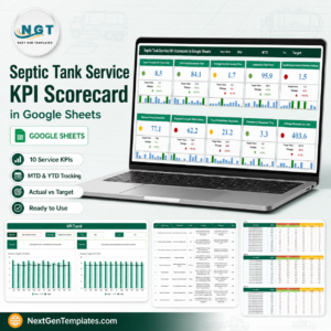
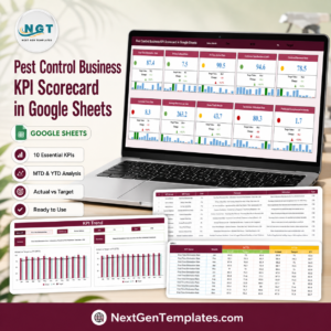
- 🐜 Pest Control Business KPI Dashboard in Google Sheets: the same dashboard family for another route-based service trade.
- 🏊 Swimming Pool Service KPI Dashboard in Google Sheets: seasonal outdoor service KPIs in the same format.
- 🚚 Septic Tank Service KPI Dashboard in Google Sheets: another truck-and-crew service business scorecard.
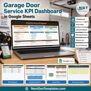
- 🛣️ Paving Contractor KPI Dashboard in Google Sheets and 🚪 Garage Door Service KPI Dashboard in Google Sheets: neighbouring property service trades.
Browse every Google Sheets KPI Dashboard template. New to dropdowns in Sheets? Google’s guide to creating an in-cell dropdown list explains the control that drives the month picker.
📖 Click here to read the Detailed Blog Post
🎥 Visit our YouTube channel for step-by-step video tutorials
👉 YouTube.com/@NextGenTemplates
Watch the step-by-step video Demo:
📅 Last updated: September 2026




Reviews
There are no reviews yet.