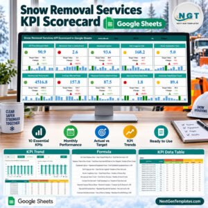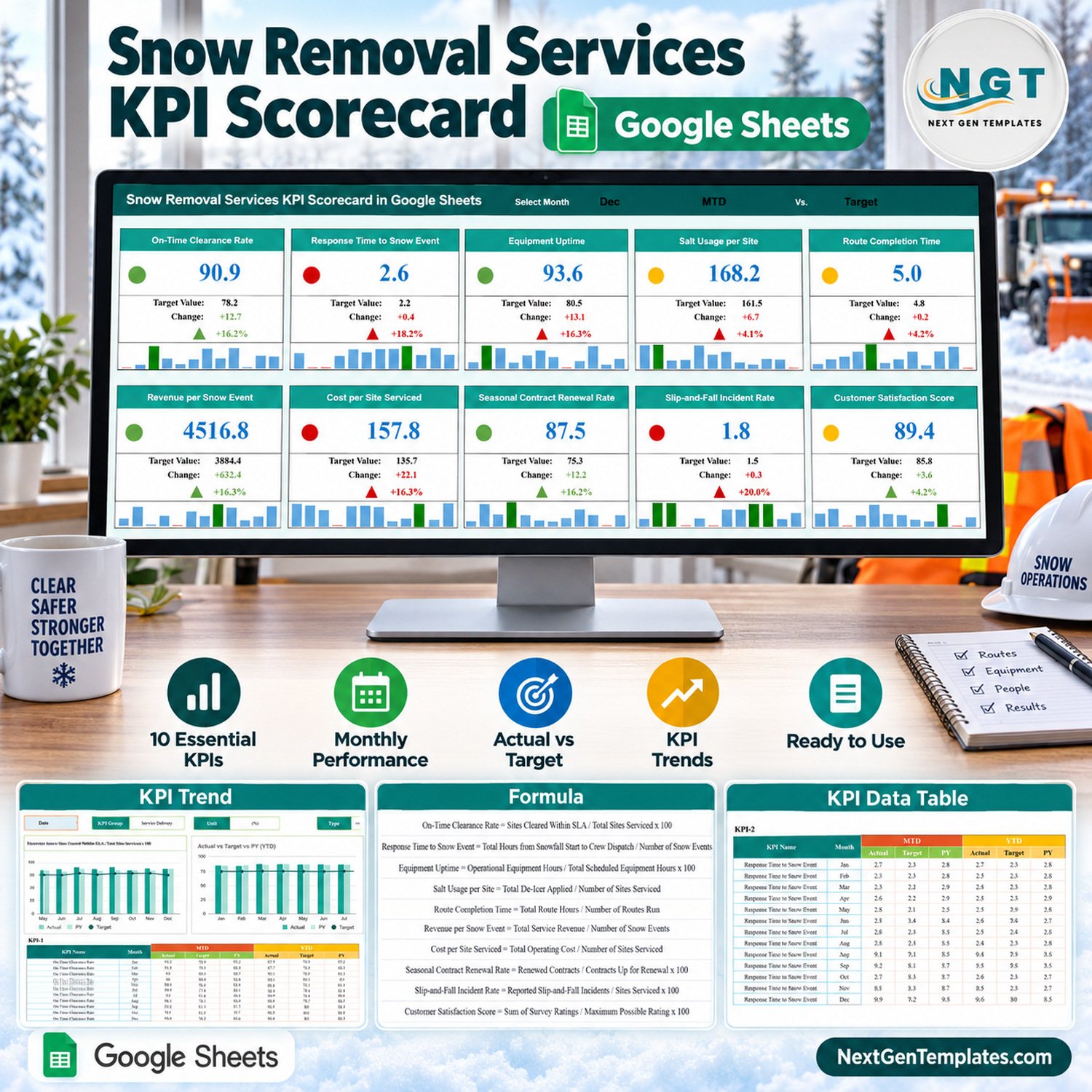
The Snow Removal Services KPI Scorecard in Google Sheets tracks 10 KPIs in four groups (Service Delivery, Operational Efficiency, Financial, Customer & Safety) on one Scorecard page. Pick a month, switch between MTD and YTD, and compare against Target or Prior Year. Every card shows the value, a traffic light, the change, the change % and a 12-month mini trend, and a separate KPI Trend page charts Actual vs Target vs PY for any KPI from Jan to Dec.
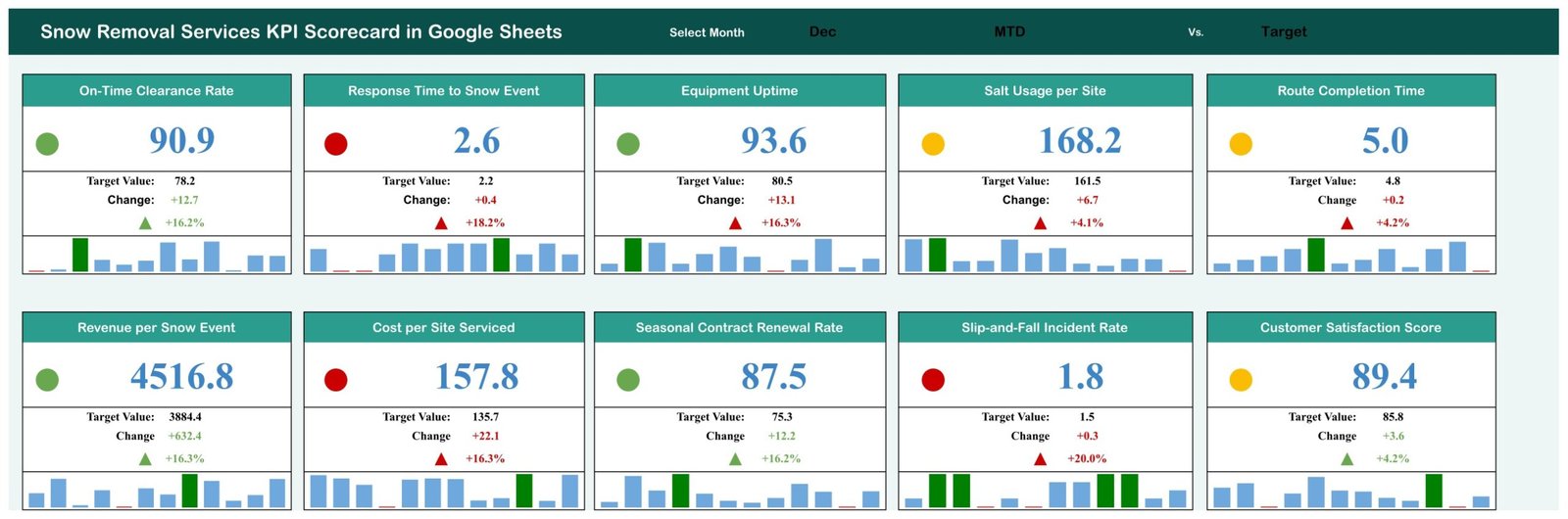
This listing is the KPI scorecard line: a ten-card monthly review sheet. It is not one of our analytical Google Sheets dashboards and not the larger KPI Dashboard family. The sample file opens on December, MTD vs Target, with 4 green, 3 amber and 3 red lights.
✅ Instant download · One-time payment · No subscription · No per-user fees
🔑 Key Features of the Snow Removal Scorecard
📅 Three selectors, one page. The header holds a Select Month drop-down (Jan to Dec), an MTD/YTD switch and a Target/PY switch. Every card, light, change figure and mini trend recalculates from those three cells, so one sheet answers “how did December go against target?” and “how is the year running against last year?”.
🚦 Traffic lights that respect KPI direction. Five KPIs are upper-the-better (UTB) and five are lower-the-better (LTB). Response Time, Salt Usage per Site, Route Completion Time, Cost per Site Serviced and Slip-and-Fall Incident Rate turn red when they rise above the comparison value, not when they fall.
📈 12-month mini trend on every card. Each of the ten cards carries a small column trend for Jan to Dec, with the highest month shown in green and the lowest in red, so a bad month stands out without opening another tab.
🧮 Formula and definition for each KPI. The KPI Definition sheet lists group, unit, formula, definition and UTB/LTB type, for example Equipment Uptime = Operational Equipment Hours / Total Scheduled Equipment Hours x 100.
📦 What’s Inside the Snow Removal Services KPI Scorecard in Google Sheets
Page 1: Scorecard
Ten KPI cards in two rows of five: On-Time Clearance Rate, Response Time to Snow Event, Equipment Uptime, Salt Usage per Site, Route Completion Time, Revenue per Snow Event, Cost per Site Serviced, Seasonal Contract Renewal Rate, Slip-and-Fall Incident Rate and Customer Satisfaction Score. Each shows the actual, the target or PY value, the change, the change % with an arrow, a traffic light and a Jan to Dec trend.
Page 2: KPI Trend
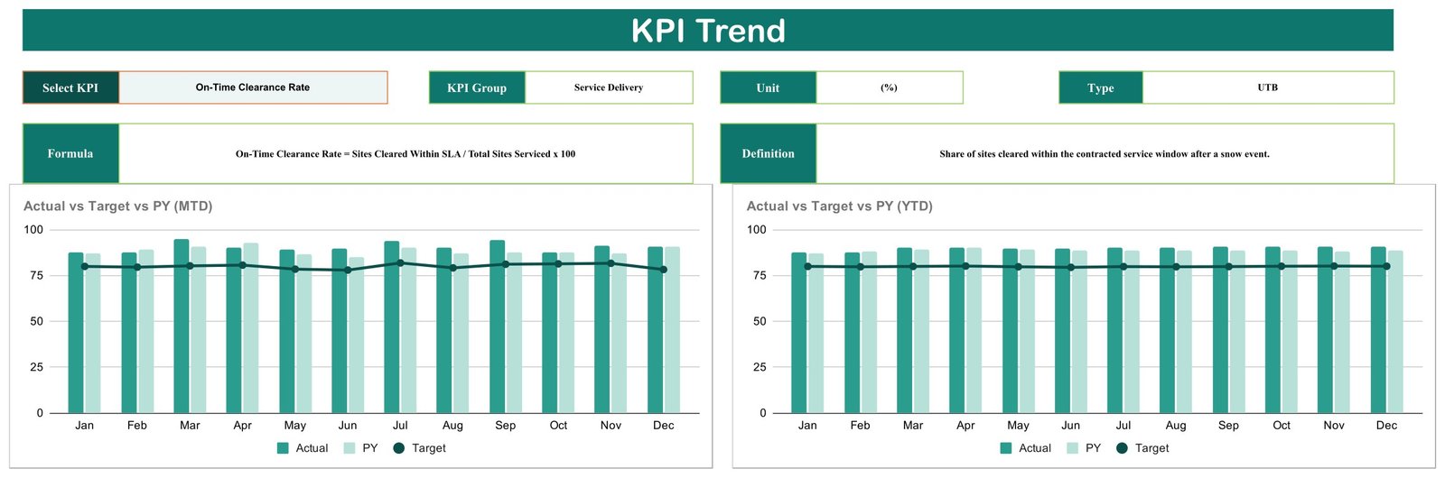
Choose any KPI from a drop-down to see its group, unit, type, formula and definition, plus two charts: Actual vs Target vs PY (MTD) and Actual vs Target vs PY (YTD), each by month.
Page 3: KPI Definition
The master list of the 10 KPIs with KPI Group, Unit ((%), (hrs), (lbs), ($) and per 100 sites), Formula, Definition and Type. The Scorecard and KPI Trend pages read their names and types from here.

Page 4: Input Data
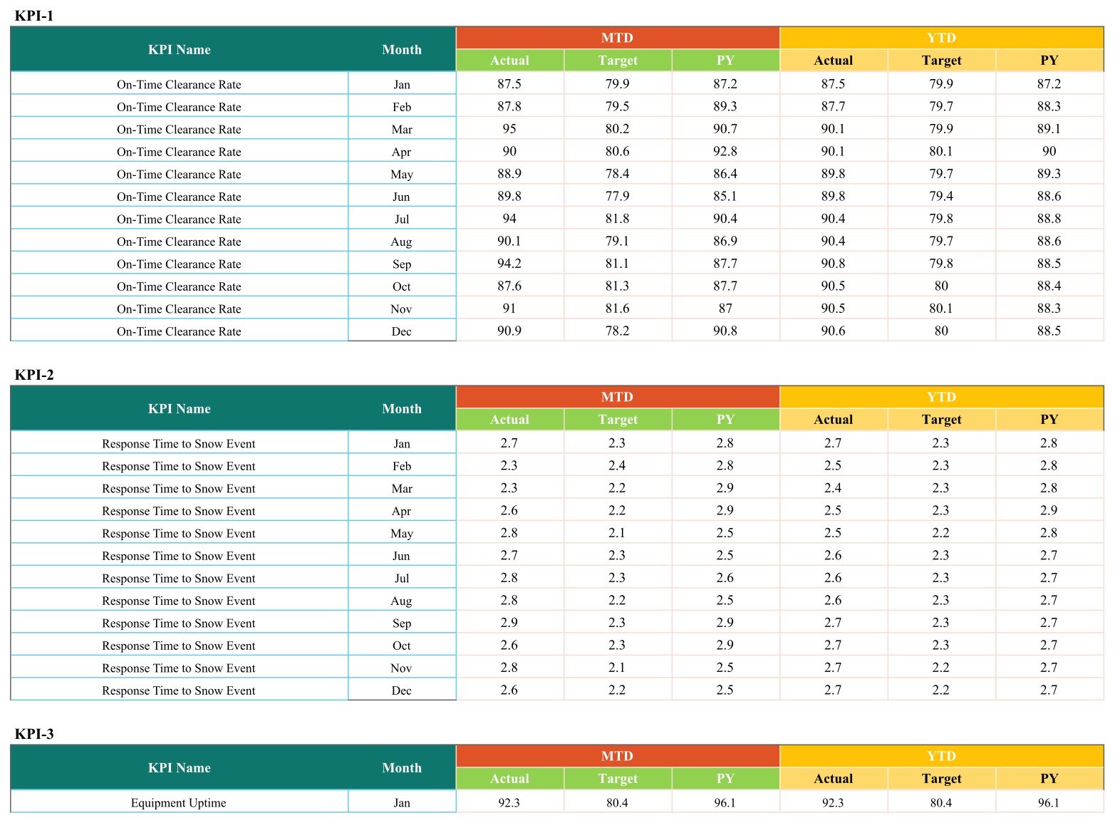
One block per KPI (KPI-1 to KPI-10), twelve month rows each, with six typed numbers per month: MTD Actual, Target and PY, and YTD Actual, Target and PY. A full year is 120 rows.
The file also holds a Read Me tab, a Color Settings tab and two helper sheets (Support and Trend_Support) that do the lookups.
📊 Snow Removal Scorecard vs. Excel Dashboard vs. Field Service Software: Where This Fits
| Feature | This Google Sheets scorecard | Microsoft Excel KPI dashboard | Field service software (e.g. Jobber, Service Autopilot) |
|---|---|---|---|
| Cost | ✅ $8.99 on sale, one-time | One-time template plus an Excel licence | Recurring subscription |
| Platform | ✅ Browser, free Google account | Excel desktop | Vendor web and mobile apps |
| Real-time team collaboration | ✅ Yes, Google sharing | Limited outside Microsoft 365 | ✅ Yes |
| Share with a link | ✅ Yes | File or OneDrive link | User accounts |
| Change KPIs and targets | ✅ Edit the KPI Definition and Input Data rows | ✅ Yes | Fixed reports |
| Monthly KPI review in one page | ✅ Ten cards with lights and trends | ✅ Yes | Varies by plan |
| Scheduling, dispatch, GPS, invoicing | No | No | ✅ Yes |
| Automatic data capture | No, typed monthly | No | ✅ Yes |
| Year-1 cost at 5 users | ✅ One purchase | Template plus 5 Excel seats | Subscription for every user or tier |
For snow contractors who want a clear monthly KPI review without paying for a full operations platform, this scorecard sits in the sweet spot.
👥 Who This Template Is For, and Who It’s Not For
✅ Built for:
- Owner-operators and small snow plowing firms that already keep monthly totals and want one page to review them
- Operations managers comparing crews’ response time, route time and equipment uptime against target or last year
- Account managers preparing renewal conversations with renewal rate and customer satisfaction trends
❌ Not for:
- Teams that need dispatch, GPS routing, time tracking or invoicing; this sheet only reports numbers you type
- Anyone wanting a whole Oct to Apr season in one file; each file holds one Jan to Dec year, so a winter season spans two files
- Multi-branch roll-ups or daily storm logs; the grain is one row per KPI per month
⚙️ How to Use the Scorecard
- Open the PDF in your download and click the link to make your own copy in Google Drive.
- On KPI Definition, keep or rename the 10 KPIs and set each Type to UTB or LTB.
- On Input Data, type the same KPI names and enter MTD and YTD Actual, Target and PY for each month.
- On the Scorecard, choose the month, MTD or YTD, and Target or PY.
- Open KPI Trend and pick a KPI to review its monthly Actual vs Target vs PY.
⚠️ Known Limitations and One-Minute Fixes
We tested the live sheet before listing it. Four points to know:
- June and July blank the cards. The Select Month list offers “June” and “July” while Input Data stores “Jun” and “Jul”, so all ten cards go empty for those two months. Fix: click Scorecard cell N1, open Data > Data validation, and change June to Jun and July to Jul.
- Equipment Uptime change colour. Both colour rules on that card use red, so its change figure and arrow stay red even when it beats target. Fix: in Format > Conditional formatting on N6:N7 and M7, set the “Green” rule’s text to green.
- Color Settings is not connected. The traffic-light bands live on the Support sheet (Z4:Z6 and AD4:AD6). By default an upper-the-better KPI is red at or below the comparison, amber up to 10% above, and green beyond 10%. Edit Support, not Color Settings, to change them.
- Read Me is empty, and YTD values are typed rather than calculated from the MTD rows.
💼 Real-World Use Cases
Dave runs four plow trucks for commercial parking lots. At the end of each month he types the totals, sets the scorecard to MTD vs Target and checks Response Time to Snow Event and Cost per Site Serviced first, because those two red lights tell him where the margin went.
Priya manages operations for a residential and HOA contractor. She switches to YTD vs PY to see whether Equipment Uptime and Salt Usage per Site are better than last winter, then opens KPI Trend to show crew leads the month where route times slipped.
Marcus handles seasonal contracts. Before renewal season he reviews Seasonal Contract Renewal Rate beside Customer Satisfaction Score to decide which accounts need a call.
❓ Frequently Asked Questions
What KPIs does this snow removal scorecard track?
It tracks ten: On-Time Clearance Rate, Response Time to Snow Event, Equipment Uptime, Salt Usage per Site, Route Completion Time, Revenue per Snow Event, Cost per Site Serviced, Seasonal Contract Renewal Rate, Slip-and-Fall Incident Rate and Customer Satisfaction Score, in four groups with a formula and definition for each.
Can one file cover a whole winter season?
No. The month picker and Input Data run Jan to Dec for a single year, so a November to March season spans two files: November and December in one, January to March in the next. Many contractors simply keep one file per calendar year.
How long does setup take?
Copying the sheet takes a minute. The real work is data entry: 10 KPIs times 12 months is 120 rows, each with six numbers. Once those are in, every card, light and chart updates on its own.
Why are all the cards blank when I pick June or July?
The month list spells them June and July while the data uses Jun and Jul. Open Data > Data validation on Scorecard cell N1 and change the two entries to Jun and Jul; the cards fill immediately.
How does this compare to Jobber or Service Autopilot?
Those tools run scheduling, dispatch and invoicing on a subscription. The Snow Removal Services KPI Scorecard in Google Sheets does none of that; it is a one-time purchase for reviewing monthly KPIs you already collect.
Does it handle salt, safety or contract compliance reporting?
No. Salt Usage per Site and Slip-and-Fall Incident Rate are simply numbers you enter and compare to target. The template makes no environmental, safety, insurance or contract compliance claim.
👤 About the Author
Built by PK, with 15+ years of Excel, Google Sheets and Power BI experience and founder of NextGenTemplates. Tutorials on YouTube: @PKAnExcelExpert, @NextGenTemplates and @NeoTechNavigators. Google’s own help pages explain the two features this sheet relies on: in-cell drop-down lists and conditional formatting rules.
🔗 Explore Related Templates
More ten-KPI scorecards in the same format: Equipment Rental Business KPI Scorecard in Google Sheets, Garage Door Service KPI Scorecard in Google Sheets, Scaffolding Services KPI Scorecard in Google Sheets and Kitchen Remodeling KPI Scorecard in Google Sheets.
Need charts and slicers instead of KPI cards? The analytical Landscaping Dashboard in Google Sheets is a different product family. Browse all Google Sheets KPI templates or every Google Sheets template.
Also in preparation: separate Excel editions of the snow removal scorecard and the snow removal KPI dashboard.
📖 Click here to read the Detailed Blog Post
🎥 Visit our YouTube channel for step-by-step video tutorials
👉 YouTube.com/@NextGenTemplates
Watch the step-by-step video Demo:
📅 Last updated: September 2026