

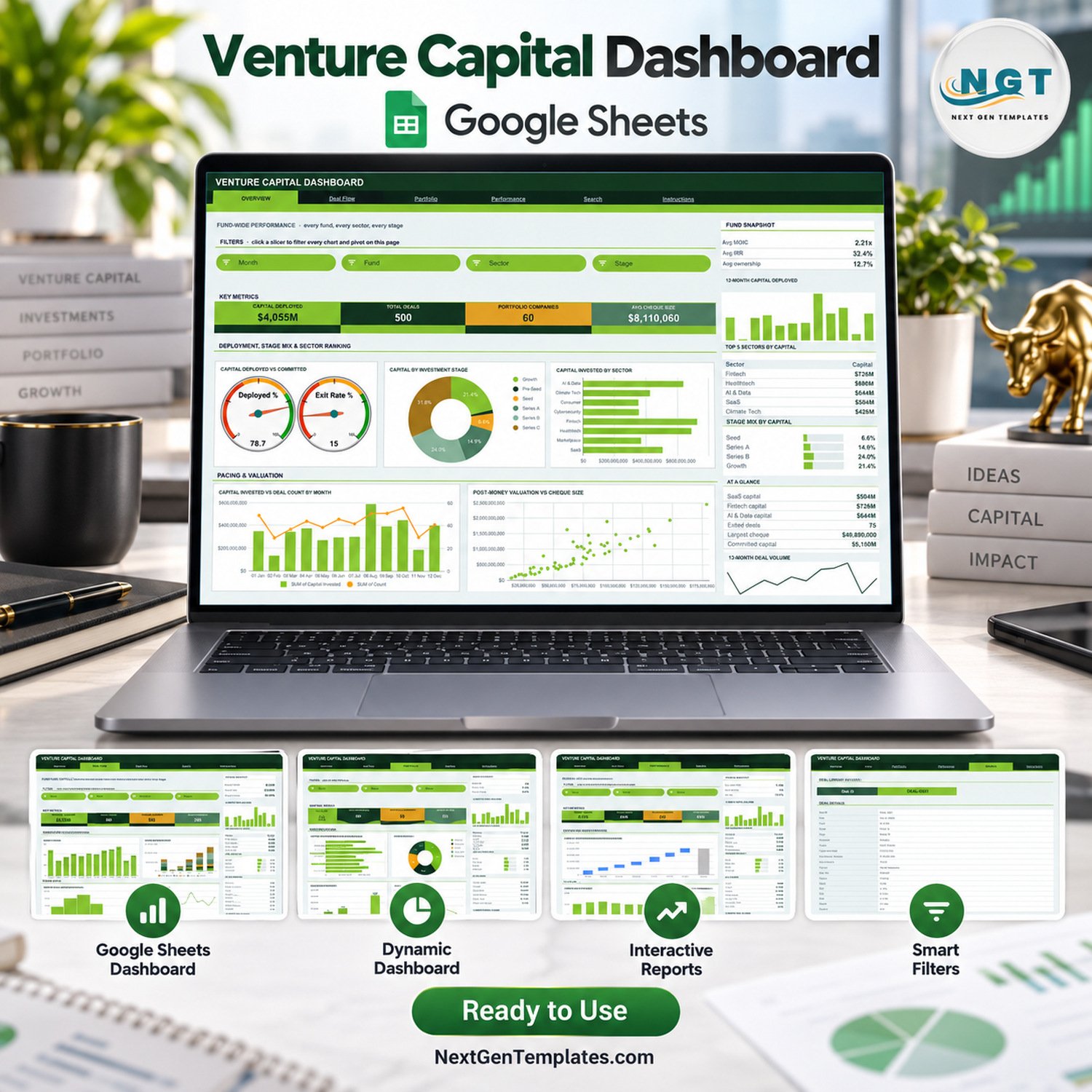
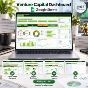
The Venture Capital Dashboard in Google Sheets turns a log of 500 sample deals into six linked pages: Overview, Deal Flow, Portfolio, Performance, Search and Instructions. It carries 16 KPI cards, 18 chart panels and 15 slicers, all running on native pivot tables, so capital deployed, deal flow, portfolio mix, MOIC and IRR sit in one browser tab.
🌍 Join thousands of teams in 40+ countries using NextGenTemplates to replace paid SaaS tools with one-time-purchase Excel, Google Sheets, Power BI and HTML templates.
✅ Instant download · One-time payment · No subscription · No per-user fees · Lifetime access
This is an analytical Dashboard for a venture fund’s deal log. It is a different template from the month-picker Venture Capital KPI Dashboard in Excel, which scores monthly KPIs against targets. It is a reporting template, not fund-administration, LP-reporting or investment software: it gives no investment advice, has no live market feed, makes no regulatory or compliance claim, and the sample funds, partners and companies are fictional.
🔑 Key Features of the Venture Capital Dashboard in Google Sheets
📊 Four analysis pages with a shared layout. Overview, Deal Flow, Portfolio and Performance each carry four KPI cards, a three-line snapshot panel, a Top 5 list, a mix panel and an At a Glance list, so a partner reads every page the same way.
🎛️ 15 slicers across the four pages. Overview filters by Month, Fund, Sector and Stage; Deal Flow by Month, Stage, Deal Source and Region; Portfolio by Sector, Stage, Region and Status; Performance by Fund, Sector and Status.
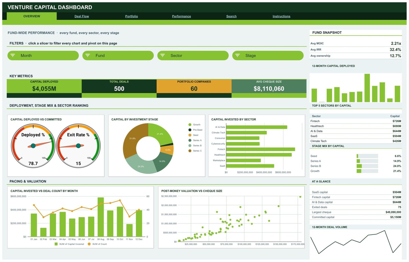
🎯 Capital deployed against committed. Two gauges on the Overview show Deployed % (78.7 in the sample, $4,055M of $5,150M committed) and Exit Rate % (15). The committed figure is one editable cell, BJ4, on the Overview sheet.
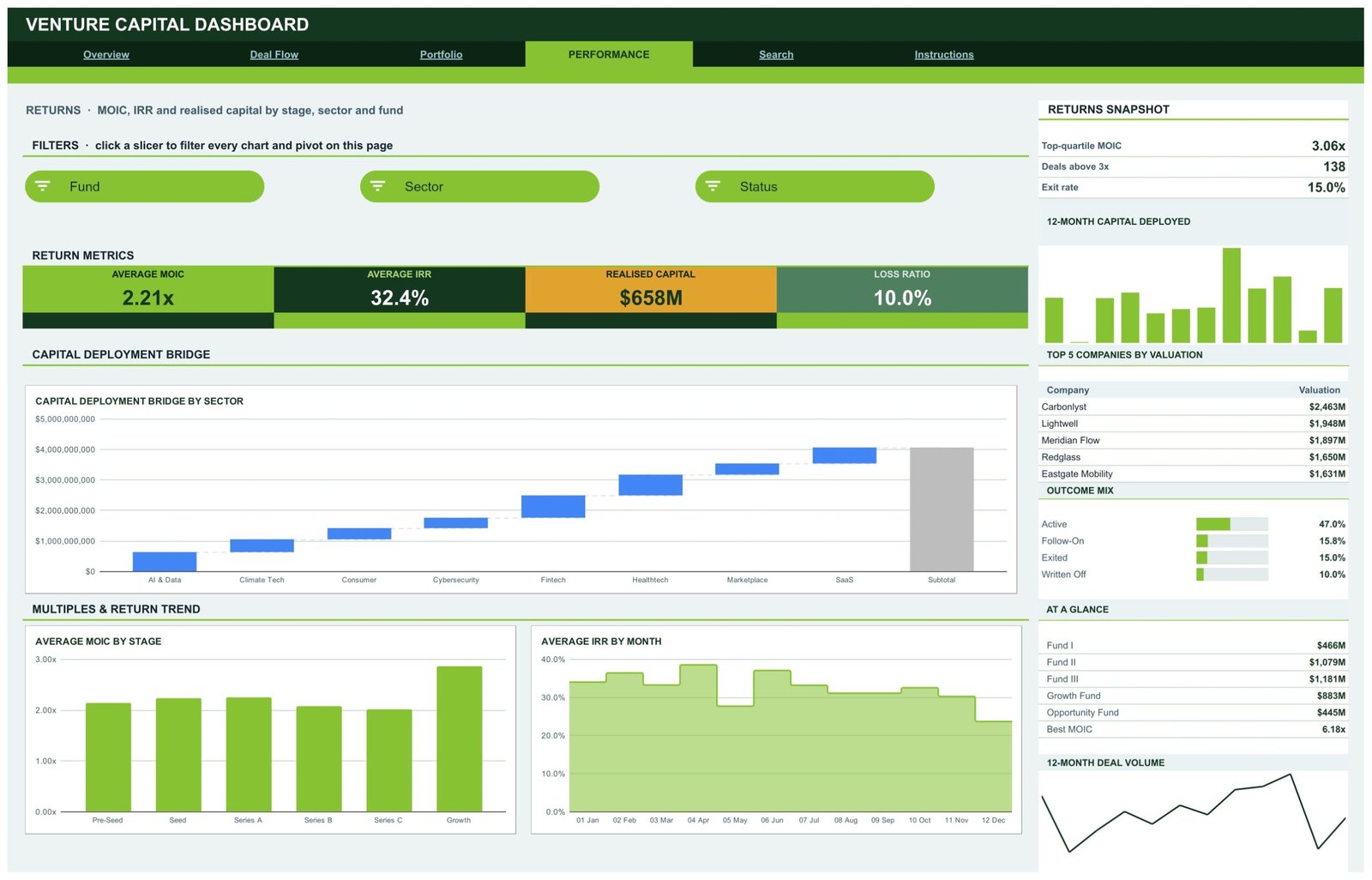
📈 Returns in one view. The Performance page shows Average MOIC (2.21x), Average IRR (32.4%), Realised Capital ($658M) and Loss Ratio (10.0%), plus a Capital Deployment Bridge by Sector and Average MOIC by Stage.
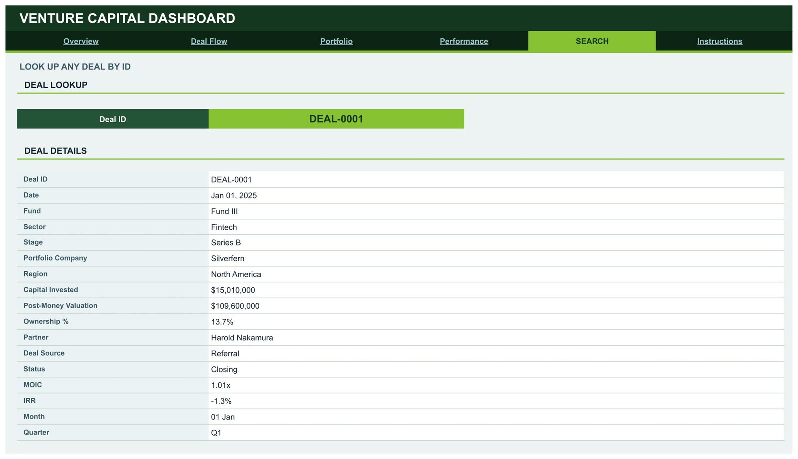
🔍 Deal-level Search. Pick any Deal ID and read the full 17-field record: date, fund, sector, stage, company, region, capital invested, post-money valuation, ownership, partner, source, status, MOIC, IRR, month and quarter.
⚡ Built on native pivot tables and slicers. Pivots, slicers and formulas already cover 1,000 deal records, so pasting rows up to row 1001 updates every page without helper formulas behind the charts.
📦 What’s Inside This VC Dashboard
Page 1: Overview
Fund-wide deployment with cards for Capital Deployed ($4,055M), Total Deals (500), Portfolio Companies (60) and Avg Cheque Size ($8,110,060). Charts: Capital Deployed vs Committed gauges, Capital by Investment Stage, Capital Invested by Sector, Capital Invested vs Deal Count by Month and Post-Money Valuation vs Cheque Size, with a Top 5 Sectors by Capital list.
Page 2: Deal Flow
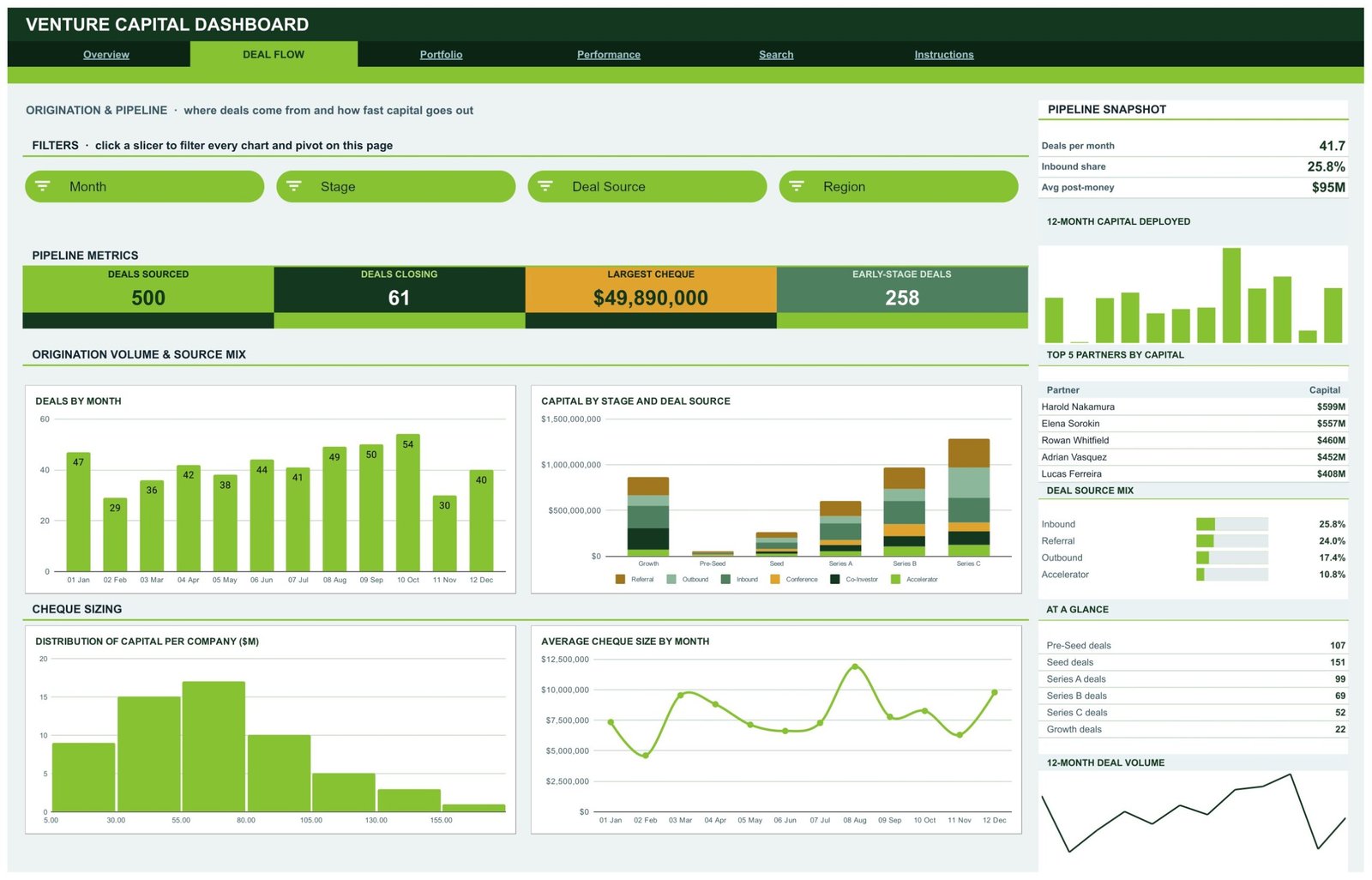
Origination and pipeline: Deals Sourced (500), Deals Closing (61), Largest Cheque ($49,890,000) and Early-Stage Deals (258). Charts show Deals by Month, Capital by Stage and Deal Source, Distribution of Capital per Company ($M) and Average Cheque Size by Month, beside a Top 5 Partners by Capital list and a Deal Source Mix panel.
Page 3: Portfolio
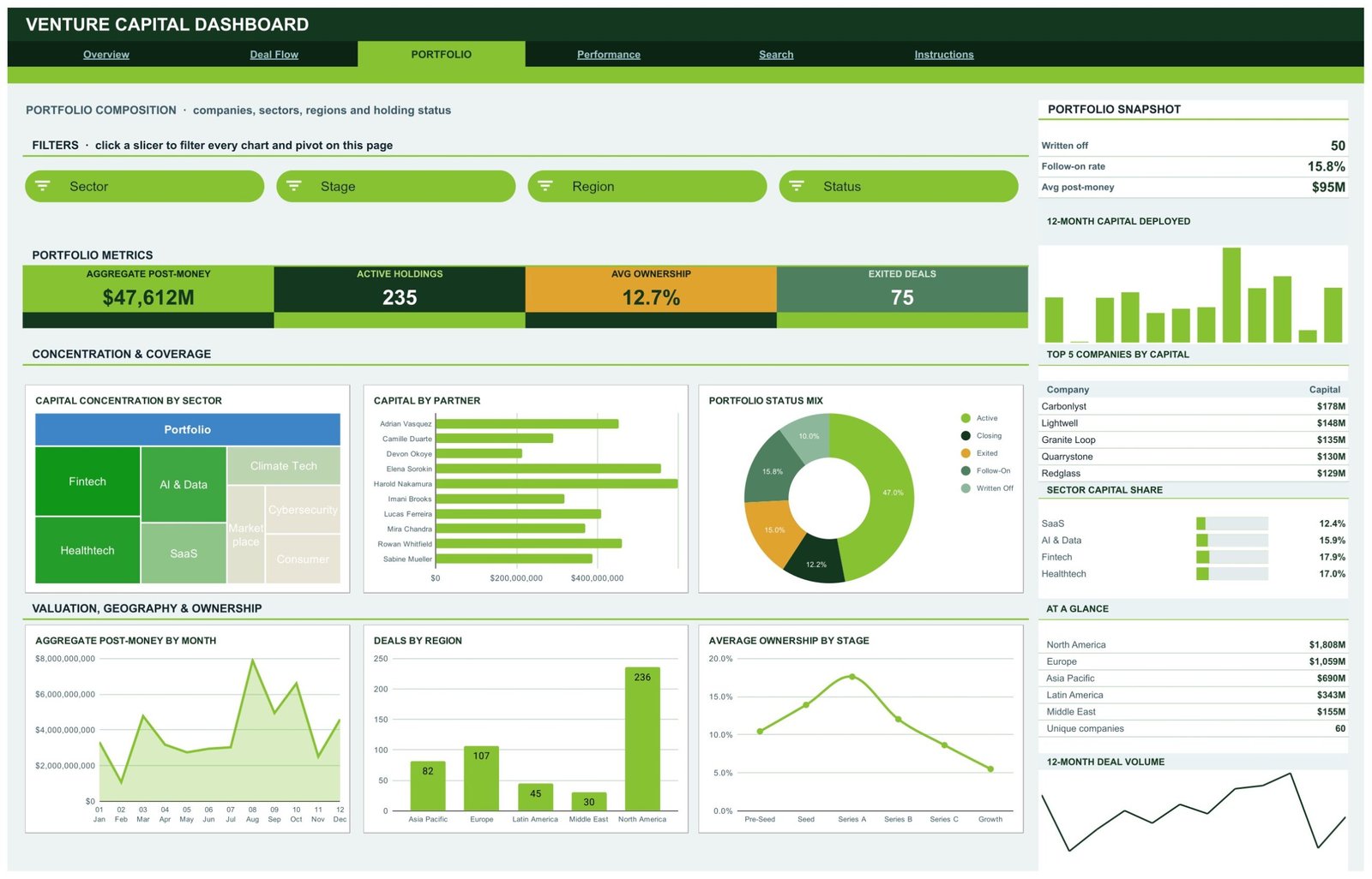
Holdings, sectors and regions: Aggregate Post-Money ($47,612M), Active Holdings (235), Avg Ownership (12.7%) and Exited Deals (75). Charts: Capital Concentration by Sector (treemap), Capital by Partner, Portfolio Status Mix, Aggregate Post-Money by Month, Deals by Region and Average Ownership by Stage.
Page 4: Performance
Returns by stage, sector and fund: a Capital Deployment Bridge by Sector waterfall, Average MOIC by Stage and Average IRR by Month. The sidebar lists Top 5 Companies by Valuation, an Outcome Mix (Active, Follow-On, Exited, Written Off) and capital by fund.
Page 5: Search
Choose a Deal ID in the lookup cell and the Deal Details block returns every field of that investment record.
Page 6: Instructions
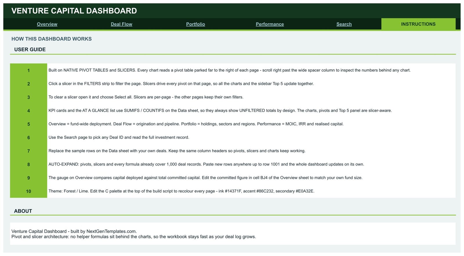
A ten-step user guide covering slicers, pivots, auto-expand, the committed-capital cell and how the pages differ.
📊 This VC Dashboard vs. Microsoft Excel Dashboard vs. Paid VC Portfolio Platform — Where This Fits
| Feature | This Google Sheets template | Microsoft Excel Dashboard | Paid VC portfolio platform |
|---|---|---|---|
| Cost | ✅ $9.99 one-time | One-time template price | Recurring subscription, often quote-based |
| Platform | ✅ Any browser with a Google account | Excel desktop | Vendor web app |
| Setup time | ✅ Under 10 minutes with sample layout | Under 30 minutes | Days to weeks of onboarding |
| Real-time team collaboration | ✅ Native Google Sheets sharing | Needs OneDrive/SharePoint | ✅ Yes, per seat |
| Mobile access | ✅ Google Sheets app | Limited | ✅ Usually |
| Customizable fields | ✅ Full sheet access | ✅ Full workbook access | Limited to vendor schema |
| Share with link | ✅ Yes | Partial | Invite-only accounts |
| Year-1 cost at 5 users | ✅ $9.99 total | One-time template price | Several thousand dollars |
| Deal-level lookup | ✅ Search page by Deal ID | Varies by template | ✅ Yes |
| Cash-flow IRR calculation, LP reporting | ❌ Not included (MOIC/IRR are data fields) | Varies | ✅ Usually included |
For emerging managers and analysts who want a clean deal-log dashboard without paying for a full portfolio platform, this template sits in the sweet spot.
👥 Who This Template Is For — and Who It’s Not For
✅ This template is built for:
- Analysts and associates at emerging VC funds who keep the deal log in a spreadsheet
- Angel syndicates, family-office investment teams and corporate venture units reporting deployment by sector and stage
- Accelerator and university venture programmes that present portfolio composition to a committee
❌ This template is NOT for:
- Funds that need cash-flow-based IRR, capital calls, waterfalls or LP statements — MOIC and IRR are read from the data, not calculated
- Anyone looking for investment advice, live valuations or a compliance or fund-administration system
⚙️ How to Use This VC Dashboard
- Open the PDF in your download and click the link to make your own copy in Google Drive.
- Replace the sample rows on the Data sheet with your deals, keeping the same column headers.
- Type your fund’s total committed capital into cell BJ4 on the Overview sheet so the Deployed % gauge is correct.
- Click a slicer on any page to filter its charts, pivots and Top 5 list (see Google’s guide to slicers).
- Use the Search page to pull up any Deal ID before an investment committee meeting.
💼 Real-World Use Cases
Maya is an associate at a $150M seed fund. Each Monday she pastes new term sheets into the Data sheet and opens Deal Flow to show partners deals per month, source mix and average cheque size — no manual chart rebuilding.
Daniel runs a corporate venture arm. He filters the Portfolio page by Region and Status to show leadership how many holdings are active, exited or written off, and which sectors hold the most capital.
Priya manages an angel syndicate. She uses the Performance page’s Average MOIC by Stage and Outcome Mix to discuss which stages have produced better recorded multiples across the syndicate’s history.
❓ Frequently Asked Questions
What does the Venture Capital Dashboard in Google Sheets track?
It tracks capital deployed, deal count, portfolio companies, average cheque size, deal sources, post-money valuation, ownership, holding status, MOIC, IRR, realised capital and loss ratio across 500 sample deals, with 16 KPI cards and 18 chart panels on four analysis pages.
Does it calculate IRR from cash flows or give investment advice?
No. MOIC and IRR are fields on each deal row that the dashboard averages and charts. This template does not model cash flows, capital calls or distributions, has no live market feed and gives no investment advice.
Why don’t the KPI cards change when I use a slicer?
By design, the KPI cards and At a Glance lists use SUMIFS and COUNTIFS on the Data sheet, so they always show unfiltered totals. The charts, pivot tables and Top 5 lists respond to the slicers on each page.
How long does setup take?
Most users are running in under 10 minutes: copy the file, paste deals into the Data sheet with the same headers, and set committed capital in cell BJ4. Pivots and slicers already cover 1,000 rows.
How does it compare with a paid VC portfolio platform?
A paid platform adds LP reporting, cash-flow returns and integrations for a recurring fee. The Venture Capital Dashboard in Google Sheets costs $9.99 once and covers deployment, deal flow, portfolio and returns reporting for teams that already keep a spreadsheet deal log.
Can I change the colours?
Yes, with normal Google Sheets formatting. The Instructions page mentions a palette in the build script; that script is not part of your copy, so recolour cells and charts manually. The sector treemap header and the bridge chart bars use Google’s default blue and grey.
👤 About the Author
Built by PK — Microsoft Certified Professional with 15+ years of Excel, Google Sheets and Power BI experience. Founder of NextGenTemplates, reaching 300K+ subscribers across YouTube channels (@PKAnExcelExpert, @NextGenTemplates, @NeoTechNavigators). Every template is hand-built and tested before release.
🔗 Explore Related Templates
📘 Wealth Management Dashboard in Google Sheets — AUM, net flows and advisory revenue in the same pivot-and-slicer layout.
🏦 Credit Unions Dashboard in Google Sheets — members, loans and deposits for financial institutions.
🔁 Also available as: Venture Capital Dashboard in Excel · Venture Capital Dashboard in Power BI · Venture Capital KPI Dashboard in Power BI (different template families built on their own data).
📂 Browse all Google Sheets Dashboards or every Google Sheets template.
📖 Click here to read the Detailed Blog Post
🎥 Visit our YouTube channel for step-by-step video tutorials
👉 YouTube.com/@NextGenTemplates
📅 Last updated: September 2026

























Reviews
There are no reviews yet.