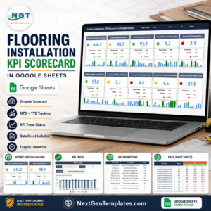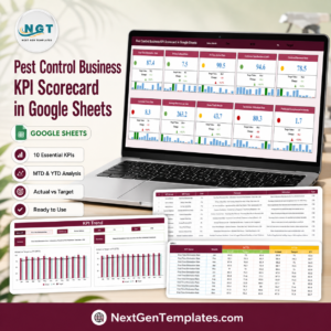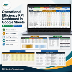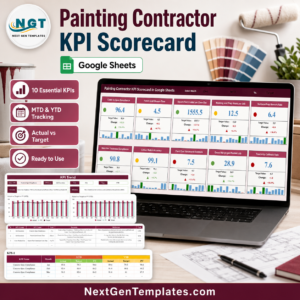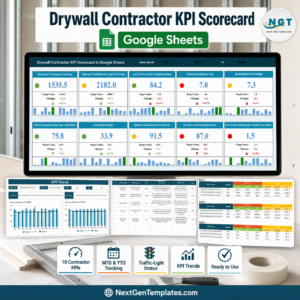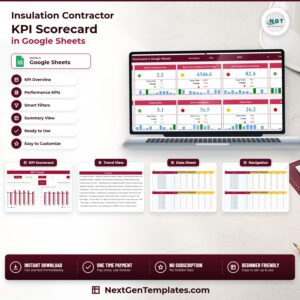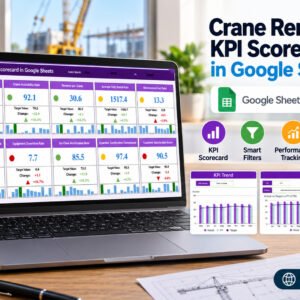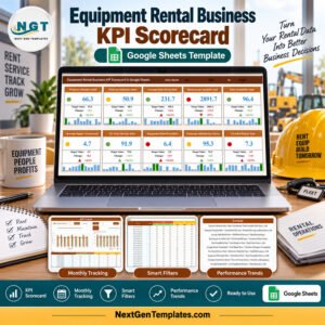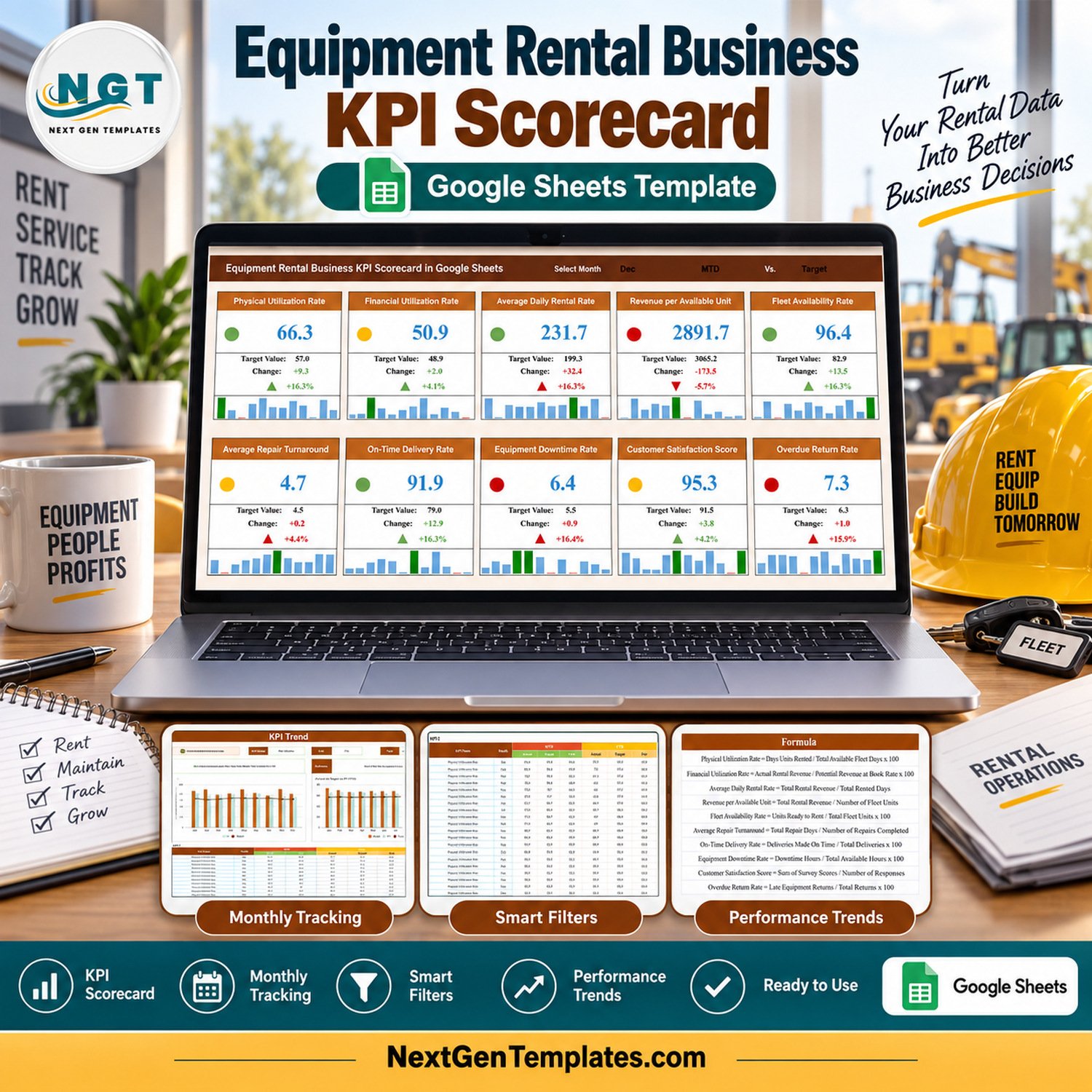
The Equipment Rental Business KPI Scorecard in Google Sheets tracks 10 rental KPIs across 4 pages. Every KPI is scored against its own target with a red/amber/green light, a variance figure, a percentage and a twelve-month spark strip, and the month picker at the top switches the whole card wall between January and December. The sample file ships 12 months of demo data for all 10 KPIs — 120 MTD rows and 120 YTD rows — so every card, chart and table is populated the moment you open it.
🌎 Join 8,400+ teams in 40+ countries using NextGenTemplates to replace paid SaaS tools with one-time-purchase Excel, Google Sheets, Power BI and HTML templates.
✅ Instant download · One-time payment · No subscription · No per-user fees · Lifetime access
Which template is this? NextGenTemplates publishes three families with similar names, and this is the KPI Scorecard. A scorecard is a target-versus-actual card wall: ten named KPIs, each with a target, a variance, a traffic light and a trend, read one month at a time. It is not one of our analytical rental and machinery dashboards, which slice transaction-level data by customer, site and asset class, and it is not the KPI Dashboard family either. If what you want is a monthly management review page that answers “did we hit target, yes or no”, this is the one.
🔑 Key Features of the Equipment Rental Business KPI Scorecard in Google Sheets
📊 Ten rental KPIs in five groups. Fleet Utilization (Physical Utilization Rate, Financial Utilization Rate), Revenue (Average Daily Rental Rate, Revenue per Available Unit), Asset Readiness (Fleet Availability Rate, Average Repair Turnaround), Operations (On-Time Delivery Rate, Equipment Downtime Rate) and Customer (Customer Satisfaction Score, Overdue Return Rate). Each KPI carries its own unit — percent, dollars, days or index — so nothing is forced onto one scale.
🟢 Direction-aware traffic lights. Seven KPIs are marked UTB (upper is better) and three are marked LTB (lower is better): Average Repair Turnaround, Equipment Downtime Rate and Overdue Return Rate. The light and the arrow follow that flag, so a rising downtime rate shows red even though the number went up.
📈 A twelve-month spark strip on every card. Under each KPI value sits a twelve-bar strip of that KPI’s monthly actuals, with the year’s high and low months picked out in colour, so you can see whether the selected month is typical before you act on it.
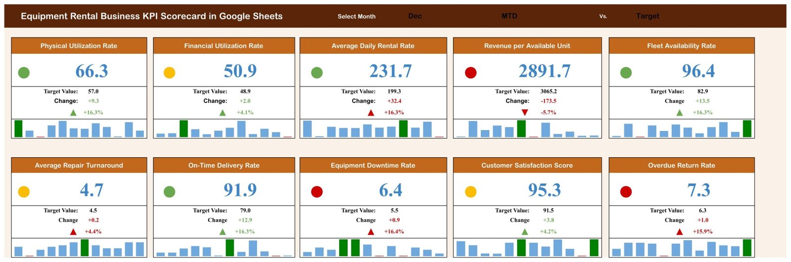
📅 One month picker drives the whole page. Choosing a month rewrites all ten cards — value, target, variance, percentage and light — from the KPI Data page. In the shipped sample the picker sits on December, showing Physical Utilization Rate at 66.3 against a target of 57.0.
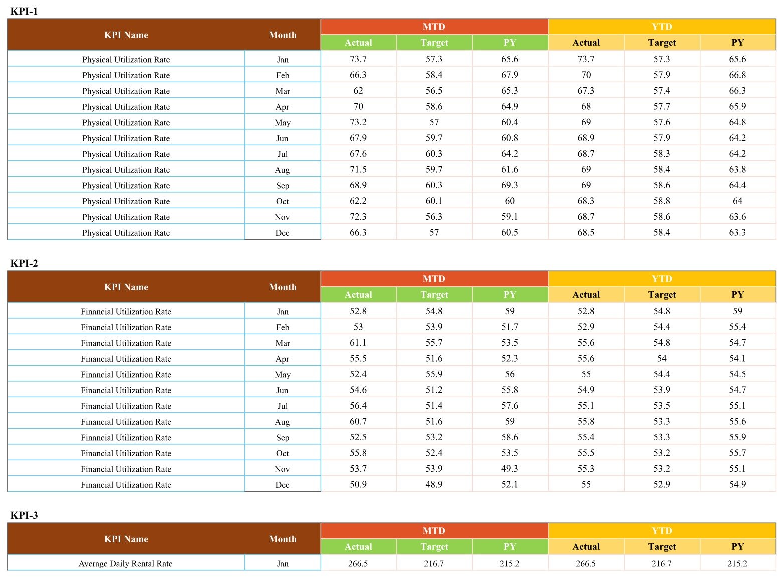
📑 MTD and YTD side by side. Every KPI stores an MTD block and a YTD block, each with Actual, Target and Prior Year. The YTD column is a running average of the months to date, so December YTD for Physical Utilization Rate reads 68.5 — the mean of the twelve monthly actuals — against a prior-year 63.3.
📝 A documented formula for all ten KPIs. The KPI Definitions page states the exact arithmetic behind each metric, for example Physical Utilization Rate = Days Units Rented / Total Available Fleet Days x 100 and Revenue per Available Unit = Total Rental Revenue / Number of Fleet Units, so two managers reading the same number mean the same thing.
📦 What’s Inside — the 4 Pages
Page 1: KPI Scorecard
The management review page. Ten KPI cards in two rows of five, each showing the traffic light, the current value, Target Value, Change and the change percentage, plus the twelve-month spark strip. The header strip carries the Select Month picker (December in the sample) and the MTD Vs. Target basis. In the demo data the green cards are Physical Utilization Rate, Average Daily Rental Rate, Fleet Availability Rate and On-Time Delivery Rate; the red cards are Revenue per Available Unit, Equipment Downtime Rate and Overdue Return Rate.
Page 2: KPI Trend
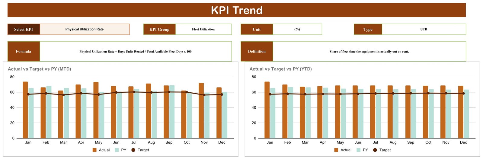
Pick one KPI and read its full year. The selector strip returns that KPI’s Group, Unit and Type, and the panel underneath prints its Formula and Definition. Two charts sit below: Actual vs Target vs PY (MTD) and Actual vs Target vs PY (YTD), each plotting twelve monthly Actual and Prior Year bars against a Target line.
Page 3: KPI Definitions
The reference table every reviewer asks for: one row per KPI with its number, KPI Group, KPI Name, Unit, Formula, Definition and Type. This is the page that settles arguments about what “availability” counts and whether a KPI is upper-is-better or lower-is-better.

Page 4: KPI Data
Where you type. One block per KPI (KPI-1 to KPI-10), twelve rows each, with an MTD group of Actual, Target and PY and a YTD group of the same three. Replace the demo numbers with your own and every card and chart on the other pages follows.
All four pages are shown above. There is no “Get More Templates” or upsell page in this file — the gallery is the product.
⚠️ What This Template Does Not Do
This is a reporting template over numbers you type in. It is a spreadsheet, not an inspection regime, and every figure in the sample file and in the screenshots above is demo data we generated to make the pages readable.
- ❌ It does not certify, inspect, test or prove the condition or roadworthiness of any machine, attachment, sling or lifting accessory.
- ❌ It does not establish compliance with OSHA, ASME B30, LOLER or PUWER, thorough-examination regimes, EN standards, operator certification schemes, or any local plant, lifting or hire regulation.
- ❌ It is not a maintenance record of legal standing, an inspection or test certificate, a hire contract, or a damage-liability determination.
- ❌ It does not replace a competent person’s statutory duties.
Utilisation, downtime, availability, repair-turnaround and overdue-return figures in this file are management reporting numbers. They must never be read as evidence that a machine is safe to use. Keep your statutory inspection, examination and certification records in the systems your regulator and insurer expect, and use this scorecard for the commercial review that sits alongside them.
📊 This Scorecard vs. a Microsoft Excel Scorecard vs. Rental SaaS — Where This Fits
| Feature | Equipment Rental Business KPI Scorecard (Google Sheets) | Microsoft Excel KPI scorecard | Point of Rental / EZRentOut |
|---|---|---|---|
| Cost | $8.99 one-time ✅ | $10-20 one-time | $60-200 / user / month |
| Platform | Google Sheets, browser only ✅ | Excel desktop or Microsoft 365 | Vendor cloud |
| Setup time | Under 10 minutes ✅ | Under 10 minutes | 2-8 weeks with onboarding |
| Real-time team collaboration | Native, multi-editor ✅ | Only via OneDrive co-authoring | Yes |
| Mobile access | Google Sheets app ✅ | Excel mobile, limited | Dedicated app |
| Edit the KPI list and formulas | Yes, all 10 rows are yours ✅ | Yes | Fixed vendor metrics |
| Share with a link | Yes, view or edit ✅ | File attachment | Seat required per viewer |
| Contract, asset register and invoicing | No — reporting only | No | Yes ✅ |
| Year-1 cost at 5 users | $8.99 ✅ | ~$15 + Office licences | $3,600-12,000 |
For a rental or plant-hire business that already runs its contracts somewhere else and just needs an honest monthly target-versus-actual page, this scorecard sits in the sweet spot.
👥 Who This Template Is For — and Who It’s Not For
✅ This template is built for:
- Owners and branch managers of equipment rental, plant hire and tool hire businesses running 20-500 units who review performance monthly.
- Fleet and asset managers who already pull utilisation and downtime numbers out of a rental system and need a clean page to present them on.
- Operations managers at construction, events, agriculture and industrial-services firms that hire out their own kit as a side line.
- Finance and commercial leads who want Revenue per Available Unit and Financial Utilization Rate tracked against target every month without buying another seat.
❌ This template is NOT for:
- Anyone looking for a compliance, inspection or certification record — see the section above; this file does none of that.
- Businesses that need live contract, booking, asset-register or invoicing functionality. Buy a rental management system, or look at our Rental Equipment Management System Web App.
- Teams that want transaction-level slicing by customer, site or asset class — that is a dashboard job, not a scorecard job.
- Operations wanting automatic ingestion from telematics or a rental ERP. The KPI Data page is typed or pasted into.
⚙️ How to Use It
- Open the PDF in your download and click the “Make a copy” link. Google Drive creates your own editable copy.
- Open the KPI Definitions page and edit the ten KPI names, groups, units, formulas and UTB/LTB flags to match how your business actually measures things.
- Go to the KPI Data page and replace the demo numbers with your monthly Actual, Target and Prior Year values for each KPI, MTD and YTD.
- Return to the KPI Scorecard page and set the Select Month picker to the month you are reviewing. All ten cards refresh.
- Use the KPI Trend page to pull any single KPI into its full twelve-month Actual vs Target vs PY view before the review meeting.
- Share the file with your team using Google Sheets’ own link sharing, view-only for people who should not type in it.
💼 Real-World Use Cases
Marcus runs a 140-unit plant hire depot in the Midlands. He exports utilisation and downtime figures from his rental system on the first working day of each month, pastes them into the KPI Data page, and walks his depot supervisors through the ten cards. The month he saw Revenue per Available Unit go red while Physical Utilization Rate stayed green, he found the yard was renting cheap kit hard and leaving the high-book-rate machines idle.
Priya is the commercial manager at a family tool hire chain with four branches. She keeps one copy of the scorecard per branch, all four shared read-only with the owners. Average Repair Turnaround and Overdue Return Rate are the two she watches, because both are lower-is-better and both quietly eat availability.
Dan is operations lead at an events company that hires out staging and lifting kit. He is not a spreadsheet person, so he uses the KPI Trend page almost exclusively — one KPI, twelve months, actual against target against last year, printed straight to PDF for the board pack.
❓ Frequently Asked Questions
Does this certify our equipment or make our hire operation compliant?
No. The Equipment Rental Business KPI Scorecard in Google Sheets is a reporting template over numbers you type in. It does not inspect, test or certify any machine or lifting accessory, it does not establish compliance with OSHA, ASME B30, LOLER, PUWER or any hire regulation, and it does not replace a competent person’s statutory duties.
Are the numbers in the screenshots real?
No. Every figure shown on the four pages is demo data we generated so the cards, charts and tables would be readable. Physical Utilization Rate at 66.3 and Fleet Availability Rate at 96.4 are placeholders. Replace them with your own on the KPI Data page.
What KPIs does this scorecard track?
Ten: Physical Utilization Rate, Financial Utilization Rate, Average Daily Rental Rate, Revenue per Available Unit, Fleet Availability Rate, Average Repair Turnaround, On-Time Delivery Rate, Equipment Downtime Rate, Customer Satisfaction Score and Overdue Return Rate. Each ships with a stated formula and an upper-is-better or lower-is-better flag.
Can I change the KPIs to my own?
Yes. The KPI names, groups, units, formulas and UTB/LTB flags all live in editable cells on the KPI Definitions page, and the data rows on the KPI Data page follow them. You are not locked into the ten we shipped.
How long does setup take?
Under ten minutes to have it running on demo data, and about an hour the first time you map your own ten KPIs and paste in a year of history. After that it is a few minutes a month.
How does this compare to Point of Rental or EZRentOut?
Those are rental management systems that run your contracts, assets and invoicing, and they charge per user per month. This scorecard does none of that. It is the monthly management review page that sits on top, at $8.99 once, and it works fine alongside a rental system you already pay for.
Do I need Microsoft Excel?
No. It runs entirely in Google Sheets in a browser, with the Google Sheets mobile app for phones and tablets. A free Google account is all you need.
👤 About the Author
Built by PK — Microsoft Certified Professional with 15+ years of Excel, Google Sheets and Power BI experience. Founder of NextGenTemplates, reaching 300K+ subscribers across YouTube channels (@PKAnExcelExpert, @NextGenTemplates, @NeoTechNavigators). Every template is hand-built and tested before release.
🔗 Explore Related Templates
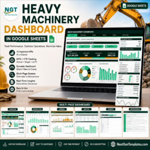
- Heavy Machinery Dashboard in Google Sheets — the analytical companion, slicing machinery data rather than scoring it against target.
- Fleet Maintenance Calendar in Google Sheets — schedule the servicing that keeps Fleet Availability Rate green.
- Scaffolding Services KPI Scorecard in Google Sheets — the same scorecard layout for a neighbouring trade.
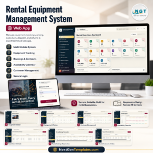
- Rental Equipment Management System Web App — step up to contracts, bookings and an asset register.
- Construction Equipment KPI Dashboard in Excel — the Excel-side equivalent for construction fleets.
Browse the rest of our Google Sheets templates, or go straight to the Google Sheets KPI Dashboards & Scorecards category.
A Crane Rental KPI Scorecard in Google Sheets is being prepared and will appear in the same category shortly.
📖 Click here to read the Detailed Blog Post
🎥 Visit our YouTube channel for step-by-step video tutorials
👉 YouTube.com/@NextGenTemplates
Watch the step-by-step video Demo:
📅 Last updated: September 2026