

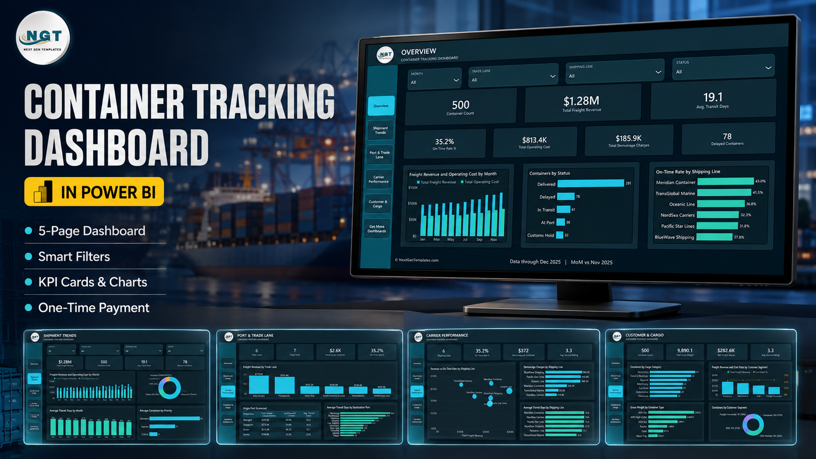

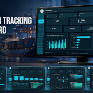
The Container Tracking Dashboard in Power BI is a ready-to-open .pbix report built on 500 sample container movements across 6 trade lanes, 7 origin ports and 6 shipping lines. Five analysis pages carry 17 DAX measures, four synced slicers, a seven-field drillthrough to container-level detail and two hover tooltips. The sample set totals $1.28M freight revenue, $813.4K operating cost and $185.9K demurrage, with 78 delayed containers and a 35.2% on-time rate – numbers you can trace back to the bundled Data.xlsx row by row. One-time payment, no subscription, no account, and the file is yours to edit and rebrand.
Read this before you buy. This is an analysis template, not a track-and-trace system. It does not connect to any carrier API, terminal operating system, AIS or vessel-tracking feed, EDI message set or GPS device. There is no live position, no ETA polling and no automatic status change. It reads the Excel file that ships with it, which you maintain. If you need live vessel positions, buy a track-and-trace service instead.
Key Features of the Container Tracking Dashboard in Power BI
- Five analysis pages – Overview, Shipment Trends, Port & Trade Lane, Carrier Performance and Customer & Cargo, plus a sixth “Get More Dashboards” page.
- Four synced slicers – Month, Trade Lane, Shipping Line and Status. Set a filter on one page and every page follows it.
- 17 DAX measures referenced by the report visuals, including On-Time Rate %, Avg. Transit Days, Demurrage per Container, Revenue per Container, Net Freight Margin and Cost Ratio %.
- A hidden Details drillthrough page reachable from seven fields – Trade Lane, Shipping Line, Status, Container Type, Cargo Category, Origin Port and Priority.
- Two hover tooltip pages – Container Summary and Shipment Trend Detail – so a hover gives context without leaving the page.
- 500 sample container rows in 18 columns, from Container ID and Shipment Date through Planned Transit Days, Transit Days, Freight Revenue, Operating Cost, Demurrage Charges and Service Rating.
- Editable Power BI text and theme – the headings, the footer and the JSON theme are all yours to change; nothing is baked into an image except the page backgrounds.
- No add-ins, no custom visuals, no gateway – it opens in free Power BI Desktop and refreshes from a local Excel file.
What’s Inside the Container Tracking Dashboard in Power BI
The download is a single ZIP holding three files: Container Tracking Dashboard in Power BI.pbix, Data.xlsx (the 500-row source), and Power BI Dashboard – User Manual.pdf.
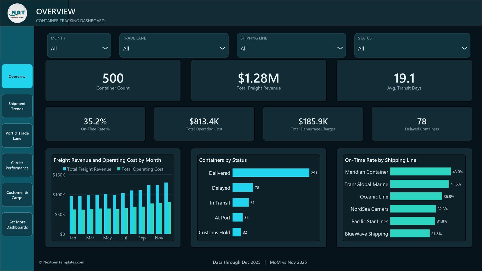
Overview opens on seven KPI cards – Container Count 500, Total Freight Revenue $1.28M, Avg. Transit Days 19.1, On-Time Rate % 35.2%, Total Operating Cost $813.4K, Total Demurrage Charges $185.9K and Delayed Containers 78 – above Freight Revenue and Operating Cost by Month, Containers by Status (Delivered 291, Delayed 78, In Transit 61, At Port 38, Customs Hold 32) and On-Time Rate by Shipping Line.
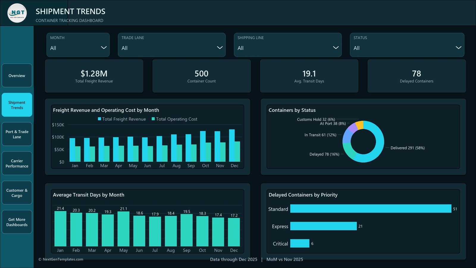
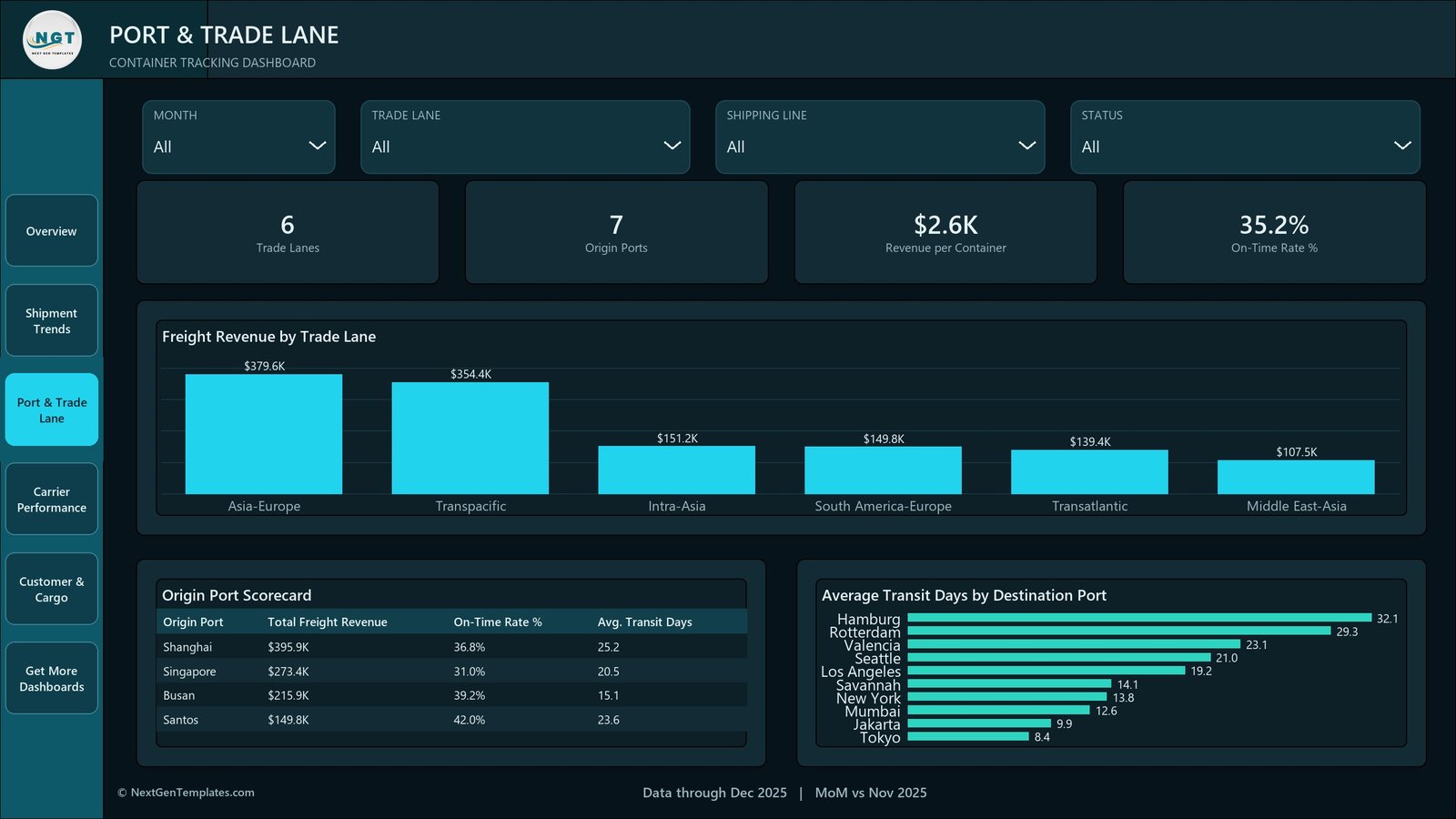
Shipment Trends adds Average Transit Days by Month, which falls from 21.4 in January to 17.2 in December, and Delayed Containers by Priority – Standard 51, Express 21, Critical 6. Port & Trade Lane ranks Freight Revenue by Trade Lane (Asia-Europe $379.6K down to Middle East-Asia $107.5K), carries an Origin Port Scorecard and plots Average Transit Days by Destination Port from Hamburg at 32.1 days to Tokyo at 8.4.
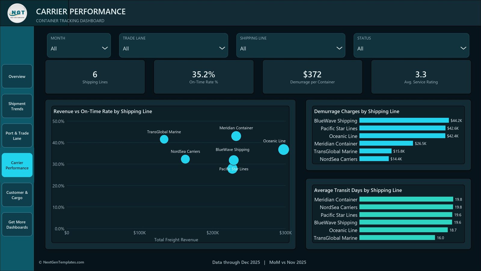
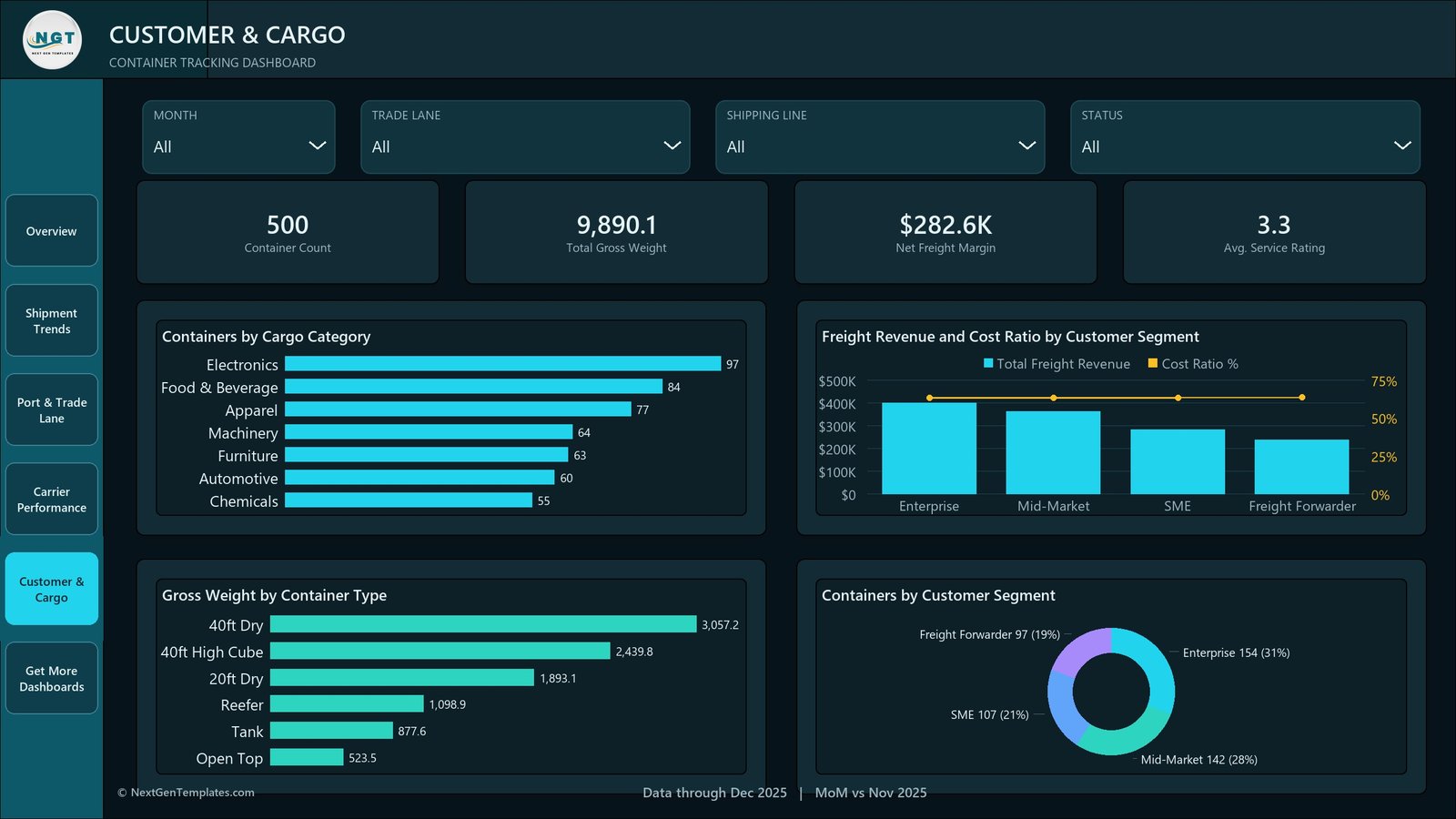
Carrier Performance puts Revenue vs On-Time Rate by Shipping Line on a scatter, then breaks out Demurrage Charges by Shipping Line and Average Transit Days by Shipping Line. Customer & Cargo closes with Containers by Cargo Category, Gross Weight by Container Type, Freight Revenue and Cost Ratio by Customer Segment and a Containers by Customer Segment donut – Enterprise 154, Mid-Market 142, SME 107, Freight Forwarder 97.
Container Tracking Dashboard in Power BI vs. Tableau vs. Paid Visibility SaaS – Where This Fits
| This template (Power BI) | Tableau or Qlik build | Paid visibility SaaS | |
|---|---|---|---|
| Cost | $17.99 once | Licence from ~$70/user/month | Typically $500+/month, often per-container |
| Platform | Power BI Desktop (free) | Tableau Desktop or Qlik Sense | Vendor web app |
| Setup time | Open the .pbix, swap Data.xlsx – about 15 minutes | Days of modelling from scratch | Weeks of carrier onboarding |
| Live carrier / AIS feed | No – manual Excel refresh | No, unless you build the connector | Yes, that is what you pay for |
| Real-time team collaboration | Only if you publish to a Power BI workspace | Server or Cloud licence needed | Yes |
| Mobile access | Power BI mobile app after publishing | Vendor mobile app | Yes |
| Customisable fields | Full – edit the model, the DAX and the theme | Full | Limited to vendor schema |
| Share with link | After publishing to your own tenant | After publishing | Yes |
| Year-1 cost at 5 users | $17.99 | $4,200+ | $6,000+ |
| Demurrage cost analysis | Built in – total, per container and by line | You build it | Usually an add-on module |
| Container-level drillthrough | Built in on seven fields | You build it | Yes |
Who This Template Is For – and Who It’s Not For
It fits a freight forwarder or NVOCC reviewing lane profitability each month; a shipper’s logistics analyst who already exports container status from a TMS or carrier portal into Excel and wants a report rather than another pivot table; a Power BI learner who wants a finished logistics model to take apart; and a consultant who needs a credible demo report for a shipping client.
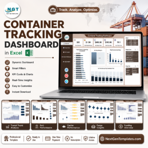
It does not fit anyone who expects live positions – there is no AIS, GPS, carrier API or EDI link of any kind, and the data file has no vessel name, no coordinates and no bill of lading number. It also does not fit teams needing multi-user simultaneous editing of the source (that is a database problem), automated exception alerts, or a customs or compliance filing system. And if you are on Excel rather than Power BI, buy the Container Tracking Dashboard in Excel instead – same subject, Excel build.
How to Use the Container Tracking Dashboard in Power BI
- Unzip the download and open the .pbix in Power BI Desktop, which Microsoft gives away free.
- Open Data.xlsx and look at the 18 columns before you touch anything – your own export has to end up in that shape.
- Replace the 500 sample rows with your container export, keeping the header names exactly as they are.
- In Power BI Desktop, use Transform data > Data source settings to point the query at your copy of the file, then Refresh.
- Check the Overview KPI cards against your own totals. If a card is blank, a column name has drifted.
- Right-click a bar – a shipping line, a status, a trade lane – and choose Drill through > Details to see the containers behind it.
- Edit the page titles and the footer text, drop your own logo over the NGT mark, and swap the theme JSON if you want different colours.
Real-World Use Cases
Priya, lane manager at a mid-size forwarder. Every month she pastes the carrier status export into Data.xlsx and refreshes. Port & Trade Lane tells her Asia-Europe is carrying $379.6K of the $1.28M while Middle East-Asia contributes $107.5K, so the quarterly rate negotiation starts on the lane that actually matters.
Marco, operations lead at a shipper. He filters Status to Delayed and reads Delayed Containers by Priority – 51 Standard, 21 Express, 6 Critical. Six critical delays is a call list, not a report, and the drillthrough gives him the container IDs in one right-click.
Dan, a consultant. He rebrands the theme, loads a client’s twelve-month extract and walks into the meeting with Demurrage Charges by Shipping Line already ranked – BlueWave $44.2K against NordSea $14.4K in the sample – which is the slide that starts the conversation.
Frequently Asked Questions
Does this track containers in real time?
No. It has no carrier API, no terminal or TOS connection, no AIS or vessel-tracking feed, no EDI and no GPS. It reports on the Excel file you maintain, and it changes only when you refresh it.
Can I connect it to my carrier or my TMS?
Not out of the box. The model is built on an Excel source. A Power BI developer can repoint the query at a database or an API, but that work is not included and is not supported.
What exactly do I download?
One ZIP with the .pbix report, Data.xlsx holding the 500 sample rows, and a user manual PDF.
Do I need a Power BI licence?
No. Power BI Desktop is free and opens the file. A Pro or PPU licence is only needed if you want to publish and share it with colleagues in the Power BI service.
Is the data real?
No. Every container, port, carrier name and figure is invented sample data built to exercise the visuals. Meridian Container, TransGlobal Marine and the rest are not real shipping lines.
Can I change the measures and the colours?
Yes. The DAX, the model, the page text and the theme JSON are all editable. Nothing is locked or password-protected.
Why is the sample on-time rate only 35.2%?
Because the sample data was generated with plenty of delay so every visual has something to show. On-time is defined as Transit Days at or under Planned Transit Days; change the two columns and your own rate appears.
About the Author
Built by PK – Microsoft Certified Professional with 15+ years of Excel, Google Sheets, and Power BI experience. Founder of NextGenTemplates, reaching 300K+ subscribers across YouTube channels. Every template is hand-built and tested before release.
Explore Related Templates
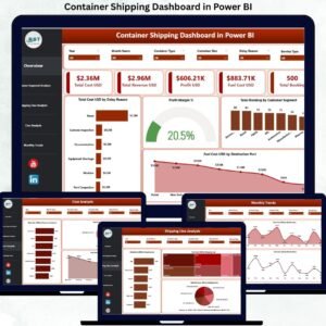
- Container Shipping Dashboard in Power BI – the wider shipping view rather than the container view.
- Port Logistics Dashboard in Power BI – terminal and yard side of the same journey.
- Logistics Automation Dashboard in Power BI – process and automation metrics.
- Shipping & Cargo Dashboard in Power BI – cargo mix and revenue analysis.
- Container Tracking Dashboard in Excel – the Excel edition of this same subject.
Browse the full Power BI template catalogue or narrow it to Power BI Dashboards.
Buy once, own it forever. Download the ZIP, open the .pbix in free Power BI Desktop, swap in your own container export and you have a working container analytics report the same afternoon – for less than the price of one hour of demurrage.
Last updated: 26 August 2026.

















Reviews
There are no reviews yet.