

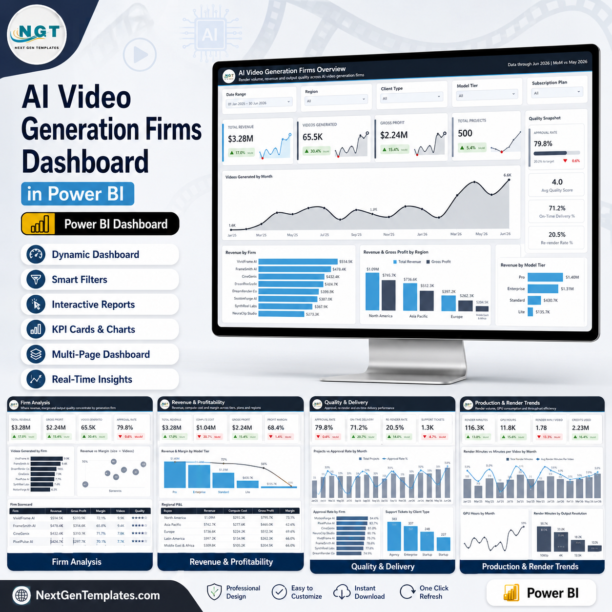
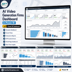
Generative video is a compute business wearing a software business’s clothes. Revenue per project is easy to report, and it tells you almost nothing on its own – the number that decides whether the firm survives is what the render cost, how much of the output the client accepted, and how much GPU time went into work that had to be done twice. The AI Video Generation Firms Dashboard in Power BI is built around exactly those measures: 6 report pages, 25 KPI cards each carrying a month-over-month delta and its own sparkline, five filters on every page, and two money tables – a Firm Scorecard and a Regional P&L. The sample model holds 500 projects and 65,500 generated videos across 18 months, spanning 8 firms, 7 video categories, 4 output resolutions, 4 model tiers, 5 client types and 5 regions. Built by PK, a Microsoft Certified Professional with 15+ years in Excel and Power BI and 300K+ subscribers across two YouTube channels. Download the .pbix, open it in free Power BI Desktop, point the model at your own data, and every page follows.
Key Features of the AI Video Generation Firms Dashboard in Power BI
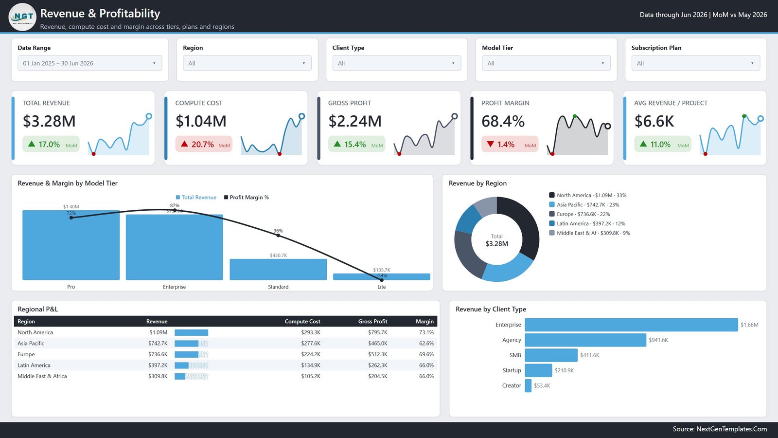
- Compute cost on the same card row as revenue. The Revenue & Profitability page puts Total Revenue, Compute Cost, Gross Profit, Profit Margin and Avg Revenue per Project side by side, each with its own MoM delta. Compute rising faster than revenue is a specific, visible event rather than a slow surprise. AI Video Generation Firms Dashboard in Power BI
- Margin by model tier, including the negative one. Revenue & Margin by Model Tier charts revenue as bars and margin as a line across Pro, Enterprise, Standard and Lite. In the sample data the Lite tier runs at a negative margin – the sort of finding that only appears when margin is plotted per tier rather than reported in aggregate.
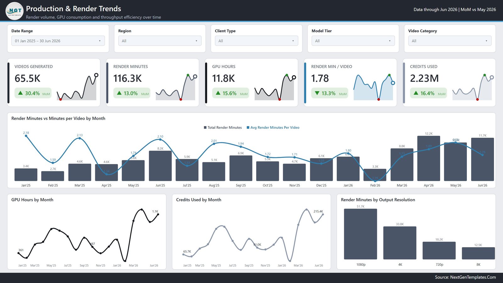
- Render economics as measures, not footnotes. Render Minutes, GPU Hours, Credits Used and Render Minutes per Video each get a KPI card and a monthly trend, so throughput efficiency is tracked the way a factory tracks yield.
- Render minutes by output resolution. 1080p, 4K, 720p and 8K compared on render time, which is where the compute budget quietly disappears and where a resolution surcharge gets its justification.
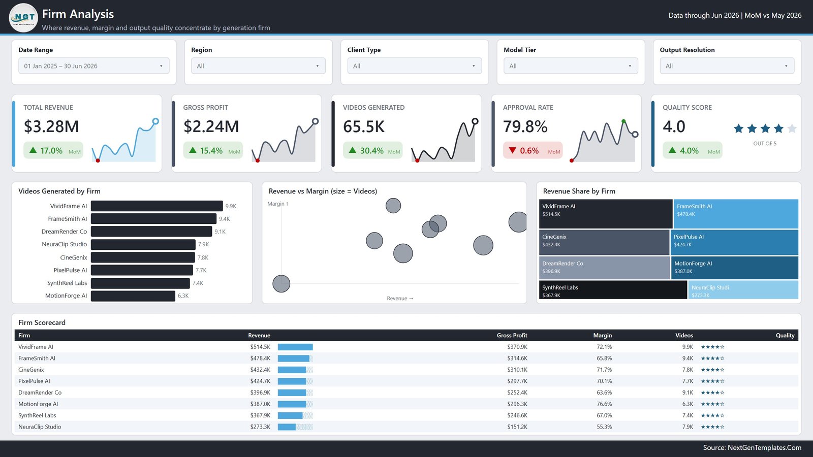
- Firm Scorecard. All eight firms in one table on revenue, gross profit, margin, videos and a star quality rating, with a data bar on revenue. Four rankings that rarely agree, in one place.
- Regional P&L. Five regions with revenue, compute cost, gross profit and margin – a genuine profit-and-loss view rather than a revenue league table.
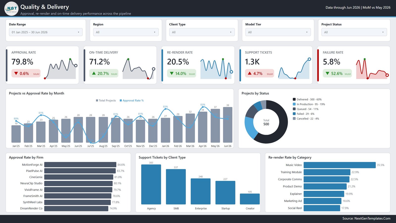
- Approval and re-render rates. Approval Rate by Firm and Re-render Rate by Category, because a video that was rendered twice was paid for twice. Music Video and Training Module lead re-renders in the sample; Social Reel is the cleanest.
- Delivery discipline. On-Time Delivery, Failure Rate and Support Tickets as KPI cards, with Projects by Status across Delivered, In Production, Queued, Failed and Cancelled.
- Revenue vs Margin bubble chart where bubble size is video volume – which separates the firm that earns a lot at a thin margin from the one earning less on far better economics.
- Month-over-month deltas on all 25 KPI cards, each with a trailing sparkline, so a single strong month never reads as a trend.
- Five filters on every page. Date range, region, client type and model tier are constant; the fifth changes per page – subscription plan, video category, output resolution or project status.
What’s Inside the AI Video Generation Firms Dashboard
Six pages, each with the NGT header carrying the data-through date and the MoM comparison month.
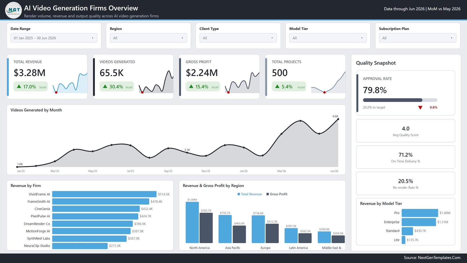
1. Overview – render volume, revenue and output quality. Total Revenue, Videos Generated, Gross Profit and Total Projects as KPI cards, with a Quality Snapshot panel carrying approval rate against target, average quality score, on-time delivery and re-render rate. Below: Videos Generated by Month, Revenue by Firm, Revenue & Gross Profit by Region, and Revenue by Model Tier.
2. Production & Render Trends – render volume, GPU consumption and throughput efficiency. Videos Generated, Render Minutes, GPU Hours, Render Minutes per Video and Credits Used, with Render Minutes vs Minutes per Video by Month, GPU Hours by Month, Credits Used by Month, and Render Minutes by Output Resolution. Minutes per video falling while volume rises is the efficiency story; this page is where it shows. AI Video Generation Firms Dashboard in Power BI
3. Firm Analysis – where revenue, margin and quality concentrate. Total Revenue, Gross Profit, Videos Generated, Approval Rate and Quality Score, with Videos Generated by Firm, the Revenue vs Margin bubble chart, Revenue Share by Firm, and the Firm Scorecard table.
4. Revenue & Profitability – revenue, compute cost and margin across tiers, plans and regions. Total Revenue, Compute Cost, Gross Profit, Profit Margin and Avg Revenue per Project, with Revenue & Margin by Model Tier, Revenue by Region, the Regional P&L table, and Revenue by Client Type.
5. Quality & Delivery – approval, re-render and on-time performance across the pipeline. Approval Rate, On-Time Delivery, Re-render Rate, Support Tickets and Failure Rate, with Projects vs Approval Rate by Month, Projects by Status, Approval Rate by Firm, Support Tickets by Client Type, and Re-render Rate by Category.
6. Get More Dashboards. A library page listing the wider NextGenTemplates Power BI catalogue and what the team builds for clients. AI Video Generation Firms Dashboard in Power BI
AI Video Generation Firms Dashboard in Power BI vs. the Excel Version vs. a BI Deployment – Where This Fits AI Video Generation Firms Dashboard in Power BI
| This Power BI report | The Excel version | A custom BI deployment | |
|---|---|---|---|
| Cost | 17.99 once | 17.99 once | Licence plus an analyst’s time |
| Software needed | Power BI Desktop, free | Microsoft Excel | Platform subscription |
| Setup time | Under an hour with your data | Under 30 minutes | Weeks, including a data model |
| Cross-filtering between visuals | Yes, click any visual | No, slicers only | Yes |
| MoM deltas on KPI cards | Yes, on all 25 | Not built in | If you build them |
| Compute cost against revenue | Built in, four ways | Built in, four ways | Only if cost data is modelled |
| Regional P&L table | Yes | Not included | If you build it |
| Data volume | Millions of rows | Tens of thousands comfortably | Unlimited |
| Scheduled refresh | Yes, via the Power BI Service | No, manual | Yes |
| Time to a first usable answer | The same afternoon | The same afternoon | Weeks |
The honest comparison: if your finance team lives in Excel, the Excel version answers most of the same questions with less setup. This one earns its place when you want cross-filtering, month-over-month deltas built into every card, the Regional P&L view, or a scheduled refresh through the Power BI Service.
Who This Template Is For – and Who It’s Not For
A good fit if you are: a founder or operator of a generative video studio who needs unit economics rather than headline revenue; a CFO or finance partner working out which tiers and regions actually make money; an analyst benchmarking several AI video vendors on identical measures; an investor reviewing margin after compute; a Power BI analyst who would rather start from a working model than a blank canvas.
Not the right tool if you are: expecting real market data – the sample is illustrative and you supply your own; unable to attribute compute cost per project, in which case four of the most valuable visuals will be empty; or looking for live pipeline monitoring, since this refreshes on your schedule rather than per render.
How to Use the AI Video Generation Firms Dashboard
- Unzip the download and open the .pbix in Power BI Desktop – the free version from Microsoft is enough. No Power BI Service licence is needed to use the file.
- Read the sample data first. Six pages of an 18-month picture show what each visual is meant to say before you replace anything.
- Find your compute cost per project before you load anything else. It is the field most studios have never attributed, and it is the one that makes half this report work.
- Point the model at your own data through Transform Data, keeping the same column names so the DAX measures and relationships hold.
- Refresh and check the Overview. Revenue, videos generated and project count will tell you within seconds whether the load landed correctly.
- Go straight to Revenue & Margin by Model Tier. If any tier shows a negative margin, that is the finding – everything else on the report is context for it.
- Then read the Firm Scorecard. Revenue, gross profit, margin, volume and quality in one table; where the rankings disagree is where the story is.
- Use cross-filtering. Click a region slice or a firm bar and every other visual on the page follows – the biggest single gain over a spreadsheet build.
Real-World Use Cases
Killing a loss-making tier. The Lite tier looked like a harmless entry point at 135.7K of revenue until the margin line put it below zero. Because the chart pairs revenue bars with a margin line, the tier that contributed 4% of revenue and negative profit was visible in one glance rather than buried in an aggregate.
Ranking eight firms on economics rather than size. The revenue leader carried a 72.1% margin while the volume leader on videos ran at 55.3%. The Firm Scorecard put revenue, profit, margin, volume and quality in one table, and the four rankings disagreed enough to change where the next investment went.
Justifying a resolution surcharge. Render Minutes by Output Resolution showed 1080p at 51.7K minutes and 4K at 33.8K on far lower volume. Pairing that with Re-render Rate by Category – where Music Video sat above 35% – produced a pricing change rather than an engineering ticket.
Frequently Asked Questions
Do I need a paid Power BI licence?
No. Power BI Desktop is free from Microsoft and is all you need to open, edit and use the file. A Power BI Service licence is only needed if you want to publish it for scheduled refresh and web sharing.
Does it come with real market data?
No. It ships with a realistic 18-month sample of 500 projects so every visual works out of the box, but the firm names and figures are illustrative. Replace them with your own project data or your own research.
What data do I need to supply?
One row per project with date, firm, client type, region, model tier, subscription plan, output resolution, video category, revenue, compute cost, videos generated, approved videos, render minutes, GPU hours, credits used, quality score, delivery status and project status. The sample file shows the exact shape.
What if I cannot attribute compute cost per project?
Then the Revenue & Profitability page and the margin columns will be empty or wrong, and the report loses most of its value. Getting that attribution in place is the real work; the dashboard is what makes it worth doing. AI Video Generation Firms Dashboard in Power BI
Can I edit the DAX and visuals?
Yes. Nothing is locked. Every measure, relationship and visual is editable in Power BI Desktop, which is why it ships as a .pbix rather than a published report. AI Video Generation Firms Dashboard in Power BI
Can I add my own firms, tiers or video categories?
Yes. They are values in your data, not hard-coded lists. Load your rows and the visuals, slicers and tables pick up whatever names you use. AI Video Generation Firms Dashboard in Power BI
Is there an Excel version?
Yes – the AI Video Generation Firms Dashboard in Excel covers the same ground with pivot tables and slicers.
About the Author
Built by PK – Microsoft Certified Professional with 15+ years of Excel, Google Sheets, and Power BI experience. Founder of NextGenTemplates, reaching 300K+ subscribers across YouTube channels. Every template is hand-built and tested before release.
Explore Related Templates
- AI Video Generation Firms Dashboard in Excel – the same analysis for teams without Power BI.
- AI Chatbot Providers Dashboard in Power BI – the same vendor-comparison shape for conversational AI.
- Sentiment Analysis Startups Dashboard in Power BI – another AI-sector market view.
- SaaS Development Dashboard in Power BI – the software side of an AI business.
- Startup Founder Pack – twelve templates for running the business behind the product.
- Browse every Power BI dashboard or the full Power BI template catalogue. AI Video Generation Firms Dashboard in Power BI
Get Your Copy
Load your last eighteen months and open Revenue & Margin by Model Tier. If one tier sits below the zero line, you have found something worth the price of the file several times over. If anything does not work as described, contact us and we will put it right.
AI Video Generation Firms Dashboard in Power BI
Last updated: 12 August 2026.







Reviews
There are no reviews yet.