
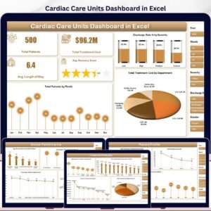
The Cardiac Care Units Dashboard in Excel tracks 4 headline KPIs across 5 interactive analysis pages, with 14 pivot-driven charts and dual slicer panels covering Department, Severity, Diagnosis, Admission Type, Insurance Provider, and Month. Setup takes under 10 minutes — paste your CCU export into the Data Sheet, click Refresh All, and every KPI card, chart, and slicer updates automatically.
🌍 Join 8,400+ teams in 40+ countries using Nextgen Templates to replace paid SaaS tools with one-time-purchase Excel, Google Sheets, Power BI, and HTML templates.
✅ Instant download · One-time payment · No subscription · No per-user fees · Lifetime access
🔑 Key Features of Cardiac Care Units Dashboard in Excel
- 🔹 4 KPI Cards on the Overview page — Total Patients, Total Treatment Cost, Avg. Length of Stay, and Avg. Recovery Score recalculate the moment you click Refresh All.
- 🔹 14 pre-built charts across 5 analysis pages — Every chart points at a pivot table on the Support Sheet, so adding 500 new patient records and clicking Refresh All rebuilds every visual in seconds.
- 🔹 Native Excel slicers on every page — Filter the entire dashboard by Department, Severity, Diagnosis, Admission Type, Insurance Provider, or Month with a single click. No formula edits, no chart repointing.
- 🔹 Pivot-table engine (Support Sheet) — All pivots live in one hidden sheet; keep it hidden for end users so the front-end pages stay clean.
- 🔹 Pre-formatted Data Sheet — Columns for Patient ID, Admission Date, Department, Diagnosis, Severity, Length of Stay, Treatment Cost, Insurance Coverage, Doctor, Discharge Status, Recovery Score, Readmission flag, and Admission Type.
- 🔹 Works offline on Windows and Mac — No VBA macros, no security prompts. Microsoft Excel 2016+, Microsoft 365, and Excel for Mac all supported identically.
- 🔹 One-time $17.99 — Replaces $140–500/user/month vendor BI suites for cardiac care unit reporting.
📦 What’s Inside the Cardiac Care Units Dashboard in Excel
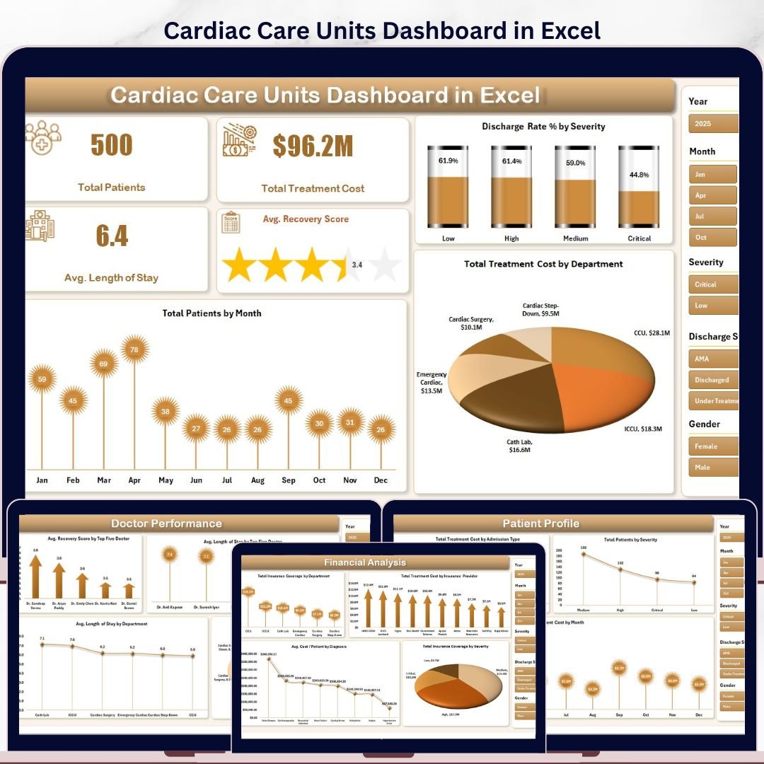
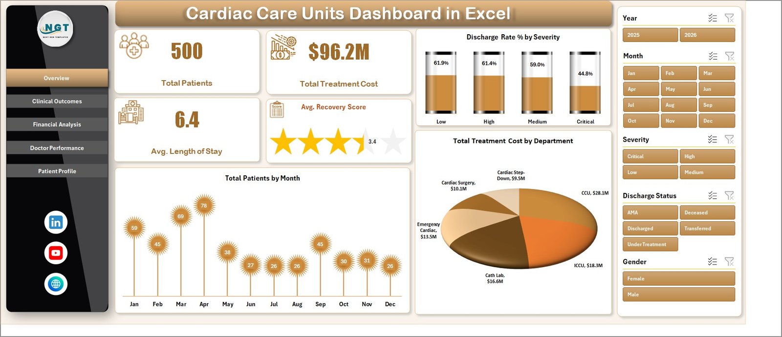
Page 1: Overview
The Overview page is the executive command center. Across the top, 4 KPI cards display the headline numbers: Total Patients, Total Treatment Cost, Avg. Length of Stay, and Avg. Recovery Score. Below, 3 charts break each KPI down by a meaningful dimension — Discharge Rate % by Severity, Total Patients by Month, and Total Treatment Cost by Department. Multiple slicers on the page filter every card and chart simultaneously, so clicking “Cardiology” or “Critical” recalculates the entire view instantly.
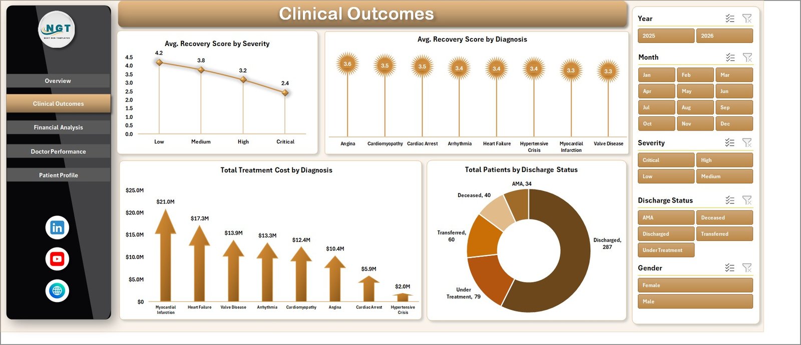
Page 2: Clinical Outcomes
The Clinical Outcomes page focuses on patient recovery quality and clinical performance. It includes 4 charts: Avg. Recovery Score by Severity, Avg. Recovery Score by Diagnosis, Total Treatment Cost by Diagnosis, and Total Patients by Discharge Status. Use this view to spot which severity tiers and diagnoses drive recovery outcomes down — and which discharge statuses (Discharged, Transferred, Expired, AMA) dominate your case mix.
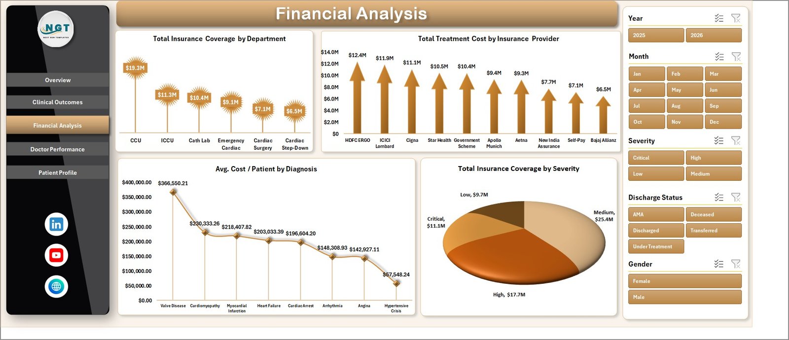
Page 3: Financial Analysis
The Financial Analysis page exposes where treatment cost concentrates and how insurance coverage stacks up. It includes 4 charts: Total Insurance Coverage by Department, Total Treatment Cost by Insurance Provider, Avg. Cost / Patient by Diagnosis, and Total Insurance Coverage by Severity. This is where finance leads diagnose underinsured diagnosis groups and renegotiate with the providers that drive the highest claim volume.
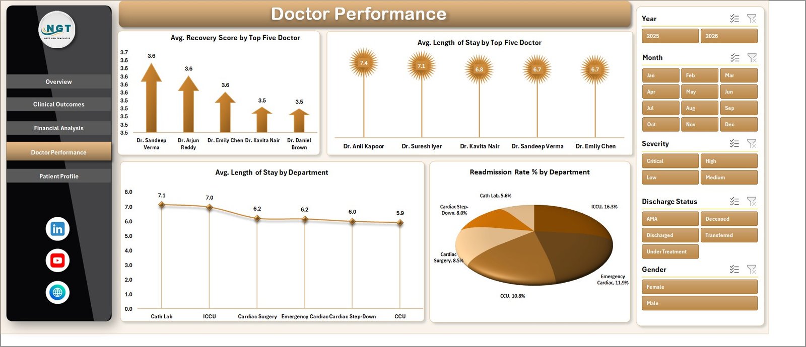
Page 4: Doctor Performance
The Doctor Performance page ranks clinicians on outcome and efficiency metrics. It includes 4 charts: Avg. Recovery Score by Top Five Doctor, Avg. Length of Stay by Top Five Doctor, Avg. Length of Stay by Department, and Readmission Rate % by Department. Use this view in monthly clinical review meetings to identify training gaps, balance caseloads, and surface high-readmission departments before they hit a quality audit.
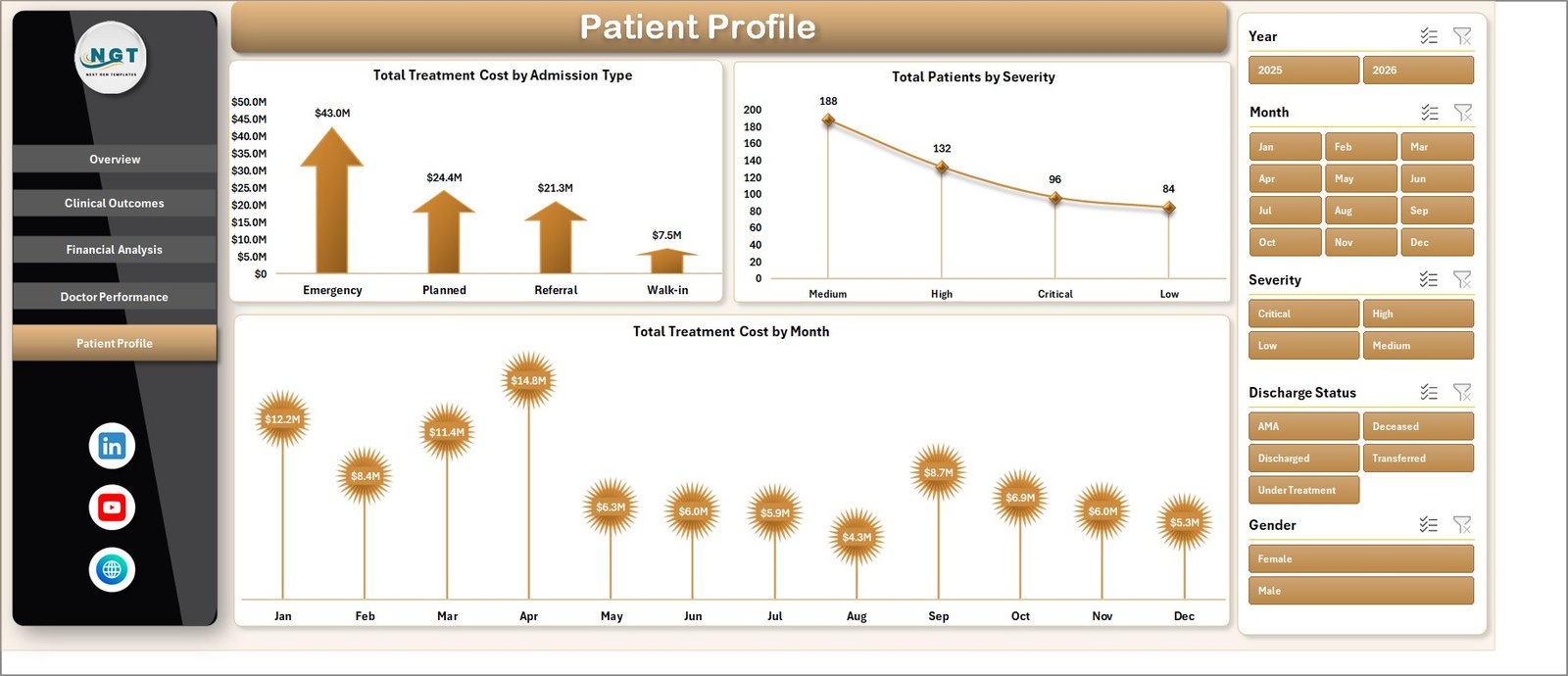
Page 5: Patient Profile
The Patient Profile page segments the patient population by admission characteristics and time. It includes 3 charts: Total Treatment Cost by Admission Type (Emergency, Scheduled, Transfer, Walk-in), Total Patients by Severity, and Total Treatment Cost by Month. Use this page to size emergency surge capacity, project monthly cost trends, and align staffing to admission-type mix.
Data Sheet
The Data Sheet is the single source of truth. Every chart, KPI card, and slicer reads from this one flat table. Columns are pre-defined to match what most hospital EMR exports produce — Patient ID, Admission Date, Department, Diagnosis, Severity (Critical / High / Medium / Low), Length of Stay, Treatment Cost, Insurance Coverage, Insurance Provider, Doctor, Discharge Status, Recovery Score, Readmission flag, and Admission Type. Paste your CCU export over the sample rows, keep the headers intact, click Refresh All. Microsoft has a detailed walkthrough on importing CSV files into Excel if your EMR export needs cleanup before paste.
Support Sheet
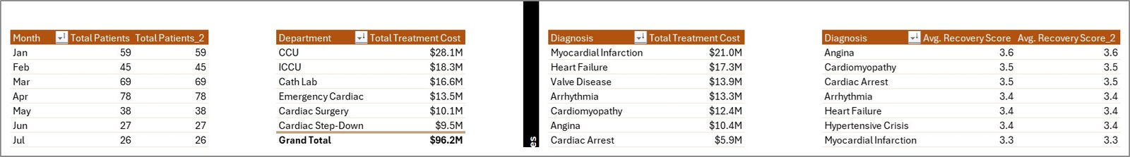
The Support Sheet holds every pivot table that drives the 14 charts and 4 KPI cards across the 5 analysis pages. The maintenance pattern is simple: update the Data Sheet → Data Ribbon → Refresh All. Every pivot recalculates, every chart redraws, every slicer button updates its available options. Keep this sheet hidden in production so end users only see the polished front-end pages.
📊 Cardiac Care Units Dashboard in Excel vs. Google Sheets Equivalent vs. Athenahealth / Epic CCU Module — Where This Fits
| Feature | Cardiac Care Units Dashboard in Excel | Google Sheets Equivalent | Athenahealth / Epic CCU module |
|---|---|---|---|
| Cost | $17.99 one-time | $19.99 one-time | $140–500 / user / month |
| Platform | Excel desktop (Windows + Mac) | Browser-only | Web SaaS, vendor-hosted |
| Setup time | Under 10 minutes | Under 10 minutes | 6–12 weeks implementation |
| Slicer filtering | ✅ 6 slicer dimensions | ✅ Slicers | ✅ Native filters |
| Works offline | ✅ Yes | ❌ No | ❌ No |
| Per-user fees | ❌ None | ❌ None | ✅ Yes |
| EMR / HL7 integration | Manual paste | Manual paste | Native HL7/FHIR |
| Doctor performance scorecards | ✅ Top-5 ranked | ✅ Top-5 ranked | ✅ Yes |
| Year-1 cost at 5 users | $17.99 total | $19.99 total | $8,400–30,000 |
For cardiac care units that want clean patient, financial, and clinician KPIs without paying for a full vendor BI suite, the Cardiac Care Units Dashboard in Excel sits in the sweet spot.
👥 Who This Template Is For — and Who It’s Not For
✅ This template is built for:
- Cardiac care unit administrators tracking 100–5,000 CCU admissions per month
- Hospital quality and finance leads consolidating Treatment Cost, Length of Stay, and Recovery Score into one monthly view
- Medical directors running monthly clinician performance reviews on Recovery Score and Readmission Rate
- Healthcare analysts at small-to-mid hospitals who need an Excel-native CCU report for non-technical leadership
- Cardiology department heads in independent hospitals that don’t have Epic or Cerner BI add-ons
❌ This template is NOT for:
- HIPAA-regulated environments that require certified cloud storage with audit logs — buy a vendor BI tool
- Teams that need real-time EMR/EHR integration — this is manual-paste, not HL7/FHIR
- Practices that cannot de-identify PHI before loading — never paste identifiable PHI into a non-certified file
⚙️ How to Use the Cardiac Care Units Dashboard in Excel
- Open the downloaded .xlsx file in Microsoft Excel 2016 or later (Windows or Mac).
- Go to the Data Sheet and replace the sample rows with your de-identified CCU export, keeping the column headers intact.
- Click the Data ribbon → Refresh All. Every pivot table on the Support Sheet recalculates.
- Navigate to the Overview page; the 4 KPI cards and 3 charts now reflect your data.
- Use the slicer panel to filter by Department, Severity, Diagnosis, or Month — the entire page recalculates instantly.
- Step through the Clinical Outcomes, Financial Analysis, Doctor Performance, and Patient Profile pages for deep-dives.
💼 Real-World Use Cases
Dr. Aisha runs a 24-bed cardiac care unit at an independent hospital. Her monthly clinical review used to take a clinical analyst three days in Tableau. She now pastes the CCU export into the Data Sheet, clicks Refresh All, and her Recovery Score by Severity, Length of Stay by Doctor, and Readmission Rate by Department charts are board-ready in 8 minutes — without renewing the $18,000/year Tableau license.
Marcus is the CFO at a 4-hospital regional system. The Financial Analysis page surfaced that one insurance provider’s average coverage on critical-severity patients dropped 14% quarter-over-quarter. He renegotiated the contract in 30 days using the dashboard charts as evidence, recovering an estimated $240,000 in annual coverage.
Priya is the quality director at a teaching hospital. She uses the Doctor Performance page to identify the two cardiologists with consistently high readmission rates and routes them to a focused CME refresher — without burning credibility by naming names; the data does the talking.
❓ Frequently Asked Questions
What KPIs does the Cardiac Care Units Dashboard in Excel track?
The Cardiac Care Units Dashboard in Excel tracks 4 headline KPIs on the Overview page — Total Patients, Total Treatment Cost, Avg. Length of Stay, and Avg. Recovery Score. The 14 charts across 5 pages also surface Discharge Rate %, Readmission Rate %, Avg. Cost / Patient, and Total Insurance Coverage by multiple dimensions.
How long does setup take?
Setup takes under 10 minutes. Open the Cardiac Care Units Dashboard in Excel, replace the sample rows on the Data Sheet with your CCU export, click Refresh All on the Data ribbon, and every KPI card, chart, and slicer updates. No formulas to edit, no macros to enable.
How does this compare to Athenahealth or Epic CCU analytics?
Athenahealth and Epic bundle CCU analytics inside a $140–500 per user per month suite with native HL7/FHIR integration. The Cardiac Care Units Dashboard in Excel is a $17.99 one-time-purchase template — no integration, no per-user fees, you paste the data yourself. Different tools for different growth stages.
Does this work in Excel for Mac and Excel Online?
The Cardiac Care Units Dashboard in Excel works fully in Excel for Windows and Excel for Mac (2019+) desktop versions. Excel Online supports the dashboard for viewing and basic filtering, but slicer interaction and pivot refresh are most reliable in the desktop app.
Is it safe to load real patient data into this dashboard?
This is a local Excel file with no cloud sync, so you control the file. However, never paste identifiable PHI into any template you didn’t build yourself — de-identify the export before loading. For HIPAA-regulated environments, use a vendor-certified BI tool.
Can I add my own KPIs or charts?
Yes. The Support Sheet contains the pivot tables that drive every chart. Add a new pivot, build a chart from it, and drop it onto any page. The slicer panel will pick up the new chart automatically if it shares the same source data.
👤 About the Author
Built by PK — Microsoft Certified Professional with 15+ years of Excel, Google Sheets, and Power BI experience. Founder of NextGenTemplates, reaching 300K+ subscribers across YouTube channels (@PK-AnExcelExpert, @NextGenTemplates, @NeoTechNavigators). Every template is hand-built and tested before release.
🔗 Explore Related Templates
- Health Tech Dashboard Report in Excel — Companion appointment-KPI report for telemedicine and clinic ops
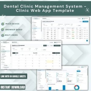
- Dental Clinic Management System — Full clinic web-app template with login and management modules
- Telehealth KPI Scorecard in Google Sheets — Browser-based telehealth KPI tracker
- Browse all Excel Dashboard Templates — 680+ options across every industry
📖 Click here to read the Detailed Blog Post
🎥 Visit our YouTube channel for step-by-step video tutorials
👉 YouTube.com/@NextGenTemplates
📅 Last updated: May 2026
Watch the step-by-step video tutorial:
YouTube


Reviews
There are no reviews yet.