🔑 Key Features of Hospital Patient Flow Dashboard in Excel
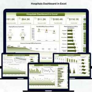
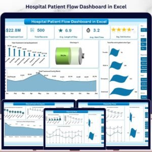
Hospital Patient Flow Dashboard in Excel is a comprehensive analytics template designed for healthcare administrators, hospital managers, and clinical operations teams who need to monitor and optimize patient movement across departments. This professionally built Excel dashboard includes 5 interactive analysis pages covering patient demographics, department performance, capacity flow, and quality metrics. It tracks key indicators such as Total Treatment Cost, Average Length of Stay, Average Wait Time, and Patient Satisfaction scores — all updated dynamically through pivot tables and slicers.Hospital Patient Flow Dashboard in Excel
Whether you manage a single hospital unit or oversee multi-department operations, this template gives you instant visibility into admission types, discharge patterns, ward utilization, and readmission trends. Explore more Excel Dashboard Templates from our collection.Hospital Patient Flow Dashboard in Excel
📦 What’s Inside the Hospital Patient Flow Dashboard
This dashboard contains 7 sheets — 5 analytical pages, 1 data sheet, and 1 support sheet with pivot tables. Here is what each page delivers:
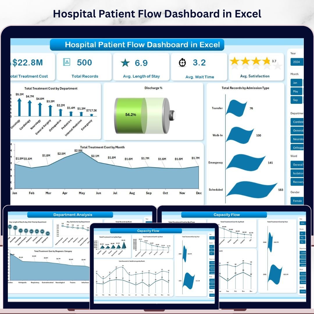
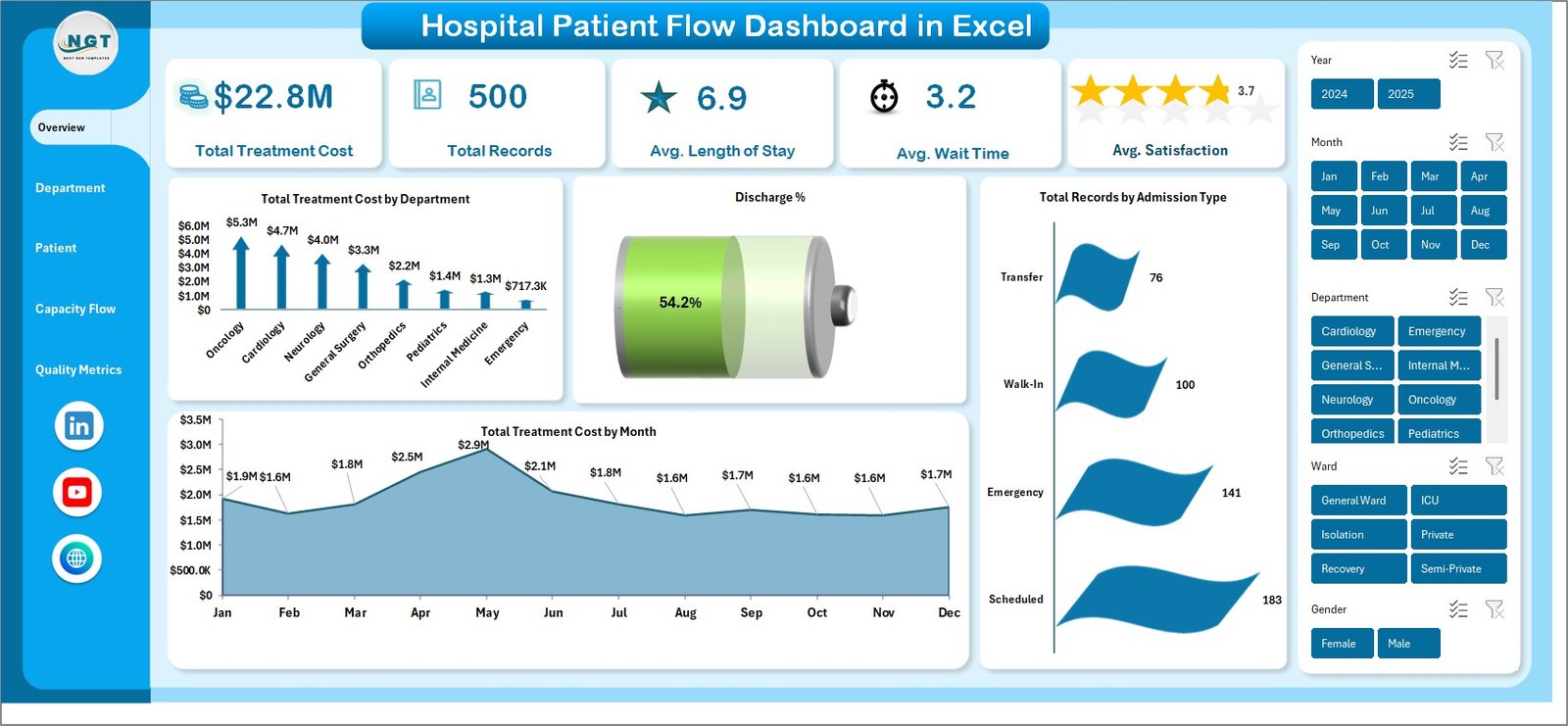
📊 Overview Page — High-level KPI cards showing Total Treatment Cost, Total Records, Avg. Length of Stay, Avg. Wait Time, and Avg. Satisfaction. Charts include Total Treatment Cost by Department, Discharge Percentage, Total Treatment Cost by Month, and Total Records by Admission Type. Multiple slicers let you filter the entire dashboard instantly.
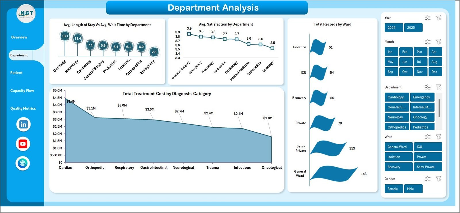
📊 Department Analysis — Deep dive into departmental performance with Avg. Length of Stay vs Avg. Wait Time by Department, Avg. Satisfaction by Department, Total Records by Ward, and Total Treatment Cost by Diagnosis Category.
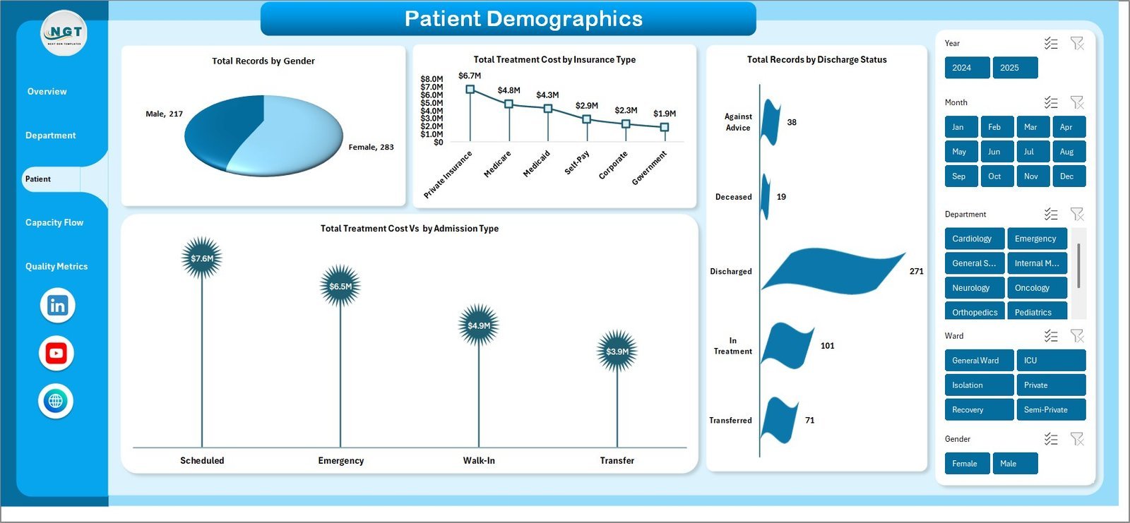
📊 Patient Demographics — Understand your patient base through Total Records by Gender, Total Treatment Cost by Insurance Type, Total Records by Discharge Status, and Total Treatment Cost by Admission Type.
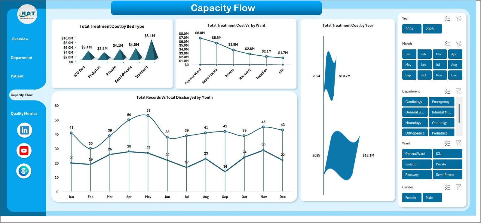
📊 Capacity Flow — Monitor hospital capacity with Total Treatment Cost by Bed Type, Total Treatment Cost Percentage by Ward, Total Treatment Cost by Year, and Total Records vs Total Discharge by Month.
📊 Quality Metrics — Track clinical quality through Total Readmissions by Department, Avg. Satisfaction by Attending Physician, Avg. Length of Stay by Diagnosis Category, and Total Treatment Cost by Readmission status.
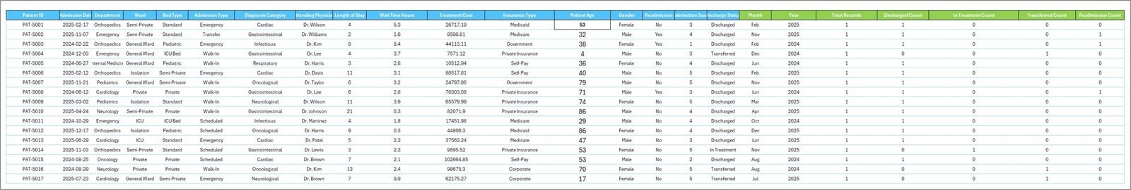
📊 Data Sheet — Add your hospital records here in the same format. The template auto-updates all charts and KPIs when you refresh.
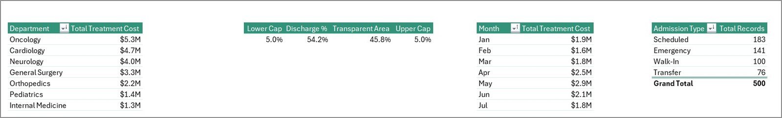
📊 Support Sheet — Contains all pivot tables powering the dashboard. Simply go to Data tab in the Excel Ribbon and click Refresh All after updating the data. Keep this sheet hidden during presentations.
If you work in healthcare operations, also check out our Dental Practice Dashboard in Excel and Blood Banks Dashboard in Excel. Browse all our Healthcare Templates for more options.
⚙️ How to Use the Hospital Patient Flow Dashboard
1️⃣ Download and open the Excel file on your computer.
2️⃣ Navigate to the Data Sheet tab and replace the sample records with your actual hospital patient data, keeping the same column format.
3️⃣ Go to the Data tab in the Excel ribbon and click Refresh All — every pivot table, chart, and KPI card updates automatically.
4️⃣ Use the slicers on the Overview page to filter by department, admission type, date range, or any other dimension.
5️⃣ Explore each analysis page for deeper insights into department performance, demographics, capacity, and quality.
👥 Who Can Benefit from This Hospital Patient Flow Dashboard
🏥 Hospital Administrators tracking patient volumes and treatment costs across departments
🏥 Clinical Operations Managers monitoring length of stay, wait times, and discharge patterns
🏥 Quality Improvement Teams analyzing readmission rates and patient satisfaction scores
🏥 Healthcare Consultants preparing data-driven reports for hospital clients
🏥 Nursing Directors overseeing ward utilization and bed type allocation
🏥 Medical Students and Researchers studying patient flow analytics
❓ Frequently Asked Questions
What KPIs does the Hospital Patient Flow Dashboard track?
The Hospital Patient Flow Dashboard in Excel tracks 5 primary KPIs: Total Treatment Cost, Total Records, Average Length of Stay, Average Wait Time, and Average Satisfaction. It also breaks down data by department, admission type, ward, insurance type, bed type, gender, diagnosis category, and discharge status across 5 interactive pages.
Do I need advanced Excel skills to use this dashboard?
No. Simply replace the sample data in the Data Sheet tab with your own hospital records and click Refresh All in the Data ribbon. All pivot tables, charts, and KPI cards update automatically. No formulas or VBA knowledge required.
Can I customize this dashboard for my hospital?
Yes. You can add new columns to the data sheet, modify chart styles, adjust slicer filters, and rename departments or wards. The pivot-based architecture makes it flexible for any hospital configuration.
How many dashboard pages are included in this template?
This template includes 5 analytical dashboard pages (Overview, Department Analysis, Patient Demographics, Capacity Flow, Quality Metrics), plus a Data Sheet for your records and a Support Sheet containing all pivot tables.
What is the best Excel template for hospital patient flow analysis?
The Hospital Patient Flow Dashboard in Excel from NextGenTemplates is purpose-built for tracking patient movement, treatment costs, wait times, readmissions, and satisfaction scores. It includes 5 interactive pages with slicers and pivot-driven charts that update automatically with your data.
Is this template compatible with Google Sheets?
This template is designed specifically for Microsoft Excel. If you need a Google Sheets version, explore our Hospital Operations KPI Scorecard in Google Sheets.
🔗 Explore Related Templates
📌 Dental Practice Dashboard in Excel — Track dental clinic performance metrics including patient visits, revenue, and treatment outcomes.
📌 Blood Banks Dashboard in Excel — Monitor blood inventory, donor activity, and collection center analytics.
📌 Cardiology Institutes Dashboard in Excel — Analyze cardiology department KPIs with an interactive Excel dashboard.
📖 Click here to read the Detailed Blog Post
Watch the step-by-step video tutorial:


Reviews
There are no reviews yet.