
Fuel prices rise. Vehicles break down. Labor costs fluctuate. Service complaints increase. If you are still managing operations with scattered Excel sheets, you are losing visibility and control.
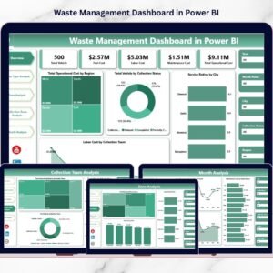
Introducing the Waste Management Dashboard in Power BI — a ready-to-use, fully interactive analytics solution designed for municipalities, waste collection companies, and environmental service providers.
This powerful dashboard transforms raw operational data into dynamic visuals, KPI indicators, cost comparisons, and monthly trend insights — all in one centralized system.
No more manual consolidation. No more delayed reports. Just real-time clarity and smarter decisions.
🚀 Key Feature of Waste Management Dashboard in Power BI
📊 5 Fully Interactive Pages – Overview, Waste Type, Zone, Collection Team, and Month Analysis.
🚛 Vehicle & Status Monitoring – Track Active, Under Maintenance, and Inactive Vehicles.
⛽ Fuel & Operating Cost Tracking – Identify high-cost regions instantly.
👥 Team-Level Performance Analysis – Measure service rating and cost by collection team.
🌍 Zone & City Comparisons – Optimize routes and regional operations.
📈 Monthly Trend Analysis – Detect seasonal cost spikes and performance changes.
⚡ Dynamic Slicers & Filters – Drill down by Region, Waste Type, Zone, Team, or Month.
📦 What’s Inside the Waste Management Dashboard in Power BI
This ready-to-use Power BI file includes 5 structured analytical pages that give you 360° operational visibility.
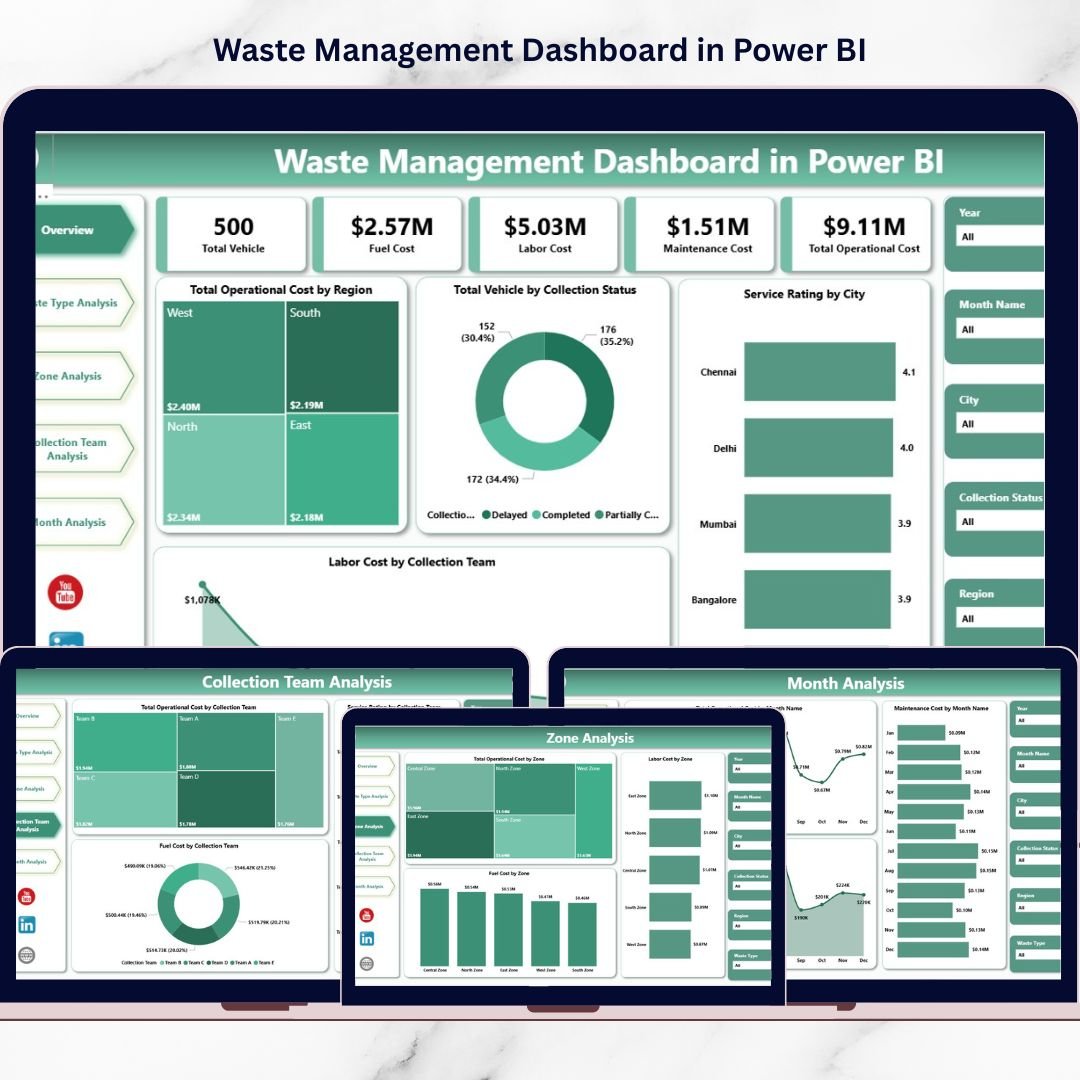
1️⃣ Overview Page – Complete Operational Snapshot
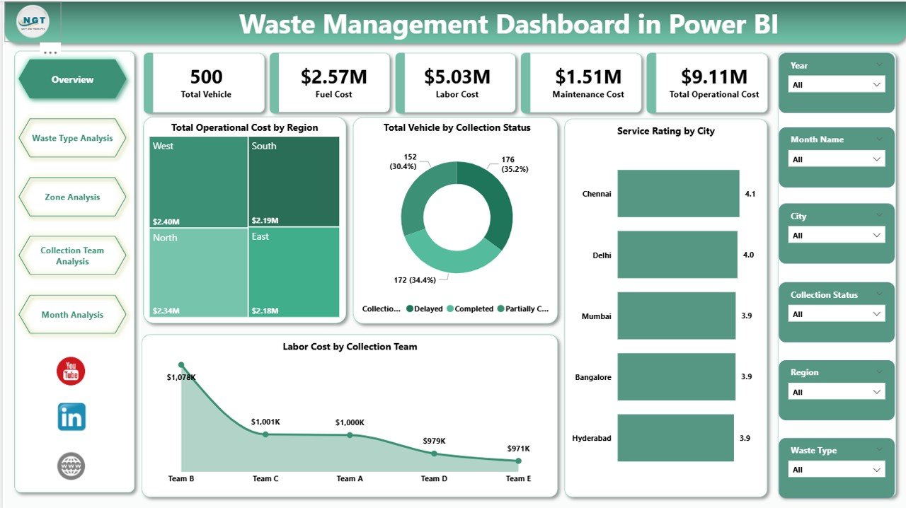
The command center of your waste operations.
KPI Insights Include:
-
Total Operating Cost by Region
-
Total Vehicles by Collection Status
-
Service Rating by City
-
Labor Cost by Collection Team
This page instantly highlights cost-heavy regions, underperforming cities, and vehicle utilization issues.
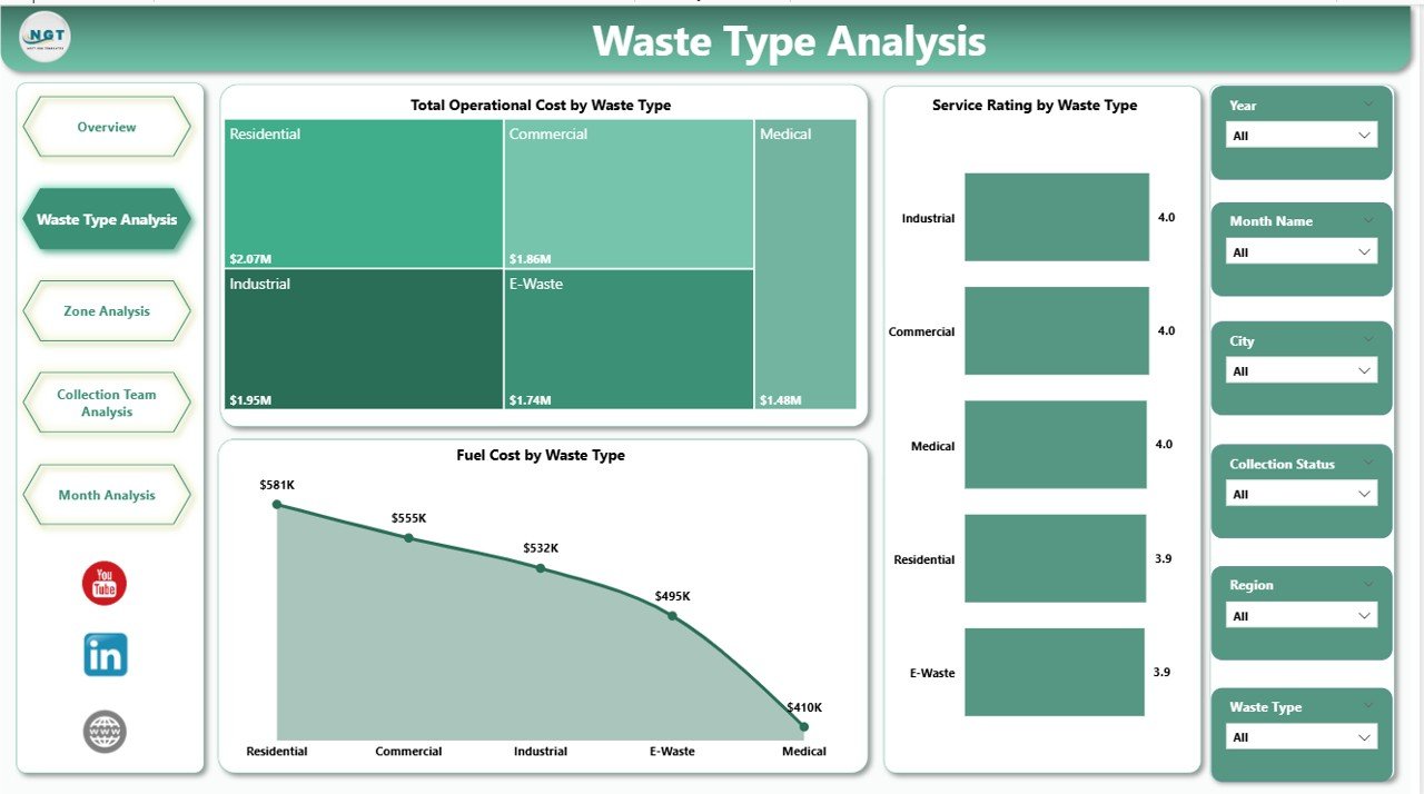
2️⃣ Waste Type Analysis – Cost & Efficiency by Category
Track performance across:
-
Organic Waste
-
Plastic Waste
-
Metal Waste
-
E-Waste
-
Hazardous Waste
Includes:
-
Total Operating Cost by Waste Type
-
Service Rating by Waste Type
-
Fuel Cost by Waste Type
Optimize vehicle allocation and control category-level expenses with precision.
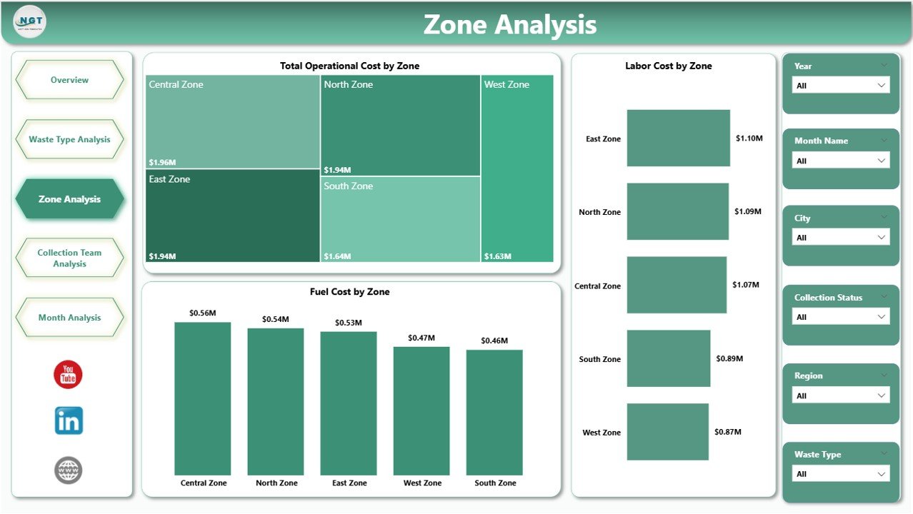
3️⃣ Zone Analysis – Geographic Performance Tracking
Analyze operational differences across zones such as North, South, East, and West.
Visual Insights Include:
-
Total Operating Cost by Zone
-
Fuel Cost by Zone
-
Labor Cost by Zone
Improve route planning and regional budgeting with zone-level clarity.
4️⃣ Collection Team Analysis – Accountability & Efficiency
Measure performance by team:
-
Total Operating Cost by Team
-
Fuel Cost by Team
-
Service Rating by Team
Identify high-performing teams and optimize workforce distribution.
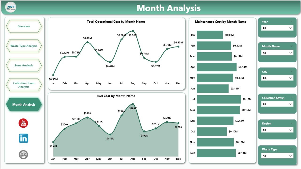
5️⃣ Month Analysis – Trend & Seasonal Tracking
Monitor time-based performance using:
-
Total Operating Cost by Month
-
Fuel Cost by Month
-
Maintenance Cost by Month
Detect seasonal fluctuations and prepare smarter budgets.
🛠 How to Use the Waste Management Dashboard in Power BI
1️⃣ Import structured Excel data (City, Zone, Waste Type, Vehicle Status, Cost, Fuel, Labor, Service Rating, Month).
2️⃣ Refresh the Power BI file.
3️⃣ Use slicers to filter insights instantly.
4️⃣ Analyze KPI cards and trend visuals.
5️⃣ Present executive-ready reports within minutes.
Because Power BI supports scalable datasets, the dashboard grows with your operations.
👥 Who Can Benefit from This Waste Management Dashboard in Power BI
✔ Municipal Corporations
✔ Private Waste Collection Companies
✔ Environmental Service Providers
✔ Recycling Businesses
✔ Facility Management Firms
✔ Operations Managers & Analysts
Whether you manage a small municipality or a multi-city waste operation, this dashboard simplifies performance tracking.
💡 Why This Dashboard Changes Everything
Instead of reacting to rising fuel costs, you detect them early.
Instead of guessing which zone underperforms, you see exact numbers.
Instead of waiting for month-end reports, you access live operational insights.
This dashboard does not just visualize data — it transforms how you manage waste operations.
If you want stronger cost control, higher service quality, and smarter resource allocation, this dashboard is your competitive advantage.
Click here to read the Detailed blog post
Visit our YouTube channel to learn step-by-step video tutorials
👉 YouTube Channel – PKAnExcelExpert