Public transportation systems are the backbone of any modern city. With thousands of daily trips, countless passengers, multiple routes, and several transport modes, tracking transit performance becomes a major challenge. When data stays scattered across spreadsheets or manual reports, teams struggle to understand delays, revenue patterns, vehicle usage, and operational issues. This is exactly where the Public Transit Dashboard in Power BI becomes a game-changing solution.
This interactive dashboard brings all transit KPIs into one clear and visually rich platform. Whether you manage buses, metros, trains, ferries, trams, or city shuttles, this dashboard helps you monitor operational efficiency, ridership, cost behavior, revenue performance, transport mode comparison, and monthly trends—all in just a few clicks. With clean visuals, slicers, dynamic filters, and drill-down insights, transit teams can make faster and smarter decisions.
Built entirely in Power BI and powered by an Excel data source, this dashboard updates instantly when new data is added. You gain complete clarity over the entire public transit system without spending hours analyzing spreadsheets. This tool is perfect for transport authorities, city planners, operations managers, and public service executives who want real-time, data-driven transit management.
🚦 Key Features of the Public Transit Dashboard in Power BI
This dashboard includes five high-impact analysis pages, each designed to give transit teams complete visibility of their operations.
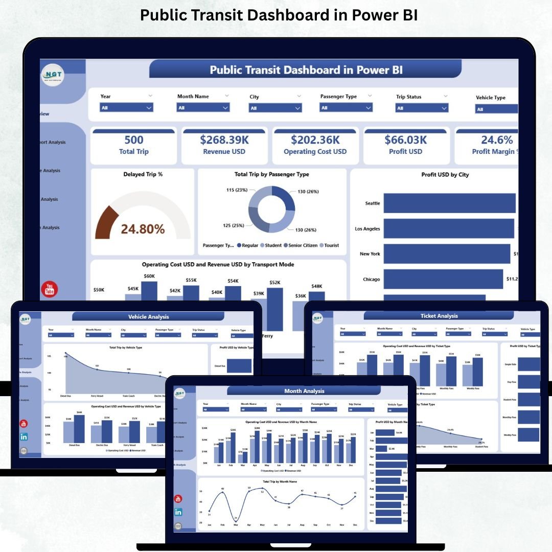
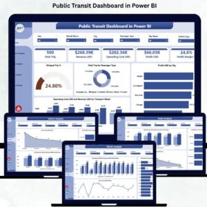
⭐ 1. Overview Page – Your Complete Transit Summary
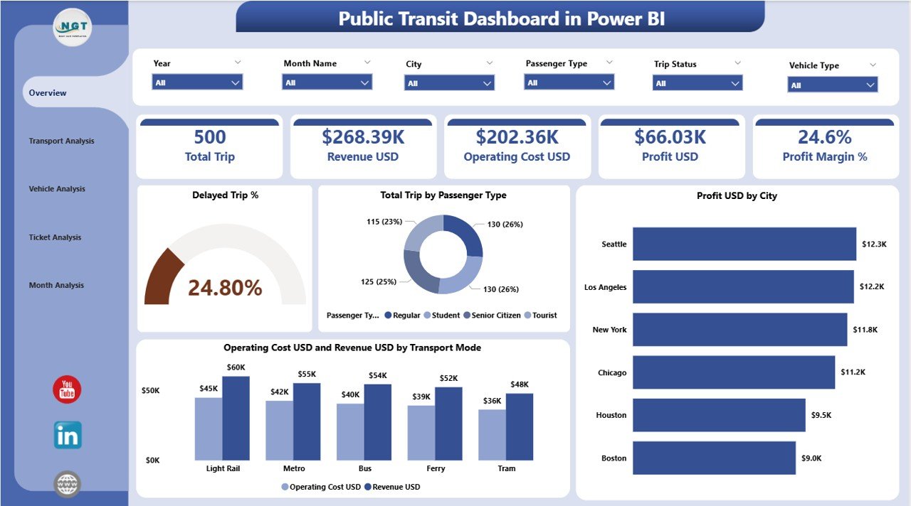
The Overview Page acts as the main control center. It summarizes all critical KPIs through simple and powerful visuals.
🔹 What You’ll See:
-
✔ Month, City, Transport Mode & Passenger Type slicers
-
✔ Four KPI cards:
-
Delayed Trip %
-
Total Trips by Passenger Type
-
Profit (USD) by City
-
Operating Cost (USD) & Revenue (USD) by Transport Mode
-
🔹 Key Charts:
-
Delayed Trip %
-
Total Trips by Passenger Type
-
Profit USD by City
-
Operating Cost USD vs Revenue USD by Transport Mode
This page gives a complete, at-a-glance understanding of system performance.
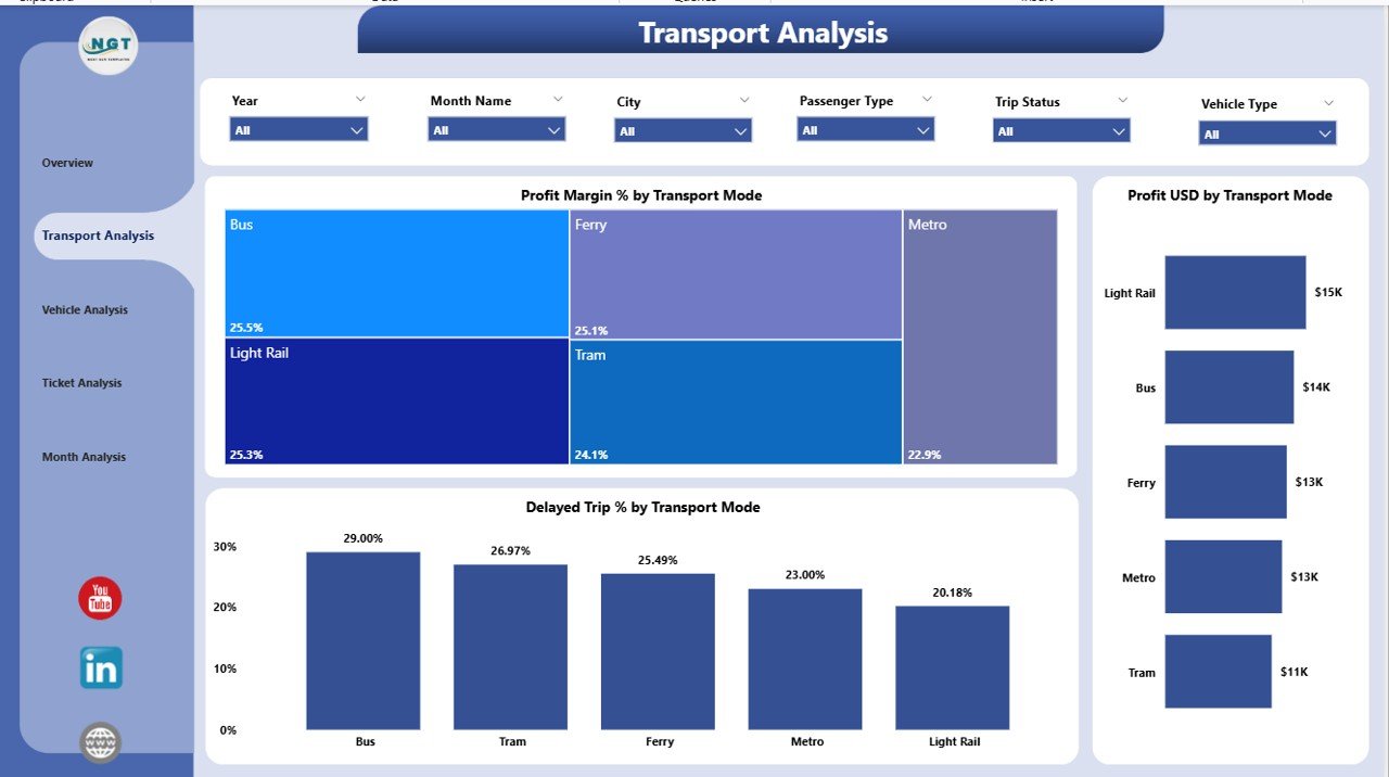
⭐ 2. Transport Analysis Page – Compare Transport Modes Easily
Every transport mode performs differently. The Transport Analysis Page helps you compare cost, delays, revenue, and profitability for:
Bus • Train • Metro • Ferry • Tram • Shuttle • Cable Car
🔹 Charts Included:
-
Profit Margin % by Transport Mode
-
Profit USD by Transport Mode
-
Delayed Trip % by Transport Mode
This page helps you identify the modes that are profitable, efficient, or causing delays.
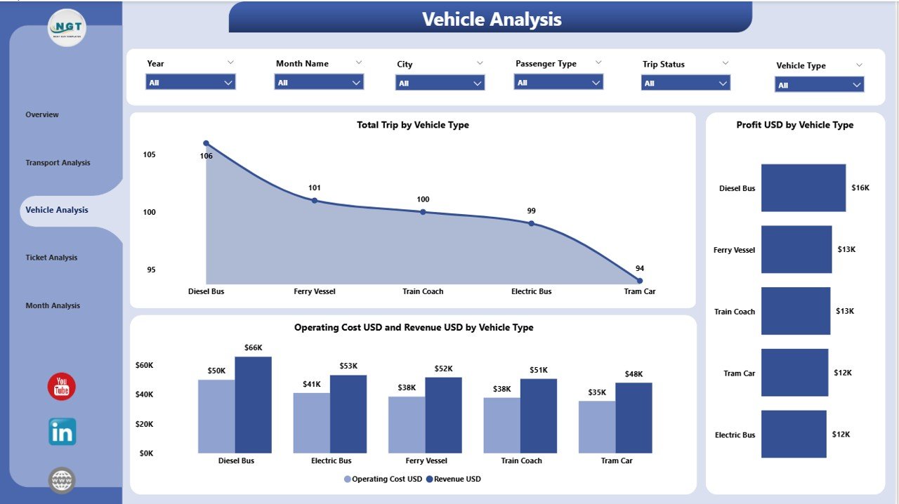
⭐ 3. Vehicle Analysis Page – Track Vehicle-Level Performance
Public transit uses a variety of vehicles, and each vehicle type plays a different role. The Vehicle Analysis Page highlights detailed insights for:
Bus • Mini Bus • Electric Bus • Tram • Metro Coach • Ferry Boat • Shuttle Van
🔹 Charts Included:
-
Total Trips by Vehicle Type
-
Profit USD by Vehicle Type
-
Operating Cost & Revenue by Vehicle Type
This helps you optimize vehicle allocation, maintenance planning, and cost management.
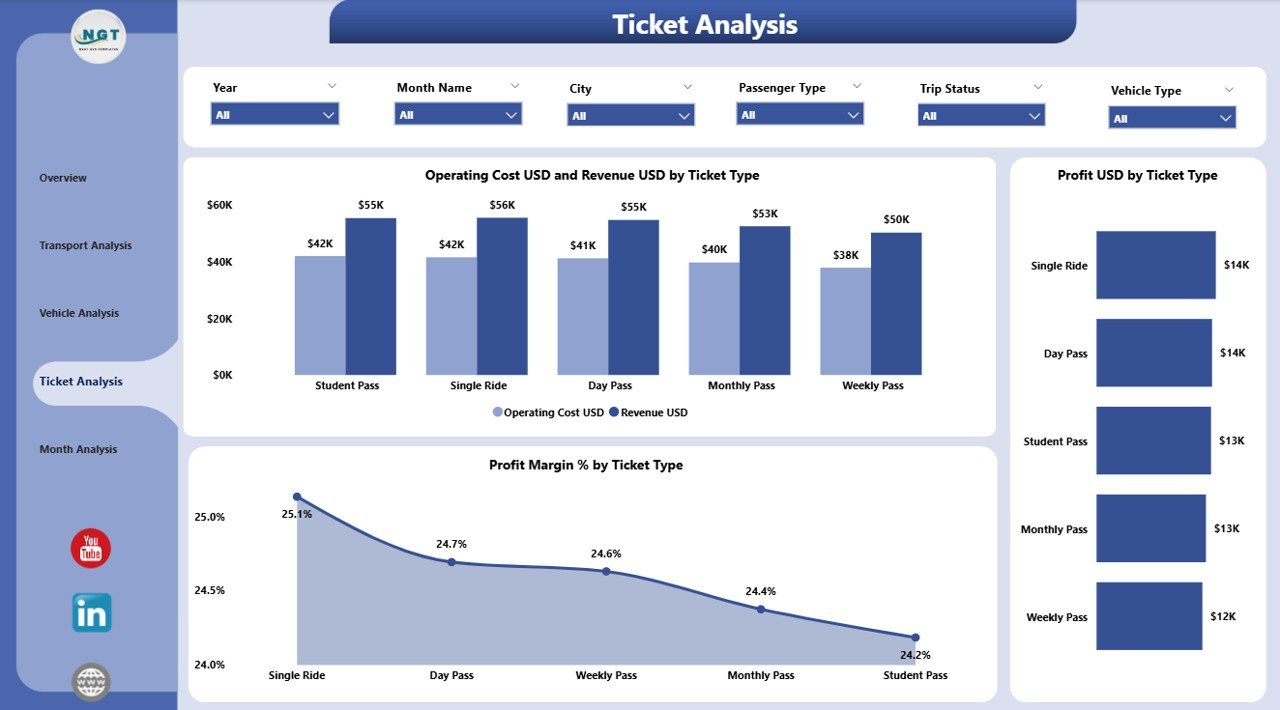
⭐ 4. Ticket Analysis Page – Understand Passenger Behavior
Ticket types reveal important revenue and travel patterns. This page helps you analyze tickets such as:
Single Journey • Monthly Pass • Student Pass • Senior Citizen Pass • Tourist Pass
🔹 Key Charts:
-
Profit Margin % by Ticket Type
-
Profit USD by Ticket Type
-
Operating Cost & Revenue by Ticket Type
This helps transit teams refine pricing, improve affordability, and enhance profitability.
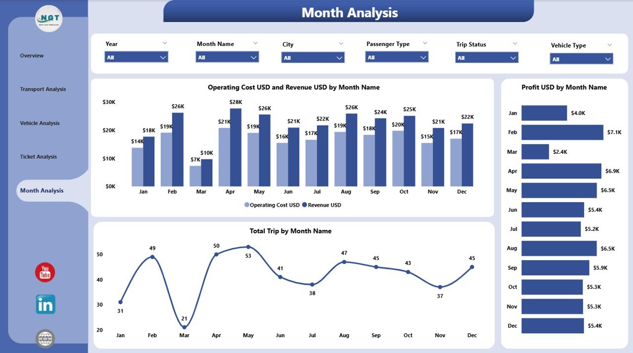
⭐ 5. Monthly Trends Page – Track Month-by-Month Performance
Seasonality and event-based demand affect public transit heavily. This page reveals:
-
Total Trips by Month
-
Profit USD by Month
-
Operating Cost vs Revenue by Month
Transit authorities use these insights for forecasting and budget planning.
🧩 What’s Inside the Public Transit Dashboard in Power BI
You get:
-
5 Power BI analysis pages
-
Dynamic slicers
-
Clean KPI cards
-
Interactive charts
-
Full transport mode comparison
-
Excel-based data entry system
-
Automatic visual updates
-
Fully customizable layout
This dashboard is designed for real-world decision-making and operational clarity.
🚀 How to Use the Dashboard Effectively
-
Enter updated transit data into Excel
-
Refresh the dashboard in Power BI
-
Use slicers to filter by city, month, ticket type, or vehicle type
-
Review KPIs on the Overview Page
-
Explore detailed pages for deeper analysis
-
Compare transport modes, ticket types, and monthly trends
-
Take corrective actions for delays, high cost, or low ridership
No technical skills required—just click, filter, and analyze.
👤 Who Can Benefit from This Dashboard
This dashboard is ideal for:
-
🚌 Public Transit Authorities
-
🚇 Metro & Rail Corporations
-
🚍 Transport Departments
-
🚢 Ferry & Water Transport Teams
-
🌆 City Planners
-
📊 Operations & Finance Teams
-
🧭 Urban Mobility Consultants
Anyone managing or analyzing public transit operations will benefit immediately.
### Click hare to read the Detailed blog post
Visit our YouTube channel to learn step-by-step video tutorials
👉 Youtube.com/@PKAnExcelExpert


Reviews
There are no reviews yet.