

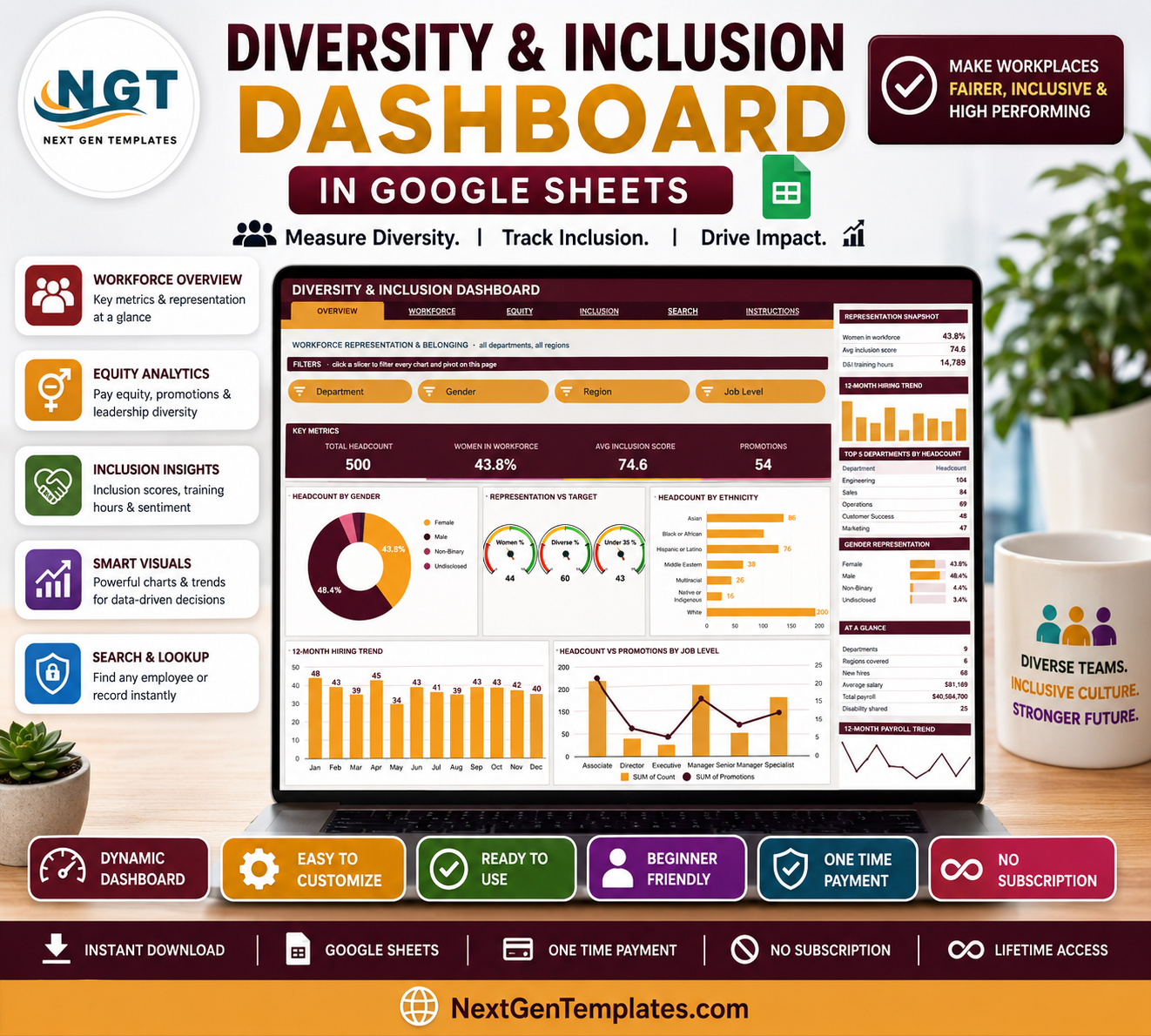
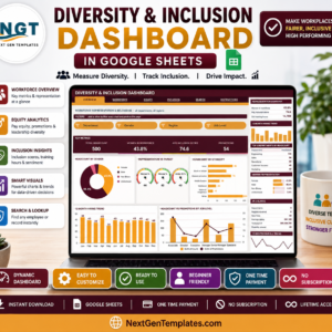
The Diversity & Inclusion Dashboard in Google Sheets turns a flat employee list into six linked pages of representation, pay and inclusion-survey reporting. The sample file carries 500 employee records spread across 9 departments, 6 regions and 6 job levels, and every chart on every page is driven by a native Google Sheets pivot table and slicer – no add-ons to install, no scripts to authorise, no monthly seat fee. Pivots, slicers and formulas are pre-extended to 1,000 rows, so you paste your own export over the sample data and the workbook redraws itself. Instant download, lifetime access and free updates.
What this template is: a tracking and reporting workbook. It charts the figures you put into it. It does not interpret them for you, grade your organisation, or produce any statutory or regulatory return.
Key Features of the Diversity & Inclusion Dashboard in Google Sheets
- Six tabs – Overview, Workforce, Equity, Inclusion, Search and Instructions, joined by a navigation strip that repeats at the top of every page.
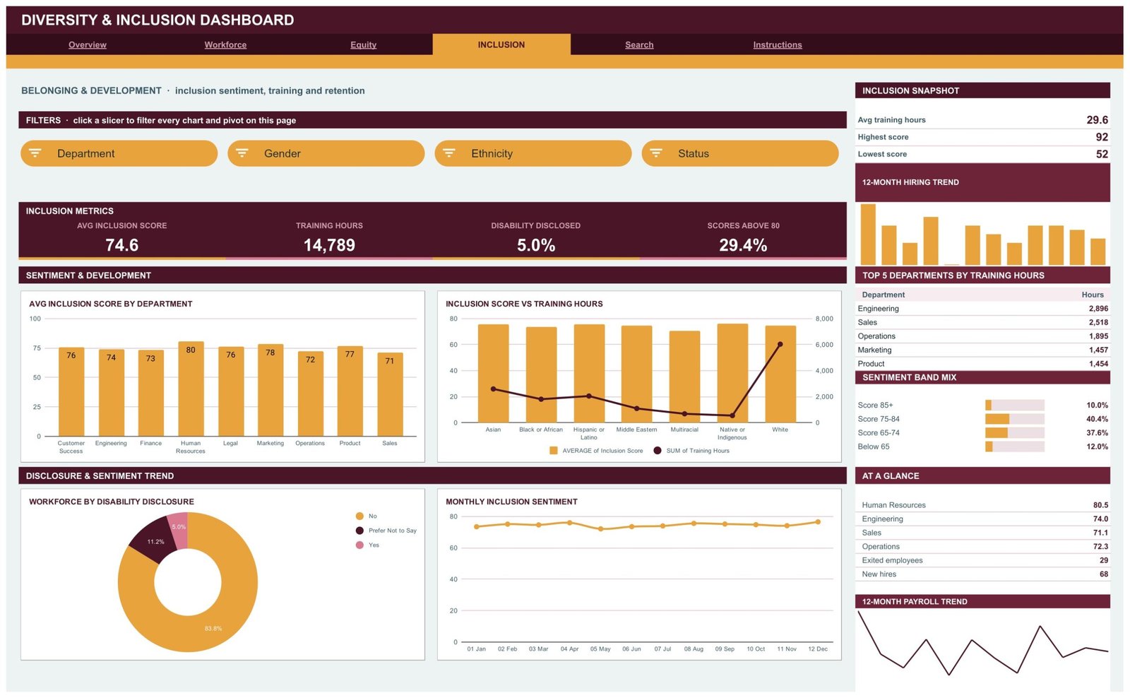
- 16 slicers – four per analysis page. Overview filters on Department, Gender, Region and Job Level; Workforce swaps in Age Group; Equity swaps in Ethnicity; Inclusion filters on Department, Gender, Ethnicity and Status.
- 16 KPI cards – four per page, covering Total Headcount, Women in Workforce, Avg Inclusion Score, Promotions, Engineering Heads, Under 35, Avg Training Hrs, Average Salary, Median Salary, Women in Leadership, Training Hours, Disability Disclosed and Scores Above 80.
- 18 charts – donut charts, bar and column charts, a three-gauge cluster, a scatter plot, three combo charts and two trend lines, each reading from its own pivot table.
- A sidebar on all four analysis pages – a snapshot block, a 12-month hiring trend, a Top 5 ranking, a percentage-bar list and an At a Glance table.
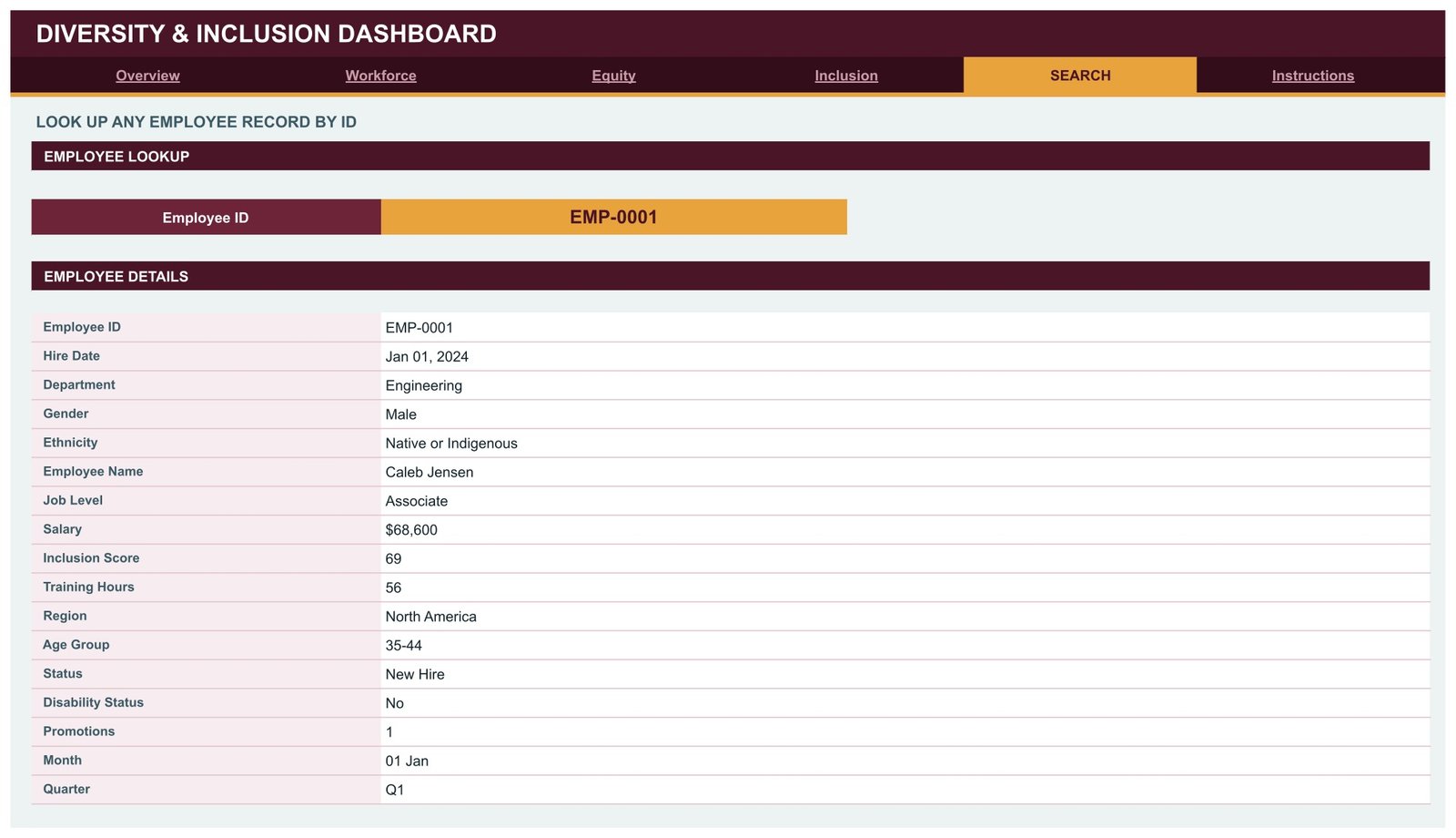
- An employee lookup page – pick any Employee ID and read the full 16-field record.
- Auto-expansion to 1,000 rows, plus a documented route past that by raising DATA_ROWS in the Apps Script file.
- One-line theme change – the palette at the top of the script controls the ink (#4A1526), accent (#E8A33D) and rose (#D9788F) colours used throughout.
What’s Inside the Diversity & Inclusion Dashboard in Google Sheets
Overview – workforce representation and belonging
The landing page reports company-wide figures. In the sample data its KPI strip reads Total Headcount 500, Women in Workforce 43.8%, Avg Inclusion Score 74.6 and Promotions 54. Beneath it sit Headcount by Gender, a Representation vs Target gauge cluster covering Women %, Diverse % and Under 35 %, Headcount by Ethnicity, a 12-Month Hiring Trend and Headcount vs Promotions by Job Level. The right-hand sidebar adds a Representation Snapshot, Top 5 Departments by Headcount, a Gender Representation bar list and an At a Glance table with departments, regions, new hires, average salary and total payroll.
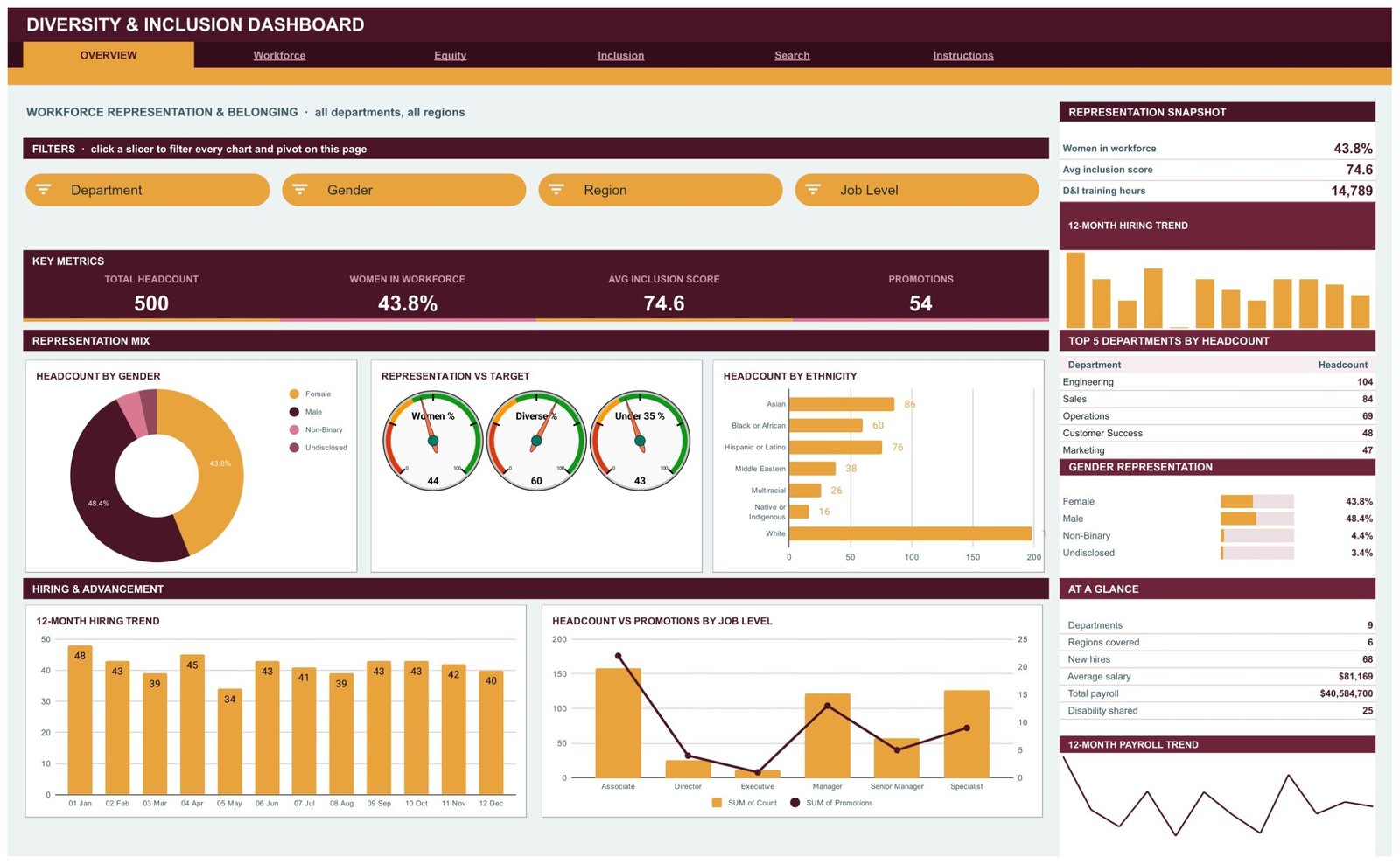
Workforce – composition by department, region and age
This page profiles who is on the payroll. KPI cards show Total Headcount, Engineering Heads, Under 35 and Avg Training Hrs. The charts are Headcount by Department, Headcount by Department & Gender as a stacked column, Headcount by Region and Workforce by Age Group. The sidebar carries a Workforce Snapshot with active employees, on leave and attrition rate, a Regional Share bar list, and an At a Glance count of associates, specialists, managers, senior managers, directors and executives.
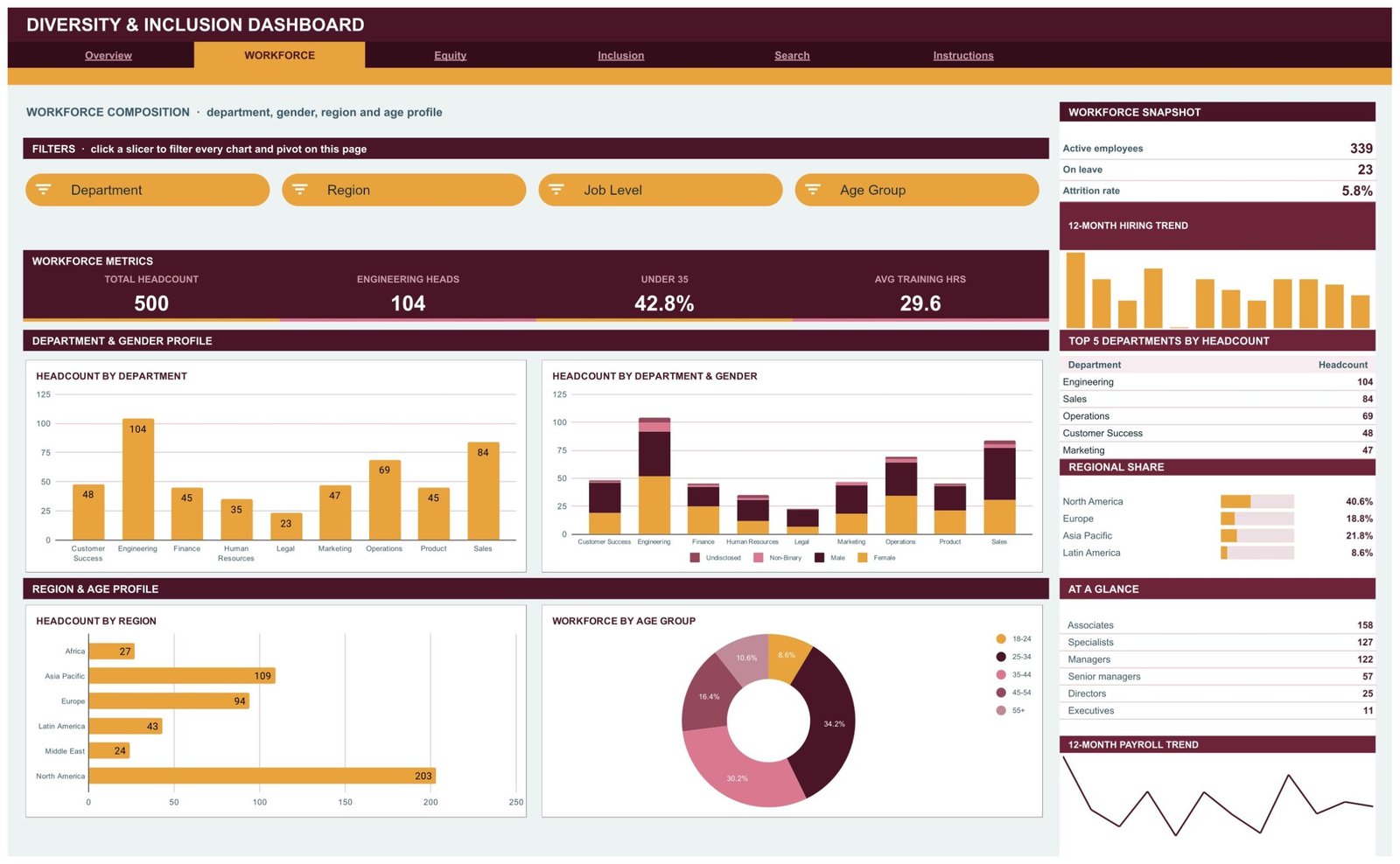
Equity – pay and progression across groups
The Equity page reports compensation and advancement. Its KPI cards are Average Salary, Median Salary, Women in Leadership and Total Promotions. Charts include Avg Salary by Job Level, Avg Salary by Gender, Avg Salary by Ethnicity, Salary vs Inclusion Score as a scatter plot, Promotions by Department and Avg Salary vs Headcount by Age. The sidebar shows an Equity Snapshot with highest salary, lowest salary and promotion rate, Top 5 Departments by Payroll, and a Leadership Representation bar list.
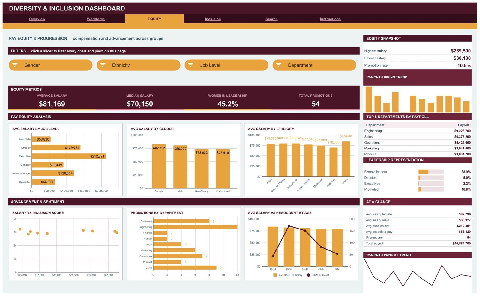
Inclusion – belonging, training and retention
Inclusion reports survey scores and development activity. KPI cards read Avg Inclusion Score, Training Hours, Disability Disclosed and Scores Above 80. The charts are Avg Inclusion Score by Department, Inclusion Score vs Training Hours, Workforce by Disability Disclosure and a Monthly Inclusion Sentiment line. The sidebar adds an Inclusion Snapshot, Top 5 Departments by Training Hours, a Sentiment Band Mix that splits the workforce into score bands, and an At a Glance table with exited employees and new hires.
Search – one employee at a time
Pick an Employee ID from the dropdown and the page returns that person’s full record: hire date, department, gender, ethnicity, name, job level, salary, inclusion score, training hours, region, age group, status, disability status, promotions, month and quarter.
Instructions – a 10-step user guide
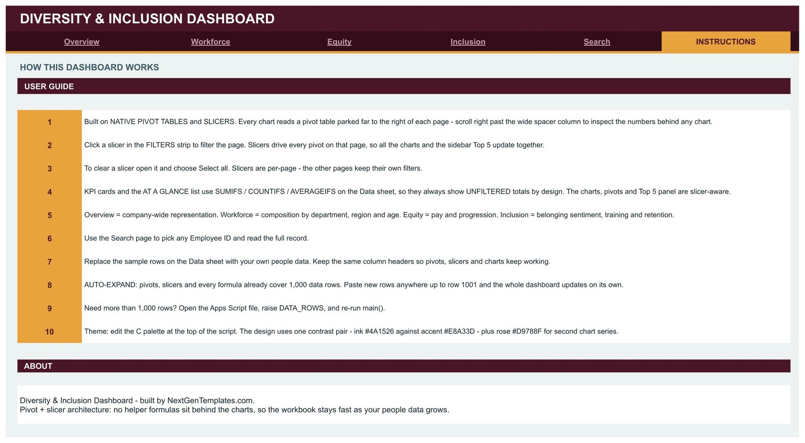
The last tab explains the build in ten numbered steps: where the pivot tables sit, how the slicers drive them, why the KPI cards use SUMIFS, COUNTIFS and AVERAGEIFS on the Data sheet and therefore stay unfiltered by design, how to replace the sample rows, and how to push past 1,000 rows.
Google Sheets vs. Excel vs. Paid HR Analytics SaaS – Where This Fits
| This template (Google Sheets) | Excel HR dashboard | Paid HR analytics SaaS | |
|---|---|---|---|
| Cost | $9.99 one time | One-time template cost | Recurring per-employee subscription |
| Platform | Google Sheets, browser only | Microsoft Excel desktop | Vendor-hosted web app |
| Setup time | Copy the sheet, paste your export | Download, open, paste | Implementation project |
| Real-time team collaboration | Yes, built in | Only via OneDrive co-authoring | Yes |
| Mobile access | Google Sheets app | Excel mobile app | Vendor app |
| Customisable fields | Every column and chart is yours to edit | Yes | Limited to vendor schema |
| Share with link | Yes | File send or cloud link | Seat-based access |
| Year-1 cost at 5 users | $9.99 total | Template plus a Microsoft 365 licence | Billed per employee, every year |
| Slicer-driven filtering | 16 native slicers | Slicers on Excel pivots | Built-in filters |
| Employee-level lookup | Dedicated Search tab | Depends on the template | Yes |
| Your data leaves your Drive | No | No | Stored with the vendor |
Who This Template Is For – and Who It’s Not For
A good fit if you keep people data in a spreadsheet already, you have between 50 and 1,000 employee records, you want representation and pay figures charted without exporting to a third party, or you need a board-ready page you can filter live in a meeting.
Not a good fit if you need a system of record with audit trails and permissions per field, you have more than a few thousand employees and want row-level security, you want automatic sync from an HRIS, or you are looking for software that decides what your numbers mean. This workbook draws charts from the data you supply and nothing more – it makes no assessment of your organisation and offers no HR or legal guidance.
How to Use the Diversity & Inclusion Dashboard in Google Sheets
- Open the PDF in your download and click the Make a Copy link. The copy lands in your own Google Drive.
- Open the Data sheet and replace the 500 sample rows with your own export. Keep the column headers exactly as they are – the pivots, slicers and formulas all point at them.
- Paste up to row 1001. Everything is already extended that far; nothing needs to be dragged down.
- Go back to Overview and click a slicer. Every chart, pivot and Top 5 panel on that page follows the selection. Slicers are per page, so each tab keeps its own filters.
- To clear a slicer, open it and choose Select all.
- Use the Search tab to read a single employee record by ID.
- Need more than 1,000 rows? Open the Apps Script file, raise DATA_ROWS, and run main() again.
- To rebrand, edit the colour palette at the top of the script and re-run.
Real-World Use Cases
Priya, HR operations lead at a 400-person software company. She exports the headcount file on the first Monday of each month, pastes it over the Data sheet and screenshots the Overview page for the leadership pack. The Top 5 Departments by Headcount panel and the 12-month hiring trend go straight into the deck.
Daniel, a people analytics contractor. He is asked to summarise pay distribution for a client. He filters the Equity page by department with the slicer, reads Avg Salary by Job Level and Avg Salary by Gender off the charts, and exports the pivot tables parked to the right of the page as his working.
Maria, an HR business partner at a manufacturing group. She runs an annual engagement survey and loads the inclusion scores into the workbook. The Sentiment Band Mix panel and Avg Inclusion Score by Department chart give her the department-level view she reports back to each site manager.
Frequently Asked Questions
Do I need an add-on or a paid Google Workspace plan?
No. The dashboard is built from features that ship with Google Sheets – pivot tables, slicers, charts and standard formulas. A free personal Google account is enough.
How many employee records can it handle?
Pivots, slicers and formulas are pre-extended to 1,000 rows. Past that, open the bundled Apps Script file, raise the DATA_ROWS constant and run main() again.
Why do the KPI cards ignore my slicer selection?
That is deliberate. The KPI cards and the At a Glance list use SUMIFS, COUNTIFS and AVERAGEIFS against the Data sheet, so they always show unfiltered totals as a reference point. The charts, pivot tables and Top 5 panels are the slicer-aware parts.
Can I change the columns to match my own fields?
Yes. Rename or add columns on the Data sheet, then update the pivot tables parked to the right of each page so they point at your new fields. The charts read from those pivots.
Does this help with regulatory or statutory reporting?
No. It is a tracking and reporting workbook that charts the data you enter. It produces no statutory return and makes no claim about any reporting obligation. Check with your own advisers about what you are required to report and how.
Is my employee data sent anywhere?
No. The copy lives in your own Google Drive under your own account. Nothing is transmitted to NextGenTemplates or any third party.
What exactly do I download?
A PDF that contains the Make a Copy link for the Google Sheet, plus setup notes. Click the link and your own editable copy is created.
About the Author
Built by PK – Microsoft Certified Professional with 15+ years of Excel, Google Sheets, and Power BI experience. Founder of NextGenTemplates, reaching 300K+ subscribers across YouTube channels. Every template is hand-built and tested before release.
Explore Related Templates
- Employee Diversity Dashboard in Google Sheets – a lighter, single-theme view of representation.
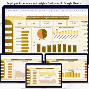
- Employee Experience and Insights Dashboard in Google Sheets – survey and engagement reporting.
- HR Employee Performance Analytics Dashboard in Google Sheets – performance and review tracking.
- Diversity and Inclusion KPI Scorecard in Excel – the same subject as a one-page Excel scorecard.
- Employee Diversity Dashboard in Power BI – for teams already on Power BI Desktop.
- Environmental, Social and Governance (ESG) Dashboard in Google Sheets – the wider ESG reporting picture.
- Investor Relations Dashboard in Google Sheets – for the reporting pack that goes outward.
Browse the full Google Sheets templates catalogue or the Google Sheets dashboards collection.
Get the Diversity & Inclusion Dashboard in Google Sheets for $9.99 – normally $16.99. Instant download, lifetime access, free updates. Add it to your cart and the Make a Copy link is in your inbox within minutes.
Watch the step-by-step video Demo:
Last updated: 14 August 2026.





















Reviews
There are no reviews yet.