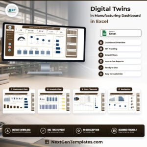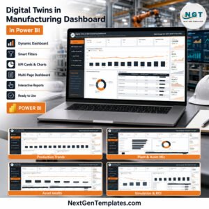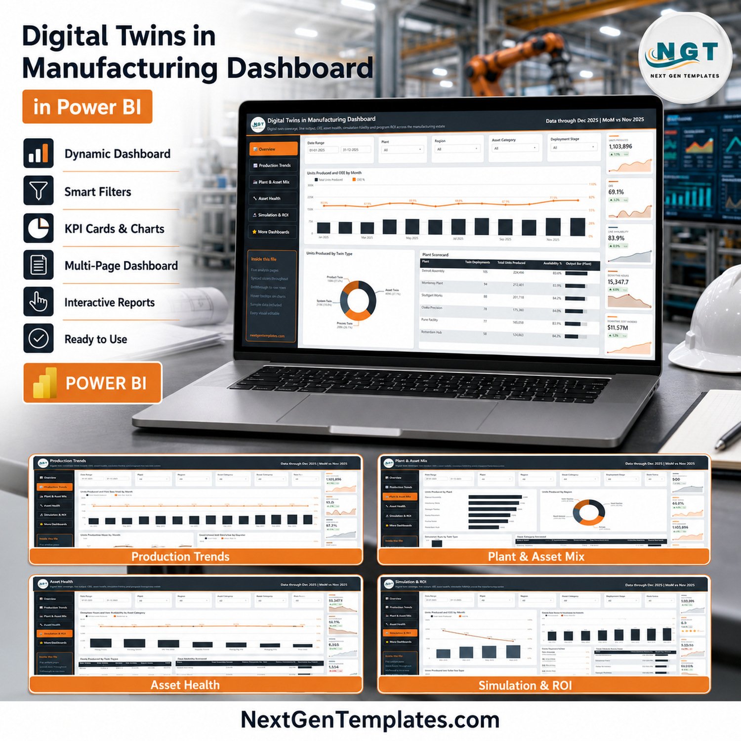
The Digital Twins in Manufacturing Dashboard in Power BI reports on 500 twin deployments across 6 plants and 4 regions, with 25 KPI cards, 16 charts and tables, and 25 slicer controls spread over 5 report pages. The sample model carries a full year of data (Jan–Dec 2025) covering 1,103,896 units produced, 31,642 simulation runs and $11.57M of downtime cost avoided.
🌍 Join 8,400+ teams in 40+ countries using NextGenTemplates to replace paid SaaS tools with one-time-purchase Excel, Google Sheets, Power BI and HTML templates.
✅ Instant download · One-time payment · No subscription · No per-user fees · Lifetime access
🔑 Key Features of the Digital Twins in Manufacturing Dashboard in Power BI
🔹 20 distinct manufacturing and twin-program metrics. The model measures Units Produced, OEE, Line Availability, Units Per Hour, First Pass Yield, Defect Rate, Downtime Hours, Downtime Rate, Downtime Cost Avoided, Twin Deployments, Active Twins %, Avg Twin Fidelity, Energy Consumed kWh, Failures Predicted, Failures Prevented, Failure Prevention %, Simulation Runs, Simulation Success %, Twin Program Cost and Twin ROI %.
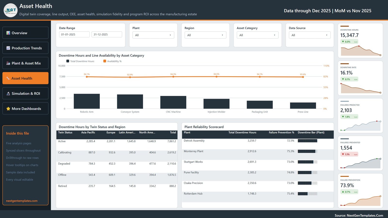
🔹 Every KPI card carries a month-on-month delta and a sparkline. The header reads “Data through Dec 2025 | MoM vs Nov 2025”, so a card such as Downtime Hours 15,347.7 also shows its 6.0% month-on-month fall and the twelve-month shape behind it — no second report needed to see direction.
🔹 Five slicers on every page, synced across the report. Date Range, Plant, Region and Asset Category appear on all five pages, with a fifth page-specific slicer (Deployment Stage, Twin Type, Twin Status or Data Source). Filter to Osaka Precision once and every page follows.
🔹 Four twin types modelled end to end. Asset Twin, Process Twin, System Twin and Product Twin each carry their own output share, simulation-run count and fidelity score, so you can prove which twin class is actually paying for itself.
🔹 Drillthrough to raw rows and hover tooltips are wired on the charts, and the sample dataset ships in the download as Data.xlsx — swap it for your own MES or historian extract and the whole report refreshes.
📦 What’s Inside the Download
Page 1: Overview
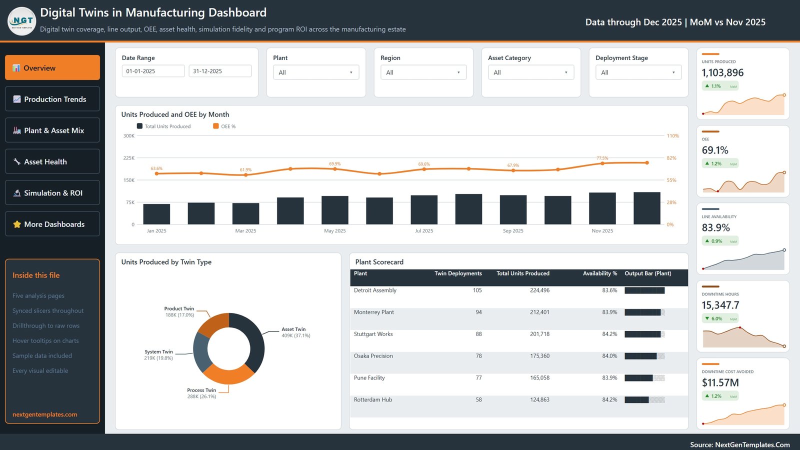
The landing page carries five cards — Units Produced 1,103,896, OEE 69.1%, Line Availability 83.9%, Downtime Hours 15,347.7 and Downtime Cost Avoided $11.57M. Visuals are Units Produced and OEE by Month, Units Produced by Twin Type, and a Plant Scorecard listing twin deployments, total units produced and availability % for each of the six plants.
Page 2: Production Trends
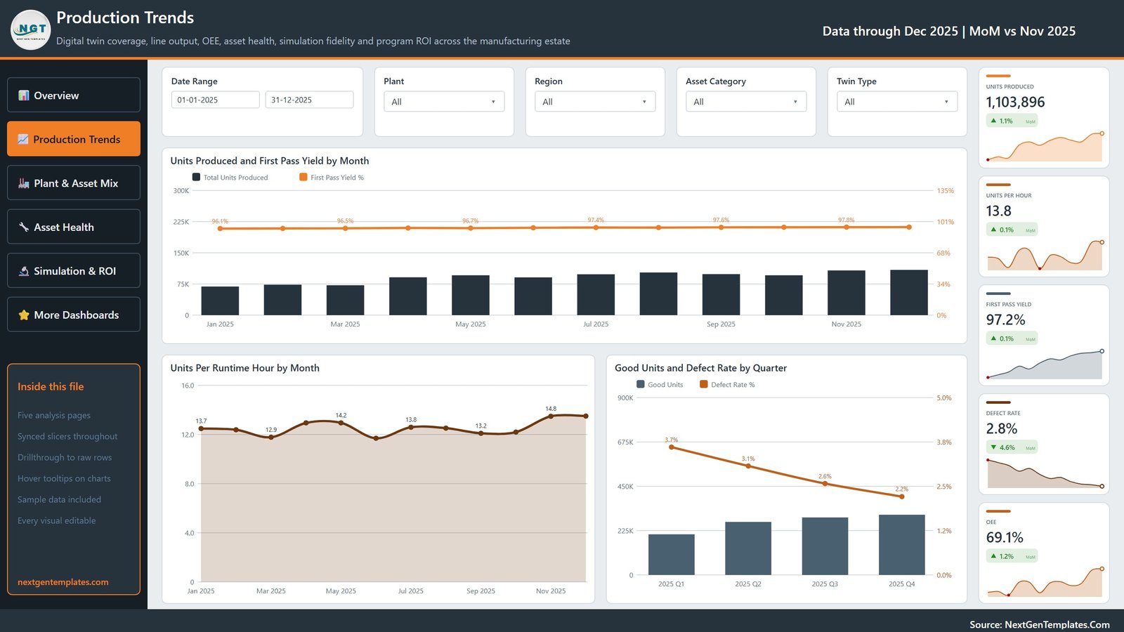
Tracks Units Produced, Units Per Hour 13.8, First Pass Yield 97.2%, Defect Rate 2.8% and OEE. Charts are Units Produced and First Pass Yield by Month, Units Per Runtime Hour by Month, and Good Units and Defect Rate by Quarter — which shows the defect rate falling from 3.7% in Q1 to 2.2% in Q4.
Page 3: Plant & Asset Mix
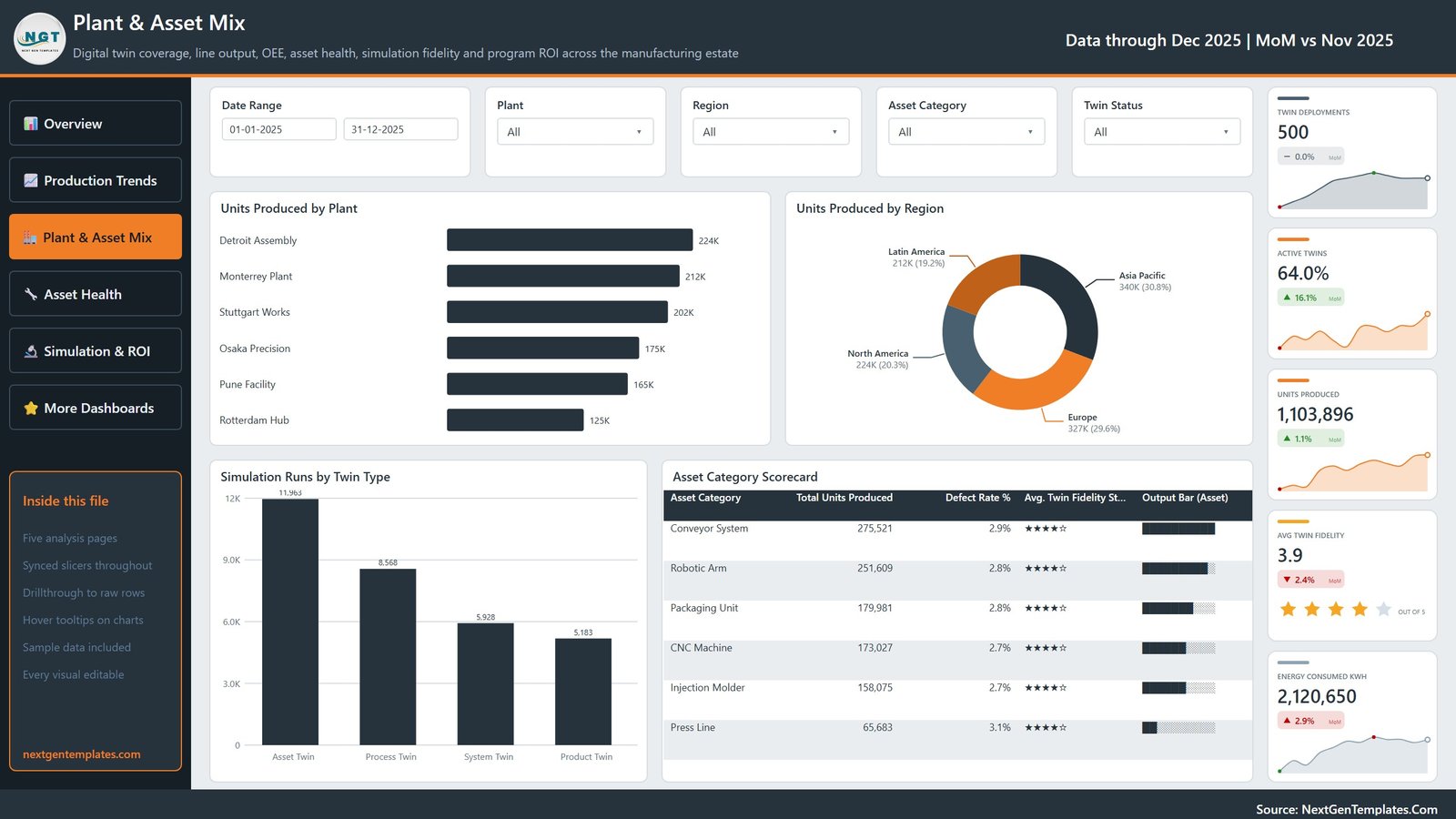
Cards show Twin Deployments 500, Active Twins 64.0%, Units Produced, Avg Twin Fidelity 3.9 out of 5 and Energy Consumed 2,120,650 kWh. Visuals are Units Produced by Plant, Units Produced by Region, Simulation Runs by Twin Type, and an Asset Category Scorecard covering Conveyor System, Robotic Arm, Packaging Unit, CNC Machine, Injection Molder and Press Line.
Page 4: Asset Health
Reliability page with Downtime Hours, Downtime Rate 16.1%, Failures Predicted 2,103, Failures Prevented 1,554 and Failure Prevention 73.9%. Visuals are Downtime Hours and Line Availability by Asset Category, Downtime Hours by Twin Status and Region, and a Plant Reliability Scorecard ranking the six plants by downtime hours and prevention rate.
Page 5: Simulation & ROI
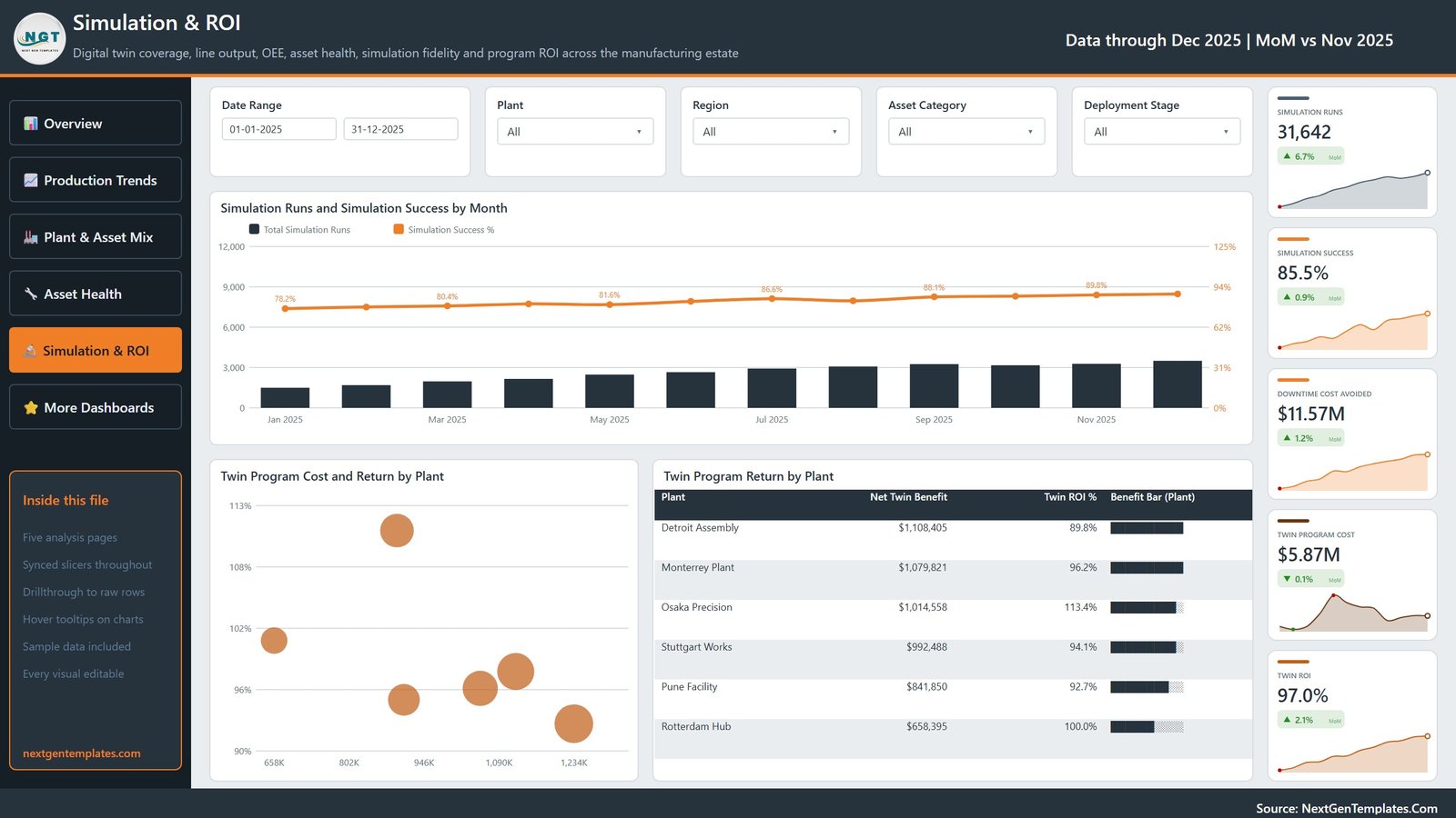
The business-case page: Simulation Runs 31,642, Simulation Success 85.5%, Downtime Cost Avoided $11.57M, Twin Program Cost $5.87M and Twin ROI 97.0%. Visuals are Simulation Runs and Simulation Success by Month, Twin Program Cost and Return by Plant, and Twin Program Return by Plant with net twin benefit per site — Osaka Precision leads on 113.4% ROI.
📊 Digital Twins Dashboard vs. Tableau / Qlik vs. an IIoT Platform Subscription — Where This Fits
| Feature | This Power BI Template | Tableau / Qlik build | IIoT platform (PTC ThingWorx / Siemens Insights Hub) |
|---|---|---|---|
| Cost | $17.99 one-time ✅ | $75 / user / month plus build time | $2,000–$15,000 / month |
| Platform | Power BI Desktop (free) ✅ | Tableau Desktop or Qlik Sense licence | Vendor cloud, locked in |
| Setup time | Under 15 minutes ✅ | 2–5 days of developer work | 6–12 week implementation |
| Report pages included | 5, already built ✅ | Blank canvas | Configurable, consultant-led |
| Twin fidelity & simulation ROI views | Built in ✅ | Must be modelled from scratch | Included |
| Customisable fields | Every visual and measure editable ✅ | Editable | Vendor-defined schema |
| Share with a link | Publish to Power BI Service | Server licence needed | ✅ Native |
| Year-1 cost at 5 users | $17.99 ✅ | ~$4,500 | $24,000+ |
For plant teams that want digital-twin reporting without a six-figure IIoT contract, this template sits in the sweet spot.
👥 Who This Template Is For — and Who It’s Not For
✅ Built for:
- Plant managers and production heads running 1–10 sites who already export data from an MES or historian
- Digital transformation and Industry 4.0 leads who must justify twin spend to a CFO
- Reliability and maintenance engineers tracking predicted vs prevented failures
- Power BI analysts who want a finished model to adapt rather than a blank canvas
❌ Not for:
- Teams needing live streaming telemetry — this is a scheduled-refresh report, not a real-time monitor
- Anyone wanting 3D twin visualisation or physics simulation; this reports on twin outcomes, it does not run the simulation
- Organisations without Power BI Desktop or a Windows machine to open the .pbix on
⚙️ How to Use It
- Download the ZIP and unzip it. You get the .pbix report, Data.xlsx and the Power BI user manual PDF.
- Open the .pbix in Power BI Desktop, free from Microsoft.
- Open Data.xlsx and replace the sample rows with your own plant, asset, twin and downtime records, keeping the column headers unchanged.
- Back in Power BI, click Refresh. All 25 cards and 16 visuals recalculate.
- Set the Date Range slicer to your reporting window and check the Overview page reads as expected.
- Recolour or rename any visual to match your plant’s branding, then publish to the Power BI Service to share.
💼 Real-World Use Cases
Marcus runs operations for a 4-plant automotive supplier. He refreshes the report every Monday and uses the Plant Scorecard to see which site is losing availability, then drills into Asset Health to check whether the loss is a robotic arm or a press line before the weekly production call.
Priya leads Industry 4.0 at a contract electronics manufacturer. Her board approved 500 twin deployments and wants proof. The Simulation & ROI page gives her twin program cost against downtime cost avoided per plant, which is the single slide she takes into the quarterly review.
Ade is a reliability engineer at a packaging plant. He watches Failures Predicted against Failures Prevented, and uses the Downtime Hours by Twin Status view to find assets whose twins have quietly gone Degraded or Offline.
❓ Frequently Asked Questions
What KPIs does this dashboard track?
It tracks 20 distinct metrics across 25 cards, including Units Produced, OEE, Line Availability, First Pass Yield, Defect Rate, Downtime Hours, Twin Deployments, Active Twins, Avg Twin Fidelity, Failures Predicted, Failures Prevented, Simulation Success, Twin Program Cost and Twin ROI.
How long does setup take?
Under 15 minutes. Unzip, open the .pbix in Power BI Desktop, paste your records into Data.xlsx with the headers unchanged and press Refresh. All five pages repopulate from the same model.
Do I need a Power BI Pro licence?
No. Power BI Desktop is free and opens the report, refreshes it and lets you edit every visual. A Pro licence is only needed if you want to publish the report to the Power BI Service and share it with colleagues.
Does it connect to a live MES or IIoT feed?
Out of the box it reads the bundled Data.xlsx. Because it is a standard Power BI model, you can repoint the query to SQL Server, Azure, a historian export or any supported source using Transform Data, and the visuals keep working.
How does it compare to an IIoT platform like ThingWorx?
A platform subscription runs $2,000–$15,000 a month and takes months to implement. This is a $17.99 one-time reporting layer over data you already export. It will not run simulations, but it reports twin coverage, fidelity, downtime avoided and ROI immediately.
Is there an Excel version?
Yes — the same five-page design ships as Digital Twins in Manufacturing Dashboard in Excel for teams that would rather stay in a workbook.
👤 About the Author
Built by PK — Microsoft Certified Professional with 15+ years of Excel, Google Sheets and Power BI experience. Founder of NextGenTemplates, reaching 300K+ subscribers across YouTube channels (@PK-AnExcelExpert, @NextGenTemplates, @NeoTechNavigators). Every template is hand-built and tested before release.
🔗 Explore Related Templates
- Also available as: Digital Twins in Manufacturing Dashboard in Excel — identical page structure, built in a workbook.
- Digital Twin Services Dashboard in Power BI — for service providers selling twin engagements rather than running a plant.
- Additive Manufacturing KPI Dashboard in Power BI — narrower, KPI-scorecard style view of a 3D printing operation.
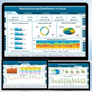
- Manufacturing Dashboard in Excel — general production reporting without the twin layer.
- Browse more Power BI Dashboard templates.
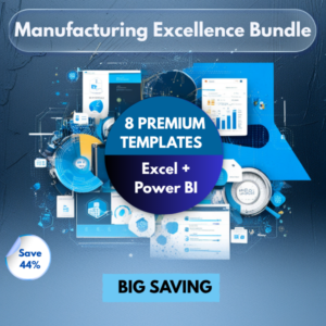
💎 Save more: this dashboard is part of the same family as the Manufacturing Excellence Bundle — 8 Premium Templates (Excel + Power BI).
📖 Click here to read the Detailed Blog Post
🎥 Visit our YouTube channel for step-by-step video tutorials
👉 YouTube.com/@NextGenTemplates
📅 Last updated: September 2026