

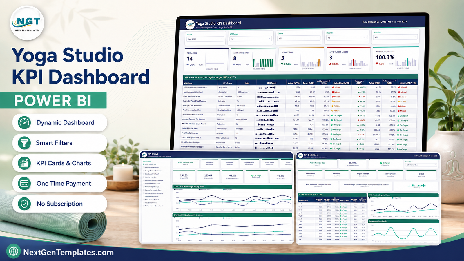

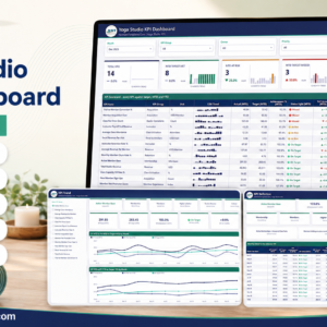
The Yoga Studio KPI Dashboard in Power BI is a ready-to-open .pbix scorecard that tracks 14 studio KPIs across 9 KPI groups – membership, retention, acquisition, class utilisation, studio operations, instructor, revenue, retail and member experience – against a target you set, month by month. It ships with 24 months of sample actuals (2024 and 2025) and 12 months of targets in a plain Excel workbook you can overwrite in minutes. Four report pages, five synced slicers, MTD and YTD traffic lights, 12-month sparklines on every row. No custom visuals to install, nothing locked, no subscription. Open it in the free Power BI Desktop, swap the sample data for yours, hit Refresh.
Key Features of the Yoga Studio KPI Dashboard in Power BI
- 14 yoga-studio KPIs, defined not guessed – Active Member Base, Monthly Member Churn Rate %, Trial-to-Member Conversion %, New Member Sign-Ups, Member Acquisition Cost, Class Capacity Fill Rate %, Average Class Attendance, Class No-Show Count, Instructor Retention Rate %, Instructor Payroll % of Revenue, Total Studio Revenue, Average Revenue Per Member, Retail Revenue Per Visit and Member Net Promoter Score. Each one carries its own unit, formula, plain-English definition, owner and priority.
- Direction-aware scoring – each KPI is flagged higher-is-better or lower-is-better. Beating a churn or acquisition-cost target scores above 100%, so cost KPIs are not silently punished for being small.
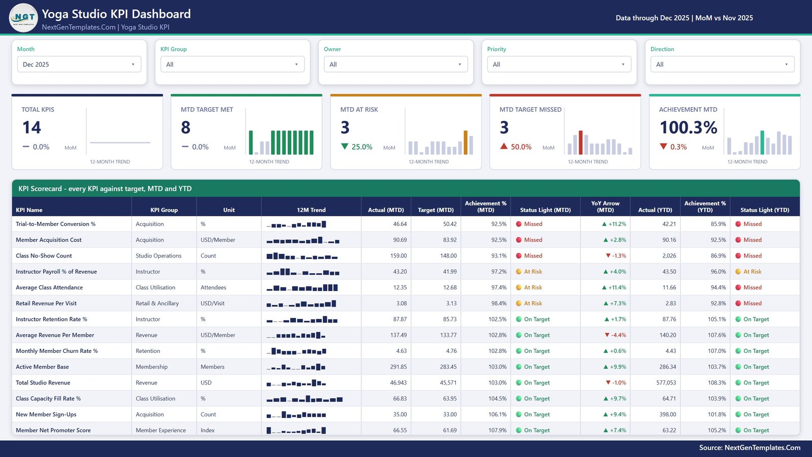
- MTD and YTD side by side – the scorecard table shows Actual, Target, Achievement % and a status light for the month and the year to date, plus a year-on-year arrow, in one row per KPI.
- Five synced slicers – Month, KPI Group, Owner, Priority and Direction. Filter to the Programming Lead’s four class-utilisation KPIs, or to everything marked Critical, and the cards above the table recount themselves.
- A 12-month sparkline on every KPI row, which stays on the full year even when you change the reporting month.
- Seven ownership lines built in – Studio Director, Membership Manager, Marketing Manager, Programming Lead, Front Desk Supervisor, Finance Manager and Retail Lead, so a monthly review has a name against every number.
- Native Power BI visuals only – cards, tables, line charts, bar charts and slicers. Nothing to download from AppSource, nothing that breaks when a marketplace visual is retired.
What’s Inside the Yoga Studio KPI Dashboard in Power BI
The download is a single ZIP holding the .pbix report and the Data.xlsx workbook it reads from. The report has four pages you navigate, plus two hidden tooltip pages that pop up on hover.
- Page 1 – KPI Scorecard. Five slicers, five summary cards (Total KPIs, MTD Target Met, MTD At Risk, MTD Target Missed, Achievement MTD – each with a month-on-month delta and its own 12-month trend), then the 14-row scorecard table sorted worst-achievement-first.
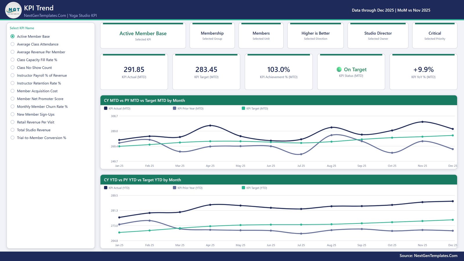
- Page 2 – KPI Trend. Pick one KPI from the list on the left and the page becomes that KPI: its group, unit, direction, owner and priority on context cards, its MTD actual, target, achievement, status and YoY on metric cards, then two line charts – CY MTD vs PY MTD vs Target MTD by Month and CY YTD vs PY YTD vs Target YTD by Month.
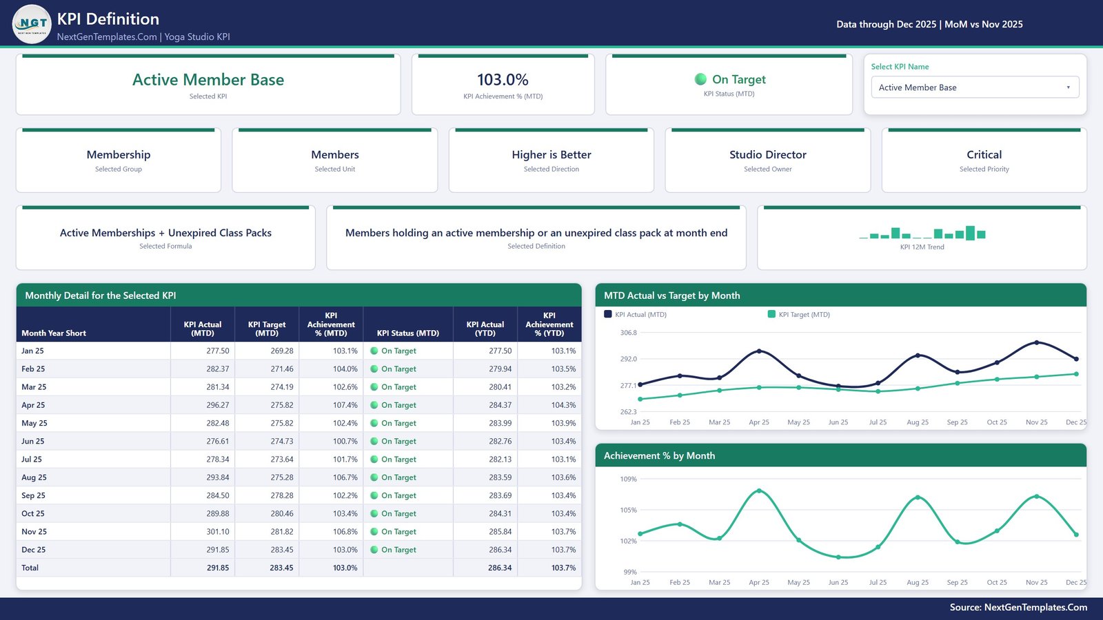
- Page 3 – KPI Definition. The same KPI selection, synced across from page 2, with the KPI’s formula and written definition on screen, a month-by-month detail table (MTD and YTD actual, target, achievement and status, with a total row) and two charts – MTD Actual vs Target by Month and Achievement % by Month.
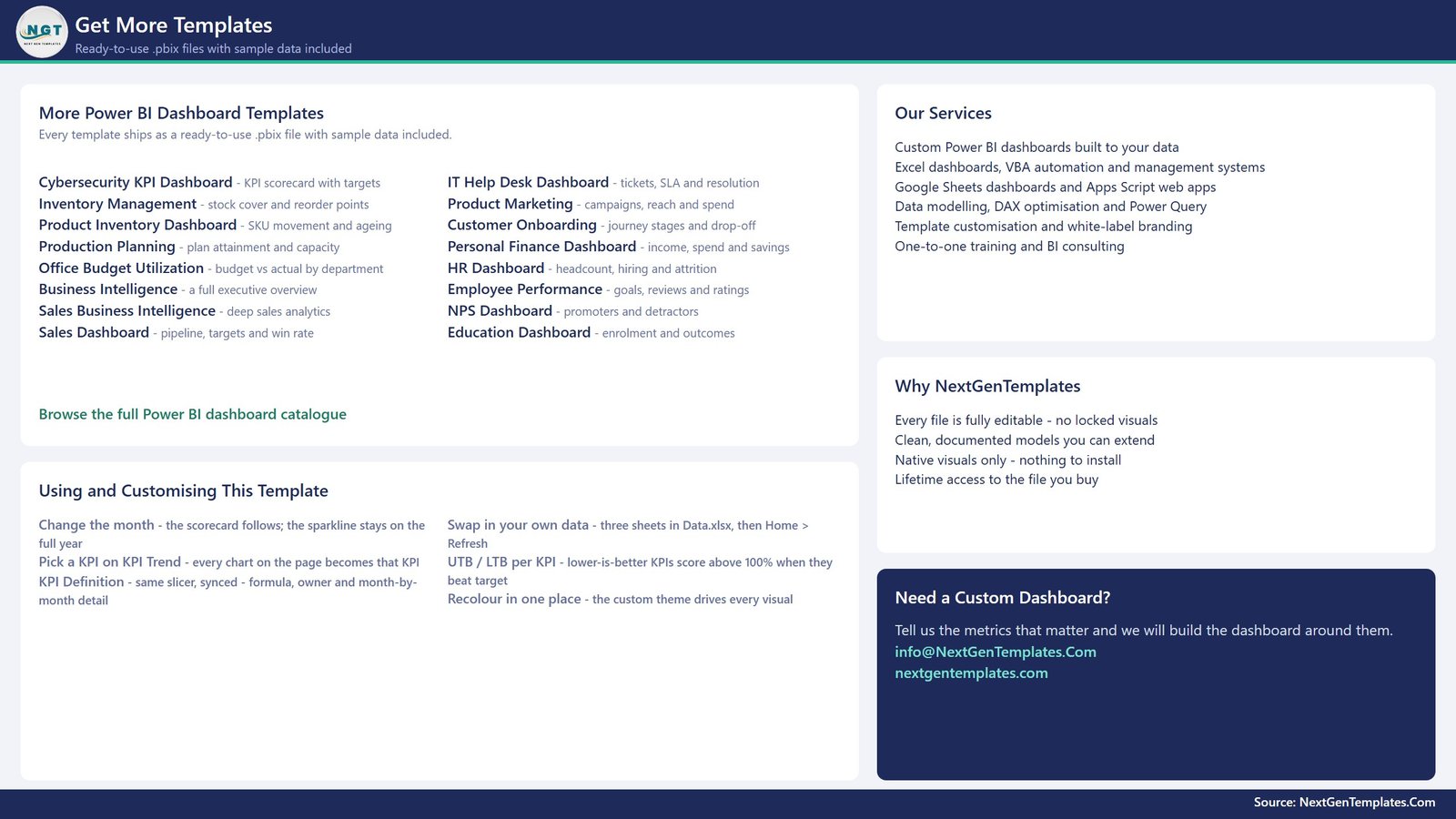
- Page 4 – Get More Templates. A short in-file guide to changing the month, swapping your data in, and recolouring, alongside the wider NextGenTemplates catalogue.
- Two hidden tooltip pages – KPI Detail and Trend Detail – that surface the numbers behind a point without leaving the page.
The workbook has four sheets: a Read Me, KPI Definition (14 rows x 9 columns), Input_ Target (168 rows – 14 KPIs x 12 months) and Input_ Actual (336 rows – the same 14 KPIs across 2024 and 2025, which is what every prior-year and YoY figure reads from). Rename a KPI in all three sheets and the whole report follows it; the KPI name is the join key and nothing in the report is hard-coded to a particular KPI.
Yoga Studio KPI Dashboard in Power BI vs. a Spreadsheet vs. Studio Software Reporting – Where This Fits
| This template (Power BI) | Excel / Google Sheets scorecard | Studio management SaaS reporting | |
|---|---|---|---|
| Cost | One-time $12.99 | One-time, similar | Recurring subscription, priced per location |
| Platform | Power BI Desktop (free from Microsoft) | Excel or a browser | Vendor’s own web portal |
| Setup time | Open, paste your numbers into 3 sheets, Refresh | Similar | Already live – but only for the metrics the vendor ships |
| Real-time team collaboration | No – it is a desktop file until you publish it to your own Power BI workspace | Google Sheets yes, Excel via OneDrive | Yes |
| Mobile access | Only after you publish to your own Power BI service | Via the Excel or Sheets mobile app | Yes |
| Customisable KPIs | Yes – add, rename or delete any KPI in the workbook | Yes | Usually fixed to the vendor’s metric set |
| Share with a link | After publishing to your workspace | Yes | Yes |
| Year-1 cost, 5 people looking at it | $12.99 total – there is no per-user fee | One-time | Ongoing, and usually scales with staff or locations |
| Owner and priority per KPI | Yes – built into the KPI Definition sheet | Only if you build it | Rarely |
| Connects to your booking system | No – it refreshes from the bundled Excel file | No | Yes, it is the booking system |
Who This Template Is For – and Who It’s Not For
It is for a studio owner or manager who already pulls numbers out of a booking platform each month and wants one page that says whether the studio is on target; a small multi-site group that needs a consistent monthly pack; a Power BI learner who wants a clean, readable KPI model to take apart.
It is not for you if you want the dashboard to log in to Mindbody, WellnessLiving, Momence, Glofox, Arketa, Punchpass or ClassPass and pull data by itself – it does not connect to any booking, POS or payments system. It is not a class scheduler, a membership CRM or a billing tool. It will not tell you what a “good” churn rate is for your market: there is no benchmark data in it, and the targets shipped are sample placeholders you replace with your own.
How to Use the Yoga Studio KPI Dashboard in Power BI
- Unzip the download and keep the .pbix and Data.xlsx in the same folder.
- Open Data.xlsx. On KPI Definition, keep, rename or replace the 14 KPIs and set each one’s unit, formula, owner, priority and direction (UTB = higher is better, LTB = lower is better).
- On Input_ Target, enter your MTD and YTD target per KPI per month. On Input_ Actual, enter the same for the reporting year and the year before – the prior year is what the YoY arrows use.
- Remember the YTD rule the Read Me spells out: sum it for money, volume and counts; average it for rates, ratios and index KPIs. A percentage that adds up to 1,900% by December makes every YTD chart useless.
- Open the .pbix in Power BI Desktop and click Home > Refresh. If you moved the folder, use Transform data > Data source settings > Change Source.
- Set the Month slicer to your reporting month, then read the scorecard top-down – it is sorted worst first.
Real-World Use Cases
Priya runs a two-room studio with 290 members. On the first Monday of the month she exports attendance and revenue, pastes them into Input_ Actual, refreshes, and screenshots page 1 for the team channel. The three red rows are the agenda for the staff meeting.
Daniel is the Programming Lead at a growing studio. He filters the Owner slicer to his own name and looks at Class Capacity Fill Rate %, Average Class Attendance and Class No-Show Count only – three KPIs, his own timetable decisions, nobody else’s noise.
Amara manages a three-site group. She keeps one copy of the workbook per site with the same 14 KPI names, so the packs are directly comparable, and uses the KPI Definition page to settle arguments about how a metric is actually calculated.
Frequently Asked Questions
Does this connect to Mindbody, WellnessLiving, Glofox or my booking system?
No. The dashboard reads from the Data.xlsx workbook that ships with it. You export your numbers from whatever system you use and paste them in, then click Refresh. There is no live connector, no API key and no login to any studio platform.
Do I need a Power BI subscription?
No. Power BI Desktop is free from Microsoft and opens the file. A Power BI Pro licence is only needed if you want to publish the report to the cloud and share it with colleagues by link.
Can I change the KPIs to my own?
Yes, and this is the point of the build. Nothing in the report is hard-coded to a KPI name. Add a row to KPI Definition plus its monthly target and actual rows, or delete a KPI from all three sheets, and every card, chart, table and count re-derives on Refresh.
How does it decide On Target, At Risk or Missed?
By achievement against your target: 100% or above is On Target, 95% to 100% is At Risk, below 95% is Missed. Higher-is-better KPIs score Actual / Target; lower-is-better KPIs score Target / Actual.
Is the data in it real?
No. The numbers shipped are realistic sample values for a single mid-sized studio, there so every visual renders before you have typed anything. They are not real operational data and they are not an industry benchmark.
Is a printed user manual included?
No. This line ships the .pbix and Data.xlsx only. The guidance lives inside the files – the Read Me sheet in the workbook and the “Using and Customising This Template” panel on page 4 of the report.
How is this different from the Excel and Google Sheets versions?
Same 14-KPI scorecard idea, three different tools. The Yoga Studio KPI Dashboard in Excel suits a studio that lives in workbooks; the Google Sheets version suits a team that wants a shared link; this Power BI build suits anyone who wants interactive filtering and, later, publishing to a workspace.
About the Author
Built by PK – Microsoft Certified Professional with 15+ years of Excel, Google Sheets, and Power BI experience. Founder of NextGenTemplates, reaching 300K+ subscribers across YouTube channels. Every template is hand-built and tested before release.
Explore Related Templates
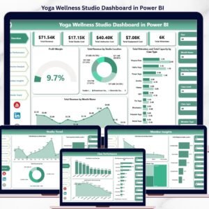
- Yoga Wellness Studio Dashboard in Power BI – the analytical companion. Where this file scores 14 KPIs against target, that one slices classes, members and revenue for exploration. Different job, same studio.
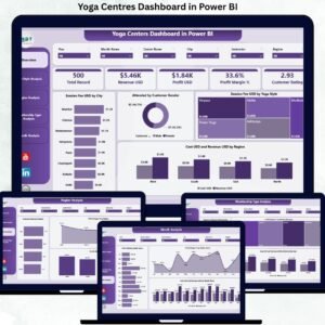
- Yoga Centres KPI Dashboard in Power BI – the same scorecard shape aimed at multi-centre operators.
- Yoga Studio KPI Scorecard in Excel – a lighter, one-sheet Excel scorecard rather than a four-page report.
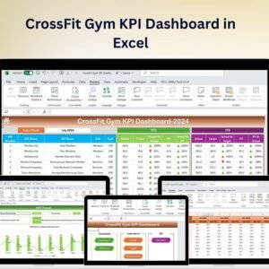
- CrossFit Gym KPI Dashboard in Excel – the same approach for a strength-and-conditioning box.
- Browse the full Power BI KPI Dashboard category and the wider Power BI template catalogue.
Download it, open it in the free Power BI Desktop, and have your own studio’s month on screen before your next staff meeting. Instant download, lifetime access to the file you buy, and every visual fully editable – no locked pages, no per-user fee, no subscription.
Last updated: 26 August 2026.
Watch the demo video:
Watch the demo video:










Reviews
There are no reviews yet.