


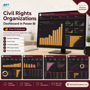
The Civil Rights Organizations Dashboard in Power BI is an administrative reporting layer for an advocacy or non-profit organisation’s own operational records. It ships as a Power BI Desktop file with 9 report pages — 5 analytical pages, a hidden Details drillthrough page, two tooltip pages and a bonus page — driven by 38 DAX measures over a 22-column case table and a generated date table. The five report pages carry 24 KPI cards and 5 synced slicers each. Setup takes under 10 minutes: point the model at your own export and refresh.
⚠️ The file ships with 500 rows of demo data. Every figure, chapter name, case manager, partner organisation and programme label you see in the screenshots is invented sample data used to demonstrate the layout. Nothing in this template describes, measures or represents any real organisation, cause, group, government or jurisdiction.
🌍 Join 8,400+ teams in 40+ countries using NextGenTemplates to replace paid SaaS tools with one-time-purchase Excel, Google Sheets, Power BI, and HTML templates.
✅ Instant download · One-time payment · No subscription · No per-user fees · Lifetime access
🔑 Key Features of the Civil Rights Organizations Dashboard in Power BI
📊 38 reusable DAX measures. The semantic model surfaces 38 distinct measures across the report, covering total funds raised, pledged funding, net programme balance, programme spend ratio, pledge conversion, cases opened, cases resolved, resolution rate, clients served, average response days, attorney coverage and an average impact score. Each card measure has a matching month-on-month delta measure.
🎛️ Five synced slicers on every page. Date range, chapter, programme area and region are shared across all five pages, and each page adds one context filter of its own — case priority, funding source, advocacy type, legal support or case status. Selections follow you from page to page.
🔍 A hidden drillthrough and two tooltip pages. Right-click any chart to drill through to a hidden Details page filtered on chapter, region, partner organisation and other fields, and hover any category or trend visual to get a compact 280×360 tooltip card without leaving the page.
🌙 A dark report theme. The build uses a deep plum canvas (#141013) with amber and rose accents, sized 1280×720 and set to Fit to Page, so it reads cleanly on a laptop, a wall projector or an exported PDF.
✏️ Every label is buyer-editable. The ten chapter labels, the seven programme labels in the sample data, the case stages, statuses, priorities and advocacy types are plain text placeholders. Rename them to match your own programme structure — the measures and visuals follow automatically.
📦 What’s Inside the Civil Rights Organizations Dashboard in Power BI
The download is a single ZIP containing the .pbix file, the sample Data.xlsx workbook and a PDF user manual. Below is each of the five report pages.
Page 1: Civil Rights Casework Overview
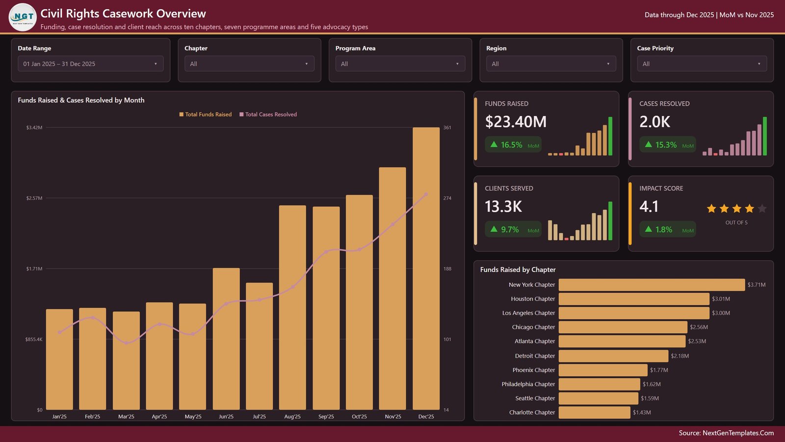
The landing page pairs four KPI cards — Funds Raised, Cases Resolved, Clients Served and an average Impact Score rendered as a 5-star rating — with two visuals: Funds Raised & Cases Resolved by Month and Funds Raised by Chapter. Slicers here are date range, chapter, programme area, region and case priority.
Page 2: Funding Trend
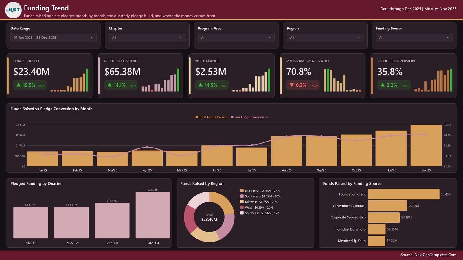
Five cards track Funds Raised, Pledged Funding, Net Balance, Programme Spend Ratio and Pledge Conversion. Charts are Funds Raised vs Pledge Conversion by Month, Pledged Funding by Quarter, Funds Raised by Region and Funds Raised by Funding Source. The page-specific slicer is funding source.
Page 3: Programme Areas
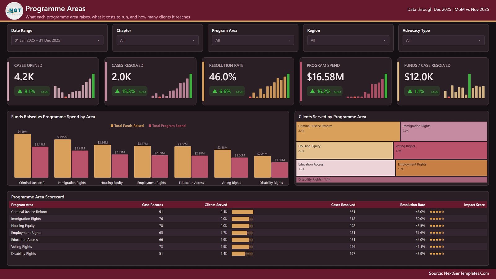
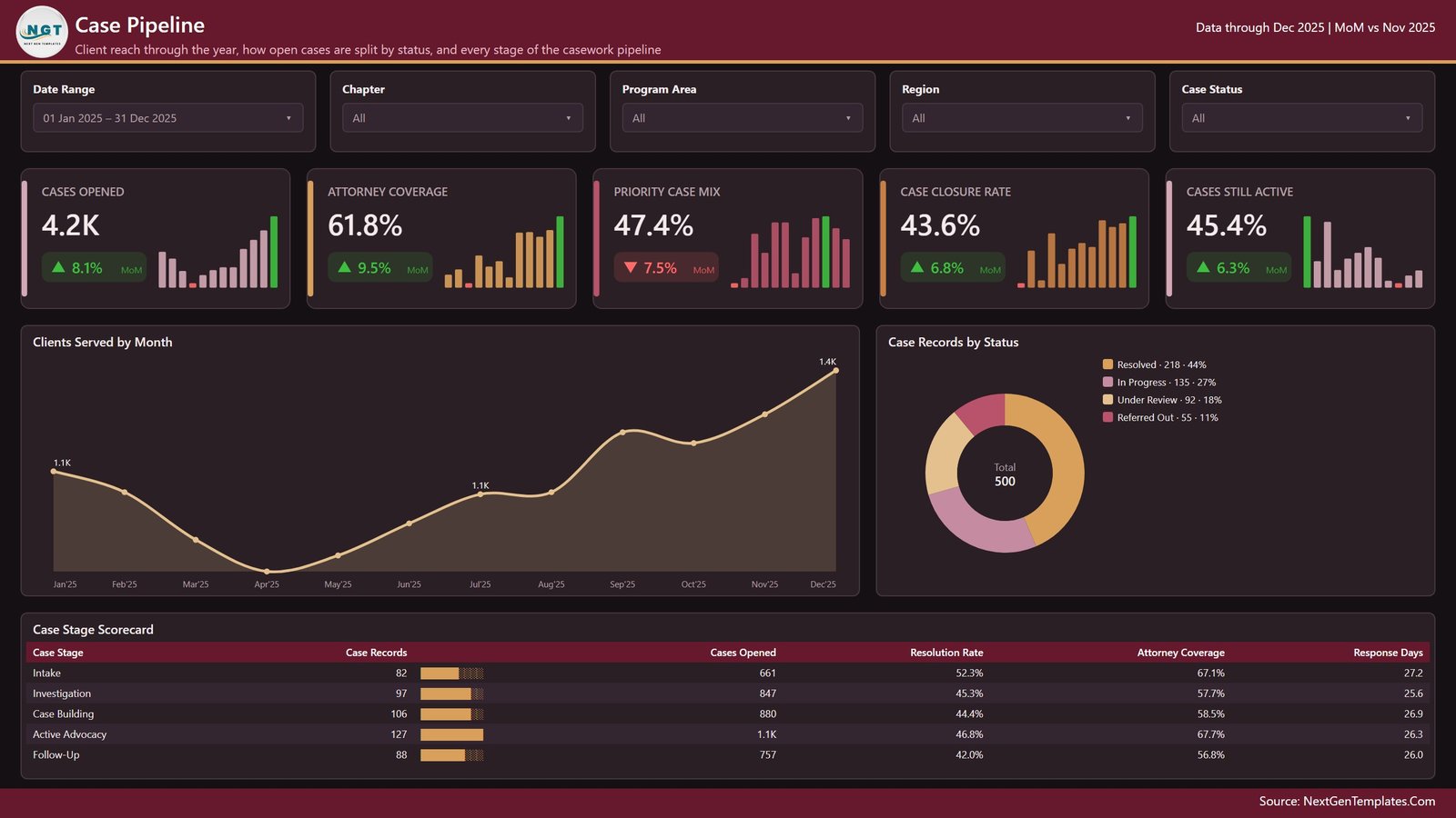
Cards cover Cases Opened, Cases Resolved, Resolution Rate, Programme Spend and Funds per Case Resolved. Visuals are Funds Raised vs Programme Spend by Area, Clients Served by Programme Area, and a Programme Area Scorecard table listing case records, clients served, cases resolved, resolution rate and impact score for each of the seven programme labels in the sample data.
Page 4: Chapter Impact
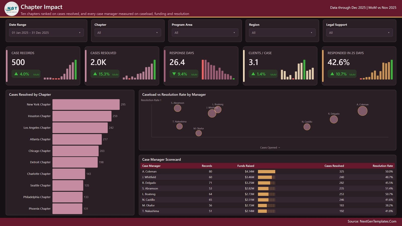
Five cards show Case Records, Cases Resolved, average Response Days, Clients per Case and the share Responded in 25 Days. Visuals are Cases Resolved by Chapter, Caseload vs Resolution Rate by Manager, and a Case Manager Scorecard table. The page filter is legal support.
Page 5: Case Pipeline
Cards report Cases Opened, Attorney Coverage, Priority Case Mix, Case Closure Rate and Cases Still Active. Visuals are Clients Served by Month, Case Records by Status, and a Case Stage Scorecard table covering intake, investigation, case building, active advocacy and follow-up. The page filter is case status.
📊 This Template vs. Tableau / Qlik vs. Paid Non-Profit SaaS — Where This Fits
| Feature | Civil Rights Organizations Dashboard in Power BI | Tableau / Qlik build | Salesforce Nonprofit Cloud / Blackbaud |
|---|---|---|---|
| Cost | $17.99 one-time | $75+ / user / month for Tableau Creator | $60-200 / user / month |
| Platform | Power BI Desktop (free) | Tableau Desktop or Qlik Sense licence | Vendor cloud only |
| Setup time | Under 10 minutes | Days to build from scratch | Weeks of implementation |
| Pre-built KPI cards | 24, with MoM deltas | Build your own | Configured by vendor |
| Pre-written DAX measures | 38 included | None — write your own calcs | Not applicable |
| Drillthrough to record level | ✅ Included | ✅ If you build it | ✅ |
| Rename categories yourself | ✅ Plain text fields | ✅ | Admin change request |
| Data stays on your machine | ✅ Local .pbix file | Depends on deployment | ❌ Vendor-hosted |
| Year-1 cost at 5 users | $17.99 | $4,500+ | $3,600-12,000 |
For a small advocacy or non-profit team that wants a working funding-and-casework report this week without a per-seat BI licence, the Civil Rights Organizations Dashboard in Power BI sits in the sweet spot.
👥 Who This Template Is For — and Who It’s Not For
✅ This template is built for:
- Operations and programme managers at non-profit or advocacy organisations with 5-200 staff who already keep case, funding and outreach records in a spreadsheet or CRM export
- Development and fundraising leads who report pledged versus received funding to a board each quarter
- Analysts and consultants who need a ready Power BI structure to adapt to a client’s own programme data
- Anyone learning Power BI who wants a finished, well-organised model to take apart
❌ This template is NOT for:
- Legal case management — this is a reporting view, not a matter-management, evidence, conflicts or court-filing system
- Establishing, measuring or evidencing discrimination, legal merit, or any human-rights or regulatory finding. It reports whatever numbers you load and nothing more
- Teams needing real-time multi-user editing, row-level security or an audit trail out of the box
- Organisations that need a hosted, vendor-supported system with a service-level agreement
🔒 Data protection note: the sample data contains no real people. If you load your own casework records, they may include personal or special-category data about identifiable individuals. Handle, store and share the resulting file in line with your own data-protection policy and the law that applies to you. This template makes no compliance claim of any kind.
⚙️ How to Use the Civil Rights Organizations Dashboard in Power BI
- Unzip the download and open the
.pbixfile in Power BI Desktop, which Microsoft provides free. - Open the included
Data.xlsxand review the 22 columns of the case table so you know what the model expects. - Replace the 500 demo rows with your own export, keeping the column headers identical.
- In Power BI, use Transform data to repoint the source to your file, then close and apply.
- Click Refresh. Every card, chart and scorecard recalculates from your data.
- Rename chapters, programme areas, stages and statuses to match your own structure by editing them in the source file.
- Use the slicers to narrow a view, then right-click a chart and choose Drillthrough to inspect the underlying records.
💼 Real-World Use Cases
Maria coordinates programmes at a ten-office non-profit. Each month she exports her case log, refreshes the Chapter Impact page, and sends the board a single view of cases resolved per office and average response days — replacing three hand-built spreadsheets.
Daniel runs development at a mid-sized advocacy organisation. He uses the Funding Trend page to show the gap between pledged and received funding by quarter and by funding source, so the finance committee can see the pledge-conversion rate without him rebuilding the chart every time.
Priya is a freelance data consultant. She buys the template as a starting structure, renames the programme labels to her client’s own service lines, and delivers a working Power BI report in two days instead of two weeks.
❓ Frequently Asked Questions
Is the data in the Civil Rights Organizations Dashboard in Power BI real?
No. The Civil Rights Organizations Dashboard in Power BI ships with 500 rows of invented demo data used only to show the layout. No figure, name or category in it refers to a real organisation, person, cause or place. Replace it with your own records.
Does this template measure discrimination or produce legal findings?
No. The Civil Rights Organizations Dashboard in Power BI is an administrative reporting tool. It counts and charts whatever operational data you load — cases, funding, clients, response times — and makes no legal, regulatory or advocacy-outcome claim of any kind.
How long does setup take?
Under 10 minutes for most buyers. Open the .pbix in Power BI Desktop, repoint the source to your own file using the same 22 column headers, and press Refresh. All 24 KPI cards and every chart update automatically.
What software do I need?
Power BI Desktop for Windows, which Microsoft distributes free from powerbi.microsoft.com. No Power BI Pro licence, no subscription and no add-ins are required to open, edit and use the Civil Rights Organizations Dashboard in Power BI.
How does this compare to Salesforce Nonprofit Cloud or Blackbaud?
Those are full hosted CRM systems billed per user per month. The Civil Rights Organizations Dashboard in Power BI is a one-time $17.99 reporting file that sits on top of data you already hold. It does not replace a CRM — it reports on the export from one.
Can I rename the programme areas and chapters?
Yes. Every category in the Civil Rights Organizations Dashboard in Power BI is a plain text field in the source workbook. Rename the ten chapter labels, the seven programme labels, the case stages and the statuses to match your own structure and the visuals follow.
Is my data uploaded anywhere?
No. The Civil Rights Organizations Dashboard in Power BI is a local .pbix file. Your data stays on your machine unless you choose to publish the report to your own Power BI service workspace.
👤 About the Author
Built by PK — Microsoft Certified Professional with 15+ years of Excel, Google Sheets, and Power BI experience. Founder of NextGenTemplates, reaching 300K+ subscribers across YouTube channels (@PK-AnExcelExpert, @NextGenTemplates, @NeoTechNavigators). Every template is hand-built and tested before release.
🔗 Explore Related Templates
Also available as: the same build ships for spreadsheet users as the Civil Rights Organizations Dashboard in Excel — identical pages and metrics, no Power BI Desktop needed.
- Community Development Dashboard in Power BI — the closest neighbour, for programme and community reporting.
- Organ Donation Networks Dashboard in Power BI — another non-profit operations build in the same style.
- Civil Rights Organizations KPI Dashboard in Power BI — a different, more compact template: a one-page KPI scorecard with targets and traffic lights rather than this multi-page analytical report. Buy it if you want a monthly scorecard; buy this one if you want to explore the data.
- Nonprofit Organizations Dashboard in Google Sheets — a browser-based alternative for teams without Power BI.
Browse the full range of Power BI Dashboard templates or the wider Power BI template catalogue.
📖 Click here to read the Detailed Blog Post
🎥 Visit our YouTube channel for step-by-step video tutorials
👉 YouTube.com/@NextGenTemplates
📅 Last updated: August 2026
Reviews
There are no reviews yet.