

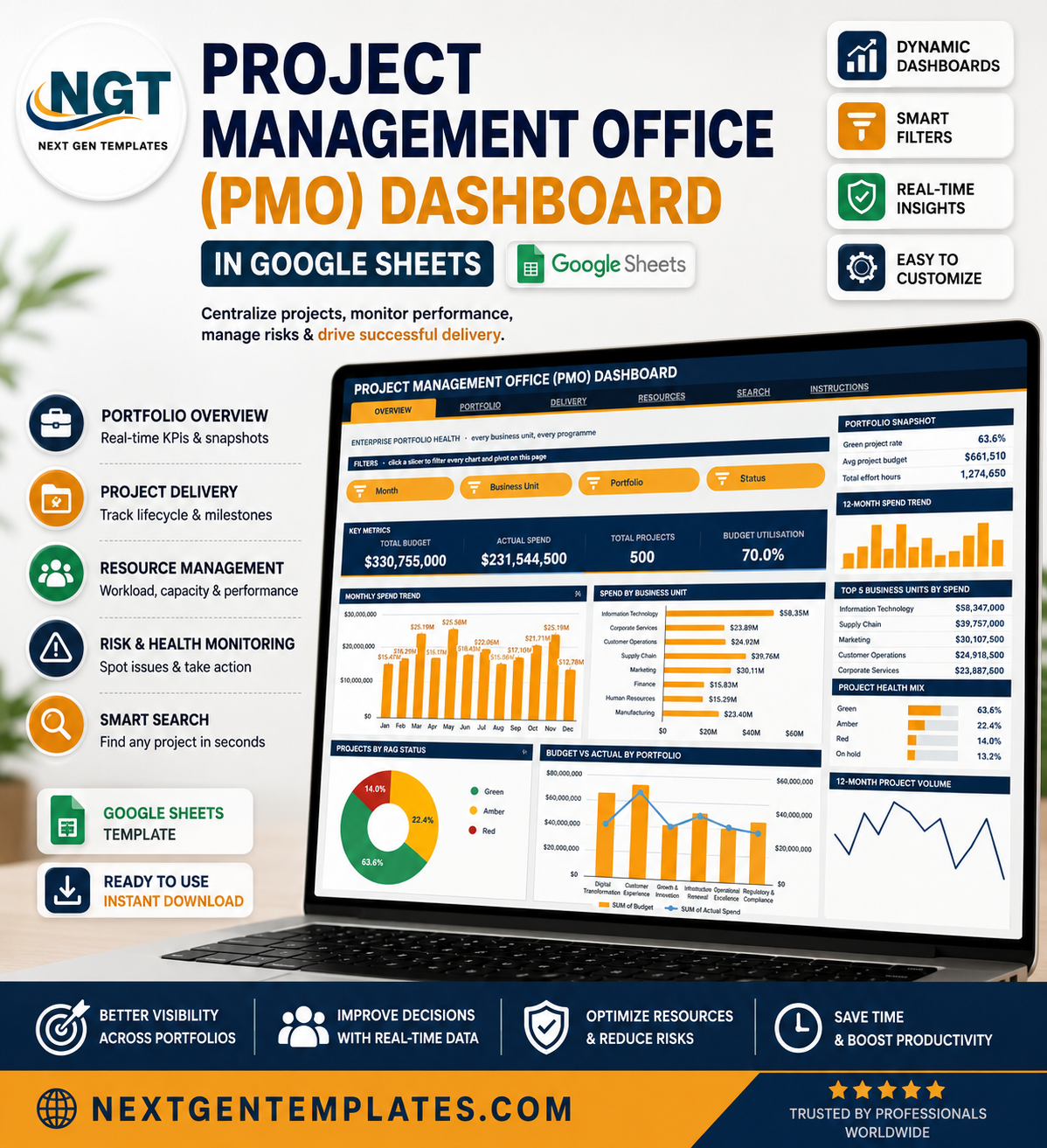
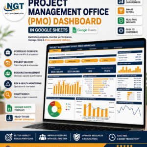
The Project Management Office (PMO) Dashboard in Google Sheets gives a PMO lead one browser tab that answers the three questions every steering committee asks: what are we spending, what is slipping, and who is overloaded. The sample file ships with 500 projects, 8 business units, 6 portfolios, 10 project managers, $330,755,000 of tracked budget and 1,274,650 effort hours already loaded, so you can click every slicer before you type a single row of your own. Six linked pages, sixteen KPI cards, sixteen pivot-driven charts and sixteen slicers. Built and tested by hand, delivered as an instant download with a Make a Copy link, and yours for life – no seat licence, no renewal, no add-on to install.
Key Features of the Project Management Office (PMO) Dashboard
- Native pivot tables and slicers. Every chart reads a real pivot table parked to the right of each page. There are no SUMPRODUCT chains behind the visuals, so the file stays fast as the project register grows.
- Four slicers per page. Click one and all four charts plus the sidebar Top 5 panel re-filter together. Slicers are per page, so Delivery can sit on Red while Resources sits on a single sponsor.
- Sixteen KPI cards driven by SUMIFS and COUNTIFS on the Data sheet, deliberately unfiltered so the enterprise totals never move under you while you drill.
- A sidebar on every analysis page – snapshot metrics, a 12-month spend sparkline, a Top 5 ranking table, a percentage mix bar list and an At a Glance block.
- A Search page that pulls the full 17-field record for any Project ID from a dropdown.
- Numbered phase and risk values (1 Initiation through 6 Closure, 1 Low through 4 Critical) so charts stay in true lifecycle order instead of sorting alphabetically.
- Auto-expansion to 1,000 project rows. Pivots, slicers and formulas already cover the range; paste and go.
- One-line theming – the palette block at the top of the Apps Script file sets ink #16304F, accent #F5A524 and sky #4FB0C6 everywhere.
What’s Inside the Project Management Office (PMO) Dashboard
Overview – enterprise portfolio health
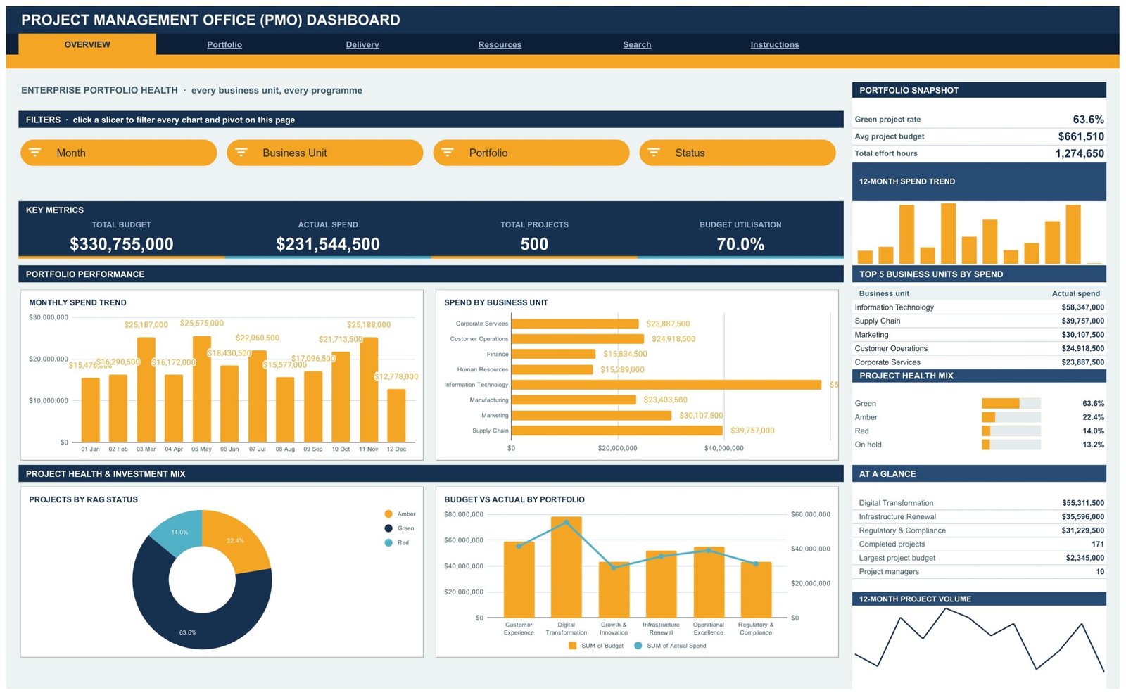
Total Budget $330,755,000, Actual Spend $231,544,500, Total Projects 500 and Budget Utilisation 70.0% sit across the top. Below them, Monthly Spend Trend, Spend by Business Unit, Projects by RAG Status and Budget vs Actual by Portfolio. The sidebar carries a green project rate of 63.6%, average project budget of $661,510, the Top 5 Business Units by Spend and a project health mix. Slicers: Month, Business Unit, Portfolio, Status.
Portfolio – where the money is committed
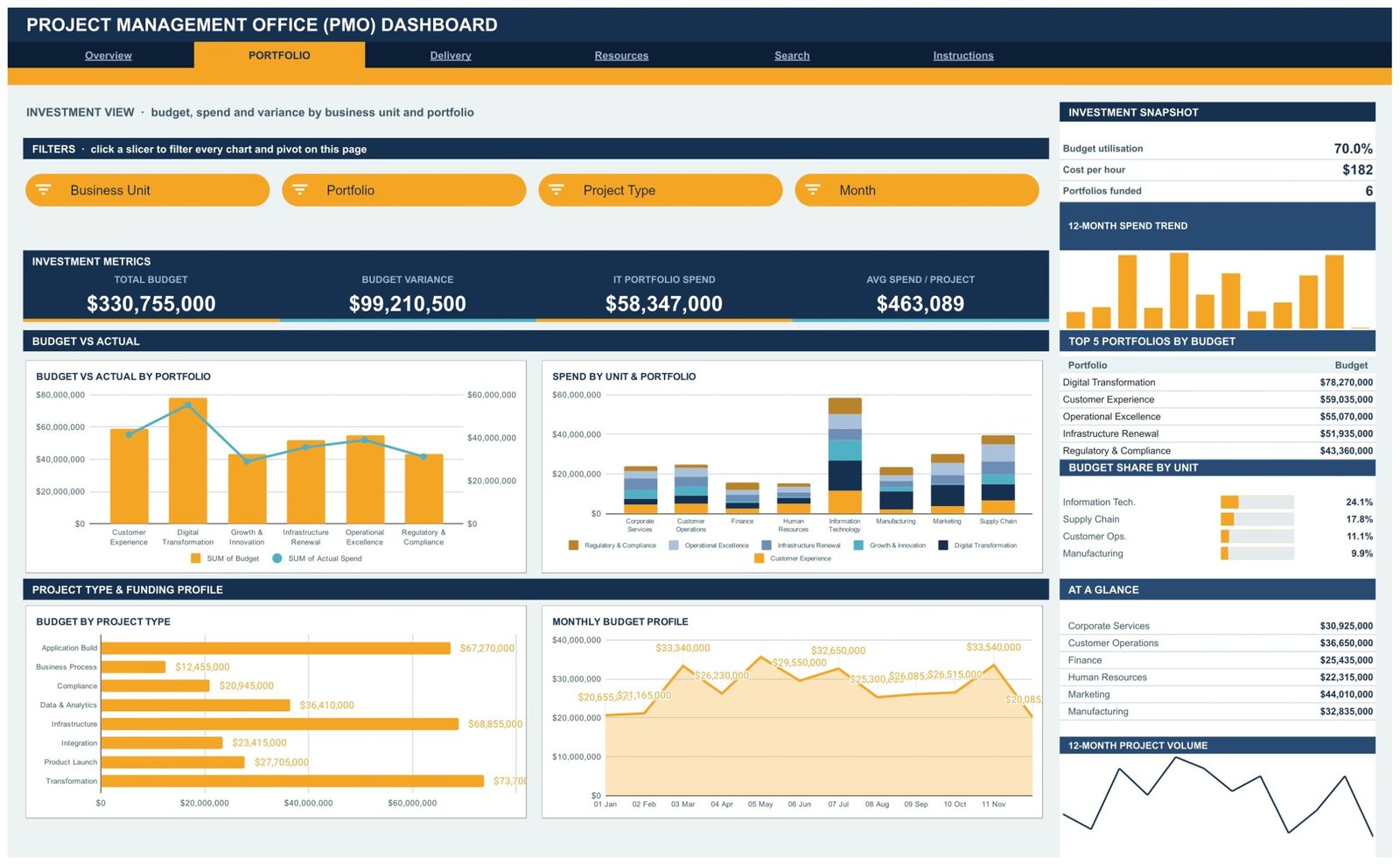
Budget Variance of $99,210,500 and Avg Spend per Project of $463,089 headline this page. Budget vs Actual by Portfolio, Spend by Unit and Portfolio, Budget by Project Type and Monthly Budget Profile show where funding sits and how it is drawn down. The sidebar ranks the Top 5 Portfolios by Budget – Digital Transformation leads at $78,270,000 – and shows budget share by unit, with Information Technology at 24.1%. Slicers: Business Unit, Portfolio, Project Type, Month.
Delivery – RAG status, phase and schedule slip
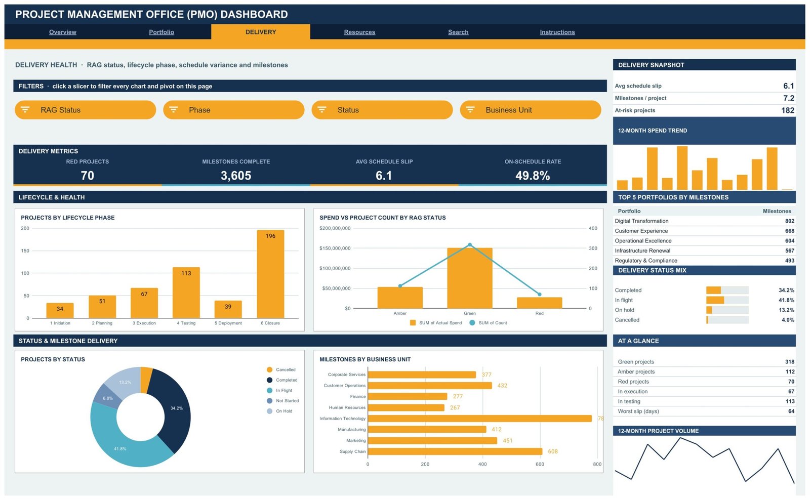
Red Projects 70, Milestones Complete 3,605, Avg Schedule Slip 6.1 days and On-Schedule Rate 49.8%. Projects by Lifecycle Phase, Spend vs Project Count by RAG Status, Projects by Status and Milestones by Business Unit make the delivery picture concrete. The sidebar flags 182 at-risk projects and a worst slip of 64 days. Slicers: RAG Status, Phase, Status, Business Unit.
Resources – workload, sponsors and risk
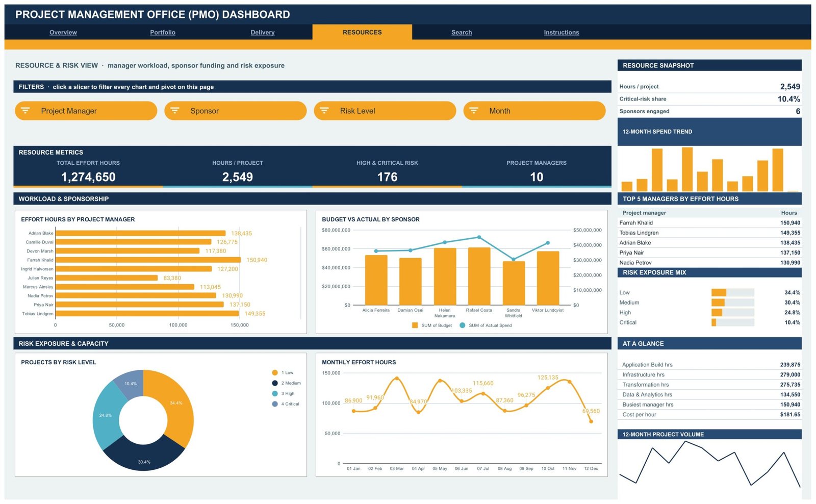
Total Effort Hours 1,274,650, Hours per Project 2,549, High and Critical Risk 176, Project Managers 10. Effort Hours by Project Manager, Budget vs Actual by Sponsor, Projects by Risk Level and Monthly Effort Hours expose the capacity story – Farrah Khalid carries 150,940 hours against Julian Reyes on 83,380. Critical risk sits at 10.4% of the portfolio. Slicers: Project Manager, Sponsor, Risk Level, Month.
Search – the full record for one project
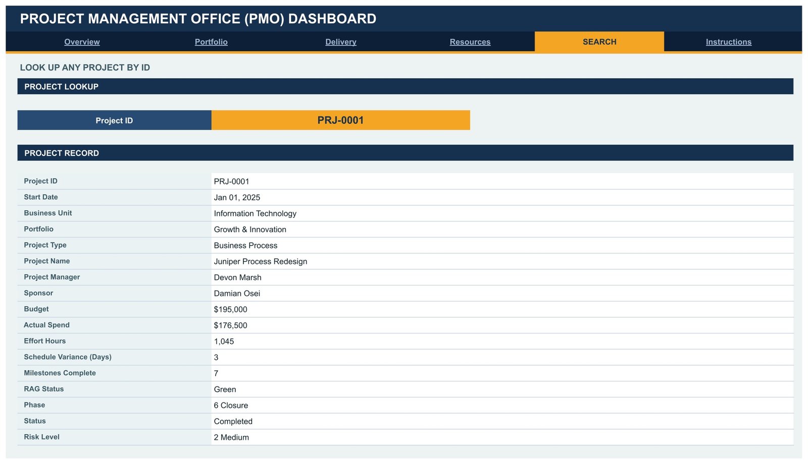
Pick a Project ID from the dropdown and the page returns start date, business unit, portfolio, project type, project name, manager, sponsor, budget, actual spend, effort hours, schedule variance, milestones complete, RAG status, phase, status and risk level. This is the page you open when a sponsor asks about one specific initiative in a review.
Instructions – a ten-step user guide
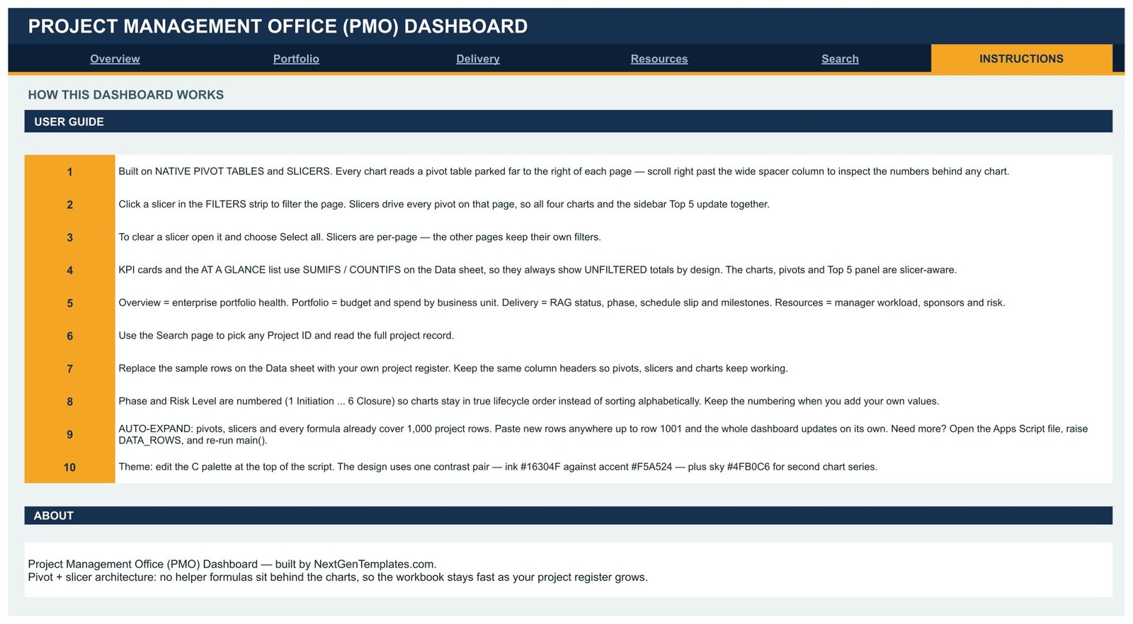
A plain-English guide covering how the pivots and slicers work, why the KPI cards stay unfiltered, how to swap in your own project register, how the numbered phase values keep charts in order, and how to raise the row limit past 1,000.
PMO Dashboard in Google Sheets vs. Excel vs. Paid PPM SaaS – Where This Fits
| This Google Sheets PMO Dashboard | Excel PMO workbook | Asana / Monday.com / Smartsheet | |
|---|---|---|---|
| Cost | $9.99 once | $15-30 once, plus an Office licence | $10-25 per user per month |
| Platform | Any browser, Google Sheets | Desktop Excel | Vendor cloud |
| Setup time | About 15 minutes | 30-60 minutes | Days to weeks of configuration |
| Real-time team collaboration | Yes, native | Only via SharePoint co-authoring | Yes |
| Mobile access | Google Sheets app | Limited | Yes |
| Customisable fields | Yes, edit the Data sheet headers | Yes | Yes, within the vendor’s model |
| Share with a link | Yes | File attachment or drive link | Yes |
| Year-1 cost at 5 users | $9.99 | $15-30 plus licences | $600-1,500 |
| Portfolio-level RAG and budget variance out of the box | Yes, on the Overview and Delivery pages | Build it yourself | Yes, usually on a higher tier |
| You own and can edit the logic | Yes, Apps Script and pivots are open | Yes | No |
Who This Template Is For – and Who It’s Not For
A good fit if you run a PMO or a programme office of 20-1,000 projects, report to a monthly or quarterly steering committee, already keep a project register in a spreadsheet, and want portfolio-level budget, RAG and capacity reporting without paying per seat.
Not a good fit if you need Gantt scheduling with dependencies and critical path, resource levelling across calendars, timesheet capture from staff, or a system of record with per-user permissions and an audit trail. This is a reporting layer over a project register, not a scheduling engine or a PPM platform. If you only run five projects, a simple task list will serve you better.
How to Use the Project Management Office (PMO) Dashboard
- Download the PDF from your order and click the Make a Copy link to create your own Google Sheet.
- Open the Instructions page and read the ten steps – about three minutes.
- Go to the Data sheet and replace the 500 sample rows with your own project register. Keep the column headers exactly as they are.
- Keep the numbering on Phase (1 Initiation to 6 Closure) and Risk Level (1 Low to 4 Critical) so the charts stay in lifecycle order.
- Return to Overview and click a slicer. All four charts and the Top 5 sidebar re-filter together; choose Select all to clear.
- Use the Search page to pull a single project record before a sponsor review.
- Share the sheet with your steering committee as view-only, or with your programme managers as editors.
Real-World Use Cases
Priya, PMO manager at a 900-person manufacturer. Her monthly pack used to take two days of copy-paste. She now pastes the register export into the Data sheet on the first working day, screenshots the Overview and Delivery pages, and the pack is done before lunch.
Daniel, IT programme director. He filters the Portfolio page to Information Technology, sees the unit holds 24.1% of enterprise budget, and takes that single number into the capital planning meeting instead of a 40-tab workbook.
Anika, delivery lead at a consultancy. She opens Resources every Monday, sorts the Effort Hours by Project Manager chart, and rebalances work before a manager quietly tips into overload.
Frequently Asked Questions
Do I need Apps Script knowledge to use this?
No. The dashboard arrives fully built in Google Sheets. Script knowledge is only useful if you want to change the colour palette or raise the row limit above 1,000, and the Instructions page tells you exactly which two lines to edit.
How many projects can it handle?
The pivots, slicers and formulas already cover 1,000 project rows. Paste anywhere up to row 1001 and everything updates on its own. For more, raise DATA_ROWS in the script and re-run main().
Why do the KPI cards not change when I click a slicer?
That is by design. The KPI cards and the At a Glance list use SUMIFS and COUNTIFS against the Data sheet so the enterprise totals stay stable while you drill. The charts, pivots and Top 5 panel are the slicer-aware parts of each page.
Can my whole team use it at once?
Yes. It is a normal Google Sheet, so share it as you would any other. Slicer selections are per page, so give reviewers view-only access if you do not want their filtering to affect your view.
Can I change the colours to match our brand?
Yes. The design uses one contrast pair – ink #16304F against accent #F5A524 – plus sky #4FB0C6 for second chart series. Edit the palette block at the top of the script and re-run it.
Is this a one-time payment?
Yes. One payment, lifetime access to the file, no seat licence and no renewal.
Can I add my own columns?
You can add columns to the right of the existing ones. Do not rename or reorder the existing headers – the pivots, slicers and charts are bound to them.
About the Author
Built by PK – Microsoft Certified Professional with 15+ years of Excel, Google Sheets, and Power BI experience. Founder of NextGenTemplates, reaching 300K+ subscribers across YouTube channels. Every template is hand-built and tested before release.
Explore Related Templates
- Engineering Dashboard in Google Sheets – the delivery-side companion for engineering programmes.
- Knowledge Management Dashboard in Google Sheets – track what your delivery teams capture and reuse.
- Real Estate Development Dashboard in Google Sheets – capital project reporting for property programmes.
- Community Services Dashboard in Google Sheets – programme reporting for non-profit and public sector teams.
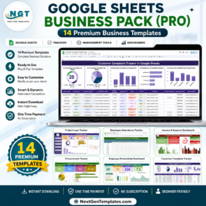
- Google Sheets Business Pack (Pro) – 14 premium business templates in one bundle.
Browse the full Google Sheets Dashboard collection or the wider Google Sheets templates category.
Get the Project Management Office (PMO) Dashboard in Google Sheets for $9.99 – instant download, Make a Copy link included, lifetime access. Read the full walkthrough on the NeoTechNavigators blog.
Watch the step-by-step video Demo:
Last updated: 14 August 2026.
























Reviews
There are no reviews yet.