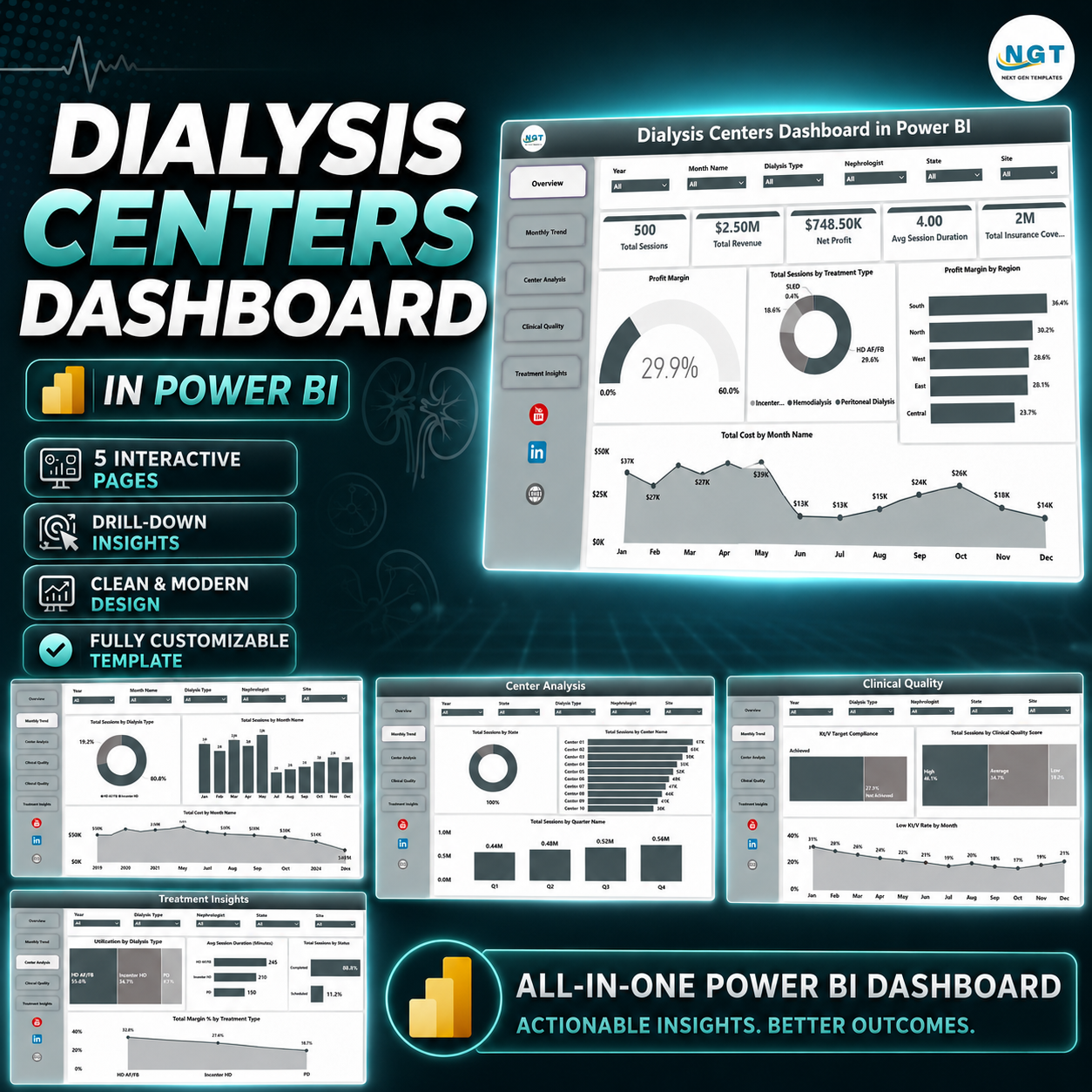

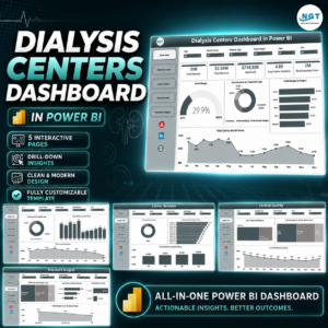
Dialysis Centers Dashboard in Power BI helps dialysis center administrators, regional clinic managers, healthcare finance teams, and nephrology analysts monitor 5 executive KPI cards, 5 interactive report pages, and focused clinical-financial visuals from one Power BI report. Dialysis operations can run hundreds or thousands of treatment sessions each month, while leadership still needs fast answers on revenue, sessions, cost, profit, insurance coverage, adequacy, complications, treatment type, city, region, center, and nephrologist performance. This ready-made Power BI dashboard gives you instant download, a one-time price, no subscription, and an editable .pbix foundation you can adapt to your own reporting model.
Instead of building visuals from scratch or depending only on static monthly spreadsheets, this dashboard gives your team a structured analytics layer for dialysis center performance reviews. Use slicers to filter the report, compare pages, identify weak margins, review clinical quality, and explain performance clearly during operations, finance, and quality meetings.
Key Features of Dialysis Centers Dashboard in Power BI
- 5 high-level KPI cards: Total Sessions, Total Revenue, Net Profit, Avg Session Duration, and Total Insurance Coverage.
- 5 report pages: Overview Page, Monthly Trend, Center Analysis, Clinical Quality, and Treatment Insights.
- Healthcare-specific analysis: Review center revenue, treatment type mix, complications, adequacy, nephrologist profit, dialyzer type, and regional margin.
- Interactive slicers: Filter the dashboard quickly by business dimensions such as center, region, treatment type, status, month, or other available fields.
- Power BI visuals: Built with cards, bar charts, line charts, column charts, slicers, and profitability views for fast executive scanning.
- Editable .pbix file: Replace the sample data model with your own source and customize visuals, measures, labels, colors, and pages.
What’s Inside the Dialysis Centers Dashboard in Power BI
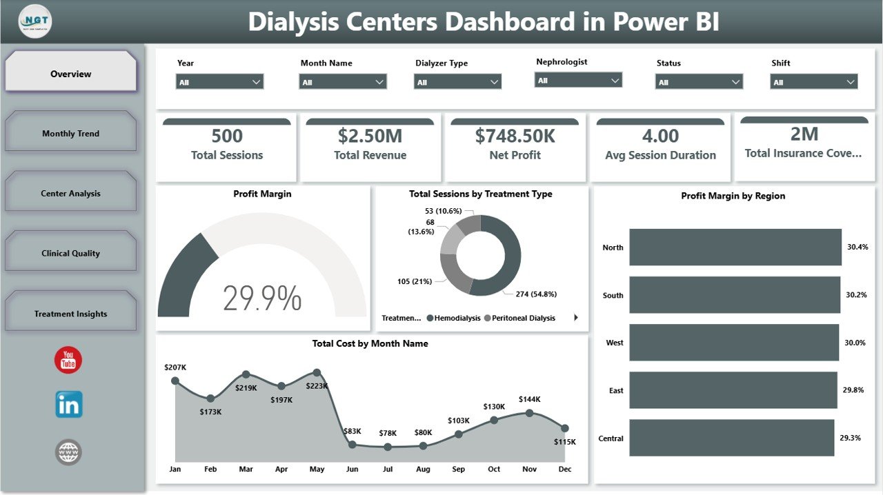
1. Overview Page
The Overview Page starts with cards for Total Sessions, Total Revenue, Net Profit, Avg Session Duration, and Total Insurance Coverage, giving leadership a fast reading of volume, financial performance, time efficiency, and payer coverage. Profit Margin by Overall Performance shows how margin changes across performance categories, helping managers identify where the center is financially strong or under pressure.
Total Sessions by Treatment Type compares the workload created by different treatment categories and helps operations teams understand service mix. Profit Margin by Region highlights which regions are driving stronger returns, while Total Cost by Month Name reveals cost movement across the year for finance review.
Dialysis Centers Dashboard in Power BI
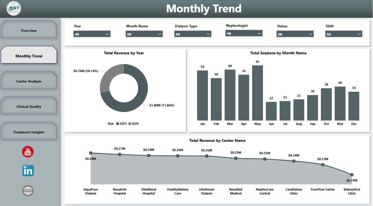
2. Monthly Trend
The Monthly Trend page focuses on time-based performance. Total Revenue by Year compares annual revenue movement so leadership can see growth or decline at a glance. Total Sessions by Month Name shows treatment volume by month and helps identify seasonal workload patterns.
Total Revenue by Center Name ranks centers by financial contribution, making it easier to see which sites are carrying the largest share of revenue and where management attention may be needed.

Monthly Trend
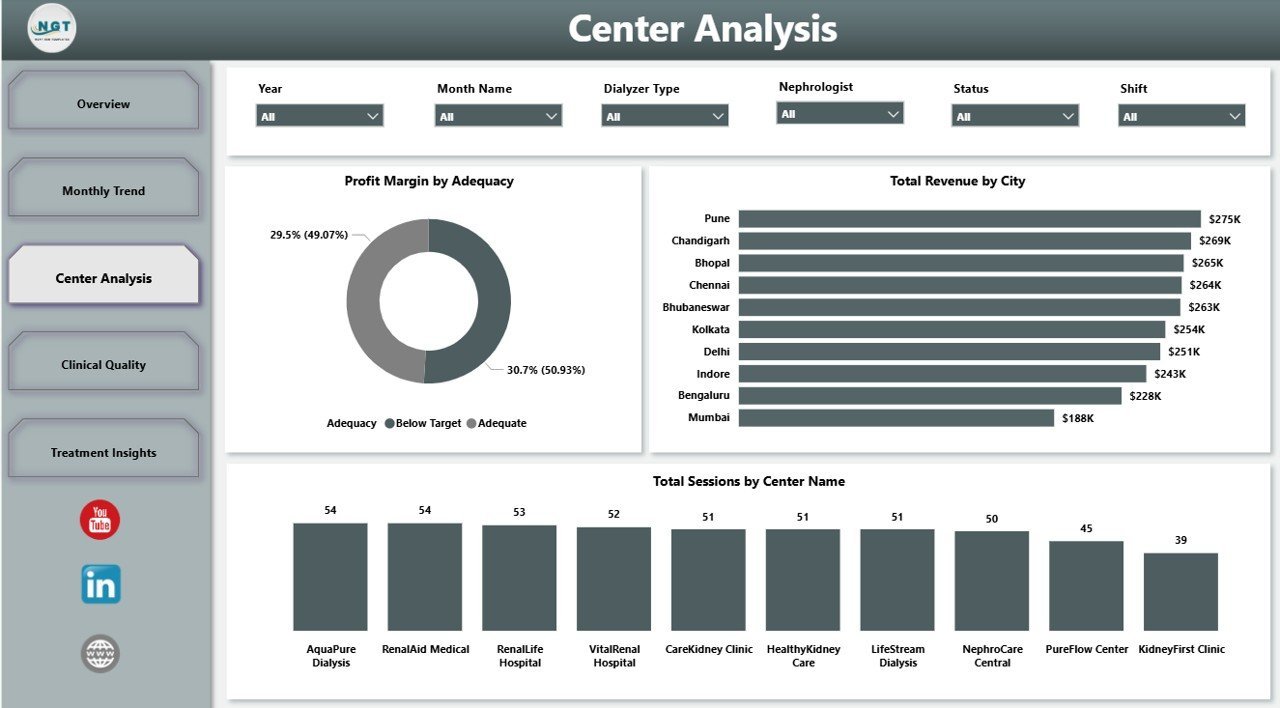
3. Center Analysis
The Center Analysis page supports branch-level review. Profit Margin by Adequacy connects clinical adequacy groupings with financial results so quality and finance teams can discuss performance together. Total Revenue by City shows where revenue is concentrated geographically.
Total Sessions by Center Name compares patient service volume across centers, helping administrators spot high-demand sites and centers that may need operational review.

Center Analysis
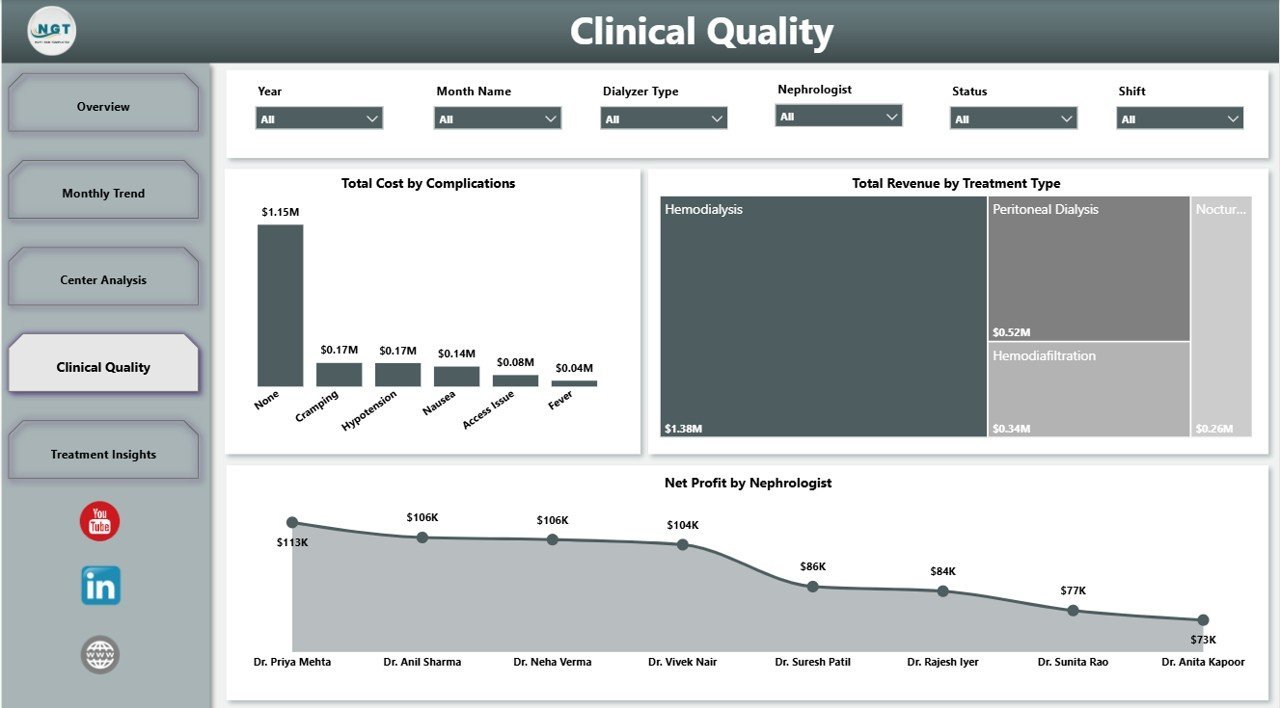
4. Clinical Quality
The Clinical Quality page connects clinical events with financial performance. Total Cost by Complications helps quantify the cost impact of complication categories, supporting quality improvement and cost-control conversations. Total Revenue by Treatment Type compares financial contribution across treatment modalities.
Net Profit by Nephrologist gives leadership a provider-level profitability view for internal management reporting, while still requiring appropriate context and responsible interpretation.

Clinical Quality
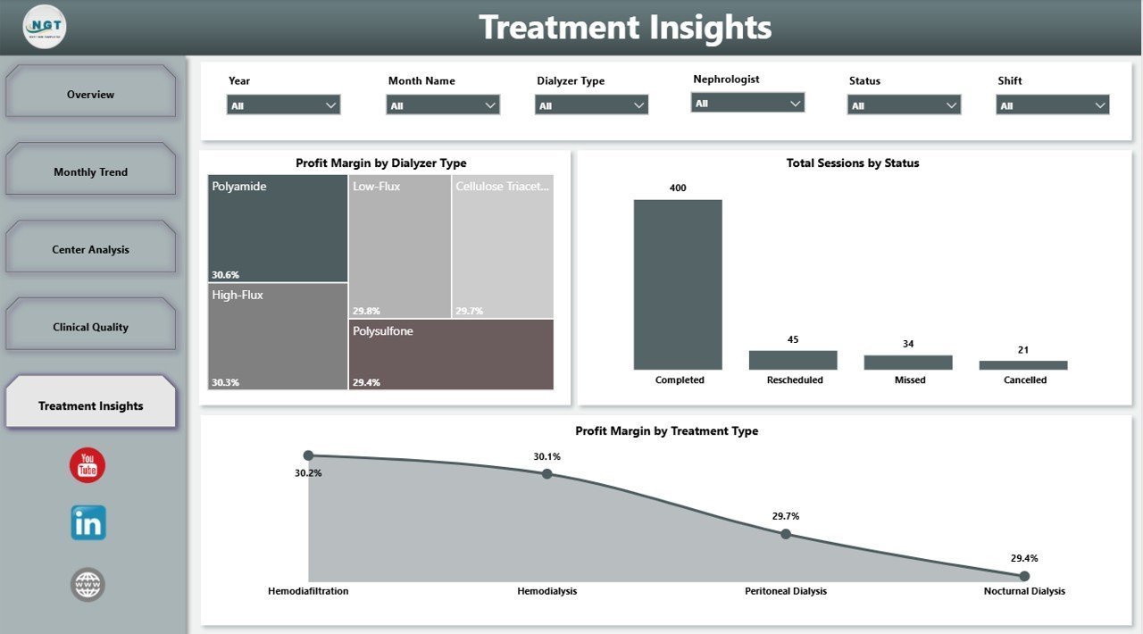
5. Treatment Insights
The Treatment Insights page helps managers understand treatment delivery patterns. Profit Margin by Dialyzer Type compares profitability across dialyzer categories and can support product, cost, or protocol discussions. Total Sessions by Status shows completed, cancelled, pending, or other session statuses for operational follow-up.
Profit Margin by Treatment Type compares profitability by modality, helping finance and clinical operations teams understand which treatment categories affect margin most.

Treatment Insights
Dialysis Centers Dashboard in Power BI vs. Tableau vs. Paid Healthcare SaaS – Where This Fits
| Feature | This Power BI Dashboard | Tableau Alternative | Paid Healthcare SaaS |
|---|---|---|---|
| Cost | $17.99 one-time | Requires separate build and licenses | Monthly or annual subscription |
| Platform | Power BI Desktop | Tableau Desktop / Cloud | Vendor-hosted platform |
| Setup time | Open .pbix and replace sample source | Build model and visuals | Implementation and onboarding |
| Real-time team collaboration | Via Power BI Service when published | Via Tableau Cloud/Server | Usually included |
| Mobile access | Power BI mobile after publishing | Tableau mobile after publishing | Vendor app or browser |
| Customizable fields | Editable report and model | Editable with Tableau skills | Limited by vendor configuration |
| Share with link | Possible through Power BI Service | Possible through Tableau Cloud | Login controlled |
| Year-1 cost at 5 users | $17.99 plus any Microsoft licensing | Often much higher after licenses | Often hundreds or thousands |
| Dialysis-specific pages | Built in across 5 pages | Must be built | Depends on vendor module |
Who This Template Is For – and Who It’s Not For
This template is built for dialysis center owners, administrators, operations managers, healthcare analysts, finance managers, nephrology department leaders, and consultants who need an editable Power BI report for sessions, revenue, cost, net profit, insurance coverage, clinical quality, center performance, and treatment insights.
It is not an EHR, billing system, patient scheduling tool, live clinical monitoring system, claims platform, or medical decision tool. Use it as a reporting dashboard after approved operational data has been exported and prepared for analysis.
How to Use the Dialysis Centers Dashboard in Power BI
- Download and unzip the product file.
- Open the .pbix file in Power BI Desktop.
- Review the sample model, pages, slicers, and measures.
- Replace the sample source with your own dialysis center dataset.
- Refresh the report and validate totals against your source data.
- Customize visuals, labels, colors, and measures as needed.
- Publish to Power BI Service if your organization wants browser or mobile sharing.
Real-World Use Cases
Aisha, dialysis center administrator: Aisha uses the Overview and Treatment Insights pages before weekly operations meetings to review sessions, status, treatment mix, and session duration.
Rahul, healthcare finance manager: Rahul checks revenue by center, total cost by month, profit margin by region, and net profit by nephrologist to identify areas needing cost or revenue review.
Maria, clinical quality analyst: Maria reviews complications, adequacy, treatment type, and dialyzer views to prepare quality improvement talking points for leadership.
Frequently Asked Questions
What KPI cards are included?
The Overview Page includes Total Sessions, Total Revenue, Net Profit, Avg Session Duration, and Total Insurance Coverage.
Do I need Power BI Desktop?
Yes. Open the .pbix file in Power BI Desktop, which is available from Microsoft, then connect or replace the sample data source.
Can I publish this dashboard online?
Yes. After customizing the report, you can publish it to Power BI Service if your Microsoft account and licensing support publishing and sharing.
Can I customize the visuals and DAX measures?
Yes. The .pbix file is editable, so you can adjust pages, visuals, fields, relationships, and calculations to match your reporting model.
Is this a clinical decision system?
No. It is a management analytics dashboard for operational reporting, not a medical device, EHR, or clinical decision support system.
Can this support multiple dialysis centers?
Yes, if your data includes a center field. The Center Analysis page and related slicers are designed for center-level review.
About the Author
Built by PK – Microsoft Certified Professional with 15+ years of Excel, Google Sheets, and Power BI experience. Founder of NextGenTemplates, reaching 300K+ subscribers across YouTube channels. Every template is hand-built and tested before release.
Explore Related Templates
Browse more Power BI templates and Power BI dashboard templates. Related downloads include Dialysis Centers Dashboard in Excel, Dialysis Centers KPI Dashboard in Power BI, and Cardiac Care Units Dashboard in Power BI.
Ready to analyze dialysis center performance in Power BI? Download the Dialysis Centers Dashboard in Power BI, replace the sample data, refresh the report, and start reviewing sessions, revenue, cost, clinical quality, and treatment insights today.
Last updated: June 2026


Reviews
There are no reviews yet.