

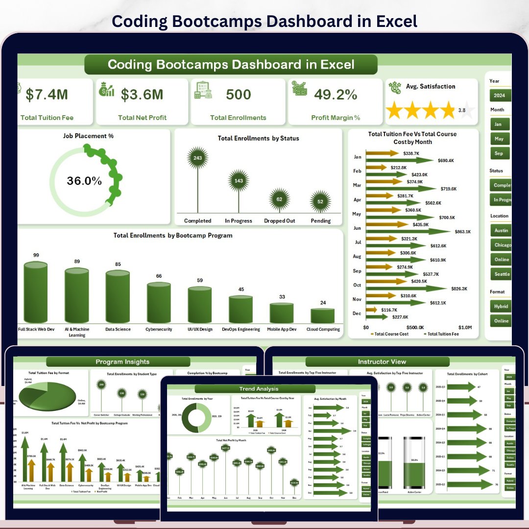



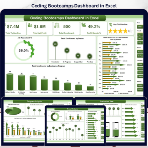
The Coding Bootcamps Dashboard in Excel tracks 5 high-level KPIs across 5 interactive analysis pages, featuring 16 pre-built charts, dynamic slicers, and a fully pivot-driven architecture. Setup takes under 10 minutes — paste your enrollment data into the Data Sheet and every chart updates automatically when you click Refresh All.
🌍 Join 8,400+ teams in 40+ countries using Excel Dashboard Templates from Nextgen Templates to replace paid SaaS tools with one-time-purchase templates.
✅ Instant download · One-time payment · No subscription · No per-user fees · Lifetime access
🔑 Key Features of Coding Bootcamps Dashboard in Excel
- 🔹 5-page interactive dashboard — Overview, Program Insights, Trend Analysis, Instructor View, and Placement Analysis, each built for a distinct management lens.
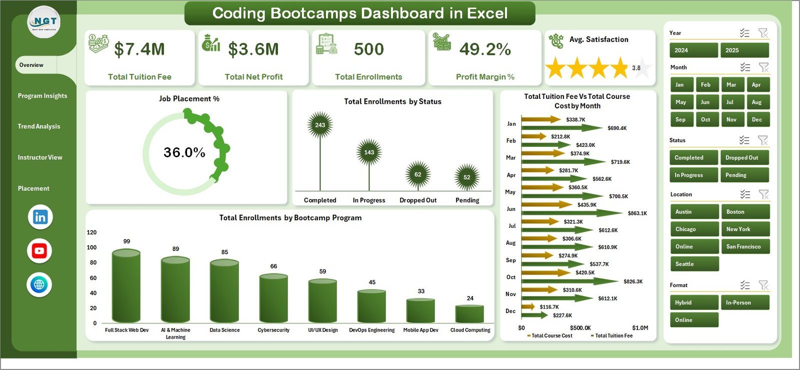
- 🔹 5 KPI summary cards — Total Tuition Fee, Total Net Profit, Total Enrollments, Profit Margin %, and Avg. Satisfaction displayed at a glance on the Overview page.
- 🔹 16 pre-built charts covering job placement rates, enrollment by status, tuition vs cost by month, program-level completion %, instructor rankings, and more.
- 🔹 Dynamic slicers for instant filtering — filter every page by Bootcamp Program, Student Type, Format, Cohort, and Location without writing a single formula.
- 🔹 Instructor performance benchmarking — rank top 5 instructors by enrollments, avg. satisfaction, and completion rate to inform resourcing and teaching assignments.
- 🔹 Job placement analytics — measure Job Placement % by student type, bootcamp program, and location; cross-reference with satisfaction scores to identify highest-ROI programs.
- 🔹 Pivot-driven auto-refresh — all charts feed from pivot tables in a hidden Support Sheet; click Refresh All and every chart updates instantly.
- 🔹 Works in Microsoft Excel — no VBA macros, no plugins, no add-ins required.
📦 What’s Inside the Coding Bootcamps Dashboard in Excel
Page 1: Overview
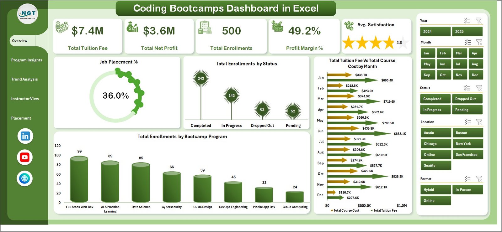
The Overview page displays 5 KPI cards — Total Tuition Fee, Total Net Profit, Total Enrollments, Profit Margin %, and Avg. Satisfaction — plus dynamic slicers and 4 charts: Job Placement %, Total Enrollments by Status, Total Tuition Fee vs Total Course Cost by Month, and Total Enrollments by Bootcamp Program.
Page 2: Program Insights
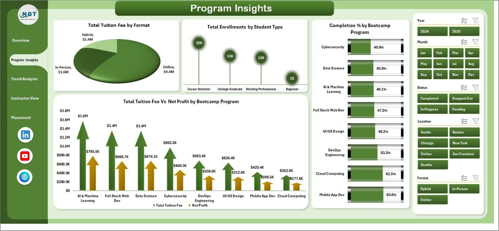
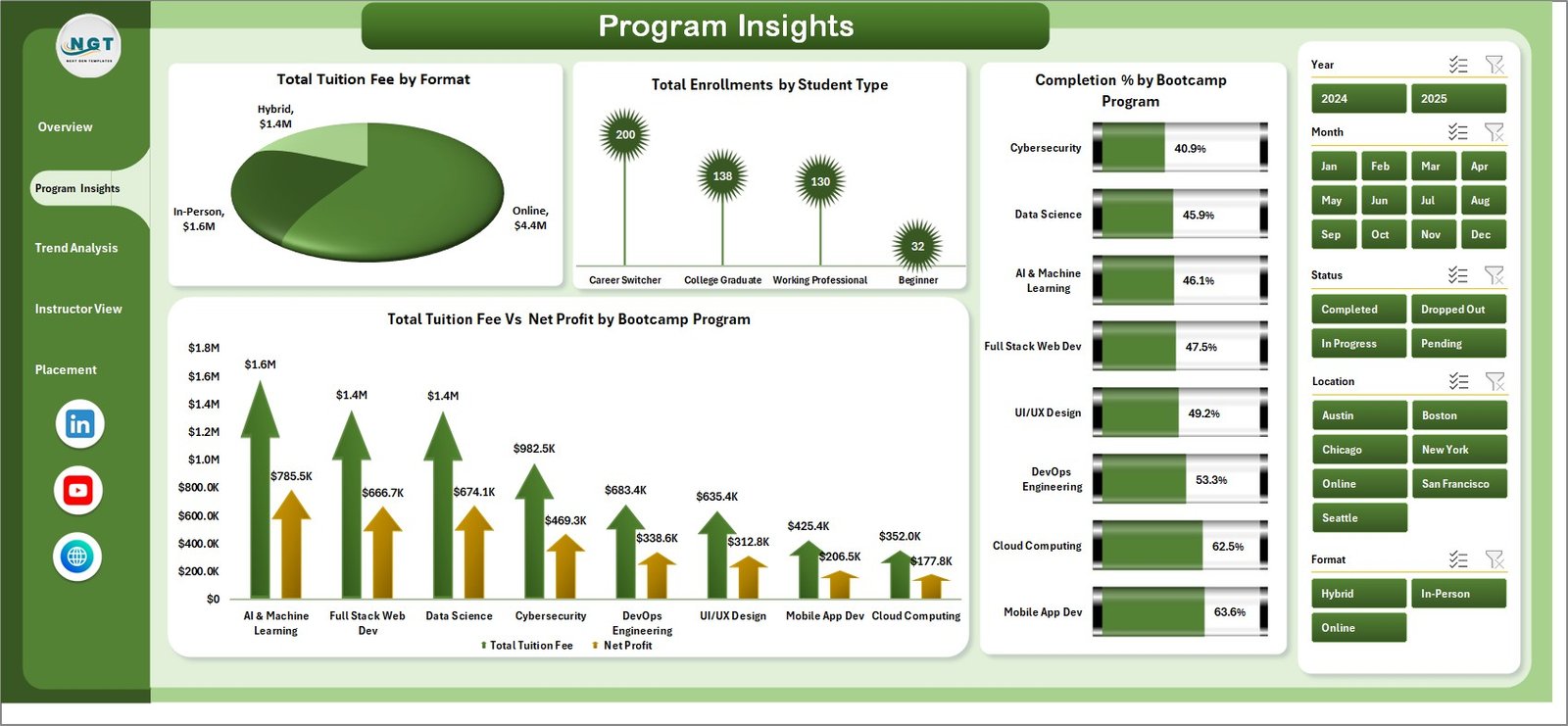
Program Insights breaks down performance across 4 charts: Total Tuition Fee by Format, Total Enrollments by Student Type, Completion % by Bootcamp Program, and Total Tuition Fee vs Net Profit by Bootcamp Program — revealing which programs deliver the highest margins and completion rates.
Page 3: Trend Analysis
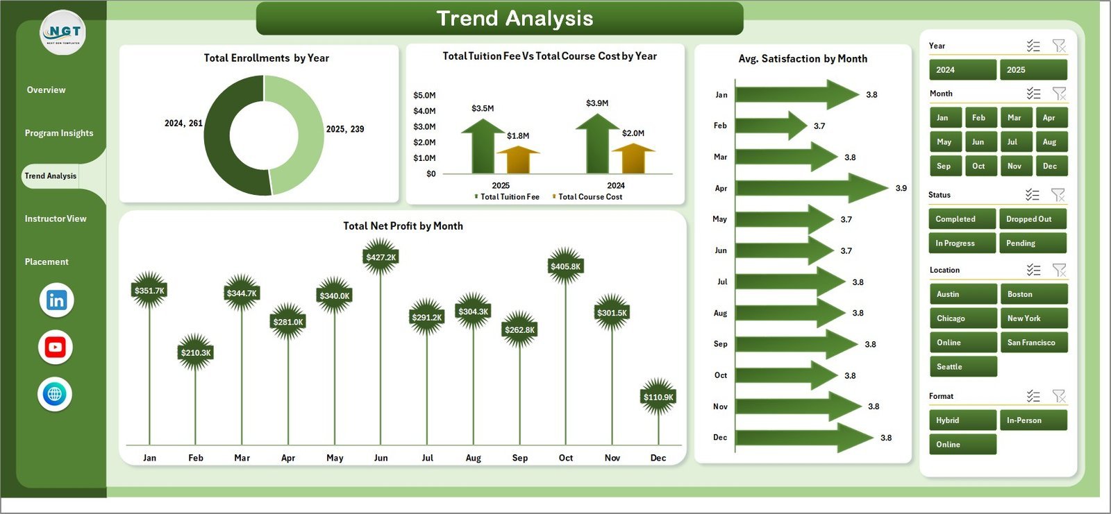
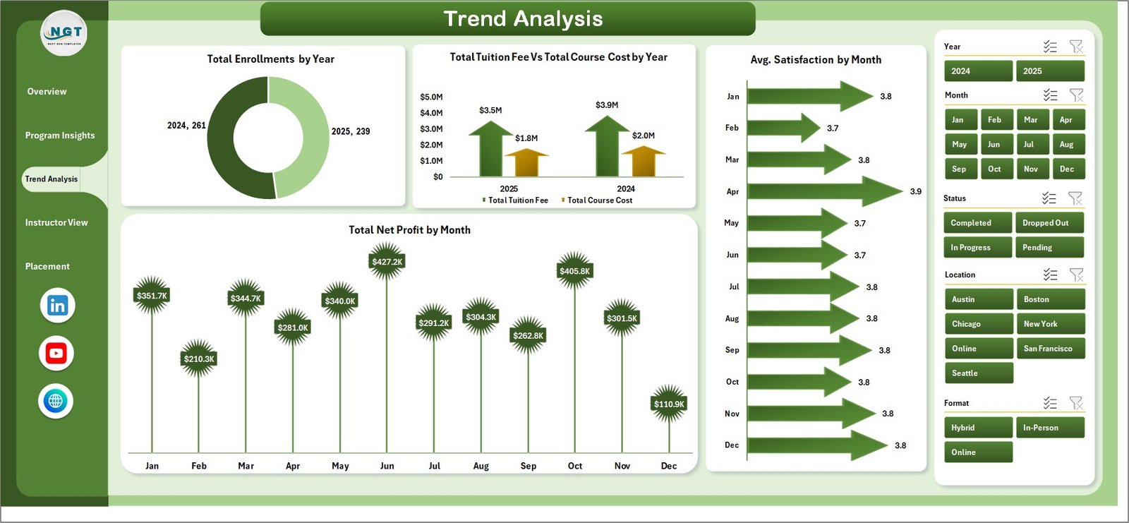
Trend Analysis surfaces time-based patterns through 4 charts: Total Enrollments by Year, Total Tuition Fee vs Total Course Cost by Year, Avg. Satisfaction by Month, and Total Net Profit by Month — essential for spotting seasonal demand and planning cohort capacity.
Page 4: Instructor View
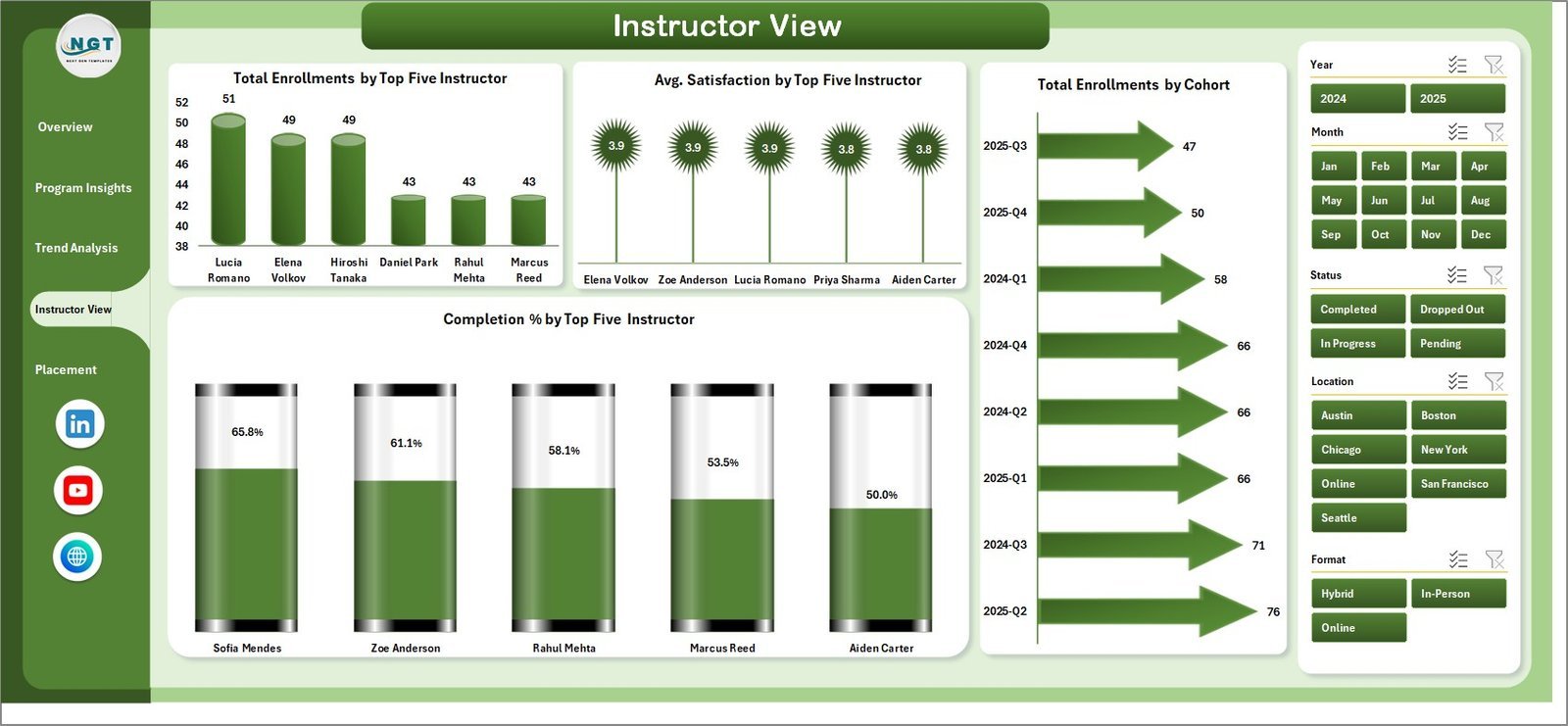
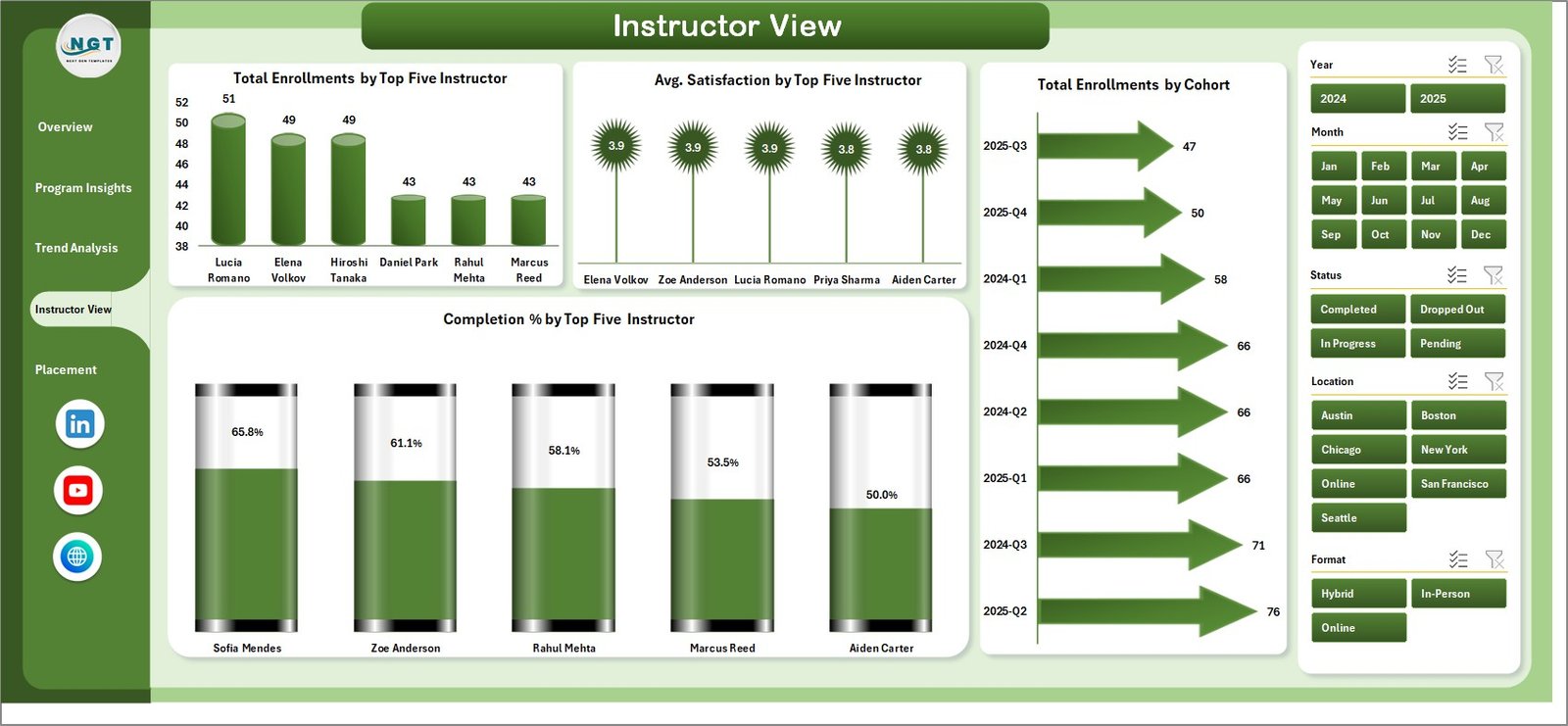
Instructor View ranks top 5 instructors across 4 charts: Total Enrollments by Top Five Instructor, Avg. Satisfaction by Top Five Instructor, Total Enrollments by Cohort, and Completion % by Top Five Instructor — giving program managers data for instructor assignments and performance reviews.
Page 5: Placement Analysis
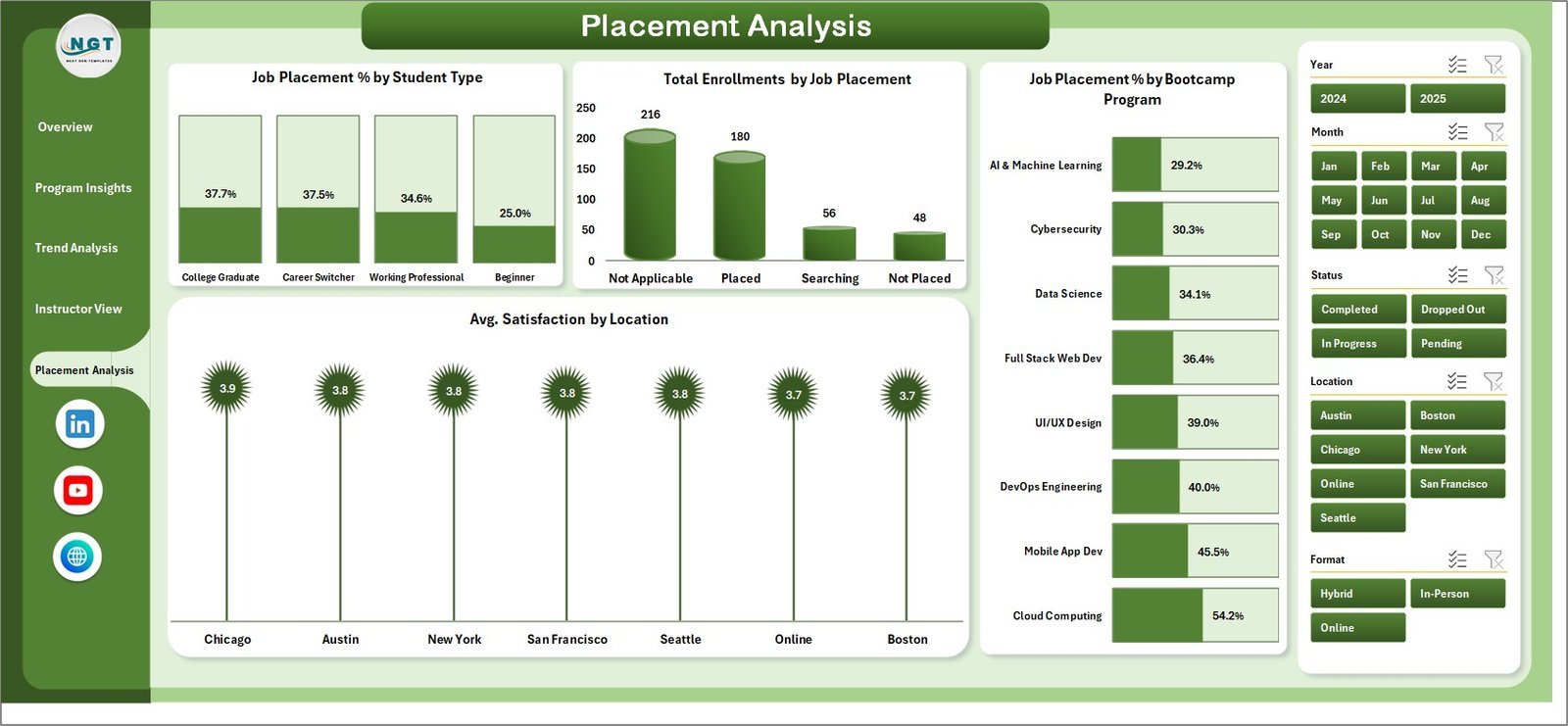
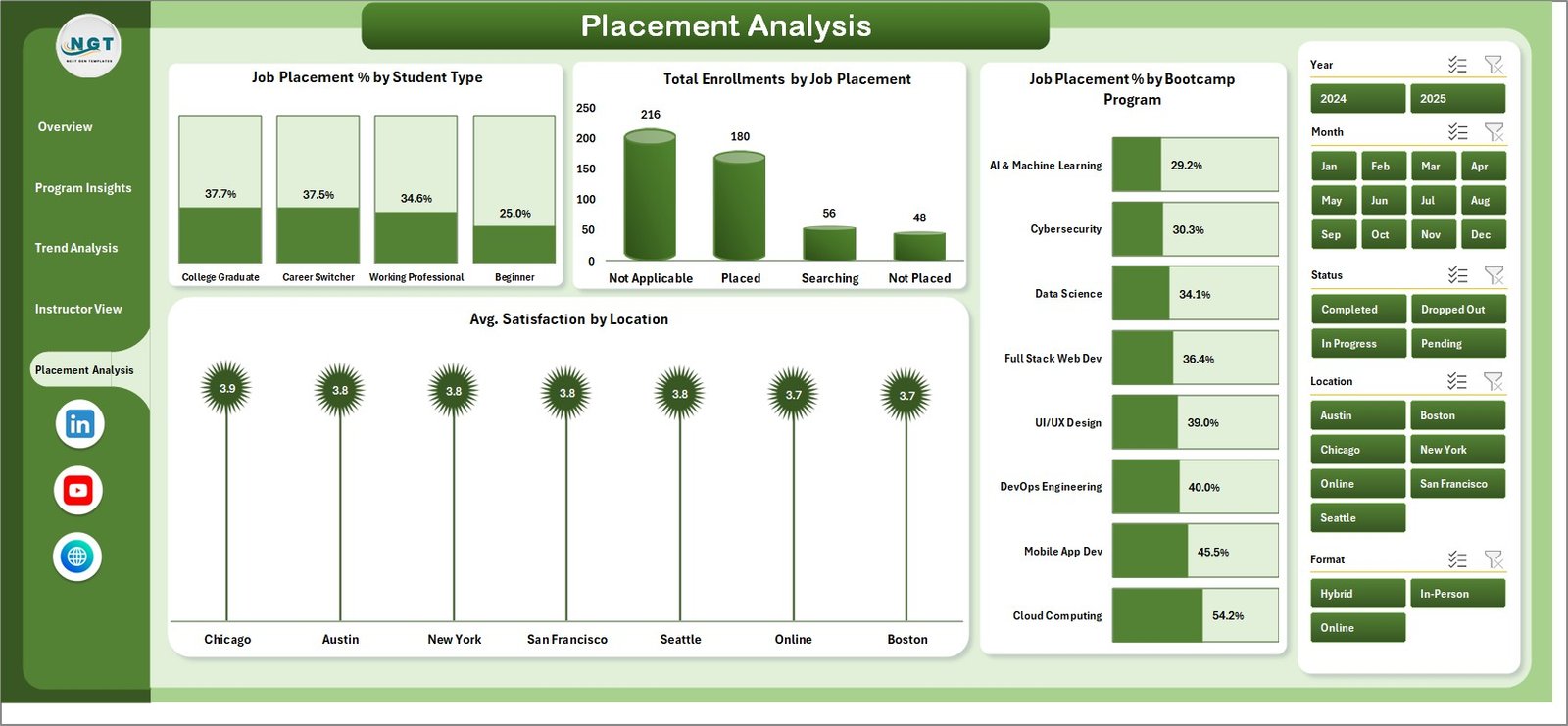
Placement Analysis measures career outcomes through 4 charts: Job Placement % by Student Type, Total Enrollments by Job Placement, Job Placement % by Bootcamp Program, and Avg. Satisfaction by Location — enabling directors to assess program ROI and refine curriculum.
Data Sheet
The Data Sheet is where you enter or paste enrollment records. All required columns are pre-labeled so you can start adding real data immediately without restructuring anything.

Support Sheet
The Support Sheet contains all underlying pivot tables powering the dashboard. After updating your data, click Data > Refresh All in the Excel Ribbon — every pivot and chart updates instantly. Keep this sheet hidden for cleaner stakeholder presentations.

📊 Coding Bootcamps Dashboard in Excel vs. Google Sheets vs. Canvas LMS — Where This Fits
| Feature | Coding Bootcamps Dashboard in Excel | Google Sheets Dashboard | Canvas LMS / Salesforce Edu Cloud |
|---|---|---|---|
| Cost | $17.99 one-time ✅ | Free but build-your-own | $50–150+ / user / month |
| Platform | Microsoft Excel ✅ | Browser (Google) | Cloud SaaS |
| Setup time | Under 10 minutes ✅ | 2–5 hours to build | Days to weeks |
| Job Placement Tracking | 5 built-in views ✅ | Manual formulas required | Limited / add-on cost |
| Instructor Benchmarking | Top-5 ranking built-in ✅ | Manual build required | Available but complex |
| Trend Analysis | Year & month charts ✅ | Build manually | Premium tiers only |
| Real-time collaboration | Shared Excel file | Native ✅ | Native ✅ |
| Year-1 cost (5 users) | $17.99 total ✅ | $0 + build time | $3,000–$9,000+ |
For bootcamp operators who want deep enrollment, placement, and instructor analytics without enterprise SaaS pricing, the Coding Bootcamps Dashboard in Excel sits in the sweet spot.
👥 Who This Template Is For — and Who It’s Not For
✅ Built for:
- Coding bootcamp directors and operations managers tracking enrollment health, tuition revenue, and completion rates
- Program managers comparing instructor performance and job placement outcomes across cohorts
- Education administrators at small to mid-size coding schools (10–500 students) already using Microsoft Excel
- Bootcamp founders needing monthly performance reporting without a dedicated BI tool
❌ Not for:
- Enterprise institutions needing SSO, data lake integration, or real-time API connections to student information systems
- Bootcamps with 5,000+ records requiring a database backend
⚙️ How to Use the Coding Bootcamps Dashboard in Excel
- Download and unzip the file. Open in Microsoft Excel 2016 or later.
- Go to the Data Sheet and replace sample records with your actual enrollment data using the pre-labeled column structure.
- Click Refresh All under the Data tab in the Excel Ribbon — all pivot tables and charts update simultaneously.
- Use the slicers on each page to filter by Bootcamp Program, Student Type, Format, Cohort, or Location.
- Review each page — Overview for high-level health, Program Insights for format/program breakdowns, Trend Analysis for patterns over time, Instructor View for staff benchmarking, Placement Analysis for career outcomes.
- Optionally hide the Support Sheet by right-clicking the tab and selecting Hide for cleaner presentations.
💼 Real-World Use Cases
Maria runs operations at a 200-student coding bootcamp. She uses the Coding Bootcamps Dashboard in Excel to present monthly enrollment and placement reports to her board. The Placement Analysis page shows Job Placement % by program — a metric her investors track — and the Trend Analysis page shows quarter-over-quarter tuition growth without manual exports from a CRM.
David manages 8 instructors across 3 cohorts. He uses the Instructor View to identify which instructors score highest on completion % and satisfaction, then builds the right teaching pairs for the next cohort — replacing a manual spreadsheet that took hours to update each month.
❓ Frequently Asked Questions
What KPIs does the Coding Bootcamps Dashboard in Excel track?
The Coding Bootcamps Dashboard in Excel tracks 5 KPI cards: Total Tuition Fee, Total Net Profit, Total Enrollments, Profit Margin %, and Avg. Satisfaction. All metrics update automatically when you replace sample data and click Refresh All in the Data tab.
How long does setup take?
Setup takes under 10 minutes. Download and unzip the file, paste your enrollment data into the Data Sheet following the column structure, then click Refresh All. All 16 charts and 5 dashboard pages update instantly — no formula rebuilding required.
How does this compare to Canvas LMS or Salesforce Education Cloud?
The Coding Bootcamps Dashboard in Excel is a $17.99 one-time purchase versus $50–150+ per user per month for enterprise platforms. It covers job placement tracking, instructor performance, and trend analysis with no IT setup, contracts, or user-based pricing — ideal for bootcamps that don’t need enterprise features.
Does this work in Excel for Mac?
Yes. The dashboard uses standard Excel pivot tables, slicers, and charts — all fully compatible with Excel for Mac (Microsoft 365 or Excel 2019+). No VBA macros or Windows-only features are used. Learn more at Microsoft Excel Support.
What is included in the download?
The download includes one Excel .xlsx file with 7 sheet tabs: Overview, Program Insights, Trend Analysis, Instructor View, Placement Analysis, Data Sheet, and Support Sheet. No additional software, plugins, or subscriptions are required.
Can I customize the dashboard for additional programs or cohorts?
Yes. Add new rows to the Data Sheet and click Refresh All — all pivot tables and charts pick up the new data automatically. To add custom dimensions, insert new columns in the Data Sheet and reference them in the Support Sheet pivot tables. Basic Excel knowledge is sufficient for these changes.
👤 About the Author
Built by PK — Microsoft Certified Professional with 15+ years of Excel, Google Sheets, and Power BI experience. Founder of NextGenTemplates, reaching 300K+ subscribers across YouTube channels (@PK-AnExcelExpert, @NextGenTemplates, @NeoTechNavigators). Every template is hand-built and tested before release.
🔗 Explore Related Templates
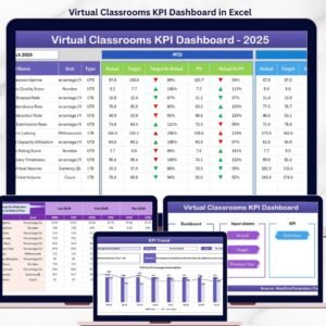
- Virtual Classrooms KPI Dashboard in Excel — track enrollments, completion rates, and performance for online learning programs
- Student Enrollment KPI Scorecard in Excel — focused scorecard for tracking enrollment KPIs month by month
- Vocational Training KPI Scorecard in Excel — similar analytics tailored for vocational and trade programs
- Explore all Education Templates — Excel, Power BI, and Google Sheets templates for education and training
📖 Click here to read the Detailed Blog Post
🎥 Visit our YouTube channel for step-by-step video tutorials
👉 YouTube.com/@NextGenTemplates
📅 Last updated: May 2026
Watch the step-by-step video tutorial:
YouTube






Reviews
There are no reviews yet.