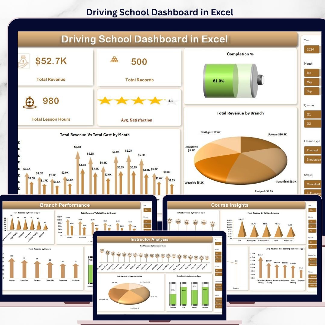

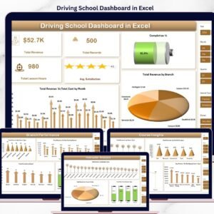
The Driving School Dashboard in Excel tracks 5 headline KPIs across 5 interactive pages, with 17 pre-built charts and multiple slicers covering branches, instructors, courses, and students. Setup takes under 10 minutes — drop your booking data into the Data Sheet, hit Refresh All, and every chart on every page updates automatically.
Join 8,400+ teams in 40+ countries using NextGenTemplates to replace paid SaaS tools with one-time-purchase Excel, Google Sheets, Power BI, and HTML templates.
✅ Instant download · One-time payment · No subscription · No per-user fees · Lifetime access
🔑 Key Features of the Driving School Dashboard in Excel
🚗 5 Headline KPIs on the Overview Page — Total Revenue, Total Records (bookings), Total Lesson Hours, Average Satisfaction, and Completion % give driving school owners an instant pulse check on operational health in a single view.
📊 5 Interactive Dashboard Pages — Overview, Branch Performance, Instructor Analysis, Course Insights, and Student Trends. Each page answers a specific business question, from branch profitability to customer type breakdown.
🎯 17 Pre-Built Charts Across All Pages — Revenue vs Cost by Month, Total Revenue by Branch, Pass Rate by Customer Type, Revenue by Vehicle Category, and 13 others — all powered by pivot tables in the Support Sheet.
🔄 Pivot-Powered Auto-Refresh — Replace the sample data in the Data Sheet, click Refresh All in the Excel Ribbon, and every chart and KPI card on every page updates instantly. No formulas to touch.
🎚️ Multi-Dimensional Slicers — Filter the entire dashboard by branch, course type, instructor, payment mode, or date range to answer ad-hoc questions in seconds.
💼 No VBA, No Macros — Built entirely with native Excel pivot tables and charts. Works on Microsoft 365, Excel 2019/2021, Excel for Mac, and Excel Online without security prompts.
📦 What’s Inside the Driving School Dashboard in Excel
The workbook ships with 7 sheets in total: 5 analysis pages, 1 Data Sheet for entry, and 1 Support Sheet hosting the pivot tables that power every visual.
Overview Page — Displays 5 KPI cards (Total Revenue, Total Records, Total Lesson Hours, Avg. Satisfaction, Completion %) and 3 charts: Total Revenue Vs Total Cost by Month, Total Revenue by Branch, and Completion %. Slicers sit on top for dashboard-wide filtering.
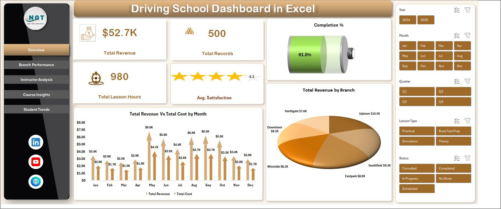
Driving School Dashboard in Excel
Branch Performance — 4 charts covering Total Records by Course Type, Total Revenue Vs Total Cost by Branch, Total Records by Branch, and Completion % by Branch. Use this page to spot your highest-margin locations and course-to-branch fit.
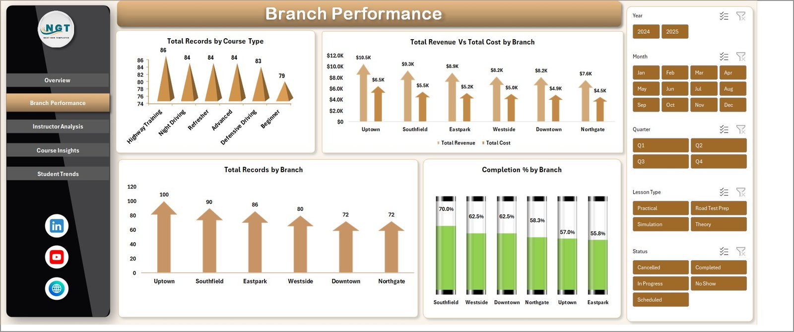
Branch Performance
Instructor Analysis — 3 charts: Total Revenue by Instructor Name, Total Records by Payment Mode, and Pass Rate % by Customer Type. This page is built for training managers who need to rank instructor performance and see which customer segments pass their tests at the highest rates.
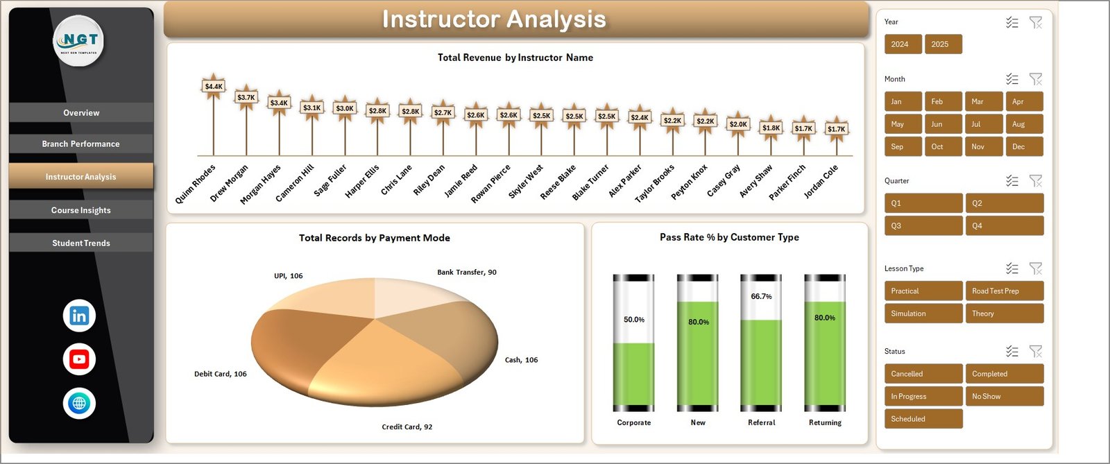
Instructor Analysis
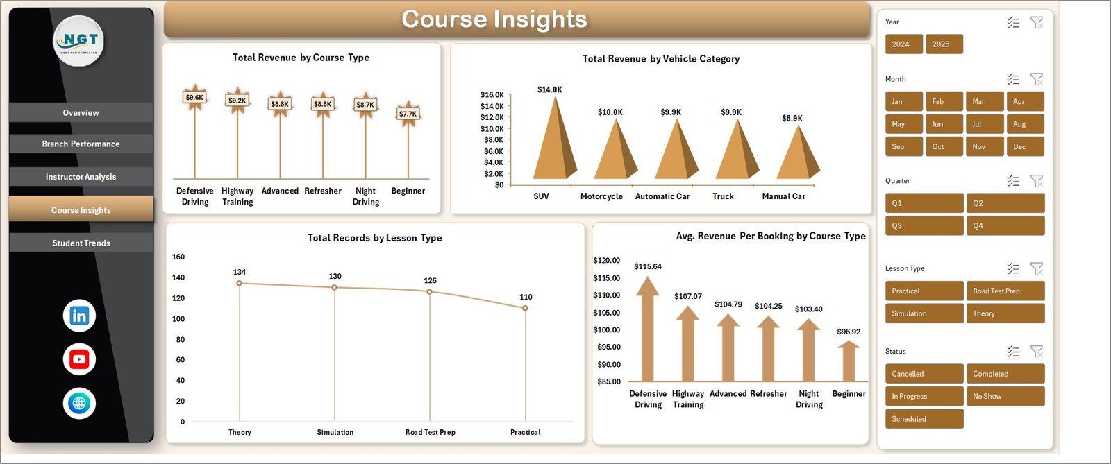
Course Insights — 4 charts: Total Revenue by Course Type, Total Revenue by Vehicle Category, Total Records by Lesson Type, and Avg. Revenue Per Booking by Course Type. Helps you understand which course types and vehicle categories generate the most revenue per booking.
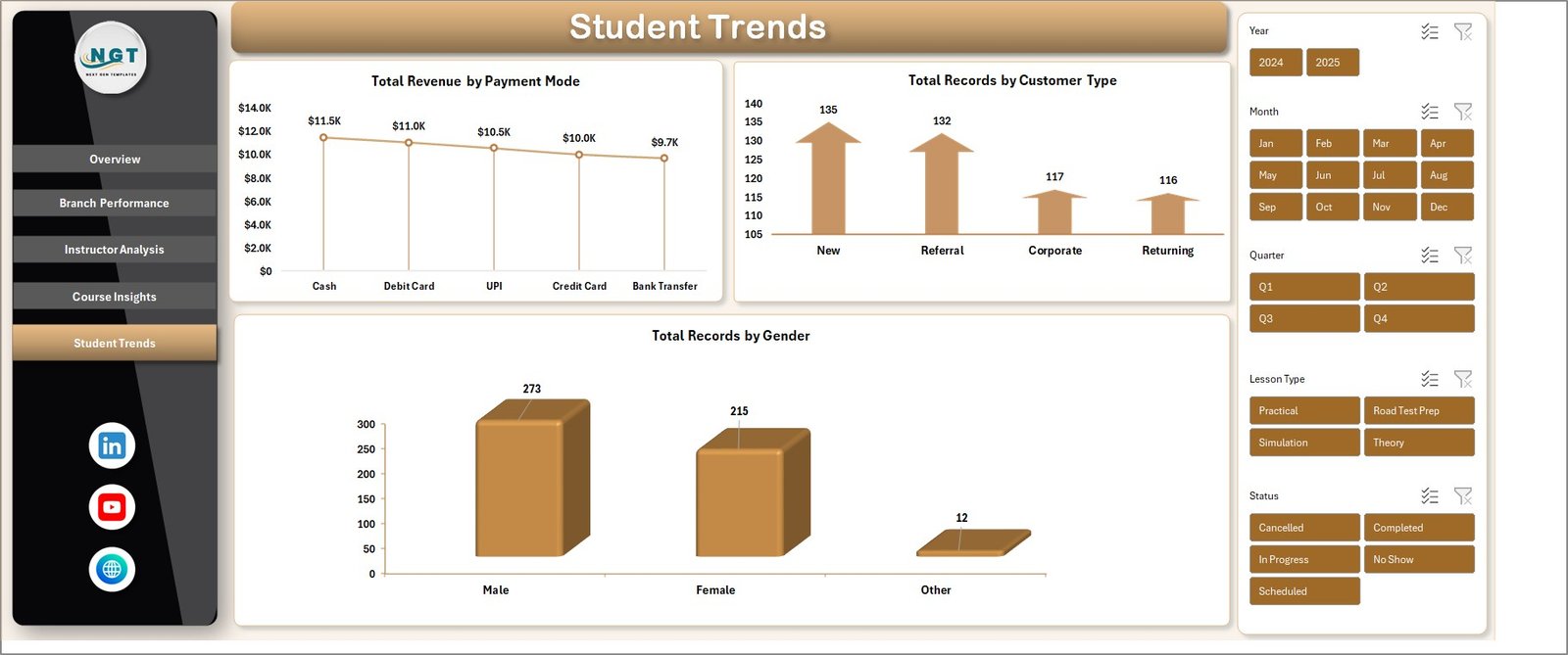
Student Trends — 3 charts: Total Revenue by Payment Mode, Total Records by Customer Type, and Total Records by Gender. Surfaces demographic and payment patterns so marketing spend can be directed at the highest-value segments.
Student Trends
Data Sheet Tab — Structured data entry area. Add your booking records in the same column format and the entire dashboard recalculates when you click Refresh All.
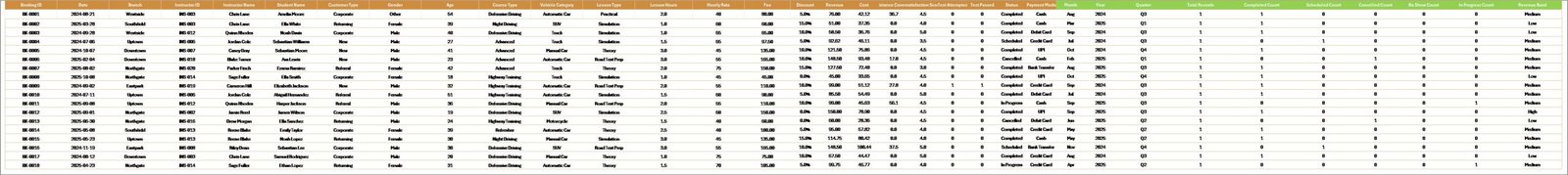
Data Sheet tab
Support Sheet — Contains all pivot tables that drive the 17 charts across 5 pages. Keep this sheet hidden in production. Navigate to Data → Refresh All after any data update.
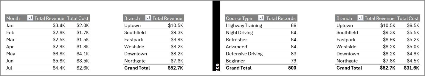
Support sheet tab
📊 Driving School Dashboard in Excel vs. Google Sheets Dashboards vs. Paid Driving School SaaS — Where This Fits
| Feature | Driving School Dashboard in Excel | Google Sheets equivalent | Paid Driving School SaaS (DriveScout / TotalDrive) |
|---|---|---|---|
| Cost | $17.99 one-time ✅ | $9–$15 one-time | $49–$129 / month per branch |
| Platform | Microsoft Excel (offline) ✅ | Google Sheets (cloud) | Web + mobile app |
| Setup time | Under 10 minutes ✅ | 10–15 minutes | 2–4 weeks onboarding |
| Works offline | Yes ✅ | No | No |
| Custom fields & KPIs | Unlimited — it’s your file ✅ | Unlimited | Limited to vendor’s data model |
| Multi-branch analysis | Built-in Branch Performance page ✅ | Available | Available |
| Instructor ranking | Built-in Instructor Analysis page ✅ | Available | Available |
| Year-1 cost at 3 branches | $17.99 ✅ | ~$15 | $1,764–$4,644 |
| Data ownership | 100% local, no cloud lock-in ✅ | Google cloud | Vendor cloud |
For driving schools that want branch, instructor, and course analytics without paying $50–$130 per branch every month, the Driving School Dashboard in Excel sits in the sweet spot.
👥 Who This Template Is For — and Who It’s Not For
✅ This template is built for:
- Driving school owners running 1–10 branches who want monthly revenue and branch-level profitability reports
- Training managers tracking instructor performance, pass rates, and customer satisfaction across multiple instructors
- Multi-vehicle driving academies offering courses across car, motorcycle, truck, and commercial vehicle categories
- Franchise driving school operators needing a consistent KPI reporting template across locations
- Excel-literate office managers who prefer owning their data locally instead of subscribing to cloud SaaS
❌ This template is NOT for:
- Enterprise driving school networks with 50+ branches that need real-time data sync across locations
- Teams that need an integrated booking engine, payment processor, or student-facing portal (this is reporting, not operations)
- Users with zero Excel experience who have never used pivot tables or slicers before
- Organizations legally required to use SOC 2 or HIPAA-certified cloud platforms
⚙️ How to Use the Driving School Dashboard in Excel
- Download and open the Excel workbook after purchase. Enable editing if prompted.
- Replace sample data on the Data Sheet with your own booking records, keeping the column structure intact.
- Go to Data → Refresh All in the Excel Ribbon so every pivot table pulls in your new data.
- Open the Overview page and confirm all 5 KPI cards and 3 charts reflect your actual numbers.
- Use slicers to filter by branch, course type, or date range to answer specific business questions.
- Hide the Support Sheet before sharing the workbook with non-technical stakeholders.
💼 Real-World Use Cases
Ravi runs a 4-branch driving school in Pune. He uses the Driving School Dashboard in Excel every Monday morning to review Total Revenue vs Cost by Branch and Completion % by Branch. In the first 90 days of use, he identified that his Kothrud branch had a 12% lower completion rate than Baner, dug into instructor-level data, and rebalanced assignments — saving roughly $14,000 a year he would have otherwise spent on DriveScout’s 4-branch subscription.
Priya manages instructor performance at a commercial vehicle training academy. She uses the Instructor Analysis page to rank her 18 instructors on Total Revenue and Pass Rate by Customer Type. The Pass Rate % by Customer Type chart revealed that her academy’s pass rate for corporate clients was 22% higher than individual students — insight she used to pitch B2B contracts that now account for 40% of revenue.
Anil operates a motorcycle training school with 2 locations. He uses the Course Insights page’s Total Revenue by Vehicle Category chart to decide which courses deserve more marketing budget. When he saw that heavy motorcycle courses generated 2.3x the per-booking revenue of scooter courses, he doubled down on Facebook ads targeting heavy motorcycle license seekers.
❓ Frequently Asked Questions
What KPIs does the Driving School Dashboard in Excel track?
The Driving School Dashboard in Excel tracks 5 headline KPIs on the Overview page — Total Revenue, Total Records, Total Lesson Hours, Average Satisfaction, and Completion %. It also includes 17 deeper analysis charts across Branch, Instructor, Course, and Student pages covering revenue, cost, pass rate, payment mode, vehicle category, and customer type.
How long does setup take for a new driving school?
Setup of the Driving School Dashboard in Excel takes under 10 minutes. You download the file, replace the sample data in the Data Sheet with your own booking records, and click Refresh All. Every chart and KPI across all 5 dashboard pages updates automatically — no formulas to adjust.
How does the Driving School Dashboard in Excel compare to DriveScout or TotalDrive?
The Driving School Dashboard in Excel is a one-time $17.99 reporting template focused on performance analytics, while DriveScout and TotalDrive are $49–$129 per month per branch full operations platforms. For driving schools that only need KPI reporting and already handle bookings elsewhere, the Excel dashboard saves $1,500–$4,500 per year at 3 branches.
Can I track multiple branches in the same file?
Yes. The Driving School Dashboard in Excel has a dedicated Branch Performance page with 4 charts including Total Revenue vs Cost by Branch, Total Records by Branch, and Completion % by Branch. You can analyze unlimited branches as long as each booking record has a Branch column filled in on the Data Sheet.
Does it work on Mac and Excel Online?
Yes. The Driving School Dashboard in Excel is built with native Excel pivot tables and charts — no VBA or macros. It works on Microsoft 365, Excel 2019, Excel 2021, Excel for Mac, and Excel Online, with no security warnings or compatibility issues.
Can I add custom KPIs or change the existing ones?
Yes. Because the dashboard is pivot-driven, adding a new KPI is as simple as adding a new column in the Data Sheet and a new pivot in the Support Sheet. The Driving School Dashboard in Excel is fully customizable — change KPI names, add metrics, tweak chart types, or rebrand colors to match your academy’s identity.
Do I need advanced Excel skills to use this dashboard?
No. The Driving School Dashboard in Excel is designed for intermediate Excel users. If you can type in cells and click Refresh All, you can use the dashboard. Advanced features like pivot table customization are optional for users who want to extend the template.
👤 About the Author
Built by PK — Microsoft Certified Professional with 15+ years of Excel, Google Sheets, and Power BI experience. Founder of NextGenTemplates, reaching 300K+ subscribers across YouTube channels (@PK-AnExcelExpert, @NextGenTemplates, @NeoTechNavigators). Every template is hand-built and tested before release.
🔗 Explore Related Templates
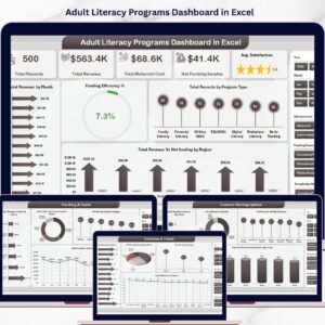
- Adult Literacy Programs Dashboard in Excel — 5-page Excel dashboard for adult education program performance tracking.
- Apprenticeship Programs Dashboard in Excel — Excel dashboard for apprenticeship program enrollment, completion, and outcome tracking.
- Continuing Education Programs KPI Dashboard in Excel — KPI scorecard for adult and continuing education providers.
- Curriculum Development Services KPI Dashboard — 7-sheet KPI dashboard for educational content teams.
- Browse our complete library of Excel Dashboard Templates on NextGenTemplates.
📖 Click here to read the Detailed Blog Post
Watch the step-by-step video tutorial:
🎥 Visit our YouTube channel for step-by-step video tutorials
👉 YouTube.com/@NextGenTemplates
📅 Last updated: April 2026


Reviews
There are no reviews yet.