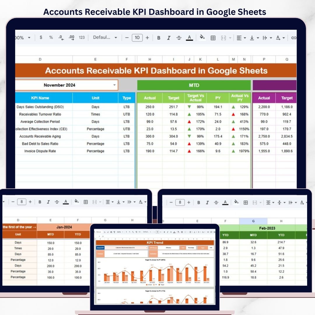


The Accounts Receivable KPI Dashboard in Google Sheets solves this by tracking 15+ AR metrics including DSO, Collection Effectiveness Index, Aging Bucket Percentages, and Bad Debt Ratio across 6 interactive worksheets with MTD and YTD trend analysis, conditional formatting arrows, and a dropdown-based month selector. Built entirely in Google Sheets, it gives AR managers, controllers, and finance teams a cloud-based receivable command center that costs $8.99 one-time — replacing $200/month accounting software for KPI-level AR monitoring.

Key Features of Accounts Receivable KPI Dashboard in Google Sheets
This ready-to-use Google Sheets dashboard template delivers a structured AR monitoring system that any finance professional can set up in under 10 minutes. Here are the features that make it one of the best accounts receivable tracking solutions built in Google Sheets:
- 15+ Accounts Receivable KPIs — Tracks Days Sales Outstanding (DSO), Collection Effectiveness Index (CEI), Aging Bucket Percentages (0-30, 31-60, 61-90, 90+ days), Bad Debt Ratio, Average Days Delinquent, and more
- MTD + YTD Dual Tracking — Every KPI shows Month-to-Date and Year-to-Date values for Actual, Target, and Previous Year side by side
- Conditional Formatting Arrows — Green up-arrows and red down-arrows for Target vs Actual and PY vs Actual variance analysis at a glance
- One-Click Month Selector — A single dropdown on cell D3 refreshes the entire Dashboard sheet for any month without editing formulas
- KPI Trend Charts — Select any KPI from the dropdown to view its MTD and YTD line charts for Actual, Target, and Previous Year data
- Self-Documenting KPI Definitions — Every metric includes its Name, Group, Unit, Formula, Definition, and Type (LTB/UTB) on a dedicated sheet
- 3 Organized Input Sheets — Separate worksheets for Actual Numbers, Target Numbers, and Previous Year Numbers with consistent month-column layouts
- Configurable Fiscal Year — Set your fiscal year start month on cell E1 of the Actual Numbers sheet and all months align automatically
- Cloud-Based Collaboration — Share with your team via Google Drive, collaborate in real time, access from any device
The Accounts Receivable KPI Dashboard in Google Sheets tracks 15+ KPIs across 6 worksheets with automated MTD/YTD trend analysis. Every KPI updates with conditional formatting arrows when you enter new data — no manual chart building or formula writing required.
Dashboard Pages Explanation
The template includes 6 interconnected worksheets, each serving a specific role in your AR monitoring workflow.
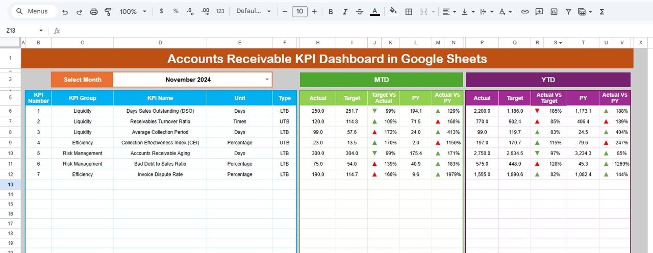
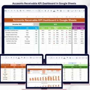
1. Dashboard Sheet
The Dashboard sheet is the main KPI overview page. On range D3, you can select any month from the dropdown and the entire dashboard updates instantly. It displays all KPIs with MTD Actual, Target, and Previous Year data alongside YTD Actual, Target, and Previous Year data. Each comparison column includes conditional formatting up-down arrows — green arrows indicate favorable performance (Actual beating Target or improving over PY) and red arrows flag areas needing attention.
This layout gives AR managers a complete receivable health snapshot in one view. You can see exactly which KPIs are on track, which are falling behind target, and how current performance compares to the same period last year.
Accounts Receivable KPI Dashboard in Google Sheets
2. KPI Trend Sheet
The KPI Trend sheet lets you deep-dive into any individual KPI. Select a KPI name from the dropdown on range C3 and the page displays its KPI Group, Unit, Type (Lower the Better or Upper the Better), Formula, and Definition. Below these details, two trend charts show the MTD and YTD trajectories for Actual, Target, and Previous Year numbers across all months.
This sheet is especially useful for identifying deteriorating collection patterns early. If DSO has been trending upward for 3 consecutive months against a flat target, the trend chart makes it immediately visible — something that is easy to miss when looking at a single month’s snapshot.
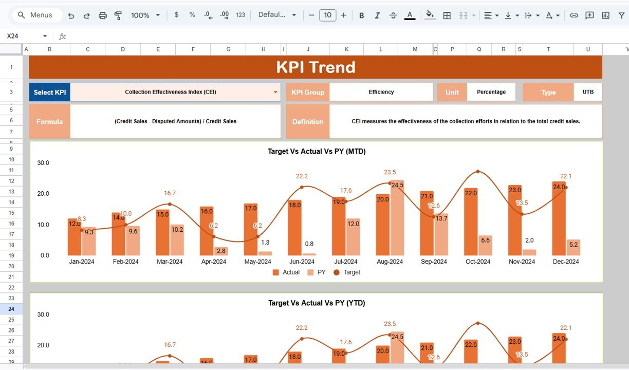
KPI Trend Sheet
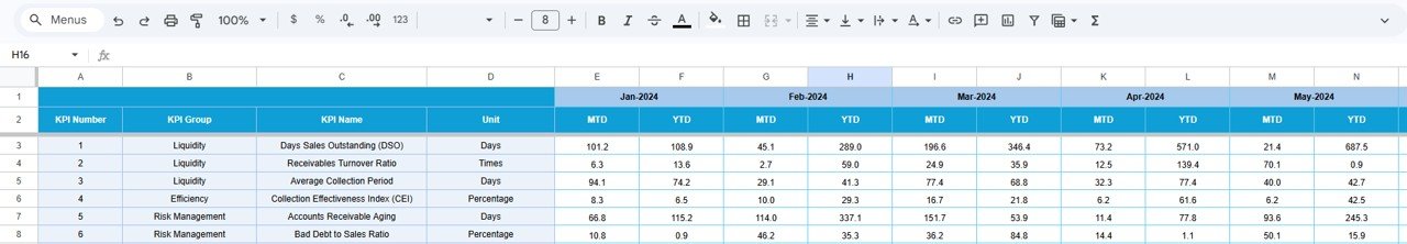
3. Actual Numbers Input Sheet
The Actual Numbers Input sheet is where you enter the real MTD and YTD data for each KPI by month. Cell E1 controls the starting month of your fiscal year — simply input the first month and all subsequent columns align accordingly. This makes the template compatible with any fiscal year configuration (January start, April start, October start, etc.).
Each row represents one KPI, and each column pair represents a month’s MTD and YTD actual values. The Dashboard and KPI Trend sheets pull directly from this data.
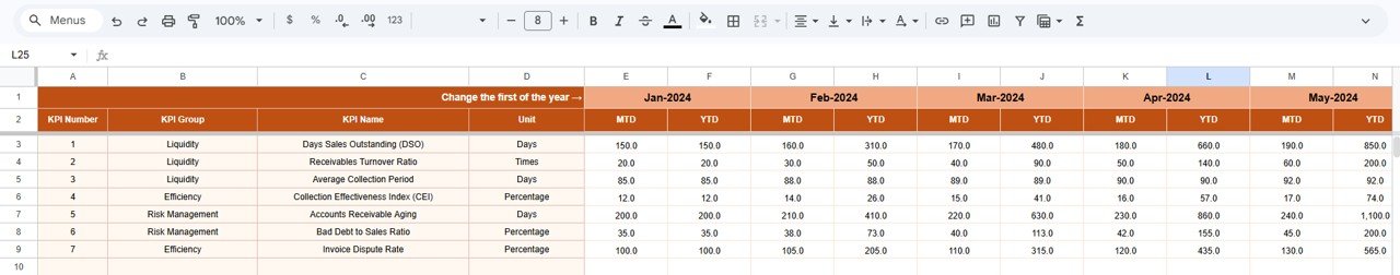
Actual Numbers Input Sheet
4. Target Number Input Sheet
The Target Number Input sheet mirrors the Actual Numbers sheet structure. Enter your monthly MTD and YTD target values for each KPI here. The Dashboard sheet uses these targets to calculate the Target vs Actual variance and apply the conditional formatting arrows. Setting realistic targets based on industry benchmarks and historical performance ensures your dashboard provides meaningful variance insights.

Target Number Input Sheet
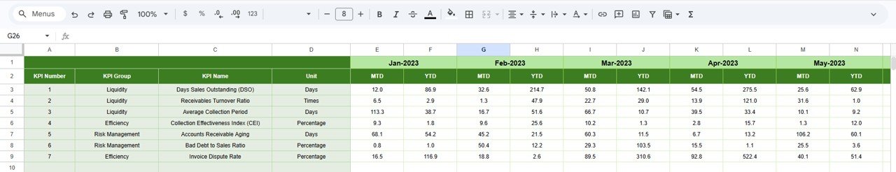
5. Previous Year Number Sheet
Enter the prior year’s KPI data in this sheet using the same structure as the Actual and Target sheets. The Dashboard uses this data for the PY vs Actual comparison, and the KPI Trend sheet plots the Previous Year line alongside current Actual and Target. Year-over-year comparison is critical for identifying seasonal patterns and measuring genuine improvement versus cyclical fluctuations.

Previous Year Number Input Sheet
6. KPI Definition Sheet
The KPI Definition sheet is the configuration backbone of the entire dashboard. For each KPI, you define the KPI Name, KPI Group (e.g., Collection Efficiency, Aging, Cash Flow), Unit (%, $, days, ratio), Formula (e.g., “Total Receivables / Average Daily Sales”), KPI Definition (a plain-language explanation), and Type — LTB (Lower the Better) for metrics like DSO and bad debt ratio, or UTB (Upper the Better) for metrics like CEI and on-time payment rate.
The Type field is especially important because it controls the conditional formatting logic on the Dashboard sheet. An increase in DSO (LTB) triggers a red arrow, while an increase in CEI (UTB) triggers a green arrow. This makes the dashboard self-documenting and audit-friendly.
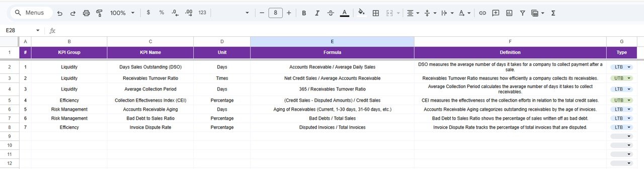
KPI Definition Sheet
Accounts Receivable KPI Dashboard vs. Microsoft Excel Dashboard vs. QuickBooks Advanced — Feature Comparison
| Feature | Accounts Receivable KPI Dashboard in Google Sheets | Microsoft Excel AR Dashboard | QuickBooks Advanced |
|---|---|---|---|
| Cost | $8.99 one-time | $14.99+ one-time (Excel version) | $200/month |
| Platform | Google Sheets (cloud-based) | Microsoft Excel (desktop) | Web-based SaaS |
| Setup time | Under 10 minutes | Under 10 minutes | 1-2 weeks |
| Real-time team collaboration | ✅ Built-in Google Sheets sharing | ❌ Requires OneDrive/SharePoint | ✅ Yes |
| Mobile access | ✅ Google Sheets mobile app | ⚠️ Limited on mobile | ✅ Yes |
| Customizable KPIs | ✅ Add/edit any KPI freely | ✅ Yes | ⚠️ Limited to preset reports |
| MTD + YTD trend charts | ✅ Yes | ✅ Yes | ✅ Yes |
| Year-over-year comparison | ✅ Built-in PY tracking | ✅ With manual setup | ✅ Yes |
| Year-1 cost at 5 users | $8.99 total | $14.99 + Excel licenses | $2,400+/year |
For finance teams that want structured AR KPI monitoring without paying $200/month for full accounting software, the Accounts Receivable KPI Dashboard in Google Sheets delivers the same receivable visibility at a fraction of the cost.
Accounts Receivable KPI Dashboard in Google Sheets


Reviews
There are no reviews yet.