


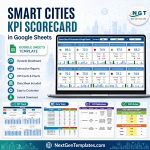
The Smart Cities KPI Dashboard in Google Sheets is a comprehensive tool designed for city managers and planners to track, manage, and analyze the performance of key metrics across various aspects of a smart city. From energy efficiency and waste management to traffic flow and public health, this dashboard helps stakeholders make data-driven decisions that optimize urban living and services.
This ready-to-use Google Sheets template provides a customizable and easy-to-navigate interface, offering insights into the city’s infrastructure, sustainability, economy, and social development, all in one place.
📊 What’s Inside the Smart Cities KPI Dashboard 📊
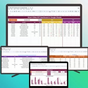
The Smart Cities KPI Dashboard includes six essential worksheets that provide a holistic view of a smart city’s performance:
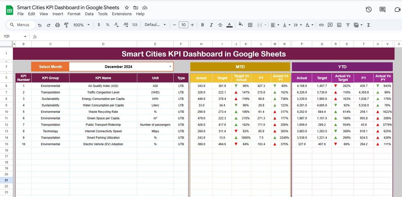
Dashboard Sheet Tab
Key Metrics Overview: This sheet displays the core KPIs for monitoring the performance of your smart city initiatives. Track essential metrics like:
Energy Consumption: Total energy usage across the city.
Traffic Efficiency: Average traffic congestion levels and traffic flow efficiency.
Waste Recycling Rate: The percentage of waste recycled in the city.
Water Usage: Total water usage and conservation metrics.
Public Health Indicators: Metrics related to public health, such as disease outbreaks and wellness programs.
Month Dropdown: Select the desired month to view updated data for specific periods.
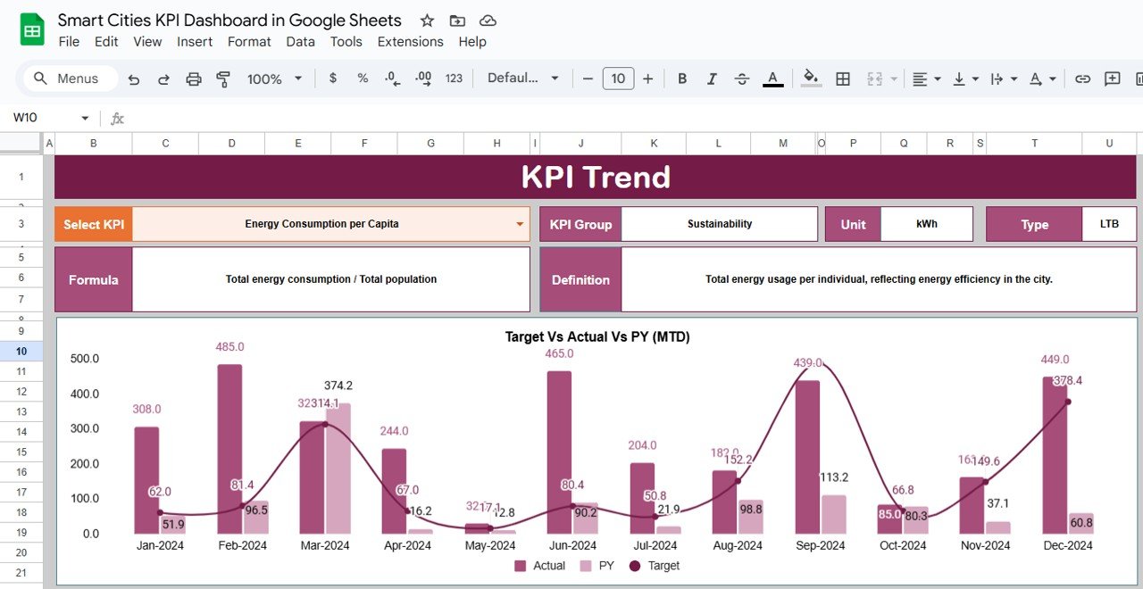
KPI Trend Sheet Tab
Track Trends Over Time: Monitor KPIs’ performance over several months with a dropdown to select specific KPIs.
KPI Group, Unit, Type: Each KPI is categorized (e.g., energy, traffic, social well-being) with its unit of measurement (e.g., kilowatt-hours, kilometers per hour), and whether it’s a “Lower the Better” (LTB) or “Upper the Better” (UTB) KPI.
Formula and Definition: Understand the calculation and significance of each KPI for informed decision-making.
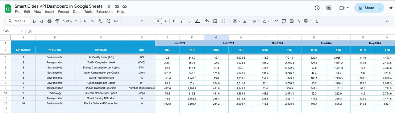
Actual Numbers Sheet Tab
Data Input: Enter actual performance data for each KPI, which will automatically update the dashboard.
Month Selection: Choose the first month of the year, and all KPIs will be updated accordingly across the dashboard.
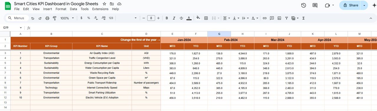
Target Sheet Tab
Set Targets: Input the target values for each KPI to track whether actual performance aligns with the goals.
Compare Data: Monitor Month-to-Date (MTD) and Year-to-Date (YTD) targets and actual performance.
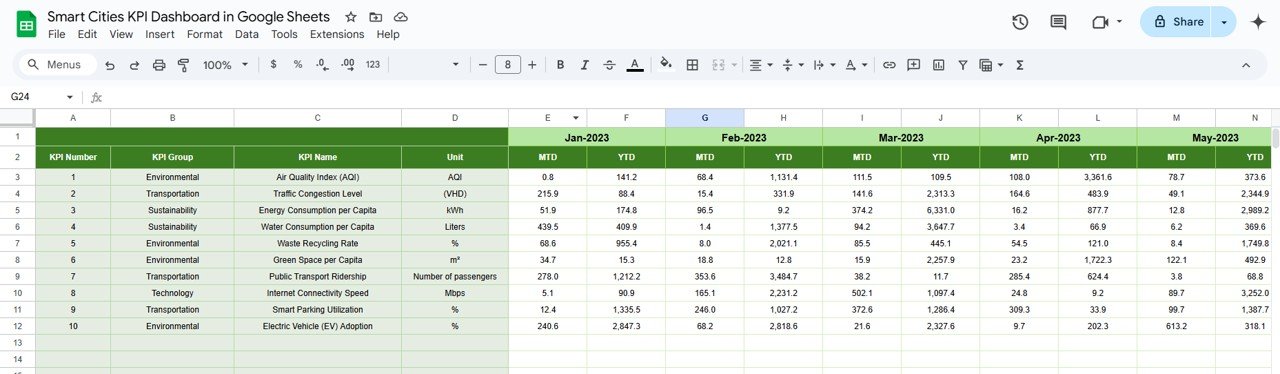
Previous Year Number Sheet Tab
Historical Comparison: Enter data from the previous year to analyze trends, assess growth, and identify areas for improvement.
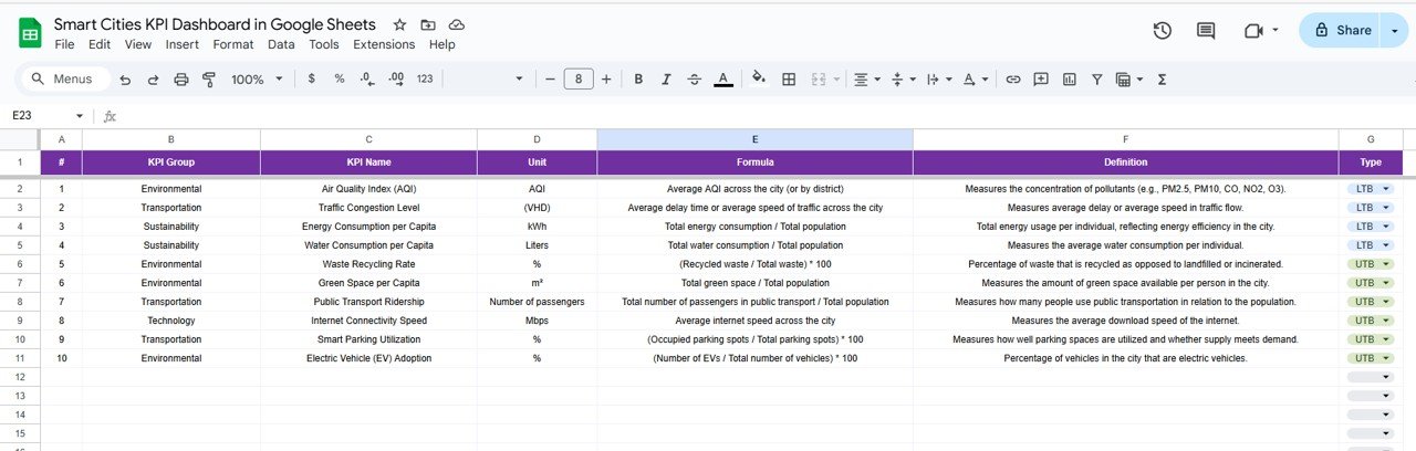
KPI Definition Sheet Tab
Clear KPI Definitions: Each KPI’s name, group, unit, and formula are explained in detail to provide clarity and transparency in data analysis.
🛠️ How to Use the Smart Cities KPI Dashboard 🛠️
Input Data: Enter the actual data for each KPI in the Actual Numbers Sheet to ensure that the dashboard reflects the most current information.
Set Targets: Define target values in the Target Sheet to measure performance against goals.
Track and Visualize: Use the Dashboard Sheet to view overall performance, track progress over time, and analyze trends.
Monitor Trends: Utilize the KPI Trend Sheet to track the evolution of KPIs over the months and adjust policies or strategies based on insights.
🏙️ Who Can Benefit from This Smart Cities KPI Dashboard 🏙️
City Managers: Track and manage key metrics related to urban development, sustainability, and infrastructure.
Urban Planners: Use data to make informed decisions about traffic, energy usage, and public health initiatives.
Sustainability Officers: Monitor and optimize sustainability efforts, such as energy efficiency and waste recycling rates.
Public Health Officials: Track key public health indicators to improve overall city well-being.
Investors and Stakeholders: Gain insights into the city’s economic development and sustainability efforts to make data-driven investment decisions.
🌟 Benefits of Using the Smart Cities KPI Dashboard 🌟
Comprehensive Overview: Track multiple KPIs in one place to get a holistic view of your smart city’s performance.
Real-Time Data: Keep your data up-to-date for quick, informed decision-making and adjustments.
Enhanced Efficiency: Focus on high-impact KPIs to optimize resource allocation and city services.
Data-Driven Decision Making: Make informed decisions based on accurate, real-time data.
Customizable: The dashboard is flexible, allowing you to adjust it to meet your city’s unique needs and development priorities.
Click here to read the detailed blog post
Watch the step-by-step video Demo:

Reviews
There are no reviews yet.