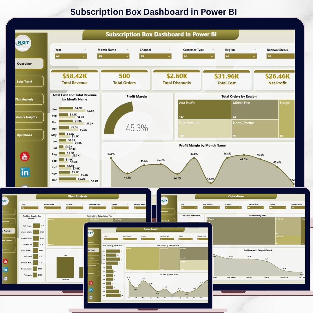
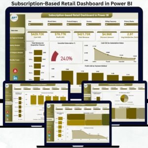
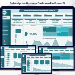
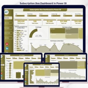
The Subscription Box Dashboard in Power BI tracks 5 KPI cards across 5 interactive analysis pages, with 16 pre-built charts and slicers covering revenue, orders, discounts, cost, and net profit. Setup takes under 10 minutes — open the .pbix file, swap your subscription box transaction data for the sample, and every page recalculates automatically.
🌍 Join 8,400+ teams in 40+ countries using NextGenTemplates to replace paid SaaS analytics tools with one-time-purchase Excel, Google Sheets, Power BI, and HTML templates.
✅ Instant download · One-time payment · No subscription · No per-user fees · Lifetime access
According to SUBTA’s State of the Subscription Commerce report, the global subscription box market is projected to reach over $74 billion by 2028 — and operators who track plan-level profit margins, channel performance, and box category mix outperform those tracking only top-line revenue. This Power BI dashboard gives subscription box founders, COOs, and growth managers a single view of every metric that matters: revenue trends, order volume by region, profit margin by month, and customer-type-level insights — all in a clean, slicer-driven layout.
🔑 Key Features of Subscription Box Dashboard in Power BI
📊 5 KPI cards on the Overview page — Total Revenue, Total Orders, Total Discounts, Total Cost, and Net Profit. Every card recalculates instantly as you click any slicer, giving you a top-line snapshot of your subscription business in seconds.
📈 16 pre-built charts across 5 analysis pages — Overview, Sales Trend, Plan Analysis, Customer Insights, and Operations. Each chart uses native Power BI visuals with cross-page filtering, so a click on one slicer updates the entire report.
🎯 Plan-level and channel-level profitability — see Net Profit by Subscription Plan, Total Revenue by Channel, Average Order Value by Customer Type, and Total Revenue by Region. Identify which acquisition channel delivers the highest-LTV customers in under 30 seconds.
🔍 Multi-slicer filtering — filter by region, subscription plan, box category, channel, customer type, and order status without writing a single DAX measure. The dashboard refreshes the moment you change a filter.
📅 Month-over-month trend analysis — track Total Orders by Month Name, Net Profit by Month Name, Profit Margin by Month Name, and Total Cost vs Total Revenue by Month Name on a single canvas to spot seasonality and forecast next quarter.
💰 Operational visibility — see Total Orders by Status (active, paused, cancelled), Total Revenue by Payment Method, and Net Profit by Channel to surface delivery bottlenecks and payment-failure leakage.
📦 What’s Inside the Subscription Box Dashboard in Power BI
This dashboard contains 5 fully interactive pages — each with named slicers, KPI cards where applicable, and 3-4 charts. We are showing multiple types of pages to give you complete visibility across revenue, plans, customers, and operations.
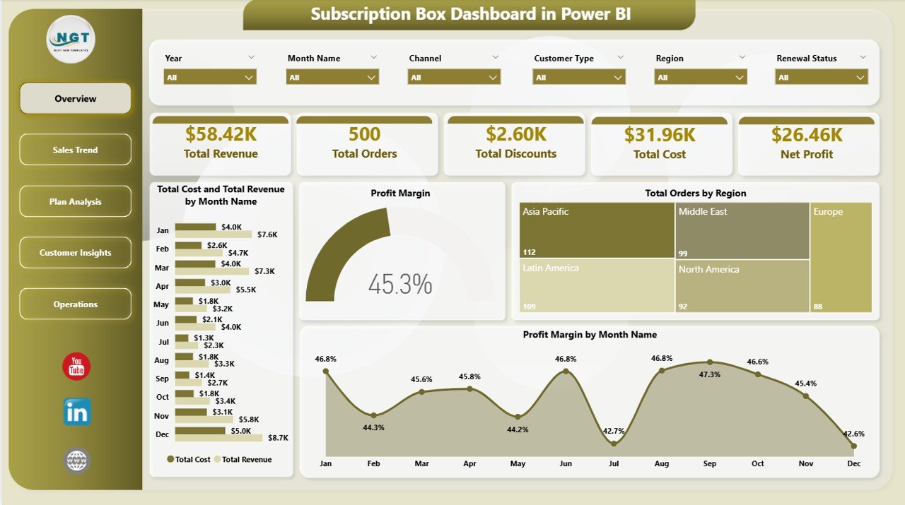
1 — Overview Page
The Overview page sits on top of the report and gives you the high-level information at a glance. It includes 5 KPI cards (Total Revenue, Total Orders, Total Discounts, Total Cost, Net Profit) and the following charts with multiple slicers to filter the entire dashboard quickly:
📊 Total Cost and Total Revenue by Month Name — A combined column chart comparing month-on-month revenue against cost, instantly revealing margin compression months and your most profitable periods.
📊 Profit Margin — A KPI/gauge visual showing your overall profit margin percentage with target and variance, so leadership can see if you’re on track without opening a single P&L.
📊 Total Orders by Region — A bar chart breaking down order volume by geographic region, surfacing your top markets and underperforming territories at a glance.
📊 Profit Margin by Month Name — A line chart tracking margin trend across 12 months, ideal for spotting seasonal patterns and validating pricing-change impact.
 Subscription Box Dashboard in Power BI
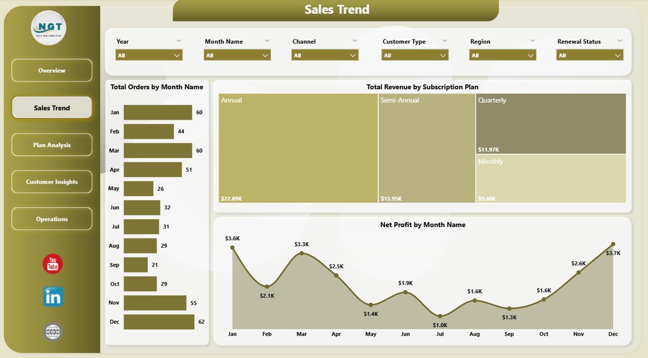
2 — Sales Trend
The Sales Trend page focuses on month-over-month performance and revenue mix. In this sheet tab, we have created the following analyses:
📊 Total Orders by Month Name — Tracks order volume across all 12 months to identify peak subscription-acquisition windows and slow seasons.
📊 Total Revenue by Subscription Plan — Shows which plan tier (Starter, Mid, Premium) contributes the most revenue, helping you decide where to invest growth budget.
📊 Net Profit by Month Name — Plots net profit trend month-by-month so finance can flag any month where profit fell despite revenue rising.
 Sales Trend
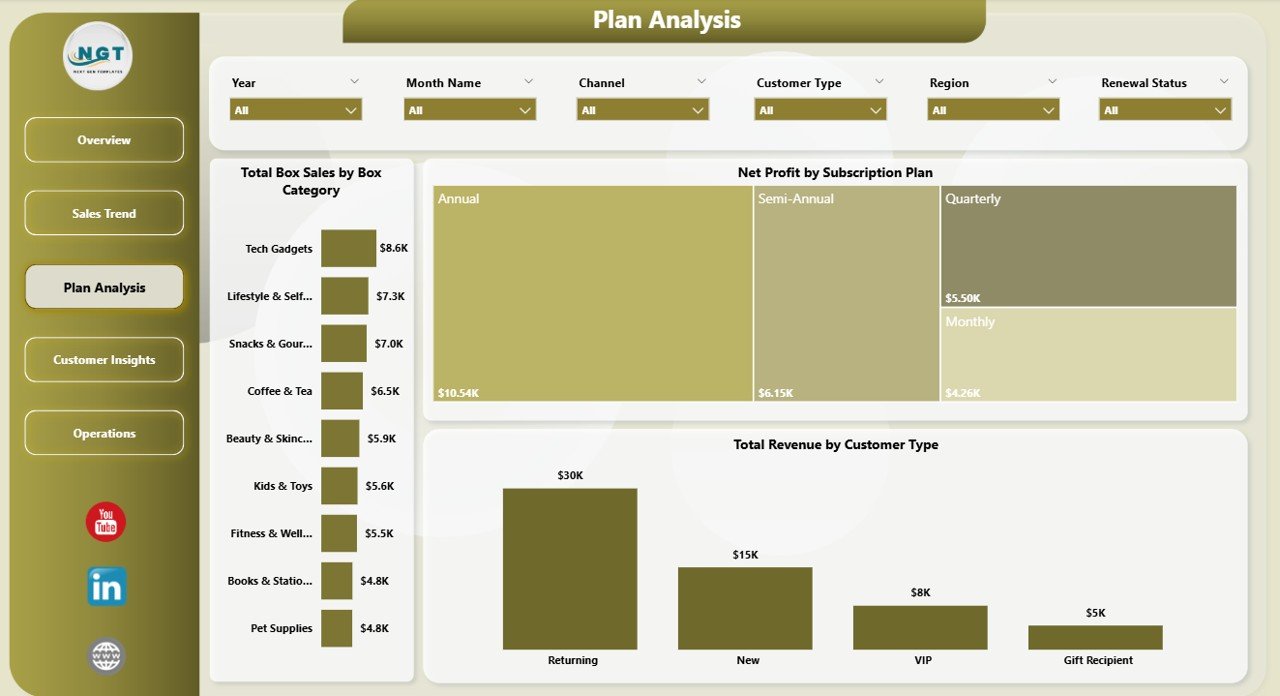
3 — Plan Analysis
The Plan Analysis page breaks down performance by subscription plan and box category. In this sheet tab, we have created the following analyses:
📊 Total Box Sales by Box Category — Compares units sold across categories (Beauty, Snacks, Fitness, etc.) so you can rationalize your category lineup.
📊 Net Profit by Subscription Plan — Reveals which plan delivers the highest absolute profit, often surprising teams who optimize on revenue alone.
📊 Total Revenue by Customer Type — Splits revenue by new vs returning customers, exposing whether your growth depends on acquisition or retention.
 Plan Analysis
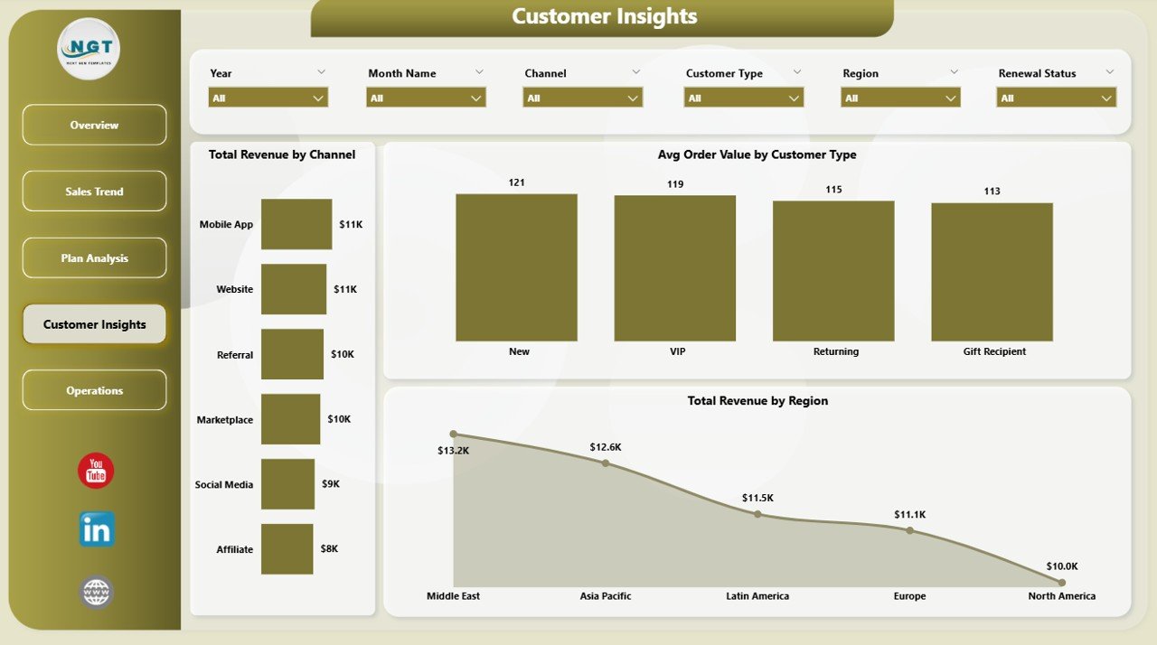
4 — Customer Insights
The Customer Insights page focuses on channel and regional revenue patterns. In this sheet tab, we have created the following analyses:
📊 Total Revenue by Channel — Compares revenue from organic, paid social, affiliate, referral, and direct channels — perfect for budget reallocation decisions.
📊 Avg Order Value by Customer Type — Shows whether new customers spend more or less than returning customers, a critical input for LTV modelling.
📊 Total Revenue by Region — Pinpoints regional revenue concentration so you know where to prioritize fulfillment partners and ad spend.
 Customer Insights
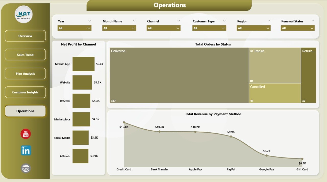
5 — Operations
The Operations page surfaces order status, channel profitability, and payment health. In this sheet tab, we have created the following analyses:
📊 Net Profit by Channel — Layers profit (not just revenue) across channels, exposing which acquisition channels look great on top-line but lose money after fees.
📊 Total Orders by Status — Splits orders into active, paused, cancelled, and pending — your first line of defense against silent churn.
📊 Total Revenue by Payment Method — Highlights revenue by card, wallet, UPI, and other methods so you can prioritize payment-failure recovery.
 Operations
📊 Subscription Box Dashboard in Power BI vs. Tableau / Qlik vs. Paid Subscription Analytics SaaS — Where This Fits
| Feature | Subscription Box Dashboard in Power BI | Tableau / Qlik Equivalent | Recharge / Stay AI / Subbly Analytics |
|---|---|---|---|
| Cost | $17.99 one-time ✅ | $70-100 / user / month | $99-499 / month |
| Platform | Power BI Desktop (free) ✅ | Tableau Desktop / Qlik Sense | Web-based SaaS |
| Setup time | Under 10 minutes ✅ | 2-4 hours per dashboard | Connector setup + reconciliation |
| Customizable DAX measures | Yes, fully editable ✅ | Yes (calculated fields) | Limited to vendor presets |
| 5 pre-built pages with slicers | Yes ✅ | Build from scratch | Limited templates |
| Mobile + web viewing | Yes (Power BI Service) | Yes | Yes |
| Vendor lock-in | None — your file ✅ | Tableau ecosystem | Locked to platform |
| Year-1 cost at 5 users | $17.99 ✅ | $4,200 – $6,000 | $1,188 – $5,988 |
| Works with custom data sources | Yes (Excel, SQL, API) ✅ | Yes | Limited to integrations |
For subscription box operators who want plan-level, channel-level, and regional profitability views without paying $1,000+ per year for a vertical SaaS, the Subscription Box Dashboard in Power BI sits in the sweet spot.
👥 Who This Template Is For — and Who It’s Not For
✅ This template is built for:
- Subscription box founders running 50-50,000 active subscribers who need monthly P&L visibility
- E-commerce growth managers who report MRR, churn, and channel ROI to leadership
- Direct-to-consumer (DTC) operators in beauty, snacks, fitness, pet, books, or hobby boxes
- Finance / FP&A analysts who want to roll up plan-level profit margins into a board pack
- Power BI users who prefer customizable .pbix files over closed SaaS dashboards
❌ This template is NOT for:
- Enterprise subscription businesses needing SOC 2 compliance, SSO, and multi-region replication
- Pure SaaS / software subscription teams (use a SaaS Onboarding Dashboard instead)
- Teams who need real-time syncing with Shopify or Recharge — this uses scheduled refresh, not webhooks
- Users who don’t want to install the free Power BI Desktop application
⚙️ How to Use the Subscription Box Dashboard in Power BI
- Download the .zip file and extract it to your local drive.
- Open the .pbix file in Power BI Desktop (free download from Microsoft).
- In the Data view, replace the sample dataset with your own subscription transaction data, keeping the same column headers.
- Click “Refresh” on the Home ribbon to recalculate every page, KPI card, and chart.
- Use the slicers on each page to filter by region, plan, channel, customer type, or status.
- Publish to Power BI Service for team-wide sharing or export individual pages as PDF.
💼 Real-World Use Cases
Maya runs a 12,000-subscriber beauty box brand. She uses the Subscription Box Dashboard in Power BI every Monday to review last week’s Net Profit by Channel and Total Revenue by Subscription Plan, deciding within an hour where to redirect her $40K monthly ad budget — without paying $399/month for Subbly Analytics.
Diego is the FP&A lead at a snacks DTC brand doing $8M ARR. He drops the .pbix into his existing Power BI workspace, swaps the sample data for the company’s monthly export, and presents Profit Margin by Month Name + Avg Order Value by Customer Type at every Friday’s executive review.
Priya operates a hobby box startup out of a 5-person team. She doesn’t have a data analyst, but the prebuilt slicers let her filter the dashboard by region and box category in seconds — surfacing that her North region’s “Crafts” boxes deliver 2.4× the margin of her flagship “Stationery” boxes.
❓ Frequently Asked Questions
What KPIs does the Subscription Box Dashboard in Power BI track?
The Subscription Box Dashboard in Power BI tracks 5 primary KPIs on the Overview page (Total Revenue, Total Orders, Total Discounts, Total Cost, Net Profit) plus 16 supporting charts across 4 analysis pages covering month-on-month revenue, plan-level profit, customer type, channel, region, and order status.
How does this compare to paid subscription analytics SaaS like Recharge or Subbly?
The Subscription Box Dashboard in Power BI costs $17.99 one-time vs $99-499 per month for Recharge or Subbly Analytics. You own the .pbix file forever, can edit DAX measures freely, and there’s no per-user fee. Year 1 saves you $1,170-$5,970 for a 5-user team.
How long does setup take?
Setup for the Subscription Box Dashboard in Power BI takes under 10 minutes. Download, open the .pbix in Power BI Desktop, paste your subscription transaction data into the existing data table, and click Refresh. Every chart, slicer, and KPI card updates automatically — no DAX rewriting required.
Can I customize the DAX measures and visuals?
Yes. The Subscription Box Dashboard in Power BI ships as an unlocked .pbix with all DAX measures fully editable. You can add new pages, swap chart types, change the colour theme, or extend the data model with your own calculated columns and tables.
Does this work with Shopify, Recharge, or Stripe data?
The Subscription Box Dashboard in Power BI accepts any tabular data with the matching column headers. You can connect it to Excel, CSV, SQL Server, or any source Power BI supports — including direct Shopify, Stripe, or Recharge exports — by repointing the data source in Power Query.
Do I get future updates?
The Subscription Box Dashboard in Power BI is a one-time purchase with lifetime access. Any major version updates we publish are downloadable from your account. There are no recurring fees, no per-user charges, and no expiration.
Is this template suitable for non-Power-BI alternatives?
If you prefer Excel, the same logic is available as the Subscription Box Dashboard in Excel. The Power BI version is recommended when you need cross-page slicer filtering and online publishing via Power BI Service.
👤 About the Author
Built by PK — Microsoft Certified Professional with 15+ years of Excel, Google Sheets, and Power BI experience. Founder of NextGenTemplates, reaching 300K+ subscribers across YouTube channels (@PK-AnExcelExpert, @NextGenTemplates, @NeoTechNavigators). Every template is hand-built and tested before release.
🔗 Explore Related Templates
📦 Also available as: Subscription Box Dashboard in Excel — same metrics and pages, built natively in Excel with pivot-driven refresh.
🎯 Related Power BI Dashboards:
- SaaS Onboarding Dashboard in Power BI — perfect companion if you also run a software subscription line.
- Dropshipping Dashboard in Excel — adjacent e-commerce template covering supplier-side fulfillment.
- Customer Retention KPI Dashboard in Google Sheets — pair with this dashboard to model churn and LTV.
- Ecommerce Conversion Rate KPI Dashboard in Excel — for tracking checkout-funnel health alongside subscription metrics.
Browse all Power BI Dashboard Templates or explore the full Dashboard Templates library on NextGenTemplates.
📖 Click here to read the Detailed Blog Post
🎥 Visit our YouTube channel for step-by-step video tutorials
👉 YouTube.com/@NextGenTemplates
📅 Last updated: May 2026
Watch the step-by-step video tutorial:


Reviews
There are no reviews yet.