


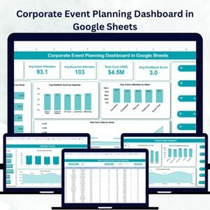
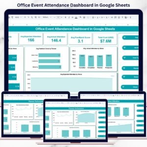
Organizing successful events requires more than just good planning — it requires smart tracking, insightful analysis, and clear visibility across all event metrics. The Organizational Event Planning & Analysis Dashboard in Google Sheets provides an all-in-one solution to help event planners, coordinators, and management teams plan, monitor, and evaluate events efficiently.
This ready-to-use dashboard simplifies the entire event management process — from budget allocation to attendance tracking and feedback analysis. Built with Google Sheets’ interactive capabilities, it delivers real-time insights through automated charts, summary cards, and search features — no coding or external tools required.
Whether you’re managing internal workshops, corporate conferences, or large-scale public events, this dashboard ensures that every decision is data-driven and every event is better than the last.

🔑 Key Features of the Organizational Event Planning & Analysis Dashboard
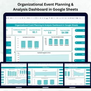
🏠 1. Overview Sheet Tab – All-In-One Event Summary
The Overview Sheet provides a quick and comprehensive snapshot of all your events. It summarizes performance metrics and visualizes key data points for faster decision-making.
Cards Section:
-
📅 # of Events: Shows the total number of planned, ongoing, and completed events.
-
👥 Avg. Expected Attendees: Displays the average target audience size.
-
✅ Avg. Actual Attendees: Measures actual participation to assess engagement.
-
⭐ Avg. Feedback Score: Tracks event satisfaction ratings (e.g., 1–5 scale).
-
💰 Total Cost (USD): Displays total spending across all events.
Charts Section:
-
💸 Total Cost by Venue: Identifies which venues consume the largest budgets.
-
🙋♀️ Avg. Feedback by Planner: Compares planners based on satisfaction scores.
-
📊 Avg. Actual Attendees by Status: Evaluates event performance by completion stage.
-
🏟 Avg. Expected Attendees by Venue: Measures turnout efficiency by location.
These visuals turn complex event data into actionable insights instantly.
🎯 2. Event Type Analysis – Compare Event Categories
Get a deep dive into how different types of events perform.
Charts Included:
-
👨🏫 Avg. Expected Attendees by Event Type – Gauge audience interest in various event categories.
-
💬 Avg. Feedback Score by Event Type – Assess satisfaction and effectiveness by format.
-
👥 Avg. Actual Attendees by Event Type – Track turnout versus expectations.
-
💵 Total Cost by Event Type – Evaluate cost efficiency per event category.
This analysis helps identify which event types deliver the best ROI and engagement.
👩💼 3. Planner Performance – Track Organizer Efficiency
Keep your planning team accountable and performance-focused.
Charts Include:
-
📈 Avg. Expected Attendees by Planner – Evaluate planning effectiveness.
-
⭐ Avg. Feedback Score by Planner – See which planners deliver top-rated experiences.
-
💰 Total Cost by Planner – Track spending per planner or department.
-
👥 Avg. Actual Attendees by Planner – Analyze engagement success per organizer.
These insights highlight star performers and reveal opportunities for coaching or process improvement.
🏢 4. Venue Utilization – Maximize Space & Cost Efficiency
Understand which venues bring the best results and value for money.
Charts Include:
-
🏟 # of Events by Venue – Visualize which venues are most frequently used.
-
💵 Total Cost by Venue – Identify cost-heavy locations.
-
👥 Avg. Actual Attendees by Venue – Measure engagement per site.
This helps event managers allocate venues wisely and optimize space utilization.
🔍 5. Search Functionality – Quick Record Retrieval
The Search Tab allows you to locate any event instantly.
Features:
-
Search by keyword or field (e.g., Planner, Venue, Event Type).
-
Filter results dynamically for audit, feedback, or performance reviews.
This function saves time when reviewing multiple events or preparing reports.
📋 6. Data Sheet Tab – The Foundation of Your Dashboard
The Data Sheet contains all the raw information powering your visuals.
Fields Include:
-
Event Name, Date, and Venue
-
Planner Name
-
Expected & Actual Attendees
-
Event Type
-
Status (Planned, Ongoing, Completed, Canceled)
-
Cost (USD)
-
Feedback Score
All dashboard charts update automatically when you modify this data.
🌟 Advantages of Using This Dashboard
-
📂 Centralized Data Management: Manage every event in one organized workspace.
-
📈 Real-Time Insights: Visual charts and summaries update automatically.
-
💸 Better Budget Control: Track expenses by venue, planner, and event type.
-
👥 Improved Accountability: Evaluate planners and vendors with transparent metrics.
-
🕒 Time-Saving Automation: No manual charting — visuals refresh instantly.
-
🌎 Cloud-Based Collaboration: Share and update with your team anytime, anywhere.
💼 Best Practices for Using the Dashboard
✅ Keep Data Updated: Enter event details immediately after planning or completion.
✅ Standardize Feedback Metrics: Use consistent scales for accuracy.
✅ Segment by Category: Compare internal vs. external events for better insights.
✅ Review Costs Regularly: Use “Cost by Venue” and “Cost by Type” charts to manage budgets.
✅ Analyze Trends: Spot which events consistently perform best to plan smarter.
👨💼 Who Can Benefit
🎤 Event Planners – Oversee multiple events efficiently.
🏢 Corporate Teams – Manage internal workshops, meetings, and conferences.
💰 Finance Departments – Track event spending across planners and venues.
🎓 Educational Institutions – Evaluate seminar and training program success.
🚀 How This Dashboard Helps
-
Streamlines event planning and evaluation.
-
Enhances decision-making with visual analytics.
-
Improves event quality through feedback tracking.
-
Optimizes resources and budgets for future events.
-
Enables collaboration between departments seamlessly.
🔗 Click here to read the detailed blog post
Watch the step-by-step video Demo:


Reviews
There are no reviews yet.