

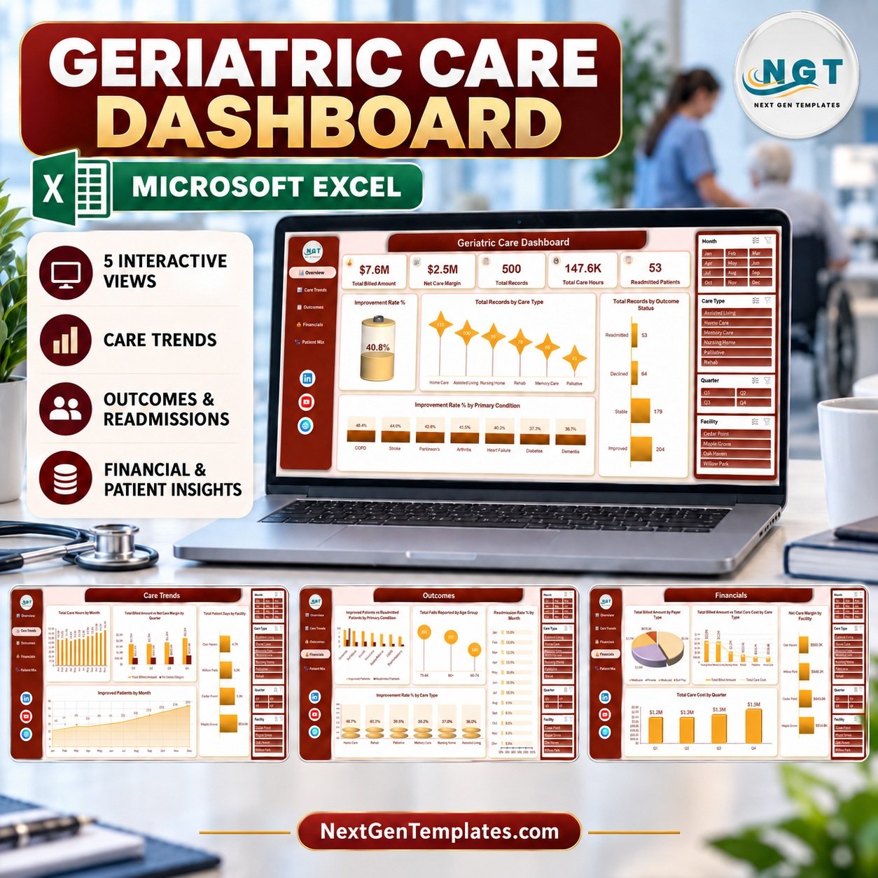
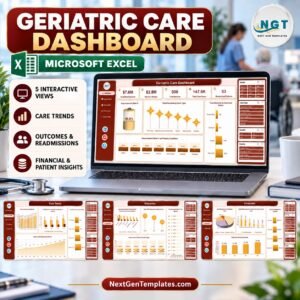
The Geriatric Care Dashboard in Excel turns 500 sample care episodes and 25 data columns into 5 interactive pages, 5 headline KPI cards and 20 linked charts. Four slicers — Month, Quarter, Care Type and Facility — sit on every page and filter all of them at once. Setup takes under 10 minutes: paste your own episode records over the sample rows on the Data sheet, refresh, and every page redraws.
🌍 Join 8,400+ teams in 40+ countries using NextGenTemplates to replace paid SaaS tools with one-time-purchase Excel, Google Sheets, Power BI and HTML templates.
✅ Instant download · One-time payment · No subscription · No per-user fees · Lifetime access
⚠️ Please read the scope first. This is an operational analytics workbook for elder-care management reporting. It is not an EHR or EMR, not a clinical decision-support or diagnostic tool, and not a care-planning or medication-management system. It ships with fictional sample data, carries no HIPAA or GDPR compliance guarantee, and does not connect to any care-management system. Do not use it to store real patient or resident records. The FAQ section below spells all of this out.
🔑 Key Features of the Geriatric Care Dashboard in Excel
🧩 Five linked analysis pages. Overview, Care Trends, Outcomes, Financials and Patient Mix each answer a different management question, and a left-hand navigation rail moves you between them. Every page is driven by the same single data table, so no page can drift out of step with another.
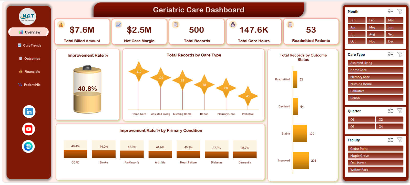
📌 Five headline KPI cards. The Overview page reports Total Billed Amount, Net Care Margin, Total Records, Total Care Hours and Readmitted Patients. In the shipped sample data these read $7.6M, $2.5M, 500, 147.6K and 53 — all of which move the moment you apply a slicer.
📈 Twenty pre-built charts. Across the five pages you get 20 charts, including Total Records by Care Type, Improvement Rate % by Primary Condition, Total Care Hours by Month, Readmission Rate % by Month, Total Billed Amount by Payer Type and Total Patient Days by Primary Condition. Each is named for what it measures, not for its chart type.
🎛️ Four synchronised slicers. Month, Quarter, Care Type and Facility are wired to a shared cache, so clicking Memory Care or Maple Grove on any page filters every KPI card and every chart on that page in one click. No formulas to edit, no parameters to retype.
🗂️ A clean 25-column data sheet. The Data sheet holds 500 episode rows with Episode ID, Admission Date, Facility, Care Manager, Care Type, Primary Condition, Patient Age, Gender, Payer Type, Outcome Status, Length of Stay, Care Hours, Falls Reported, Billed Amount, Care Cost, Satisfaction Score and pre-calculated Month, Year, Quarter and Age Group helper columns.
🔐 Episode IDs, not names. The sample data identifies each record by an Episode ID and an age band — there is no patient-name or address column anywhere in the workbook. If you adapt it, keep it that way and map your own records to a reference code held in your care system.
🖥️ No macros, no add-ins. The file is a plain .xlsx built on PivotTables, slicers and worksheet formulas. Nothing to enable, nothing to trust, no VBA security prompt. It opens in Microsoft Excel 2016 or later on Windows or Mac desktop.
📦 What’s Inside the Geriatric Care Dashboard in Excel
Seven worksheets ship in the workbook: five dashboard pages, one Data sheet and one Support sheet that holds the PivotTables feeding every chart. Here is what each page shows.
Page 1: Overview
The landing page carries all five KPI cards — Total Billed Amount, Net Care Margin, Total Records, Total Care Hours and Readmitted Patients — above an Improvement Rate % gauge reading 40.8% on the sample data. Charts on this page are Total Records by Care Type (Home Care 119, Assisted Living 100, Nursing Home 92, Rehab 78, Memory Care 68, Palliative 43), Total Records by Outcome Status (Improved 204, Stable 179, Declined 64, Readmitted 53) and Improvement Rate % by Primary Condition, which ranks COPD at 46.4% down to Dementia at 36.7%.
Page 2: Care Trends
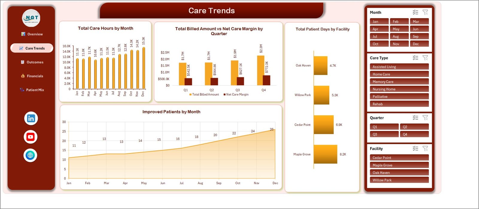
This page follows workload and margin through the year. It shows Total Care Hours by Month (11.1K in January rising to 15.3K in December), Total Billed Amount vs Net Care Margin by Quarter, Total Patient Days by Facility across Maple Grove, Cedar Point, Willow Park and Oak Haven, and Improved Patients by Month climbing from 11 to 26.
Page 3: Outcomes
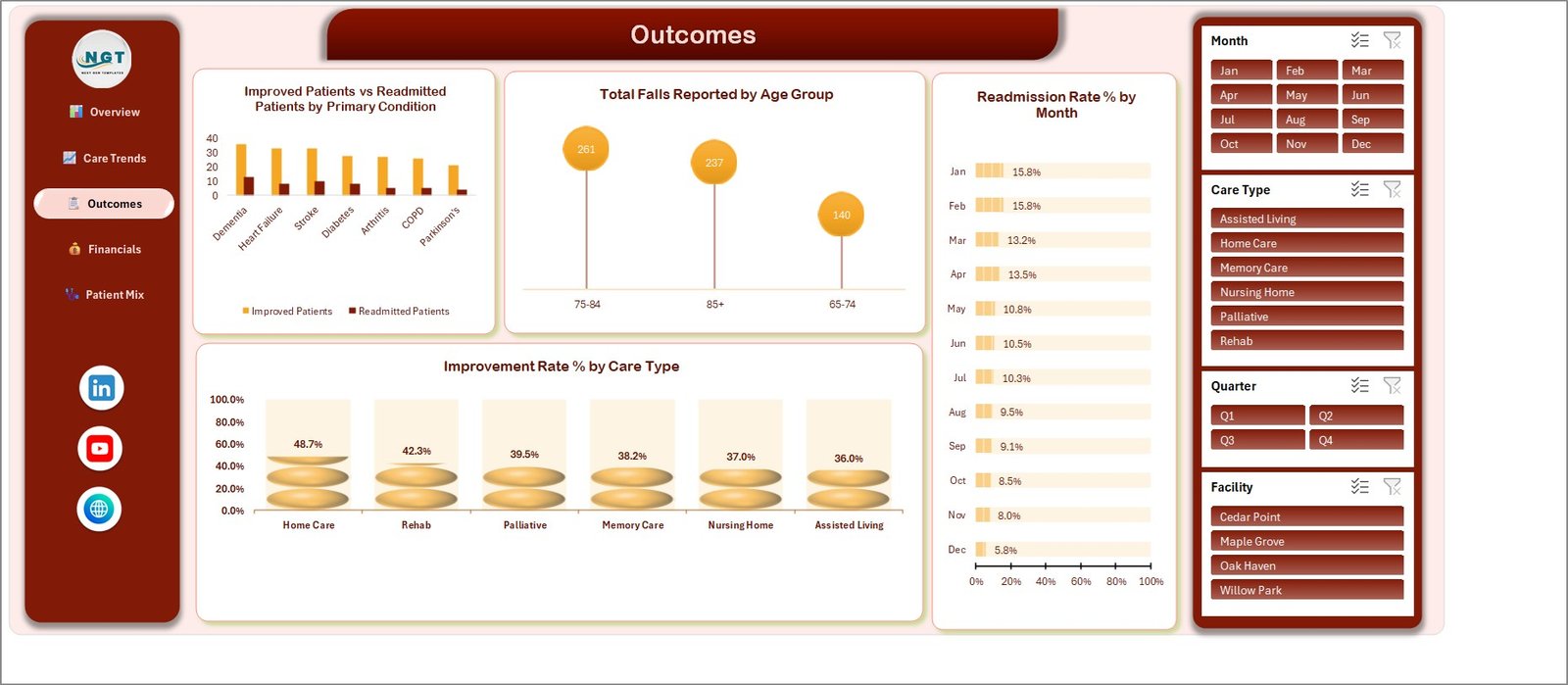
The Outcomes page pairs improvement against readmission. It carries Improved Patients vs Readmitted Patients by Primary Condition, Total Falls Reported by Age Group (75-84 at 261, 85+ at 237, 65-74 at 140), Readmission Rate % by Month falling from 15.8% in January to 5.8% in December, and Improvement Rate % by Care Type, where Home Care leads at 48.7% and Assisted Living trails at 36.0%.
Page 4: Financials
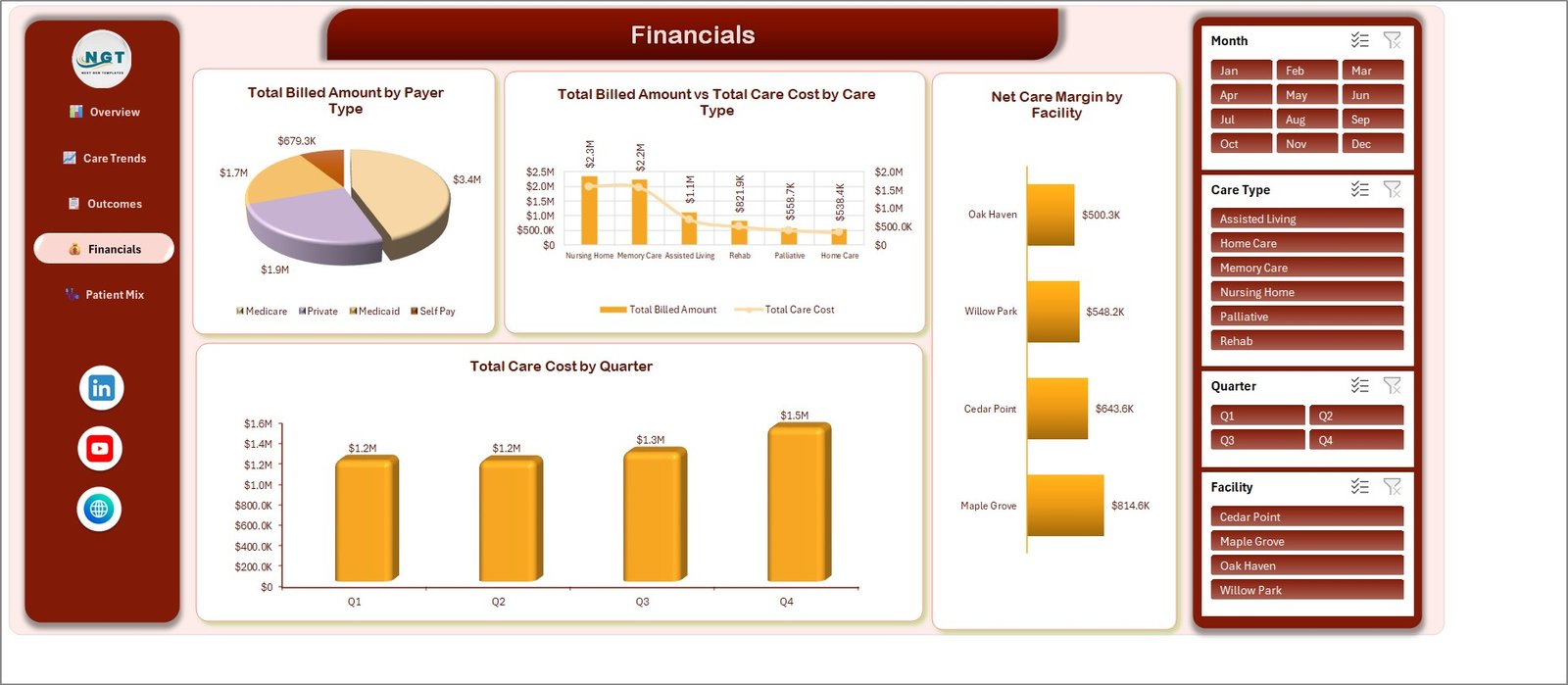
Financials splits revenue and cost four ways. It shows Total Billed Amount by Payer Type (Medicare $3.4M, Private $1.9M, Medicaid $1.7M, Self Pay $679.3K), Total Billed Amount vs Total Care Cost by Care Type, Net Care Margin by Facility from Maple Grove at $814.6K down to Oak Haven at $500.3K, and Total Care Cost by Quarter rising from $1.2M to $1.5M.
Page 5: Patient Mix
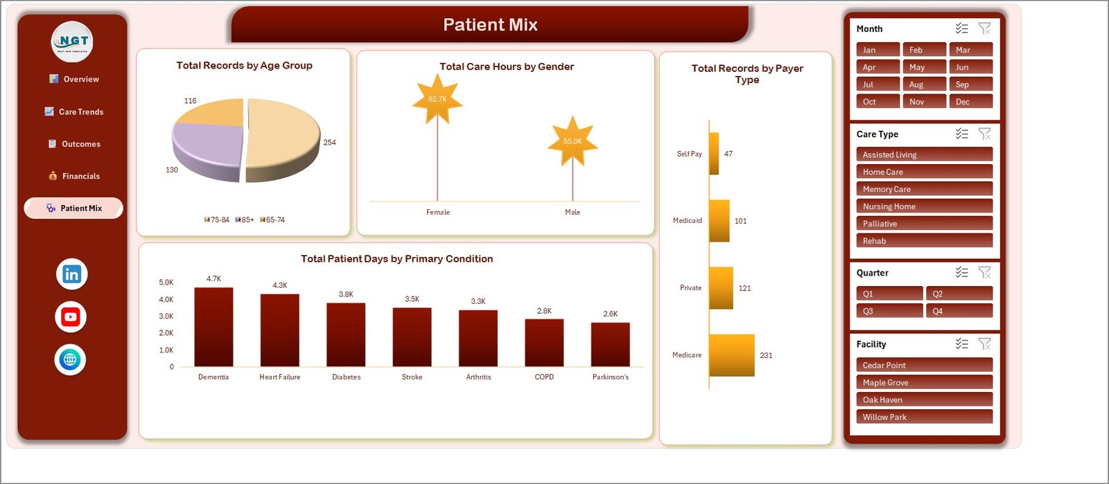
The last page profiles who is being cared for. It reports Total Records by Age Group (75-84 at 254, 85+ at 130, 65-74 at 116), Total Care Hours by Gender (92.7K female, 55.0K male), Total Records by Payer Type and Total Patient Days by Primary Condition, where Dementia consumes 4.7K days against 2.6K for Parkinson’s.
Data sheet and Support sheet
The Data sheet is the single source for everything above: 500 episode rows, 25 columns, one row per care episode. The Support sheet holds the PivotTables and helper blocks that feed all 20 charts. Both are visible and unlocked, so you can see exactly how a number is produced before you trust it in a board pack.
📊 Geriatric Care Dashboard in Excel vs. a Google Sheets Build vs. PointClickCare / Athenahealth
| Feature | Geriatric Care Dashboard in Excel | Google Sheets equivalent | PointClickCare / Athenahealth |
|---|---|---|---|
| Cost | $29.99 one-time ✅ | $0-$25 / user / month | Quoted per bed or per provider, typically four figures a month |
| Platform | Microsoft Excel 2016+ desktop, works offline ✅ | Browser, Google account required | Vendor cloud, browser only |
| Setup time | Under 10 minutes – paste and refresh ✅ | Hours of chart rebuilding | Weeks of implementation and staff training |
| Pages and charts out of the box | 5 pages, 20 charts, 5 KPI cards ✅ | Build it yourself | Extensive, but locked to the vendor model |
| Real-time team collaboration | Shared drive or SharePoint co-authoring | Native multi-user editing ✅ | Native, role-based ✅ |
| Mobile access | View-only via the Excel mobile app | Full browser access ✅ | Native apps ✅ |
| Stores real resident records | No – analytics only, by design | No | Yes, it is the system of record ✅ |
| Your data leaves your machine | Never – the file is yours ✅ | Stored in Google Drive | Stored in the vendor cloud |
| Year-1 cost at 5 users | $29.99 total ✅ | $0-$1,500 | $15,000+ |
For a care group that wants monthly occupancy, outcome and margin reporting without buying a bed-management platform, this workbook sits in the sweet spot — and it sits alongside your care system rather than replacing it.
Put another way: if you already own Microsoft Excel, you already own the licence you need for elder care analytics in Excel. The only thing you are buying here is the five pages, the twenty charts and the wiring that connects them to your data.
👥 Who This Template Is For — and Who It Is Not For
✅ Built for:
- Administrators and operations managers running 1-10 assisted living, memory care or nursing home sites who need a monthly management pack
- Home care and domiciliary agency owners tracking care hours, billed amount and margin by care type
- Quality and improvement leads who want readmission, falls and improvement-rate trends in one place
- Finance teams reconciling Medicare, Medicaid, Private and Self Pay mix across facilities
- Consultants and analysts who need a presentable elder care dashboard template they can hand to a client the same day
❌ Not for:
- Anyone needing an EHR, EMR or system of record – this workbook stores no clinical record and replaces nothing you already run
- Clinical teams wanting risk scoring, triage, alerting or any form of decision support at the bedside
- Care planning, medication administration or e-prescribing workflows
- Organisations that need a signed BAA, an audit trail, SSO or certified HIPAA/GDPR processing – none of that is on offer here
- Live operational monitoring – the workbook refreshes when you refresh it, not continuously
⚙️ How to Use the Geriatric Care Dashboard in Excel
- Download the ZIP and unpack it. You get the
.xlsxworkbook and the Excel Dashboard User Manual PDF. - Open the workbook in Microsoft Excel 2016 or later on Windows or Mac desktop. There are no macros, so nothing needs enabling.
- Walk the five pages with the sample data in place so you can see what each chart measures before you change anything.
- Go to the Data sheet and replace the 500 sample rows with your own episodes, keeping the 25 column headers exactly as they are.
- Keep the existing category values, or edit the Facility, Care Type, Primary Condition and Payer Type lists to match your own sites and services.
- Press Ctrl+Alt+F5 (Refresh All). Every PivotTable on the Support sheet rebuilds and all 20 charts redraw.
- Use the Month, Quarter, Care Type and Facility slicers to cut the view, then print or export the page you need for your management pack.
💼 Real-World Use Cases
Marta runs three assisted living homes with 140 beds between them. Every month she pastes her episode export onto the Data sheet, filters the Facility slicer to each site in turn, and prints the Financials and Outcomes pages into a four-page board pack. The Net Care Margin by Facility chart is what her trustees ask about first, and it takes her ten minutes rather than the two days her previous spreadsheet took.
Dev is quality lead for a domiciliary care agency. He uses the Outcomes page to watch Readmission Rate % by Month and Total Falls Reported by Age Group. When the 75-84 band showed the highest fall count, he had the evidence to move his falls-prevention training budget – a conversation he could not have had from a pile of incident forms.
Priya is a healthcare consultant. She keeps a copy of this template per client, swaps in their episode data, and delivers a five-page review in an afternoon. Because the file is a plain workbook with no add-ins, her clients IT departments never have to approve anything.
❓ Frequently Asked Questions
Is this an EHR or a clinical system?
No. The Geriatric Care Dashboard in Excel is a management reporting workbook and nothing more. It is not an EHR or EMR, not a clinical decision-support or diagnostic tool, and not a care-planning or medication-management system. It holds no clinical record, produces no clinical advice, and is designed to sit beside the care system you already use.
Can I put real patient or resident data in it?
Please do not. The workbook ships with fictional sample data, carries no HIPAA or GDPR compliance guarantee, and offers no signed BAA, no access control and no audit trail. Use de-identified or aggregated episode data only, keyed to a reference code held in your own system. That is how the sample data is built.
Does it connect to my care management system?
No. There is no integration with PointClickCare, Athenahealth or any other care-management platform. You export your episode data, paste it onto the Data sheet and press Refresh All. That manual step is deliberate: it keeps the workbook offline and leaves your source system untouched.
How long does setup take?
Under 10 minutes for the first run. Unpack the ZIP, open the workbook, paste your rows over the 500 sample rows on the Data sheet keeping the 25 headers intact, and press Ctrl+Alt+F5. All 20 charts and the 5 KPI cards redraw against your numbers immediately.
How does this differ from the Geriatric Care KPI Dashboard in Excel?
They are different products from different lines. The Geriatric Care KPI Dashboard in Excel is a scorecard: targets, actuals and traffic lights against a KPI list. This workbook is an analytical dashboard, with 5 pages, 20 charts and 4 slicers exploring 500 episodes across care type, facility, condition, age group and payer.
Do I need macros, add-ins or a subscription?
None of the three. The file is a plain .xlsx using PivotTables, Excel slicers and worksheet formulas. It works in Excel 2016 or later on Windows or Mac desktop, offline, on a one-time payment with no per-user fee.
Can I change the facilities, care types and conditions?
Yes. Facility, Care Type, Primary Condition, Payer Type, Outcome Status and Age Group are ordinary text columns on the Data sheet. Replace the sample values with your own, refresh, and every chart and slicer picks up your categories automatically. No formula editing is required.
👤 About the Author
Built by PK — Microsoft Certified Professional with 15+ years of Excel, Google Sheets and Power BI experience. Founder of NextGenTemplates, reaching 300K+ subscribers across YouTube channels (@PKAnExcelExpert, @NextGenTemplates, @NeoTechNavigators). Every template is hand-built and tested before release.
🔗 Explore Related Templates
- Nursing Homes Dashboard in Excel – the same analytical layout aimed at residential nursing operations rather than the full elder-care pathway.
- Patient Care Homes Dashboard in Excel – occupancy, staffing and cost analysis for care-home groups.
- Palliative Care Dashboard in Excel – the end-of-life care counterpart to this workbook.
- Also available as: Geriatric Care KPI Dashboard in Excel (scorecard format) and Geriatric Care KPI Dashboard in Power BI.
- Browse the full Excel Dashboard Templates range, or the Health and Safety templates collection.
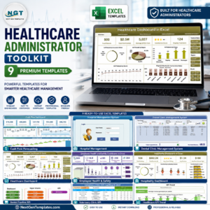
- 💎 Save more – get this and eight other healthcare workbooks in the Healthcare Administrator Toolkit – 9 Premium Templates (Excel).
For background on why elder-care demand keeps rising, the World Health Organization Ageing and health fact sheet is a useful primer.
📖 Click here to read the detailed blog post
🎥 Visit our YouTube channel for step-by-step video tutorials
👉 YouTube.com/@NextGenTemplates
📅 Last updated: September 2026







Reviews
There are no reviews yet.