Energy management is the backbone of every power generation and utility business. The Energy Generation & Efficiency Dashboard in Google Sheets provides a smart, automated, and interactive way to track performance, emissions, and efficiency across multiple facilities — all in one place. ⚡📊
This ready-to-use Google Sheets template empowers energy producers, renewable energy companies, and power plant operators to make data-driven decisions. With dynamic visuals, MTD/YTD calculations, and color-coded KPIs, it helps you monitor generation output, downtime, and emissions in real time — ensuring operational excellence and sustainability.
🔑 Key Features of the Energy Generation & Efficiency Dashboard in Google Sheets
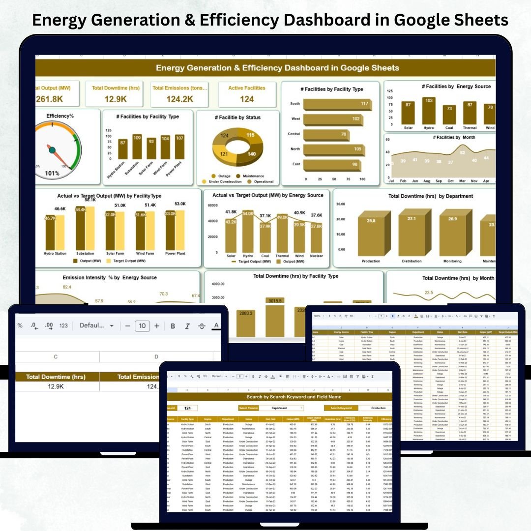
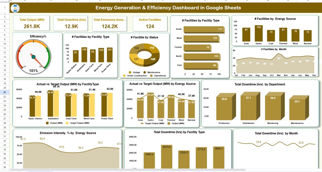
📋 Dashboard Sheet Tab (Main Visualization Hub)
This is the central page of the system, combining performance summaries and interactive visuals for at-a-glance decision-making.
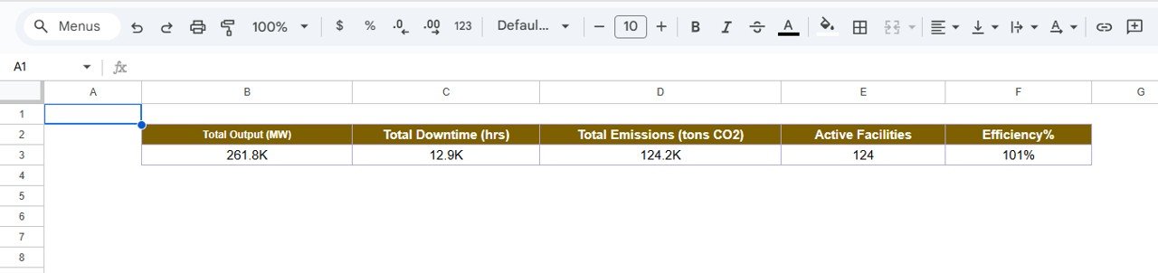
KPI Cards Displayed:
-
⚡ Total Output (MW): Total energy produced across all facilities.
-
⏱ Total Downtime (hrs): Hours lost due to outages or maintenance.
-
🌍 Total Emissions (tons CO₂): Tracks environmental impact.
-
🏭 Active Facilities: Number of plants currently operational.
-
🔋 Efficiency (%): Compares actual energy output with total potential capacity.
Charts Included:
-
📈 Efficiency % by Facility Type
-
⚙️ Efficiency % by Status (Active/Inactive)
-
🔌 Efficiency % by Energy Source (Solar, Wind, Thermal, etc.)
-
📆 Efficiency % by Month
-
⏳ Total Downtime (hrs) by Department
-
🔋 Actual vs Target Output (MW) by Source
-
🏗 Actual vs Target Output (MW) by Facility Type
-
🌫 Emission Intensity % by Energy Source
-
🕒 Total Downtime (hrs) by Month
All visuals update automatically whenever the dataset changes or a new month is selected (cell D3). This gives stakeholders instant clarity on energy efficiency and sustainability goals.
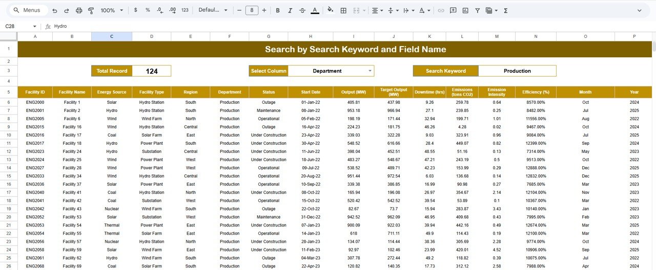
🔍 Search Sheet Tab (Smart Filtering System)
No need to scroll through endless records — simply search by any field name.
Examples:
-
“Status = Active” → See all operational facilities.
-
“Department = Operations” → Filter downtime by the operations team.
-
“Energy Source = Solar” → View performance of renewable assets.
This smart lookup feature makes reporting faster, clearer, and more accessible for managers.
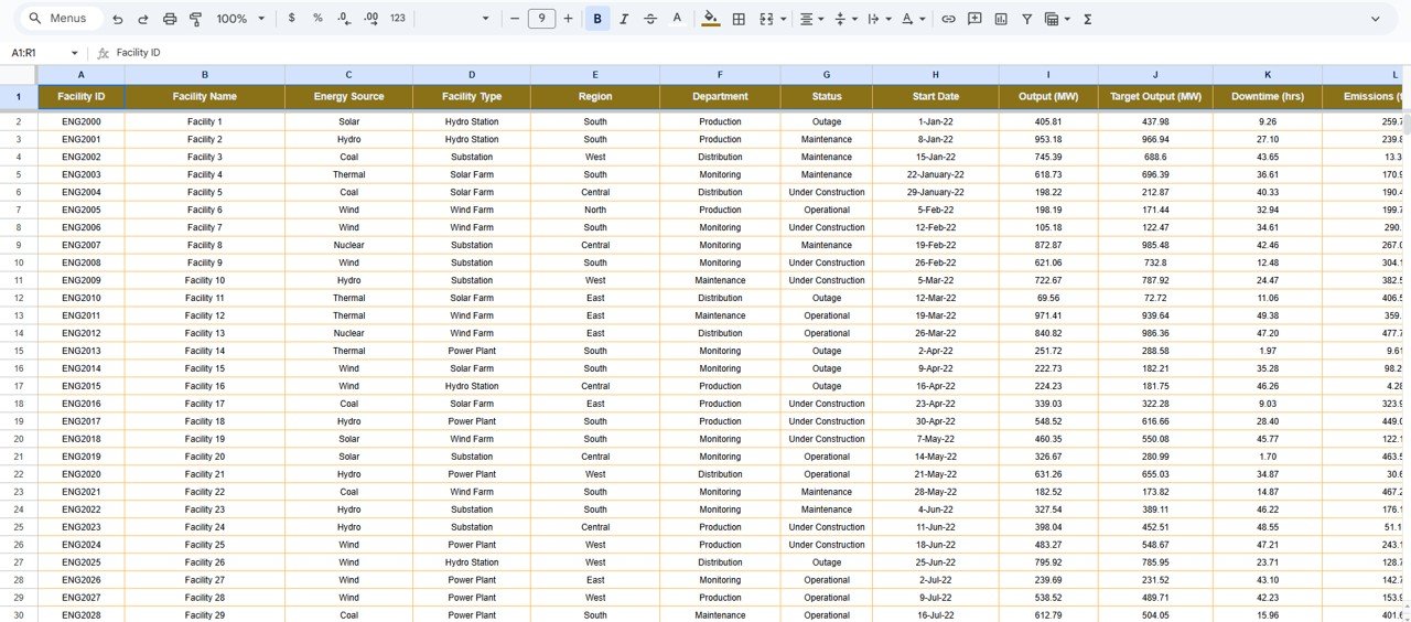
📊 Data Sheet Tab (Core Data Engine)
This tab is the foundation of the dashboard where monthly data is stored.
Columns Include:
-
Facility Name
-
Energy Source
-
Status
-
Department
-
Output (MW)
-
Efficiency (%)
-
Downtime (hrs)
-
CO₂ Emissions (tons)
All calculations, visuals, and KPIs are powered automatically from this structured dataset — ensuring accuracy and eliminating manual reporting.
🧾 Support Sheet Tab (Backend Configuration)
This tab maintains dropdown lists, reference formulas, and color coding logic.
It ensures clean data entry, uniform formatting, and reliable results across all sheets.
📦 What’s Inside the Dashboard
✅ Dynamic KPI dashboard for energy output & emissions
✅ MTD/YTD automatic performance tracking
✅ Conditional formatting with arrows & colors
✅ Search & filter functions for easy data access
✅ Cloud-based collaboration for multiple users
✅ Fully editable and customizable template
🧑💼 Who Can Use This Dashboard
🏭 Power Plant Operators: Track output, downtime, and operational health.
🔋 Renewable Energy Companies: Analyze performance by source — solar, wind, hydro, or biomass.
🌍 Sustainability Teams: Monitor emission intensity and environmental metrics.
⚙️ Operations & Maintenance Teams: Identify underperforming facilities or departments.
📊 Executives & Analysts: Get a consolidated view of energy generation efficiency across plants.
This dashboard is ideal for energy companies, utility providers, and renewable energy startups aiming to balance performance and sustainability.
⚙️ Opportunities for Improvement
You can enhance this tracker further by adding:
-
📩 Automated Summary Emails: Send monthly performance reports via Google Apps Script.
-
☁️ Emission Factor Integration: Auto-calculate CO₂ data from energy output.
-
💵 Cost Metrics: Introduce cost-per-unit energy tracking for financial insights.
-
📉 Forecast Sheet: Predict output trends using regression analysis.
-
🔔 Performance Alerts: Highlight low-efficiency or high-downtime events automatically.
🧠 Best Practices
✅ Update data monthly for accuracy.
✅ Use consistent facility and source names.
✅ Review downtime logs regularly to find recurring issues.
✅ Compare emission trends to national or internal benchmarks.
✅ Protect formulas and charts from edits to preserve structure.
🌟 Why Choose the Energy Generation & Efficiency Dashboard
-
⚡ Real-time analytics for energy production & sustainability.
-
📈 Automated KPI tracking with MTD/YTD comparison.
-
🌍 Emission and efficiency visualization in one tool.
-
☁️ 100% Google Sheets-based — no software installation needed.
-
🧩 Customizable to match your organization’s needs.
-
🔋 Designed for utility providers, renewable energy companies, and sustainability teams.
The Energy Generation & Efficiency Dashboard in Google Sheets helps you achieve maximum output, minimal waste, and measurable sustainability — empowering data-driven decisions for a greener future. 🌱⚙️
🔗 Click here to read the Detailed blog post
Watch the step-by-step video Demo:


Reviews
There are no reviews yet.