

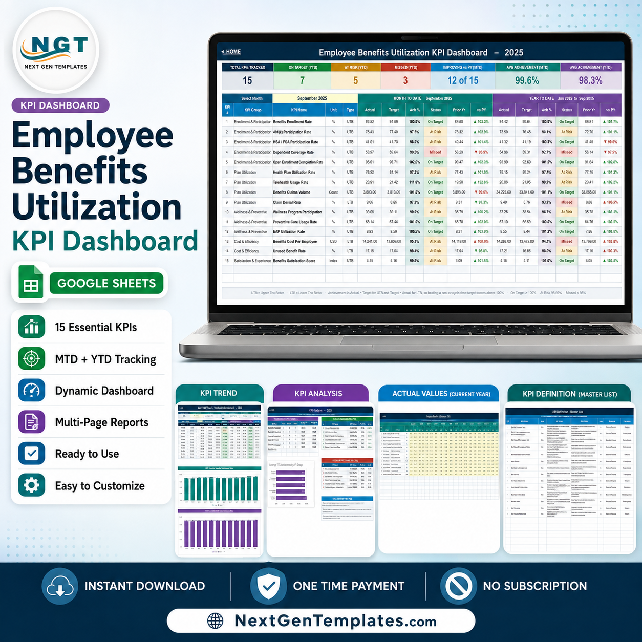
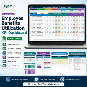
The Employee Benefits Utilization KPI Dashboard in Google Sheets is a formula-driven monthly scorecard that turns 15 benefits metrics into one readable screen. It covers 5 KPI groups across 9 tabs, shows month-to-date and year-to-date side by side for all 12 months, and colours every row On Target, At Risk or Missed the moment you pick a month. It is part of the NextGenTemplates library of 1,400+ Google Sheets templates. There is no subscription, no add-on and no script to authorise: instant download, one-time payment, and the PDF in your order carries a Make a copy link that drops an editable copy into your own Google Drive in about a minute.
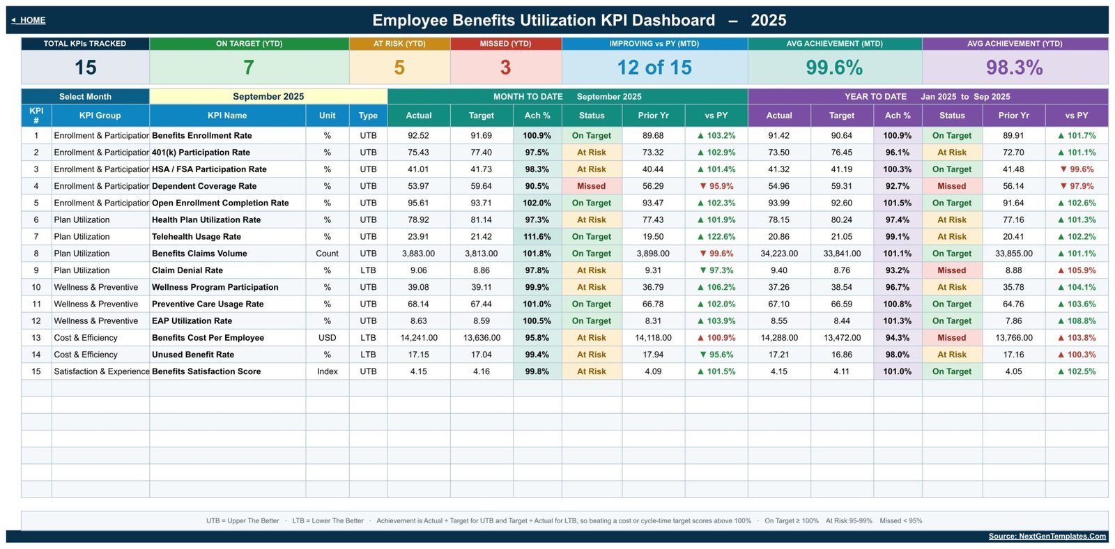
This is the KPI scorecard build – a month picker, traffic lights, a KPI Trend page and a KPI Analysis page. It is a different template from the chart-led Employee Benefits Dashboard in Google Sheets, which is an analytical dashboard built on a record-level data table. If you want targets, achievement percentages and a status per KPI, this is the one.
Key Features of Employee Benefits Utilization KPI Dashboard in Google Sheets
- 15 KPIs in 5 groups. Enrollment & Participation (5), Plan Utilization (4), Wellness & Preventive (3), Cost & Efficiency (2) and Satisfaction & Experience (1).
- One month picker. The dropdown on the KPI Dashboard sheet re-bases the scorecard, the trend page and the analysis page together. No refresh, no query to run.
- MTD and YTD in the same row. Each KPI shows Actual, Target, Achievement %, Status, Prior Yr and vs PY for both windows.
- Direction-aware achievement. KPIs are typed UTB (upper the better) or LTB (lower the better), so Claim Denial Rate and Benefits Cost Per Employee score above 100% when they come in under target.
- Editable thresholds. On Target from 100%, At Risk 95% to 99%, Missed below 95% – all three live in the Status formulas on the KPI Dashboard sheet.
- Seven header tiles. Total KPIs Tracked, On Target, At Risk, Missed, Improving vs PY, Avg Achievement (MTD) and Avg Achievement (YTD).
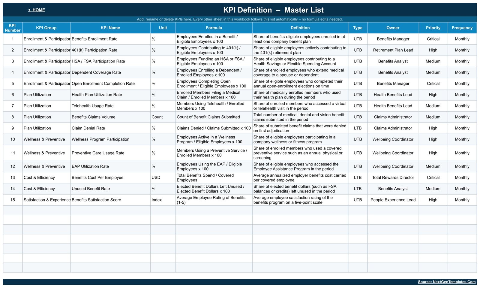
- Master KPI list. Rename a KPI, change its owner or add a new group on the KPI Definition sheet and every other sheet picks it up automatically.
- No add-ons. Pure Google Sheets formulas and native charts. Nothing to install, nothing to authorise, and it opens on the free tier.
What’s Inside the Employee Benefits Utilization KPI Dashboard
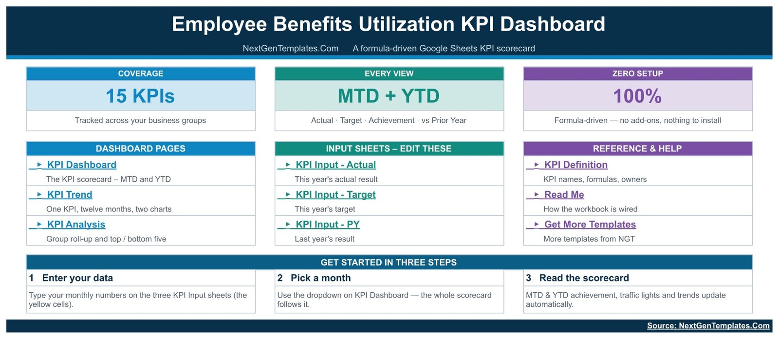
Nine tabs, grouped into three jobs – read, edit, reference.
KPI Dashboard – the scorecard
The month dropdown sits top-left. To its right, Month to Date and Year to Date blocks each carry Actual, Target, Ach %, Status, Prior Yr and vs PY for all 15 rows. The sample file opens on September 2025 with 7 On Target, 5 At Risk and 3 Missed on the year, and 12 of 15 KPIs improving against prior year.
KPI Trend – one KPI, twelve months
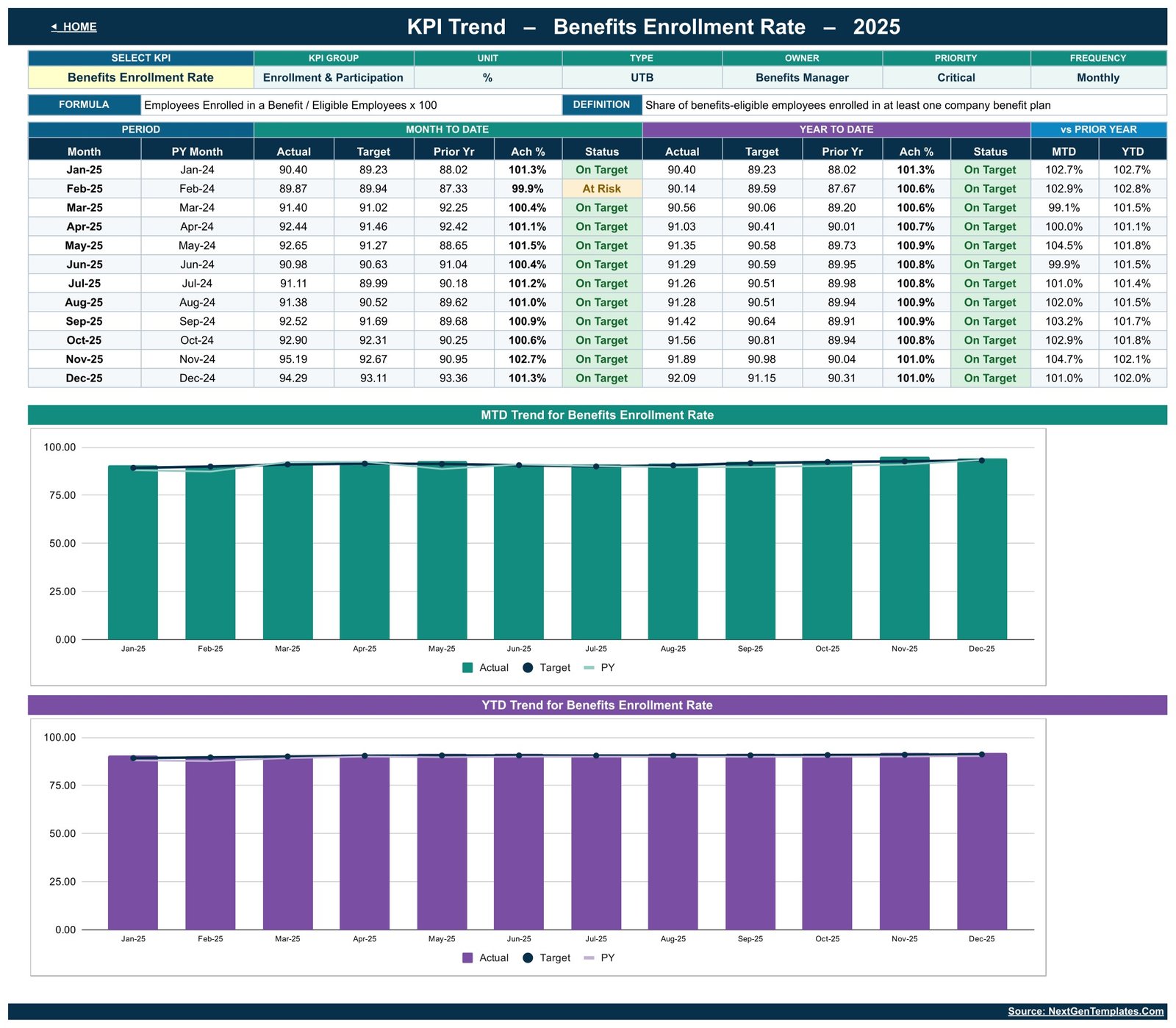
Pick any KPI from the yellow dropdown and the header fills in its group, unit, type, owner, priority and frequency, plus its formula and definition. Below that, a Jan to Dec table with MTD and YTD status per month, then two charts: MTD Trend for Benefits Enrollment Rate and YTD Trend for Benefits Enrollment Rate, each plotting Actual against Target and prior year.
KPI Analysis – where the problems are
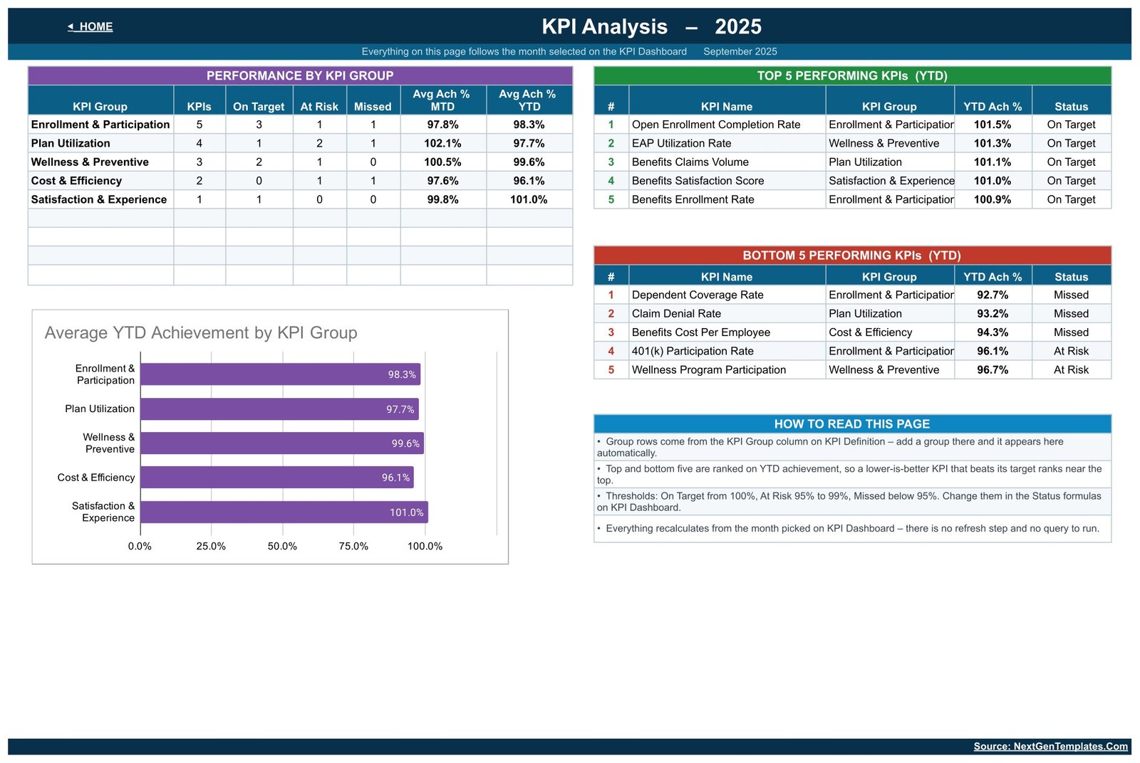
A Performance by KPI Group table counts On Target, At Risk and Missed per group and averages MTD and YTD achievement. Beside it, Top 5 and Bottom 5 Performing KPIs ranked on YTD achievement, and an Average YTD Achievement by KPI Group bar chart. Everything follows the month selected on the scorecard.
KPI Input – Actual, Target and PY
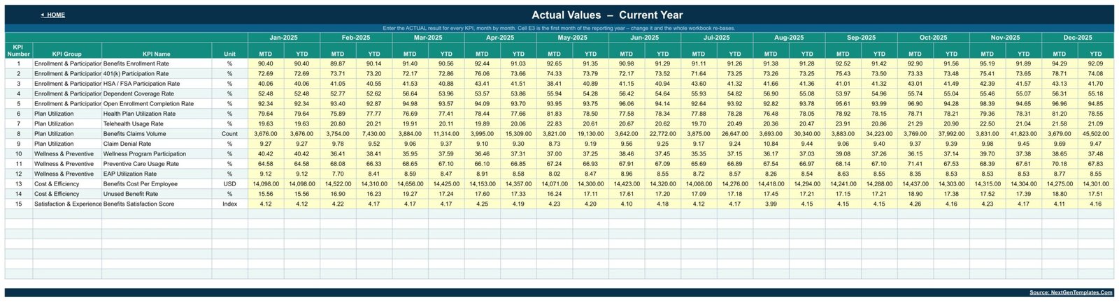
Three plain grids, one row per KPI and one column per month. Type your numbers into the yellow cells; MTD and YTD are calculated for you. Cell E3 on the Actual sheet sets the first month of the reporting year, so a July-to-June financial year works without editing a formula.
KPI Definition, Read Me and Get More Templates
The master list holds KPI number, group, name, unit, formula, definition, type, owner, priority and frequency. Read Me explains how the workbook is wired. Get More Templates links back to the NextGenTemplates catalogue.
Google Sheets vs. Excel vs. Paid Benefits Platforms – Where This Fits
| This template (Google Sheets) | Excel KPI scorecard | Paid benefits analytics platform | |
|---|---|---|---|
| Cost | $13.99 one time (currently $8.99) | One-time file price plus Microsoft 365 | Per employee, per month, billed annually |
| Platform | Any browser, free Google account | Desktop Excel, Microsoft 365 licence | Vendor cloud, admin onboarding |
| Setup time | Minutes – copy the sheet and type your numbers | Minutes, once Excel is installed | Weeks – implementation and data feeds |
| Real-time team collaboration | Yes, native multi-user editing | Only via OneDrive co-authoring | Yes, with seat licences |
| Mobile access | Google Sheets app, free | Excel mobile app | Vendor app |
| Customisable KPIs | Yes – edit the master list, everything follows | Yes, with formula edits | Limited to the vendor’s metric catalogue |
| Share with a link | Yes, view or edit, per person | File send or cloud link | Named seats only |
| Year-1 cost at 5 users | $13.99 total | File price plus 5 Microsoft 365 seats | Typically the largest of the three by a wide margin |
| Month picker with MTD + YTD | Built in | Built in | Usually a report filter |
| Reads raw claims or enrolment records | No – you type monthly summary numbers | No | Yes, via carrier feeds |
Who This Template Is For – and Who It’s Not For
It is for HR and Total Rewards teams who already pull monthly benefits numbers out of a carrier portal, an HRIS report or a broker summary and want a consistent way to show them. Benefits managers reporting to a leadership meeting. Small HR teams with no BI tool. Consultants who need a client-ready scorecard without building one from scratch.
It is not for you if you need a benefits administration or enrolment system – this template does not enrol anyone, does not process claims and does not connect to a carrier. It is not a compliance or regulatory reporting tool, and nothing in it should be read as benefits, insurance, tax or legal advice; check anything of that kind with your own advisers. It also will not crunch a record-level export for you: it works on monthly summary figures that you type in. If you want chart-led analysis of a record table instead, look at the Employee Benefits Dashboard in Google Sheets.
A note on the data. Real enrolment, claims and wellness figures are confidential personal information about your employees. This is an ordinary spreadsheet with ordinary Google Drive sharing, so keeping the numbers aggregated, controlling who the file is shared with and following your own organisation’s data-handling rules is your responsibility as the file owner.
How to Use the Employee Benefits Utilization KPI Dashboard
- Make your copy. Open the PDF in your download and click the Make a copy link. The workbook lands in your own Google Drive.
- Set your reporting year. Change cell E3 on the KPI Input – Actual sheet to your first month. Calendar year and financial year both work.
- Adjust the KPI list. On KPI Definition, rename anything that does not match your plan design, set the owner and priority, and delete rows you do not track. Add a new group there and the KPI Analysis page picks it up.
- Type your numbers. Fill the yellow cells on KPI Input – Actual, KPI Input – Target and KPI Input – PY, month by month.
- Pick a month. Use the dropdown on KPI Dashboard. Tiles, statuses, the trend page and the analysis page all re-base together.
- Work the exceptions. Read Bottom 5 Performing KPIs on KPI Analysis, then open KPI Trend for each one to see whether it is a bad month or a bad year.
- Share it. Give the leadership team view access and the benefits team edit access with a normal Google Drive share.
Real-World Use Cases
Priya, Benefits Manager at a 900-person software firm. Her open-enrolment window closes on 30 November. She tracks Open Enrollment Completion Rate weekly against a 95% target, and when the November MTD cell turns At Risk she knows to send the second reminder before the deadline rather than after it.
Daniel, Total Rewards Director. He presents one page to the CFO each quarter. Benefits Cost Per Employee is typed LTB, so coming in under target scores above 100% and reads green – and the vs PY column shows whether the saving is real or just a soft month.
Rachel, HR consultant with six retainer clients. She keeps one copy per client, renames the KPI master list to match each plan design, and hands over the same scorecard shape every month without rebuilding anything.
Frequently Asked Questions
Do I need any add-on, script or paid Google account?
No. The workbook is built from ordinary Google Sheets formulas and native charts. It opens and calculates on a free personal Google account with nothing installed and nothing to authorise.
Can I change the KPIs to match our benefits programme?
Yes. The KPI Definition sheet is the master list. Rename a KPI, change its unit, owner, priority or direction, delete rows you do not use, or add a new KPI group – the dashboard, trend and analysis pages all follow that list.
Does it connect to our HRIS, carrier portal or claims system?
No. It is a manual tracking and visualisation template. You type monthly summary numbers into three input sheets. There is no import, no API and no live feed of any kind.
Is this an enrolment or benefits administration system?
No. Nobody enrols, elects or files a claim in this file. It reports on numbers you have already produced elsewhere, and it makes no compliance or regulatory claim of any kind.
Our financial year starts in July. Will that work?
Yes. Cell E3 on the KPI Input – Actual sheet sets the first month of the reporting year, and the twelve monthly columns, MTD and YTD all shift with it.
How do the traffic lights decide On Target, At Risk and Missed?
Achievement is Actual divided by Target for upper-the-better KPIs and Target divided by Actual for lower-the-better ones. On Target starts at 100%, At Risk covers 95% to 99%, and anything below 95% is Missed. All three cut-offs sit in the Status formulas and can be edited.
What exactly do I download?
A PDF walkthrough that contains the Make a copy link for the Google Sheets file. Click it and an editable copy is created in your own Drive – the original stays untouched.
About the Author
Built by PK – Microsoft Certified Professional with 15+ years of Excel, Google Sheets, and Power BI experience. Founder of NextGenTemplates, reaching 300K+ subscribers across YouTube channels. Every template is hand-built and tested before release.
Explore Related Templates
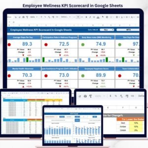
- Employee Wellness KPI Scorecard in Google Sheets – the natural partner to the Wellness & Preventive group here.
- Internal Communications KPI Dashboard in Google Sheets – measure whether your benefits messaging actually lands.
- Workplace Safety KPI Dashboard in Google Sheets – same scorecard mechanics, incident and safety metrics.
- Leadership Development KPI Dashboard in Google Sheets – people-development metrics in the same format.
- Browse every Google Sheets KPI Dashboard or the full Google Sheets catalogue.
Get the Scorecard
Stop rebuilding the benefits slide every month. Download the Employee Benefits Utilization KPI Dashboard in Google Sheets, copy it into your Drive, type your numbers once and let the month picker do the rest. One-time payment, instant download, no subscription. There is a full walkthrough on the blog: Employee Benefits Utilization KPI Dashboard in Google Sheets.
Watch the step-by-step video Demo:
Last updated: August 20, 2026.




Reviews
There are no reviews yet.