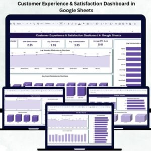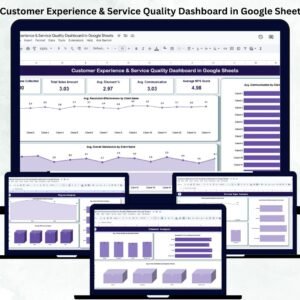
Delivering an outstanding customer experience is what separates successful companies from the rest. But measuring that experience consistently across regions, channels, and service types can be difficult. The Customer Experience & Service Quality Dashboard in Google Sheets solves that challenge with a ready-to-use, interactive reporting tool that visualizes feedback data and highlights actionable insights — all within a familiar spreadsheet interface. 💬📊
This dynamic Google Sheets dashboard enables teams to monitor satisfaction, service quality, communication effectiveness, and NPS (Net Promoter Score) without the need for complex software. It’s perfect for customer-centric organizations that want to improve retention, loyalty, and service efficiency through data-driven decisions. 🚀
🔑 Key Features of the Customer Experience & Service Quality Dashboard in Google Sheets
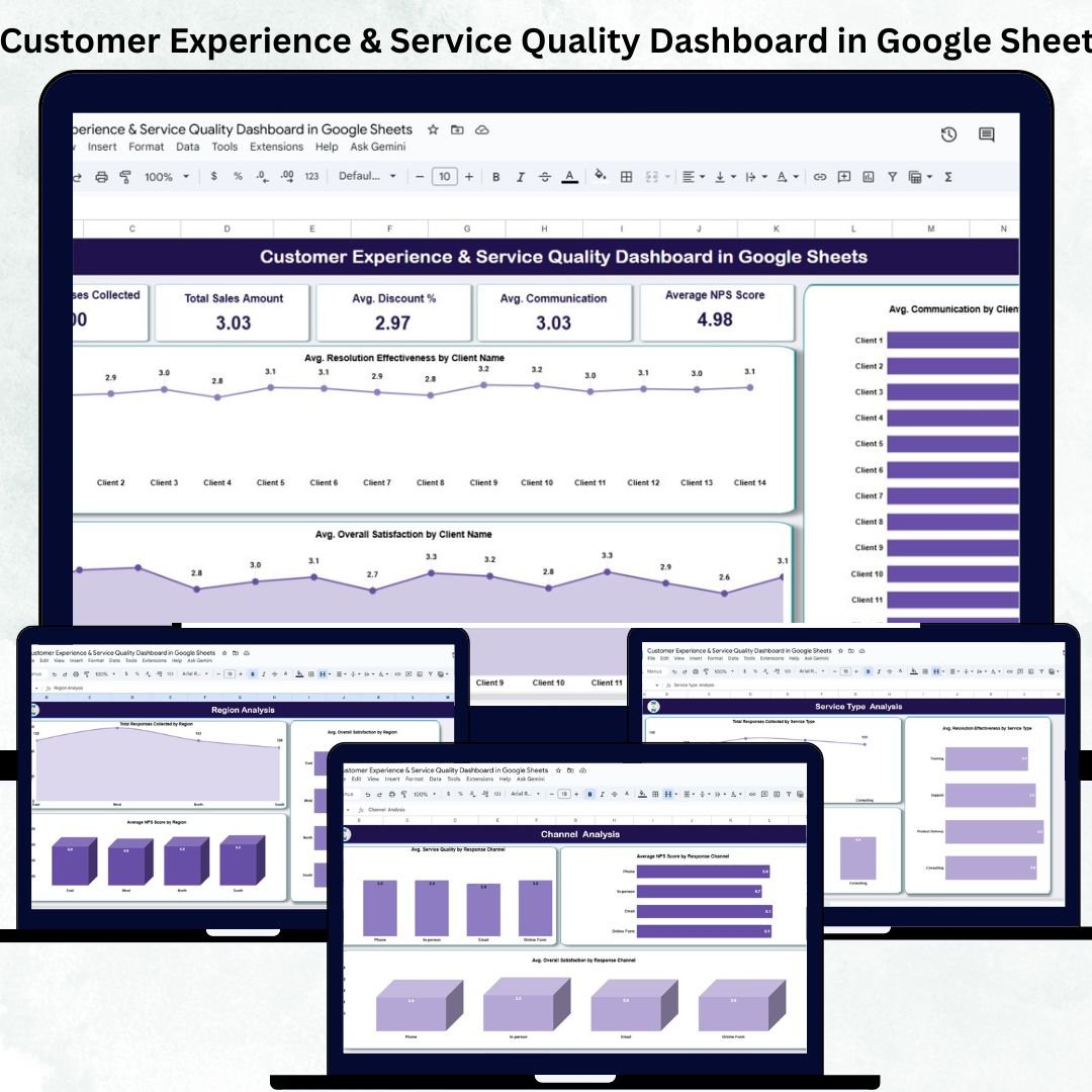
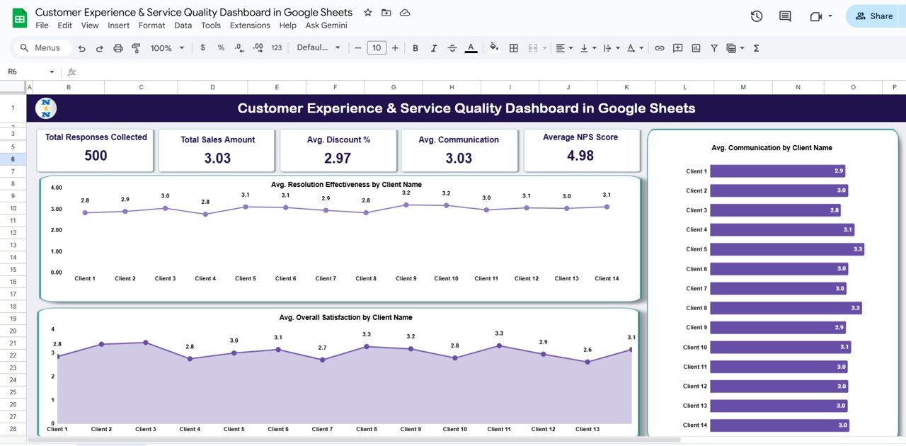
📋 Overview Sheet Tab
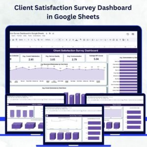
Centralized dashboard with KPI cards and charts for instant insights
KPI Cards include:
Total Responses Collected
Avg. Overall Satisfaction
Avg. Service Quality
Avg. Communication
Average NPS Score
Charts include:
Avg. Resolution Effectiveness by Client
Avg. Overall Satisfaction by Client
Avg. Communication by Client
Instantly visualize feedback performance and identify improvement areas.
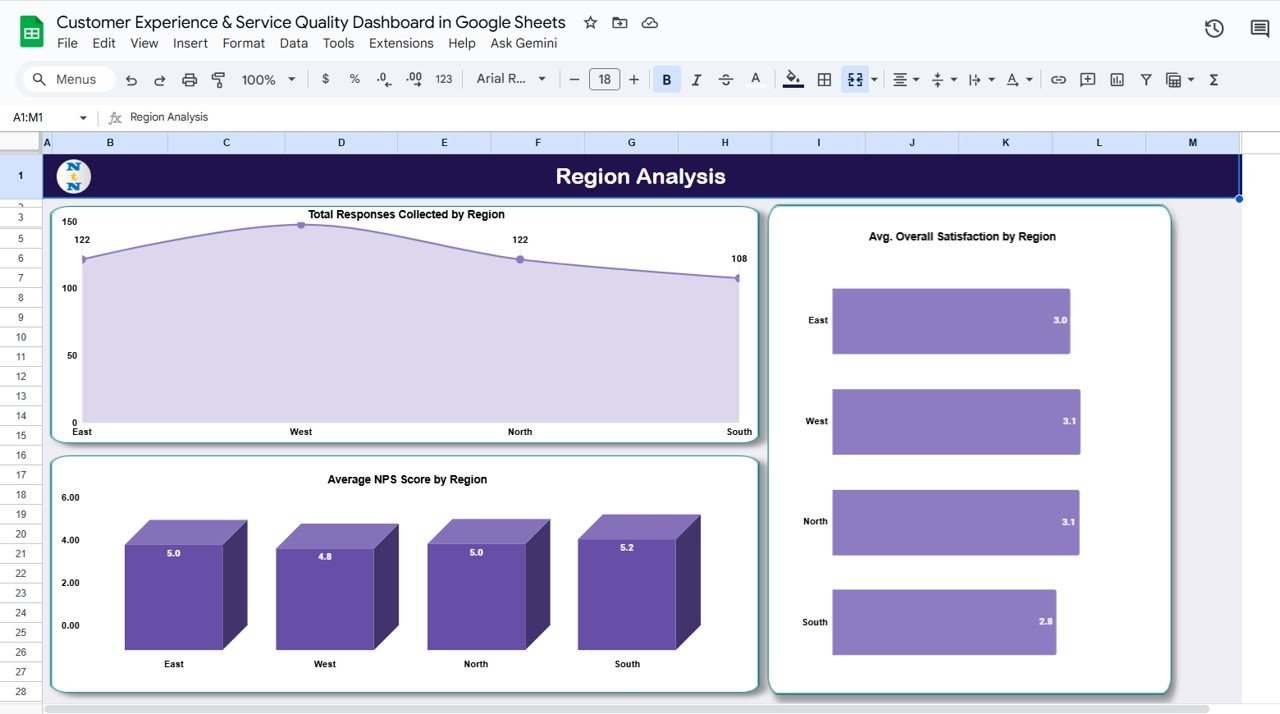
📈 Region Analysis Tab
Compare satisfaction and service scores across regions
Charts for:
Total Responses by Region
Avg. Overall Satisfaction by Region
Avg. NPS Score by Region
Ideal for identifying regional performance variations.
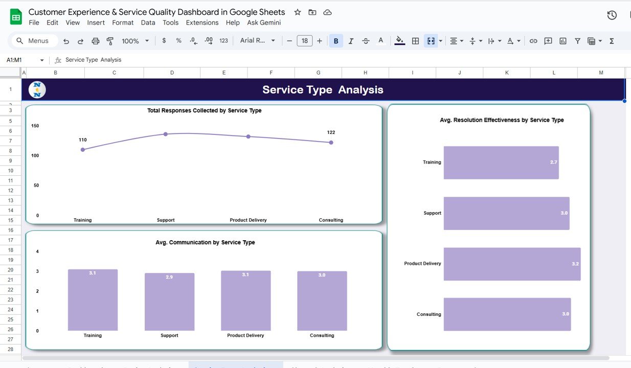
🧾 Service Type Analysis Tab
Evaluate feedback by service category (Support, Onboarding, Consultation, etc.)
Charts include:
Total Responses by Service Type
Avg. Resolution Effectiveness by Service Type
Avg. Communication by Service Type
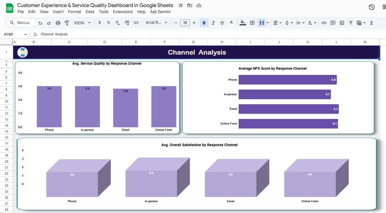
💬 Channel Analysis Tab
Assess customer experience by communication platform (Email, Chat, Phone, Social Media)
Charts include:
Avg. Service Quality by Channel
Avg. NPS by Channel
Avg. Overall Satisfaction by Channel
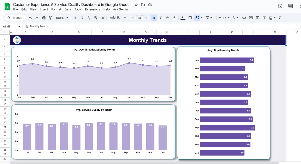
📅 Monthly Trends Tab
Analyze trends over time to track engagement and service quality improvements
Charts for:
Avg. Overall Satisfaction by Month
Avg. Timeliness by Month
Avg. Service Quality by Month
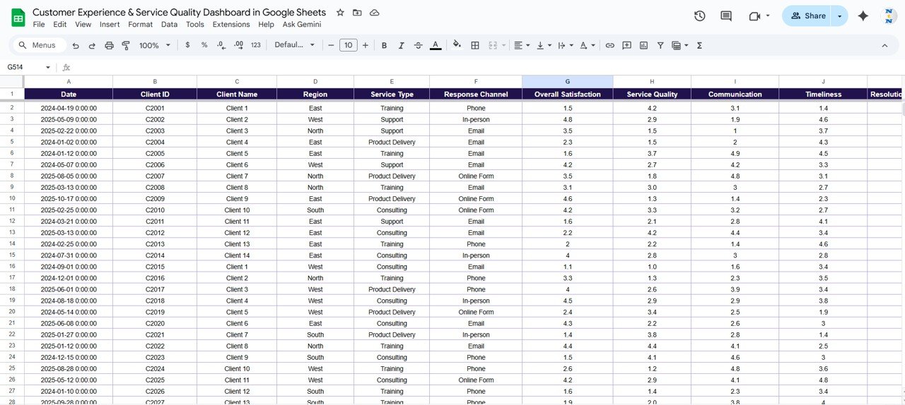
📊 Data Sheet Tab
Structured data entry sheet for feedback inputs
Each record includes details like Client Name, Region, Service Type, Channel, Scores, and Comments
Auto-linked to update all visuals dynamically
📦 What’s Inside the Dashboard
✅ Pre-formatted Google Sheets template with six analytical tabs
✅ Built-in KPI cards and dynamic charts
✅ Auto-updated visuals upon new data entry
✅ Conditional formatting for instant score interpretation
✅ Real-time collaboration with multiple users
✅ Editable metrics and thresholds for customization
✅ Preloaded sample data to understand functionality
Everything is organized and automated so you can focus on insights, not formulas. 🧠
🧑💼 Who Can Benefit from This Dashboard
🎯 Customer Service Managers – Track response quality, resolution time, and satisfaction.
📊 Operations Leaders – Monitor service efficiency and identify recurring gaps.
💼 Business Owners & Executives – Gain visibility into customer sentiment by region and channel.
🤝 Support Teams – Understand where communication or service delivery needs improvement.
It’s ideal for organizations that value customer experience as a strategic advantage.
🧪 How to Use the Customer Experience & Service Quality Dashboard
1️⃣ Enter Feedback Data – Input survey responses in the Data Sheet tab.
2️⃣ Review KPIs – Instantly view overall satisfaction, communication, and NPS scores.
3️⃣ Analyze by Segment – Use Region, Service Type, or Channel tabs for deep analysis.
4️⃣ Track Trends – Observe monthly patterns in service quality and satisfaction.
5️⃣ Collaborate Live – Share and edit the file with your team in real time.
No coding, no setup, no extra tools required — just plug, analyze, and act. ✅
🌟 Why Choose This Dashboard
Consolidates customer feedback in one visual platform
Automatically updates KPIs and charts in real time
Simplifies service quality tracking across multiple regions
Enhances decision-making through clear, actionable visuals
100 % customizable to fit your organization’s needs
Works entirely in Google Sheets — accessible from anywhere
The Customer Experience & Service Quality Dashboard in Google Sheets empowers businesses to understand their customers better, improve service quality, and elevate satisfaction — all from one easy-to-use file. 🌟