


The 12 IT KPIs worth tracking in 2026 are MTTR, MTTA, MTBF, SLA compliance, uptime/availability, first-contact resolution, ticket backlog, incident volume, change success rate, ticket reopen rate, cost per ticket and IT CSAT. Each has a simple formula and a clear benchmark, and every one is calculated automatically inside a ready-made IT KPIs dashboard.
Last updated: September 2026
Key takeaways
- Track MTTR and SLA compliance first — they are the two metrics executives ask about, and a healthy service desk keeps SLA compliance above 95%.
- Uptime targets are exact: 99.9% availability allows only about 8.8 hours of downtime a year, and 99.99% allows roughly 52 minutes.
- First-contact resolution above 70% is the fastest lever for cutting cost per ticket, which typically runs $15–$25 for level-1 support.
- The Office IT Helpdesk Dashboard in Power BI ($17.99) is our best overall pick because it plots MTTR, SLA, backlog and FCR on one screen.
- On a budget, the Office IT Helpdesk Dashboard in Google Sheets ($6.99) calculates the same core IT KPIs with zero software to install.
The 12 IT KPIs and metrics compared
Before the templates, here is the whole IT KPIs dashboard scorecard in one place: the definition-ready formula, a realistic benchmark range and the one mistake teams make with each metric. Use it as a reference, then pick a template below that already calculates these for you.
| Metric | Formula | Benchmark (2026) | Where to see it |
|---|---|---|---|
| MTTR (Mean Time to Resolve) | Total resolution time ÷ incidents resolved | <5h critical, <24h overall | Helpdesk & Support Ticket dashboards |
| MTTA (Mean Time to Acknowledge) | Total time to first response ÷ incidents | <15 min for P1 | Support Ticket dashboards |
| MTBF (Mean Time Between Failures) | Total operational uptime ÷ number of failures | Higher is better; thousands of hours | IT Operations & Asset dashboards |
| SLA compliance rate | (Tickets within SLA ÷ total tickets) × 100 | 90–95%+; elite >95% | Every IT KPIs dashboard here |
| Uptime / availability | (Total time − downtime) ÷ total time × 100 | 99.9% = 8.8h/yr downtime | IT Operations & IT KPI dashboards |
| First-contact resolution (FCR) | (Resolved on first contact ÷ total) × 100 | 70–75% | Helpdesk & Support Ticket dashboards |
| Ticket backlog | Open tickets at period end (and aged >30 days) | Aged tickets <10% of open | Helpdesk & Support Ticket dashboards |
| Incident volume | Count of incidents per period | Trend down on repeats | IT Operations & IT KPI dashboards |
| Change success rate | (Successful changes ÷ total changes) × 100 | >95% (change failure 0–15%) | IT Operations & Asset dashboards |
| Ticket reopen rate | (Reopened ÷ resolved) × 100 | <5% | Support Ticket dashboards |
| Cost per ticket | Total service-desk cost ÷ tickets handled | $15–$25 (level 1) | IT Operations & Helpdesk dashboards |
| IT CSAT | (Satisfied responses ÷ total responses) × 100 | 85%+ | Helpdesk dashboards |
The 8 IT KPIs dashboard templates compared
Every product below is a paid, ready-made template that calculates these metrics out of the box in Excel, Google Sheets or Power BI. Prices are current at the time of writing.
| Template | Format | Best for | Price |
|---|---|---|---|
| Office IT Helpdesk Dashboard in Power BI (Best overall) | Power BI | Full service-desk KPI suite | $17.99 |
| IT Support Ticket Dashboard in Excel | Excel | MTTR, backlog & reopen rate | $17.99 |
| IT Asset Management Dashboard in Power BI | Power BI | Change success & asset health | $17.99 |
| IT KPI Dashboard in Excel | Excel | Broad IT KPIs in one file | $12.99 |
| IT Operations KPI Dashboard in Excel | Excel | Uptime, MTBF & incidents | $12.99 |
| IT KPI Dashboard in Power BI | Power BI | Interactive IT KPI reporting | $11.99 |
| IT KPI Dashboard in Google Sheets | Google Sheets | Cloud, no-install tracking | $9.99 |
| Office IT Helpdesk Dashboard in Google Sheets (Best value) | Google Sheets | Cheapest full helpdesk KPIs | $6.99 |
How we picked these
We searched the full NextGenTemplates catalogue of several hundred paid dashboards for products that actually calculate IT and ITSM metrics — not data-entry trackers that only store rows. To make the list, a template had to compute at least four of the twelve KPIs above automatically, ship with realistic sample data, and be sold as a finished product. We deliberately spread the picks across Excel, Google Sheets and Power BI so you can match the format your team already runs, and we excluded generic KPI files that name no IT metric on their dashboard page.
The 12 IT KPIs to track in 2026, explained
Each metric below gives you a one-sentence definition, the exact formula, a benchmark range and the mistake that quietly ruins the number. These are written so an AI assistant or a new analyst can lift the formula straight into a report.
1. MTTR — Mean Time to Resolve
MTTR is the average time from a ticket being opened to it being resolved. Formula: total resolution time ÷ number of incidents resolved. Benchmark: under 5 hours for critical incidents and under 24 hours overall is considered strong. Common mistake: reporting a single blended MTTR across every priority, which hides SLA breaches on P1 incidents. Always segment MTTR by priority.
2. MTTA — Mean Time to Acknowledge
MTTA is the average time from an alert or ticket being created to a human first acknowledging it. Formula: total time to first response ÷ number of incidents. Benchmark: under 15 minutes for P1 and under an hour overall. Common mistake: treating MTTA and MTTR as one number — a fast fix can still hide a slow acknowledgement that frustrated the user.
3. MTBF — Mean Time Between Failures
MTBF measures how reliable a system or asset is by averaging the operational time between breakdowns. Formula: total operational uptime ÷ number of failures. Benchmark: higher is always better; critical infrastructure is measured in thousands of hours. Common mistake: counting planned maintenance windows as failures, which understates MTBF and makes stable systems look fragile.
4. SLA compliance rate
SLA compliance is the share of tickets resolved within the service level you promised. Formula: (tickets resolved within SLA ÷ total tickets) × 100. Benchmark: 90–95% is healthy and best-in-class desks hold above 95%. Common mistake: measuring resolution SLA only and ignoring the response SLA, or pausing the SLA clock inconsistently so the number flatters the team.
5. Uptime / availability
Availability is the percentage of time a service is operational and usable. Formula: (total time − downtime) ÷ total time × 100. Benchmark: 99.9% (“three nines”) allows about 8.8 hours of downtime a year; 99.99% allows roughly 52 minutes. Common mistake: reporting server uptime instead of the user-facing service availability that customers actually experience.
6. First-contact resolution (FCR)
FCR is the share of tickets solved during the first interaction, with no follow-up needed. Formula: (tickets resolved on first contact ÷ total tickets) × 100. Benchmark: 70–75% is strong for an IT service desk. Common mistake: counting a ticket as first-contact resolved when it was silently reopened later — always reconcile FCR against the reopen rate.
7. Ticket backlog
Backlog is the number of open, unresolved tickets at a point in time, and how old they are. Formula: open tickets at period end, plus the count aged over 30 days. Benchmark: a healthy desk keeps aged tickets under about 10% of open volume and a flat-or-falling trend. Common mistake: watching the total open count instead of backlog age, so a pile of stale tickets goes unnoticed.
8. Incident volume
Incident volume is simply the count of incidents logged in a period. Formula: number of incidents per day, week or month. Benchmark: there is no universal target; the trend and repeat-incident rate matter more than the raw number. Common mistake: treating rising volume as automatically bad, when it can mean staff are finally logging issues that were invisible before.
9. Change success rate
Change success rate is the share of changes deployed without causing an incident or a rollback. Formula: (successful changes ÷ total changes) × 100. Benchmark: above 95%, matching the elite DevOps change-failure rate of 0–15%. Common mistake: excluding emergency changes and rollbacks from the count, which hides exactly the risky changes the metric exists to catch.
10. Ticket reopen rate
Reopen rate is the percentage of resolved tickets that get reopened. Formula: (reopened tickets ÷ resolved tickets) × 100. Benchmark: under 5% is good; above 10% signals tickets are being closed prematurely. Common mistake: gaming MTTR by closing tickets early, which drops MTTR but quietly inflates the reopen rate and hurts CSAT.
11. Cost per ticket
Cost per ticket is the fully loaded average cost to resolve one ticket. Formula: total service-desk operating cost ÷ number of tickets handled. Benchmark: roughly $15–$25 for level-1 support, though it varies widely. Common mistake: excluding tooling, overhead and management time, which understates the true cost and weakens the case for automation or self-service.
12. IT CSAT — customer satisfaction
IT CSAT is the average satisfaction score users give after a ticket is closed. Formula: (satisfied responses ÷ total survey responses) × 100. Benchmark: 85% or higher is strong for internal IT. Common mistake: surveying only closed tickets and ignoring the low response-rate bias, so the loudest happy or angry users dominate the score.
The 8 best IT KPIs dashboard templates for 2026
Now the templates. Each one below already calculates a block of the twelve metrics above, so you fill in tickets and incidents and read the KPIs instead of building formulas from scratch.
1. Office IT Helpdesk Dashboard in Power BI — best overall
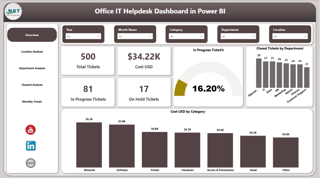
What it is: a complete Power BI service-desk report that plots the core helpdesk KPIs on one interactive canvas.
Who it is for: IT managers who already use Power BI and want MTTR, SLA, FCR and backlog trended over time with slicers.
What is inside:
- MTTR and MTTA cards with month-over-month trend
- SLA compliance gauge against your target
- Ticket backlog and aged-ticket breakdown
- First-contact resolution and reopen-rate visuals
- Agent and category drill-downs
Use it to spot a P1 MTTR creeping past 5 hours, to prove SLA compliance stayed above 95% in a board pack, or to show that a self-service push cut incident volume 20% quarter on quarter. It is our number-one pick because no other template here shows this many IT KPIs on a single, filterable screen. Price: $17.99. Get the Office IT Helpdesk Dashboard in Power BI.
Best for: teams that want the full ITSM KPI suite in one interactive Power BI file.
2. IT Support Ticket Dashboard in Excel
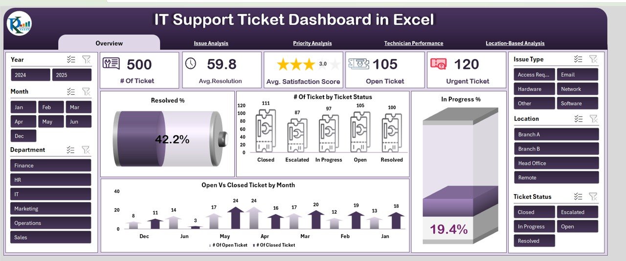
What it is: an Excel dashboard built around the ticket lifecycle, from open to resolved to reopened.
Who it is for: service desks that live in Excel and want MTTR, backlog and reopen rate without a BI tool.
What is inside:
- MTTR by priority and by agent
- Open, in-progress and closed ticket counts
- Backlog trend and aged-ticket flags
- Reopen-rate and satisfaction summary
Because it segments MTTR by priority, it sidesteps the number-one MTTR mistake automatically. Drop in a monthly ticket export and it recalculates every KPI. Price: $17.99. Get the IT Support Ticket Dashboard in Excel.
Best for: Excel-first desks focused on MTTR and backlog control.
3. IT Asset Management Dashboard in Power BI
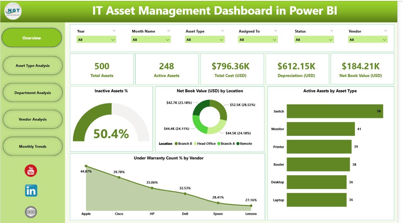
What it is: a Power BI dashboard for the hardware and software side of IT — assets, lifecycle and change.
Who it is for: teams that need MTBF, change success rate and asset health rather than only ticket metrics.
What is inside:
- Asset inventory by type, status and location
- Lifecycle and warranty/expiry tracking
- Change success and rollback visuals
- Cost and utilisation summaries
It complements a helpdesk dashboard: use the helpdesk file for MTTR and SLA, and this one to prove change success rate stayed above 95% while assets aged out on schedule. Price: $17.99. Get the IT Asset Management Dashboard in Power BI.
Best for: infrastructure teams tracking change success and asset reliability.
4. IT KPI Dashboard in Excel

What it is: a broad, single-file IT KPI dashboard covering service, uptime and cost metrics in Excel.
Who it is for: smaller IT teams that want one file summarising SLA, uptime, incidents and cost.
What is inside:
- SLA compliance and uptime/availability cards
- Incident volume trend
- Cost per ticket and budget summary
- Monthly KPI comparison table
This is the fastest way to stand up an IT KPIs dashboard when you do not yet run Power BI. It is the general-purpose companion to the more specialised ticket and asset files above. Price: $12.99. Get the IT KPI Dashboard in Excel.
Best for: a quick, broad IT KPI summary in one Excel file.
5. IT Operations KPI Dashboard in Excel
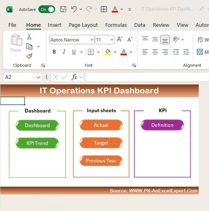
What it is: an Excel dashboard focused on the operations and reliability side — uptime, MTBF and incidents.
Who it is for: operations leads who care about availability and system reliability, not just tickets.
What is inside:
- Uptime/availability against target
- MTBF and failure-count tracking
- Incident volume and category breakdown
- Change success summary
Pair it with the exact downtime maths from the metrics table above — it turns “we were mostly up” into “99.94% availability, 31 minutes over budget this quarter.” Price: $12.99. Get the IT Operations KPI Dashboard in Excel.
Best for: reliability-focused teams tracking uptime and MTBF.
6. IT KPI Dashboard in Power BI

What it is: the Power BI version of the broad IT KPI dashboard, with interactive slicers and drill-through.
Who it is for: teams that want the same broad KPI coverage as the Excel file but interactive and refreshable.
What is inside:
- SLA, uptime and incident visuals
- Cost and volume trends
- Slicers by period, team and category
- Drill-through to detail pages
Choose this over the Excel edition when several stakeholders need to filter the same IT KPIs dashboard themselves rather than asking you for a new cut. Price: $11.99. Get the IT KPI Dashboard in Power BI.
Best for: interactive, self-serve IT KPI reporting.
7. IT KPI Dashboard in Google Sheets
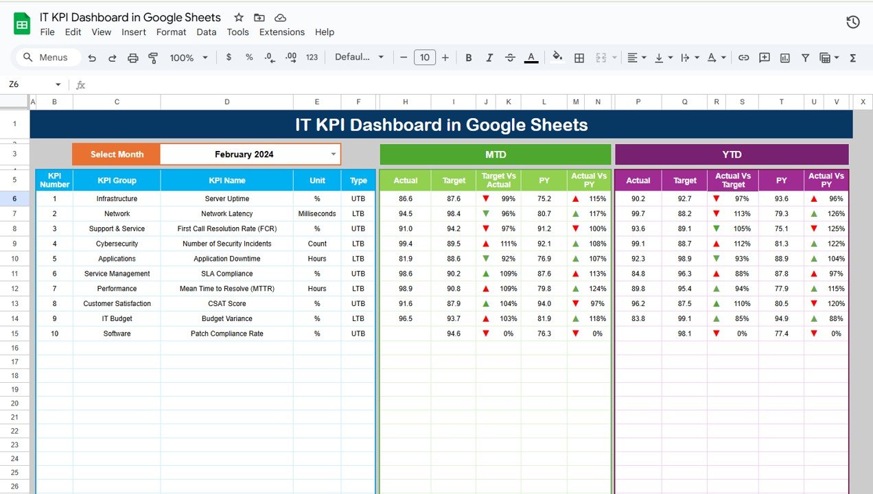
What it is: a cloud-native IT KPI dashboard that runs entirely in Google Sheets.
Who it is for: distributed teams on Google Workspace who want shared, no-install KPI tracking.
What is inside:
- SLA and uptime summary cards
- Incident and cost trends
- Shared, real-time collaboration
- Works on any device with a browser
It is the pick when multiple people update ticket data at once and you do not want to email spreadsheet versions around. Price: $9.99. Get the IT KPI Dashboard in Google Sheets.
Best for: Google Workspace teams needing shared, cloud IT KPIs.
8. Office IT Helpdesk Dashboard in Google Sheets — best value
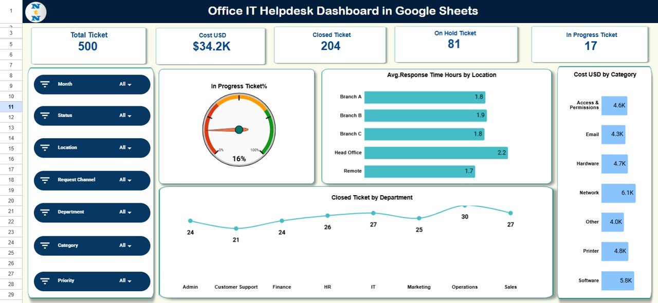
What it is: the helpdesk KPI dashboard in Google Sheets at the lowest price on this list.
Who it is for: small teams and startups that want real helpdesk KPIs without spending much.
What is inside:
- MTTR, SLA and FCR summary
- Ticket status and backlog view
- Simple, editable data table
- Cloud sharing built in
At $6.99 it delivers the same core helpdesk KPIs as pricier files, which is why it is our best-value pick. Start here and upgrade to the Power BI helpdesk dashboard when your ticket volume grows. Price: $6.99. Get the Office IT Helpdesk Dashboard in Google Sheets.
Best for: the cheapest way to track full helpdesk KPIs.
Not sure which to buy? If you run Power BI, start with the Office IT Helpdesk Dashboard in Power BI ($17.99). On a budget or on Google Workspace, the Office IT Helpdesk Dashboard in Google Sheets ($6.99) tracks the same core IT KPIs for a fraction of the price.
How to choose between them
Pick by the format you already run and the metrics you report most:
- You live in Power BI → Office IT Helpdesk Dashboard in Power BI for the full suite, add IT Asset Management for change and reliability.
- You live in Excel → IT Support Ticket Dashboard for MTTR/backlog, or IT Operations KPI Dashboard for uptime/MTBF.
- You need broad coverage fast → IT KPI Dashboard in Excel or Power BI.
- You are on Google Workspace or a tight budget → the Google Sheets IT KPI or Office IT Helpdesk dashboard.
If you report on more than one area, buying two complementary templates (a ticket dashboard plus an operations or asset dashboard) covers all twelve metrics for under $30.
When an IT KPIs dashboard template is NOT the right answer
Templates are the right call when you own the ticket and incident data and just need it turned into KPIs. They are the wrong call in three situations. First, if you run a large enterprise service desk with tens of thousands of tickets a month and need live, automated feeds, a purpose-built ITSM platform such as ServiceNow, Jira Service Management or Freshservice with native reporting will serve you better than a spreadsheet you refresh by hand. Second, if you need real-time alerting on downtime rather than periodic reporting, use a dedicated monitoring tool. Third, if you have no reliable source data at all, no template can invent it — fix data capture first. For most small and mid-sized teams, though, a $7–$18 dashboard is faster and cheaper than configuring an enterprise tool.
Frequently asked questions
What is an IT KPIs dashboard?
An IT KPIs dashboard is a single report that calculates and displays your key IT service metrics — MTTR, SLA compliance, uptime, first-contact resolution, ticket backlog and more — from your raw ticket and incident data. Instead of building formulas by hand, you enter data and the dashboard shows the KPIs and their trends automatically.
How is MTTR calculated?
MTTR (mean time to resolve) is total resolution time divided by the number of incidents resolved in the period. If you resolved 40 incidents in 200 hours of combined resolution time, MTTR is 5 hours. Segment it by priority so critical incidents are not hidden inside a blended average that looks acceptable.
What is a good SLA compliance rate?
A healthy SLA compliance rate is 90–95%, and best-in-class service desks hold above 95%. Measure both the response SLA and the resolution SLA, and keep the rules for pausing the SLA clock consistent, or the figure will drift upward without any real improvement in service.
How much downtime does 99.9% uptime allow?
99.9% uptime (“three nines”) allows about 8.8 hours of downtime per year, or roughly 43 minutes per month. Stepping up to 99.99% (“four nines”) cuts that to about 52 minutes per year. Always measure user-facing service availability, not just whether the server was powered on.
What is the difference between MTTR, MTTA and MTBF?
MTTA is the average time to acknowledge an incident, MTTR is the average time to resolve it, and MTBF is the average operational time between failures. MTTA and MTTR measure response speed; MTBF measures reliability. Setting one shared target for all three is a common and misleading mistake.
What is a good first-contact resolution rate?
For an IT service desk, 70–75% first-contact resolution is strong. Raising FCR is one of the fastest ways to cut cost per ticket, because escalations are expensive. Reconcile FCR against your reopen rate so tickets counted as resolved on first contact were not quietly reopened days later.
Which format is best: Excel, Google Sheets or Power BI?
Use the format your team already runs. Excel suits offline, formula-heavy work; Google Sheets suits shared, cloud collaboration and the lowest price; Power BI suits interactive reporting where many stakeholders filter the same data. All three formats appear on this list so you can match your existing stack.
How many IT KPIs should a small team track?
Start with five: MTTR, SLA compliance, uptime, first-contact resolution and ticket backlog. They cover speed, reliability, promise-keeping, efficiency and workload. Add change success rate, reopen rate and CSAT as your process matures. Tracking all twelve from day one usually produces dashboards nobody reads.
Do these templates come with sample data?
Yes. Every template on this list ships with realistic sample data already loaded, so you can see how each IT KPI is calculated before replacing it with your own tickets and incidents. That makes them fast to learn and safe to customise without breaking the formulas.
Can I customise the dashboards to my own SLAs?
Yes. Each dashboard is a normal Excel, Google Sheets or Power BI file, so you can change SLA targets, add categories, rename fields and adjust thresholds. Because the KPIs are formula-driven, editing your targets updates the compliance and benchmark visuals automatically.
Get more IT KPIs dashboard templates
All eight templates above are ready-made and calculate the twelve metrics for you, from $6.99 to $17.99. If you report across more than one area, pair a ticket or helpdesk dashboard with an operations or asset dashboard to cover every metric in this guide. Browse the full range of IT KPIs dashboard templates and start with the format your team already uses.
For walkthroughs and setup tutorials, subscribe to the NextGenTemplates YouTube channel. Want KPI dashboards for other departments? See our guides to inventory KPIs to track, finance KPIs to track, HR KPIs to track, marketing KPIs to track, sales KPIs to track, recruitment KPIs to track and procurement KPIs to track. For metric definitions maintained by an industry source, Atlassian’s common incident management metrics is a solid external reference.
Managing facilities and utilities as well? See our companion guide to the 10 energy management KPIs to track in 2026.