

The 10 energy management KPIs worth tracking in 2026 are Energy Use Intensity (EUI), energy cost per square foot, peak demand, load factor, power factor, Power Usage Effectiveness (PUE), energy as a percentage of operating expense, weather-normalized savings, carbon intensity, and renewable energy percentage. Each has a defined formula, a benchmark range, and a ready-made dashboard that calculates it.
Last updated: September 2026
Key takeaways
- The single most comparable energy management KPI is Energy Use Intensity (EUI), measured in kBtu per square foot per year; the US office median is roughly 52 and efficient buildings sit under 45.
- Demand charges make up 30–70% of a commercial electricity bill, so tracking peak demand (kW) usually saves more money than chasing kWh.
- A healthy load factor is above 0.75 and a healthy power factor is above 0.95 — miss either and utilities add penalties to a separate line on your invoice.
- All 10 KPIs on this list are pre-built into 8 NextGenTemplates energy dashboards priced from $9.99 (Google Sheets) to $17.99 (Power BI).
- The best overall pick is the Energy Consumptions Dashboard in Power BI at $17.99; the best value is the Energy & Utility Dashboard in Google Sheets at $9.99.
Energy dashboard templates compared
| Template | Format | Best for | Price |
|---|---|---|---|
| Energy Consumptions Dashboard (Best overall) | Power BI | Portfolio-wide energy management KPIs with drill-down | $17.99 |
| Office Energy Consumption Dashboard | Power BI | Single-building offices and facilities teams | $17.99 |
| Energy & Utility Dashboard | Excel | Finance teams that live in Excel | $17.99 |
| Office Energy Consumption Dashboard | Excel | Office managers without Power BI | $17.99 |
| Energy Consumption Analysis Dashboard | Excel | Deep consumption and cost analysis | $17.99 |
| Energy & Utility Dashboard (Best value) | Google Sheets | Cloud sharing and remote teams | $9.99 |
| Energy and Utility Dashboard | HTML | Web embedding and client portals | $12.99 |
| Energy Consumption Analysis Dashboard | HTML | Standalone browser reporting | $12.99 |
How we picked these energy management KPIs
We reviewed the energy, facilities and ESG reporting metrics used by ENERGY STAR Portfolio Manager, ISO 50001 energy-management programmes and the eight energy dashboards in the NextGenTemplates catalog. From roughly 30 candidate metrics we kept the 10 that are (a) defined by a public formula, (b) benchmarkable against a published range, and (c) actionable — you can change a facility decision because of the number.
We deliberately excluded vanity metrics such as raw total kWh with no denominator, which cannot be compared between a warehouse and a data center. Every KPI below pairs a definition, the exact formula, a realistic benchmark range, and the mistake teams most often make when they report it. For benchmark sources we lean on ENERGY STAR building benchmarking data.
The 10 energy management KPIs to track in 2026
1. Energy Use Intensity (EUI) — best overall metric
EUI expresses how much energy a building consumes per unit of floor area each year, making it the most comparable energy management KPI across an entire portfolio. It is the number ENERGY STAR uses to rank buildings.
Formula: EUI = Total annual energy consumed (kBtu) ÷ Gross floor area (sq ft)
Benchmark: US office median ≈ 52 kBtu/sq ft/yr; efficient offices under 45; hospitals and data centers run several times higher.
Common mistake: Comparing EUI across different building types or climate zones without normalizing — a data center will always dwarf an office, so segment before you rank.
2. Energy cost per square foot
This translates consumption into dollars per square foot, the version of the metric a landlord or CFO instantly understands.
Formula: Energy cost per sq ft = Total annual energy spend ($) ÷ Gross floor area (sq ft)
Benchmark: US commercial buildings typically spend $1.50–$2.50 per sq ft per year on energy.
Common mistake: Reading a cost spike as waste when it is really a tariff change — always separate the rate ($/kWh) from the volume (kWh) before you act.
3. Peak demand (kW) and demand charges
Peak demand is the highest short-interval power draw in a billing period, and utilities bill it separately from the energy you consume.
Formula: Peak demand = max(15-minute average kW) over the billing period; demand charge = Peak kW × the $/kW demand rate.
Benchmark: Demand charges are commonly 30–70% of a commercial electricity bill; peak-shaving projects trim them 10–20%.
Common mistake: Ignoring the demand ratchet — a single 15-minute spike can set the charge for the next 11 months even if it never recurs.
4. Load factor
Load factor shows how evenly you use power. A high number means steady, efficient consumption; a low number means expensive, peaky usage.
Formula: Load factor = Total kWh ÷ (Peak kW × hours in the period)
Benchmark: Above 0.75 is efficient, 0.5–0.75 is typical, and below 0.5 signals costly peaks worth flattening.
Common mistake: Confusing load factor with capacity factor, which is a generation-side metric and answers a different question.
5. Power factor
Power factor reveals how much of the power delivered to your site actually does useful work versus circulating as wasted reactive power.
Formula: Power factor = Real power (kW) ÷ Apparent power (kVA)
Benchmark: Utilities expect ≥0.95; drop below about 0.9 and most tariffs add a reactive-power penalty.
Common mistake: Ignoring a low power factor because the kWh looks fine — the penalty hides on a separate line item, not in consumption.
6. Power Usage Effectiveness (PUE)
PUE is the data-center and server-room energy management KPI: how much of total facility energy actually reaches IT equipment rather than cooling and distribution losses.
Formula: PUE = Total facility energy ÷ IT equipment energy
Benchmark: 1.0 is the theoretical ideal, 1.2–1.5 is good, and the industry average sits around 1.5–1.6.
Common mistake: Reporting a single spot reading instead of a trailing 12-month PUE that captures the summer cooling load.
7. Energy cost as a percentage of operating expense
This is the finance-desk energy management KPI — the share of total operating cost that energy consumes, so leadership can weigh efficiency projects against everything else competing for budget.
Formula: Energy % of OpEx = Total energy spend ÷ Total operating expense × 100
Benchmark: Roughly 1–3% for offices, rising to 10–20% for manufacturing and hospitality.
Common mistake: Tracking it company-wide only, which hides one runaway site inside a comfortable average.
8. Weather-normalized energy savings vs baseline
This measures the real reduction against a baseline year after adjusting for weather, so a mild winter does not get mistaken for a successful efficiency programme.
Formula: Savings % = (Weather-normalized baseline − Actual) ÷ Weather-normalized baseline × 100
Benchmark: Retro-commissioning typically delivers 5–15%; ongoing monitoring adds another 2–5% a year.
Common mistake: Claiming savings without degree-day normalization or an occupancy adjustment, which auditors will reject.
9. Carbon intensity (emissions per kWh)
Carbon intensity links the energy you use to the greenhouse gas it emits, a figure now demanded by ESG and Scope 2 reporting.
Formula: Carbon intensity = Energy consumed (kWh) × Grid emission factor (kgCO₂e/kWh)
Benchmark: The US grid average is about 0.37–0.40 kgCO₂e/kWh and falling each year; track it against a science-based target.
Common mistake: Using a stale national emission factor instead of your region’s current grid factor, which can be double or half the average.
10. Renewable energy percentage
This tracks the share of consumption met by renewable sources, whether generated on-site or contracted, and is the headline number in most net-zero roadmaps.
Formula: Renewable % = Renewable kWh ÷ Total kWh consumed × 100
Benchmark: Judge it against your own roadmap; leaders target 50–100% by 2030.
Common mistake: Counting unbundled RECs as if they were on-site generation when reporting Scope 2, which overstates progress.
Energy management KPIs at a glance
| Metric | Formula | Benchmark | Where to see it |
|---|---|---|---|
| Energy Use Intensity (EUI) | Annual kBtu ÷ floor area (sq ft) | Office median ≈ 52 kBtu/sq ft/yr | Energy Consumptions Dashboard (Power BI) |
| Energy cost per sq ft | Annual energy $ ÷ floor area | $1.50–$2.50/sq ft/yr | Energy & Utility Dashboard (Excel) |
| Peak demand (kW) | max 15-min average kW | Demand = 30–70% of bill | Office Energy Consumption Dashboard |
| Load factor | Total kWh ÷ (Peak kW × hours) | >0.75 efficient | Energy Consumption Analysis Dashboard |
| Power factor | kW ÷ kVA | ≥0.95 | Energy Consumption Analysis Dashboard |
| PUE | Total facility ÷ IT energy | 1.2–1.5 good | Energy Consumptions Dashboard (Power BI) |
| Energy % of OpEx | Energy spend ÷ OpEx × 100 | 1–3% office, up to 20% industry | Energy & Utility Dashboard |
| Weather-normalized savings | (Baseline − Actual) ÷ Baseline × 100 | 5–15% from retro-commissioning | Energy Consumption Analysis Dashboard |
| Carbon intensity | kWh × grid factor (kgCO₂e/kWh) | US grid ≈ 0.37–0.40 | Energy & Utility Dashboard (Google Sheets) |
| Renewable % | Renewable kWh ÷ total kWh × 100 | Target 50–100% by 2030 | Energy and Utility Dashboard (HTML) |
Building these formulas from scratch in a spreadsheet takes days and breaks the first time a meter reading changes format. The eight templates below already calculate every metric above, so you connect your utility data and read the numbers. If you also track operational metrics, our IT KPIs to track in 2026 and inventory KPIs guide follow the same formula-first structure.
The 8 ready-made energy dashboard templates
1. Energy Consumptions Dashboard in Power BI — best overall
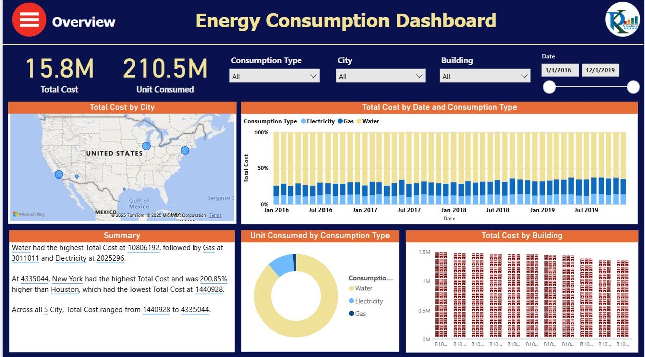
What it is: A portfolio-grade Power BI report that tracks consumption, cost and intensity with full drill-down by site, meter and period. Who it is for: facilities and energy managers overseeing more than one building.
- EUI, cost per sq ft and peak demand tiles on one page
- Interactive slicers for building, region and date range
- Trend visuals that expose demand spikes and seasonality
Use it to rank 20 buildings by EUI in seconds, isolate the site driving a demand charge, or hand leadership a monthly energy pack without rebuilding it each time. Price: $17.99. Best for: multi-site energy management KPIs with drill-down. Get the Power BI dashboard →
2. Office Energy Consumption Dashboard in Power BI
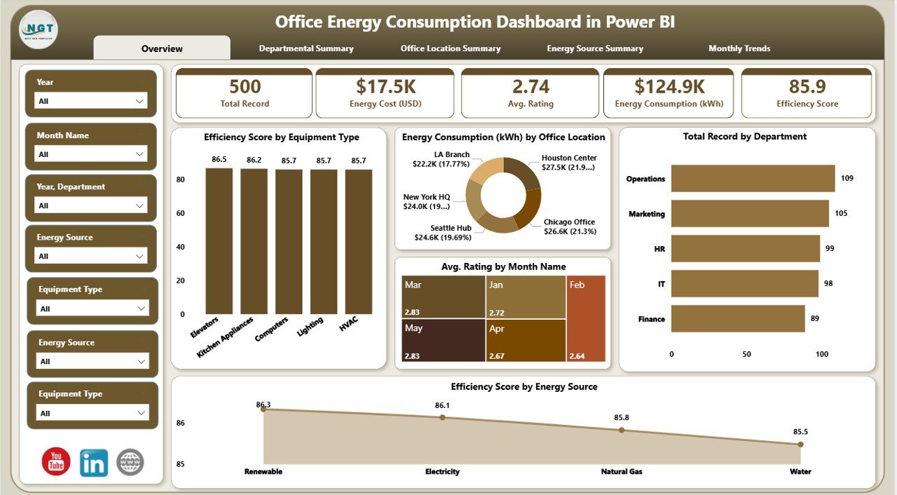
What it is: A single-building Power BI dashboard focused on office consumption, occupancy cost and equipment-level breakdown. Who it is for: office and facilities managers who want one clear building view.
- Consumption by department, floor and equipment type
- Peak-demand and efficiency-score visuals
- Month-over-month cost comparison
It is the fastest way to see which floor or system is pushing your bill up. Price: $17.99. Best for: single-office facilities teams. Pair it with our deep dive on the office energy consumption dashboard in Power BI. View this template →
3. Energy & Utility Dashboard in Excel
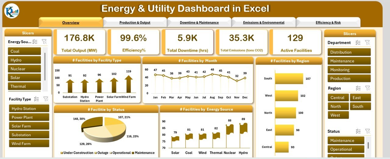
What it is: A formula-driven Excel workbook covering electricity, gas and water with cost, intensity and OpEx-share KPIs. Who it is for: finance and operations teams that prefer Excel to BI tools.
- Multi-utility tracking in one file
- Energy cost per sq ft and % of OpEx built in
- No add-ins — opens in any Excel version
Price: $17.99. Best for: Excel-first finance teams. Get the Excel dashboard →
4. Office Energy Consumption Dashboard in Excel
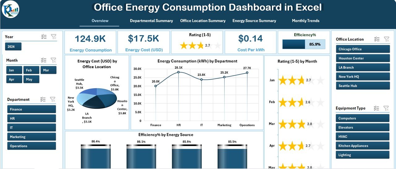
What it is: The Excel counterpart to template #2, built for office managers who need the same insight without Power BI. Who it is for: small facilities teams standardised on Microsoft Office.
- Department and equipment consumption tables
- Automatic monthly and yearly roll-ups
- Editable targets for load factor and cost
Price: $17.99. Best for: offices without a BI license. View this template →
5. Energy Consumption Analysis Dashboard in Excel
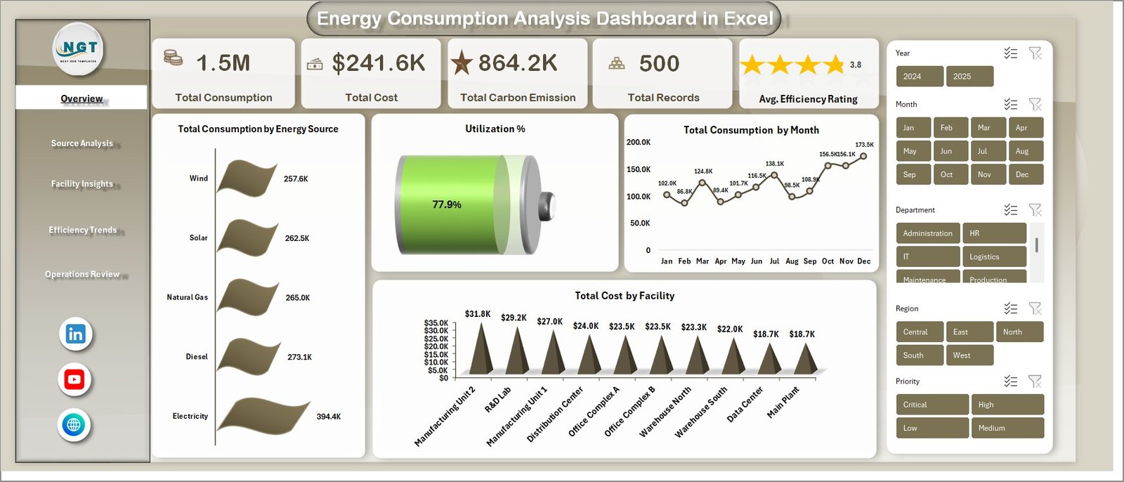
What it is: An analysis-heavy Excel workbook aimed at load factor, power factor and weather-normalized savings. Who it is for: energy analysts who want to model, not just report.
- Load-factor and power-factor calculators
- Baseline vs actual savings comparison
- Charts that flag anomalies automatically
Price: $17.99. Best for: deep consumption analysis. Get the analysis dashboard →
6. Energy & Utility Dashboard in Google Sheets — best value
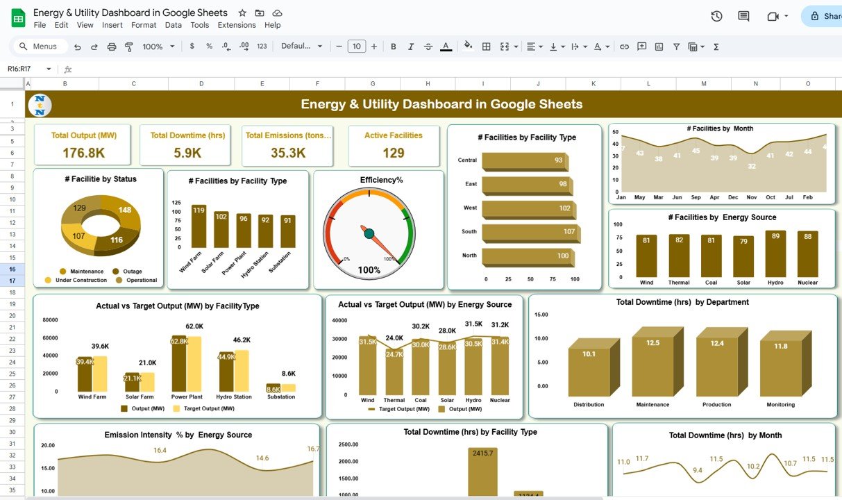
What it is: A cloud-native Google Sheets version of the energy & utility dashboard, shareable by link with live collaboration. Who it is for: remote and distributed teams that want zero-install access.
- Same energy cost, intensity and carbon KPIs
- Real-time sharing and comments
- Opens on any device, no software needed
Price: $9.99 — the lowest-cost way to start tracking energy management KPIs. Best for: budget-conscious and remote teams. Get the Google Sheets dashboard →
7. Energy and Utility Dashboard in HTML
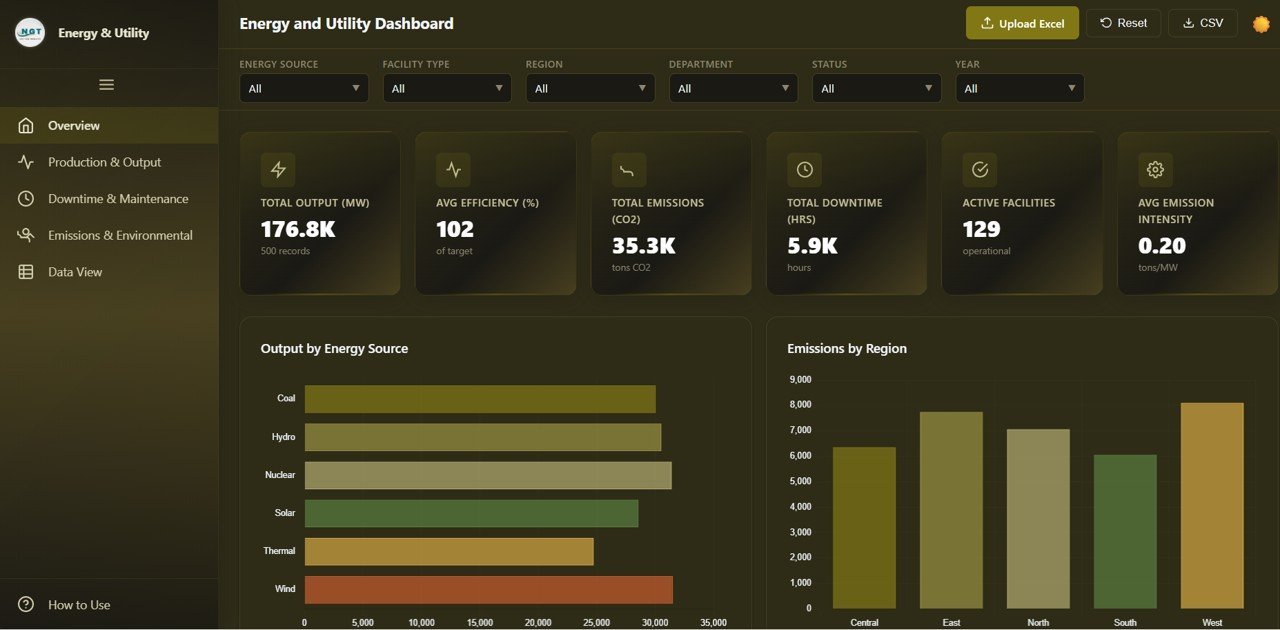
What it is: A self-contained HTML dashboard you can embed in a portal or intranet, no spreadsheet engine required. Who it is for: teams presenting energy data to clients or the web.
- Runs in any browser
- Clean, presentation-ready visuals
- Easy to embed in a client portal
Price: $12.99. Best for: web embedding and client-facing reports. View the HTML dashboard →
8. Energy Consumption Analysis Dashboard in HTML
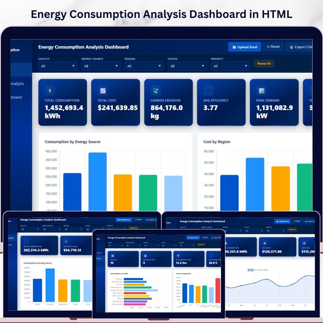
What it is: The analysis dashboard delivered as standalone HTML for browser-based reporting without Excel or Google Sheets. Who it is for: teams that want a lightweight, shareable web report.
- KPI cards for consumption, cost and efficiency
- Interactive charts in the browser
- No license or install to view
Price: $12.99. Best for: standalone browser reporting. Get the HTML analysis dashboard →
Not sure which format? Start with the Energy Consumptions Dashboard in Power BI ($17.99) for multi-site depth, or the Energy & Utility Dashboard in Google Sheets ($9.99) if you want the fastest, cheapest start. Both calculate every energy management KPI on this page out of the box.
How to choose between them
Match the template to how your team already works rather than to the longest feature list:
- Multiple buildings and you own Power BI → Energy Consumptions Dashboard in Power BI ($17.99).
- One office building → Office Energy Consumption Dashboard in Power BI or Excel ($17.99).
- Finance owns the reporting → Energy & Utility Dashboard in Excel ($17.99).
- Analysts modelling load and power factor → Energy Consumption Analysis Dashboard in Excel ($17.99).
- Remote team, tight budget → Energy & Utility Dashboard in Google Sheets ($9.99).
- Client portal or web report → either HTML dashboard ($12.99).
Energy is a major cost line at most mine sites. If that is your world, pair these KPIs with our mining KPI dashboard roundup, which ranks six mining and metals templates.
When a template is NOT the right answer
A spreadsheet or BI dashboard is the right tool for tracking, reporting and benchmarking energy management KPIs. It is the wrong tool in three situations, and being honest about them saves you a refund and a headache.
You need real-time sub-metering. If you want alerts the moment a chiller trips or demand crosses a threshold, you need a Building Management System (BMS) or an energy monitoring platform with live meter feeds, not a template that reads monthly bills. You have thousands of meters. At enterprise scale, an energy management information system (EMIS) with automated ingestion is worth the six-figure cost. You need automated regulatory filing. Mandatory ESG or carbon disclosure with audit trails belongs in dedicated compliance software. For everyone else — most offices, facilities and finance teams — a ready-made dashboard delivers 90% of the value at 0.1% of the cost.
Managing facilities for a charity, school or NGO? Energy cost is one line in the budget; our roundup of the best nonprofit dashboard templates shows the fundraising side your board will ask about next.
Frequently asked questions
What are energy management KPIs?
Energy management KPIs are quantified measures of how efficiently an organisation uses energy, such as Energy Use Intensity, energy cost per square foot, peak demand and carbon intensity. Each has a defined formula and benchmark, so teams can track performance, compare buildings and prove that efficiency projects actually reduced consumption and cost.
What is the most important energy KPI to track?
Energy Use Intensity (EUI) is the most important single metric because it normalizes consumption by floor area, letting you compare any building against a benchmark. The US office median is around 52 kBtu per square foot per year. Pair it with peak demand, since demand charges often cost more than the energy itself.
How do you calculate Energy Use Intensity?
Divide total annual energy consumed, converted to kBtu, by the gross floor area in square feet. For example, a 50,000 sq ft office using 2,600,000 kBtu a year has an EUI of 52. Lower is better; compare only against buildings of the same type and climate zone.
Why are demand charges so important?
Demand charges bill you for your highest short-interval power draw, not total energy, and make up 30–70% of a commercial electricity bill. A single 15-minute spike can set the charge for months under a demand ratchet, so flattening peaks through load management often saves more money than reducing overall kWh.
What is a good load factor?
A load factor above 0.75 is efficient, 0.5 to 0.75 is typical, and below 0.5 means expensive, peaky consumption. It is calculated as total kWh divided by peak kW multiplied by the hours in the period. Improving it usually means shifting or staggering loads to avoid short demand spikes.
Can I track energy KPIs in Excel or Google Sheets?
Yes. Excel and Google Sheets handle every KPI on this list — EUI, cost per square foot, load factor, carbon intensity and more — as long as the formulas are set up correctly. Ready-made templates like the Energy & Utility Dashboard ($9.99 in Google Sheets, $17.99 in Excel) come pre-built so you only connect your data.
What is Power Usage Effectiveness (PUE)?
PUE is a data-center metric equal to total facility energy divided by the energy that reaches IT equipment. A PUE of 1.0 is ideal, 1.2 to 1.5 is good, and the industry average is about 1.5 to 1.6. Report a trailing 12-month value so seasonal cooling is included rather than a single spot reading.
How often should I review energy management KPIs?
Review cost and consumption KPIs monthly when utility bills arrive, peak demand and load factor within each billing cycle, and strategic metrics like carbon intensity and renewable percentage quarterly. Re-benchmark EUI and Energy Star scores annually, since grid emission factors and building stock both shift year to year.
How much do the energy dashboard templates cost?
NextGenTemplates energy dashboards range from $9.99 for the Google Sheets Energy & Utility Dashboard to $17.99 for the Power BI and Excel versions, with HTML dashboards at $12.99. Each is a one-time purchase with every KPI in this guide pre-built, versus days of spreadsheet work to replicate them yourself.
Get more energy management KPI templates
Start tracking every metric in this guide today. The Energy Consumptions Dashboard in Power BI ($17.99) is the best all-round pick, while the Energy & Utility Dashboard in Google Sheets ($9.99) is the fastest, lowest-cost start. Prefer a full walkthrough? Read 5 reasons you need an energy & utility dashboard, and browse related metric guides for HR KPIs and marketing KPIs.
See the dashboards in action on our YouTube channel: youtube.com/@NextGenTemplates.