

A good operations dashboard template stack gives a COO four things: a plan (OKRs and projects), weekly tracking (efficiency, supply chain, vendors), a monthly report and an interactive board view. Our core pick is the Operations KPI Dashboard in Excel ($14.99, paid once). For the widest coverage, the COO Operations Director Toolkit bundles 10 operations templates for $86.99.
Last updated: October 2026
Related guide: Building the finance side of the leadership team too? See our CFO dashboard template stack, which uses the same plan, track, report and present structure.
Key takeaways
- A COO does not need one giant dashboard. A working operations stack is 4 to 10 focused templates, each doing one job: plan, track, report or present.
- The best overall operations dashboard template is the Operations KPI Dashboard in Excel at $14.99, which scores operational KPIs MTD and YTD against target and prior year.
- The COO Operations Director Toolkit packs 10 operations templates (9 Excel, 1 Power BI) for $86.99, which is $67.91 less than buying its parts separately.
- The nine single templates in this guide cost $130.91 together, one time. Microsoft publishes Power BI Pro at $14 per user per month, so ten report viewers cost $1,680 a year on licences alone.
- Templates are the right answer for operations teams running one to five sites on monthly data. Once you need live machine, warehouse or ERP transactions, buy software.
Operations dashboard templates compared
Every template in this guide, side by side. “Job” is where it sits in the COO stack. “What it replaces” is the tool, subscription or manual task a COO can usually drop once the template is running.
| # | Template | Format | Job | Best for | What it replaces | Price |
|---|---|---|---|---|---|---|
| 1 | Operations KPI Dashboard (Best overall) | Excel | Report | The monthly operations scorecard | Hand-built monthly ops pack | $14.99 |
| 2 | COO Operations Director Toolkit (Best value) | Excel + Power BI | All four | Production, supply chain and logistics leaders | 10 separate template purchases | $86.99 |
| 3 | OKR Management Dashboard | Excel | Plan | Quarterly objectives, budget and risk | OKR software seats | $17.99 |
| 4 | Project Management Dashboard | Excel | Plan | Gantt, workload and risk register | Project tool subscription for status reporting | $17.99 |
| 5 | Operational Efficiency KPI Dashboard | Excel | Track | Cycle time, cost and utilization | Ad-hoc efficiency spreadsheets | $12.99 |
| 6 | Supply Chain Dashboard | Excel | Track | Orders, suppliers, locations and delays | Emailed supplier status reports | $17.99 |
| 7 | Vendor Performance Dashboard | HTML | Track | Vendor delivery and quality ratings | Supplier-scorecard add-ons | $12.99 |
| 8 | Productivity Tracker KPI Dashboard | Excel | Track | Team task completion and goals | Manual weekly status roll-ups | $14.99 |
| 9 | Operations KPI Dashboard | Power BI | Present | Interactive leadership reviews | Slide decks rebuilt every month | $11.99 |
| 10 | Operational Efficiency KPI Dashboard | Google Sheets | Report | Shared multi-site scorecard | Excel files emailed between sites | $8.99 |
How we picked these
We searched the full NextGenTemplates operations, supply chain, project and KPI catalogue across Excel, Google Sheets, Power BI and HTML. We kept only paid templates that answer a question a COO is asked every month: are we delivering on time, what does it cost, are our suppliers performing, and are the strategic projects on track?
We dropped marketing and SEO dashboards that sit in the same KPI family but belong to the CMO, single-industry tools that only fit one sector, and duplicates of another pick. Every price below is the live store price in October 2026. We then grouped the survivors by the job they do, because a COO buys capability, not files.
What should a COO operations dashboard template stack cover?
Most “COO dashboard” examples online show one screen with output, cost and delivery. That screen is the result. Behind it, an operations leader runs four different jobs every month, and each one needs its own tool.
- Plan: set quarterly objectives, fund initiatives and schedule the projects that deliver them.
- Track: watch the numbers that move weekly: efficiency, cycle time, supplier delivery and team throughput.
- Report: turn the month into a KPI scorecard with targets, prior-year comparison and traffic lights.
- Present: give the CEO and board an interactive view they can question by site and department.
A useful rule: if a number changes weekly, it belongs in a Track template. If it changes monthly, it belongs in the Report scorecard. If it changes quarterly, it belongs in Plan. The 10 templates below are ranked overall, but each is tagged with its job so you can build the stack in the order you need.
The 10 best operations dashboard templates for 2026
1. Operations KPI Dashboard in Excel: best overall
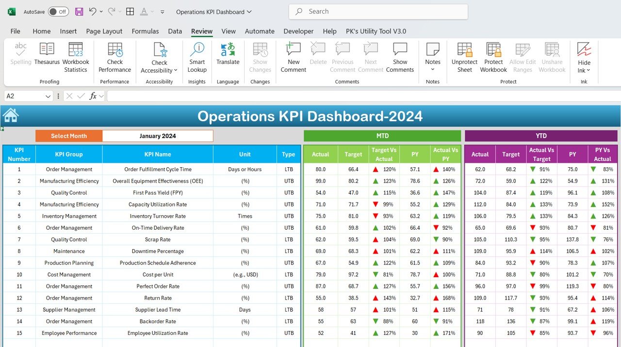
Job: Report. This is the operations dashboard template we would buy first, and it is #1 because it is the only pick built to score the whole operation on one sheet rather than one function. Each KPI row shows its group, unit and type, then month-to-date and year-to-date actuals against target and prior year.
- Tracks production output, inventory turnover, resource utilization, on-time delivery and customer service performance.
- MTD and YTD views side by side, so a bad month and a bad year look different.
- Target vs actual for every KPI, plus a prior-year comparison.
- Color-coded conditional formatting flags delayed deliveries, low inventory or low customer satisfaction.
Use it for: the monthly operations review, the operations page of the CEO’s board pack, and a site-by-site comparison when you run one copy per site. A plant manager can fill in the monthly numbers in 20 minutes.
Price: $14.99, one-time. Get the Operations KPI Dashboard in Excel.
Best for: COOs and operations directors who want one trusted monthly scorecard before anything else.
2. COO Operations Director Toolkit: best value
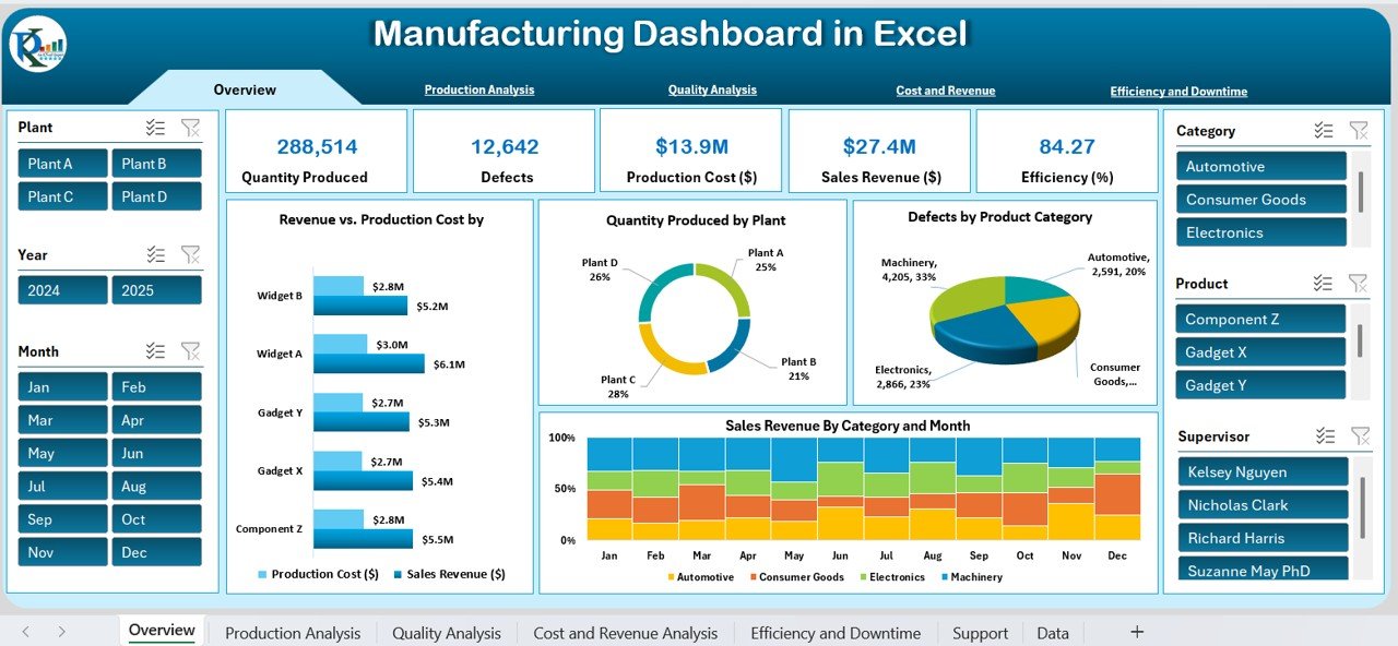
Job: all four. This bundle is built for exactly this reader: COOs, operations directors and the plant, supply chain and logistics leads who report to them. It holds 10 premium templates, nine in Excel and one in Power BI.
- A 7-page Manufacturing Dashboard tracking OEE, throughput, downtime, quality and inventory across shifts, machines and lines.
- Transportation and Logistics, Supply Chain Management, Supply Chain and Freight Cost KPI dashboards for the chain end to end.
- A Manufacturing Efficiency Dashboard in Power BI for multi-plant sharing.
- A traffic-light Manufacturing KPI Scorecard for leadership reviews, plus a Hospital Operations KPI Dashboard for service-sector groups.
The maths: the 10 templates cost $154.90 bought one by one. The toolkit costs $86.99, a saving of $67.91 (44%). It already includes the Supply Chain Dashboard in Excel (#6 below), so do not buy both.
Price: $86.99, one-time. Get the COO Operations Director Toolkit.
Best for: manufacturing, distribution and logistics COOs who need production and supply chain coverage in one purchase.
3. OKR Management Dashboard in Excel
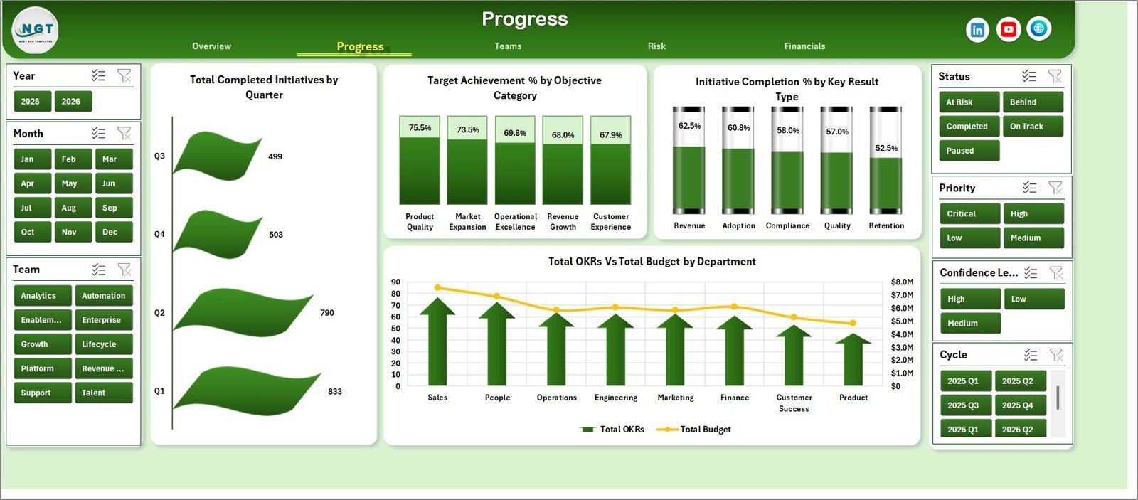
Job: Plan. Operations is where strategy turns into work, so the COO usually owns the OKR process. This workbook has 7 tabs, 5 KPI cards (Total OKRs, Total Budget, Budget Variance, Total Completed and Avg. Alignment Score) and 16 chart views.
- 5 dashboard pages: Overview, Progress, Teams, Risk and Financials.
- Achieved value against target value by month and by cycle.
- Confidence and risk views by owner and team, so slipping objectives surface early.
- Budget against spend for every initiative.
Use it for: the quarterly planning offsite, a fortnightly OKR check-in with department heads, and proving to the board that operating budget is tied to objectives.
Price: $17.99, one-time. Get the OKR Management Dashboard in Excel.
Best for: COOs who run the company’s goal-setting cadence and want it out of scattered status sheets.
4. Project Management Dashboard in Excel
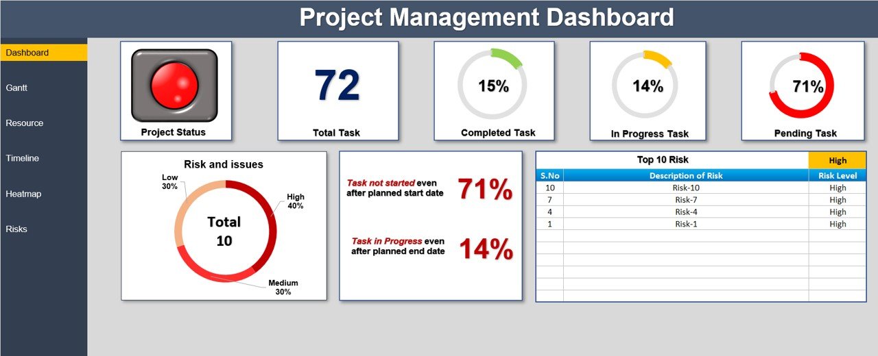
Job: Plan. Every operations improvement, from a new warehouse to an ERP rollout, is a project. This dashboard combines a task status summary, a Gantt timeline, a resource workload heat map and a risk register in one file.
- Total, completed, in-progress and pending task counts with a percentage breakdown.
- Interactive Gantt chart with color-coded task status and milestones.
- Resource heat map that shows who is overloaded and who has capacity.
- Risks rated low, medium or high, each with an owner and mitigation notes.
Use it for: a portfolio view of 5-15 operational projects, the weekly project stand-up, and spotting overloaded team leads before deadlines slip. More options are in our guide to project management dashboard templates.
Price: $17.99, one-time. Get the Project Management Dashboard in Excel.
Best for: COOs who sponsor several improvement projects at once.
5. Operational Efficiency KPI Dashboard in Excel

Job: Track. Where #1 scores the whole operation, this one goes deep on efficiency: production rates, operational costs, time efficiency, resource utilization and cycle time.
- MTD and YTD tracking for every efficiency KPI.
- Target vs actual comparison to show which processes miss their standard.
- Customisable KPI list, so you can add your own measures such as cost per order.
- Simple layout that works for teams with limited Excel experience.
Use it for: a lean or continuous-improvement programme, a weekly bottleneck review, and measuring the effect of a process change. If you are cutting cost per unit by 5%, this is where you prove it. For quality measures to pair with it, see our list of quality KPIs such as DPMO, FPY and cost of quality.
Price: $12.99, one-time. Get the Operational Efficiency KPI Dashboard in Excel.
Best for: operations teams running a cost or cycle-time reduction programme.
6. Supply Chain Dashboard in Excel
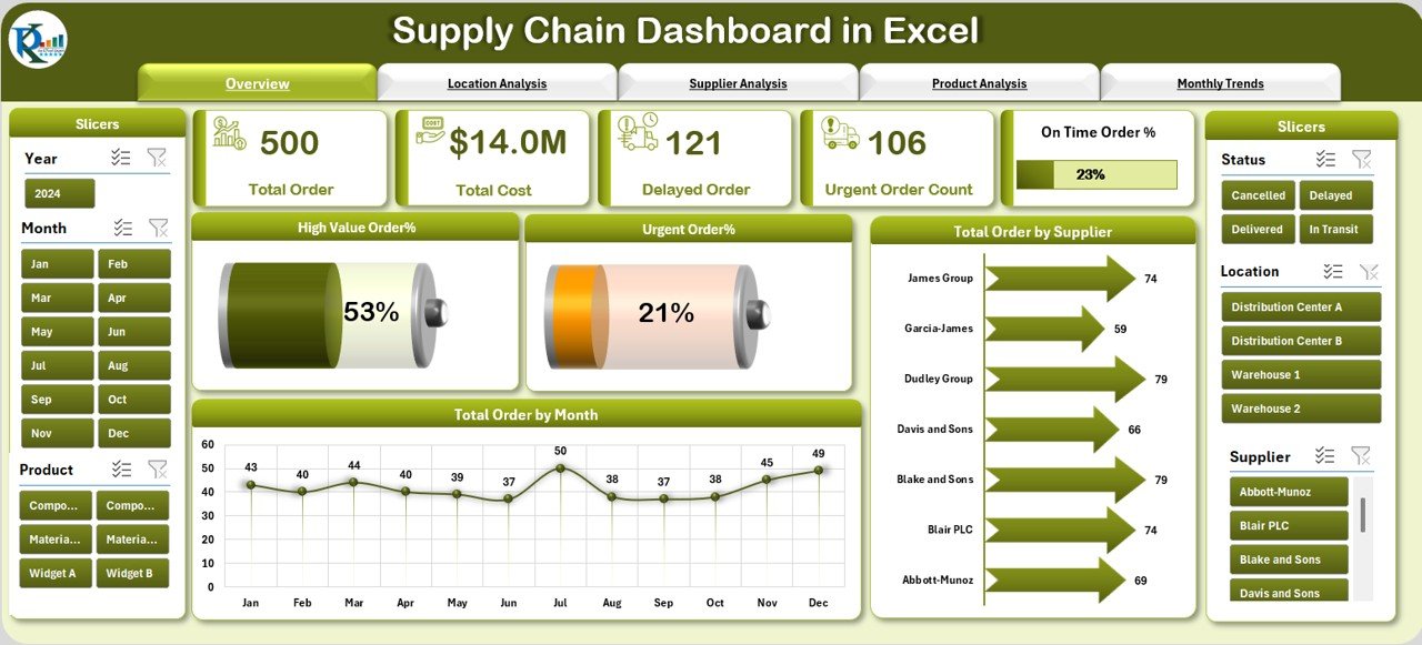
Job: Track. Late inbound orders are the most common reason output misses plan. This dashboard gives a 360-degree view of orders, with a page navigator and five analysis pages.
- Overview with 5 metric cards, including total, urgent and high-value orders.
- Location analysis: cost, quantity and urgent orders by region.
- Supplier analysis: cost, quantity, urgent order count and high-value order share.
- Monthly trends, including delayed orders by month.
Use it for: a weekly supply review with procurement, a quarterly supplier negotiation, and showing which regions drive cost. Pair it with our guide to warehouse KPIs to track if you also run storage.
Price: $17.99, one-time, or included in the COO Operations Director Toolkit. Get the Supply Chain Dashboard in Excel.
Best for: product businesses where supplier delays hit customer delivery.
7. Vendor Performance Dashboard in HTML
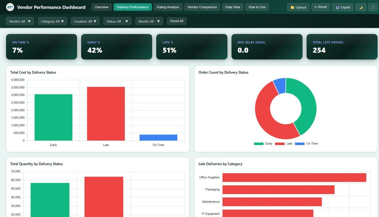
Job: Track. A browser-based dashboard for scoring suppliers. It opens in any browser with no Excel needed, which suits procurement staff on shared machines.
- 5 pages: Overview, Delivery Performance, Rating Analysis, Vendor Comparison and Data View.
- 5 KPIs: Total Cost, Total Quantity, Average Rating, Total Orders and Units Ordered.
- On-time, delayed and late deliveries by vendor and category.
- Quality and communication ratings, with side-by-side vendor comparison.
Use it for: the quarterly vendor business review, deciding which supplier gets the next contract, and backing a price renegotiation with delivery data.
Price: $12.99, one-time. Get the Vendor Performance Dashboard in HTML.
Best for: COOs who manage 10 or more active suppliers.
8. Productivity Tracker KPI Dashboard in Excel
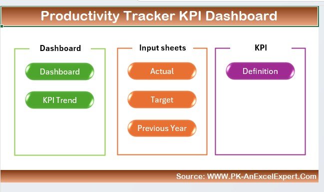
Job: Track. Not every operation makes physical products. For service and back-office teams, output is tasks completed and goals hit. This dashboard tracks task completion, goal progress and deadlines with visual progress indicators.
- Multiple productivity KPIs in one view.
- Task and goal tracking with deadlines.
- Trend analytics to show whether productivity is rising or falling.
- Works for one team or several.
Use it for: a shared-services or customer operations team, a weekly team-lead roll-up, and checking whether a new hire or tool actually raised output.
Price: $14.99, one-time. Get the Productivity Tracker KPI Dashboard in Excel.
Best for: COOs in service businesses where people time is the main operating cost.
9. Operations KPI Dashboard in Power BI
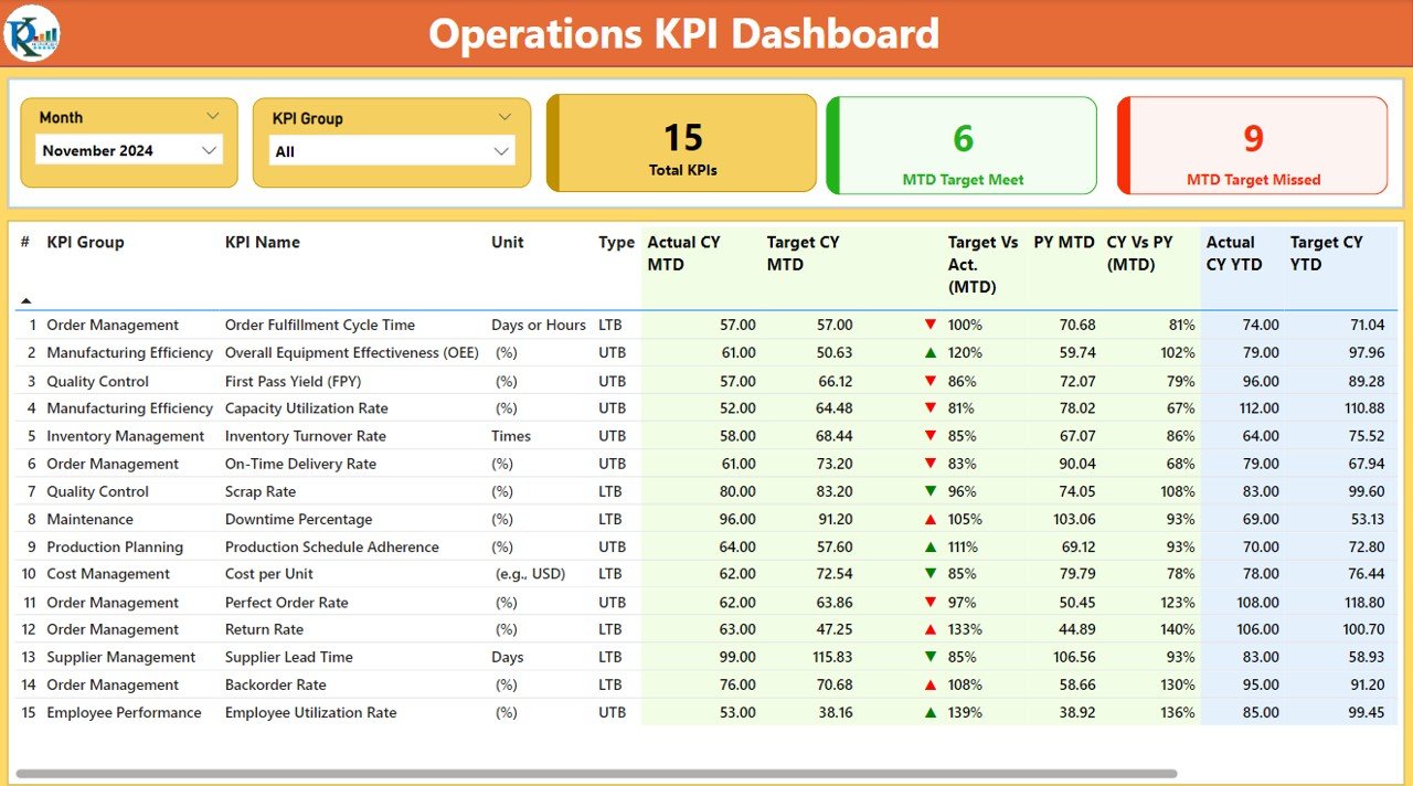
Job: Present. The Power BI twin of #1, built for leadership meetings where people want to click. It covers efficiency, productivity, cost management and resource utilization.
- Interactive charts with drill-down into specific data points.
- Daily, weekly and monthly time views.
- KPI comparison across departments, locations or teams.
- Customisable KPIs to match your own operating model.
Use it for: the monthly leadership review, a board session where directors ask “which site?”, and a multi-location comparison without building a slide per site.
Price: $11.99, one-time. Get the Operations KPI Dashboard in Power BI.
Best for: COOs whose leadership team already uses Power BI.
10. Operational Efficiency KPI Dashboard in Google Sheets
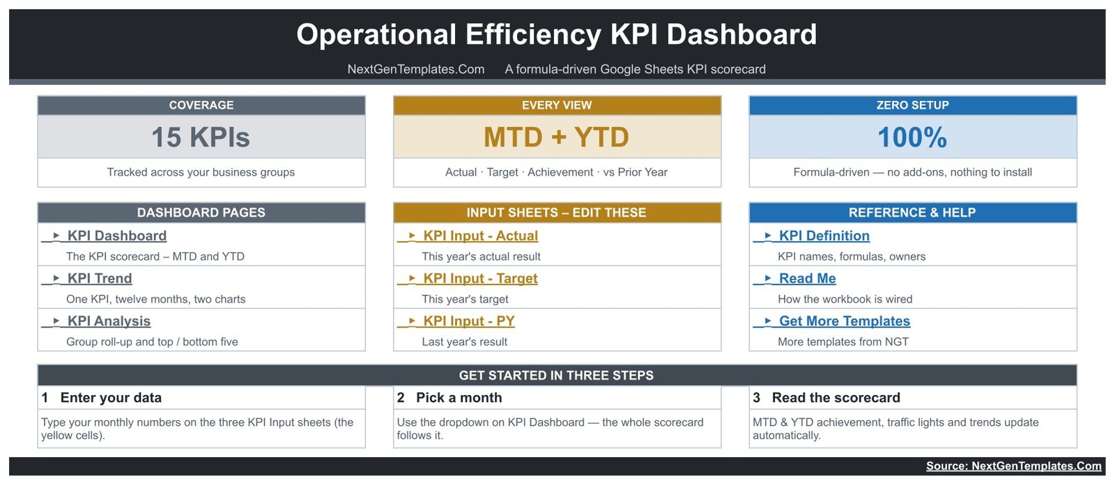
Job: Report. The shared layer for multi-site teams. It tracks 15 operations KPIs in 5 groups: asset effectiveness, throughput and flow, quality and rework, labour and cost, and delivery and automation.
- One month dropdown re-bases the whole workbook.
- MTD and YTD actual, target, achievement % and prior-year comparison in one row.
- Editable traffic-light thresholds: On Target from 100%, At Risk 95-99%, Missed under 95%.
- Upper-the-better and lower-the-better logic, so beating a cost or cycle-time target scores correctly.
Use it for: giving every site manager the same live scorecard, a monthly ops call where everyone looks at one link, and teams that work in Google Workspace.
Price: $8.99, one-time. Get the Operational Efficiency KPI Dashboard in Google Sheets.
Best for: distributed operations teams that need one shared source of truth.
Short on time? Start with the Operations KPI Dashboard in Excel for $14.99. Running production or logistics? The COO Operations Director Toolkit covers 10 operations templates for $86.99, one payment and no subscription.
A 30-day rollout plan for your operations dashboard template stack
Do not install all ten at once. This order gets the monthly scorecard live first and adds weekly tracking only when the reporting habit exists.
| Days | Job | Template | Outcome |
|---|---|---|---|
| 1-5 | Report | Operations KPI Dashboard (Excel) | Agree 8-10 KPIs and targets; load last month’s actuals |
| 6-10 | Plan | OKR Management Dashboard | This quarter’s objectives, owners and budgets in one file |
| 11-15 | Plan | Project Management Dashboard | Every live improvement project on one Gantt with risks |
| 16-20 | Track | Operational Efficiency KPI Dashboard | Weekly cycle-time and cost tracking for the worst bottleneck |
| 21-25 | Track | Supply Chain + Vendor Performance dashboards | Supplier delivery and quality scored before the next review |
| 26-28 | Report | Operational Efficiency KPI Dashboard (Google Sheets) | Site managers update one shared scorecard |
| 29-30 | Present | Operations KPI Dashboard (Power BI) | First leadership review run live from the dashboard |
What does this stack replace, and what does it cost?
The nine single templates in this guide cost $130.91 together, paid once. Add the toolkit and all ten picks come to $217.90, but most COOs only need the toolkit plus three or four singles.
Compare that with a per-seat model. Microsoft publishes Power BI Pro at $14 per user per month, paid yearly. Ten leaders viewing shared reports cost $1,680 a year in licences, before anyone builds a report. Templates do not remove that licence if you publish Power BI reports to colleagues, but they remove the build cost, and the Excel and Google Sheets editions need no BI licence at all.
Running the floor rather than the boardroom? The daily layer underneath this stack is covered in our guide to operations manager tools: the 8-template Excel, Sheets and Power BI stack, with production planning, shift rotas, maintenance, quality and inventory templates.
How to choose between them
- Need one file only? Buy the Operations KPI Dashboard in Excel.
- Run manufacturing, distribution or logistics? Buy the COO Operations Director Toolkit first; it is cheaper than four of its parts.
- Own the company’s goals? Add the OKR Management Dashboard next.
- Suppliers are the problem? Add the Supply Chain and Vendor Performance dashboards.
- Service business, not a factory? Choose the Productivity Tracker over the manufacturing tools.
- Several sites on Google Workspace? Use the Google Sheets scorecard as the shared layer.
- Leadership already lives in Power BI? Add the Power BI Operations KPI Dashboard for reviews.
Building a wider leadership stack? The same structure works for finance controls in our financial controller template stack and for people metrics in our list of HR KPIs to track. If maintenance is part of your remit, our guide to maintenance KPIs like MTBF and MTTR pairs well with the toolkit’s manufacturing dashboards.
When a template is NOT the right answer
Templates are the right tool for an operations team of one to five sites reporting monthly. They stop being right in these situations:
- Real-time shop-floor data. If you need machine status every minute, you need an MES or IoT platform, not a monthly workbook.
- Transaction processing. Picking, receiving, purchase orders and stock moves belong in an ERP or warehouse management system. A dashboard reports on them; it does not run them.
- Approvals and audit trails. If regulators need to see who changed a target and when, file version history is not enough.
- Dozens of sites. Beyond about 10 locations, copying one workbook per site gets fragile. A central database with a BI layer is cleaner.
- Nobody owns the update. Every template still needs someone to enter the month’s numbers. Name that person before you buy.
If none of those apply, a one-time operations dashboard template will cover most of the job for less than a single month of many software seats. Weighing tools more broadly? See our guide to Notion alternatives in Excel and Sheets or browse Excel dashboard templates under $15.
Frequently asked questions
What should a COO operations dashboard include?
A COO operations dashboard should show on-time delivery, throughput or output against target, cost per unit, resource utilization, quality or rework rate, inventory turnover and the status of strategic initiatives. Keep the front page to 6-10 KPIs with MTD and YTD views, and push detail onto drill-down pages for each function.
Is there an operations dashboard template for Excel?
Yes. The Operations KPI Dashboard in Excel costs $14.99 one-time. It tracks production output, inventory turnover, resource utilization, on-time delivery and customer service KPIs, with MTD and YTD actuals against target and prior year, plus color-coded alerts for underperforming areas. You enter monthly numbers and the dashboard updates.
What are the most important KPIs for a COO?
The core COO KPIs are on-time delivery rate, throughput, cycle time, cost per unit, capacity or resource utilization, first pass yield, inventory turnover, supplier on-time rate and initiative completion. Together they answer the three questions a CEO asks operations: are we delivering, at what cost, and are the big projects on track?
Excel, Google Sheets or Power BI for an operations dashboard?
Use Excel for the monthly operations pack and anything that needs modelling. Use Google Sheets when site managers in several locations must view or update the same scorecard. Use Power BI when leadership wants to click into departments and locations live. Many COOs run Excel underneath and Power BI on top.
How much does an operations dashboard template cost?
The templates in this stack cost $8.99 to $17.99 each as one-time purchases. The 10-template COO Operations Director Toolkit costs $86.99 against $154.90 for its parts bought separately. By comparison, Microsoft publishes Power BI Pro at $14 per user per month, paid yearly, before any report has been built.
Can a template replace operations management software?
For a single company with one to five sites, a template stack covers KPI tracking, OKRs, project status, supplier scoring and leadership reporting. It does not replace an ERP, a warehouse management system, live machine data or approval workflows. Once you need real-time transactions rather than monthly reporting, buy software.
How often should a COO dashboard be updated?
Update delivery, output and supplier metrics weekly, because problems there compound fast. Update cost, efficiency and quality KPIs monthly after the close. Refresh OKR and project status every two weeks, in step with leadership check-ins. Board-level operations summaries are usually refreshed monthly or quarterly.
What is the difference between a KPI dashboard and an operations dashboard?
A KPI dashboard scores a fixed list of metrics against targets, usually with MTD, YTD and traffic-light status. An operations dashboard is broader and more analytical: it slices orders, costs and output by site, supplier, product or month. A COO needs both, which is why this stack mixes the two styles.
Do these operations templates need macros?
No. The Excel templates are built on formulas, tables, pivot tables and slicers, and the Google Sheets scorecard is fully formula-driven with no Apps Script. The OKR dashboard uses a Refresh All step after you paste new data. That makes the files safe to share across sites and with auditors.
Get the complete COO template stack
Best value: the COO Operations Director Toolkit includes 10 operations templates in Excel and Power BI for $86.99, one payment and no subscription.
Best single file: the Operations KPI Dashboard in Excel for $14.99.
See more in our CFO dashboard template stack for your finance partner. Watch the walkthroughs on the NextGenTemplates YouTube channel.