

Quality KPIs are the metrics that tell you whether your product, process and suppliers meet standard: the essential twelve are DPMO, First Pass Yield, Cost of Quality, Cost of Poor Quality, Rolled Throughput Yield, Process Sigma, Defect Density, Scrap Rate, Rework Rate, Defective PPM, Non-Conformance Rate and Supplier Quality Rating. Each has a fixed formula and a benchmark range you can act on.
Last updated: September 2026
Key takeaways
- DPMO = (defects ÷ (units × opportunities)) × 1,000,000; world-class Six Sigma is 3.4 DPMO, most companies run at 3–4 sigma (6,210–66,807 DPMO).
- First Pass Yield (FPY) above 99% is world-class; below 85% means rework is eating your margin before anyone measures it.
- Cost of Quality (COQ) usually lands at 10–15% of revenue; laggards exceed 20% and never see it because failure cost hides inside COGS.
- The 12 quality KPIs in this guide are pre-built in eight ready-made dashboards from $9.99, across Excel, Power BI and Google Sheets.
- Best value is the Quality KPI Dashboard in Google Sheets at $9.99; the most complete build is the Quality Assurance Dashboard in Excel at $17.99.
Quality KPI dashboard templates compared
| Template | Format | Best for | Price |
|---|---|---|---|
| Quality KPI Dashboard in Excel (Best overall) | Excel | Teams that want every core quality KPI in the tool they already own | $12.99 |
| Quality Assurance Dashboard in Excel | Excel | Full QA program: inspections, defects and audits in one book | $17.99 |
| Quality Assurance Dashboard in Power BI | Power BI | Drill-down analysis across plants and inspectors | $17.99 |
| Quality KPI Dashboard in Power BI | Power BI | Auto-refreshing KPIs from large defect logs | $11.99 |
| Quality KPI Dashboard in Google Sheets (Best value) | Google Sheets | Cloud collaboration with zero software cost | $9.99 |
| Product Quality KPI Dashboard in Google Sheets | Google Sheets | Manufacturing and product-line defect tracking | $9.99 |
| Quality Assurance Dashboard in Google Sheets | Google Sheets | Lightweight QA logging for small teams | $9.99 |
| Code Quality KPI Dashboard in Excel | Excel | Software and engineering QA (defect density per KLOC) | $14.99 |
How we picked these
We searched the NextGenTemplates catalogue of 150-plus KPI dashboards and shortlisted only templates that natively calculate quality metrics — defects, yield, cost of quality and supplier performance — rather than generic scorecards you would have to rewire. We excluded advisory and finance dashboards that share the KPI shell but track unrelated numbers. Every template below is a paid, formula-driven build, priced between $9.99 and $17.99, with the same twelve quality KPIs defined in this guide already wired to charts. We ranked on breadth of quality coverage first, then format flexibility and price.
The 12 quality KPIs to track in 2026 (with formulas and benchmarks)
Below is the reference table, then a full breakdown of each metric: the one-sentence definition, the exact formula, a realistic benchmark range, and the mistake teams make. The three headline metrics named in the title — DPMO, FPY and COQ — get the deepest treatment because they anchor almost every quality program.
| # | Metric | Formula | Benchmark range | Where to see it |
|---|---|---|---|---|
| 1 | DPMO | (Defects ÷ (Units × Opportunities)) × 1,000,000 | 3.4 (6σ) – 66,807 (3σ) | Quality KPI Dashboard |
| 2 | First Pass Yield | Units passing first time ÷ Units started | 85% – 99%+ | Quality KPI Dashboard |
| 3 | Cost of Quality | Prevention + Appraisal + Internal failure + External failure | 5% – 20% of revenue | Quality Assurance Dashboard |
| 4 | Cost of Poor Quality | (Internal failure + External failure) ÷ Revenue × 100 | <2% – 20% of revenue | Quality Assurance Dashboard |
| 5 | Rolled Throughput Yield | FPY₁ × FPY₂ × … × FPYₙ | >90% (short lines) | Product Quality KPI Dashboard |
| 6 | Process Sigma | NORMSINV(1 − DPMO÷10⁶) + 1.5 | 3σ – 6σ | Quality KPI Dashboard |
| 7 | Defect Density | Total defects ÷ Size (units, KLOC, m²) | <0.5 – 1 per KLOC | Code Quality KPI Dashboard |
| 8 | Scrap Rate | Scrapped units ÷ Total produced × 100 | <1% – 5% | Product Quality KPI Dashboard |
| 9 | Rework Rate | Reworked units ÷ Total produced × 100 | <3% – 10% | Quality KPI Dashboard |
| 10 | Defective PPM | (Defective parts ÷ Total shipped) × 1,000,000 | <25 – 500 PPM | Quality Assurance Dashboard |
| 11 | Non-Conformance Rate | Non-conformances ÷ Units inspected × 100 | <2% | Quality Assurance Dashboard |
| 12 | Supplier Quality Rating | (Rejected parts ÷ Received parts) × 1,000,000 | <50 – 500 PPM | Quality Assurance Dashboard |
1. Defects Per Million Opportunities (DPMO)
Definition: DPMO scales your defect rate to a per-million basis so processes of any size and complexity can be compared on one axis.
Formula: DPMO = (Number of defects ÷ (Units × Opportunities per unit)) × 1,000,000. If 500 units each have 8 inspection opportunities and you find 12 defects, DPMO = (12 ÷ 4,000) × 1,000,000 = 3,000.
Benchmark: 3.4 DPMO is the Six Sigma gold standard; 4 sigma is 6,210 DPMO (99.38% good) and 3 sigma is 66,807 DPMO (93.3% good). Most organisations live between 3 and 4 sigma.
The mistake teams make: counting opportunities inconsistently. If one plant counts 5 opportunities per unit and another counts 20, their DPMO is not comparable — fix the opportunity definition before you benchmark anyone.
2. First Pass Yield (FPY)
Definition: The share of units that clear a step correctly the first time, with no rework, scrap or re-inspection.
Formula: FPY = Units passing first time without rework ÷ Units entering the step. 940 good out of 1,000 started = 94% FPY.
Benchmark: 90–95% is normal for mature manufacturing, above 99% is world-class, and below 85% signals a rework habit that hides in your labour cost.
The mistake teams make: measuring final yield after rework instead of first pass yield. Final yield can read 99% while FPY is 80%, and the 19-point gap is pure hidden cost you are paying to fix your own defects.
3. Cost of Quality (COQ)
Definition: The total money spent because quality is not perfect — both the cost of preventing defects and the cost of the defects that escape.
Formula: COQ = Prevention + Appraisal + Internal failure + External failure costs, usually expressed as a percentage of revenue. The American Society for Quality’s cost of quality framework defines these four buckets in detail.
Benchmark: Total COQ of 10–15% of revenue is typical; world-class programs push below 5%, while laggards exceed 20% without realising it.
The mistake teams make: cutting prevention and appraisal spend to save money. Every dollar removed from prevention typically returns as several dollars of internal and external failure — the cheapest COQ mix is heavy on prevention, light on failure.
4. Cost of Poor Quality (COPQ)
Definition: The failure half of COQ — only the money lost to defects, scrap, rework, returns and warranty, ignoring what you spent to prevent them.
Formula: COPQ = (Internal failure + External failure costs) ÷ Revenue × 100.
Benchmark: Under 2% of revenue is excellent; 5–8% is common; above 15% is a business-threatening leak.
The mistake teams make: leaving external failure (returns, recalls, lost customers) out because it is hard to quantify. External failure is the most expensive bucket — excluding it makes quality look cheaper than it is.
5. Rolled Throughput Yield (RTY)
Definition: The probability a unit passes every step of a multi-step process with no rework anywhere along the line.
Formula: RTY = FPY₁ × FPY₂ × … × FPYₙ. Five steps each at 95% FPY give RTY = 0.95⁵ = 77.4%.
Benchmark: RTY falls fast as steps multiply, so judge it against step count — above 90% is strong for a short process, and any long line under 70% needs step-level attention.
The mistake teams make: quoting the best single step’s yield as if it were the whole process. RTY is a product, not an average, and one weak step drags the entire number down.
6. Process Sigma Level
Definition: A single number that translates DPMO into the familiar 1–6 sigma scale of process capability.
Formula: Process Sigma ≈ NORMSINV(1 − DPMO ÷ 1,000,000) + 1.5 (the 1.5 accounts for long-term drift), or read it from a sigma conversion table.
Benchmark: 3 sigma = 93.3% yield, 4 sigma = 99.38%, 5 sigma = 99.977%, 6 sigma = 99.99966%. Aim for at least 4 sigma on customer-facing processes.
The mistake teams make: chasing 6 sigma everywhere. For low-risk internal steps, the cost of moving from 4 to 6 sigma rarely pays back — reserve it for safety- and customer-critical characteristics.
7. Defect Density
Definition: Defects normalised by the size of the thing being inspected, so a big unit and a small unit can be compared fairly.
Formula: Defect Density = Total defects ÷ Size of unit (per physical unit, per thousand lines of code, or per square metre).
Benchmark: In software, under 1 defect per KLOC is good and under 0.5 is excellent; in manufacturing the “size” unit is product-specific, so trend it against your own baseline.
The mistake teams make: comparing raw defect counts across products of different size. A 100,000-line release with 40 defects is healthier than a 5,000-line one with 15 — only density shows that.
8. Scrap Rate
Definition: The proportion of production thrown away because it cannot be reworked to specification.
Formula: Scrap Rate = Scrapped units ÷ Total units produced × 100.
Benchmark: Under 1% is good, 2–5% is typical for many processes, and above 5% is a direct material-cost problem worth a root-cause investigation.
The mistake teams make: tracking scrap in units but reporting cost in dollars without linking the two. Scrap value, not scrap count, is what tells you which defect to fix first.
9. Rework Rate
Definition: The share of units that fail first inspection but are salvaged by additional labour instead of being scrapped.
Formula: Rework Rate = Reworked units ÷ Total units produced × 100.
Benchmark: Under 3% is healthy, 5–10% is common, and a rising rework rate is often the earliest warning that a process is drifting out of control.
The mistake teams make: treating rework as “free” because the unit still ships. Rework consumes capacity, delays orders and masks the true FPY — it is a cost even when the part is saved.
10. Defective Parts Per Million (PPM)
Definition: The customer-facing reject rate — how many shipped parts per million turn out defective in the field or at the customer’s line.
Formula: Defective PPM = (Defective parts ÷ Total parts shipped) × 1,000,000.
Benchmark: Automotive suppliers target under 25 PPM and world-class runs in single digits; under 500 PPM is acceptable in many general industries.
The mistake teams make: reporting internal PPM and customer PPM as one figure. The gap between them is exactly the effectiveness of your final inspection — keep them separate.
11. Non-Conformance Rate
Definition: The frequency at which inspected items fail to meet a specification or standard requirement.
Formula: Non-Conformance Rate = Non-conformances found ÷ Total units inspected × 100.
Benchmark: Under 2% is the usual target for a controlled process; audit-driven environments such as ISO 9001 track it alongside corrective-action closure time.
The mistake teams make: logging non-conformances without tracking how long they stay open. A low rate with a slow corrective-action backlog is worse than a higher rate that gets closed quickly.
12. Supplier Quality Rating
Definition: How defective the parts arriving from a supplier are, on a per-million basis, so incoming quality can be scored and compared.
Formula: Supplier Quality Rating = (Rejected supplier parts ÷ Total parts received) × 1,000,000 (supplier PPM).
Benchmark: Under 50 PPM is excellent (and expected in automotive), while under 500 PPM is acceptable for most supply chains.
The mistake teams make: scoring suppliers on price alone. A cheap supplier at 2,000 PPM can cost more in incoming inspection, line stoppages and rework than a pricier one at 50 PPM. Pair this KPI with your supply chain KPIs.
The 8 best quality KPI dashboard templates for 2026
Every one of these quality KPIs is already wired to charts in the eight dashboards below. They are ranked by how completely they cover the twelve quality KPIs, then by format flexibility and price.
1. Quality KPI Dashboard in Excel — best overall
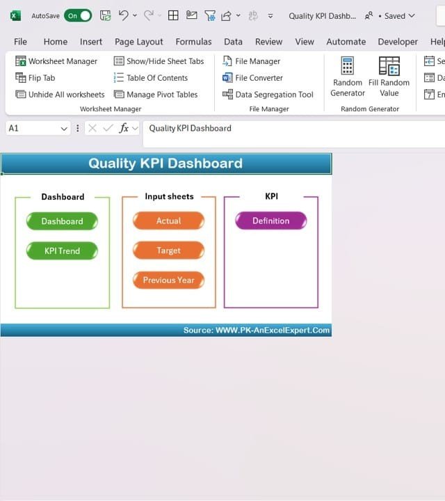
What it is: A formula-driven Excel workbook that tracks DPMO, FPY, sigma level, scrap and rework on a single dashboard, with input sheets for actuals and targets.
Who it is for: Quality managers who want every core quality KPI in the tool they already own, with no add-ins.
- Dashboard, KPI Trend and Definition tabs built in
- Actual-vs-target input sheets that feed every chart
- Defect breakdown by type, inspector and shift
- Editable KPI list — swap in your own metrics without breaking formulas
A 5-line manufacturing team used it to expose an 82% FPY hiding behind a 98% final yield, then tracked the recovery month over month. Price: $12.99. Get the Quality KPI Dashboard in Excel.
Best for: the fastest path from spreadsheet to a working quality scorecard.
2. Quality Assurance Dashboard in Excel — most complete
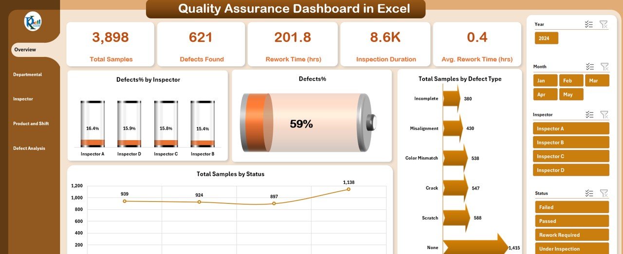
What it is: A broader QA workbook that adds cost of quality, non-conformance logging, PPM and supplier quality on top of the core KPIs.
Who it is for: Teams running a full quality program — inspections, defects, audits and COQ — who want it all in one book.
- Cost of Quality and Cost of Poor Quality breakdowns
- Non-conformance and corrective-action tracking
- Supplier PPM and incoming-quality views
- Audit-ready summary aligned to ISO 9001 thinking
At $17.99 it is the priciest template here and the only one that closes the loop from prevention spend to external-failure cost. Price: $17.99. Get the Quality Assurance Dashboard in Excel.
Best for: a complete quality management system in one workbook.
3. Quality Assurance Dashboard in Power BI — best for drill-down
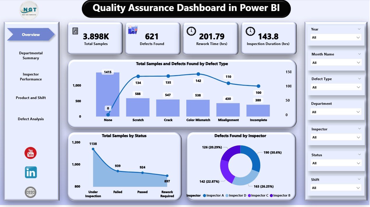
What it is: An interactive Power BI model of the same QA metrics, with slicers by plant, product line and inspector.
Who it is for: Multi-site quality teams who need to slice defects and yield across locations without rebuilding a pivot each time.
- Cross-filtering by site, line, shift and inspector
- DPMO and sigma cards that recalc on every filter
- Trend pages for FPY, scrap and rework
- Refreshes from your defect log automatically
Price: $17.99. Get the Quality Assurance Dashboard in Power BI.
Best for: interactive analysis across plants and inspectors.
4. Quality KPI Dashboard in Power BI — best for large data
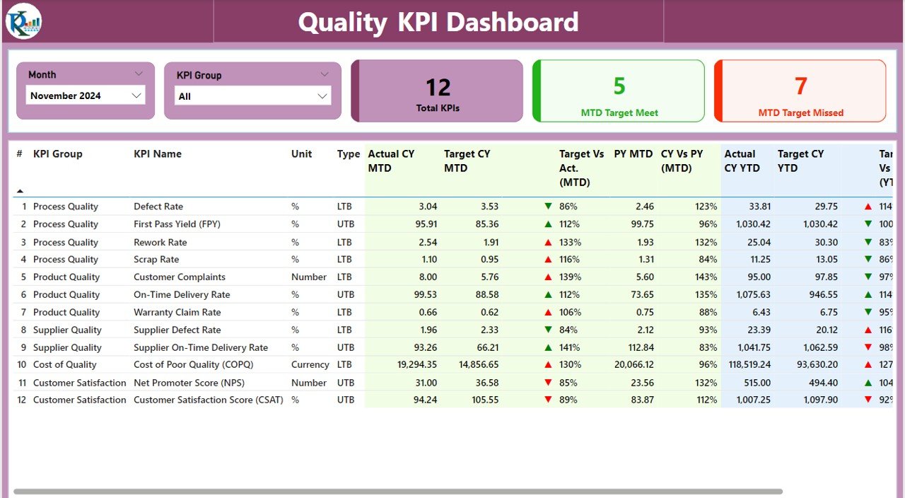
What it is: The core quality KPI set in Power BI, tuned for auto-refreshing from large defect and inspection logs.
Who it is for: Teams whose defect data is too big for a spreadsheet and who want the KPIs to update on a schedule.
- DPMO, FPY, RTY and sigma level as live cards
- Handles hundreds of thousands of inspection rows
- Scheduled refresh from Excel, CSV or database
- Mobile-friendly report layout
Price: $11.99. Get the Quality KPI Dashboard in Power BI.
Best for: high-volume defect data with scheduled refresh.
5. Quality KPI Dashboard in Google Sheets — best value

What it is: A cloud-native version of the core quality scorecard that any teammate can open in a browser.
Who it is for: Small teams and startups that want real quality KPIs with zero software cost and instant sharing.
- Same DPMO, FPY, scrap and rework logic in Sheets
- Live collaboration and comment threads
- Works on any device with a browser
- No licence, no install — share a link
At $9.99 it is the cheapest way onto a proper quality dashboard, which is why it is our best-value pick. Price: $9.99. Get the Quality KPI Dashboard in Google Sheets.
Best for: cloud collaboration on a budget.
6. Product Quality KPI Dashboard in Google Sheets — best for product lines
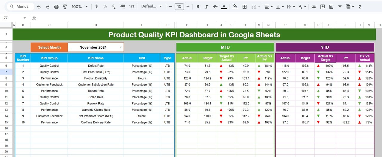
What it is: A Sheets dashboard focused on product- and SKU-level quality: defects by product, scrap, rework and yield per line.
Who it is for: Manufacturers and product teams tracking quality across many products or SKUs at once.
- Defect and yield views broken down by product
- Rolled Throughput Yield across process steps
- Scrap and rework cost per product line
- Shareable with production and QA together
Price: $9.99. Get the Product Quality KPI Dashboard in Google Sheets.
Best for: SKU-level and production-line quality tracking.
7. Quality Assurance Dashboard in Google Sheets — best lightweight QA

What it is: A simpler QA log in Sheets for inspections, non-conformances and pass/fail rates.
Who it is for: Small QA teams that need to log inspections and see non-conformance and defect trends without heavy setup.
- Inspection log with pass/fail and non-conformance rate
- Defect-by-type and defect-by-inspector charts
- Cloud sharing for auditors and managers
- Fastest of the eight to populate from scratch
Price: $9.99. Get the Quality Assurance Dashboard in Google Sheets.
Best for: lightweight inspection logging in the cloud.
8. Code Quality KPI Dashboard in Excel — best for software QA

What it is: A quality dashboard adapted for software engineering — defect density per KLOC, escaped defects, and code review metrics.
Who it is for: Engineering and QA leads who apply the same quality discipline to code that a factory applies to parts.
- Defect density per thousand lines of code
- Escaped-defect and first-pass code-review rates
- Trend charts by release and module
- Same KPI framework, software-specific units
Price: $14.99. Get the Code Quality KPI Dashboard in Excel.
Best for: software teams tracking defect density and escaped defects.
How to choose between them
| If you… | Choose | Price |
|---|---|---|
| Want every core quality KPI in Excel | Quality KPI Dashboard in Excel | $12.99 |
| Need COQ, audits and supplier quality too | Quality Assurance Dashboard in Excel | $17.99 |
| Analyse defects across many sites | Quality Assurance Dashboard in Power BI | $17.99 |
| Have huge defect logs | Quality KPI Dashboard in Power BI | $11.99 |
| Want the cheapest cloud option | Quality KPI Dashboard in Google Sheets | $9.99 |
| Track quality by product or SKU | Product Quality KPI Dashboard in Google Sheets | $9.99 |
| Measure software defect density | Code Quality KPI Dashboard in Excel | $14.99 |
Decision rule: pick the format your team already lives in (Excel, Power BI or Google Sheets), then pick the breadth you need — core KPIs only, or the full QA program with cost of quality and supplier tracking.
Quality is one page of the wider operations picture. Our COO operations dashboard template stack pairs quality tracking with delivery, efficiency and supplier dashboards.
When a quality KPI template is NOT the right answer
A spreadsheet dashboard is the right tool for tracking and reviewing quality KPIs, but it is not a system of record. If you need enforced workflows — sign-offs on every non-conformance, audit trails that satisfy a regulator, or automatic CAPA routing — buy a dedicated Quality Management System (QMS) such as an eQMS platform instead. If your defect data streams live off production equipment in real time, a manual dashboard will always lag; you want an MES or SPC tool wired to the line. And if you only make a handful of units a month, formal DPMO and sigma calculations add ceremony without insight — a simple pass/fail log is enough. Templates win when you need clear, low-cost measurement and reporting; they lose when you need enforced process control or real-time automation. For related operational metrics, see our guides to inventory KPIs and profitability KPIs.
Frequently asked questions
What are the most important quality KPIs to track?
The core set is DPMO, First Pass Yield and Cost of Quality, backed by Rolled Throughput Yield, Process Sigma, Scrap Rate, Rework Rate, Defective PPM, Non-Conformance Rate and Supplier Quality Rating. Together they cover process capability, hidden cost and supplier performance — the three things quality programs are judged on.
How do you calculate DPMO?
DPMO = (Number of defects ÷ (Units × Opportunities per unit)) × 1,000,000. Count every place a defect could occur per unit as an opportunity, total the defects found, and scale to a million. For example, 12 defects across 500 units with 8 opportunities each gives 3,000 DPMO.
What is a good First Pass Yield?
For mature manufacturing, 90–95% First Pass Yield is normal and above 99% is world-class. Below 85% usually means significant rework is hiding inside your final yield. Always measure FPY before rework, not the final yield after it, or you will understate the true cost.
What is the difference between Cost of Quality and Cost of Poor Quality?
Cost of Quality includes all four buckets — prevention, appraisal, internal failure and external failure. Cost of Poor Quality is only the failure half (internal plus external). COQ tells you total quality spend; COPQ isolates pure waste, and is usually reported as a percentage of revenue.
What is the ideal Cost of Quality as a percentage of revenue?
Total Cost of Quality typically runs 10–15% of revenue; world-class programs push below 5%. The goal is not just a lower number but a better mix — more spent on prevention and appraisal, far less lost to internal and external failure.
How is Process Sigma related to DPMO?
Process Sigma is DPMO expressed on the 1–6 sigma scale. 3 sigma equals 66,807 DPMO (93.3% good), 4 sigma equals 6,210 DPMO (99.38%), and 6 sigma equals 3.4 DPMO. Use Process Sigma ≈ NORMSINV(1 − DPMO÷1,000,000) + 1.5 to convert.
Can I track quality KPIs in Google Sheets instead of Excel?
Yes. The Quality KPI Dashboard in Google Sheets ($9.99) runs the same DPMO, FPY, scrap and rework logic in the cloud, with live collaboration and no licence cost. Google Sheets is ideal for small teams and remote quality reviews; Excel and Power BI suit larger datasets and offline work.
What is a good Defective PPM for suppliers?
World-class supplier quality runs under 50 PPM, and automotive suppliers are often held to under 25 PPM. Under 500 PPM is acceptable in many general industries. Track incoming supplier PPM separately from your internal PPM so you can tell supplier problems from process problems.
Do these dashboards work for ISO 9001 audits?
They give you the measurement and trend evidence auditors expect — non-conformance rates, corrective-action tracking and cost of quality — but they are reporting tools, not a controlled QMS. Use them to monitor and present KPIs; pair them with your documented procedures for the audit itself. See our quality control Excel templates for ISO 9001 teams.
How often should I review quality KPIs?
Review process KPIs like FPY, scrap and rework weekly so drift is caught early, and review cost KPIs like COQ and COPQ monthly against revenue. DPMO and Process Sigma are best trended monthly, because short windows are too noisy to judge capability reliably.
Get more quality KPI dashboard templates
The fastest way to start is the Quality KPI Dashboard in Excel ($12.99) for the core metrics, or the Quality Assurance Dashboard in Excel ($17.99) if you want cost of quality, audits and supplier tracking in one book. On a budget, the Quality KPI Dashboard in Google Sheets gives you a full quality scorecard for just $9.99. For more on why a live scorecard beats a static report, read 7 reasons to use a quality KPI dashboard, and see the quality assurance dashboards for data-driven teams. Watch build walkthroughs on the NextGenTemplates YouTube channel.