

The best operations manager tools for a small or mid-sized site are eight one-time templates that cover the job end to end: plan the week, track the floor, report the numbers and present them upward. Our top pick is the Production Planning Dashboard in Excel ($17.99, paid once), because planned-versus-actual output is the question every operations manager answers first each morning.
Last updated: October 2026
Related guide: If you report to the board rather than run the floor, read the COO operations dashboard template stack. That post covers the executive scorecard; this one covers the daily operations manager Excel templates that feed it.
Key takeaways
- An operations manager needs four kinds of tool: one to plan, one to track, one to report and one to present. Eight templates cover all four for $163.92 in total, paid once.
- Best overall is the Production Planning Dashboard in Excel ($17.99); best value is the Inventory & Warehouse Master Kit ($69.99 for 8 templates, 36% off buying them singly).
- The seven single templates in this stack cost $93.93 together. A five-person team on Smartsheet Pro pays about $540 a year, every year.
- The stack mixes Excel, Google Sheets and Power BI, so the shift roster can live in a shared Sheet while the monthly review runs in Power BI.
- Templates lose to real software on automation, audit trails and mobile data capture at scale. We name exactly when to buy software instead.
Operations manager tools compared
All eight operations manager tools side by side, grouped by the job they do. One is marked best overall and one best value.
| # | Template | Job | Format | Best for | Price |
|---|---|---|---|---|---|
| 1 | Production Planning Dashboard (Best overall) | Plan | Excel (Power BI edition too) | Planned vs actual output, delayed orders | $17.99 |
| 2 | Operations KPI Dashboard | Report | Google Sheets | One shared weekly KPI page with MTD and YTD | $9.99 |
| 3 | Equipment Maintenance Management System | Track | Google Sheets web app | Work orders, preventive maintenance, MTTR and MTBF | $24.99 |
| 4 | Quality Control Tracker | Track | Excel (VBA) | Inspection logging by inspector and department | $6.99 |
| 5 | Employee Shift Schedule | Plan | Google Sheets | Weekly rota, coverage and overtime | $6.99 |
| 6 | Supplier Performance KPI Dashboard | Present | Power BI | Monthly supplier review with year-on-year comparison | $11.99 |
| 7 | Project Management Operations KPI Dashboard | Report | Excel | Improvement projects, milestones and budget | $14.99 |
| 8 | Inventory & Warehouse Master Kit (Best value) | Track | Excel, Sheets, VBA, Power BI | Stock, multi-location and warehouse KPIs | $69.99 |
Running a factory specifically? The plant manager dashboard Excel stack goes deeper on the plant floor: OEE, variance analysis, maintenance and production control systems.
How we picked these
We searched the full NextGenTemplates catalogue of more than 7,000 Excel, Google Sheets, Power BI and web-app templates for anything an operations manager touches in a normal week. We kept a template only if it does one of the four jobs (plan, track, report, present) on its own, ships with editable formulas or a documented data sheet, and costs less than one month of the SaaS it stands in for.
We left out industry-specific dashboards such as museum or hospital operations, because a general operations manager would pay for screens they never use. We also left out the executive OKR and efficiency scorecards, which belong to the COO dashboard stack and would duplicate it.
What does an operations manager actually need a tool for?
Strip away job-description language and the week looks the same in a plant, a warehouse or a service centre. Monday is about the plan: what we are making or shipping, who is on shift and what is at risk. Tuesday to Thursday is about tracking: breakdowns, quality failures, late suppliers and stock-outs. Friday is the report. Once a month, the numbers go upstairs in a review.
That rhythm gives us the four groups this stack is built around:
- Plan – the production plan and the shift rota. Get these wrong and nothing downstream recovers.
- Track – maintenance, quality and inventory, the three places where a plan quietly breaks.
- Report – one KPI page the team reads every week, plus the improvement projects you are running.
- Present – a clean, filterable view for the monthly review with your director or a supplier.
Most small teams try to do all four in one huge workbook, and that workbook breaks the first time two people edit it. Splitting the jobs across focused templates is cheaper to maintain, and each file can live wherever its users already work.
The 8 best operations manager tools for 2026
1. Production Planning Dashboard in Excel – best overall
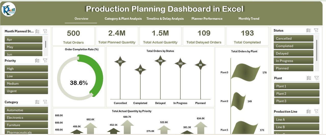
What it is: an interactive Excel dashboard for production orders, built across six worksheet tabs: Overview, Category & Plant Analysis, and separate views for timelines and delays, planner performance and monthly trends.
Who it is for: operations managers who own an output target and need to see where the plan is slipping before the end of the shift.
What is inside:
- Total orders, planned quantity, actual quantity, delayed orders and completed orders as headline cards.
- Order status split (pending, completed, delayed, in progress, planned) with slicers for plant, category, priority and production line.
- Planner performance view, so you can see whose orders run late.
- Priority-based output, so urgent orders are not hidden inside the averages.
How you would use it: say Plant 2 was planned at 2,000 units this week and delivered 1,840. That is 92% schedule attainment (actual ÷ planned). The delay view shows whether the gap came from one line or one planner. In the Monday meeting you replace “we were a bit short” with “Line B, three urgent orders, two days late”.
We rank it first because every other tool in this stack reacts to the plan. If you prefer to present from Power BI, the same layout exists as the Production Planning Dashboard in Power BI ($17.99), with five report pages.
Price: $17.99, one-time. Get the Production Planning Dashboard in Excel.
Best for: the operations manager’s morning question – are we on plan?
2. Operations KPI Dashboard in Google Sheets – best weekly report

What it is: a Google Sheets KPI dashboard that lists your operations KPIs with month-to-date and year-to-date actuals against targets, by KPI group.
Who it is for: managers who need one link the whole team, plus their boss, can open on any device.
What is inside:
- KPI table grouped by area, such as order management, manufacturing efficiency, quality, inventory and maintenance.
- MTD and YTD actual vs target, with up and down indicators.
- A month selector, so last month’s numbers stay a click away.
- Customisable KPIs, so you can rename and add the measures your site actually runs on.
How you would use it: each Friday, supervisors type their weekly actuals into the data tab. On-time delivery (on-time orders ÷ total orders), scrap rate and OEE then update for everyone at once. Because it is Google Sheets, you share it view-only with your director and edit-only with two team leads. Nobody emails a file named “KPI_v7_FINAL”.
If you need a deeper Excel version, see our guide to manufacturing dashboard templates for plant managers.
Price: $9.99, one-time. Get the Operations KPI Dashboard in Google Sheets.
Best for: one shared weekly KPI page with no installation.
3. Equipment Maintenance Management System Web App – best for uptime
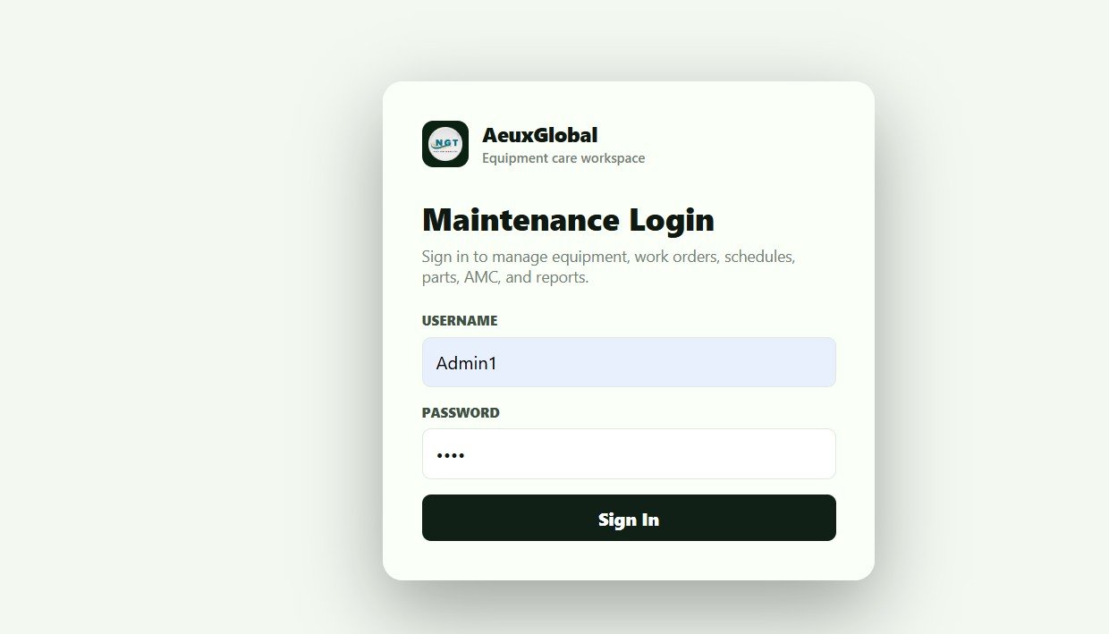
What it is: a multi-user web app built on Google Sheets and Apps Script, with 21 connected screens. They cover the dashboard, technician view, calendar, equipment master, work orders, spare parts, vendors, AMC contracts and reports.
Who it is for: operations managers who own maintenance but cannot justify a per-technician CMMS subscription.
What is inside:
- Secure login with Admin and User roles.
- 12 live KPIs, including open and overdue work orders, PM due, downtime hours, MTTR, MTBF and low-stock parts.
- Preventive maintenance schedules that create due work orders automatically on a daily trigger.
- Spare-part issues linked to work orders, so maintenance cost per asset stays accurate.
How you would use it: MTTR is total repair time divided by the number of repairs. MTBF is operating time divided by the number of failures. If a packing line logged 4 breakdowns and 10 repair hours last month, MTTR is 2.5 hours. The dashboard calculates both for you, so the conversation moves from “the line is always down” to “the filler fails every 9 days”.
Price: $24.99, one-time. Get the Equipment Maintenance Management System.
Best for: cutting unplanned downtime without a CMMS licence.
4. Quality Control Tracker in Excel – best for inspections
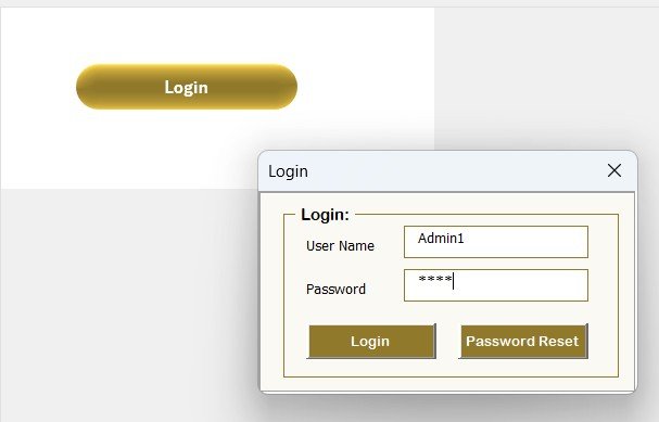
What it is: a VBA-powered Excel system for logging inspections, with a login form, a main control form and a dashboard that refreshes after every change.
Who it is for: sites where inspection results still live on paper or in a shared sheet that anyone can overwrite.
What is inside:
- Login protection and user management, so only named inspectors can add or edit records.
- A data entry form to add, update or delete records in one click.
- Four pivot charts: QC by status, by inspector, by department and by quality parameter.
- Slicers for date, department, status and inspector, and editable dropdown lists.
How you would use it: track first pass yield (units passing first time ÷ units inspected). If one department passes 96% and another 88%, the inspector and parameter charts show whether the gap is a process problem or one inspector applying a tighter standard. Either answer is worth knowing before your next customer audit.
Price: $6.99, one-time. Get the Quality Control Tracker in Excel.
Best for: a locked-down inspection log for less than the price of a sandwich.
5. Employee Shift Schedule in Google Sheets – best for the rota
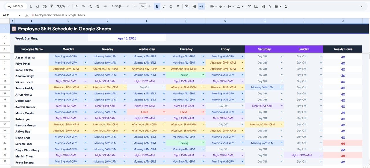
What it is: a five-page Google Sheets scheduler with a weekly view, monthly calendar, employee directory, KPI dashboard and settings page for shift definitions.
Who it is for: operations managers running 10 to 100 people across shifts who need everyone to see the same rota.
What is inside:
- Monday-to-Sunday shift assignment with weekly hours calculated automatically.
- Monthly calendar with total hours per employee.
- Dashboard cards for shifts filled, overtime, leave and training.
- A coverage heatmap showing staff per shift, so understaffed slots stand out.
How you would use it: overtime percentage (overtime hours ÷ total hours worked) is the cleanest early warning of an under-planned rota. If overtime climbs from 6% to 14% over a month, the heatmap usually shows the gap. It tends to be the same night shift, every week. Fix the rota before the overtime bill reaches finance.
Price: $6.99, one-time. Get the Employee Shift Schedule in Google Sheets.
Best for: a shared rota that replaces a per-user scheduling app.
6. Supplier Performance KPI Dashboard in Power BI – best for the monthly review
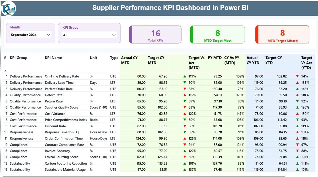
What it is: a three-page Power BI report (Summary, KPI Trend and a KPI Definition drill-through) for supplier metrics. You fill three Excel sheets and every visual updates.
Who it is for: operations managers who present supplier performance upward, or across the table to the supplier.
What is inside:
- An 18-column KPI table with MTD and YTD actual vs target, and the prior year alongside.
- Lower-the-better and upper-the-better logic, so defect rate and lead time turn green when they fall.
- Trend charts comparing current-year actual, prior-year actual and target.
- Setup in under 15 minutes from the supplied Excel data sheets.
How you would use it: a supplier’s on-time delivery reads 91% YTD against a 95% target, down from 94% last year. The trend page shows the slide began in one quarter. That is a specific, fair conversation to have, rather than “your deliveries feel late”. For the spreadsheet side of vendor management, see our supplier management Excel templates.
Price: $11.99, one-time. Get the Supplier Performance KPI Dashboard in Power BI.
Best for: a presentation-ready supplier review with year-on-year context.
7. Project Management Operations KPI Dashboard in Excel – best for improvement projects
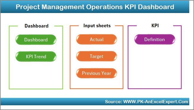
What it is: an Excel KPI dashboard for the projects an operations team runs alongside daily work: line changeovers, layout moves, lean initiatives and system rollouts.
Who it is for: operations managers who own two to ten improvement projects and get asked “where are we on that?” every week.
What is inside:
- Project completion percentage and milestone tracking against deadlines.
- Task and resource allocation, showing who is overloaded.
- Budgeted vs actual cost per project.
- Editable KPIs and charts.
How you would use it: a changeover-reduction project budgeted at $8,000 has spent $6,500 at 60% complete. That is a cost-performance warning you can raise in month two instead of month five. If your projects need full task boards rather than KPIs, compare our monday.com alternatives in Excel and Sheets.
Price: $14.99, one-time. Get the Project Management Operations KPI Dashboard.
Best for: keeping improvement projects on time and on budget.
8. Inventory & Warehouse Master Kit – best value
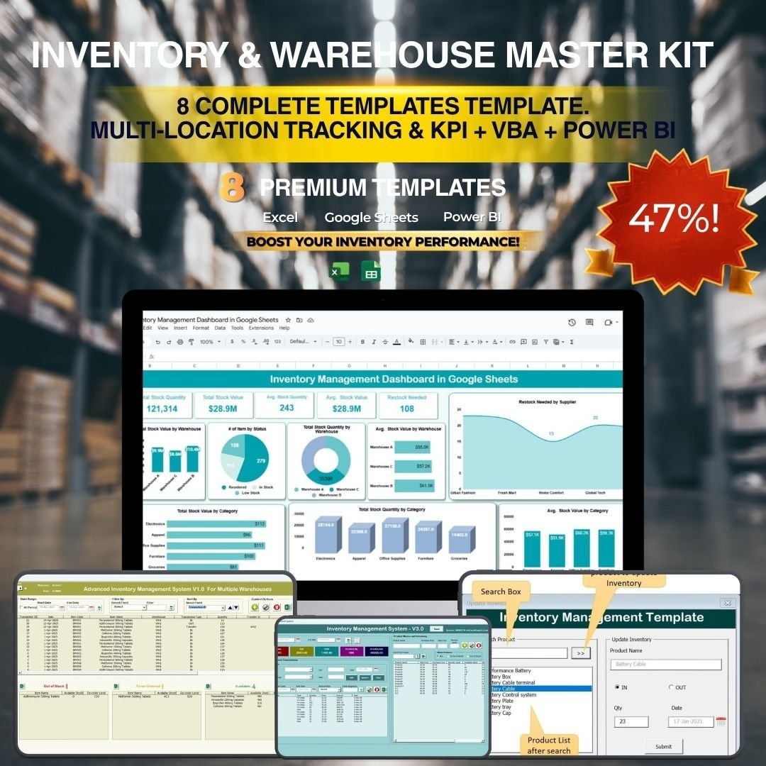
What it is: a bundle of 8 inventory and warehouse templates across Excel, Google Sheets, VBA and Power BI, priced at $69.99 against $109.92 if bought one by one.
Who it is for: operations managers who also own stores, a warehouse or more than one stock location.
What is inside:
- Two VBA inventory management systems (V1.0 and V3.0).
- Multi-location tracking for stock held across several warehouses.
- A five-page Power BI inventory dashboard with supplier analysis.
- A KPI scorecard with MTD, YTD and previous-year comparisons.
How you would use it: inventory turnover (cost of goods sold ÷ average inventory value) tells you whether cash is stuck on shelves. A site turning stock 4 times a year holds roughly three months of inventory; moving to 6 turns frees about a third of that cash. The kit gives you both the transaction system and the dashboard to measure it. Our guide to Excel inventory tools for warehouse managers goes deeper on the single templates.
Price: $69.99 for 8 templates, one-time. Get the Inventory & Warehouse Master Kit.
Best for: the lowest cost per template in this stack.
Start with the plan. If you buy one template today, make it the Production Planning Dashboard in Excel for $17.99. Add the Operations KPI Dashboard in Google Sheets ($9.99) for your Friday report, and you have the core of the stack for $27.98. Both are one-time purchases with no per-user fee.
Which operations manager Excel templates replace which SaaS?
The point of the stack is to stop paying per seat for tools a small team barely uses. Prices below are vendor list prices at the time of writing, billed annually. Check the vendor page before you decide, as they change often.
| Job | Template | What it can replace | Typical SaaS cost | Template cost |
|---|---|---|---|---|
| Plan | Production Planning Dashboard | Spreadsheet-style planning boards such as Smartsheet | Smartsheet Pro about $9 per user per month (Smartsheet pricing) | $17.99 once |
| Plan | Employee Shift Schedule | Per-user scheduling apps such as Deputy or When I Work | Usually charged per user per month | $6.99 once |
| Track | Equipment Maintenance System | Entry-level CMMS such as MaintainX or UpKeep | Usually charged per technician per month | $24.99 once |
| Track | Quality Control Tracker | Paper checklists or a basic inspection app | Per-user inspection apps | $6.99 once |
| Report | Project Management Operations KPI | Work-management tools such as monday.com | monday.com Standard about $12 per seat per month, minimum 3 seats | $14.99 once |
| Present | Supplier Performance KPI (Power BI) | Paid BI dashboards built from scratch | Power BI Desktop is free; sharing online needs Power BI Pro at $14 per user per month (Microsoft pricing) | $11.99 once |
The arithmetic is simple. A five-person team on Smartsheet Pro pays about $540 a year. On monday.com Standard it is about $720 a year. The seven single templates here cost $93.93 once, and you own the files.
A 30-day rollout plan for the stack
Do not switch everything on in one week. Roll the stack out in the order the work flows, so each tool has clean data before the next one depends on it.
| Days | Set up | Done when |
|---|---|---|
| 1–3 | Production Planning Dashboard: load the last 4 weeks of orders | Planned vs actual matches your ERP or order book within 1% |
| 4–7 | Employee Shift Schedule: enter the directory and next two weeks’ rota | Every supervisor reads the rota from the shared link only |
| 8–12 | Equipment Maintenance System: deploy, add assets and PM schedules | The first automatic PM work orders appear |
| 13–16 | Quality Control Tracker: create inspector logins and dropdown lists | One full week of inspections logged with no paper copy |
| 17–20 | Inventory kit: load stock by location | Cycle-count variance under 2% on your top 20 items |
| 21–24 | Operations KPI Dashboard: agree the 10–15 KPIs and targets | The first Friday report is sent as a link, not an attachment |
| 25–27 | Project Management Operations KPI: enter live improvement projects | Every project has a budget, an owner and a next milestone |
| 28–30 | Supplier Performance KPI in Power BI: load 12 months of supplier data | The first monthly supplier review runs from the dashboard |
How to choose between them
If your budget only covers one or two now, use this order:
- You miss output targets and do not know why → start with the Production Planning Dashboard ($17.99).
- Your boss asks for “the numbers” every week → the Operations KPI Dashboard in Google Sheets ($9.99).
- Breakdowns are your biggest loss → the Equipment Maintenance Management System ($24.99).
- Overtime or understaffing is the pain → the Employee Shift Schedule ($6.99).
- You also run stores or a warehouse → the Inventory & Warehouse Master Kit ($69.99), the cheapest way to get eight tools.
Excel suits single-owner files and offline work. Google Sheets suits anything three or more people edit. Power BI suits monthly presentations and data over about 100,000 rows. For a longer format comparison, read Excel vs Google Sheets vs Power BI.
When a template is NOT the right answer
Templates are the right call for most teams under about 50 people. They are the wrong call in these cases:
- You need machine data in real time. If OEE must come straight from PLCs or sensors, you need an MES or IIoT platform, not a spreadsheet.
- You are regulated and audited on records. Pharma, food and aerospace sites often need validated systems with electronic signatures and full audit trails (for example FDA 21 CFR Part 11). A VBA tracker is not validated software.
- Technicians work entirely on mobile, offline. The maintenance web app runs in a browser, but dedicated CMMS apps handle offline sync and barcode scanning better at scale.
- You have more than a few hundred thousand transactions a month. At that volume, inventory belongs in an ERP or WMS. Use the Power BI dashboards to report on that data rather than replace it.
- Nobody will own the files. A template needs one person to keep the data clean. If that person does not exist, a managed SaaS with support may cost less in the end.
Frequently asked questions
What tools does an operations manager use?
Most operations managers use tools for four jobs: planning (production plan and shift rota), tracking (maintenance, quality and inventory), reporting (a weekly KPI dashboard) and presenting (a monthly review). Small teams cover all four with Excel, Google Sheets and Power BI templates instead of separate per-user software subscriptions.
What are the best operations manager Excel templates?
For most sites, the strongest operations manager Excel templates are a production planning dashboard, a quality control tracker and a project operations KPI dashboard. The Production Planning Dashboard in Excel ($17.99) is our top pick because planned versus actual output is the first number every operations manager checks.
Which KPIs should an operations manager track?
Start with schedule attainment (actual ÷ planned output), on-time delivery, first pass yield, OEE, MTTR, overtime percentage and inventory turnover. Ten to fifteen KPIs are enough for a weekly report. Track more and the team stops reading the page. Every template here supports editable KPIs and targets.
Is Google Sheets or Excel better for an operations dashboard?
Google Sheets is better when three or more people enter data or need the live view on any device. Excel is better for single-owner analysis, VBA forms such as the Quality Control Tracker, and offline work. Many operations managers run the rota and weekly KPIs in Sheets and planning in Excel.
Do I need Power BI Pro to use the Power BI templates?
No. Power BI Desktop is free, and you can open, edit and present the .pbix templates in it. You only need Power BI Pro, about $14 per user per month, if you want to publish the report online and share it with colleagues through the Power BI service.
How much does this operations manager template stack cost?
The seven single templates cost $93.93 together and the Inventory & Warehouse Master Kit adds $69.99, so the full stack is $163.92, paid once. There are no per-user fees or renewals. A five-person team on Smartsheet Pro pays about $540 every year.
Can I customise these templates for my site?
Yes. Formulas, KPI names, targets, dropdown lists and charts are all editable, and you own the files outright. Rename plants and lines, add your own quality parameters, or change shift definitions in the settings page. Being editable was a selection rule for every template in this stack.
How long does it take to set up the whole stack?
Plan on about 30 days if you roll it out in order: planning first, then the rota, maintenance, quality, inventory, weekly KPIs, projects and finally the Power BI supplier review. Each single template takes under an hour to set up. Most of the work is cleaning your historical data.
Is the COO dashboard stack the same as this one?
No. The COO stack is an executive layer: company-wide operations KPIs, OKRs and efficiency scorecards. This operations manager stack is the daily layer underneath it: production plans, rotas, maintenance, inspections and inventory. Larger companies often use both, with this stack feeding the COO’s monthly numbers.
Get the full operations manager template stack
Start with the Production Planning Dashboard in Excel ($17.99). If you also run stores, add the Inventory & Warehouse Master Kit ($69.99 for 8 templates, 36% off). Every template is a one-time purchase with an instant download and lifetime access.
Want to see the dashboards working before you buy? Watch the walkthroughs on the NextGenTemplates YouTube channel. To manage projects as well as operations, see our ClickUp alternatives in Excel and Sheets.