

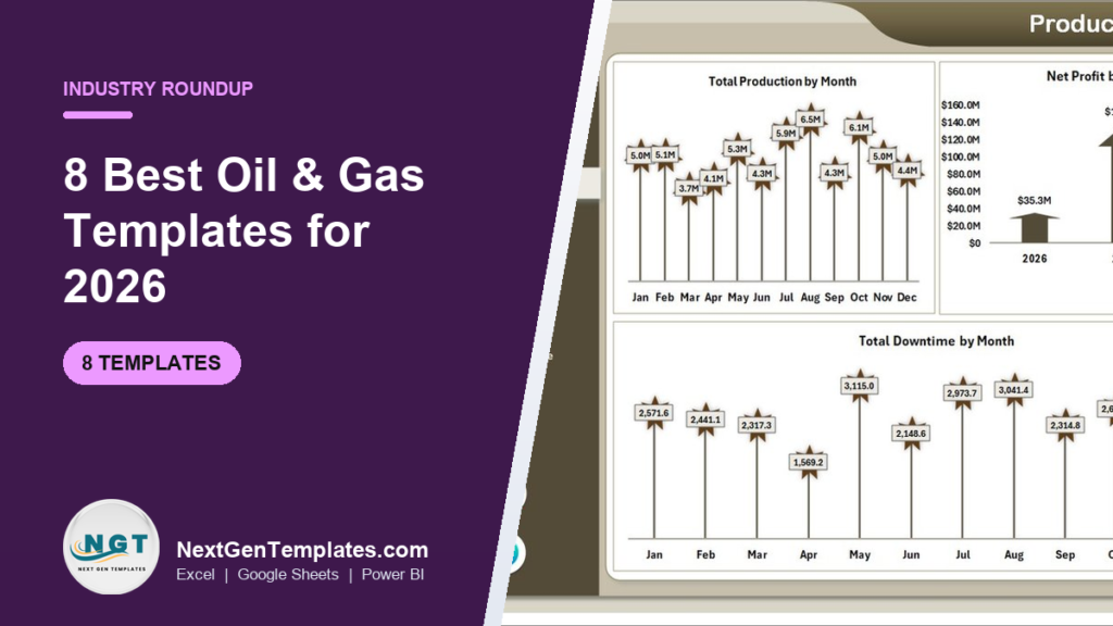
The best oil and gas dashboard for most operators in 2026 is the Oil and Gas Analysis Dashboard in Excel ($17.99): it reports production, revenue, net profit, incidents and downtime by region, field, operator and well type across five pages. The Google Sheets edition is the best value at $9.99, and six more ranked picks cover Power BI, monthly KPIs and refinery tenders.
Last updated: October 2026
Key takeaways
- Best overall oil and gas dashboard: the Oil and Gas Analysis Dashboard in Excel at $17.99, the only pick that puts production, profit and safety (incidents and downtime) in one Excel file.
- Best value: the Oil and Gas Analysis Dashboard in Google Sheets at $9.99, shared by field and head-office teams in a browser.
- Best for executives and multi-country portfolios: the Oil and Gas Dashboard in Power BI at $17.99, with capacity utilisation and profit margin by country and region.
- All eight picks are one-time purchases from $9.99 to $17.99, with no per-user fee and no subscription.
- Templates report on your exports; they do not replace SCADA, production accounting or ERP, which stay your systems of record.
Oil and gas dashboard templates compared
| Template | Format | Best For | Price |
|---|---|---|---|
| Oil and Gas Analysis Dashboard | Excel | Best overall: production, profit, incidents and downtime by field | $17.99 |
| Oil and Gas Analysis Dashboard | Google Sheets | Best value: shared production and revenue reporting | $9.99 |
| Oil and Gas Dashboard | Power BI | Executives comparing countries, regions and energy types | $17.99 |
| Oil and Gas Dashboard | Excel | Production vs capacity in barrels per day | $13.99 |
| Oil & Gas KPI Dashboard | Excel | Monthly KPIs vs target and previous year | $12.99 |
| Oil & Gas KPI Dashboard | Power BI | KPI review meetings on screen | $11.99 |
| Petroleum Industry KPI Dashboard | Google Sheets | Small operators and distributors starting KPI tracking | $9.99 |
| Refinery Tender KPI Dashboard | Excel | Refinery procurement and contracts teams | $14.99 |
How we picked these oil and gas templates
We searched the full NextGenTemplates catalogue of Excel, Google Sheets and Power BI products for oil, gas, petroleum, refinery and energy tools, then kept the eight that a production engineer, asset manager, finance controller or HSE lead would open every month. Each pick had to run from a real data sheet, show genuine oil and gas measures such as production volume, capacity utilisation, downtime or tender cycle time, and be editable without a consultant.
We covered all three formats on purpose, because an oil and gas dashboard is often built once by an analyst in Excel and then shared with field offices or presented to partners. We left duplicates of the same design out of the ranking and list them in the decision section instead. Prices are the current one-time list prices on each product page. For market context we refer readers to the U.S. Energy Information Administration petroleum data, the standard public source for production, price and inventory statistics.
Why oil and gas teams need a dashboard
Oil and gas is capital-intensive and price-sensitive. A field can be producing well and still lose money when operating cost per barrel creeps up, and a refinery can hit throughput while a procurement delay quietly pushes a turnaround back. The numbers usually exist, but they sit in a production database, a maintenance system, accounting exports and an engineer’s own workbook.
So the monthly review starts with someone stitching exports together, and the questions that matter take days to answer: which fields convert volume into margin, which regions run below capacity, where downtime is concentrated, and whether incidents are rising on a particular asset. Commodity prices make it harder, because a strong price month can hide an efficiency problem that only appears when prices fall.
Enterprise analytics suites and specialist production platforms solve this at a cost, usually with implementation projects and per-seat licences. Many independents, service companies, consultants and asset teams cannot justify that just for reporting. An oil and gas dashboard template sits on top of your exports. It does not replace the system of record; it turns the numbers into a one-page view for a one-time $9.99 to $17.99.
The 8 best oil and gas templates for 2026
1. Oil and Gas Analysis Dashboard in Excel: best overall
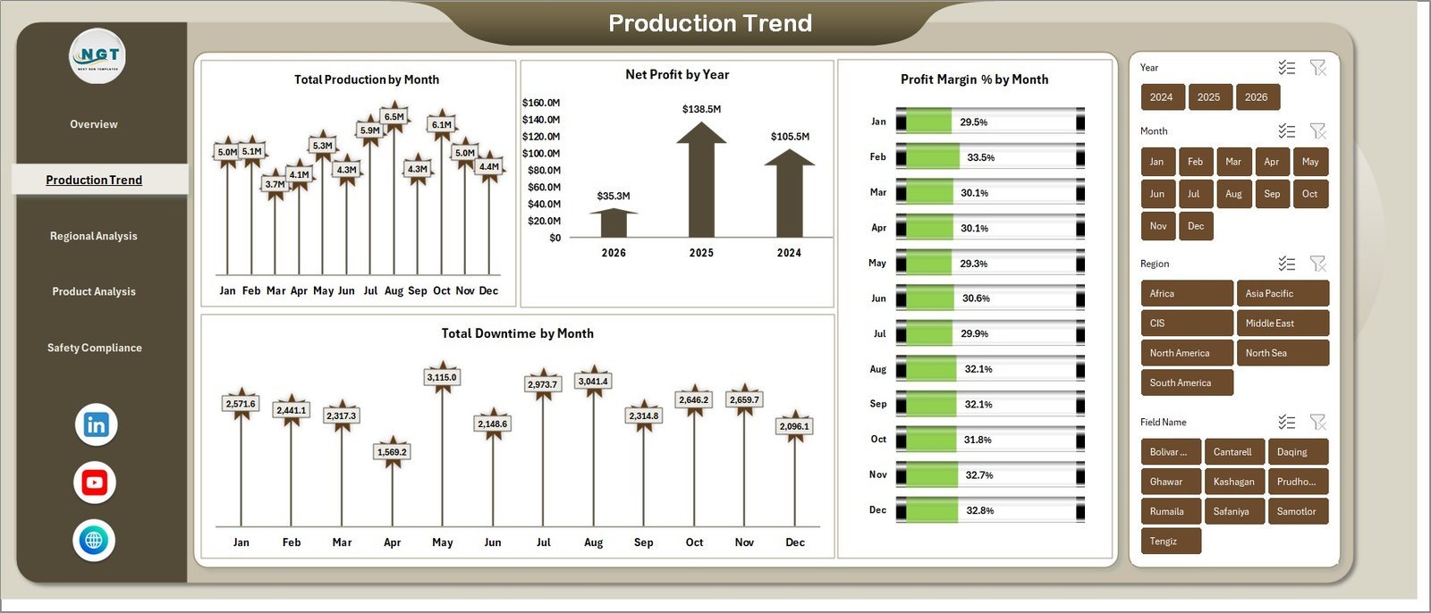
This is the most complete oil and gas dashboard in the roundup, and it ranks first because it is the only pick that joins production, financial and safety performance in one workbook. Five KPI cards (Total Revenue, Net Profit, Total Production, Total Incidents and Total Downtime) sit on the Overview page, and 14 pivot-driven charts rebuild with a single Refresh All.
Who it is for: upstream operators, asset managers, finance controllers and HSE managers who report in Microsoft Excel.
- Five pages: Overview, Production Trend, Regional Analysis, Product Analysis and Safety Compliance.
- Slicers for year, month, region, field name, operator, product type and well type.
- Revenue vs production cost by region, operating cost by field and profit margin % by region.
- Net profit by well type, production cost by extraction method and revenue vs net profit by product type.
Concrete uses: the Production Trend page charts total production and downtime by month side by side, so a month with a spike in downtime hours is visible next to the production dip it caused; the sample data shows monthly profit margin moving between roughly 29% and 34%, the band to watch; and the field slicer narrows the whole file to one asset for a partner meeting. Setup is a paste into the Data Sheet and a refresh. Price: $17.99. Get the Oil and Gas Analysis Dashboard in Excel →
Best for: the team that wants production, profit and safety in one Excel file.
2. Oil and Gas Analysis Dashboard in Google Sheets: best value
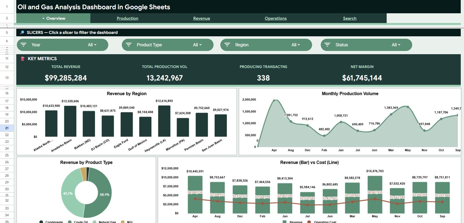
At $9.99 this is the best value in the list. It is a separate build, not a copy of the Excel file: six tabs (Overview, Production Analysis, Revenue Analysis, Operations Analysis, Search Analysis and Data) run in Google Sheets, so field offices and head office open the same live file from any browser.
Who it is for: operators, analysts, finance teams and energy consultants who already work in Google Workspace.
- Four KPI cards: Total Revenue, Total Production Volume, Producing Transactions and Net Margin.
- 20+ analysis views covering revenue by basin or region, production share by well type and production by operator.
- Operations views for operating cost and well status distribution.
- A Search page that returns every field for a transaction ID, so a summary figure can be traced back to its record.
Concrete uses: the sample data compares basins such as the Permian, Bakken and Eagle Ford on revenue; the revenue-versus-operating-cost chart shows margin pressure as soon as cost grows faster than income; and the product split shows whether revenue leans on crude oil or natural gas. Price: $9.99. Get the Oil and Gas Analysis Dashboard in Google Sheets →
Best for: distributed teams that need shared, browser-based reporting at the lowest price.
3. Oil and Gas Dashboard in Power BI: best for executives
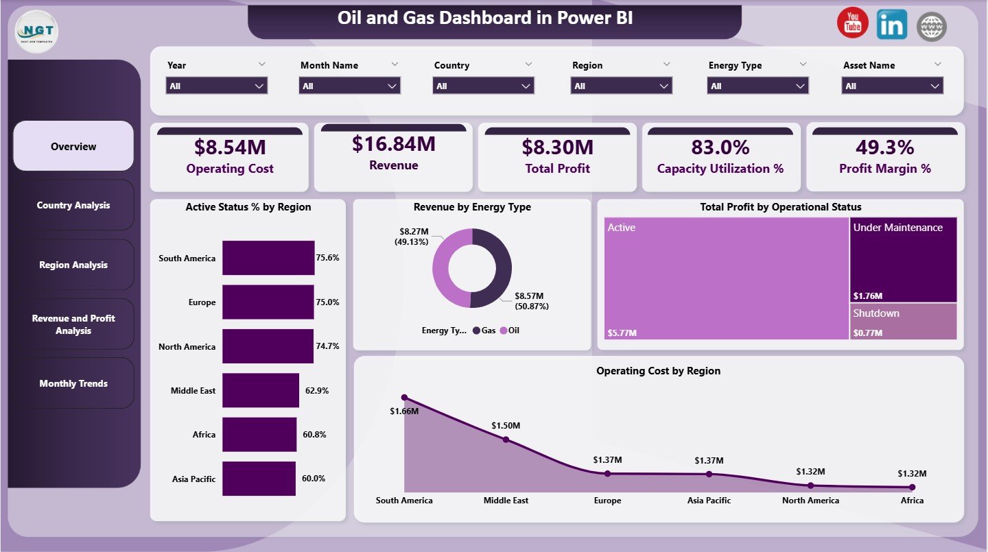
A Power BI report built for leadership views across a portfolio. Five pages (Overview, Country Analysis, Region Analysis, Revenue and Profit Analysis, and Monthly Trends) sit behind slicers for year, month, country, region, energy type and asset name.
Who it is for: executives, strategy and finance teams overseeing assets in several countries, across upstream, midstream and downstream.
- KPI cards for Operating Cost, Revenue, Total Profit, Capacity Utilization % and Profit Margin %.
- Active status % by region, revenue by energy type (oil and gas) and total profit by operational status.
- Country pages for operating cost, profit and revenue; region pages for profit margin, actual production in barrels per day and capacity utilisation.
- Monthly trends for profit, operating cost and revenue.
Concrete uses: the sample overview shows $16.84M revenue, $8.54M operating cost and 83.0% capacity utilisation, which is the kind of one-screen summary a board pack needs; the operational-status treemap separates profit from active, under-maintenance and shutdown assets; and the country page shows which markets carry the highest cost. Price: $17.99. See the Oil and Gas Dashboard in Power BI →
Best for: portfolio owners who present on screen and need country and region comparisons.
Not sure where to start? Most teams start with the Oil and Gas Analysis Dashboard in Excel ($17.99). If your people work in Google Workspace, the Google Sheets edition ($9.99) is the cheapest way to put one production and margin view in front of everyone.
4. Oil and Gas Dashboard in Excel
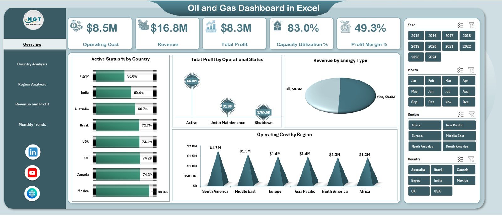
The Excel twin of pick 3, at a lower price. It uses the same five-page structure with a left-side page navigator, and adds production capacity in barrels per day next to actual production, so utilisation gaps are explicit rather than implied.
Who it is for: analysts and managers who want the country-and-region model in Excel rather than Power BI.
- KPI cards for operating cost, revenue, total profit, capacity utilisation % and profit margin %.
- Country Analysis with operating cost, profit, capacity utilisation and revenue by country.
- Region Analysis with profit margin, actual production, production capacity and active status by region.
- Revenue and Profit Analysis by energy type, operational status, country and region, plus monthly trends.
Concrete uses: find the region with spare capacity before approving new drilling spend elsewhere; compare profit by energy type when the gas price diverges from oil; and email a static workbook to partners who do not use Power BI. Price: $13.99. Get the Oil and Gas Dashboard in Excel →
Best for: capacity and utilisation reporting in Excel on a smaller budget.
5. Oil & Gas KPI Dashboard in Excel
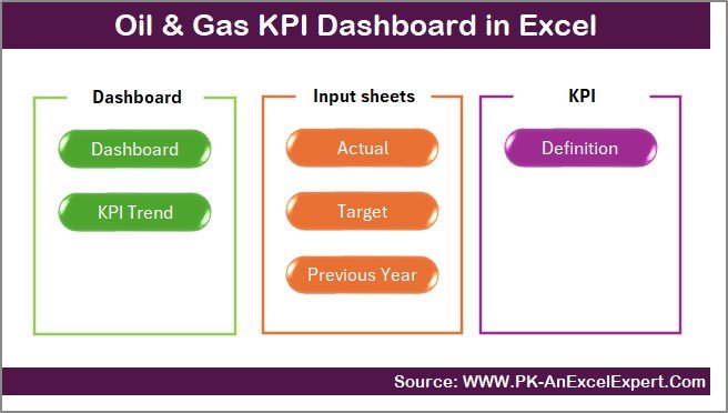
A different style of template: a KPI scorecard rather than a transaction dashboard. You enter one monthly number per KPI, load targets and last year’s figures, and the dashboard shows month-to-date and year-to-date actuals against target and previous year with up and down arrows.
Who it is for: operations, production, refining, safety and compliance managers who report a fixed KPI set each month.
- Seven sheets including Summary navigation, Dashboard, KPI Trend, actual, target and previous-year input sheets and KPI Definitions.
- Month selector that refreshes MTD and YTD actual vs target and vs previous year.
- KPI Trend sheet with unit, KPI type (upper or lower is better), formula and definition.
- Covers production, refining, safety, financial, transport and compliance KPI groups.
Concrete uses: report production, safety and financial KPIs against target every month (rename or add KPIs such as lost time incidents or cost per barrel to match your scorecard); show year-on-year improvement to a lender or joint-venture partner; and give new site managers the KPI Definition sheet so every asset measures the same way. Price: $12.99. Get the Oil & Gas KPI Dashboard in Excel →
Best for: teams that manage by monthly targets and previous-year comparison.
6. Oil & Gas KPI Dashboard in Power BI
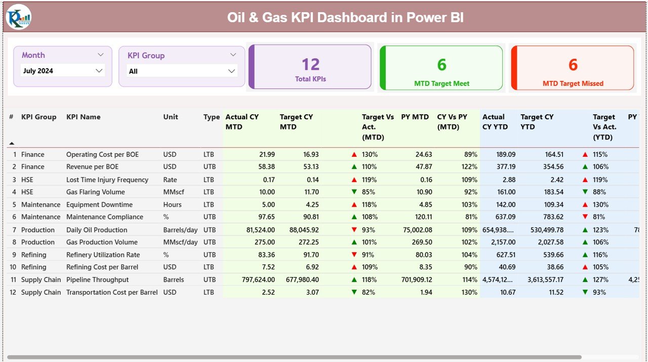
The KPI framework from pick 5 as a Power BI report. The Summary page counts total KPIs, targets met and targets missed, with month and KPI group slicers and a drill-through to each KPI’s formula and definition.
Who it is for: leadership teams who run the monthly performance review from a live screen.
- KPI groups for production, safety, maintenance, operations and finance.
- Green and red icons for MTD and YTD actual vs target and vs previous year.
- Trend page with combo charts for actual, target and previous year for any KPI.
- Data maintained in a simple Excel input file and refreshed in Power BI.
Concrete uses: filter to the Maintenance group to see whether maintenance KPIs are recovering after a turnaround; track safety KPIs alongside production in the same meeting; and drill through when someone asks how a KPI is calculated. Price: $11.99. See the Oil & Gas KPI Dashboard in Power BI →
Best for: organisations that already use Power BI for management reporting.
7. Petroleum Industry KPI Dashboard in Google Sheets

A Google Sheets KPI tracker for the wider petroleum value chain, from producers to refiners and fuel distributors. Overview, KPI Trend, actual, target and previous-year sheets give monthly and yearly comparisons without Excel.
Who it is for: smaller operators, distributors and service companies setting up KPI reporting for the first time.
- Customisable KPIs such as production volume, safety incidents, refining capacity and revenue.
- MTD and YTD actuals against target and previous year.
- Trend charts for long-term performance.
- Browser-based sharing with no installation.
Concrete uses: let a remote site update its own monthly numbers in the shared file; watch incident counts after a contractor change; and keep targets visible to everyone who enters data. Price: $9.99. Get the Petroleum Industry KPI Dashboard in Google Sheets →
Best for: a first shared KPI tracker on a small budget.
8. Refinery Tender KPI Dashboard in Excel
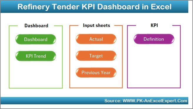
A specialist pick for the commercial side of downstream. Refinery tenders are high-value, heavily regulated contracts with many stakeholders, and this seven-sheet workbook tracks tender KPIs month to date and year to date against target and previous year.
Who it is for: refinery procurement, contracts and tender committees.
- Dashboard with MTD, YTD, target and previous-year comparisons and conditional arrows.
- Dynamic month selector that updates the whole workbook from one cell.
- Trend sheet with MTD and YTD charts for each KPI.
- Customisable KPI list, targets and formulas.
Concrete uses: set up tender KPIs such as cycle time, bid participation or savings (the KPI list is fully editable) and track them against target; show the committee which KPIs slipped this month; and keep definitions consistent between procurement and finance. Price: $14.99. Get the Refinery Tender KPI Dashboard in Excel →
Best for: refinery commercial teams that need a tender scorecard rather than a production view.
The oil and gas KPIs every dashboard should show
Whichever oil and gas dashboard you choose, make sure the monthly pack answers these questions. Each formula works in any spreadsheet once your data sits in one table.
| KPI | Formula | What to watch for |
|---|---|---|
| Production volume (bbl/d or boe/d) | Total volume divided by days in the period | Compare against plan and decline curve, not just last month |
| Capacity utilisation | Actual production divided by design capacity | Low utilisation at a healthy price usually means downtime or constraints |
| Operating (lifting) cost per barrel | Operating cost divided by barrels produced | Rising cost per barrel on flat volume is the earliest margin warning |
| Net profit margin | Net profit divided by revenue | Read by field or asset; a portfolio average hides weak assets |
| Downtime hours | Sum of unplanned outage hours per asset | Split planned from unplanned before comparing months |
| Total recordable incident rate | Recordable incidents × 200,000 divided by hours worked | Track leading indicators too, such as near misses reported |
| Tender cycle time (refining) | Days from tender issue to award | Long cycles delay turnarounds and project start dates |
The 200,000-hour base in the incident rate is the convention used by OSHA for oil and gas extraction and most US operators. Keep formal incident records and regulatory submissions in your HSE system; the dashboard is where you monitor the trend.
How to choose the right oil and gas dashboard template
Match the template to two things: the question you answer every month and the software your team already uses.
- Upstream production, profit and safety in Excel: the Oil and Gas Analysis Dashboard in Excel ($17.99); the Oil and Gas Analysis Dashboard in Power BI ($17.99) covers the same analysis in Power BI.
- Field offices and head office in Google Workspace: the Google Sheets edition ($9.99).
- Multi-country portfolio on screen: the Oil and Gas Dashboard in Power BI ($17.99), or the Excel edition ($13.99).
- Managing by monthly targets: the Oil & Gas KPI Dashboard in Excel ($12.99) or the Power BI edition ($11.99); petroleum-wide versions exist as the Petroleum Industry KPI Dashboard in Excel ($12.99) and Petroleum Industry KPI Dashboard in Power BI ($11.99).
- Refining and refinery procurement: the Refinery Tender KPI Dashboard ($14.99), the Refinery Tender Dashboard in Power BI and the Refinery Dashboard in Power BI ($17.99).
- Midstream and gas processing: the Pipeline Infrastructure KPI Dashboard in Excel ($14.99) and the Industrial Gas Production Dashboard in Excel ($17.99).
Energy companies with transition or ESG reporting duties can add the Energy & ESG Sustainability Bundle ($59.99 for eight Excel and Power BI templates). For neighbouring operations, see our logistics and transportation dashboard templates for fleet and haulage, the quality control templates for ISO 9001 teams and the project management dashboard templates for capital projects and turnarounds. Before you buy anything, our guide to evaluating an Excel dashboard lists the checks worth doing.
When an oil and gas template is NOT the right answer
A dashboard is a reporting layer, not a system of record. Be honest about where an oil and gas dashboard template stops:
- You need real-time well or plant data. SCADA, historians and control systems handle live sensor feeds. Export summaries into a dashboard; do not run operations from a spreadsheet.
- You need hydrocarbon allocation, royalties or joint-interest billing. Production accounting and JIB software carry the audit trail regulators and partners expect.
- You file regulatory or reserves reports. Reserves estimates and statutory filings need dedicated engineering and compliance tools.
- Many users must enter data at once with permissions. Google Sheets handles light collaboration; high-volume multi-user entry needs a database-backed system.
- Your data runs to millions of rows a month. Use the Power BI picks, or a data warehouse feeding Power BI, instead of a workbook.
If none of those apply, and for monthly management reporting they usually do not, a template is the faster, cheaper and more flexible choice, and it keeps working if you change the system underneath.
Frequently asked questions
What is an oil and gas dashboard?
An oil and gas dashboard is a ready-made Excel, Google Sheets or Power BI file that turns production, revenue, operating cost, downtime and safety records into KPI cards and charts. You paste your own field or asset data into the data sheet, refresh, and see output, margin and incidents by region, field, operator or month without building reports by hand.
Which KPIs should an oil and gas operator track?
Start with production volume in barrels or barrels of oil equivalent per day, capacity utilisation, lifting or operating cost per barrel, revenue, net profit margin, downtime hours, total recordable incident rate and lost time injuries. Refiners add throughput and yield; procurement teams add tender cycle time and savings. The KPI dashboards in this guide let you define your own list.
Is a dashboard template a replacement for production accounting software?
No. Production accounting, SCADA historians, ERP and hydrocarbon allocation systems remain the systems of record. A dashboard template is a reporting layer that reads a monthly export from those systems, and it costs a one-time $9.99 to $17.99 rather than an enterprise licence or a per-user subscription.
Excel, Google Sheets or Power BI: which suits an oil and gas team best?
Choose Excel when one analyst or controller prepares the monthly pack offline, Google Sheets when field offices and head office need one live file in the browser, and Power BI when data spans many assets, countries or years and you present on screen to management or partners. Every pick here is a one-time purchase.
How do I calculate capacity utilisation and profit margin?
Capacity utilisation is actual production divided by nameplate or design capacity for the same period, shown as a percentage. Profit margin is net profit divided by revenue. Calculate both by asset and month, because one field on planned maintenance can pull the company-wide figure down and hide a real cost problem elsewhere.
Can these templates track safety and HSE performance?
Yes. The Oil and Gas Analysis Dashboard in Excel has a Safety Compliance page with total incidents and downtime, and the KPI dashboards let you add measures such as total recordable incident rate or lost time injury frequency. Keep formal incident investigation and regulatory reporting in your HSE system.
Do I need macros, coding or a Power BI Pro licence?
No. The Excel dashboards run on formulas, pivot tables and slicers, the Google Sheets editions work in any browser, and the Power BI files open in the free Power BI Desktop app. You need a paid Power BI licence only to publish the report to the Power BI service and share it online.
Which template is best for upstream production versus downstream refining?
Upstream teams should start with the Oil and Gas Analysis Dashboard in Excel or Google Sheets, which report by field, operator, well type and product. Downstream and refining teams get more from the KPI dashboards and the Refinery Tender KPI Dashboard, plus the Refinery Dashboard in Power BI listed in the decision section.
Can I report in barrels per day and in my own currency?
Yes. The data sheets accept whatever units and currency your exports use, and the Oil and Gas Dashboard editions already chart actual production and production capacity in barrels per day. Change the number format on the KPI cards once, then every chart follows the same data.
How long does setup take?
Most teams are reporting within an afternoon. Export one row per asset or transaction per period with date, region, field, product, volume, revenue and cost, paste it into the data sheet with the same headings, refresh, then check the Total Revenue card against a figure you trust from accounting before sharing the file.
Get more oil and gas dashboard templates
Ready to see production, margin and safety on one page? Start with our best overall oil and gas dashboard, the Oil and Gas Analysis Dashboard in Excel ($17.99), or the best-value Google Sheets edition ($9.99). Executives comparing countries should try the Oil and Gas Dashboard in Power BI ($17.99). Every option is a one-time purchase with no subscription and no per-user fee.
Compare formats more widely with our Power BI dashboard templates ranked by industry, the premium Power BI templates under $20, the shareable Google Sheets templates for teams and the 25 best-selling business templates. Subscribe to the NextGenTemplates YouTube channel for setup tutorials.