



A locksmith business already generates every number on this page. The response times sit in the dispatch log, the key counts are on the shop counter, the transponder jobs are in the technician’s day sheet, and the survey scores arrive by text message and are never added up. What almost nobody has is one page that puts them side by side, month after month, in the same shape – so a bad month looks different from a good one at a glance instead of after an evening of spreadsheet archaeology.
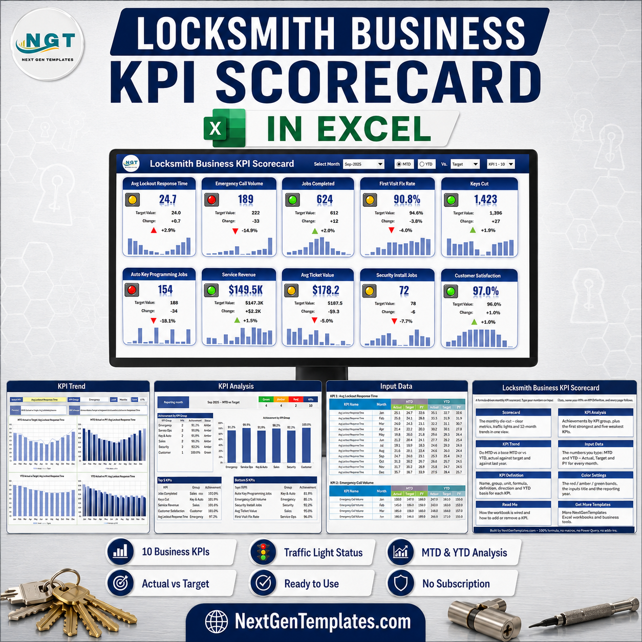
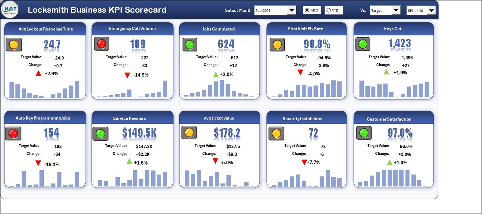
The Locksmith Business KPI Scorecard in Excel is that page. Ten locksmith-specific KPIs across six groups, a month picker, an MTD / YTD switch, and traffic lights that know which direction is good. It ships loaded with a complete 2025 sample year: leave it on Sep-2025 with MTD and Vs. Target selected and you get 4 Green, 4 Amber and 2 Red, with Jobs Completed at 624 against a 612 target and Auto Key Programming Jobs at 154 against 188. It is 100% formulas – no macros, no Power Query, no add-ins – and it opens on any Excel from 2016 onward.
One thing worth naming up front, because three NextGenTemplates families carry near-identical titles: this is the KPI Scorecard line. It is a monthly reporting page driven by a month picker and a KPI Definition sheet you rename. It is not the slicer-driven Excel KPI Dashboard line, and it is not the analytical Excel Dashboard line. Different tools, different questions.
Key Features of the Locksmith Business KPI Scorecard in Excel
- Ten locksmith KPIs on one page – Emergency, Service Ops, Key & Auto, Sales, Security and Customer, each metric on its own tile.
- Month picker with an MTD / YTD switch – report the month or the year to date without rebuilding anything.
- Three comparison bases – measure Actual against Target, against the same period last year (PY), or against the Prior Month.
- Direction-aware traffic lights – nine Upper-the-Better KPIs and one Lower-the-Better KPI, so a rising Avg Lockout Response Time shows a red arrow instead of a false green.
- A 12-month sparkline on every tile – value, target, absolute change, percentage change and the shape of the year in one glance.
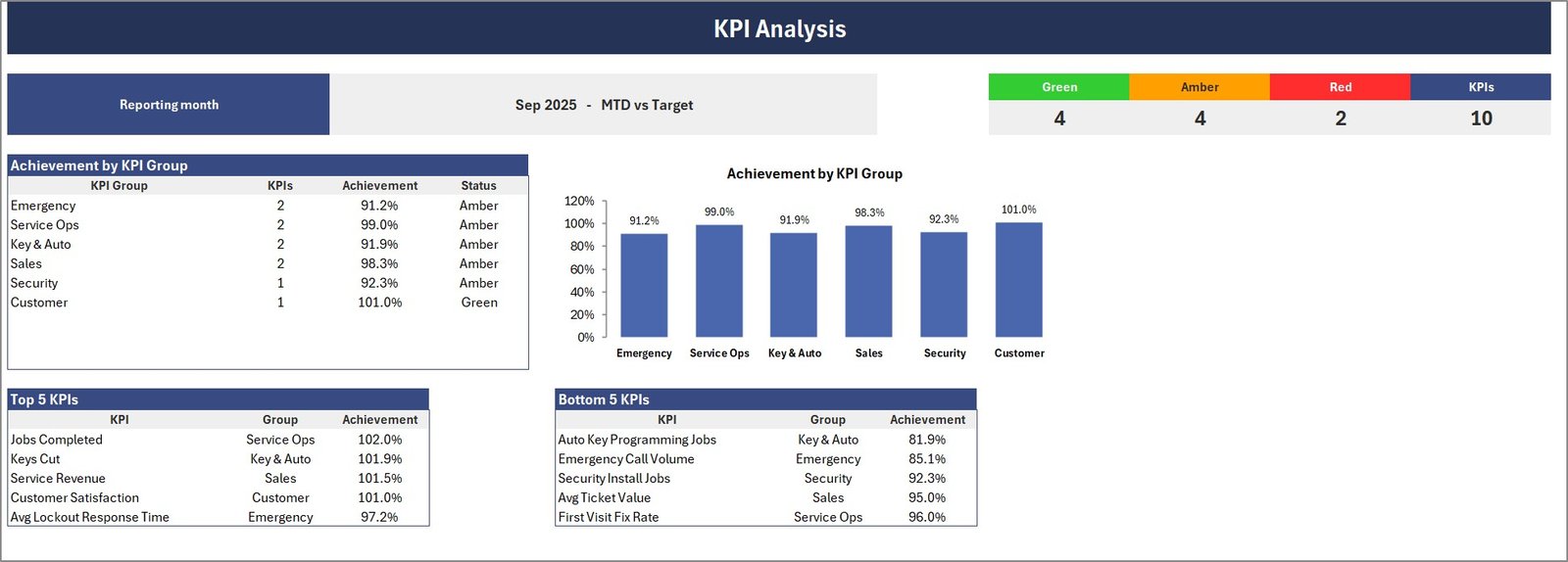
- KPI Analysis page – achievement by KPI group with a matching column chart, the Green / Amber / Red counts, and Top 5 / Bottom 5 tables.
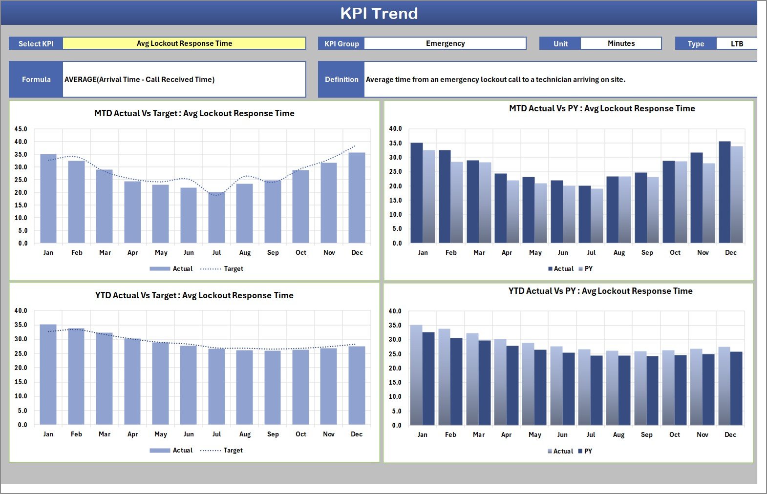
- KPI Trend page – four charts for any single KPI: MTD and YTD, each against Target and against last year, with the KPI’s group, unit, direction, formula and definition printed above them.
- Rename every KPI – room for 20, ten already filled with locksmith metrics, and a duplicate-name check that flags collisions.
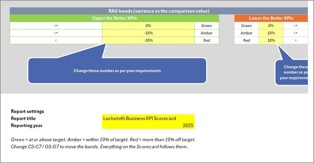
- Editable RAG bands – the Amber and Red thresholds live in cells on the Color Settings sheet and are read live by every traffic light, separately for Upper-the-Better and Lower-the-Better KPIs.
- 100% formulas, zero macros – conditional formatting, camera pictures and sparklines only, delivered as a plain .xlsx.
- Instant download – the .xlsx plus a user manual PDF in one ZIP.
What’s Inside the Locksmith Business KPI Scorecard in Excel
Eleven sheets in total: nine you can see and two hidden calculation sheets that do the lookups. You only ever type on two of them.
| Sheet | What it does |
|---|---|
| Home | A navigation page – one linked card per sheet, each with a one-line description of what that sheet is for. |
| Scorecard | The month tile wall. Ten tiles, each carrying the traffic light, the value, the target, the absolute change, the percentage change with a coloured arrow, and a 12-month sparkline. The header holds Select Month, the MTD / YTD option buttons, the Vs. selector and the KPI 1-10 / KPI 11-20 set picker. |
| KPI Analysis | Achievement by KPI Group as a table and a column chart, the Green / Amber / Red / total KPI counts, and the Top 5 and Bottom 5 KPIs for the selected month. |
| KPI Trend | One KPI at a time. Pick it from the dropdown and the page prints its group, unit, direction, formula and definition, then draws four charts: MTD Actual Vs Target, MTD Actual Vs PY, YTD Actual Vs Target and YTD Actual Vs PY. |
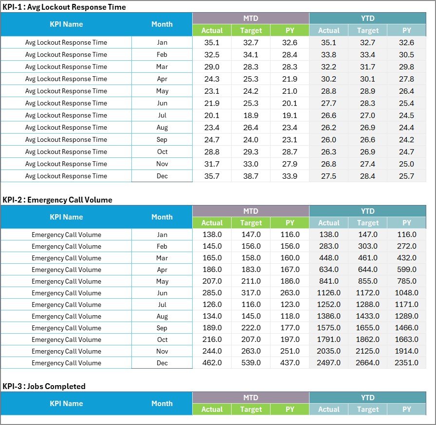
| Input Data | The one sheet you maintain month to month. A numbered 12-month block per KPI, with MTD Actual / Target / PY and YTD Actual / Target / PY columns. Twenty numbered blocks, ten of them filled. |
| KPI Definition | The other sheet you maintain. Number, group, name, unit, formula, definition, Type (UTB or LTB) and YTD Basis for each KPI, plus a Check column that flags a duplicate name. |
| Color Settings | The RAG bands for Upper-the-Better and Lower-the-Better KPIs, the report title and the reporting year. The band cells are the live thresholds, not a description of them. |
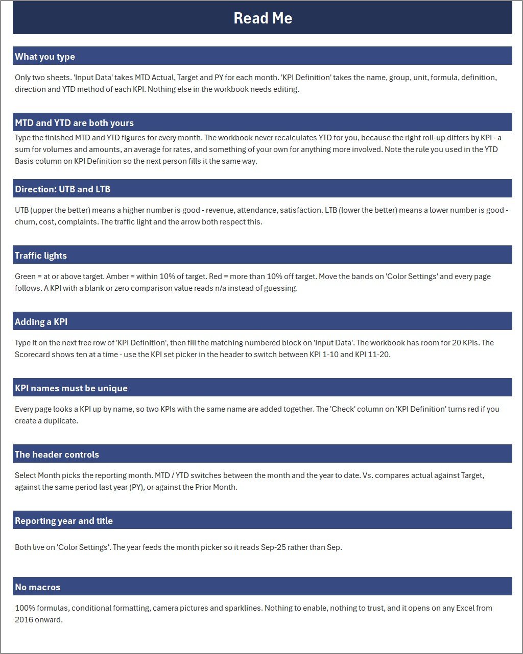
| Read Me | Nine short sections covering what to type, how MTD and YTD work, UTB vs LTB, the traffic lights, adding a KPI, unique names, the header controls, the title and year, and the no-macros promise. |
| Get More Templates | The NextGenTemplates catalogue links and the customisation contact address. |
The ten KPIs it ships with
| # | KPI | Group | Unit | Direction |
|---|---|---|---|---|
| 1 | Avg Lockout Response Time | Emergency | Minutes | Lower the better |
| 2 | Emergency Call Volume | Emergency | Count | Upper the better |
| 3 | Jobs Completed | Service Ops | Count | Upper the better |
| 4 | First Visit Fix Rate | Service Ops | % | Upper the better |
| 5 | Keys Cut | Key & Auto | Count | Upper the better |
| 6 | Auto Key Programming Jobs | Key & Auto | Count | Upper the better |
| 7 | Service Revenue | Sales | USD (000s) | Upper the better |
| 8 | Avg Ticket Value | Sales | USD | Upper the better |
| 9 | Security Install Jobs | Security | Count | Upper the better |
| 10 | Customer Satisfaction | Customer | % | Upper the better |
Avg Lockout Response Time is the one Lower-the-Better KPI in the set, which is exactly the metric a scorecard most often gets backwards. Every other row is a label you can overwrite. If you bill by call-out rather than by ticket, or you track Safe Opening Jobs instead of Keys Cut, you rename the row on KPI Definition and the whole workbook follows – tiles, charts, group totals, Top 5 and Bottom 5 included.
Excel Scorecard vs. Google Sheets vs. Paid Field-Service SaaS – Where This Fits
| This Excel scorecard | A Google Sheets scorecard | Field service / dispatch SaaS | |
|---|---|---|---|
| Cost | One-off, under $20 | One-off, under $20 | $50-$400 per user per month |
| Works offline | Yes | No | Usually no |
| Multiple people editing at once | No – single-user desktop file | Yes | Yes |
| Pulls data from your dispatch or accounting system | No – you type it | No – you type it | Yes |
| Macros to enable | None | N/A | N/A |
| You control the KPI list | Yes – all 20 rows | Yes | Rarely – fixed reports |
| Time to first report | An hour of typing | An hour of typing | Weeks of onboarding |
| Data leaves your machine | No | Yes | Yes |
The honest summary: if you need live job costing pulled straight out of your dispatch or accounting system, buy the SaaS. If you want one credible monthly page for an owner, a bank or a Monday morning shop meeting – and you want to own the file – this is a great deal cheaper and starts working the same afternoon.
Who This Template Is For – and Who It’s Not For
It is for owner-operators and small-to-mid locksmith businesses running emergency lockouts, residential and commercial service, key cutting, automotive transponder work and security installation; shop managers who report monthly to an owner or a partner; and anyone who has to explain to a customer, an insurer or a bank why last month looked the way it did.
It is not for anyone who needs live integration with a dispatch platform, a POS, or QuickBooks – there is none, and there is no import routine or API either. It is not a job-costing system, not a dispatch or scheduling tool, and not a key-code or key-control register: it stores no key codes, no customer addresses, no bitting records and no lock combinations, and it makes no licensing or bonding compliance claim. And it is a single-user desktop file – two people cannot edit it at the same time.
How to Use the Locksmith Business KPI Scorecard in Excel
- Open Color Settings first. Set the report title and the reporting year – the year feeds the month picker so it reads Sep-2025 rather than a bare Sep. Adjust the Amber and Red bands if 10% is not the right tolerance for your business; the Upper-the-Better and Lower-the-Better bands move independently and every traffic light reads them live.
- Fix KPI Definition before you type any figures. Number, group, name, unit, formula, definition, direction (UTB or LTB) and YTD basis for each of the ten. Add rows up to 20 if you need more. Get direction right now – re-deciding it after three months of reading the lights is painful.
- Type your numbers on Input Data. Each KPI has a numbered 12-month block. Fill MTD Actual, Target and PY, and the matching YTD columns. The workbook does not roll YTD up for you on purpose – a sum is right for keys cut and job counts, an average is right for a response time or a satisfaction score, and only you know which rule your KPI needs. Record the rule you used in the YTD Basis column so the next person fills it the same way.
- Open Scorecard and pick your month. Toggle MTD or YTD, choose whether to compare against Target, PY or Prior Month, and read the wall.
- Use KPI Analysis for the group story – which of Emergency, Service Ops, Key & Auto, Sales, Security and Customer is carrying the month, and which five KPIs sit at the bottom.
- Open KPI Trend only when a number is challenged. Pick the KPI and the four charts show whether the month is an outlier or the shape of the whole year.
- Save as a new file each January. The reporting year is one cell, so a new year is a save-as, not a rebuild.
Real-World Use Cases
- The monthly owner meeting. One page, printed. Ten lights, six group scores, and a Bottom 5 that says where the argument should start. In the sample September that is Auto Key Programming Jobs at 81.9% of target and Emergency Call Volume at 85.1%.
- Defending the call-out promise. Avg Lockout Response Time is the one Lower-the-Better KPI here, so the tile turns green when it falls. In the sample September it runs 24.7 minutes against a 24.0-minute target and the arrow goes red on the way up – which is exactly the behaviour a scorecard must never get backwards.
- Seeing whether a busy month was a profitable one. Service Revenue is Green at $149.5K against $147.3K while Avg Ticket Value is Amber at $178.2 against $187.5 – volume covered for a softer ticket, and both numbers are on the same page.
- Chasing return visits out of the business. First Visit Fix Rate at 90.8% against a 94.6% target sits next to Jobs Completed, which is the only way to tell a genuine quality problem from a month of harder jobs.
- Automotive work as its own line. Auto Key Programming Jobs beside Keys Cut separates the transponder and fob side of the business from counter key cutting, so a bad month in one is not hidden by a good month in the other.
- Growing the security-install side. Security Install Jobs tracked monthly against target turns “we should do more smart locks” into a number somebody owns.
Frequently Asked Questions
Does this connect to my dispatch software, POS or QuickBooks?
No – to all three. There is no connector, no import routine and no API. You type each month’s figures on the Input Data sheet. That is the whole workflow, by design.
Are macros required?
No. It is 100% formulas, conditional formatting, camera pictures and sparklines, delivered as a plain .xlsx. There is nothing to enable and nothing to trust.
Can I change the KPI names to my own?
Yes – all of them. Overwrite the row on KPI Definition and every page follows, because each page looks a KPI up by name. The Check column flags a duplicate name if you create one.
Does it calculate year-to-date for me?
No, and that is deliberate. You type the finished YTD figures alongside the MTD ones. The right roll-up differs per KPI – a sum for keys cut, an average for a response time – so the workbook asks you to record your rule in the YTD Basis column rather than guessing on your behalf.
How many KPIs can it hold?
Twenty. Ten arrive filled with locksmith metrics; the Scorecard shows ten at a time and the KPI 1-10 / KPI 11-20 picker in the header switches between the two sets.
Can I really move the red and amber thresholds?
Yes. The six band cells on Color Settings are the live thresholds – every traffic light on the Scorecard, every Status on KPI Analysis and the RAG counts all read them directly. Change 10% to 5% and the page recolours immediately. Upper-the-Better and Lower-the-Better bands are separate, so you can be strict on response time and generous on volume.
Is this the same as your Excel KPI Dashboard?
No. This is the KPI Scorecard line – a monthly reporting page built on a month picker, a fixed KPI list and traffic lights. The Excel KPI Dashboard line is slicer-driven and built for interactive analysis across a dataset, and the Excel Dashboard line is analytical reporting on a full transaction table. If you want interactivity rather than a monthly close, one of those two is the better fit.
Does it store key codes, bitting records or customer addresses?
No. It holds monthly totals only – ten KPIs, twelve months, six figures each. There is no customer table, no job list, no key register and no code storage of any kind, and it makes no locksmith licensing or bonding compliance claim.
Which Excel versions does it work on?
Excel 2016 and later on Windows, plus Microsoft 365. It opens on Excel for Mac and Excel mobile for reading, but the header dropdowns and option buttons are most comfortable on desktop.
What exactly is in the download?
One ZIP containing the .xlsx workbook and the Excel KPI Scorecard user manual as a PDF. Nothing else.
About the Author
Built by NextGenTemplates.com, where we have been shipping Excel, Google Sheets and Power BI templates for small businesses for years – including monthly scorecards for more than 200 industries. This one was built to the same rule as the rest of the line: everything the buyer needs is on two input sheets, and nothing on any other sheet needs touching.
Explore Related Templates
There is no Google Sheets edition of this locksmith scorecard yet – this Excel workbook is the only edition on the site today. If you want the same idea in a browser with shared access, the closest live equivalent is the Electrical Contractor KPI Scorecard in Google Sheets, built on the identical month-picker layout with its own KPI set.
Neighbouring service trades on the same scorecard line, all live: Electrical Contractor KPI Scorecard in Excel, Plumbing Business KPI Scorecard in Excel, HVAC Contractor KPI Scorecard in Excel, Roofing Contractor KPI Scorecard in Excel and Drywall Contractor KPI Scorecard in Excel. Each ships its own KPI set – they are not the same ten metrics with the trade name swapped.
If you want slicers and an interactive dataset rather than a month picker, look at the Electrical Contractor KPI Dashboard in Excel, the Plumbing Business KPI Dashboard in Excel or the HVAC Contractor KPI Dashboard in Excel – all three are the KPI Dashboard line, not this one.
Watch the demo video:
Compatibility and Requirements
- Works in Microsoft Excel desktop (Excel 2016 or later, or Microsoft 365). It is a plain .xlsx file with no macros to enable.
- The header dropdowns and option buttons are most comfortable on desktop Excel. The page also opens on Excel for Mac and Excel mobile for reading.
- You can add your own charts to the workbook. Microsoft explains how in Create a chart from start to finish.
Related KPI Templates
- Small Business KPI Scorecard in Excel: the same scorecard layout with a general small business KPI set
- Freelance Business KPI Scorecard in Excel: a scorecard for solo service work
- Manufacturing KPI Scorecard in Excel: a scorecard with production metrics
- KPI Scorecard Mega Pack: 12 scorecard templates in one download
- Small Business Owner Essentials: 12 templates for owners in one download
Browse all Excel KPI dashboards and scorecards or the full MS Excel range.

















Reviews
There are no reviews yet.