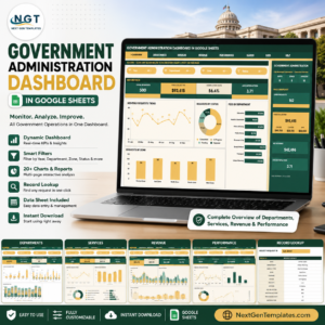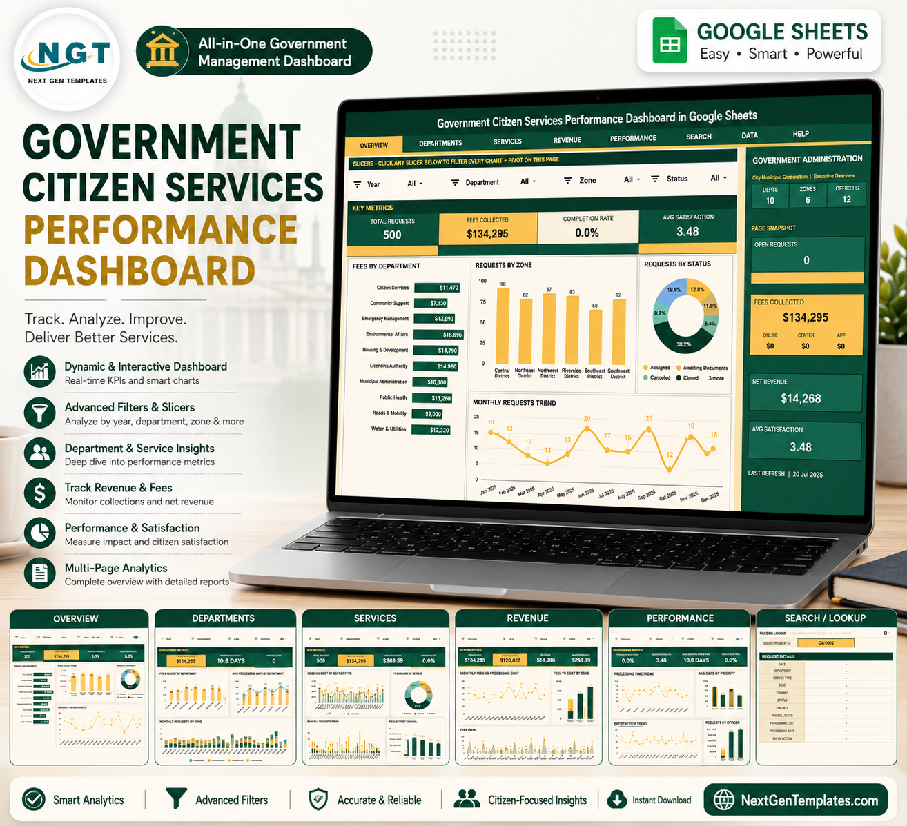
Government Citizen Services Performance Dashboard in Google Sheets helps public-sector teams turn request records into a seven-tab reporting system for volume, fees, cost, completion, satisfaction, officers, zones, and revenue. The U.S. Census Bureau reported 90,837 local governments in 2022, including 19,491 municipal governments, so even small service teams need a practical way to review daily citizen requests. Built by PK for a 300K+ subscriber learning audience, this $9.99 sale-price Google Sheets dashboard gives you a one-time template option before moving into a larger government SaaS contract.
Key Features of Government Citizen Services Performance Dashboard in Google Sheets
- Seven Google Sheets tabs: Overview, Department Analysis, Service Analysis, Revenue Analysis, Performance Analysis, Search Sheet, and Data Sheet.
- Six high-level cards: Total Requests, Fees Collected, Completion Rate, Avg Satisfaction, Open Requests, and Net Revenue.
- Interactive slicers: Filter dashboard pages quickly during reviews without rebuilding charts.
- Overview reporting: Review fees by department, requests by zone, request status, and monthly demand.
- Department analysis: Compare fees, processing cost, average processing days, satisfaction, and zone trends.
- Service analysis: Track requests and fees by service type, priority, month, and channel.
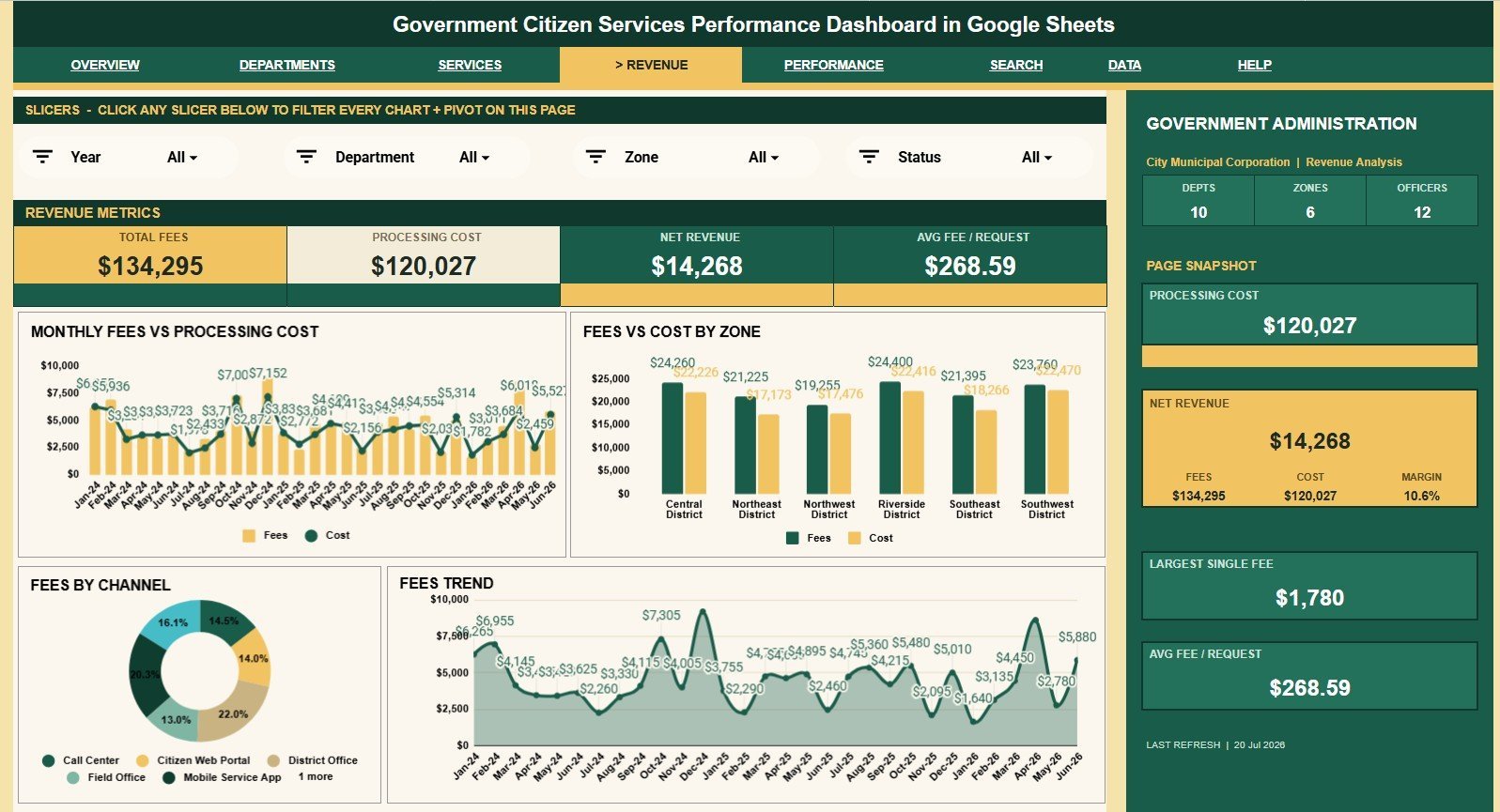
- Revenue analysis: Review fee and processing cost movement by month, zone, and channel.
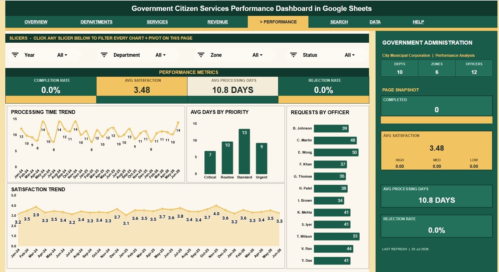
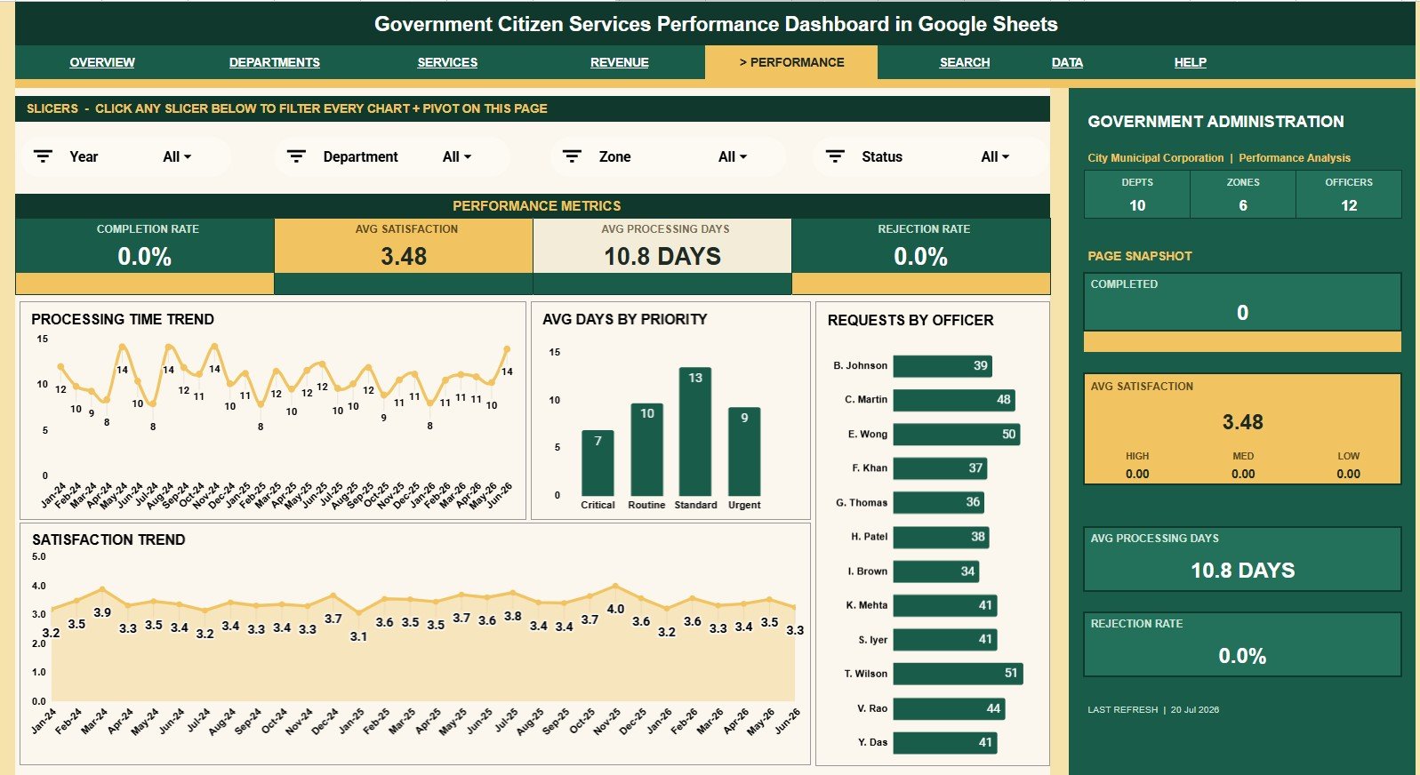
- Performance analysis: Monitor processing days, officer workload, priority turnaround, and satisfaction trends.
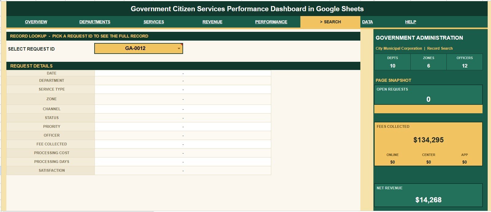
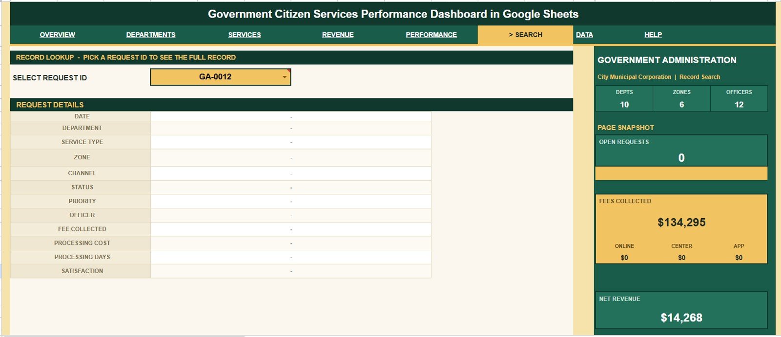
- Request ID lookup: Select one request and view the full citizen service record instantly.
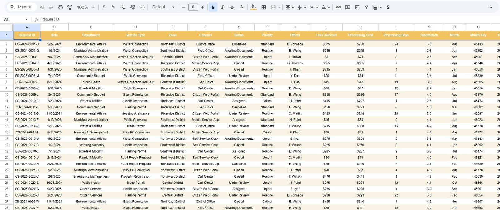
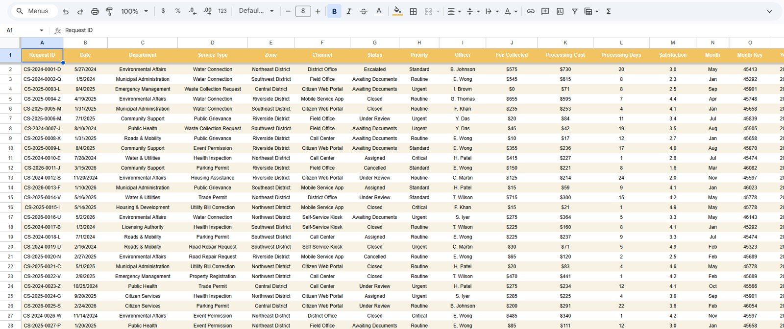
- Editable Data Sheet: Replace sample rows with your own records while keeping the same format.
What’s Inside the Government Citizen Services Performance Dashboard in Google Sheets
1. Overview Page
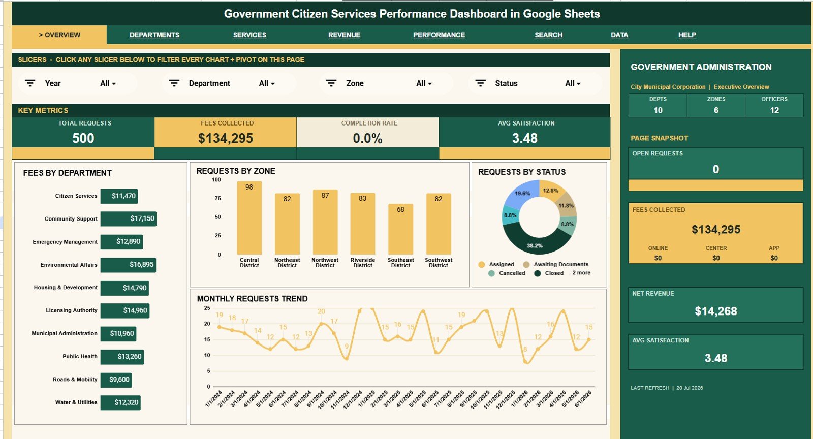
The Overview page gives leaders a fast view of Total Requests, Fees Collected, Completion Rate, Avg Satisfaction, Open Requests, and Net Revenue. The page also includes slicers so teams can filter by department, zone, status, priority, officer, channel, or month.
Fees by Department: This chart compares collected fees across departments. It helps finance and administration teams see which service areas contribute the most revenue and where collections need review.
Requests by Zone: This chart shows citizen request distribution across zones. It helps managers identify high-demand areas and plan follow-up support.
Requests by Status: This chart separates requests by workflow status. It helps teams see open, completed, pending, or delayed work at a glance.
Requests by Month: This chart tracks request volume across months. It helps teams spot demand peaks, seasonal patterns, and quieter periods.
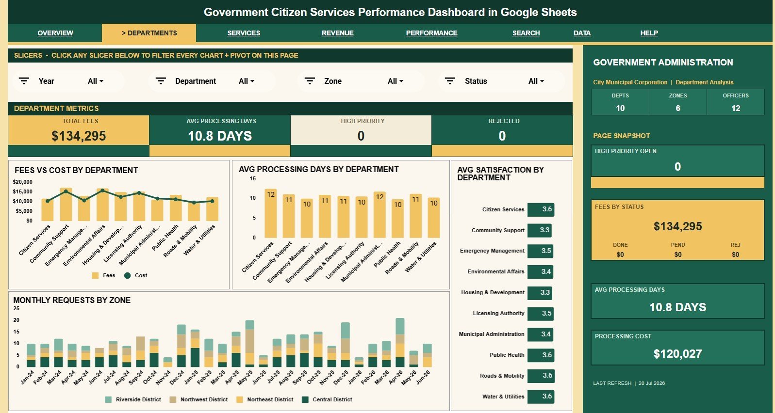
2. Department Analysis
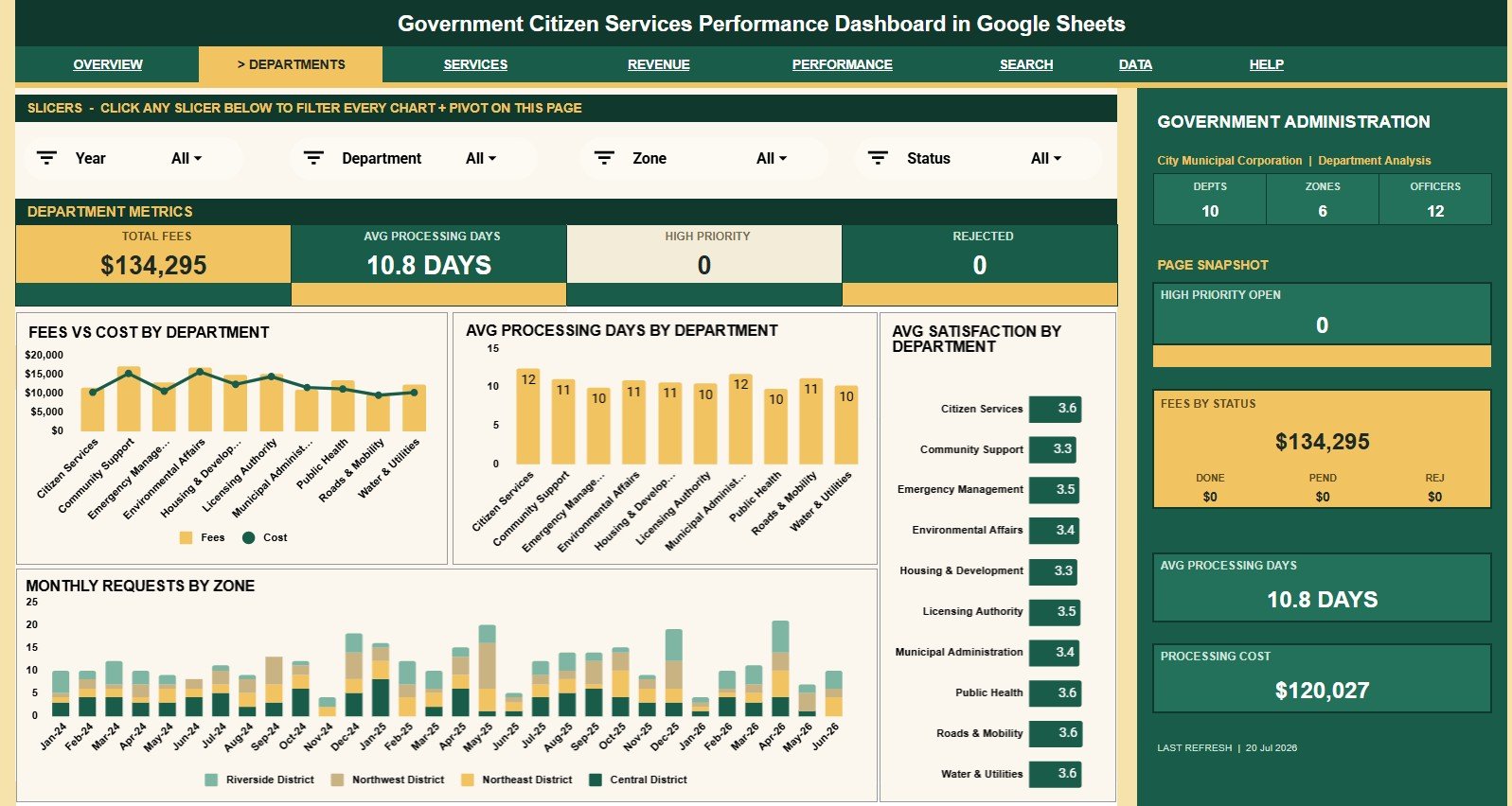
The Department Analysis tab compares financial, speed, and satisfaction performance by department. It is useful for department heads who need to understand where requests are expensive, slow, or creating lower satisfaction.
Fees and Processing Cost by Department: This chart places revenue and cost side by side. It helps users compare service economics by department.
Average Processing Days by Department: This chart shows how long departments take to complete requests. It helps identify teams that may need staffing or process review.
Average Satisfaction by Department: This chart compares citizen satisfaction across departments. It helps leaders see where service quality is strong or slipping.
Requests by Month and Zone: This chart combines time and zone analysis. It helps teams understand whether zone workload is growing, falling, or clustered in certain months.
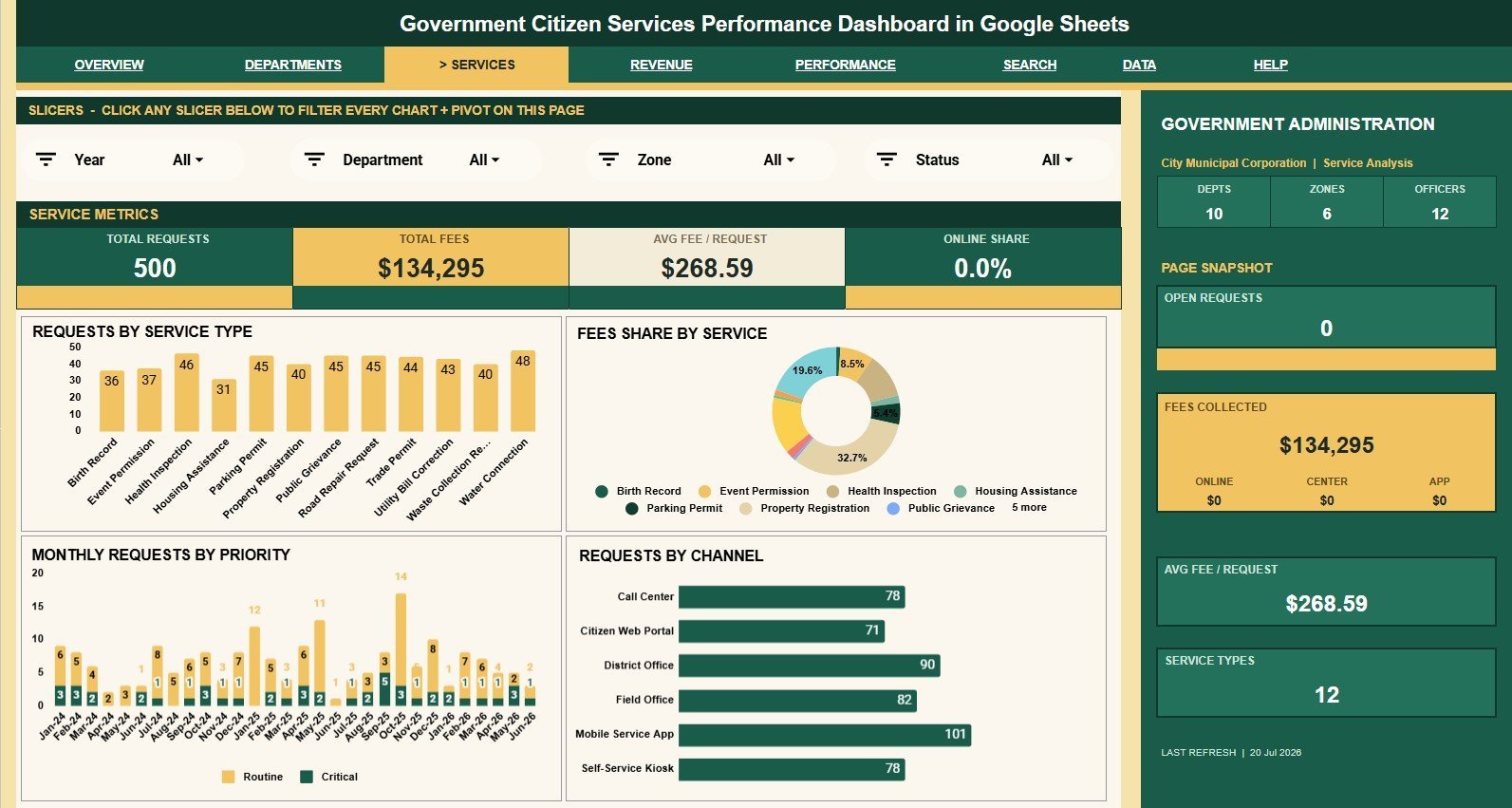
3. Service Analysis
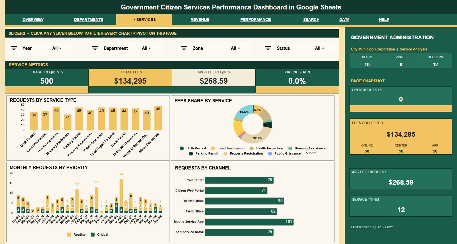
The Service Analysis tab explains which service types drive workload and collections. It helps service desks compare demand, revenue, priority, and intake channels.
Requests by Service Type: This chart counts request volume by service. It helps teams find the services that create the most citizen demand.
Fees by Service: This chart compares fee collection by service type. It helps separate high-volume services from high-revenue services.
Requests by Month and Priority: This chart shows how request urgency changes over time. It helps managers plan for high-priority work.
Requests by Channel: This chart shows whether requests arrive through online, phone, walk-in, email, or other channels. It helps teams improve the channels citizens use most.
4. Revenue Analysis
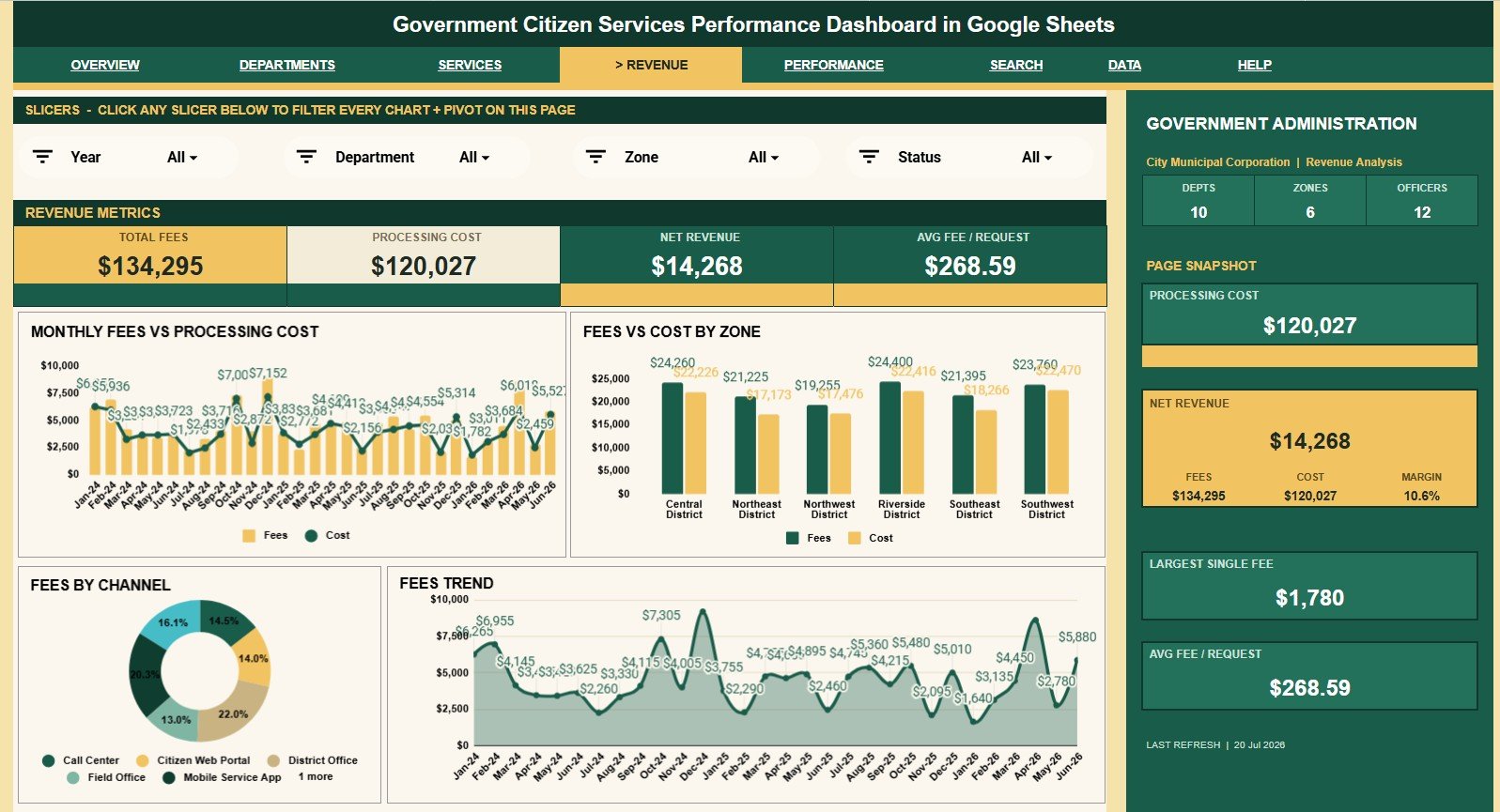
The Revenue Analysis tab focuses on fee collection, processing cost, and revenue movement. It helps finance teams connect service activity with cost and net revenue trends.
Fees and Processing Cost by Month: This chart compares monthly fees with monthly processing cost. It helps users see whether collections are rising faster than cost.
Fees and Processing Cost by Zone: This chart compares financial results by zone. It helps identify areas where cost may be high relative to collected fees.
Fees by Channel: This chart shows which request channels generate the most collections. It helps teams understand the financial role of online, walk-in, phone, and other channels.
Fees by Month: This chart provides a clear monthly fee trend. It is useful for budget meetings and monthly administration reviews.
5. Performance Analysis
The Performance Analysis tab helps teams monitor turnaround, officer workload, priority handling, and satisfaction. It is useful for monthly service quality reviews.
Processing Days by Month: This chart tracks processing time over the year. It helps managers see whether services are becoming faster or slower.
Average Days by Priority: This chart compares turnaround by priority level. It helps confirm that urgent requests are handled faster than lower-priority work.
Requests by Officer: This chart compares request counts by officer. It helps supervisors review workload distribution and assignment balance.
Satisfaction by Month: This chart shows citizen satisfaction movement over time. It helps teams connect service speed and quality with user experience.
6. Search Sheet Tab
The Search Sheet lets users select a Request ID and view the full citizen service record with date, department, service type, zone, channel, status, priority, officer, fee collected, processing cost, processing days, and satisfaction.
7. Data Sheet Tab
The Data Sheet is where users add records in the same format as the sample data. Keeping the structure consistent allows cards, charts, slicers, and the Search Sheet to update correctly.
Government Citizen Services Performance Dashboard in Google Sheets vs. Microsoft Excel Dashboard vs. Paid Government SaaS – Where This Fits
| Feature | This Google Sheets template | Microsoft Excel dashboard | Paid government SaaS |
|---|---|---|---|
| Cost | $9.99 sale price, one-time | Template cost plus Microsoft licensing | Recurring subscription or contract cost |
| Platform | Google Sheets in Drive | Excel desktop or web | Vendor-hosted system |
| Setup time | Copy the file and replace sample rows | Open workbook and customize | Often requires implementation |
| Real-time collaboration | Native Google Drive sharing | Requires OneDrive or SharePoint setup | Usually role-based |
| Mobile access | Google Sheets app or browser | Excel app or browser | Usually included |
| Customizable fields | Editable sheets, formulas, labels, and charts | Editable workbook structure | Depends on vendor configuration |
| Share with link | Yes, with Google permissions | Yes, with Microsoft sharing tools | Usually invite-based |
| Year-1 cost at 5 users | $9.99 before any Google Workspace costs | Template plus license costs | Can rise with seats and modules |
| Request ID lookup | Included Search Sheet | Must be built or customized | Usually included |
Who This Template Is For – and Who It’s Not For
This dashboard is for municipal offices, citizen service desks, government administration teams, zone managers, department heads, revenue officers, and public-sector analysts who already maintain request data and want a cleaner reporting layer in Google Sheets.
It is not a citizen portal, official case-management system, payment processor, field dispatch tool, legal archive, or workflow approval application. If you need those controls, use dedicated government service software and treat this dashboard as a reporting companion.
How to Use the Government Citizen Services Performance Dashboard in Google Sheets
- Open the PDF guide after purchase and copy the Google Sheets template to your Drive.
- Review the sample records in the Data Sheet before replacing them.
- Add your own request records in the same column format.
- Use slicers to filter by department, zone, status, priority, channel, officer, or month.
- Use the Search Sheet to select a Request ID and inspect one full record.
Real-World Use Cases
Asha, a citizen service manager: reviews Total Requests, Open Requests, Completion Rate, and Avg Satisfaction before weekly leadership meetings.
Daniel, a revenue officer: uses the Revenue Analysis tab to compare fees and processing cost by month, zone, and channel.
Meera, a department head: opens Department Analysis to find teams with longer processing days or lower satisfaction scores.
Frequently Asked Questions
What does this dashboard track?
It tracks citizen service requests, departments, service types, zones, channels, statuses, priorities, officers, fees, processing cost, processing days, satisfaction, open requests, and net revenue.
How many tabs are included?
The template includes seven tabs: Overview, Department Analysis, Service Analysis, Revenue Analysis, Performance Analysis, Search Sheet, and Data Sheet.
Can I filter the dashboard?
Yes. The dashboard includes slicers. Google Support notes that slicers can filter tables, charts, and pivot tables in Sheets: Filter charts and tables with slicers.
Does it include request lookup?
Yes. The Search Sheet lets users select a Request ID and view the full citizen service record in one place.
Can I customize the template?
Yes. You can edit labels, charts, formulas, and sheet layout after making your own copy. Keep a backup before major changes.
Is this a replacement for a government service SaaS platform?
No. It is a reporting dashboard, not a public intake portal, workflow engine, or official records platform.
About the Author
Built by PK – Microsoft Certified Professional with 15+ years of Excel, Google Sheets, and Power BI experience. Founder of NextGenTemplates, reaching 300K+ subscribers across YouTube channels. Every template is hand-built and tested before release.
Explore Related Templates
Browse more Google Sheets templates and Google Sheets dashboard templates. Related products include Government Administration Dashboard in Google Sheets, Municipal Services Dashboard in Google Sheets, Public Sector KPI Dashboard in Google Sheets, Government Administration Dashboard in Power BI, and Government Administration KPI Dashboard in Excel.
Ready to make citizen-service reporting easier? Add the Government Citizen Services Performance Dashboard in Google Sheets to your template library and turn request rows into a review-ready dashboard.
Watch the step-by-step video Demo:
Last updated: July 20, 2026.