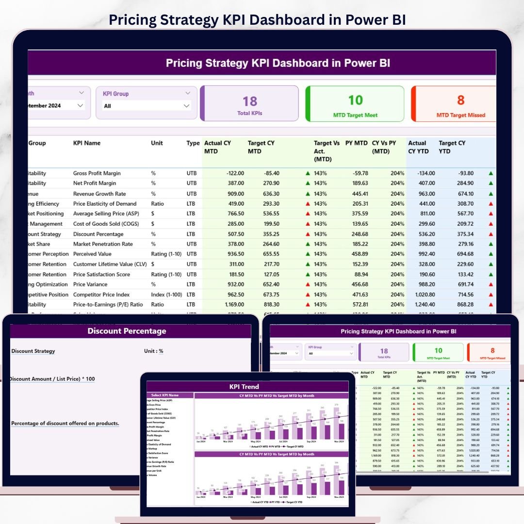
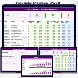
The Pricing Strategy KPI Dashboard in Power BI tracks your pricing metrics across 3 dedicated report pages — covering MTD and YTD Actual vs Target vs Prior Year in a single .pbix file. The 16-column Summary Table gives pricing managers, finance analysts, and commercial teams a full picture of every KPI in one view, with ▼▲ red/green icons that flag misses instantly. Define your KPIs once in the Excel input file and the entire dashboard auto-updates every month.
🌍 Join 8,400+ teams in 40+ countries using NextGenTemplates to replace expensive SaaS reporting tools with one-time-purchase Power BI, Excel, Google Sheets, and HTML templates.
✅ Instant download · One-time payment · No subscription · No per-user fees · Lifetime access
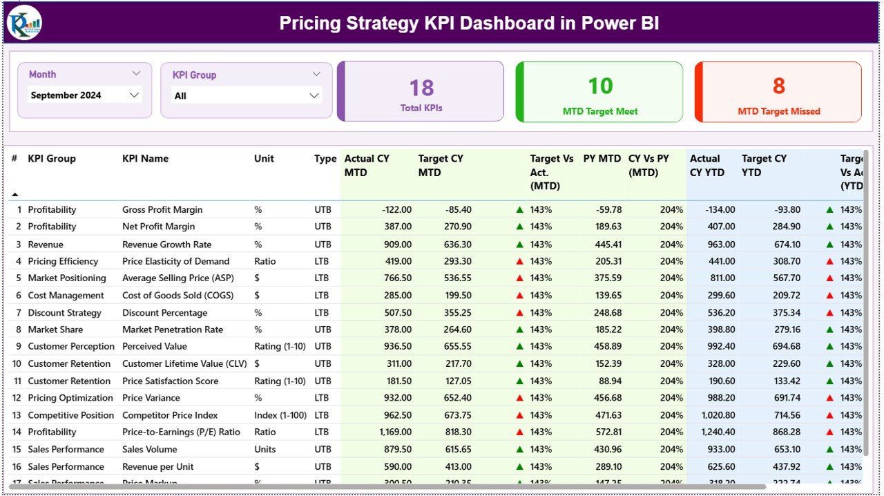
Pricing Strategy KPI Dashboard in Power BI – Summary Page
🔑 Key Features of Pricing Strategy KPI Dashboard in Power BI
🔹 3-Page Power BI Report File — The dashboard ships with a Summary page, a KPI Trend page, and a hidden KPI Definition drill-through page — all inside one .pbix file you open in the free Power BI Desktop app.
🔹 MTD & YTD Tracking with Prior-Year Benchmarking — Every pricing KPI shows Actual CY MTD, Target CY MTD, PY MTD, Actual CY YTD, Target CY YTD, and PY YTD side by side. The dashboard calculates Target vs Actual % (Actual ÷ Target) and CY vs PY % (Current Year ÷ Prior Year) automatically — 16 columns of pricing intelligence in one table.
🔹 ▼▲ Status Icons in Red/Green — Both the MTD Icon and YTD Icon columns display colored up/down arrows so pricing managers can spot off-target KPIs at a glance without reading raw numbers.
🔹 LTB and UTB KPI Logic — Each pricing KPI is classified as Lower the Better (LTB) or Upper the Better (UTB). The icon color logic respects the KPI type, so a rising Discount Rate correctly shows red even though the number went up.
🔹 Month & KPI Group Slicers — Two top-level slicers let users filter by any month and by any KPI Group or Category, making it easy to focus on a specific pricing segment or reporting period.
🔹 KPI Trend Combo Charts — The KPI Trend page shows two combo charts (one for MTD, one for YTD) plotting Current Year Actual, Previous Year Actual, and Target on the same axis. A KPI Name slicer on the left lets users drill into any single metric.
🔹 Hidden Drill-Through KPI Definition Page — Right-click any KPI row on the Summary page and drill through to see its Formula, Unit, KPI Group, and Definition. A back button returns to the main view. This page is hidden from the navigation bar so it only appears on demand.
🔹 Excel-Based Data Input — No DAX Required — The data source is a plain Excel file with 3 sheets: Input_Actual (enter monthly MTD and YTD actuals), Input_Target (enter monthly MTD and YTD targets), and KPI Definition (define KPI Number, Group, Name, Unit, Formula, Definition, and Type). No coding or DAX knowledge needed.
📦 What’s Inside the Pricing Strategy KPI Dashboard in Power BI
📌 Page 1 — Summary Page (Main Dashboard)
Month and KPI Group slicers sit at the top. Three headline cards show Total KPI Count, MTD Target Met, and MTD Target Missed. Below, the 16-column detail table covers KPI Number, KPI Group, KPI Name, Unit, Type (LTB/UTB), Actual CY MTD, Target CY MTD, MTD Icon, Target vs Actual MTD %, PY MTD, CY vs PY MTD %, Actual CY YTD, Target CY YTD, YTD Icon, Target vs Actual YTD %, PY YTD, and CY vs PY YTD %.
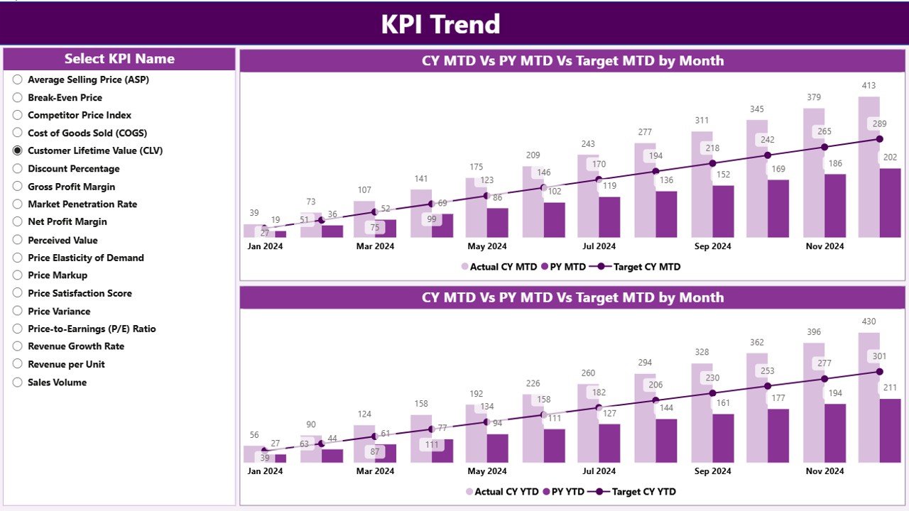
KPI Trend Page — MTD & YTD combo charts with Current Year, Prior Year & Target
📌 Page 2 — KPI Trend Page
Two combo charts display MTD and YTD trend lines for any selected KPI. A KPI Name slicer on the left updates both charts to show Current Year Actual, Previous Year Actual, and Target month-by-month — ideal for spotting seasonal pricing patterns and year-over-year variance.
📌 Page 3 — KPI Definition Page (Hidden Drill-Through)
Accessible via right-click drill-through from the Summary page only. Displays the selected KPI’s Formula, Unit, KPI Group, and Definition. A back button in the top-left corner returns to the Summary page.
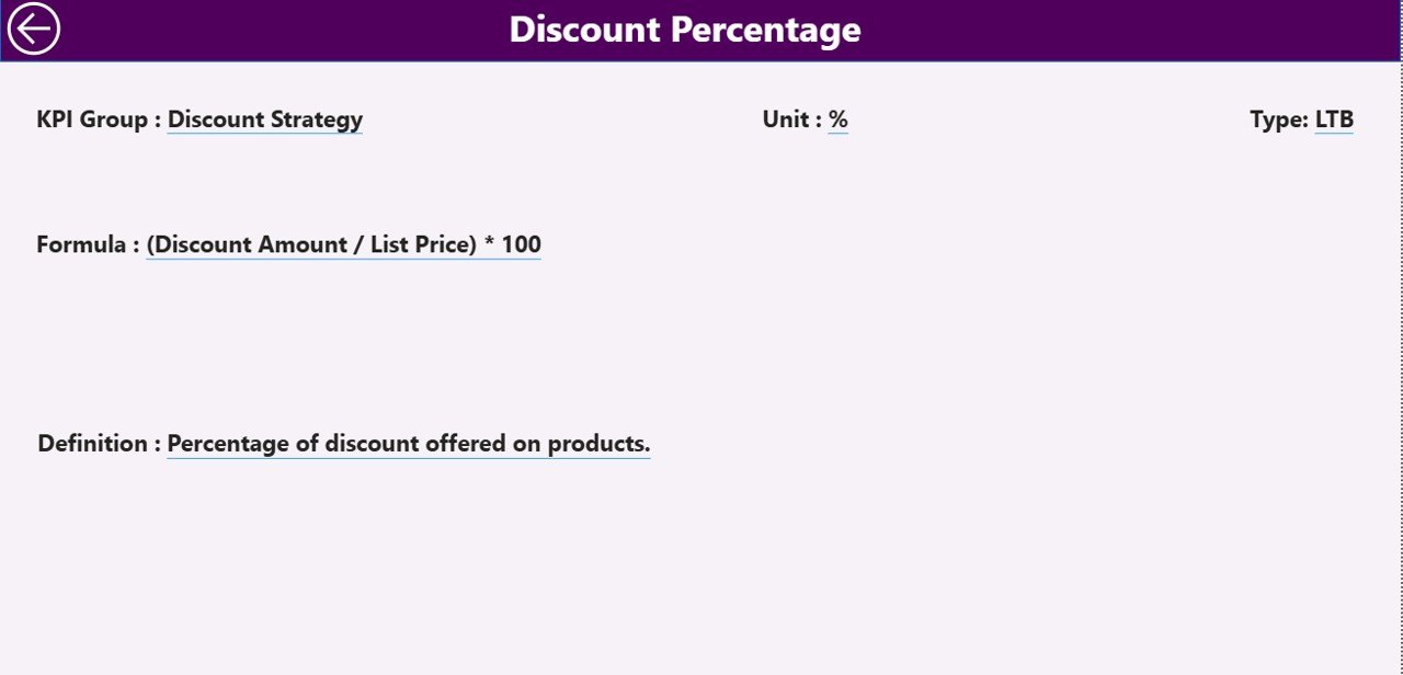
KPI Definition Drill-Through Page — formula and definition on demand
📌 Excel Data File — 3 Input Sheets
🔸 Input_Actual: Enter KPI Name, Month (first date of month), MTD Number, and YTD Number.
🔸 Input_Target: Same structure for MTD and YTD targets.
🔸 KPI Definition: Enter KPI Number, KPI Group, KPI Name, Unit, Formula, Definition, and Type (LTB or UTB).
📊 Pricing Strategy KPI Dashboard in Power BI vs Excel Manual Tracking vs Tableau
| Feature | Pricing Strategy KPI Dashboard in Power BI | Excel Manual Tracking | Tableau / Power BI Premium |
|---|---|---|---|
| Cost | $11.99 one-time ✅ | Free but hours of setup | $70–$420/user/month |
| Platform | Power BI Desktop (free) ✅ | Microsoft Excel | Tableau / Power BI Service |
| Setup time | Under 10 minutes ✅ | Days of formula work | Weeks of developer time |
| MTD & YTD vs Target | Built-in ✅ | Manual formulas | Custom DAX required |
| Prior-Year comparison | Built-in ✅ | Manual setup | Custom measures required |
| LTB/UTB icon logic | Built-in ✅ | Not available | Custom conditional formatting |
| Drill-through definitions | Built-in ✅ | Not available | Requires custom page setup |
| Year-1 cost (5 users) | $11.99 total ✅ | $0 but high time cost | $4,200–$25,200/year |
| No subscription | Yes ✅ | Yes | No — ongoing license |
For pricing teams that need MTD/YTD vs Target reporting without an enterprise BI license, the Pricing Strategy KPI Dashboard in Power BI sits in the sweet spot.
👥 Who This Template Is For — and Who It’s Not For
✅ This template is built for:
- Pricing managers and revenue analysts who need monthly KPI scorecards for leadership
- Finance teams tracking price realization, margin performance, and discount rates against targets
- Commercial directors who want MTD vs YTD vs Prior Year in one Power BI report
- Strategy consultants delivering pricing performance reports to clients
- Small to mid-size businesses that want structured pricing analytics without an enterprise BI budget
❌ This template is NOT for:
- Teams needing real-time pricing feeds from ERP or CRM systems — this uses a static Excel data source
- Enterprise teams requiring Row-Level Security (RLS) or Power BI Service workspace sharing
- Users who primarily want dashboard-style charts rather than a detailed KPI table as the main view
⚙️ How to Use the Pricing Strategy KPI Dashboard in Power BI
- Download and unzip the file — you receive one .pbix file and one Excel data file.
- Open the Excel file and fill the KPI Definition sheet with your pricing KPI names, groups, units, formulas, and LTB/UTB type.
- Enter monthly MTD and YTD actuals in the Input_Actual sheet (use the first date of each month).
- Enter monthly MTD and YTD targets in the Input_Target sheet.
- Open the .pbix in Power BI Desktop (free from Microsoft), update the data source path, and click Refresh.
- Use the Month and KPI Group slicers on the Summary page to filter your view.
- Right-click any KPI row to drill through to the KPI Definition page for formula details.
💼 Real-World Use Cases
Priya manages pricing analytics at a mid-size FMCG brand. Each month she fills the Excel input sheets with Gross Margin %, Net Price Realization, and Promotional Discount Rate actuals and targets. The Pricing Strategy KPI Dashboard in Power BI gives her a 16-column view of every metric — with ▼▲ icons flagging misses — ready for the monthly commercial review in under 10 minutes of data entry.
A financial consultant tracks pricing performance across 6 client accounts. He keeps a separate Excel file for each client, pointing the same .pbix to whichever file he needs. The drill-through KPI Definition page lets him show clients exactly how each metric is calculated — building trust without walking through spreadsheet formulas in meetings.
The finance director at a B2B SaaS company tracks 12 pricing KPIs — including Average Revenue Per User, Discount Rate by Segment, and Price Volume Mix variance — against annual targets. The KPI Trend page shows month-by-month CY vs PY vs Target, making it easy to see whether the pricing strategy is gaining traction quarter over quarter.
❓ Frequently Asked Questions
What KPIs can I track with the Pricing Strategy KPI Dashboard in Power BI?
The dashboard is fully flexible — you define your own KPIs in the Excel KPI Definition sheet. Common pricing KPIs include Gross Margin %, Net Price Realization, Discount Rate, Average Selling Price, Price Volume Mix Variance, and Promotional Discount Impact. Any metric with an MTD and YTD target can be tracked.
Do I need Power BI Pro or a paid license?
No. The Pricing Strategy KPI Dashboard in Power BI runs in Power BI Desktop, which is free to download from Microsoft. A paid license is only needed if you want to publish the report to the Power BI Service and share it online with colleagues.
How does the LTB/UTB icon logic work?
Each KPI in the KPI Definition sheet is classified as LTB (Lower the Better) or UTB (Upper the Better). For UTB KPIs, a ▲ green icon means the actual exceeded the target. For LTB KPIs, a ▼ red icon fires when the actual is higher than target — so cost and discount metrics are flagged correctly even when the number goes up.
How long does setup take?
Setup takes under 10 minutes. Fill in the three Excel sheets, open the .pbix file in Power BI Desktop, update the data source path to your saved Excel file, and click Refresh. The entire Pricing Strategy KPI Dashboard in Power BI auto-updates from that point forward.
Can I add more KPIs after initial setup?
Yes. Add new rows to the KPI Definition sheet and corresponding rows in the input sheets. Power BI reads from the Excel tables dynamically, so new KPIs appear in the Summary table on the next refresh — no changes to the .pbix file needed.
Does this work for industries other than pricing teams?
Yes. The Pricing Strategy KPI Dashboard in Power BI works for any team needing MTD/YTD vs Target vs Prior Year KPI scorecards — manufacturing, retail, finance, SaaS, and healthcare teams all use this template format. Define your domain-specific metrics and the dashboard adapts.
👤 About the Author
Built by PK — Microsoft Certified Professional with 15+ years of Excel, Google Sheets, and Power BI experience. Founder of NextGenTemplates, reaching 300K+ subscribers across YouTube channels (@PK-AnExcelExpert, @NextGenTemplates, @NeoTechNavigators). Every template is hand-built and tested before release.
🔗 Explore Related Templates
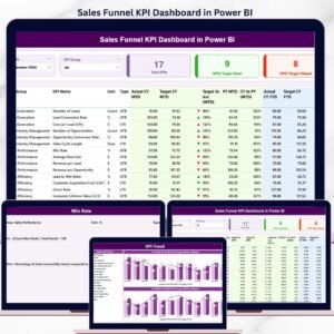
🔹 Sales Funnel KPI Dashboard in Power BI — MTD/YTD sales funnel KPI tracking with the same Power BI scorecard format.
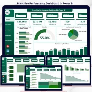
🔹 Franchise Performance Dashboard in Power BI — 5-page revenue and compliance reporting for franchise networks.
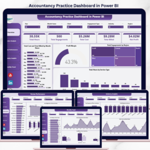
🔹 Accountancy Practice Dashboard in Power BI — Financial KPI tracking for accounting firms in Power BI.
Browse the full Power BI Dashboard Templates collection or explore all KPI Dashboard Templates on NextGenTemplates.
📖 Click here to read the Detailed Blog Post
🎥 Visit our YouTube channel for step-by-step video tutorials
👉 YouTube.com/@NextGenTemplates


Reviews
There are no reviews yet.