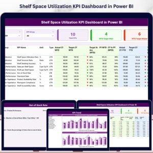
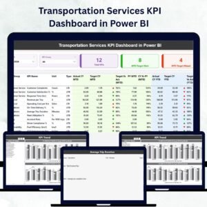
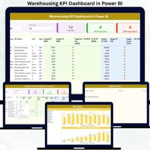
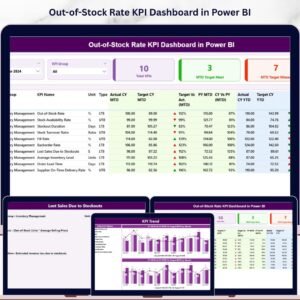
The Out-of-Stock Rate KPI Dashboard in Power BI monitors inventory availability across 3 interactive pages — tracking 17 KPI data points per metric including MTD actuals, YTD actuals, targets, directional icons, and year-over-year comparisons. With Month and KPI Group slicers on the Summary page, supply chain managers get a complete out-of-stock picture in under 10 minutes of setup. Open the .pbix file in Power BI Desktop, connect your Excel data source, and every visual updates automatically.
🌍 Join 8,400+ teams in 40+ countries using NextGenTemplates to replace paid SaaS tools with one-time-purchase Excel, Google Sheets, Power BI, and HTML templates.
✅ Instant download · One-time payment · No subscription · No per-user fees · Lifetime access
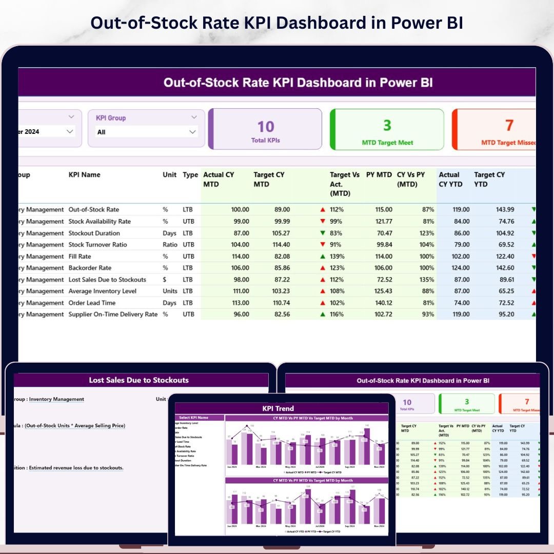
 Out-of-Stock Rate KPI Dashboard in Power BI — Summary Page
🔑 Key Features of the Out-of-Stock Rate KPI Dashboard in Power BI
The Out-of-Stock Rate KPI Dashboard in Power BI tracks inventory KPIs across 3 summary cards — Total KPIs, MTD Target Met, and MTD Target Missed — giving procurement and supply chain teams an instant health check at a glance. This dashboard covers out-of-stock rate, fill rate, stock availability, and related inventory performance metrics for any industry.
🔹 LTB / UTB KPI Classification — Each KPI is tagged as Lower the Better (LTB) or Upper the Better (UTB). The dashboard evaluates performance direction accordingly and colors ▲▼ icons green or red — so a rising out-of-stock rate is flagged red immediately, without manual formula adjustments.
🔹 17-Column Detail Table — The Summary page shows KPI Number, KPI Group, KPI Name, Unit, Type, Actual CY MTD, Target CY MTD, MTD Icon, Target vs Act (MTD%), PY MTD, CY vs PY MTD%, Actual CY YTD, Target CY YTD, YTD Icon, Target vs Act (YTD%), PY YTD, and CY vs PY YTD% for every KPI — all in one scrollable view.
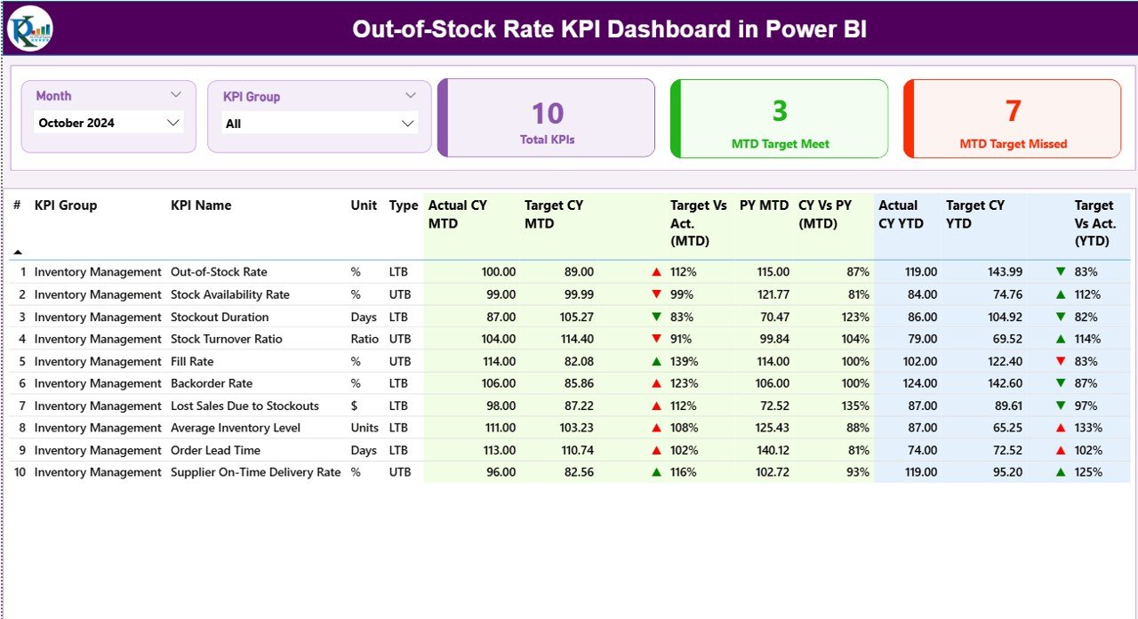
🔹 Combo Charts on KPI Trend Page — Two side-by-side combo charts display month-by-month CY actual, PY actual, and target lines for MTD and YTD independently, making seasonality and trend gaps immediately visible for any selected KPI.
🔹 Drill-Through KPI Definition Page — Right-click any row on the Summary page and select Drill Through to view the selected KPI’s full formula, definition, group, unit, and type classification on a hidden page. A single back button returns you to the Summary.
🔹 Structured Excel Data Source — 3 worksheets capture all inputs: Input_Actual (KPI Name, Month, MTD, YTD actuals), Input_Target (KPI Name, Month, MTD, YTD targets), and KPI Definition (KPI Number, Group, Name, Unit, Formula, Definition, Type). Update the Excel file and refresh Power BI — done.
📦 What’s Inside the Out-of-Stock Rate KPI Dashboard in Power BI
Page 1 — Summary Page (Main Dashboard)
Month and KPI Group slicers sit at the top for instant cross-filtering. Three KPI cards display Total KPIs, MTD Target Met count, and MTD Target Missed count. Below is the full 17-column detail table showing every inventory KPI’s MTD and YTD performance side by side with red/green directional icons and year-over-year percentages.
 Out-of-Stock Rate KPI Dashboard in Power BI — KPI Trend Page
Page 2 — KPI Trend Page
Select any KPI from the left-side slicer to view its monthly performance trend. Two combo charts display Current Year actuals, Previous Year actuals, and Targets for MTD and YTD separately — ideal for spotting out-of-stock spikes, seasonal patterns, and target gaps across the year.
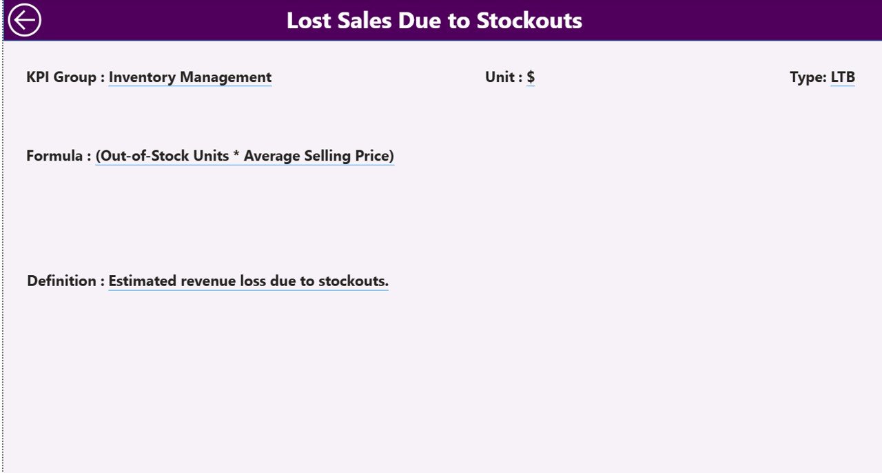 Out-of-Stock Rate KPI Dashboard in Power BI — KPI Definition Page (Drill-Through)
Page 3 — KPI Definition Page (Hidden Drill-Through)
A hidden drill-through page activated from the Summary table. Displays the full formula, definition, KPI group, unit, and LTB/UTB classification for the selected KPI. Use the Back button (top-left) to return to the Summary without losing your filter context.
Excel Data File — 3 Worksheets:
- 📋 Input_Actual — KPI Name, Month (first date of month), MTD Actual, YTD Actual
- 🎯 Input_Target — KPI Name, Month (first date of month), MTD Target, YTD Target
- 📖 KPI Definition — KPI Number, KPI Group, KPI Name, Unit, Formula, Definition, Type (LTB or UTB)
📊 Out-of-Stock Rate KPI Dashboard in Power BI vs. Tableau vs. Zoho Inventory — Where This Fits
| Feature | Out-of-Stock Rate KPI Dashboard in Power BI | Tableau | Zoho Inventory / NetSuite ERP |
|---|---|---|---|
| Cost | $11.99 one-time | $75/user/month | $79–$399/user/month |
| Platform | Power BI Desktop (free) | Tableau Desktop/Server | Cloud SaaS |
| Setup time | Under 10 minutes | 1–5 days | Weeks (with IT) |
| LTB/UTB KPI logic built-in | ✅ Yes | ❌ Build from scratch | ❌ Not available |
| MTD + YTD dual view | ✅ Both on one page | Partial (custom) | Limited |
| Drill-through KPI definition | ✅ Built-in | ❌ Manual setup | ❌ Not available |
| CY vs PY comparison | ✅ Automatic | Custom DAX required | Depends on plan |
| Year-1 cost (5 users) | $11.99 total | $4,500+ | $4,700+ |
| Customisable KPI list | ✅ Fully via Excel | Partial | Locked to system fields |
For inventory and supply chain teams that want MTD/YTD out-of-stock KPI visibility without paying enterprise SaaS prices, the Out-of-Stock Rate KPI Dashboard in Power BI sits in the sweet spot.
👥 Who This Template Is For — and Who It’s Not For
✅ This template is built for:
- Supply chain analysts tracking out-of-stock rate, fill rate, and stock availability KPIs monthly
- Retail and e-commerce operations teams comparing inventory KPI performance vs targets and prior year
- Procurement managers presenting MTD and YTD KPI scorecards to leadership in Power BI
- Warehouse and distribution managers who need LTB/UTB logic applied automatically across multiple KPI groups
- Power BI beginners who want a ready-to-use inventory dashboard without writing DAX from scratch
❌ This template is NOT for:
- Teams needing live ERP/WMS integration (this uses a static Excel data file as the source)
- Enterprise teams requiring role-based Row Level Security or Azure Active Directory authentication
- Businesses without Power BI Desktop installed (required, but free from Microsoft)
⚙️ How to Use the Out-of-Stock Rate KPI Dashboard in Power BI
- Download and unzip the file — you will find a .pbix file and an Excel data file.
- Fill the KPI Definition sheet — enter KPI Number, KPI Group, KPI Name, Unit, Formula, Definition, and Type (LTB or UTB) for each metric you want to track.
- Enter actuals in the Input_Actual sheet — add KPI Name, Month (use the first date of the month), MTD Actual, and YTD Actual.
- Enter targets in the Input_Target sheet — same structure as actuals but with your target values.
- Open the .pbix file in Power BI Desktop, update the data source path to point to your Excel file, and click Refresh.
- Use the Month and KPI Group slicers on the Summary page to explore your data — all visuals update instantly.
- Drill through any KPI row for its full definition; view the KPI Trend page for month-by-month performance charts.
💼 Real-World Use Cases
Riya manages supply chain analytics at a mid-sized FMCG company. She uses the Out-of-Stock Rate KPI Dashboard in Power BI to track 12 inventory KPIs across 3 product groups — including out-of-stock rate, days of supply, and fill rate. Every month she refreshes the Excel file and presents the Power BI Summary page in her leadership review, showing MTD and YTD actuals vs targets with red/green icons — all without a BI developer or paid SaaS subscription.
James is a retail operations manager for a regional supermarket chain. He uses the dashboard to monitor stockout rates by category, comparing current year fill rates against previous year figures to identify which months historically see the highest out-of-stock spikes. The KPI Trend combo charts let him spot seasonal patterns that inform his reorder timing decisions.
An e-commerce logistics team uses the KPI Definition drill-through page during onboarding to train new analysts on exactly how each inventory metric is calculated — the formula, unit, and LTB/UTB direction are all documented in the dashboard itself, reducing dependency on tribal knowledge.
❓ Frequently Asked Questions
What KPIs does the Out-of-Stock Rate KPI Dashboard in Power BI track?
The Out-of-Stock Rate KPI Dashboard in Power BI tracks any inventory KPIs you define in the KPI Definition sheet — including out-of-stock rate, fill rate, days of supply, stock availability, and more. KPIs are classified as Lower the Better (LTB) or Upper the Better (UTB), and the dashboard auto-applies red/green icon logic for both MTD and YTD.
Do I need Power BI Pro or a paid Power BI license?
No. The Out-of-Stock Rate KPI Dashboard in Power BI runs entirely in Power BI Desktop, which is free to download from Microsoft. You only need a Power BI Pro license if you want to publish and share the report with others via the Power BI Service cloud.
How do I add or remove KPIs from the dashboard?
Simply update the KPI Definition, Input_Actual, and Input_Target sheets in the Excel data file with your desired KPI entries, then refresh Power BI. The dashboard’s table and trend charts will automatically include or exclude KPIs based on what’s in the Excel file — no .pbix editing required.
What is the difference between LTB and UTB KPIs in this dashboard?
LTB stands for Lower the Better — the KPI performs better when the actual value is below the target (e.g., out-of-stock rate should be minimised). UTB stands for Upper the Better — the KPI performs better when the actual exceeds the target (e.g., fill rate should be maximised). The dashboard applies opposite icon and color logic for each type automatically.
Can I use this dashboard for multiple product categories or KPI groups?
Yes. The KPI Group field in the KPI Definition sheet lets you categorise KPIs into as many groups as needed. The KPI Group slicer on the Summary page filters all visuals to show only the selected group’s performance — making this dashboard suitable for multi-category inventory operations.
How does this compare to building a KPI tracker in Excel instead of Power BI?
The Out-of-Stock Rate KPI Dashboard in Power BI provides interactive slicers, drill-through navigation, and dynamic combo trend charts that aren’t natively available in a flat Excel table. Power BI handles the visual interactivity while Excel remains the familiar data entry point — giving teams the best of both tools.
How long does it take to set up the dashboard?
Most users complete setup in under 10 minutes — fill the three Excel sheets with your KPI definitions, actuals, and targets, connect the .pbix to your Excel file path, and click Refresh. The dashboard populates automatically with your data.
👤 About the Author
Built by PK — Microsoft Certified Professional with 15+ years of Excel, Google Sheets, and Power BI experience. Founder of NextGenTemplates, reaching 300K+ subscribers across YouTube channels (@PK-AnExcelExpert, @NextGenTemplates, @NeoTechNavigators). Every template is hand-built and tested before release.
🔗 Explore Related Templates
Looking for more Power BI KPI Dashboard templates? Check out these related tools:
- 📊 Shelf Space Utilization KPI Dashboard in Power BI — monitor retail shelf performance KPIs with the same MTD/YTD structure
- 📋 Supply Chain Procurement Dashboard in Google Sheets — a Google Sheets alternative for procurement performance tracking
- 📦 Inventory Tracker in Google Sheets — lightweight stock tracking for teams not yet using Power BI
Also available as: Browse all Power BI Dashboard Templates →
📖 Click here to read the Detailed Blog Post
🎥 Visit our YouTube channel for step-by-step video tutorials


Reviews
There are no reviews yet.