
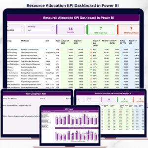
The Resource Allocation KPI Dashboard in Power BI tracks resource utilization across 3 interactive pages, with MTD and YTD comparisons against targets and prior year, plus drill-through to KPI definitions. Setup takes under 10 minutes — fill 3 Excel sheets (Actual, Target, KPI Definition) and every visual updates automatically.
🌍 Join 8,400+ teams in 40+ countries using NextGenTemplates to replace paid SaaS tools with one-time-purchase Excel, Google Sheets, Power BI, and HTML templates.
✅ Instant download · One-time payment · No subscription · No per-user fees · Lifetime access
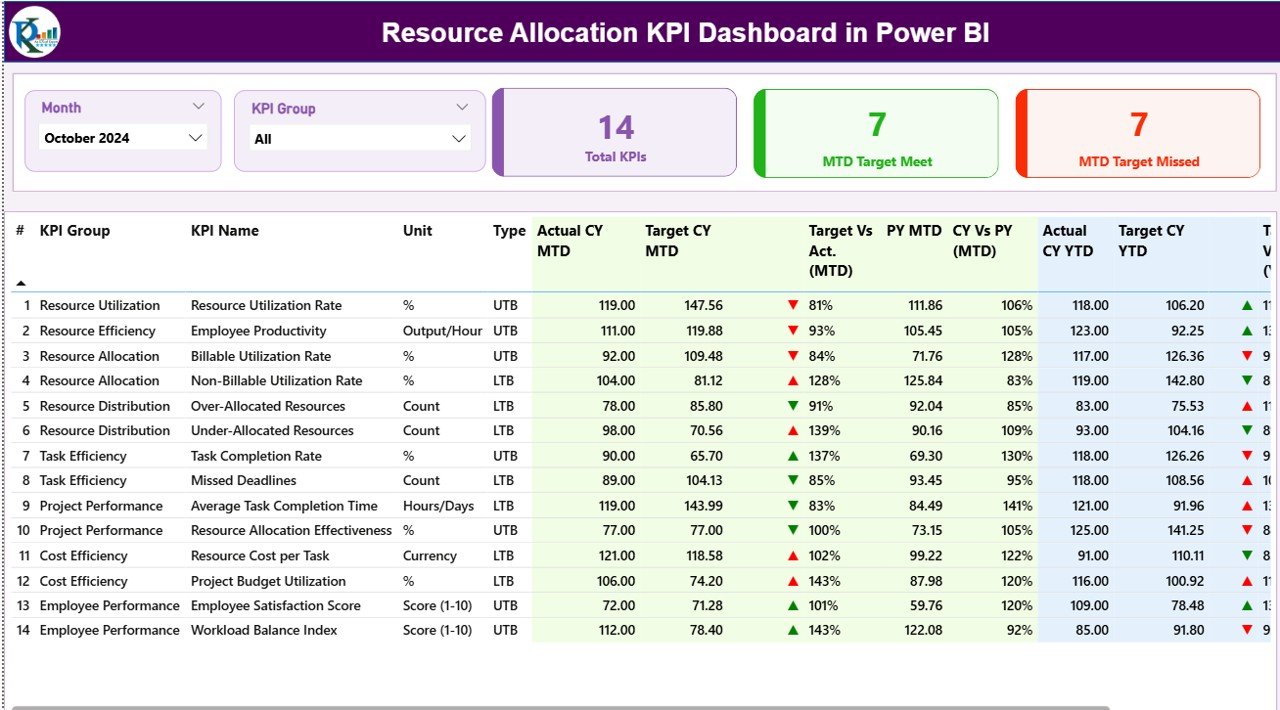
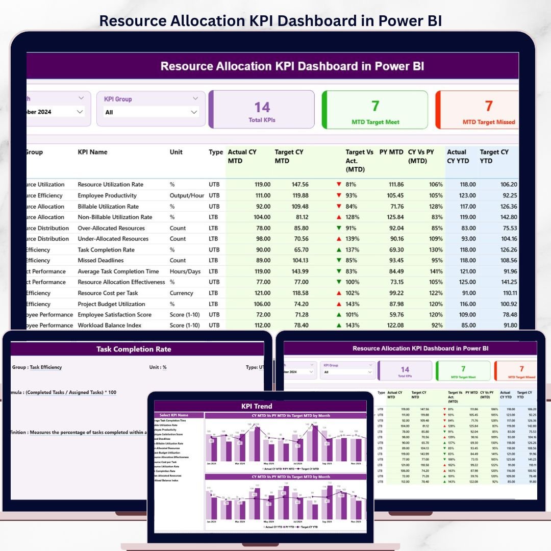
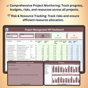
Resource Allocation KPI Dashboard — Summary Page in Power BI
🔑 Key Features of Resource Allocation KPI Dashboard in Power BI
This dashboard is engineered for project managers, PMO leads, and resource managers who need a single source of truth for resource performance — without paying $25-150 per user per month for enterprise PPM software.
🔹 3 connected report pages — Summary view, KPI Trend analysis, and a hidden KPI Definition drill-through page accessible from any KPI row.
🔹 Month and KPI Group slicers — Filter the entire Summary page by selected month or KPI category in one click. Slicers cascade to every card and table on the page.
🔹 3 status cards on top of Summary — Total KPIs count, MTD Target Met count, and MTD Target Missed count. Numbers refresh the moment you change the slicer.
🔹 Up/down icons with red/green color coding — Both MTD and YTD columns show ▲ green (target met) or ▼ red (target missed) icons. The dashboard auto-detects KPI direction (LTB / UTB) so the same icon logic works for both metric types.
🔹 Current Year vs Previous Year comparison — Built-in CY vs PY columns for both MTD and YTD show the percentage change against the same period last year, so trend conversations become data-led instead of opinion-led.
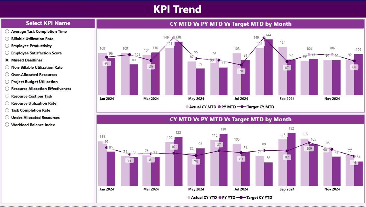
🔹 2 combo charts on the KPI Trend page — Compare Actual CY, Actual PY, and Target across all 12 months, for any KPI selected from the left-hand slicer. One view for MTD numbers, one for YTD.
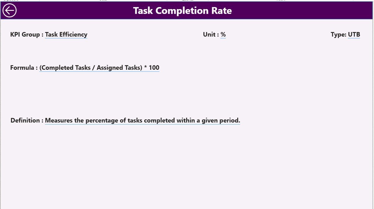
🔹 Drill-through KPI definition page — Right-click any KPI on the Summary page and drill through to a hidden page that shows the KPI Number, Name, Group, Unit, Type (LTB / UTB), formula, and full definition. A back button returns you to the Summary in one click.
🔹 Excel-based data source — All inputs live in a single Excel workbook with 3 tabs: Input_Actual, Input_Target, and KPI Definition. No SQL, no Power Query M code edits required to start.

KPI Trend page — combo charts for MTD and YTD across CY, PY, and Target
📦 What’s Inside the Resource Allocation KPI Dashboard in Power BI
📂 Power BI Desktop file (.pbix) with 3 pre-built pages:
📊 Page 1 — Summary Page: Month slicer, KPI Group slicer, 3 KPI status cards, and a 16-column detailed KPI table covering KPI Number, KPI Group, KPI Name, Unit, Type, Actual CY MTD, Target CY MTD, MTD status icon, Target vs Actual % (MTD), PY MTD, CY vs PY % (MTD), Actual CY YTD, Target CY YTD, YTD status icon, Target vs Actual % (YTD), PY YTD, and CY vs PY % (YTD).
📈 Page 2 — KPI Trend Page: KPI Name slicer on the left, plus 2 combo charts side by side — one for MTD trend, one for YTD trend. Each chart plots Current Year Actual, Previous Year Actual, and Target across all 12 months for the selected KPI.
📋 Page 3 — KPI Definition Page (hidden, drill-through): Shows KPI Number, Group, Name, Unit, Type, Formula, and Definition for the KPI you drilled in from. Includes a back button to return to the Summary.
📁 Excel data source workbook with 3 input sheets:
📝 Input_Actual sheet — KPI Name, Month (first date of month), MTD value, YTD value.
📝 Input_Target sheet — KPI Name, Month (first date of month), MTD target, YTD target.
📝 KPI Definition sheet — KPI Number, KPI Group, KPI Name, Unit, Formula, Definition, and Type (LTB / UTB).
📊 Resource Allocation KPI Dashboard in Power BI vs. Tableau / Qlik vs. Asana / Monday.com / Smartsheet — Where This Fits
| Feature | Resource Allocation KPI Dashboard in Power BI | Tableau / Qlik Sense | Asana / Monday / Smartsheet |
|---|---|---|---|
| Cost | $11.99 one-time | $15-75 / user / month | $10-25 / user / month |
| Platform | Power BI Desktop (free) | Tableau / Qlik Cloud | Web SaaS |
| Setup time | Under 10 minutes | 2-6 weeks (model + reports) | 1-2 weeks (workspace + automations) |
| MTD + YTD vs Target + PY in one view | ✅ Built in | ✅ Custom-built | ❌ Requires reporting add-on |
| Drill-through KPI definitions | ✅ Pre-configured | ✅ Custom-built | ❌ |
| Customizable KPI list | ✅ Edit Excel, refresh | ✅ Edit data model | ⚠️ Limited |
| Year-1 cost at 5 users | $11.99 total | $900-4,500 | $600-1,500 |
| Lifetime access | ✅ Yes | ❌ Subscription | ❌ Subscription |
For PMO leads, project managers, and resource managers who want enterprise-grade KPI tracking without paying $900-4,500 per year for Tableau or Qlik, the Resource Allocation KPI Dashboard in Power BI sits in the sweet spot.
👥 Who This Template Is For — and Who It’s Not For
✅ This template is built for:
- PMO leads at 20-500 person service firms tracking billable utilization, bench time, and project staffing
- Project managers who report monthly resource KPIs to leadership and need MTD vs YTD vs target views
- Resource managers in IT, consulting, and engineering teams allocating talent across multiple concurrent projects
- Operations leads who already use Power BI Desktop and want a starter KPI framework instead of a blank canvas
❌ This template is NOT for:
- Teams that need real-time API connections to Jira, Asana, or Workday — this template uses an Excel data source
- Enterprises requiring SOC 2, SSO, or row-level security baked into the report (those need Power BI Service with paid tiers)
- Solo freelancers who only manage 1-2 projects — a simpler tracker will serve you better
⚙️ How to Use the Resource Allocation KPI Dashboard in Power BI
- Download the .zip file and extract both the Excel data workbook and the .pbix file.
- Open the Excel workbook and fill the KPI Definition sheet with your KPI list (number, group, name, unit, formula, definition, LTB or UTB).
- Fill the Input_Actual sheet with month-wise actual MTD and YTD numbers for each KPI.
- Fill the Input_Target sheet with the same structure but target values.
- Open the .pbix file in Power BI Desktop (free download from Microsoft).
- In the Home ribbon, click Transform Data → update the file path to point to your Excel workbook → Close & Apply.
- Click Refresh — the Summary, KPI Trend, and KPI Definition pages now reflect your data.
💼 Real-World Use Cases
Priya leads the PMO at a 120-person consulting firm. She uses the Resource Allocation KPI Dashboard in Power BI to track billable utilization, bench rate, and project staffing variance across 8 service lines. Her monthly leadership meeting now opens with a single screen instead of 6 separate Excel files — and she swapped her $1,800/year Smartsheet reporting add-on for this template.
Daniel runs IT resource planning at a mid-market software company. He tracks 12 KPIs including engineer utilization, on-call coverage, ticket throughput per FTE, and skills coverage. The drill-through KPI Definition page lets new managers on his team understand exactly how each metric is calculated without a separate Confluence wiki.
Aisha is a freelance Power BI consultant. She uses this template as the baseline she ships to her construction-industry clients, then customizes the KPIs for crew utilization and equipment allocation. What used to take 3 days of dashboard build work now takes 4 hours of tailoring.
❓ Frequently Asked Questions
What KPIs does the Resource Allocation KPI Dashboard in Power BI track?
The Resource Allocation KPI Dashboard in Power BI tracks any resource KPIs you define in the Excel KPI Definition sheet — typical examples include billable utilization rate, bench rate, project staffing variance, allocation accuracy, time-to-allocate, and skills coverage. Each KPI displays both MTD and YTD comparisons against target and prior year.
How does this compare to Tableau or Qlik for resource KPI reporting?
Tableau and Qlik are powerful but cost $15-75 per user per month and need 2-6 weeks of model and report build. The Resource Allocation KPI Dashboard in Power BI is a one-time $11.99 purchase, runs in free Power BI Desktop, and ships ready to use with MTD, YTD, target, and prior-year comparisons already built.
How long does setup take?
Setup takes under 10 minutes once your data is ready. Fill the 3 Excel input sheets (Actual, Target, KPI Definition), open the .pbix file in Power BI Desktop, point it at your Excel workbook, and click Refresh. All visuals on the Summary, KPI Trend, and KPI Definition pages update automatically.
Can I add my own KPIs to the dashboard?
Yes. The Resource Allocation KPI Dashboard in Power BI is data-driven — every KPI displayed comes from the KPI Definition sheet in the Excel workbook. Add a new row with the KPI Number, Group, Name, Unit, Formula, Definition, and Type (LTB or UTB), then add matching rows to Input_Actual and Input_Target, and refresh.
Do I need a Power BI Pro license to use this template?
No. The .pbix file opens and runs in Power BI Desktop, which is free from Microsoft. A Pro license is only required if you want to publish the report to the Power BI Service and share it with other users in your organization.
What does LTB and UTB mean in the KPI Type column?
LTB stands for Lower the Better (e.g., bench rate, allocation error rate) and UTB stands for Upper the Better (e.g., billable utilization, on-time staffing). The Resource Allocation KPI Dashboard in Power BI uses this Type field to flip the green/red icon logic automatically, so a low value can be “good” or “bad” depending on the KPI.
Can I use this for a non-project use case like manufacturing crew or warehouse staffing?
Yes. The Resource Allocation KPI Dashboard in Power BI is topic-agnostic — the visuals respond to whatever KPIs you list in the KPI Definition sheet. Many customers use it for crew utilization, equipment allocation, contact center staffing, healthcare bed allocation, and shared services capacity tracking.
👤 About the Author
Built by PK — Microsoft Certified Professional with 15+ years of Excel, Google Sheets, and Power BI experience. Founder of NextGenTemplates, reaching 300K+ subscribers across YouTube channels (@PK-AnExcelExpert, @NextGenTemplates, @NeoTechNavigators). Every template is hand-built and tested before release.
🔗 Explore Related Templates
📌 Productivity Tracker KPI Dashboard in Power BI — Pair this with productivity tracking to see whether your allocated resources are actually delivering hours.
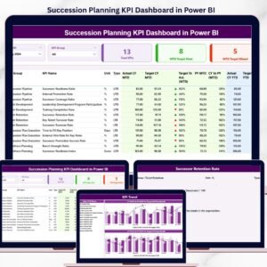
📌 Succession Planning KPI Dashboard in Power BI — Combine resource allocation with bench-strength planning for long-term workforce continuity.
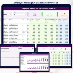
📌 Employee Training KPI Dashboard in Power BI — Track training completion against the skills gaps your allocation data uncovers.
📌 Browse the full Power BI Dashboard Templates library for 200+ ready-to-use industry dashboards.
🔁 Also available as:
- Resource Allocation KPI Dashboard in Google Sheets — same KPI framework, browser-based
- Resource Allocation Report in Excel — Excel-only version with simpler structure
📖 Click here to read the Detailed Blog Post
🎥 Visit our YouTube channel for step-by-step video tutorials
👉 YouTube.com/@NextGenTemplates


Reviews
There are no reviews yet.